
Don't wanna be here? Send us removal request.
Statistics
We looked inside some of the posts by typographyblogposts and here's what we found interesting.
Average Info
Notes Per Post
0
Likes Per Post
0
Reblog Per Post
0
Reply Per Post
0
Time Between Posts
7 days
Number of Posts By Type
Text
12
Last Seen Tumblr Blogs


Fun Fact
When “GIF” was named word of the year in 2012, Oxford Dictionaries U.S.A. credited Tumblr for pushing the word.
Text
Final Reflection
For my second typography class, I was not disappointed. This class teaches you the alternate fundamentals that you need to learn for any sort of design you were looking to go into. Typography class has taught me so much not only about the work itself, but about my own work and my own style. I've gotten to learn so many new terms and rules that will hopefully make me stand out from others and take my design career further. I am very grateful to have two amazing teachers that are very well-known in the program and also who have helped me when creating projects and work that I can use in a portfolio for the future. Typography class has made me realize that design not only relies on your own creativity, but also on rules that have been around and been used for years by so many people in so many different ways. This class specifically was personally one of my favorites I have had. One of my favorite things I will always say about my art classes is getting to see and admire my peers' work. It's always so fun for me to be able to see how all of our minds work differently when given the same prompt and even more so when the class focuses mainly on type. It's easy to create a fun and dynamic illustration, but even harder to add type into that into and to “make type the hero.” Ultimately I will keep everything that I learned in these courses under my belt for a long time and am very grateful to be able to learn from such amazing professors, and specifically Marius!
0 notes
Text
Week 11
This week we have continued to work on our spreads for our process book. I am really excited about this process book as I can have a lot of fun with it and include my work that means most to me. I've decided to go with a scrapbook type design and theme. I'm having a lot of fun playing around with that and making it something that is slightly out of my comfort zone, but still important and meaningful to me. I've had some great feedback from my professor and ultimately feel like I'm on the right track. I can't wait to get this book ordered!
For this week I decided to go with another skill share video. I think sometimes when you're trying to create it's always good to go back to the basics. The video I chose was called five examples of graphic design basics. This included contrast, patterns, color, balance, and white space. I really liked how Sophia Yeshi and this video really walked us through the steps of each basic. When she was talking about contrast she mentions how much you can do with that one element. She said that you can create this through images, typography, color shapes, and so much more. She mentions ways you can try to draw your eye to the center of peace with contrast. I really enjoyed how she talked about the use of color. I like to work with a lot of color and all my pieces and I'm a very bright and fun person with my designs so this was really helpful to also see her examples and work. I love it all! The tips in this video were very helpful when again, knowing to go back to the basics and remembering the things that you need to help yourself be a good designer.
0 notes
Text
Week 10
Week 10
Our final project is in full force. We are working on our process books and I am really excited to put together all my work for both typography classes. This process book has a little bit of weight lifted off of me from last year since I already made it into the GD+I program! So thankful for that opportunity but still want to put everything I have into this process book because I loved how Professor Valdes talked about how he's used it as a good portfolio for job interviews to leave with people. This week I mainly worked on making sure I got all of my projects in order and getting pictures and images of all of them so then it's smooth sailing when putting it all together and I can focus more of the creative side of it.
The video that I chose to watch this week was from skillshare on YouTube and it talked about how to beat writer's block. I know that this isn't a writing class, but I still wanted to watch a video on how to get your creative focus back. Sometimes as a designer I struggle with getting stuck in a creative block and wanted to know how I could get over that and help get the juices flowing again. I like how in the video how mentioned that notifications from our phones could be a big thing that we need to learn to put down, and be able to isolate ourselves. He suggested just writing down a bunch of things to help get all of our ideas flowing, even if they didn’t relate to your project. I definitely used this when working on my project this week by getting in a good headspace of focusing and just looking up inspiration and writing everything down then choosing what stood out to me the most.
0 notes
Text
Week 9
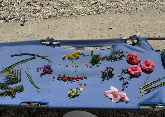
This week we finally got to turn in our project three posters. I continued working on my mindful poster and finally got to go outside to put all my materials together to create it. This process was really fun for me because I got to go out in nature and think about the different ways of the world around me can be used for art. I really wanted a part of my project to speak in that way and to show that mindful design can mean so many different things and be interpreted in many different ways. I was extremely happy with my final design because it was very out of my comfort zone but at the same time felt very “me” and was one of my favorite projects to create.
The online tutorial I chose to watch was from Skill share. It was called “3 Ways to Make Art with Nature”. Tutorial was very interesting! I wanted to watch an online YouTube tutorial that helped with creating design through nature, as that was what my project was based on. This video helped me get creative and think about the different ways that I can use the nature around me to make art. I got some really great ideas for future projects from this video like; using pressed flowers to make a portrait and then going in with a thin tip pen and tidying them up! I learned that you can make tie-dye from certain kinds of flowers. This was really interesting because that is never really something I've thought of trying before but I definitely might give it a go in the future!

0 notes
Text
Week 8
This week was pretty relaxed as it was the week before spring break, so we didn't meet for in person class on Thursday, but instead we had an open studio day. So far we've just been working on our mindful design assignment. I am really excited about this project because I feel like it gives room for loads of creative freedom and everyone's work is going to be so different in such a good way! I am very excited to work on mine because I think it's super different because instead of more digital flat work, I am going to try to work outside in nature and make art of that mostly, which will be really fun for me and shows that art doesn't always have to just mean one thing and the process can always change up!
For this week's assignment I chose to watch the skill share video on “Graphic Design Basics: Core Principles for Visual Design”. I decided to choose this video because I think it will really help me on my assignment. I really like how they talk about using blank space and also what can make a design visually pleasing. It all goes back to how to set up your page and what will draw the eye first. I think that's what I will try to use in my project and continue to build off what I have already learned in that field and apply it to my work even more!
0 notes
Text
Week 7
This week was honestly pretty easy and a fun and creative filled week. I am really excited about the new project that we were presented with. We are starting a new project that focuses on mindful design. There is so many ways that that two word phrase could be interpreted and I am very excited about my sketches and ideas I've come up with so far. Unfortunately I was not able to come to the Thursday class but I am excited to be able to begin this process and work on it , I also am very excited to see what my classmates come up with as well.
While watching the abstract episode on Netflix, I was very intrigued by the lifestyle of Paula Scher. This was a great episode and I feel like the biggest part that stood out to me was when they talked about sketching. Paula talks about her approach to design as intuitive and spontaneous. She often sketches ideas quickly before she refines them. This is something that stood out to me because I feel like as design students we are always taught to sketch ideas because sometimes that's the best way we could start out with an idea and concept. I also like how it talks now you can refine the sketch and how that's all you need to get started and can sometimes accidentally turn into something more beautiful than if you were to start on something digitally.
0 notes
Text
Week 6
Week 6
This week we pretty much just worked on our posters. On Monday we had online class and got more critiques on our posters and more suggestions. I always like hearing from my peers because it gives new and fresh ideas of what I can work on and what I can improve. I wasn't able to make it to the final critique on Wednesday But I ended up still working on my poster and asking some of my friends I have on social media about it anyway. I'm very happy with how my poster turned out and can't wait to share with the class.
While reading communications arts. I really enjoyed looking at all of the designs and how different each of them can be. I think something that stood out to me the most about the pictures is all the colors that were used and how they can really make the feel of the entire poster. Another thing that stood out to me was the text using some of these posters and how we've been talking and texting fully to make an image. Overall this is a very interesting book to flip through and I was really happy to be able to get my hands on it.

0 notes
Text
Week 5
This week was honestly really fun for me! We got to keep working on our Soda City project and mainly focused on making our poster. I had a really good workday on Tuesday and then on Thursday I got to show Marius my colorful printed poster. I got some really great feedback from him and got steered in the right direction to ultimately end up with a successful project that I'm proud of. I definitely feel like I have some things to tweak with the text specifically and how I will decide to display that. Other than that, I'm very excited to keep working on my poster!
This week's reading, the first few lines of page 230 really stood out to me. It talks about how a typographic grid is like a playing field, and then goes on to tell why and how it can be brought to life and how it's like playing a game. I know that it seems like each week we've been focusing a lot on grades but it's honestly such an important part of type in general and specifically with graphic design it helps add structure and visually pleasing elements to a page that really helps to find it. I also like with the pictures how you can see that sometimes, an image doesn't need to be on the page for it to be interesting. It can fully be interesting with just elements of types and a fun grid to go along with it. Now that I've read and talked about grids so much in class, I'm really starting to notice them in everything around me; whether it's on a dinner menu, on a billboard, or even on posters around campus!


0 notes
Text
Week 4
This week was a big learning experience for me in a simple way. I've been working on my original soda city logo that I journal on procreate but then after looking at it some more I definitely wanted to do something a little bit more interesting. I drop a silly little sketch of a cursive text with a stroked background that kinda bubbles around it like a sticker and all my peers including my teacher thought that one would be better than what I've been working on. I messed around with that idea before but never fully went into it but I'm glad that I did because I love the way that it turned out. Think Marius told me was “Always go with the one that's more interesting” and I'm very glad that I did that. I'll always remember that.
This weeks reading we read about layout and the importance of a grid style. I really like this because I think it goes to show that your text can still be a part of your overall look and then it's very important where you choose to place your text along with your images to make it look visually pleasing. I also like when they talk about making your text like a visual landscape. It also stood out to me when they talked about how your own style can also be included in a grid, and how you can still be creative even though a grid layout is a more textbook technique.


0 notes
Text
Week 3
This week we mainly worked on just refining our sketches and turning them into digital work. I took one of my sketches and started working on it in procreate, but then ended up taking a different route and decided to just draw my own letters in a blocky and funky way that I thought worked with my image. I ended up with two options. I definitely know that they both can use some more work, but I got some really great feedback during our mini critique and also really enjoyed the practice of when we were given 10 minutes to sketch over our printed images with some tracing paper in a fun and freeing way. This really helped me unlock new ideas and realize that sometimes when you're not trying so hard and being so refined: that's when your ideas flow the most!
I watched Draplin Design on youtube and chose his logo video. First what stood out to me was his unique style and how nothing looks quite the same yet all has a cool and free vibe to it, especially with the type. I like when he is also talking about logo design and how you rarely see a logo the way it is hoped to be presented. For example, you'll see in tiny in the corner of an instagram post or just on any small scale and that ties back to what we have talked about that your type and logo should be recognizable and legible on any scale.

0 notes
Text
Week 1 (mistake)
Week 1
We’re Back! I'm so excited to be back in Marius’ class and I can't wait to see what we do that's different from last semester. Based on what we talked about, I'm sure it will be fun and we have lots to look forward to. Our first class unfortunately was online because Maruis was out of town but we got to watch the syllabus video and upload a picture of ourselves. We were also introduced to what will be our first project about Soda City and I can't wait to get started on that!
0 notes
Text

This week we mainly focused on our sketches and ideas for our Soda City project. I was very excited for this prompt because I love soda city not only because of its funky cool name, but because of its logo and brand! I worked on just sketching what came to mind when I was looking at the images and played around with different fonts and text style. Many of my sketches were different but I'd like to think they all had a touch of my style on them :)
Attached is a photo of my sketches and now where I'm working from here on. I got some great feedback from my classmates and Marius so I'm excited now to see where it can go from here.
The video I chose to watch was Made By James 5 Ways to build your creative confidence. This title stood out to me because I often find myself being too refined or too much of a perfectionist which can tend to hold me back. When he talked about showing your work, I really liked the part in detail where he talks about how just sharing your ideas about why you did what you created and the thoughts behind it builds your confidence because you can see how your ideas are unique in their own way and art to me is all about creativity (obviously) and interpretation! I also liked when he talks about a mentor and not being afraid to ask questions because that outside eye is sometimes all you need to help you get going or find that missing piece you can't always pinpoint on your own.
0 notes