
Don't wanna be here? Send us removal request.
Statistics
We looked inside some of the posts by unit33leviclass and here's what we found interesting.
Average Info
Notes Per Post
0
Likes Per Post
0
Reblog Per Post
0
Reply Per Post
0
Time Between Posts
27 minutes
Number of Posts By Type
Text
7
Last Seen Tumblr Blogs


Fun Fact
Tumblr posted its first advertisements in May 2012 and subsequently earned $13M in revenue.


Text
Unit 33, Modeste, C. - Task 4
When tasked with a project of designing packaging for a luxury brand, one must take a few things into consideration before the design process can begin. Infusion Beverages Incorporated (IBI) has requested visual branding for a new line of beverages called Elevation.
Firstly, the designer needed to be clear whom the brand is targeting. Elevation targets high-income professionals who frequently travel and engage in leisure activities. They also appreciate and are drawn to the more luxurious and finer things in life. They are open to new products and experiences; they are innovators. Currently , this market is exposed to other brands and products who do seem to satisfy them such as MOET Champagne, 2014 Varner Wines, Foxglove Chardonnay, Krug Clos du Mesnil 2000 Champagne and Hennessy Paradis Rare Cognac. So how will Elevation stand out amongst these?
The designer decided to make heavy usage of a few principles and elements of design that suit the target and that will produce the success intended. One sought to design an organic, minimalistic pattern that will not only fully utilize the brand’s colours, but also suit the target. Walden (2014) agrees that Minimalism reigns supreme. She quotes Alaina Johnson, art director at Killer Infographics,
“Minimalism is always a good route to go when trying to achieve something more elegant and upscale”. According to VanEenoo (2011) Minimalism means using limited material to create a desired effect.
The limited materials used were that of the brand’s colours including black and organic as well as geometric lines. The bottling of competitors mentioned are mostly curved or rounded. The designer saw this as an opportunity to go a different route of having Elevation’s bottles carry a geometric design. A combination of straight lines formed almost a diamond-like shape that will grab the attention of the consumer by not only subtly mimicking the shape of a pricy jewel, but also stands out amongst it’s competitors.
Adding as well as contrasting the unique bottle shapes, organic lines of the brand’s colours wrap around the bottle as the label with the logo centered. The lines vary in size, shape and colour that speak fluidity, free flowing leisure and fun to the consumer. The lines contrast in tone by being bright upon a dark/black solid. The thin white lines create detail which is appreciated by the target market looking as though it took careful thought and time to produce said Walden.
The packaging of the bottles all possess like elements such as the wrapped design seen on bottle whilst including white vertical line/rectangle contrasting the horizontal label mimicking that of a tied gift.
Both bottle and package designs were executed using the highly professional illustration program Adobe Illustrator. It was said that Illustrator enables the user to draw smooth curves and create high-resolution shapes and images (Encyclopedia Britannica 2018). The designer is greatly familiar with this software, which made it easier to perform the task given. To achieve the sleekness of the design imagined as well as considering the packaging would have to be printed, this was also the software of choice because of its high-resolution capabilities. Adobe Photoshop, another software used for image manipulation and creation, was also considered in the beginning because of its diverse tools for creating such as the brush tool and pen tool which can produce a variety of creative outcomes. However, quality is limited due to its pixel-based programming. The client has requested sophistication and luxury and with that comes high quality.
Crisp and fluid lines could not have been achieved to their highest level with the use of Adobe Photoshop due to the skill of the designer as well as the fuzzy feel of the brushes available. Illustrator’s pencil tool, transparent and masking capabilities, provided the desired look and feel of the client’s request coupled with the advanced skills of the designer within the program. The pencil tool in Illustrator was found to be more diverse than Photoshop’s brush tool because of the various types and scales of strokes one can achieve when creating a line as well as it’s path segment reshape feature to complete and refine a simple illustration. Plant (2017) explains how you can achieve extra level of accuracy to create even smoother paths using this tool
After completing design in Illustrator, one can express satisfaction with line and colour quality, however the bottles could have been executed in a more realistic form by using a 3D based program, such as Autodesk Maya, for a better or more elegant feel. The designer is not verse in 3D programs, for improvement, packaging and bottle design can be developed using mentioned program.
In conclusion, the design embodied all elements and approach the client desired. The logo is fully visible and the product definitely suits the target as well as will stand out amongst competitors.
Reference List:
Walden, S. (2014). The Elements of Elegance: What Makes Design 'Sophisticated'?. [Blog] Mashable. Available at: https://mashable.com/2014/09/29/sophisticated-design/#_VHCJFhZ1Oq5 [Accessed 14 Jul. 2018].
VanEenoo, C. (2011). Minimalism in Art and Design: Concept, influences, implications and perspectives. Journal of Fine and Studio Art, [online] 2(1), pp.7-12. Available at: http://www.academicjournals.org/journal/JFSA/article-full-text-pdf/3A668BC6040 [Accessed 15 Jul. 2018].
Encyclopedia Britannica. (2018). Adobe Illustrator | software. [online] Available at: https://www.britannica.com/technology/Adobe-Illustrator [Accessed 14 Jul. 2018].
Plant, K. (2017). Draw smooth lines and shapes with the Pencil tool. [online] Helpx.adobe.com. Available at: https://helpx.adobe.com/ca/illustrator/how-to/illustrator-pencil-tool.html [Accessed 16 Jul. 2018].
0 notes


Text
Unit 33 Modeste, C. Task 2
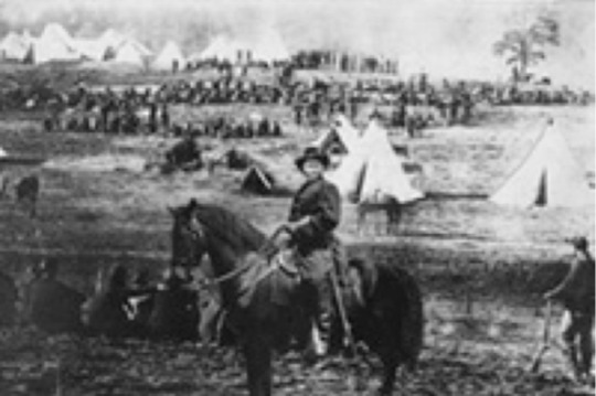
Digital image manipulation has existed for a great amount of years. Not too long after Nicéphore Niepce created the very first photo, Photo Tampering Throughout History (2018) mentioned that image manipulation surfaced in the 1860’s and further evolved with the advancement of powerful software such as digital cameras and computers. A couple of the first recorded image compositions were of extremely iconic past U.S president Abraham Lincoln, where his head was placed upon a body not belonging to him, and another American of General Ulysses S. Grant where the image depicted him on a horse in front of his troops which was said to be 3 complied images. But how did persons in this time period compile these images?

A couple methods such as ink blotching and multiple exposure to light were practiced in order to achieve different outcomes like compiling multiple images or the removal of persons or objects in an image. PBS News Hour (2012) as well as Mia Fineman mentioned that Gustave Le Gray used the technique of exposure by using two separate negatives in his seascape collection where the same cloud negative was repeated in all three images.
Today, technology evolved from complicated methods into the heavy usage of photo manipulation programs and software such as Adobe Photoshop, Lightroom, Illustrator, Fireworks, CorelDRAW, etc. Which made things easier and simpler through the method of layering. The future of photo manipulation can be seen in social media face filters and current applications that are applying augmented reality to the public such as Facebook.
Adobe Photoshop, being the core contributor to image manipulation today, was born under the nameDisplay, as a means of simply displaying grayscale images on a monochrome display, to Thomas Knoll. Today Photoshop hosts a variety of features and abilities. Photoshop features such as filters, blurs and colour matching all aided in the final outcomes of this project. They helped compose scenes related to theme – Human Trafficking – as well as withhold a personal style almost as though the various elements and objects were actually there rather than super imposing images into fonts or unrealistic imagery. Whilst critically analyzing the posters, moods of fear, empathy and more can be depicted from these posters based on the manipulation abilities of Photoshop. A critical analysis, defined by, Southeastern.edu (n.d.) is subjective writing because it expresses the writer's opinion or evaluation of a text.
Experimenting with each program really gave way for deciding on which features would best executed desired outcomes. Adobe Illustrator seemed best for if one’s final piece planned to consist of a high level of vectorized content and tools such as the pen and pencil tools. This was not the case for this project. One’s personal style was projected in the direction of minimalism and realism.
Like graphic designer Pete Majarich who took a minimalist approach to movie posters in 2016 said Shi (2017), there was only one focal point for each poster created using minimal material to do so by gathering about 7-9 images per poster to create the composition. Unlike Pete, the designer did not include heavy use of a vector based visual style. It was clear that Pete took full advantage of the tools Adobe Illustrator had to offer and very little use of Adobe Photoshop. This worked for the theme Pete worked on which were movies. However, one decided to go along the route of realism because of the theme ‘Human Trafficking’ spoke of occurrences in real life.

Realism posters were being done from as early as the 1950s. The designer’s personal style can be depicted by the use of 2018 design trends outlined by Jones-Cann (2017) and op Graphic Design Trends 2018: The Ultimate Guide (2017), negative space and illustration over photos and authentic photography.
Photoshop best aided in the completion of desired style. One took advantage of it’s capabilities such as filters like multiply, lighten and darken; and also features like the clipping mask and drop shadows, mainly used throughout posters. Compiling the images used for each poster could have also been done in another program such as Microsoft Paint because it allows multiple photos to be placed on a single canvas just like Photoshop. However, Microsoft Paint does not include a range of features like Photoshop and is very limited to simple tools such as the pencil, eraser and shape tools. These comparisons can be determined by one’s familiar use of the programs.
In conclusion, one can say the personal style of the designer displayed realism and a small scale of minimalism using the industry standard program Adobe Photoshop to complete pieces. The designer was content with final result, however improvements can be made by exploring in-depth features of the program to achieve an even higher level of the realist effect.
Reference List:
Photo tampering Throughout History. (2018). [ebook] Available at: https://www.cc.gatech.edu/~beki/cs4001/history.pdf[Accessed 4 Jul. 2018].
PBS News Hour. (2012). What did we do before Photoshop?. [online] Available at: https://www.pbs.org/newshour/arts/slide-show-what-did-we-do-before-photoshop[Accessed 4 Jul. 2018].
Www2.southeastern.edu. (n.d.). CRITICAL ANALYSIS. [online] Available at: https://www2.southeastern.edu/Academics/Faculty/elejeune/critique.htm [Accessed 16 Jul. 2018].
Historyofinformation.com. (n.d.). The Origins of Adobe Photoshop (1987 – February 1990) : HistoryofInformation.com. [online] Available at: http://www.historyofinformation.com/expanded.php?id=1260 [Accessed 16 Jul. 2018].
Shi, D. (2017). The Guy Who Designed Minimalist Movie Posters Every Day For a Year Finally Finished. [online] Creators. Available at: https://creators.vice.com/en_au/article/yp9xkx/the-guy-who-designed-minimalist-movie-posters-every-day-for-a-year-finally-finished [Accessed 16 Jul. 2018].
Jones-Cann, M. (2017). 10 inspirational graphic design trends for 2018 - 99designs. [online] 99designs. Available at: https://99designs.com/blog/trends/graphic-design-trends-2018/ [Accessed 16 Jul. 2018].
op Graphic Design Trends 2018: The Ultimate Guide. (2017). [Blog] Graphic Mama. Available at: https://graphicmama.com/blog/graphic-design-trends-2018/ [Accessed 16 Jul. 2018].
0 notes
Text
Unit 33, Modeste,C. - Task 1 Poster 3
Poster 3 and image referencing


0 notes
Text
Unit 33, Modeste,C. - Task 1 Poster 2
Poster 2 and image referencing


0 notes
Text
Unit 33, Modeste,C. - Task 1 Poster 1


Poster 1 and image referencing
0 notes