Don't wanna be here? Send us removal request.
Statistics
We looked inside some of the posts by unit6-ethanhayward and here's what we found interesting.
Average Info
Notes Per Post
1
Likes Per Post
1
Reblog Per Post
0
Reply Per Post
0
Time Between Posts
1 minute
Number of Posts By Type
Text
17
Last Seen Tumblr Blogs


Fun Fact
US Tumblr user growth rate is estimated to slow down to 4.1%.
Text
Evaluation
Media and techniques:
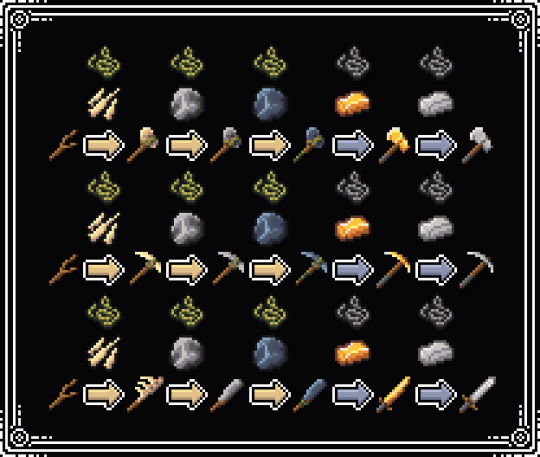
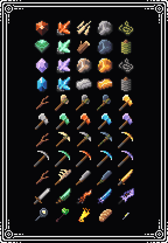
For this project I used aseprite which is my main program for pixel art. I didn’t particularly learn anything new, I only expanded my skills on creating tile maps and game related assets; a lot of the smaller assets were 16x16 and bigger ones were 32x32. By sticking to a pixel size limit, it helped me to keep consistency with my work and attempt to recreate items on a smaller scale.
In my proposal I said that I wanted to make top down assets for a game that had its main mechanic as upgrading. I made a bunch of art for upgradeable weapons and tools using ores and materials collected around the map.
Purpose/ Theme/ Concept:
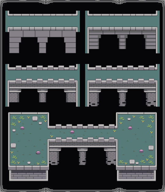
Overall im happy with how the world and assets turn out as they all went to plan the only big change I made was doubling the original scale of the map assets from 16x16 to 32x32 to give me more space for detail, I did keep the materials and tool as 16X16 as it fit with the overall style and kept me from spending too much time on them
At the end of the project I changed the map colour from a high saturated high contrast palette to one that was more mute and washed out. I changed the colours to make the game less straining on the eyes, and overall many people including myself preferred the colour change.
At first some of the materials I made looked too close and didn't look like the ore in real life. For example the stone and iron looked too similar, and so I changed the iron to more of a pale yellow colour instead of grey.
Outcome:
For my project I met my expectations for the map and assets but not the animation. I would have liked to include more animations in tools and the map but only ended up making an animated slime.
There were a number of assets I was happy with at the end of the project, the main ones being the animated slime, as it was the first enemy I made with an animation in this project and I liked the end result. The house upgrades ended up looking a lot better than I predicted and I specifically liked the colours and design
Conclusion
Even though I feel like this project went really well, there are a few things I would improve in the future. As I said before I wanted to do more animation as I feel like this would add a lot to the overall feel of the game map, also I would have liked to create more world improving assets like pillars and ruins to integrate story line and law into the map.
Something new I learned was creating and designing swords with a consistent style in a 16x16 size. This will help me create better weapons for future projects as i have a better understanding of the pixel art limitations
0 notes


Text
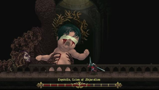
blasphemous
Blasphemous is a high resolution pixel art game that uses body horror to progress a dark story line throughout the game. it used negative space well to contrast the player against the background.

0 notes
Text
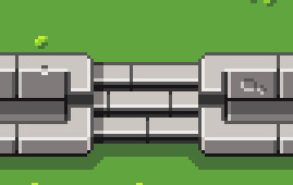
making sideways stair


I used the pokemon stairs as reference for my sideways staircase.
0 notes
Text
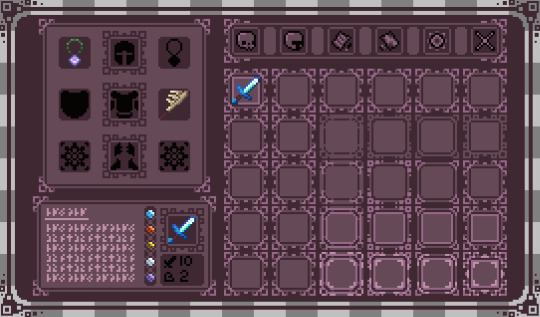
inventory progression
For my inventory, I started off by planning and making basic inventories off of references I had from other games. I ended up creating a basic inventory like this:

After I decided that I liked this inventory layout, I started to make a more polished looking one. On the top left, you would be able to see what armour and weapons were equipped to the character.

I made a small test version then scaled it to the size I wanted for my game.
0 notes
Text
smooth


I wanted to experiment with using a software to smooth my pixel art. i like how the smoothing makes it less harsh on your eyes.
0 notes
Text
stairs


I wanted to include levels into my game to break up areas so i made stair assets that would allow the player to go up and down the areas similar way to pixel art zelda games.
0 notes
Text
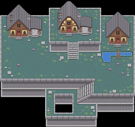
tile map update


halfway through my project i decided i wanted to up the asset scale for the map from 16x16 to 32x32 as i felt the detail would greatly improve the overall look of my game.


0 notes
Text
world colour pallet

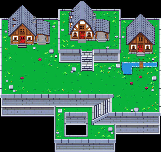
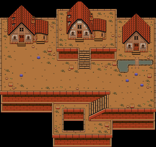
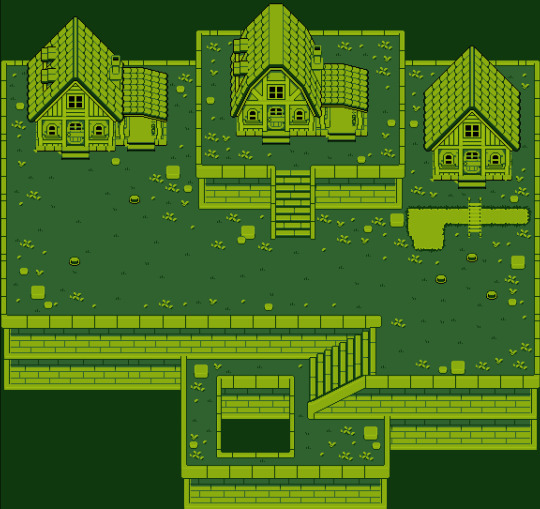
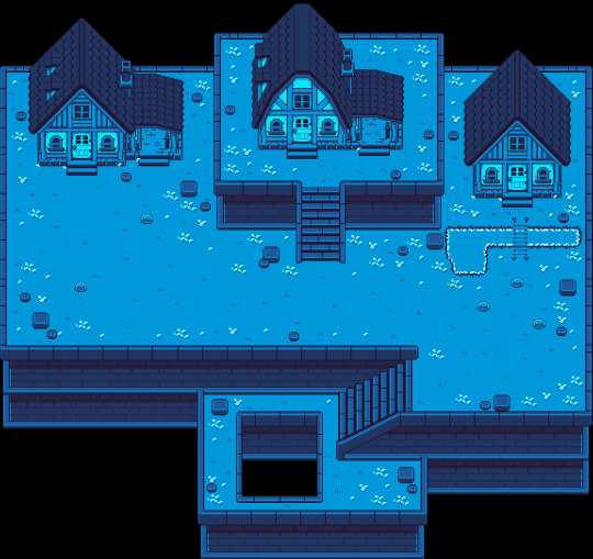
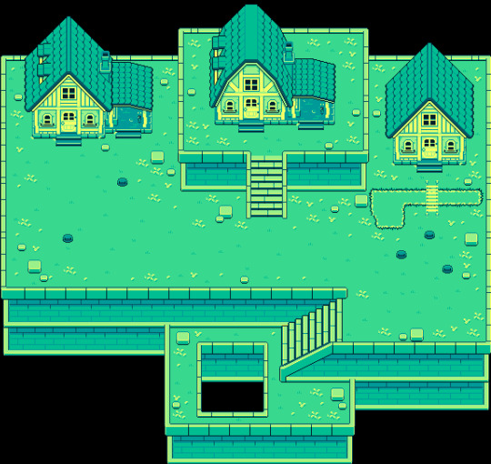
At the end of the project i wanted to test with alternate colours in reference to older games like the gameboy i used a bunch of colour palettes to see how they would affect the look of the game and listed them in descending order of best looking to worse with the top being the original.
0 notes
Text
changing the hue and saturation

after i had made the map concept area i decided the map was to saturated to i chose to reduce the saturation to make the game more washed out.

0 notes
Text
wario land 4
Wario Land 4 is a platformer developed by Nintendo and released for the Game Boy Advance. Wario has to gather four treasures to unlock a pyramid and save Princess Shokora from the Golden Diva. i remember bust the boss fights and fun levels i couldn't fault the game it was fun to play the bosses where different from each other meaning that each time you entered a boss fight is would be a different fight mechanic each time for example the fight with cractus you had to wait until ropes fell from the roof and you had to doge him until he was tired and you could jump on his head.
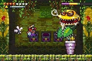
1 note
·
View note
Text
cuphead

cup head is one of few games that use the old cartoon style animation so in most sense compared to cartoons there very similar and the only difference really between old and new cartoons are the over pronounced movements and reuse of walk cycles and arm movement the animation style is closer to adventure time rather than the regular show as they movements and “skeleton” of the character is quite free.

The way the characters are collard is the same as adventure time, they consist of one base color and that's mostly it there's very little shading or detail other than some highlights but the backgrounds are closest to the regular show as they consist on loads of detail though this is a bit distracting during gameplay it's nice to look at and has enough contrast between the characters to not really matter.

0 notes
Text
Paul Robertson artist research

Paul Robertson is an Pixel Artist and also works on animations that are filled with different characters and objects that all have different color schemes but he keeps to complimentary colors so it doesn't have to much contrast and look out of place in the image.

In his art each character seem to have their own story line giving each of them characteristics that imply movement throughout giving it the feeling of it being a picture just before chaos I also like that in his work me layers and stacks his characters making them interact and intertwine with other characters adding loads of depth into the art.

0 notes
Text
Rieko Kodama
Rieko Kodama is a video game artist, developer and producer. Rieko Kodama was also the first lady of RPGs. rieko has worked on many games for sega like Phantasy Star, Hoshi wo Sagashite, Sonic the Hedgehog and many others games.she is also known for her work on the RPG Phantasy Star series, 7th Dragon series and Skies of Arcadia both quite notable games at the time.

Rieko’s art style is quite different to other 2D games bit for many it stuck well and almost anyone could tell what games its from immediately i personally really like the art style its the first thing that tends to come to mind why i think of old and retro games, but would i use it myself unfortunately no i feel its outdated and its beauty is gone not fitting into modern games which is exactly why it wasn't included in those terrible kids tv shows made of it but even know i wouldn't use the style its still good and very memorable.
0 notes
Text
Army of Trolls
The art he produces is always messy with no real focus point in mind it feels like hes trying to keep you occupied looking at his work your drawn to different areas that all have completely different themes from different games for example the Mario castle and pac-man maze, i also like the fact it's all done in his art style so although there all from completely different games there fit in to the chaos.

0 notes
Text
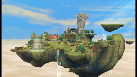
skyward sword


In skyward sword you navigate the floating island of Skyloft and the land below it, completing quests that advance the story and solving environmental and dungeon-based puzzles. The mechanics and combat, the latter focusing on attacking and blocking with sword and shield.

The world of skyward sword is built to guide the player to the next objective while giving them the freedom to explore this is something i want to include in my assets using grass patches.
0 notes