Statistics
We looked inside some of the posts by valenjoya and here's what we found interesting.
Average Info
Notes Per Post
9K
Likes Per Post
5K
Reblog Per Post
4K
Reply Per Post
0
Time Between Posts
3 days
Number of Posts By Type
Text
17
Last Seen Tumblr Blogs


Fun Fact
Tumblr was created by web developers David Karp and Marco Arment.
Text

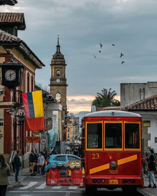
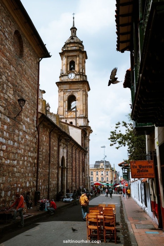
This is my inspiration for creating my film poster. How pretty Bogota looks! I decided to create a film poster for a documentary about Bogotá, my hometown. I believe we often miss showcasing the panoramic beauty that the city holds. I have a deep appreciation for colors, textures, and contrast, and I want to capture various aspects of the place I call home.
The perspective from which these images were taken resonates with me because I've been to those exact locations. It authentically reflects the beauty of Bogotá. My film poster aims to show the city where I was born, focusing on capturing cultural elements such as street markets, churches, and everyday streets.
While the image may not explicitly showcase these aspects, it invites viewers to see the world through different eyes. I love Bogota!
Marie-Helene Brault, Josefina Salcedo
12 notes
·
View notes
Text


My next assignment will be the film poster, that's why, im trying to find inspiration on different works. However, these film poster ideas are part of my inspiration for a documentary about Bogota, the capital of Colombia, and they play a key role in my visual diary. Each poster shares a common thread – the use of a single image that encapsulates the core concept of the film, which will focus on exploring the vibrant city of Bogota. As I prepare to travel to Bogota for the documentary, my goal is to capture a powerful shot that distills the essence of the city into one impactful image.
When it comes to hierarchy theory, I've experimented with different types of typography. Some posters play with a contrast in color to emphasize certain elements. This diverse use of typography serves as my foundation, providing a starting point for the design journey. By strategically incorporating hierarchy and color, I aim to create visually compelling film posters that not only communicate the documentary's message but also reflect the richness and diversity of Bogota. Each poster is a piece of my creative puzzle, contributing to the larger visual story of my documentary project.
Fire at sea (Gianfranco,2016), The Oslo Diaries Movie Poster - Chargefield, (Nomadland. 2020), Crip Camp, How to make a movie poster (studioBinder)
0 notes
Text


Black and White inspiration - images
I started thinking of the idea of applying all white and black images for my assignments. Because I feel like Black and white images the without color you can focus on the fundamental elements of an image, such as composition, form, and contrast. This simplicity can enhance the clarity of the visual message, making it more accessible and impactful.
Also, black and white photography or design can evoke a sense of nostalgic feelings and this emotional connection can enhance the viewer's engagement with the visual content. Basically, black and white images inspire visual communication by emphasizing essential elements, conveying a timeless quality, and fostering emotional connections that contribute to the overall impact and effectiveness of the visual message.
Credits:
Pinterest: Everything Adobe
Sarah Virumbrales, Acontraluz 2017
Wattpad: Carinah090
Uploaded by :-) BellaBella BoBella2
Uploaded by Andrés
0 notes
Text
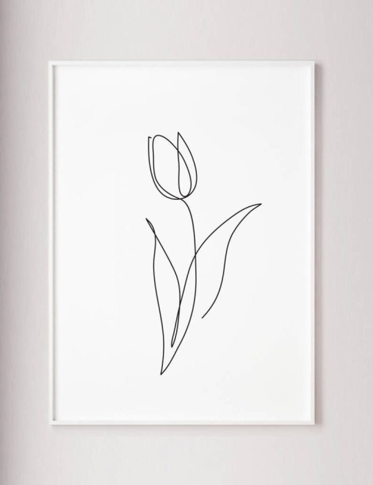
Tulip Print Flower Art Abstract - Etsy
I love the idea of simple and abstract things.
This Tulip Print Flower Art Abstract is like a beautiful painting that follows design and minimalism ideas. It's simple and elegant, with the tulip as the main focus. The use of white spaces makes it clean and balanced, emphasizing the colorful tulip petals. It's a pretty and straightforward piece that shows how simplicity can be powerful in flower art.
This tulipán inspired my visual presentation, for minimalism. I realized that I’ve like and enjoy the idea of simple thing less is better, so I just started focusing on it, and to be fair I totally agree with the concept, simple thing are more, when you try to add so many thing you just lose the essential beauty of things.
0 notes
Text

Hong Kong - street Photography
I adore the vibrant contrast and the captivating play of colors in this picture. The skillful editing enhances its overall appeal. The image features an assortment of vegetables – bananas, cauliflower, tomatoes – arranged naturally, with a man seated among them. The composition is a beautiful blend of vivid colors and a harmonious arrangement that draws attention to the details, making it a visually engaging and thought-provoking scene.
This picture from Hong Kong caught my attention because, even though it's far away, it feels a lot like the markets we have in Bogotá. It's cool to see how markets, with all their lively colors and busy vibes, are similar in different parts of the world. It makes me think about how some experiences are the same for people, no matter where they live. This connection between Hong Kong and Bogotá inspires me to explore the shared things that make us all alike, even in different cultures.
0 notes
Text
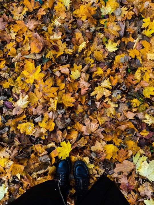
Walking on a bunch of fall leaves feels like stepping on a soft cloud of autumn. The colors and the sound of the leaves make it a special moment. The picture shows this feeling, taking you to the cozy and nostalgic vibe of fall. It's a nice way to enjoy the little happy things that nature gives us during this time. This photo inspired me to try and recreate this moment in my own way, connecting it to finding joy in simple things and appreciating the beauty of each season.? #fall #autumn #leaves 🍁🍂
0 notes
Text
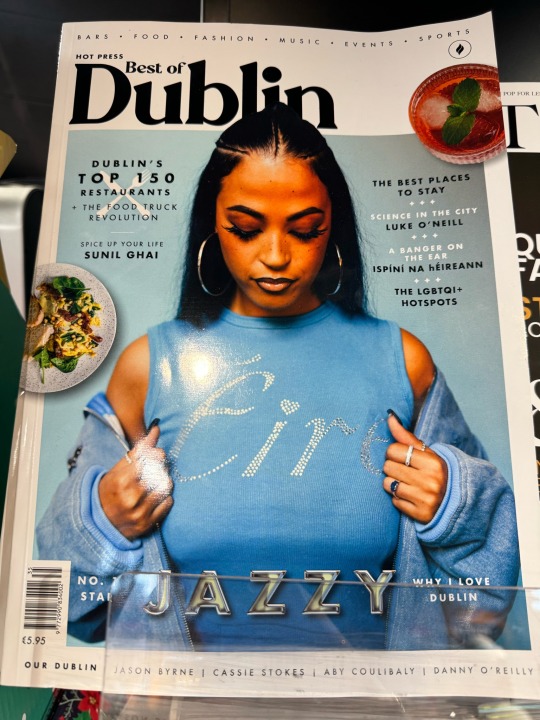


I was going to a normal shop in Dublin, and near the cashier I saw this three magazines – Image, Best of Dublin, and The Gloss. These magazines are a blend of photography, typography, colors, and hierarchy. They showcase a mix of creative elements that can inspire your design process applying design concepts. Flipping through the pages, you get to see how real companies, with various people contributing, use visual communication concepts to make sales and present their brand. It's like a visual feast that sparks ideas for your own creative journey.
These Dublin magazines use pretty colors in their writing, making the design look nice. They also put small things in smart places to keep everything looking neat. I really like how they make the spaces on the sides (margins) and how they organize the different parts in a cool way. They also do a great job of making some words or parts stand out more than others (hierarchies), making it easy for readers to follow along. It's a great example of how paying attention to these little things can make a magazine look awesome!
0 notes
Text

Recently, I've become obsessed with taking pictures everywhere I go, especially after learning about visual communication in class. Now, I try to discover the art behind the scenes, exploring how you see and perceive things. For instance, in this picture, my initial focus was on capturing textures. However, upon closer inspection, I realized there's more to it – the angles, the contrast in colors, and the various textures all contribute to the overall composition.
In this specific shot, I captured a flower without knowing its name, placing emphasis on the textures behind the "petals". Even in the simplicity of a flower, there's a hidden beauty in ordinary things. My approach to photography is deeply connected to life, highlighting how we perceive and appreciate the simple yet beautiful moments. Through the lens of visual communication theory, I've learned to not only capture images but to decode the intricate language of visual elements that convey a richer narrative.
0 notes
Text

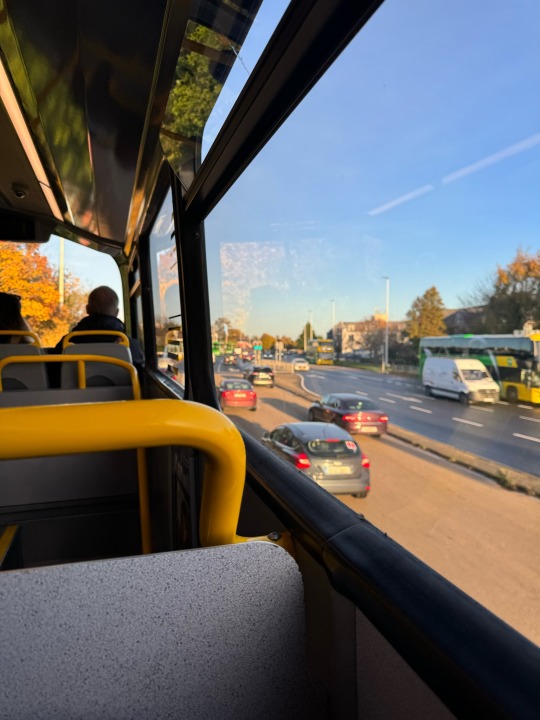

I took a picture of a Dublin bus because I liked the bright colors outside. It was like the view from the window as one of those landscapes paints with vibrant colors. You could see the deep blue sky and feel the autumn atmosphere. This made me think about taking pictures of everyday things using their lively colors as a creative idea and inspiration.
Also the changing colors of autumn, visible through the window, bring a dynamic element to the scene. This seasonal transition can serve as a metaphor for transformation and evolution, providing thematic inspiration for my creative designs. The combination of the natural landscape with the urban athmosphere of the bus introduces an other concept in my visual diary, that can be explored, playing with the harmony between man-made structures and the changing seasons.
0 notes
Text
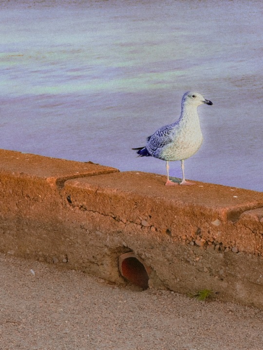
You might be thinking why a Seagull been part of her visual diary?
Well, A seagull can be understood as a dynamic visual element. The contrast of its white feathers against the blue sky or ocean can evoke a sense of freedom and tranquility. In this case I just capture the picture while she was standing but if you’re able to Capture different angles and behaviors of a seagull through photography or sketches can contribute to a diverse and visually appealing collection in my visual diary. Additionally, it inspires me to explore the symbolism associated with seagulls, such as freedom, adaptability, or a connection to the sea, adding depth to your creative reflections.
0 notes
Text

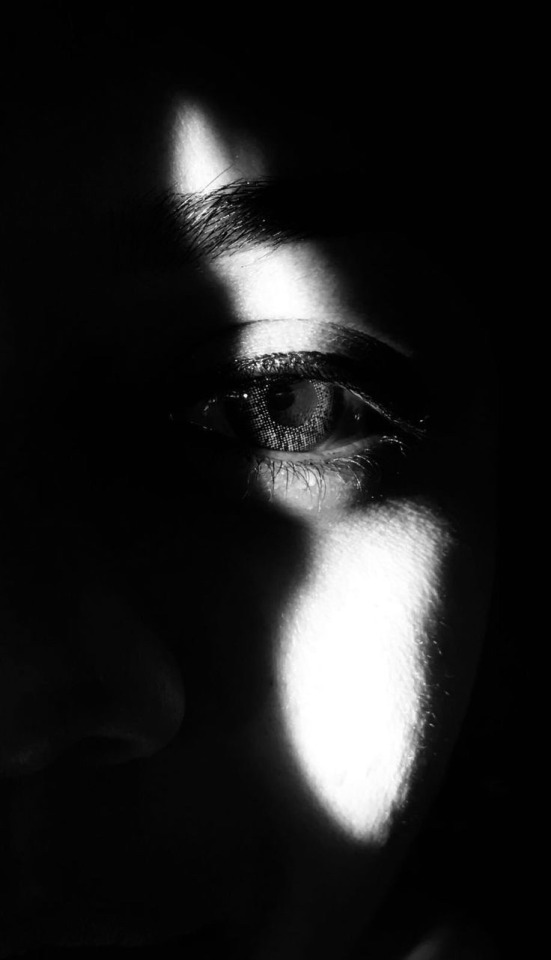
This mural has a similar perspective to the poster below, but it brings a whole different vibe. It's street art that blends elements like colors, textures, and expressions in a unique way. I came across these murals while looking for inspiration for my image of Anger. Initially, I was solely focused on capturing facial expressions for an assignment about emotions. However, discovering these diverse murals made me rethink my approach. Now, I'm exploring a broader range of elements beyond just facial expressions to convey the emotion of Anger in my image. The same mural may evoke diverse emotions and thoughts, creating a dynamic interaction between the artist's intentions and the audience's perceptions. It's this open-ended nature that turns murals into powerful visual narratives, sparking conversations and allowing for a multitude of interpretations.
0 notes
Text

I found this mural while I was walking seeking for inspiration and then I realized how inspiring was for exploring facial expressions, especially in my pad dedicated to safe representation. In this picture, you see a man holding a girl in a wild sea, and he looks calm. I love how he's gently holding her hands, transferring a comforting feeling. The picture has various shades of blue, making the main focus stand out more with a nice contrast. It's like a visual story where the colors and expressions speak their own language.
Murals are fascinating canvases that often reflect the deep thoughts and emotions of the artists. Behind the vibrant colors and intricate designs, there's a hidden world of feelings and thoughts waiting to be explored. These concepts within murals offer a unique glimpse into the artist's inner world, a visual diary of their experiences and perspectives. What's intriguing is how these expressions can be interpreted in various ways by different viewers
0 notes
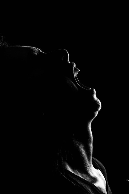
Text

Recently, I've developed a strong affinity for black and white photographs. To me, they seem like an analogy for life, offering a different perspective. Just like how life unfolds in varied shades, the absence of color in these photos highlights the essence of moments, allowing for a unique and contemplative view.
That's precisely why I turned to this black and white photograph while seeking inspiration for my images assignment. In the absence of color, I aimed to capture the expression of feelings and emotions, delving into the photograph's composition to uncover a deeper meaning behind the lens.
0 notes
Text
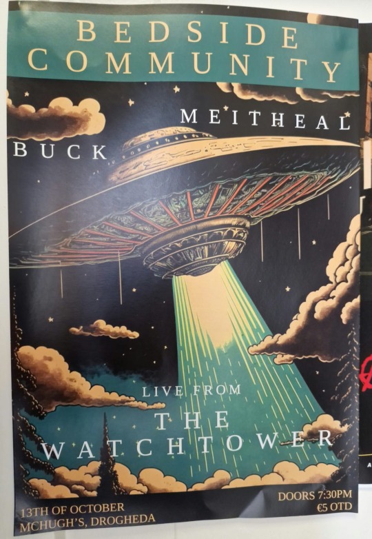
This design was part of my inspiration process, as it inspired my music poster in a different way. I looked at how they arranged things and used the same font, but how they play with line spacing, font color and mix of typography with shapes like clouds, threes and a spaceship.
The background is like a night sky, it has a cold pallette with navy and dark colors blending in and you can see the contrast that creates with the white typography. It's not my absolute favorite poster, but it helped me figure out how to organize stuff and keep and eye on the use of typography and contrast for my musical poster. I checked what they did first and how they put things together. It gave me ideas on where to begin and what to avoid when making my poster.
0 notes
Text
The painted peaks of Death Valley, California, serve as a source of inspiration for my visual diary aimed at creative design thoughts. The vibrant and varied colors found in the geological formations create a natural palette that can be translated into diverse color schemes for designs. The interplay of warm earth tones, ranging from rich reds to subtle yellows, can evoke a sense of warmth, energy, and dynamism.
The open landscapes can instill a sense of expansiveness and freedom. This feeling can be translated into design concepts that convey openness, minimalism, or a sense of boundless possibilities.
In essence, the painted peaks of Death Valley provide a visual feast that stimulated my design thinking by offering a diverse color palette, inspiring textures, that can be translated into various creative concepts within my visual diary.
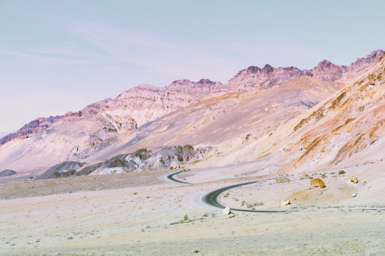


painted peaks; death valley, california
instagram - twitter - website
9K notes
·
View notes
Text
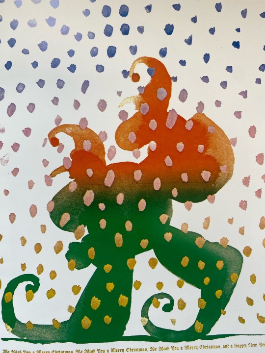
I saw this picture in a design book, and even though I don't know who made it, I liked it a lot. It has red and green colors, kind of like Christmas, you know? And those dots look like snow, but not the usual way. It's not a normal picture; it's more like a mix of colors and shapes. I thought it was a cool and simple way of doing art. It made me think about how you can show your feelings and thoughts through design, like playing with colors and making things stand out. It's like saying art is all about expressing yourself in a creative way.
What colors would you use to tell your story, and how would you play with shapes and contrasts? Art is like a conversation between the artist and the viewer, and this picture sparked my curiosity about how we all have our unique way of saying things through design. What do you think your colors and shapes would say?
1 note
·
View note
Text
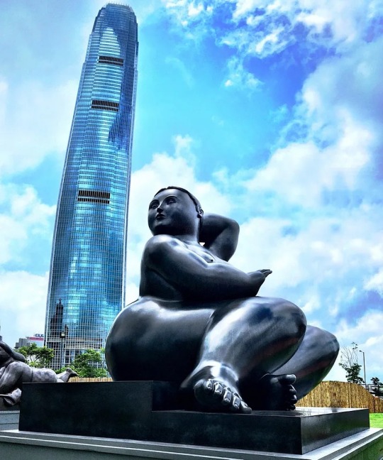
In here you can appreciate One of Boteros art.
Exploring Botero's art is like stepping into different art worlds, and that's something I really like. He has this cool way of drawing, and making art called "Boterismo," where everything looks big and funny or serious. It's like he's using a secret code to create his own unique style. I enjoy looking at art from different perspectives, and Botero's way of making his subjects exaggerated gives me a fresh way to see things.
What's even cooler is that Fernando Botero is from Colombia, and his art represents our country. It makes me proud to know that he brought a piece of Colombia to the art world. His unique style, "Boterismo," is like a special signature that tells everyone, "Hey, this is from Colombia!" It's awesome how he made a mark on the art scene, showing that our country has its own cool and creative way of doing things.
0 notes