
veronicajeanette-blog
Veronica Jeanette
Hi! I'm Veronica Jeanette, a Mexican Graphic Designer currently focusing on UX/UI Design. Besides I enjoy working on Editorial projects, Branding and Photography.
6 posts
Don't wanna be here? Send us removal request.
Last Seen Blogs

kkigallery-blog
kkigallery

dianawrites
𝑝𝑒𝑛𝑠𝑖𝑣𝑒.

evan-hansens-positive-blog
Ask Evan Hansen
dianawrites
𝑝𝑒𝑛𝑠𝑖𝑣𝑒.

remonifisoxo
Untitled
Photo

Daily UI 005 - App Icon
Design Hint: Design an app icon. What best represents the brand or product? Or is it incredibly unique? Does it look great at a distance and does it stand out when put on your home screen alongside other apps?
Solution: I decided to create an icon for a laundry service app. Most laundry apps or logos use some sort of blue, so I used it as well but with dark purple hints, that go perfectly together with the opposite color: yellow. Because of the high contrast it stands out from the rest of the icons, and the simple minimal design conveys the idea of the laundry machine without being too obvious.
0 notes
Photo

Daily UI 004 - Calculator
Design Hint: Design a calculator. Standard, scientific, or specialty calculator for something such as a mortgage? Is it for a phone, a tablet, a web app?
Solution: I decided to create a desktop app, very simple and minimal for simple calculations. What’s different about my approach is the fact that you can drag the main screen with your result and place it to the side. How many times have you forgotten the previous number when you were doing multiple-step calculations? Well, now you can have all the steps next to the one you’re working on so you don’t miss anything. If you need to use the calculator again in one of the screens you dragged from the main app, you just click the arrow and open the whole screen again.
0 notes
Photo

Daily UI 003 - Landing Page
Design Hint: What's the main focus? Is it for a book, an album, a mobile app, a product? Consider important landing page elements (call-to-actions, clarity, etc.)
Solution: Since co-living and co-working spaces are in huge trend right now, I decided to create a landing page for co-living spaces by the beach. It’s quite simple, with a pretty clear call-to-action button, and the illustration makes it look young and fresh while playing with the rest of the layout.
Illustration by Supriya Bhonsle on Mixkit
0 notes
Photo

Daily UI 002 - Credit Card Checkout
Design Hint: Design a credit card checkout form or page. Don't forget the important elements such as the numbers, dates, security numbers, etc.
Solution: I created two screens for payment options, the first one has shortcuts to saved payment methods on top, with an option to add another form of payment on the bottom. The second screen refers to the process of adding a credit card, and it is minimal and simple. Whatever data you input on the bottom you will see on the card at the top.
0 notes
Photo

Daily UI 001 - Sign Up
Design Hint: Create a sign up page, modal, form, or app screen related to signing up for something. It could be for a volunteer event, contest registration, a giveaway, or anything you can image.
Solution: I created this minimal and simple sign up page where you can input your information on the right while looking at what step of the process you’re at on the left. I also decided to use mostly a monochromatic approach to keep things simple and elegant.
Photo by Joshua Davis on Unsplash
0 notes
Photo
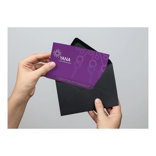
Throwback to the time I created the branding design for YANA (You Are Not Alone), a non-profit organization in Rockaway, NY that helped a lot of people with training and guidance for obtaining careers. Most of these people were immigrants or people trying to integrate back into society. For the logo I wanted to represent YANA at the center of the community, creating connections between people. This work was shown at the MoMA PS1 dome in Rockaway in June 2013. (at Rockaway Beach, Queens) https://www.instagram.com/p/B25H4SpADL9/?igshid=a6hje8xtjoga
1 note
·
View note