
I'm Deev and I write things ♤ she/her ♤ Residence of Eleanor ♤ headcanons, fic requests, and rp ♤ personal tumblr: dvsharpie ♤ ao3: dvsharpie
Last active 60 minutes ago
Don't wanna be here? Send us removal request.
Statistics
We looked inside some of the posts by vesuvia-in-flames and here's what we found interesting.
Average Info
Notes Per Post
622K
Likes Per Post
362K
Reblog Per Post
259K
Reply Per Post
677
Time Between Posts
1 month
Number of Posts By Type
Text
16
Photo
1
Last Seen Tumblr Blogs


Fun Fact
In 2020, 44% of users from Denmark used Tumblr daily.

Text
the partition of the Mongol empire sounds like the background of a JRPG. “Long ago there was this guy who ruled the whole world and then divided it up into four parts: the Cold Slavic Forest realm, the Hot Persian Desert realm, the Vast Steppe and Mountain Pass realm, and the China realm” oh let me guess, then he gave each realm a magic crystal that controls the elements
9K notes
·
View notes

Text
Hobbits vs Cinematography
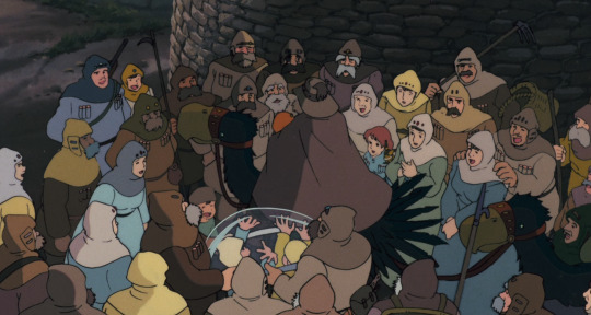
In the LOTR films there’s always a huge height difference between the tiny hobbit characters and the tall human characters they interact with. This means that a crucial part of any scene’s tone– even if you don’t consciously notice it– is whether the hobbits are shot in a way that downplays how small they are, or in a way that emphasizes how small they are.
Like: there are two scenes where Frodo (a tiiny hobbit) talks to Boromir (a tall powerful man). In one scene, the film downplays the height difference, and in the other scene, the film emphasizes it.
The first scene is the one where Boromir comforts Frodo after Gandalf’s death. (”You carry a heavy burden– don’t carry the weight of the dead.) The cinematography™ makes you feel like the two of them are equals.
We get medium shots of Frodo sitting on the ground:

And medium shots of Boromir sitting on the ground with him:

The camera angle is neutral….like, we’re not looking up at Boromir, or down at Frodo– we’re looking directly at both of them.
The two characters both take up the same amount of space in the frame– making it feel like they’re basically the same size.
The two of them are sitting on the ground together, while the characters around them are standing. This makes it feel like Boromir is “down on Frodo’s level” in a way that the other characters aren’t.
So we know that Boromir is much taller than Frodo, but in this scene it doesn’t *feel* like he is. It feels like they’re equals, two ordinary people who are going through the same shit, and are equally powerless to stop it.
But the scene where Boromir takes the Ring is the exact opposite!
In this scene, the height difference between the two is emphasized to make Boromir seem threatening.
Remember how the camera angle in the other scene was neutral, so that you were just looking into the character’s eyes? In this scene you’re always looking UP at Boromir, like he’s incredibly tall/standing above you:

And looking dOWN at Frodo, like he’s very tiny:

The environment itself emphasizes the camera angles, which I think is really neat! The scene takes place on a steeply sloping hill. So any time we look up at Boromir, we’re also looking uphill. Anytime we look down on Frodo, we’re also looking downhill.
Frodo is also standing next to that enormous fallen stone statue— which makes him seem even smaller by contrast. The giant statue head behind him makes Frodo feel impossibly tiny…… so small that he’s smaller than a face……….
Also again: in the previous scene, they’re shot so they look like they’re basically the same size in the frame. Boromir doesn’t look that much bigger than Frodo.
But in this scene, Boromir is often put in the foreground while Frodo is in the background….so you get shots like this, where Boromir is a HUGE looming figure in the foreground while while Frodo is a tiny-looking small guy in the background;
This is why the scene feels instantly wrong in a way their previous conversation didn’t.
Even though Boromir begins by saying basically the same thing he did in their previous conversation (”you carry a heavy burden…” “you suffer, I see it day by day…”) it feels threatening this time. You’re deeply aware of how much taller and more powerful Boromir is than Frodo, you really feel the power imbalance between them and you’re instantly aware that Frodo is in danger.
And it’s not just these two scenes that are careful with the cinematography like this? It’s EVERY SINGLE SCENE that involves a hobbit talking to a taller person.
Another obvious example is the opening with Gandalf in the Shire.
In the early scenes, Gandalf is supposed to feel like a harmless hobbit friend who is basically One of the Hobbits. So he’s always stooping down, or kneeling, or sitting down, and the camera angle is almost always neutral.
We know he’s bigger than the hobbits, but it doesn’t feel that way, because the height difference is being downplayed.


But then he gets angry at Bilbo– and CINEMATOGRAPHY SHIFT
The camera is angled UP at Gandalf, and DOWN at Bilbo…Gandalf is giant in the foreground, while Bilbo is tiny and in the background….for the first time in the film, we actually realize how much bigger Gandalf is than the hobbits.


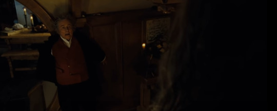
But then another cinematography shift! As Gandalf reminds Bilbo of their friendship, the camera angle becomes neutral again, and Gandalf is down on Bilbo’s level again:

TL;DR
Once you see it, you can’t unsee it: most major tone shifts in Lord of the Rings generally involve switching from one mode of shooting the height difference to the other.
When a likeable tall character becomes threatening to the hobbits, the film switches from downplaying the height difference to emphasizing it.
When an intimidating tall character becomes friendly, the film switches from emphasizing the height difference to downplaying it.
8K notes
·
View notes
Text
joke i'll never get tired of: "they died doing what they loved, [something no one would ever do on purpose]"
49K notes
·
View notes
Text
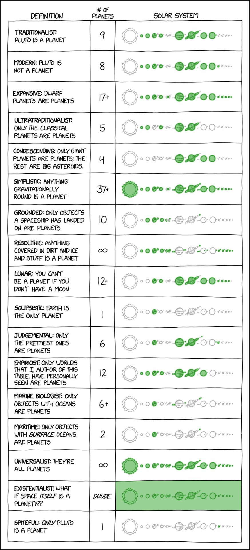
[Link]
Under the "has cleared its orbital neighborhood" and "fuses hydrogen into helium" definitions, thanks to human activities Earth technically no longer qualifies as a planet but DOES count as a star.
32K notes
·
View notes

Text
does it ever get better? has it gotten better? will it get better? when will it get better?
54K notes
·
View notes
Text


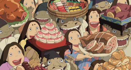
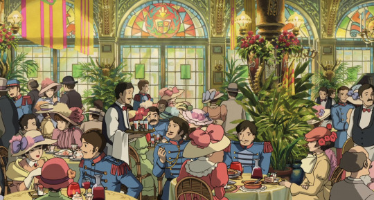
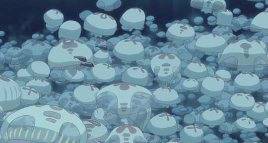
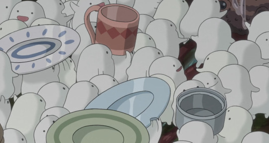
Miyazaki’s visual storytelling thrives on a sense of flatness that doesn’t diminish but rather enriches his worlds. By compressing the layers of his compositions—merging the foreground’s details, middle ground’s action, and background’s context—he crafts images that feel like living illustrations. Take the Warawara swarming with dishes in "The Boy and the Heron" or the jubilant feast scene in "Spirited Away" : both are packed with vibrant details, yet the visual plane feels collapsed, like a tableau unfolding all at once. This "flatness" isn't a flaw but a deliberate technique, pulling us into the frame as if we’re unrolling a scroll of visual wonder. It’s not depth that Miyazaki aims for—it’s a sheer density of storytelling in every frame, a reminder that 2D animation’s strength lies in its ability to immerse without imitating.
18K notes
·
View notes
Text
do you ever start writing a comment on the internet and then think “oh what the fuck am i going on about” and delete it
102K notes
·
View notes
Text
Mesopotamian girl sending clay tablets to her best friend who lives five city states to the west: what if..... Enkidu begot Gilgamesh with child?🤭
45K notes
·
View notes
Text
Nice penis, but I really don’t care. I need to get back to the lab.
53K notes
·
View notes
Text
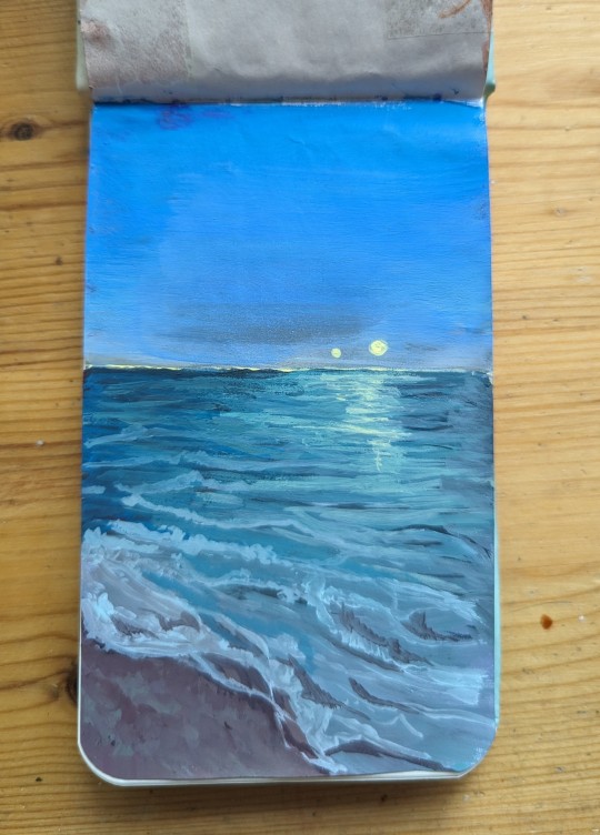
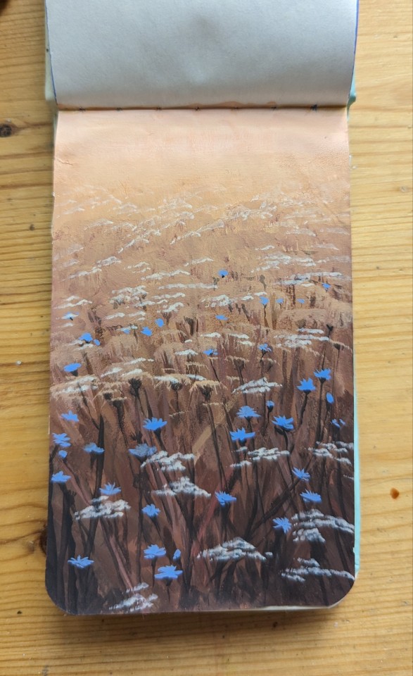
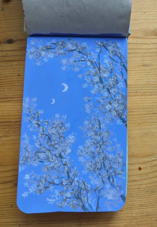
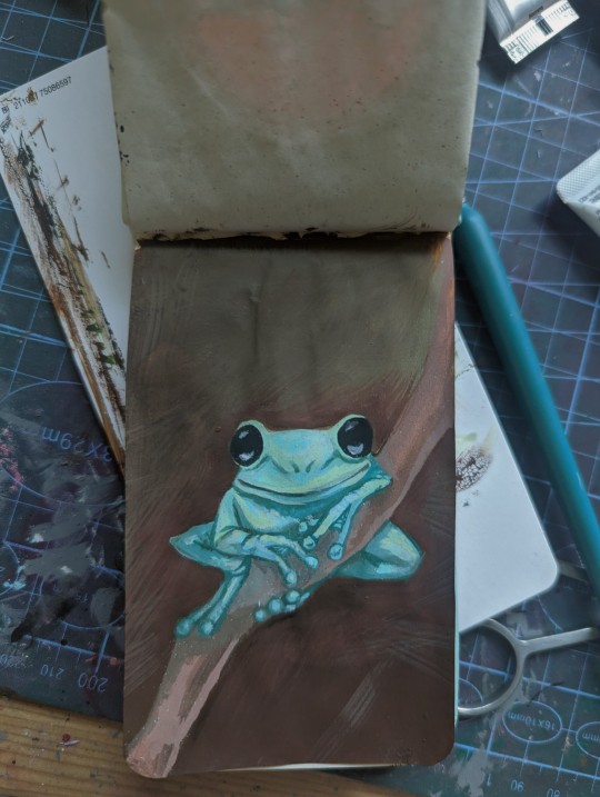
Got myself a little notebook with shoddy paper that I decided to practice gouache painting in!

2K notes
·
View notes
Text
I don't care what gender you are. Put on this slutty top and these tight shorts.
34K notes
·
View notes

