
vhairidesign
VHAIRIDESIGN
3rd year design student currently on placement at mimis bakehouse
16 posts
Don't wanna be here? Send us removal request.
Last Seen Blogs

creepypastabookclub
New episodes every other Friday

rhivnncn
✧・゚:* ☽

miskid24
digita marketing
sharpymusic
Sharpy

theclayclayclay-blog
brain plasticity
Text
Covid Signs
During the pandemic ‘please wear a mask’ signs were required. I designed updated versions with new illustrations to make it more clear for guests and to keep consistency in the company. These signs were used extensively during the pandemic.
Id say that this was the first example of my work being used in store and they are still being used to this day - even if that is less regularly. It was nice to use my own illustrations as previously to this I was supplied with them.
0 notes
Text
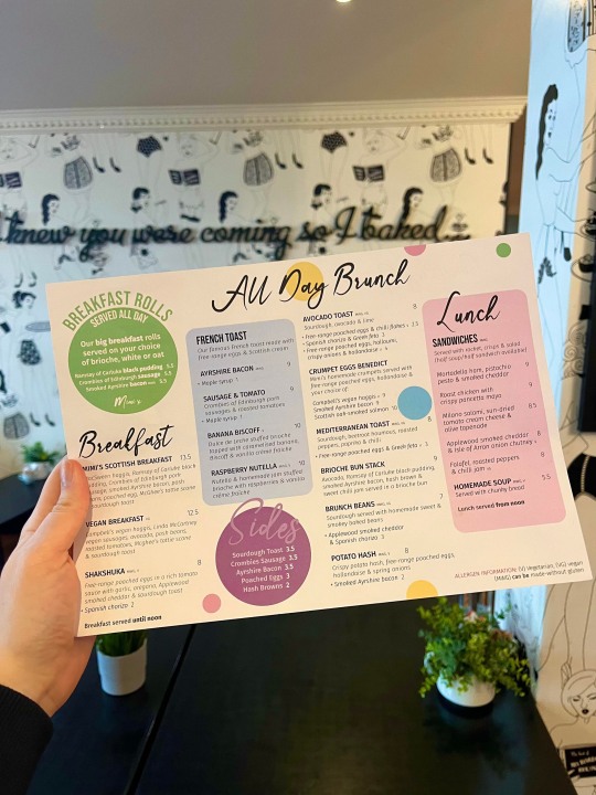
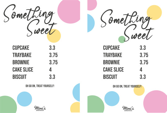
Comely Bank Re-Design
The redesign of menus happens regularly due to seasonal changes. The Comely Bank store required a new menu following the Leith store redesign. Keeping brand consistency meant taking elements which the client previously liked and re-applying these to different menu items. This menu will be seen in stores in the coming months.
Using the leith menu to work off of gave a good indication of what it should look like and what the client is happy with. I kept with the circles to make specific menu items pop and then took some other elements such as the boxes to keep the page neat and tidy.
The client was really happy with this design and the only changes required before print was actual items which were being changed last minute. Getting to design such important items for clients makes for such good experience in the design field.
0 notes
Text
Photo Editing
One of the more consistent tasks which I undergo on this placement is photo editing. This is a very transferrable task which I don’t think really realized how vital it was when doing jobs such as content creation. Every week we have content shoots where hundreds of photos are taken. Only three or four of these will ever be used on any of the platforms but the ones we do use are edited to make them look appetizing and up to mimis standard.
This week we were shooting for the new Leith menu. Above you can see an example of the before and after editing. Simple edits make a massive difference in food photography so having the skill of subtle editing skills has turned into a vital transferrable skill.
I think that this is something interesting which I maybe wouldn’t of thought about if I was in university. In class its very design heavy and I didn’t quite realize that a skill we take for granted as a side project is actually a skill which employers look for.
0 notes
Text
Striped Poster

As mimis expands, more and more advertising is needed for all the different locations, events and menus. Due to this, head office felt like the spots were being overused and were over saturating the store walls and instagrams. I was tasked with designing a new layout guide for people to use as an alternative to the spots.
I wanted to still keep it mimis with the colours and type. Head office also requested that the types stay consisted as a sort of brand marque. To keep linking to mimis without using the existing spots was difficult as I wanted to keep it fun and colourful but also sleek and neat. In the end I went with coloured stripes to link to the striped bags we use in stores. It gives a nod to the mimis stores but also takes a new twist on it with the new colours. The type side of it fell into place itself. Using the script font as the main focal point while adding the off center subheading tucked away under the title makes the page look neat but fun with the contrasting types.
I enjoy doing projects like these as I think that they serve purpose for a long time, even after I end my placement. Its giving these alternative posters which should help with the day to day running of the company which makes you feel like a valued team member.
0 notes
Text
Lauri A1
A few wee projects ive been working on recently is a A1 Board for Lauristion Castle. Head office wanted to get new signage for lauristion just to inform people of a mimis at the front gate. We are the only café on site so as for competitors its not as important however, in terms of location, we are pretty tucked away. This mimis opened in lockdown so some locals and visitors still aren't aware we are there so some more signs should help boost engagement.
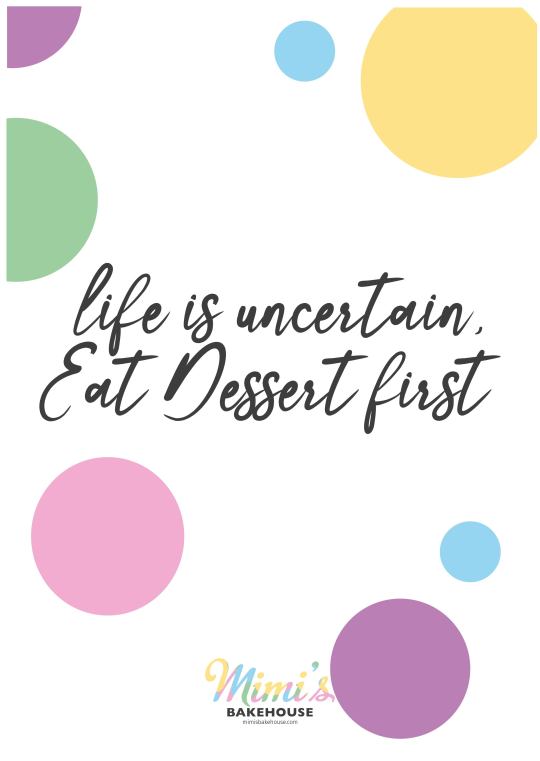
One side of the poster was to be a cheeky quote. Something that makes people go ‘aw go on then I deserve it’. Some ideas were thrown about but the top picks were ‘you make life funfetti’ , ‘going, going, scone’ and ‘lifes short, eat dessert first.’ This is something I like about mimis is the fun, lighthearted side which is still very relevant in their branding. For this side of the board, I kept it simple with the dots but re-imagined the logo in making it colourful and bright to match the fun quotes. I also gave options with the alternative stripes poster however, they preferred the dots on this occasion.
For the back of the board, they wanted something hinting towards the family owned aspect. Mimis is still very much family owned and ran so it is vital that we shout about this. This side was more difficult for me to comprehend as I feel as though I was totally lost in the sea of information. There was a lot of things I could say about this aspect of mimis but it had to be relevant and fit on this board. In the end the design seen above was created.
Making and designing things like these shows how the degree is used in the work place which has been very interesting for me. I feel like it emphasizes how Graphic Design interlocks with so many other aspects including social media. Its all about being creative and showing that through the content we create.
0 notes
Text
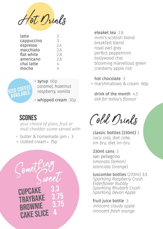
Leith Menu
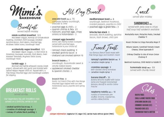
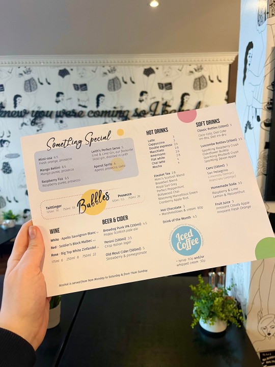
Another large task for mimis was redesigning their main branch menus. These brunch, lunch and breakfast menus are large with a massive range of food options. Head office wanted to re-emphasize the locally sourced products along with really describing the dishes to intrigue people more than before. This means for a rather wordy menu so fitting all the products and cakes on it was a bit like a jigsaw.
Keeping the branding consistent was key here as it is the blueprint to help assist the new menu redesigns which are following this one. I decided to play around with new elements such as using larger bubbles to emphasize certain items and also played around with the overall navigation, to see what would work best for the reader. Above you can see the development from the first draft to the re-imagined second which is now seen in the Leith stores.
Having this experience of time pressured work – the launch of the menu was a very short time after I had been given the list of items – and getting to see the final product now used in stores is vital and is something that I wouldn’t of been able to do if I hadn't been given the opportunity of this placement.
0 notes
Text
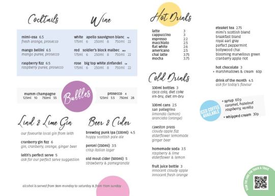
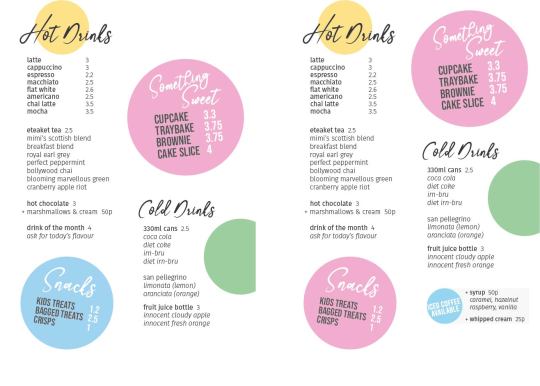
Drinks Menu
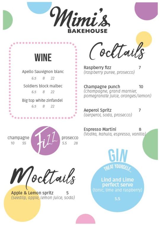
A small quick turn around project which I had to do was a branded drinks menu for a event which mimis had coming up which would be selling various alcoholic beverages. For this, I was given the drinks list and pricing but no creative direction. I was told to make it ‘mimis’ with the existing branding and guidelines.
This had a very short completion time of just a day so working quickly and efficiently was vital here. I took elements which the client liked in previous projects to ensure that they would be happy with the final design quicker than if I was experimenting. The menu was to be small, just A5, so making the type legible on such a small page was also important. After playing around with various designs, I decided to send off the one attached to this post. I think that the layout is easily read and will keep the branding consistent in this out of hours event.
0 notes
Text
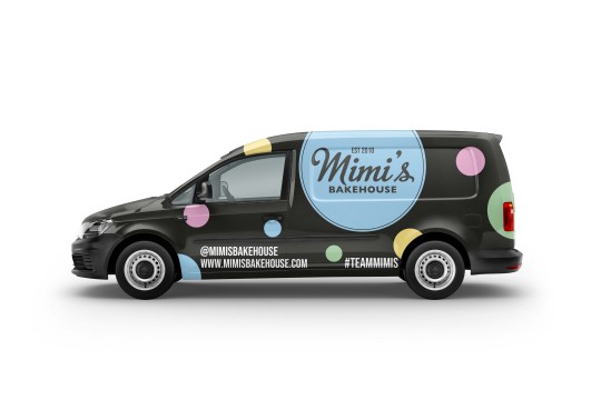
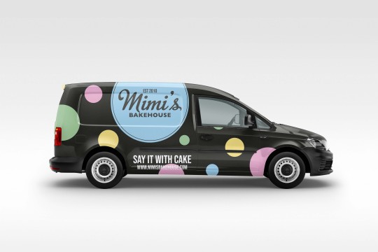
Another larger task which was requested was re-imagining the cake delivery vans which are seen around Edinburgh delivering to the shops and homes. They are currently pretty plain with the older logo and branding along with dated awards decaled onto the sides. A reimagine of this was needed to promote the company while on the go.
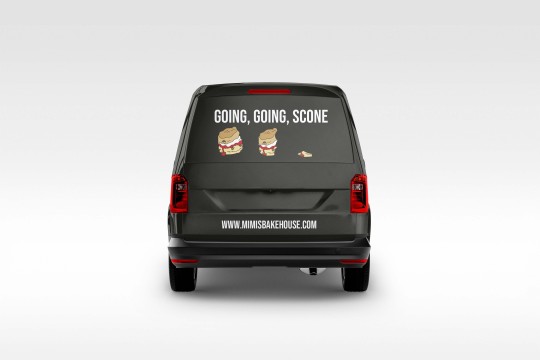
I wanted to continue the newer branding with these as I think it represents the new route which mimis are taking with their graphics. I also needed to remember the purpose of these decals. They are to be seen quickly when driving past so simplicity was key, overcomplicating this would mean for overpowering graphics which may distract drivers or be too much to read when the vans are driving. The sides have the spotty branding on them with the logo being the main focal point. This means that people passing can see the fun vans and who they represent. The website and social media handles are also placed on either side to encourage people to check out mimis. I decided to keep the back panel and window fun and on brand. As we are known for our scones, I thought a fun pun would suit the demographic. The logo continued onto the back decal will also highlight the company while simultaneously adding a pop of colour.
The added colour to the vans should draw attention to them which in the end brings in attention for the company. I think this was a good task to start on as it's something which has been put on the back-burner due to other projects taking priority. This was unlike any other design project which i've done previously so it was a vital experience going forward. I hope to see more development of this to come to hopefully bring these decals onto the roads.
0 notes
Text
Cake Pricing
Another quick turn around project was cake pricing sheets for the shops. I had just a few hours to design these and get them back to head office so they could be printed off for the following day. We had some complaints in stores about the pricing not being obvious enough although the price is already on our menus so its combat this we decided to make specific cake pricing posters to be put up in the cake cabinets instead of beside it on the menu. Designing things like this improves the customers experience and makes it clear how much everything is improving their experience in the store.
Making these quick turnaround posters while still sticking to the brand guidelines is vital when working for a company such as Mimis. All this experience is vital for my learning as it shows that some projects are slow burning and take time perfecting while others need to be completed quickly and efficiently to improve the day to day running of the shops.
0 notes
Text
Science Festival
This week is city arts centres Science festival and Mimis hold a stall with coffees and smaller snacks for children upstairs. This means new menus for this event. Another interesting thing which I've learned during this placement is how fast a turn around some designs have to be. These menus were emailed to me in the morning and had to be completed the following day so they could get printed in time for the festival starting. Although these menus were small and basic it still possessed a very quick turn around in designing them. At the end of last week these were given to me and now they're already printed up and being used.
This is interesting to me as it shows how quickly content and designs have to be completed for events such as this one while still keeping to the brand guidelines. You don't get as much time as you do when designing an entire portfolio in university so getting this experience in the field I think, is vital.
0 notes
Text
Content Creation
Although I do enjoy the graphics side to the placement, the content creation has proven to be quite a fun task as well. Getting appetizing content of food had proven to be quite the task with perfect placement of each item to be vital. I got tasked with getting photo and video content of the Leith menu to put in the photo bank for emergency posts. Getting the correct lighting on a dull day is quite difficult but I managed eventually when propped against the window.
What's interesting about this is that we have hundreds of photos of each cake, coffee and brunch item just incase we need them for any reason. Some may never be used and some get put on the website immediately. I think this is a good experience in seeing my photos appear slowly on the platforms including the website.
0 notes
Text
Instagram Stories
To help engage followers and encourage posting and tagging of Mimis in posts and personal stories, we often repost/reblog customers content. It’s a good way of accessing new content without making it ourselves while still promoting the brand. It also highlights happy customers making others more likely to head into stores to pick up some cake and brunch. Previously, we would repost with a plain background which kept the stories consistent but was quite boring and didn’t keep to the mimis branding. I was tasked in finding a solution on this.
On a android phone, you are able to make a PNG with a transparent center so you can easily place the story in the center making a background which can be consistent in all reposted stories. Unfortunately, the team all has iPhones where this option isn't available. Making a transparent center doesn’t allow the user, for some reason, to add their own content in the center.
Keeping this simple is key as this needs to be quick and efficient so the entire team including head office, can make the consistent stories. I came up with an alternative route in making the spotty background on an apple device. It consists of making the background white by holding the white pen on the background, then placing photos of the colored sprinkles and using the circle crop tool on instagram to make them round. These are then positioned around the repost with the photo then being moved to the front.
This is the simplest way to create this effect and has become a staple in the mimis instagram. It has made the stories more consistent and the whole feed appear more clean.
0 notes
Video
@mimisbakehouseedinburgh It’s okay! We are here for those forgetful folk ❤️ love, Mimi x💙 #KindAndFree #valentinesfood #edinburgh #fyp #foryou #bakery #cake
♬ yeah hot people use this sound - cxaluv
tiktok
Continuing on from the valentines day shoot, more content had to be created on alternative platforms. TikTok is a large and growing platform which mimis is not that relevant upon. I was tasked with filming some short tiktoks of the collection to help promote online orders further. From doing these tiktoks I was informed it did in fact help sales and that the family were very happy with the content created.
This was the first time making batches of tiktoks and posting them in one go, so figuring out what does and doesn’t work was vital. As we are still figuring this platform out and what works/fits with the mimis look, it was a good exercise to trial out ideas. From this series, I found out that posting early is the key to views along with simple videos showcasing ‘instagramable’ food. These two aspects seem to get the followers and people on the FYP to interact more with the content and even improves the profile clicks leading to a higher volume of potential customers heading to the instagram where the website can be found.
Having this play around with the tiktok has helped in making more of a game plan for future content which I think was very helpful in making a improved tiktok presence.
0 notes
Text
GIFFY

One of the largest tasks which I am currently tackling is opening and producing a new GIFFY account for Mimis. As a company Mimis uses Instagram stories a lot and having their own GIFs to use would add an extra element to help keep the page captivating and interesting for followers. To open a GIFFY account is easy however opening a business account is a little harder. Theres a longer process of application and approval to ensure the content produced on the site is relevant to the business posting and appropriate for access on Instagram and other platforms which use GIFFY.
To start this process off five GIFs had to be made to make the account valid to begin the authentication. When authorized by GIFFY companies can then post their personalized GIFs on other social media platforms. The five basic GIFs were designed and submitted along with an appropriate profile photo and main profile. The regular GIFs were approved and the account was successfully made into a business account.
After making these GIFs I assumed incorrectly that these could be used on the Instagram stories. What is used on stories is actually GIF stickers which are only available to upload to GIFFY when you have been accepted as a business account. These stickers have to be GIF files with transparent backgrounds. This detail meant that I had to figure out how to remove the background on GIF files.
This turned out to be a challenge however when done, the stickers only took a short amount of time to be approved by GIFFY. Now that these had been approved, they can be used on any social media platform associated with GIFFY.
Learning how this process works and seeing the outcome first hand was valuable experience as GIFs are another aspect of motion graphics which can be used alongside content creation. You can look at the GIFs made on GIFFYs platform @mimisbakehouse
0 notes
Text
Loyalty Cards

One of the first digital design projects which I completed was making new loyalty cards for the shops. There had been some designed previously however, this was in line with the old branding and not the new colorful one. To begin with I started with the backside which was decided to keep simple as it was irrelevant to the use of the card. The design developed into just the spotty background to hold consistency with the other graphic items in the company with the logo in the center. I like the simple design of this and I think anymore complex would have made the design unnecessarily busy.
For the front side of the card I decided to keep with the spotty, sprinkle design and to use them as the stamp marks. Mimis had previously designed and illustrated their products to be used on printed graphics such as this one so, these were used to identify which award you would win at each mark. After a few tweaks you can see how the design developed from the first design to the final printed outcome.
I’m happy with the final design of these and I think this has been a good task to undergo as I can now see my final design printed in the stores across Edinburgh.
0 notes
Text
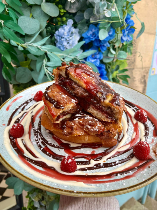
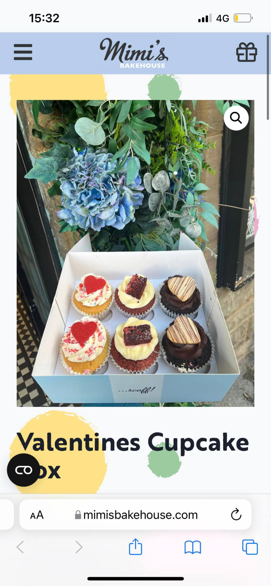
Valentines Shoot
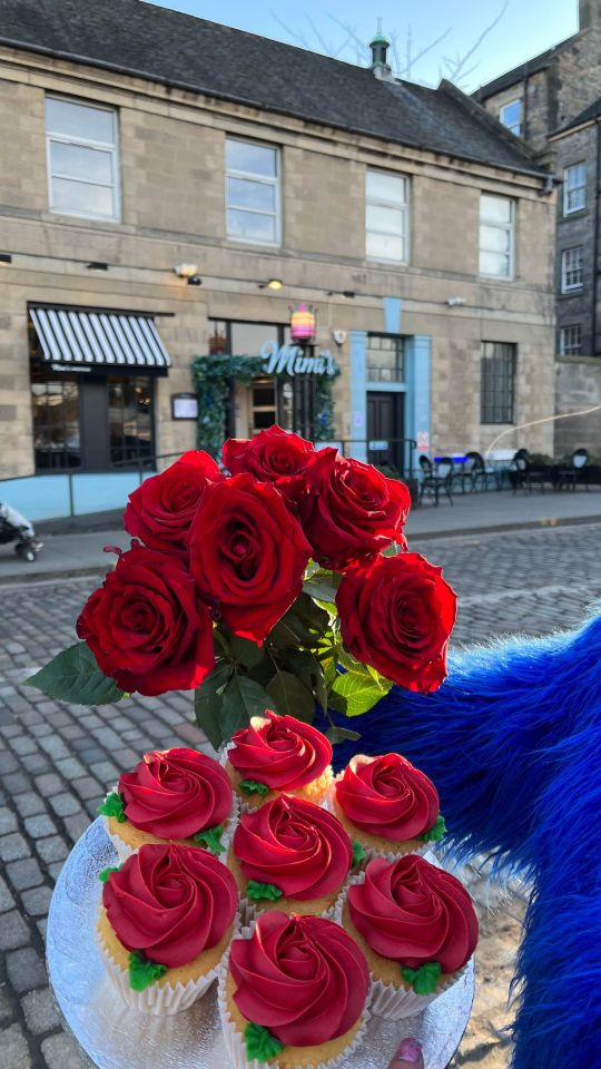
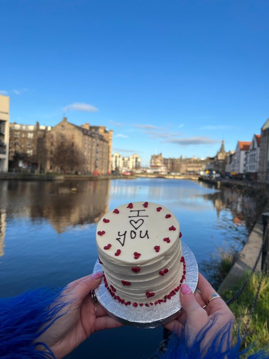
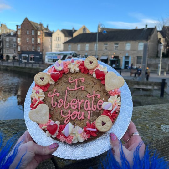
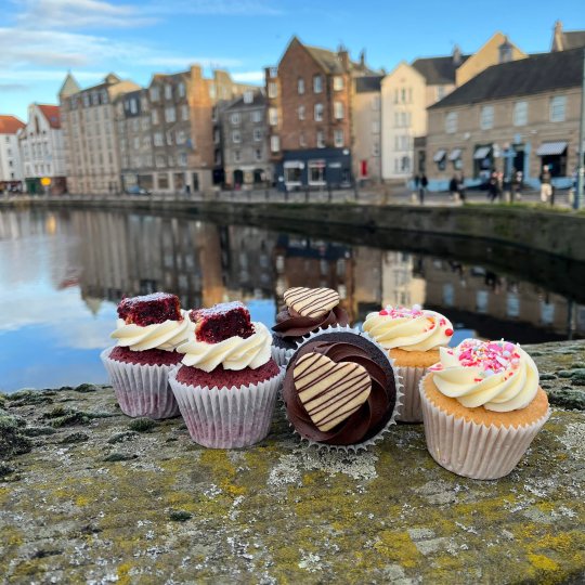
Valentines day is one of Mimis biggest days of the year in regards to selling and profits. Well in advance of this, our bakers produce the products so the marketing team have time to make and post content of these. This was my first ever shoot with Mimis so it was a little overwhelming to begin with. The team takes a very hands on approach to shoots like this with us all getting involved and taking our own photos and then sharing the final products.
We couldn’t of been luckier with the weather on shooting day. The sun was out and glimmered on the water. Prior to heading out, Rebecca and I took the website photos which were used to sell the products online. To do this, we used the colored backdrops to keep the new website looking uniform and neat. Setting up lighting and positioning of the products is key in food photography as we have to showcase what is included in each product while still making it look appetizing. After taking these photos, we sat and edited them to head offices requirements before they were uploaded onto the website ready for the launch the following week.
After these more professional photos were taken, Rebecca sent myself and the rest of the team out to take more informal and fun photos of the cakes in Leith where the largest Mimis is based. The same format was used with the hands on environment with different backdrops. After taking photos of all the range, we edited and drafted the content to be used on the Instagram in the following days.
Getting a behind the scenes look on content creation for a brand with a high following was super interesting and highlighted how planned and calculated each post is while still keeping the content relatable, formative and on brand with the Mimis guidelines.
1 note
·
View note