Don't wanna be here? Send us removal request.
Text
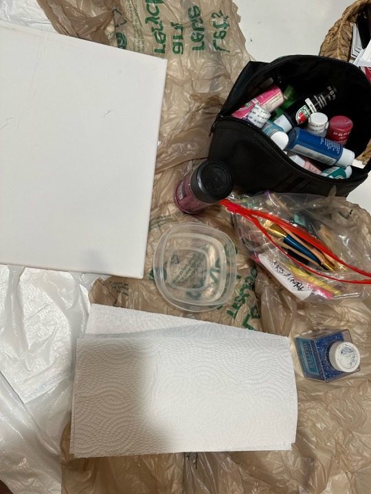
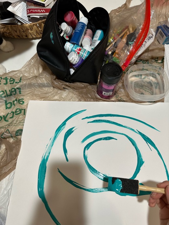
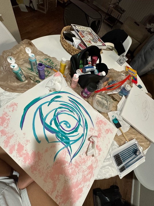
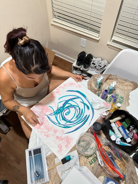
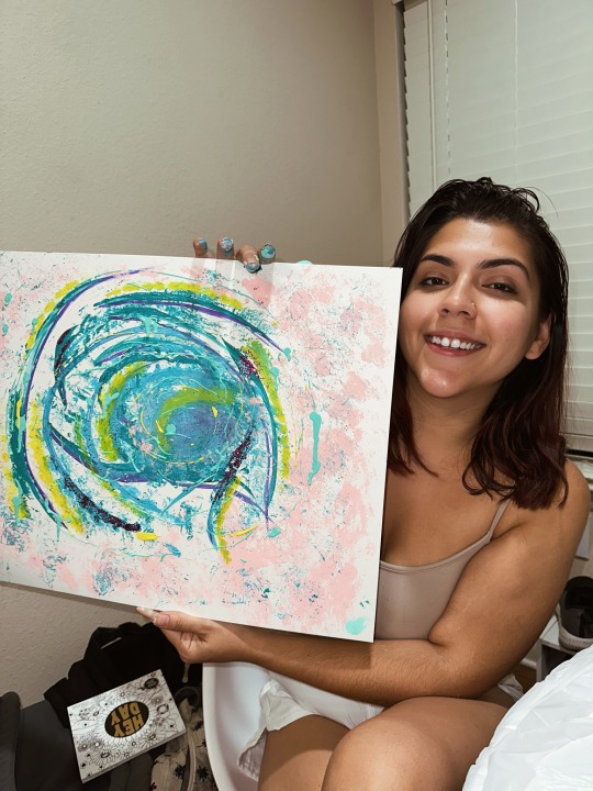
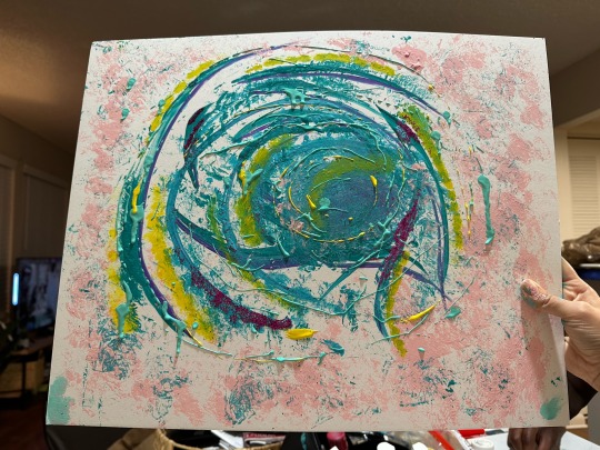
Final sketchbook. 🎨
Title: Galaxy 🌌
Media: Acrylic paint
I wanted to make an abstract piece of art for my final. I was really inspired by Jason Pollock’s artwork we learned about I really was inspired by how he let his unconscious takeover into almost the category of surrealism. I completely didn’t plan out any of my work and just let what what felt right in the moment take place. I let my creativity flow and had fun making this. I put my own spin on Pollock’s idea and added more of a vibrant feel with my color choices and of course, glitter! ✨
0 notes
Text
Virtual Sketchbook #4. 🎨
1. I don’t think Pollock changing his style of painting was an accident at all. He studied ways of many different painters, taking and adding things he liked over time. I think what stuck out to him the most was surrealism. He would map out his paintings and “let the subconscious take over” which I thought was a really cool concept when thinking of art. I love making art but sometimes get too caught up on what to actually make. By creating an outline of something rough you allow your subconscious to get creative and fill in the rest with whatever makes sense in the moment. I think that was a huge inspiration into his style of drip paintings; which I found beautiful. I can clearly see why they’re worth millions. The details were breathtaking and the hidden materials were fascinating like the nails in the art pieces. I enjoyed his rhythmic forms in his drips, they’re really beautiful. I also enjoyed the quote from one of the movies, saying he had “controlled accidents.” I thought that was a really great way to overall sum up his art.
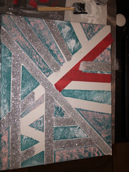
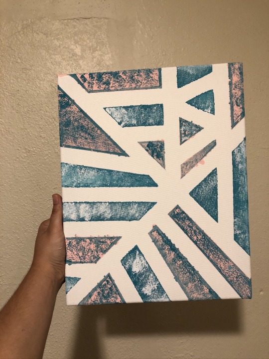
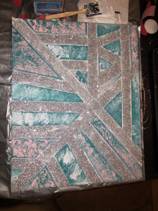
2. Untitled.
I took inspiration from Pollocks work in the way of “controlled accidents.” I love using blue when I make art because it was my Grandma’s favorite color as well as mine. Glitter is something I find fun and vibrant and I used painters tape to make the zig zag lines. 🎨
0 notes
Text
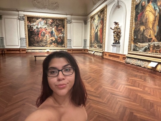
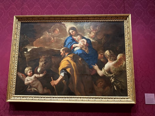
Virtual sketchbook #3: John Ringling Analysis When I visited the Ringling Museum, of the many artworks I observed, I chose The Flight Into Egypt painted by Luca Giordano. It is an oil on canvas painting with dimensions measuring 204 c 191.5cm. It features many darker and somber colors with a pop of blue on the main figure holding the child to draw your attention to the center of the painting. The opaque color of the angels balance the dark tans and brown tonality. The blue definitely serves as the focal point for the viewer. The subjects include two adults, a baby (presumably Christ), and multiple angels in the form of babies. Giordano had many inflicted while living in Naples, Italy, and drew many inspirations from the works of Murillo. When thinking about rhythm, Giordano exhibits a nice rhythm in this painting in that the angels are balanced on either side while the two adults are centered, creating an almost circle around the two focal points. I liked this piece because it actually made me feel calm due to the brown and tan colors used throughout. Some of the other pieces in the Baroque era I found almost quite disturbing with their graphic detail and somewhat goriness. Giordano painted this near the end of his life, being 62 when it was completed. His preferred media was oil on canvas and sketched drawings as well as using some fresco styles. He was widely known, and Venetian artists really took to his paintings due to the warm use of colors and the contrast of light and dark. Towards the end of his life, Giordano spent time in Spain, drawing much of his later inspiration from Murillo (1692-1702). The painting was created during the Baroque period which dates from 1600-1700. The artwork is based on a biblical gospel from the book of Matthew. Due to this knowledge, we can gather that he captured the essence of the gospel well. The gospel stated that a dream was a warning that Harod the King was searching for Jesus (the infant) to kill him, so Joseph took Jesus and his mother away to find safety in Egypt. Giordano was able to depict this well in the use of the brown tonality, giving a sense of nighttime or darkness along with the clouds, giving a dreamlike vision. I picked this work of art because as I stated, some of the Baroque period pieces were very disturbing; many pieces during this era were driven from old gospels, stories, history, etc. I chose this one because it invoked a sense of calmness I liked. I think this was a really accurate way to convey the story from the book of Matthew onto a work of art!
0 notes
Text
Sketchbook #2: Part 2 🦋
4. Art Project.
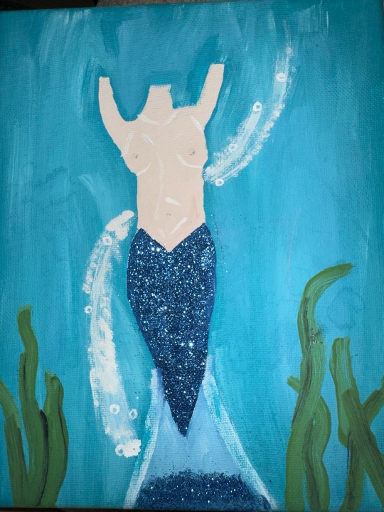
I actually love to paint, just for fun in my free time. I paint with a lot of blues and whites. Using blue reminds me of my grandma because she loved sparkly things and blue things like I stated previously. I thought this was a fun dedication 🧜♀️
5. Photo/Design.
Already posted 2 down. ⬇️
0 notes
Text
Virtual sketchbook #2: Part 1 🦋
1. Principles of Design:
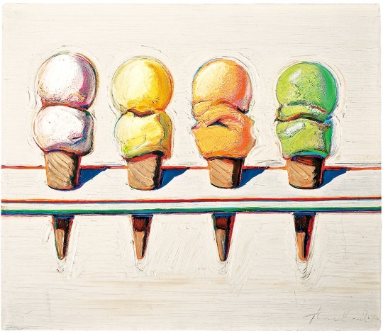
• Unity: Appearing similar. A use of different things making it seem one. For example:
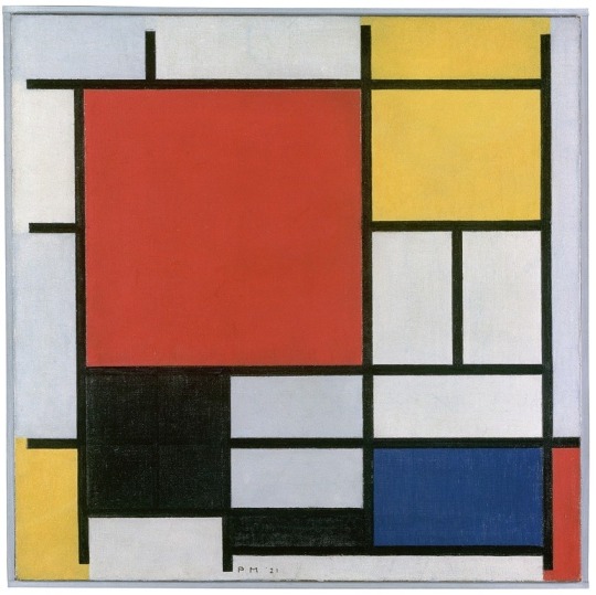
• Balance: Is when different items like objects and colors are used to offset the other to make it seem proportioned. For example:
• Emphasis: A technique used by the artist to direct the viewers attention to a certain vocal point. For example:
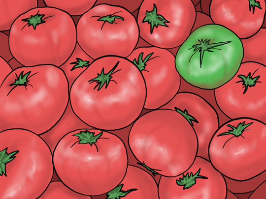
• Subordination: the same thing as emphasis but the artists will use a muted color on the vocal point instead. For example:

• Directional forces: Elements found in the art that create a “pathway” to guide the viewer from one direction to the other. For example:
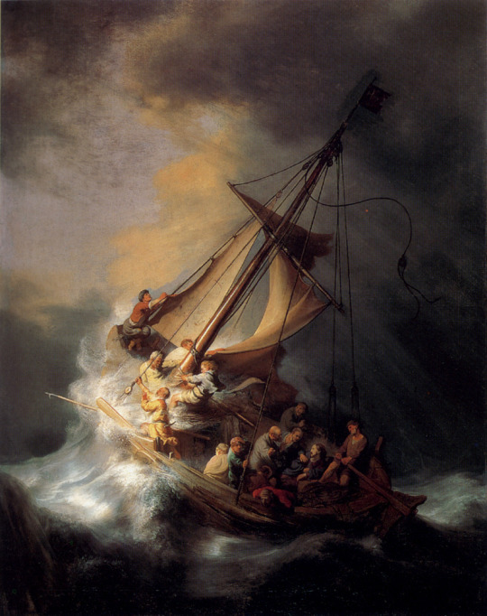
• Repetition: The use of an element many times in the work. For example:

• Rhythm: Similar to directional forces in moving your eye to a vocal point but done fluidly, almost like with movement in the piece. For example:
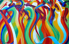
• Scale: Comparing in the art itself; the size of something, usually the viewer compared to it. For example:

• Proportion: The different size elements that make up that art. For example:
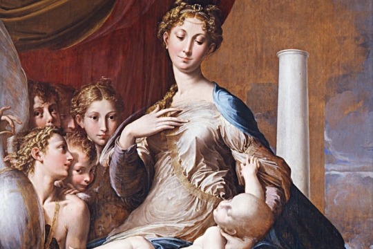
2. Writing & Looking.
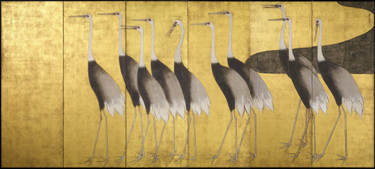
This artwork was made by a Japanese Artist Ogata Korin, called Cranes. He used rhythm in this artwork as well as increasing their composition from the heights and location of their heads. They have rhythm from the line they crest as well. He made it on paper with ink, color, gold and silver. This is figure 4.15 from the book located in Chapter 4, 4.5, page 2 of the chapter.
3. Connecting Art to Our World.
The biggest color that has had an impact on me is the color blue. With some many different hues, my favorite is a deep Persian blue; it reminds me of my grandma who passed away last year. It was her favorite color. She had many different blue accessories and even her glass kitchen plate and glass sets were deep blue. The deeper the saturation of the blue, the prettier, in my opinion. It’s really eye catching, and a bit moody.
0 notes
Text
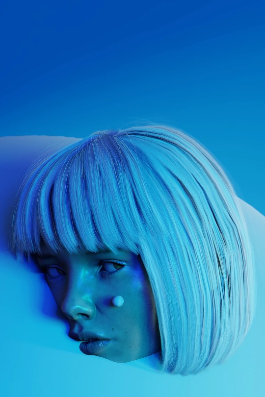
Portrait: Title was Snow White. I LOVE this picture! The creativity, the lighting, the angle and the color choice. It tells me they were looking to be creative in a headshot/portrait.

Landscape: This photo is located in Cappadocia, Turkey. I’ve always wanted to visit here. The natural landscape is beautiful & it’s known for its exquisite views from hot air balloon rides.
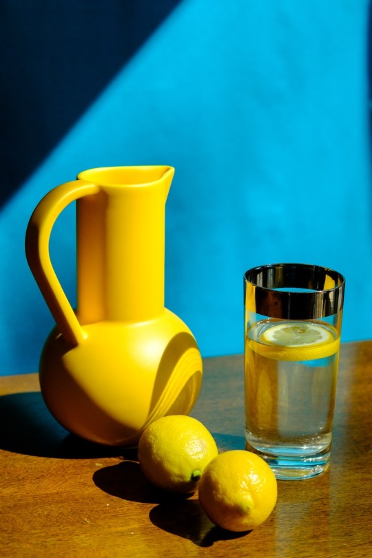
Still life: This picture has a yellow pitcher, lemons and a glass of water. I like the picture because I love the colors, and it captures the essences of a summer afternoon to me. I think the message was just to create something vibrant and beautiful with everyday items found in your home or pantry.
0 notes
Text
3. I am 26 years old & female. I am considered white, but I have French and Indian on my dad’s side as well as Sicilian Italian on my Mom’s. For fun, I like to do something physical like marathon runs or workout and travel when I get time. I just joined the Student Government Association at SCF and hold the treasurer position. I currently work at Connor’s Steak & Seafood near Siesta Key. What makes me unique is simply the thing that makes everyone the same ironically; is that there will never be another of me in the world/this life! Everyone, including myself is essentially one of a kind.
0 notes
Text
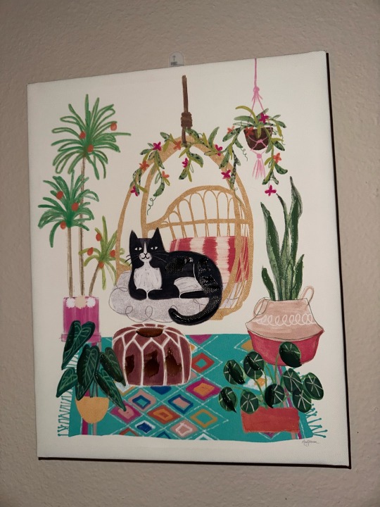
2. This hangs across from my bed, so I look at it every day. I found this at TJ Maxx one day and immediately bought it because it looks exactly like my male cat. I think it’s beautiful because of the colors used (which also fits my home color scheme) and it represents a pet I love. I think the media used to create it was a mixture of pairing, maybe acrylic, with outlining and what looks to be watercolor.
0 notes
Text
1. Writing and Research
1. Hello everyone, my name is Dakota! A little fact about me is that I absolutely love to travel any chance I get. I'll be traveling to Naples and Rome, Italy as well as visiting London this coming July, I am very excited!
2. Artwork #13: Leonardo d Vinci c.1500 Salvator Mundi. Oil on walnut; 25.8" x 19.2".
The Mona Lisa is thought to be one of the world's most expensive paintings, however, the Salvator Mundi actually supersedes it.
It was auctioned in NYC in 2017 to a Saudi Arabian Prince with a hefty price tag of $450.3 million.
The clear sphere in Christ's hand is supposed to represent the universe/cosmos and that Christ is saving it from calamity and darkness.
It was thought that this painting was originally made for King Louis XIII of France.
Salvator Mundi is actually latin. It means, "Savior of the World."
3. Before even knowing much about the painting, or who was the artist, I had a feeling from first glance it was the work of Leonardo because the face reminded me so much of the Mona Lisa. I thought the clothes were an important notation because they looked very royal. At first I also thought the hands looked very feminine. With research stating it was in fact supposed to represent Christ, I came to the conclusion he wanted his hands to look gentle and almost inviting you into his presence. His fingers being crossed in the painting were a bit confusing at first but I came to the conclusion the fingers being crossed means he is saying, "don't worry, I'm in control" hense the sphere he holds.
0 notes
