
Statistics
We looked inside some of the posts by viscomamelia and here's what we found interesting.
Average Info
Notes Per Post
0
Likes Per Post
0
Reblog Per Post
0
Reply Per Post
0
Time Between Posts
6 hours
Number of Posts By Type
Photo
13
Text
3
Video
1
Last Seen Tumblr Blogs


Fun Fact
Premium Tumblr themes are available from anywhere between $9 to $49.
Photo

My Intro Page
This is just the intro page to my portfolio, giving my logo and a hint of what I specialise in. I won’t be posting my finished portfolio on here, but I will on my Behance.
0 notes
Photo


Digital Portfolio Research
Looking through Behance - it has given me some inspiration on how to handle my digital portfolio:
Intro page with ‘Portfolio’ and my name Contents page A intro page to each project CV at the beginning A photo of yourself (not big)
0 notes
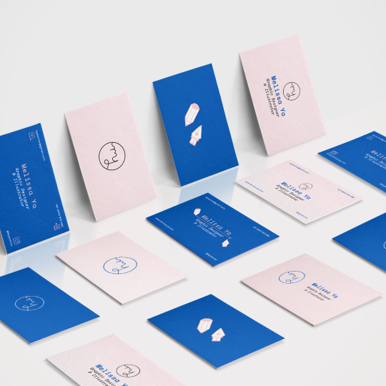
Photo


Business Cards
Using the pink and purple combination as the main colours for my business cards as I think they are the more distinctive.
0 notes
Photo

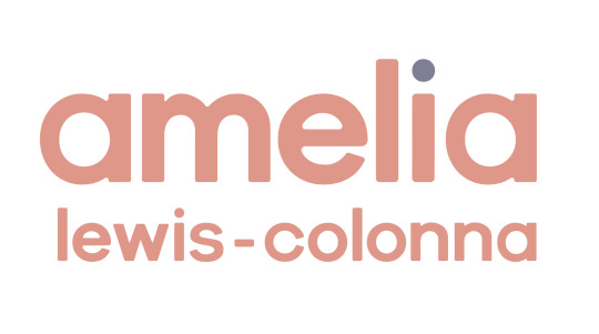
Logo
For an icon logo I have used the same system of colours, but just ‘a’.
al-c didn’t look right, and because of my colour palette I think it is distinctive enough.
0 notes
Photo

Fun gif!
I thought I’d do a fun gif introducing my new re-brand, which I can apply to my online platforms.
0 notes
Photo


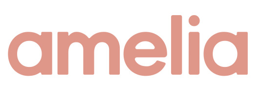
My logotype finished
I wanted to add my full name as ‘amelia’ was probably quite common. I applied my other colours of my colour palette to it, to create four different combinations.
This will allow easy application to anything I want to put my logotype on, as I have a lighter colour for darker backgrounds and visa-versa.
(the colours are completely off in this blog, I’m not sure why- but refer to the gif for correct colours)
0 notes
Photo

Editing my logotype
Here you can see the tweaks I have done on Illustrator from the original typeface (in black). I have made it rounded edges, a slightly lighter weight, and made the thicknesses of the letters even which created a really satisfying look.
0 notes
Photo


Applying my new palette to typefaces, I wanted to try a more rounded bolder typeface. I found Galano Grotesque, which was similar to Century Gothic which I love.
I took it to Illustrator to play with the letters. The black letters are standard Galano Grotesque and the pink is where I have started to edit it.
I started my rounding the edges so there is no harsh edges, which I think looks so much more friendly.
I want to try to make the type slightly less bold, and little things such as having the ‘a’ a little more even widths.
0 notes
Photo


Coolors
I found this website which is really helpful for creating colour palettes, and with the aid from my friends and families colour representation of me, I chose these two styles.
I really love both for different reasons, the pinks purples and yellows because they are so happy, friendly, and there is more colour variety than the other, and the oranges and blue because it is super bright and will be remembered.
I have decided to go for the pinks purples and yellow palette because it seems to represent me well and has more variety to play with.
https://coolors.co/272838-f3de8a-eb9486-7e7f9a-f9f8f8
0 notes
Text
Self-Branding
I began just by bringing some typefaces which I love and applying my colour palette to them, but nothing seemed to work.


Using a mixture of colours from my palette made it a little more fun and different, but I still really wasn’t happy with it.
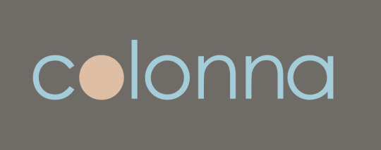

my name in the o of colonna didn’t work either as it isn’t seen when the logotype is smaller
0 notes
Photo


Colouring Picking
I really loved the colours of my illustrations and the tone I used; it’s soft and friendly, which I think represents me and my design.
I want to start using these colours for my self-branding.
0 notes
Text
What colours represent me?
I asked my friends and family questioned about what colours they think reflect me as a person and as a designer, and they came back with:
pinks
purples
blues
yellows
I want to focus on the pinks and purples as they are warming friendly colours, and yellow is a happy light colour.
0 notes
Photo


Self-Branding Research
Key notes:
They are packed with colour - that represents them
Play with type after choosing a typeface for your logo
Have a logo as well as a logotype
Make it playful and fun
No more than 3 different typefaces
0 notes
Video
tumblr
ISSUU Flip Book Mock-up
Using the website ISSUU I was able to make my book into a digital flipping book, which I have then screen recorded. Not the best quality, which is why I will hand in the PDF as well for better quality.
https://issuu.com/amelialewiscolonna/docs/book_pages
0 notes
Text
Final Major Project Evaluation
For my final major project outcome, I am massively happy with the achievements I have gained in experience and knowledge in visual communication skills. I think that this whole final brief has been challenging to say the least, but I have thoroughly enjoyed it.
I never thought I would have done my major project on memories, but through research and development into my concept to create my graphic novel book I have learnt something so important. One of my biggest aims during this project when I started to think about what topic I wanted to focus on was that no matter what it was, I knew that I wanted to learn something out of it. I didn’t want to go into a topic which I had already ventured into, but something I knew I would be interested in. I have achieved this goal as I had always found the human brain, psychology and sociology very interesting. Another aim of mine was to have my final outcome to have purpose; I didn’t want it to just be a pretty piece. I think I have achieved this also, as telling the true story of a woman’s tragic accident is enlightened my thoughts and everyone around me who has read my book of the connection between memories and the human self. I have learnt that memory is an important part in mental health and self-identity and is very precious, and I think through reading my book, my audience will see this too.
Going down the route of telling Jenny’s story through narrative design was the best way I could have directed my final outcome, as it led me to achieving my goals as previously mentioned. If I had continued with short ‘unimportant’ memories, I think I would have created a beautiful piece, but I don’t think I would have learnt as much.
My favourite part of my final outcome specifically, is the hidden ‘Easter egg’ present in the narrative. I placed a hidden object throughout my book that is a symbol of love, hope and care to others, which is what Jenny had all along, but only felt it at the end. The ‘get well soon’ card is always there, and as so is love, but due to Jenny’s journey through recovery, it isn’t a smooth one. Whether it is a physical or mental illness, love and care from loved ones is always there, even when it isn’t the most obvious to the person who needs it.
If I could go back and change anything I have done throughout this project, I think I wouldn’t. I have learnt a lot, experimented a lot, and changed quite a bit, but I have not regretted any of it or thought anything was a waste of time. I think every aspect of my research and development of this project has helped my final outcome in a certain way.
Doing an ISTD submission during this time, with a pandemic and my final major project was definitely very struggling, but I am so glad I managed to do it. The key was organisation; being able to split my time well that my final project didn’t suffer, but I still gave time to ISTD too. Through the other end of it, I have learnt an incredible amount of typographic knowledge that I had never even known existed before. I have developed a keen eye for typography and editorial now, more than so before.
Overall, I would say I am incredibly happy with my final major project and ISTD brief because I have answered both brief’s well, but most importantly I have learnt so much through each one and loved every minute of it.
0 notes
Photo


Final Book Mock-up Designs
These is my final outcome of my book ‘Lost Memories’ where I have put into mockups.
I managed to find a really good quality mock-up for the book, where I am able to crop in and it still maintains quality. I am able to remove the background too which will be helpful for making my portfolio sheets.
0 notes
Photo


Final Cover Design
This is the final cover design for my book ‘Lost Memories’.
I am really happy with this design, it is simple which is what I wanted. It shows the main character and the setting the book is in, and the title gives a hint towards the content but only enough for interest.
I was thinking maybe it is a little dull with the light grey background, but this book isn’t supposed to be colourful and bright. It is reflective of the emptiness and fear which Jenny felt during this accident as it is reflected the same in the book too.
0 notes