Statistics
We looked inside some of the posts by viscommolly and here's what we found interesting.
Average Info
Notes Per Post
0
Likes Per Post
0
Reblog Per Post
0
Reply Per Post
0
Time Between Posts
5 hours
Number of Posts By Type
Text
2
Photo
15
Last Seen Tumblr Blogs


Fun Fact
China blocked Tumblr because of pornography and censorship problems in 2013.
Text
Unit Evaluation
This unit has allowed me to research in depth about a topic I am really passionate about, which I throughly enjoyed. I also felt I learned a lot from this project, both in terms of the feminist movement as well as really bettering my editorial skills which I am excited to take forward into a job.
On reflection I am happy with my final outcome; at first I was unsure about involving illustration, however this turned out to be crucial in my final designs and also my favourite part of the process. And although It took a while I believe I reached a good outcome from the process. I never imagined my FMP to become more of a branding project however I have found it extremely insightful and think this project has taught me by far the most, in comparison to previous uni projects. I am happy with the aesthetics of the menus, I think they achieve a menu feel whilst still feeling original, they are simplistic to lend themselves to the content and the intricacies of the illustrations on the menu. If I had access to uni and the resources, particularly a printer, I think I would have had a better gage at how each menu handles. Mocking up the menus for the idea of dimension on plain paper unfortunately didn't provide a real feel of what the menus would look like bound/ cased and therefore when they are bound some tweaks may need to be made. However I think I gave good consideration to this and hopefully they will be fine.
I believe I managed my time well during this unit, balancing between contextual research, that was detrimental to my final outcome, to visual research as well as leaving plenty of time for visual experimentation in illustration and editorial designs, a balance I have previously struggled with before so when coming to the FMP I was very aware of. I believe that It goes without saying that the initial lockdown period challenged my time management as I felt myself unable to concentrate and then moving back home to jersey really effected my work flow. However with the extension I believe I adapted my time to best fit the revised time frame.
Although I am happy with my final outcomes, recent events happing globally; specifically the heightening of the Black Lives Matter Movement have made me consider the positionality of my work in relation to this social movement being fully representative, and wether I have facilitated this to the best of my ability. I have done a lot of reflection on my work, deliberating over wether its levels of intersectionality are good enough. However, I also recognise that I am a privileged, white, middle class woman and that I cannot speak for the experienced of others. I have done my best to hold a neutral standpoint in relaying information as well as collect and form information that is diverse and representative but true to history. And I fully understand that this process will forever be a work in progress for me as a white designer.
If I could do it again I think I would create the menus specific to countries, the F word focuses on mainly the UK and some, but very few, pieces of American information. In doing it again and had more time I would look at a few different countries and design the menus specific to that regions cuisine and their feminist views, and experiment with displaying them in a hand made box/ appropriate bind. I can’t not mention that this period of working in isolation has taught me so much about myself, especially the way I work and how I get the best out of my process. It has also taught me how much I can adapt, but also how much I value and thrive off discussion and deliberating ideas with peers. I am absolutely gutted that this time fell amidst out final major project as I was so eager to embrace all the facilities uni had to offer for this project, I also didn’t realise how much I loved the library.
0 notes


Photo
A critical element ot my research has been this website! Used it nearly everyday, really great site!
0 notes
Photo


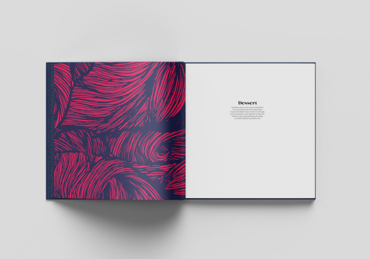
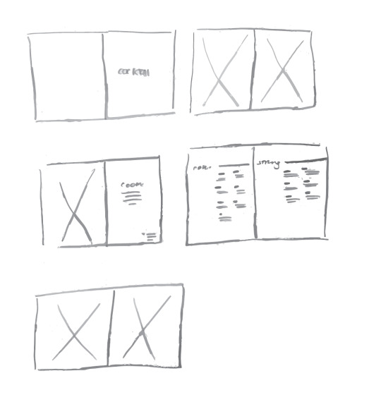
Menu Mock Ups
Questioning wether to have the cocktail menu blue and the main menu in pink foiling instead of having one of each for both, realistically this would be much better and also much more sustainable. Also the colours do mean something but in this instance they don’t overly add anything and having them on one each would be sufficient.
0 notes
Photo
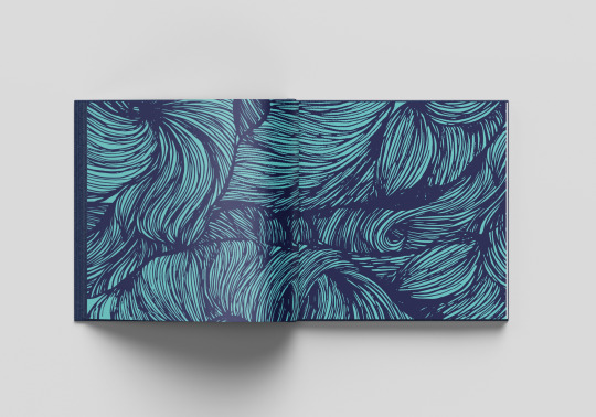

Each menus front and back pages will have the pink and blue versions of the pattern, as there are two menus one pink the other will be blue!
0 notes


Photo


Adding additional info in small to the intro pages of the menu
“ *To our Male customers, you will include a 17.3% additional charge on your bill, this cost is sympathetic to the gender pay gap, according to the Office of National Statistics.“
0 notes
Text
Intro for the menu
the F word.
Please delve into this menu that aims to give you a taste of the feminist movement, dismantling and breaking down the elements with intent of making it more digestible and understandable. The information on this menu is by no means as in depth, however the purpose of this menu is to give you the taste and a basic understanding. We hope that it sparks a fire in you; to go and learn more, support movements, to protest, to follow accounts, to support women, to support feminism and maybe, to be a feminist.
0 notes
Photo

Better centered or left aligned?
all the rest of the text in the menus are left aligned however It does look better centered
0 notes


Photo

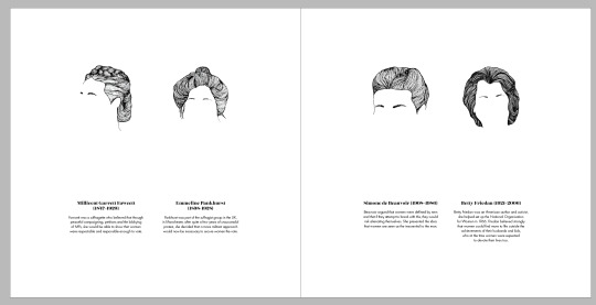
1st and 2nd wave typographic editing (left before/right after editing)
0 notes


Photo


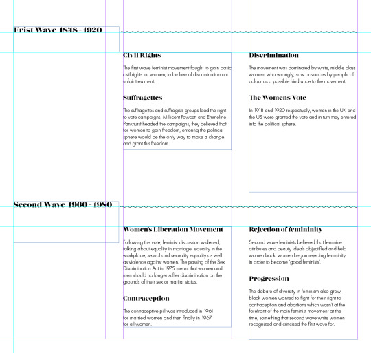
Editing the rag and line length to make it more cohesive, using the tracking; upping it 5 or taking away five as this is the limit before you begin to notice.
0 notes