Statistics
We looked inside some of the posts by visuallanguageappeal and here's what we found interesting.
Average Info
Notes Per Post
0
Likes Per Post
0
Reblog Per Post
0
Reply Per Post
0
Time Between Posts
4 days
Number of Posts By Type
Text
14
Last Seen Tumblr Blogs


Fun Fact
1,644 Tumblr posts in 1 second.
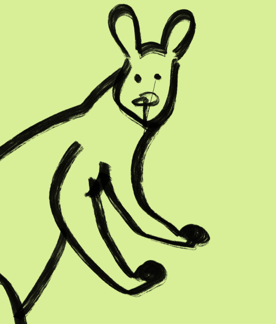
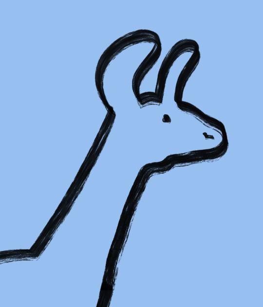
Text

Image by Mike Karolos
I love the “rhythm” in this image! Dots in some parts, lines in other and solid colors create a nice harmony. Thick lines also add character to the picture - it seems more cartoony and abstract that way
0 notes
Text

Image taken from Laura on Flickr
I really love the harmony of flowers and silhouette on this photo. The usage of space is phenomenal in my opinion as well as the contrast of bright red on blue-grey sky.
0 notes
Text
I’ve always been fascinated by designs that use less to tell more. One of my favorite “limitations” in the desgin is color. For example, really strong and effective imagery can be created by using only two colors

Image taken from Artrudenko
This image for example only has 2 main colors - red and green. They just have different values and shades to create a more interesting picture. Yes, the sofa seems yellow, but it’s actually more close to red. I believe this color was chosen to make the picture more interesting.
What bothers me a little about this picture is thet id doesn’t really follows the rule of thirds. The only thing that falls under it in the picture is the dog, but I could see the the lamp could be moved a little bit to the left to create more harmony in composition.
0 notes

Text
Recently I talked about how color is important for visual design and today I found posters that in my opinion aren’t great because of their use of color


Images taken from It’s Nice That
First of all I want to note that these posters do complete their primary function - they caught the eye of the viewer and I need to admit, it is interesting to look at with the placement of text and typography. However, the color combinations of the posters seems off to me. I especially don’t like blue on green on the second poster - they blend in.
As i said - these posters attract attention, but I do not feel any esthetical pleasure in them
0 notes
Text
Color is one of the most important aspects of a desgin. It is easy to convey the mood and emotions by simply adding certain colors to the picture.


Pictures taken from Tayler Rayburn
It is interesting to me how a picture of a man on the metal fence can show sadness and a little bit of despair by simply being done in blue hues.
Value is another important aspect when it comes to the design as it amplifies and changes the way colors are percieved. Like bright, high value colors can create the feeling of warmth (Yellow, orange) or danger (Red). Same goes to low-value colors - they can create the mood of mystery and horror when used correctly
0 notes
Text
One of the “building blocks” of the design is Space. The use of positive and negative space can create very simple but effective and memorable designs.
Images taken from Fonts In Use
On the image above the use of negative space can be seen. I admit, it is somewhat hard to see numbers on some of them if you don’t actively look for them, but I still find this use of negative space effective.
However, my favorite desgins that are based on the use of space are the one that can create visual with both positive and negative space.

Image taken from The Awesomer
For example, the poster from above. The positive space create the silhouette of a gun, but the negative space around it create an image of a face. This usage of space can create a story within one image, since it potentially could fit more than one “symbol” inside.
I also find it interesting how it highlight the importance of contrast - there would not be positive and negative space if there was no contrast.
0 notes
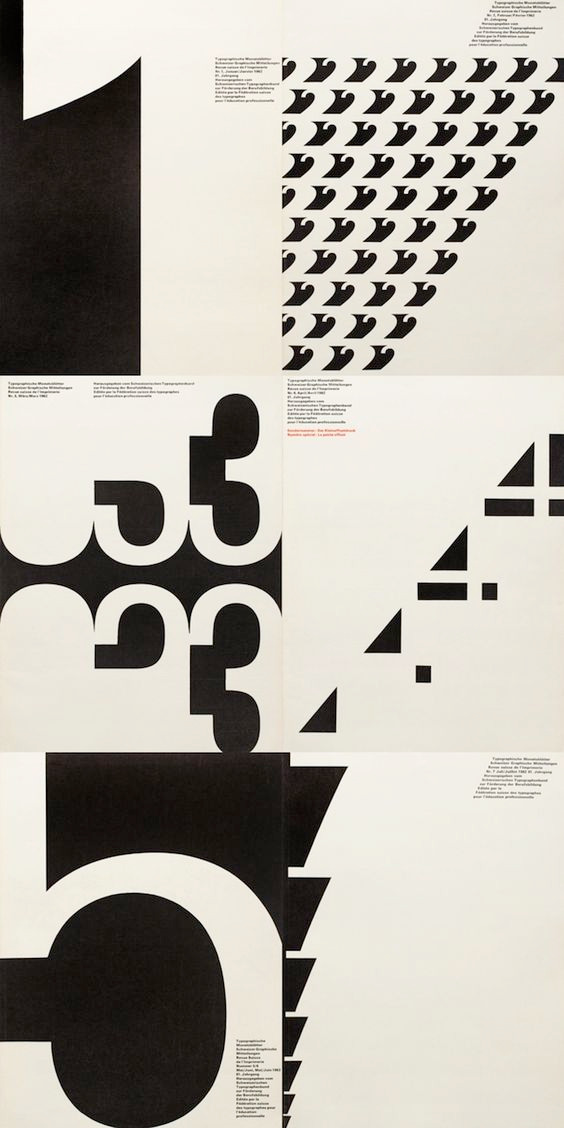
Text
Recently I was encountering a lot of posters that heavily relied on grids.

Images taken from Dmitry Naumov To be completely honest, I didn’t think much of grids before, but now I see how they can greatly help with organization and aesthetics of the picture. It also helps with the direction - when you look at these posters as a whole, they look chaotic, but once you start reading what they say, it is really easy to follow. I hope I could incorporate grids in my designs
0 notes
Text
While browsing “It’s nice that” I found an interesting article about a website that allows people feed the animals in Ukranian zoos. Of course, part of the reason this particular article caught my eye was that it was about Ukraine - my home country. However, I mainly focused my attention on the design of the site.
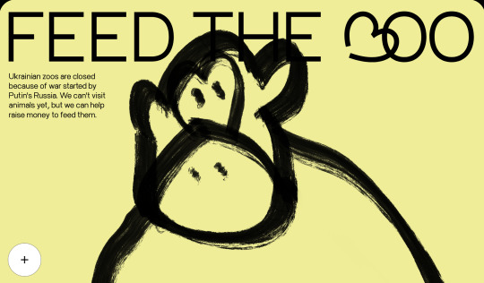
The website ЗOO
As designer and architect Ludwig Mies van der Rohe said “less is more” and I agree, especially when it comes to design. The website in question uses quick “doodles” of animals on a single colored background. This website was created quickly but in my opinion, the messy simple drawing of animals really provide the right feeling of them being in need. The pictures on the website are animated as well, which helps keep people’s attention and, again, shows the scale of a situation. In my opinion, it shows that sometimes the best designs are the simpliest ones.
Pictures taken from the Website
0 notes
Text
Recently I found this image of the sky
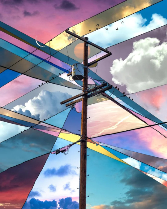
Image by Alex Hyner
I really like the contrast of the sky in different times and the idea of using an electric post as the borders is brilliant! It creates such a nice aesthetic with a little bit of “chaos” in my opinion.
0 notes
Text
When I was in Greece, I was fascinated by the Mediterranean Sea. I don’t see open seas a lot, so for me, it was huge and I tried taking pictures of it.
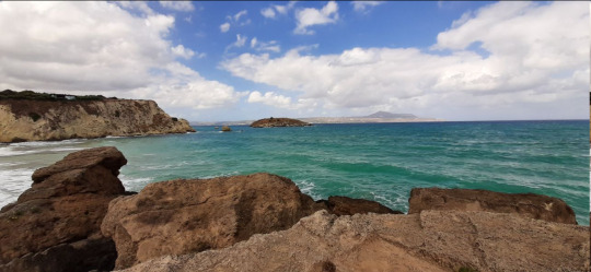
Most of them looked like this. It’s fine in my opinion, but it never conveyed the feeling of how open and vast the sea is. I blamed it on the camera most of the time. The other times I blamed it on myself, as I’m not a professional photographer by any means. However, after some time I found another angles and I feel it showed the size of the sea better.


Looking at this now, I finally understand why. There are people and benches in these photos. You can also see a car in the first one and how small it is compared to the giant body of water before it. And because people usually know what size these things are, it makes the sea seem bigger and more open. Still, I wish I fixed the horizon line on these photos, I think it’s a little bit skewed. Another picture of the sea that I like is this one:

It does not show how huge the sea is, but I still find it aesthetically pleasing. I like how it almost split in thirds horizontally: brown land, deep blue sea and light sky.
0 notes
Text

Some time ago, I was playing with glass bottle and the way it reflected sun beams. Most of the photos I made were just for fun, but then I got this one, and I liked it the best. I know it’s not the best picture I could’ve taken, but I still like how the sun highlights the bottle in the contrast to a mostly dimmed background.
0 notes
Text
Words as images
From time to time I encounter interesting types and words on the internet. I mean when words are “drawn” in a way that they not only tell, but also show. For example:

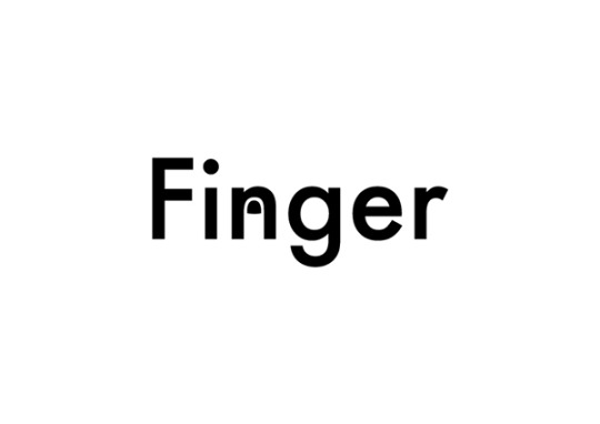
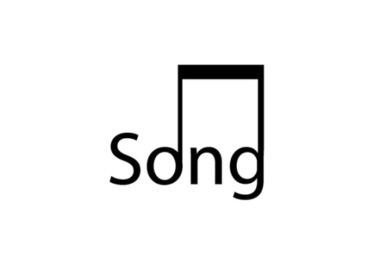
Images by Tilius Superoid
Most often than not, those images are simple, as the artist is limited by letters of the word. In my opinion, however, these limitations help to find more creative ways of showing what the word mean. Which means finding more creative ways to use simple shapes and lines. For example, I can make a cat’s head with only 5 triangles:
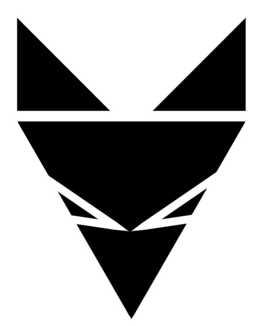
It’s simple and you can see a cat. But I personally find it more impressive, when things like this achieved with just text.
You might be able to draw a dog, but can you “draw” the dog only using letters “d”, “o” and “g”? Haejin Song can

I think it shows that you can achieve a lot with less, if you know how to use simple shapes.
0 notes


