
The 'Stranger' brief inspired me to make work that has a focus on imagery produced from hands. Hands, normally associated with comfort, physical touch and limitless activity, are explored in a different context, aiming to evoke feelings of unease and confuse the viewer, questioning what they are looking at. I also explore the power of bedtime stories and abstracting the contents till they are altered, no longer giving comfort to the reader. My work weaves through disciplines but finds meaning in print, photography and installation.
Don't wanna be here? Send us removal request.
Statistics
We looked inside some of the posts by visuallanguagepiotrgacmenga and here's what we found interesting.
Average Info
Notes Per Post
0
Likes Per Post
0
Reblog Per Post
0
Reply Per Post
0
Time Between Posts
1 day
Number of Posts By Type
Text
17
Last Seen Tumblr Blogs


Fun Fact
If you dial 1-866-584-6757, you can leave an audio post for your followers.
Text
Evaluation
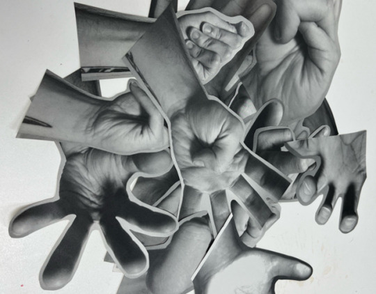
My exploration and research of the Visual Language brief needed to be vast as I initially struggled to choose from the two proposed briefs. The work I wanted to produce weaved between the two, and made it a struggle honing into just one. I opted for the ‘Stranger’ brief and focused on challenging my own and others perceptions of hands and creating a brand-new narrative for them, one which conveys unease and confusion for the viewer. Hands are a universal sign of comfort, through touch, actions and freedom of movement, but my work aimed to change that. I began my process by taking close-up photographs of my hands, which gave them an uncanny feel as there was an ambiguity to what the viewer could see. Around this time, I found the work of Asger Carlsen, a Danish photographer, known for his digitally manipulated photographs of ‘impossible pieces of flesh’. In an interview, Carlsen spoke about his practice weaving between photography and sculpture, where the photographs he takes act as the medium to create sculptures inside the photographs. While my coloured photographs gave a more disturbed response from viewers, because of the clear presence of some kind of flesh, my black and white ones were more successful as the images of twisted fingers and distorted hands resembled rocks, cave systems or ravines. My exploration continued through collage. I began collating my images of hands and coming up with brand new compositions which were initially intended to be painted. Through chance, I opted to incorporate screen-printing which elevated my exploration and opened brand new avenues for creation. I felt like there was a ghostly appearance to my prints of hands which helped to create an unease in the viewer, and led to me making lots of series of prints, most importantly my 40-print series of hands. 39 of these were in black and white, with just one having a second layer of red over it to convey the idea of someone or something being the odd one out. The poem workshop was also key to my practice as it generated my interest in the comforting effects of bedtime stories. Through projection, I distorted the famous ‘Three Little Pigs’ story to create a text that no longer gave comfort to the reader and made no sense. I feel like with more time, I could have refined this aspect of the project a bit more, as to me it seems like it isn’t researched enough. Lastly, I explored some folded forms in the form of crumpled print outs of my hand collages, creating rock like formations. These were very successful alongside my projected text as the many faces of the paper distorted the text and the folds distorted the images of hands. Overall, I think I explored the ‘Stranger’ brief well, but it lacked succinctness towards the end when I began exploring text in my artworks. I also thought my pieces lacked the uncanny factor that I tried to convey throughout, perhaps because I gave a focus to screen-printing, a process I’m still learning.
I struggled with Process and Enquiry as I wasn’t sure where I wanted to take the project. I chose to focus on the gold foil that had been given out at the start of the year. I initially had no use for it, but found it interesting how much it could change an environment from dullness to radiance. I chose to try and make as many iterations of this foil as possible, ranging from photographs and prints to sound and video. Joseph Kosuth’s ‘One and Three Chairs’ was an inspiration for this project as he explored a simple chair and displayed it in 3 different ways despite there only being 1 physical chair. I particularly enjoyed using photographs of the foil to project or print back onto the foil. My video work was interesting as it started as simple footage that was then taken on a journey. I aimed for it to have no clear perspective to confuse the viewer and create an environment from the foil. I recorded the harsh sound of the foil and exaggerated it through editing before adding it onto the video, re-recording it via a projector to distort the video further and take the original foil through another process. My most successful exploration for this module was my relief prints of the foil which were an index of the foil at that given time. The textures of the foil were captured beautifully on both paper and plaster, resembling artefacts or fossils. Overall, despite making some interesting work, I’m not happy with the end outcome of Process & Enquiry. While I explored various workshops and techniques, the work I created felt disjointed and I fell victim to prioritising Visual Language. Looking forward to semester 2, I want to evaluate my work further and try to hone into a topic to avoid creating work that feels disjointed.
0 notes
Text


Final 10 Portfolio Pieces.
Macro Photographs (Series of 8)
Macro Photographs (Series of 4)
Photo Collage
Riso Print Collage
Screen Print
Screen Print
Screen Print
Screen Print
Screen Print (Series of 40)
Folded Form with Projection
0 notes
Text


Some final projection work on my ‘developed’ hand folded form. For the pin up I wanted my folded forms to interact with the environment a bit more and rather than simply hang on a wall, I decided to have them extend onto the floor. I feel like the idea of growth is conveyed well in the piece because of this placement, especially with one of the folded forms curling around my wall, inviting viewers to look in and look at the whole thing. I used push pins to attach the forms this time as blue tack did not hold them up as well as I’d hoped.
In terms of projection, I once again projected my text onto the forms to distort it and make it unrecognisable. I think looking back, printing text onto the actual folded forms would work better? I like how this process is a way of collating these images of my hands and transforming the way they are viewed.
0 notes
Text


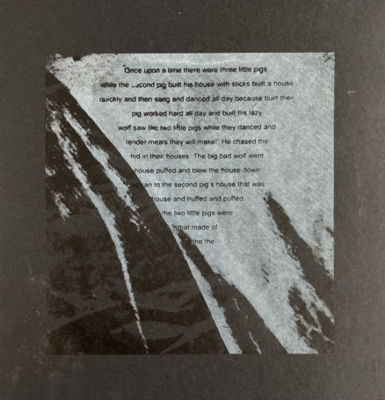
Some experimentation with printing text onto previous screen prints. Mostly experimenting with the placement of the text. Text used is original ‘Three Little Pigs’ distorted version. The importance and effects of reading, gives both adults and children a sense of comfort and pleasure. This goes hand-in-hand with the comfort we feel through physical touch and our hands which we take for granted. I aimed to create a new narrative for a bedtime story and distort it, so it no longer was comforting for the reader.
1 - A simple text print onto white card. There is something nice about how simple this is and I’m wondering whether I could integrate just text into my pin up.
2-7 - Experimenting on hand prints. The black/white prints make the text difficult to see which doesn’t really work as well as the red/black ones. Placement wise central works best but I really like placing the text under the print almost like a comment on the work above. The empty space is also filled and compositionally looks nice.
8-9 - Printing text onto other prints. These aren’t as successful as the other prints as the text is lost in the compositions and they look more graphic like which I’m not wanting my work to look like.
0 notes
Text


Projecting my new edited bed time story onto a folded form, distorting the text even further from before. I’ve noticed that projecting onto paper, with the shadows and light it creates, gives the paper a more 3D distinction.
New text reads:-
upon a
little
were
built
pig built his house
and and danced all
pig worked hard all day
saw the two pigs while they
meals they will make
hid in their houses
house
to the
and
little
0 notes
Text
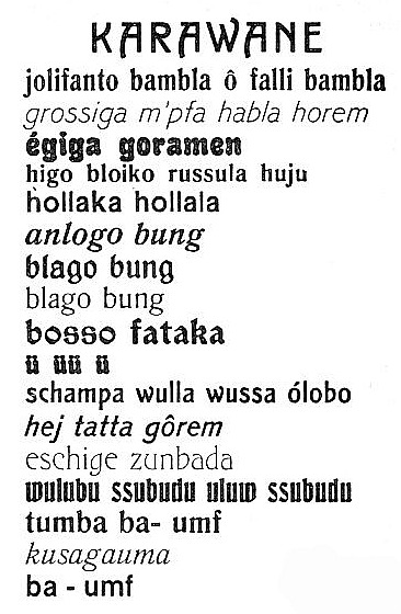
Hugo Ball
Hugo Ball (22 February 1886 - 14 September 1927) was a German author, poet and most famously, the founder of the Dada movement in Zurich in 1916. Ball was born in Primasens, Germany to a middle-class Catholic family. He studied philosophy and sociology at Munich/Heidelberg Universities. He had bigger dreams though, and Ball moved to Berlin to pursue an acting career. At the start of WW1, he tried to join the army as a volunteer but got rejected for health reasons. He was disillusioned after seeing Belgiums invasion, saying “The war is founded on a glaring mistake - men have been confused with machines.” He was considered a traitor in Germany so moved to Zurich with cabaret performer and lover, Emmy Hennings. Here Ball continued his interest in Anarchism and in 1916 wrote the Dada Manifesto, making a statement on his views on the state of society and aiming to destroy old philosophies. In the manifesto, Ball aimed to legitimise the art movements intention of not just “write poetry with words” but to “write poetry out of words” creating a brand new language, the old one allegedly “ruined by the capital.” After co-opening the Cabaret Voltaire, an art space for people like Ball, his involvement with Dada lasted around 2 years.
Hugo Ball performed his sound poetry at the Cabaret Voltaire in an attempt to highlight the insanity of society at the time. The poems were nonsensical and made sounds but had no real meaning to a listeners ears. Ball has said that these poems reminded him of attending Catholic mass as a child. His most famous poem is ‘Karawane’, performed in 1916. While he was a trained actor, the art of the performance came from the spoken word rather than the acting skills. During the performance, Ball was dressed in a paper costume resembling a clerical uniform. While reading the poem, he entered a trance like state, finally collapsing at the end and having to be carried off stage at the end with the crowd climbing up on it.
“Every word that is spoken and sung here represents at least this one thing: that this humiliating age has not succeeded in winning our respect.”


0 notes
Text


Added some folded gold foil to my folded form. I don’t know how to feel about it, I like how it breaks up the form and adds focal points, which shouldn’t really be focus points but the gold stands out greatly. It resembles little gold nuggets that could be wedged in rocks. There is a lustre to the gold foil, it doesn’t look cheap and tacky like other gold things.
0 notes
Text

Revisited my prints and reprinted a print onto a print using red this time. I don’t know why but I like this inclusion of an odd one out in my work, it is something that has been prevalent in a lot of my recent work. Is there a link to my subconscious and feeling of being odd one out? Am I the stranger?
0 notes
Text

Series of 40 prints, taken from images of hand collages. Wanted to display these in a grid format from personal preferences and thought the large number of small A5 prints would look impressive on a wall in multiples. The prints have a ghostly quality to them devoid of the qualities of a living hand, full of warmth and comfort. There is also a resemblance to the Arabic language and or some sort of hieroglyphics/visual language. I want one to be the odd one out and have decided to add a red layer to one of my prints.
0 notes
Text

Screen print of photo of folded form in red, looking to add black to the image layering over the red. This set of prints didn’t work out as my screen moved and the prints couldn’t be registered properly. More to come…
0 notes
Text


1-2 - Projecting my hand images onto the bedtime story, ‘Three Little Pigs’. I chose this story as I think it’s one of the most widely recognised children’s short story which has a clear meaning and message behind it. I love how the background of the text looks now that it has projections on top of it although I did want the image to be more conceited in the frame of the page. Could the light and dark parts of the story be separated, creating two newly found pieces of text.
3-4 - Using the smaller compositions and layering them onto the text. There is something much simpler in these images. The image of what we are looking at is clearer but I like how clean the images look.
5 - Lastly, I looked at projecting the images on a folded form created from the short story. I liked this idea a lot as the story was no longer readable! Instead it was reimagined in a new context:-
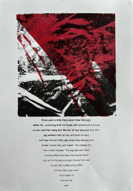
Once upon a time there were three little pigs.
while the second pig built his house with sticks built a house
quickly and then sang and danced all day because built their
pig worked hard all day and built his lazy
wolf saw the two little pigs while they danced and
tender meals they will make!” He chased the
hid in their houses. The big bad wolf went
house puffed and blew the house down
pig ran to the second pig’s house that was
house and huffed and puffed
the two little pigs were
that made of
but the the
very
0 notes
Text

Playing about with the projector and how far away piece of acetate is from light bulb. The closer it is the fuzzier the image is, and when moved, creates an effect of waves. The flowing transformations go with the imagery in the image, long extending shapes abstracted from images of hands.
0 notes
Text


Projecting a photo of my folded form, onto my folded form. I’m very interested in the process this work has been created in as the artwork is photographed then projected onto itself which is an even bigger abstraction than before. In terms of creating a different narrative for the work, the work is the narrative and is then used to narrate itself. There are some lovely closeups in these images with light and dark areas created from overlaying the work.
0 notes
Text


1-6 - Layering acetate images and projecting onto wall. I like the abstraction that occurs when the images are layered together, there is a fluidity to how the images react with each other. More interesting combinations are created when more layers are created I think and I like how the opacities layer up and areas become darker.
0 notes
Text


1-7 - Projecting acetate images of hand collages, I like the effect of this, grainy, old.
8-10 - Layering acetate images and projecting onto wall. I like the abstraction that occurs when the images are layered together, there is a fluidity to how the images react with each other. The next logical step in abstracting these is printing?
11 - Here I hold up the acetate far from the projection. I like the idea of a moving image using my thematic structure.
0 notes
Text


Folded form using sheet aluminium print. Not too keen on this process as the metal is harder to manipulate because of how solid it is and there are limits to what bends and fold you can make by hand. I was also hoping the folds would make the prints come out more reflective but that’s not the case and many of the prints are lost in the work.
0 notes
Text


Photos of folded form made from screen prints on waxy paper. I love the fact that when photographed there isn’t a depth to the photos and it’s unclear that you are looking at a 3D image. Lit underneath the piece but it didn’t have the effect I wanted and instead just lit the piece up slightly. I’m happy with the fact my image now has zero figurative relation to my hand. Material wise I’m not too keen on it as it’s a bit too soft for folding accurately.
0 notes