
Don't wanna be here? Send us removal request.
Statistics
We looked inside some of the posts by visualrhetoric and here's what we found interesting.
Average Info
Notes Per Post
0
Likes Per Post
0
Reblog Per Post
0
Reply Per Post
0
Time Between Posts
8 days
Number of Posts By Type
Text
12
Last Seen Tumblr Blogs


Fun Fact
Tumblr is available in 18 languages.
Text

Rengastie and Land-Based Digital Design Rhetoric
Arola’s land-based digital design rhetoric spoke to me as she connects the theory to her own spatial experiences in nature and the digital environment. As a Finnish person I share similar experiences of growing up only 4 kilometers from the nearest lake, currently living only 400 meters from one. I have spent my childhood in a forest on our backyard and I am very familiar with the different shades of grey that can be found in nature during different times of the year. I also recognize that there are differences in our spatial experiences with the author as I am not Indigenous. I have also visited the region of the Great Lakes in Ontario and I felt out of place there with the North American unwalkable design that prevents me from connecting with the environment with my body. In this post I will explore if Rengastie’s web design succeeds in utilizing land-based design rhetoric and therefore engage with a Finnish audience making them feel at home.
The first principle is that “land-based digital design rhetoric acknowledges how understanding comes from ‘active participation with the land’” (205). Rengastie depicts the coastal region where I have spent summers at camps and at a summer job. My experiences have included swimming in the sea and moving through it with kayaks and boats. I have run in the forests, bicycled through the islands, picked berries and danced in the nature. These spatial experiences are present in the tones of blue and green in the logo, background colors and images. The images do not only depict the sunny days but also the gray weather.
Through this engagement with the environment comes the relationships we have with particular elements in the biosphere. What does this mean in terms of the website? During the summer the islands are isolated as one cannot just walk on ice. We need vehicles to take ourselves to other islands and to connect with other people and experiences. Through the website I engage with this environment and find information about how to move in my current environment to where I want to go.
All of my experiences on the coastal region have created memories that come out when I look at this website. My memories are fond when I look at the simple website, a true testament of the DIY culture on the islands, where nothing happens if you do not do it yourself.
Sources:
Arola, Kristin. “A Land-Based Digital Design Rhetoric.” The Routledge Handbook of Digital Writing and Rhetoric, 2018.
0 notes
Text

Sea of Thieves and Remediation
Many video games strive to erase the medium so that the player feels directly present in the video game universe. This has led to efforts of hiding the UI: omitting clickable buttons from the gameplay that are not a part of the video game universe or hiding health bars and other heads-up displays. One such game is Sea of Thieves. Sea of Thieves strives for minimalism in their UI design, which makes it a great example of the desire for immediacy. However, immediacy is never truly possible, and I am interested in exploring how hypermediacy infiltrates the game. As an example, I will use this image of the game map.
The desire for immediacy is visible in the way that the map is posited as a part of the video game world. It lays on the table instead of being behind a button. The only HUD element visible is the health bar, which disappears when there is full health. This lack of buttons helps the player forget that this is a video game. But is this a good thing? Ethical questions arise when we think about people who lose themselves to video games and use screen time to forget about their real-life issues. At least the graphics make it clear that this is not the real world but something animated.
Hypermediacy is not as clear in this image as the goal is not to remind the viewer of the medium or open windows to multiple perspectives in one visual space. However, hypermediacy leaks to the video game as it borrows the medium of a map. The map can be viewed as a window to different type of content, where the player moves from the level of experience to a level of abstraction visible from a bird’s eye view perspective.
The concepts of immediacy and hypermediacy come together in remediacy and in the ways that Sea of Thieves refashions older media, like the map or older video games. The game mediates the mediation of maps and games, becomes a part of our reality, and participates in the development of the medium and reforms it.
Sources:
Bolter, Jay David, and Richard Grusin. Remediation: Understanding New Media. MIT Press, 1999.
0 notes
Text
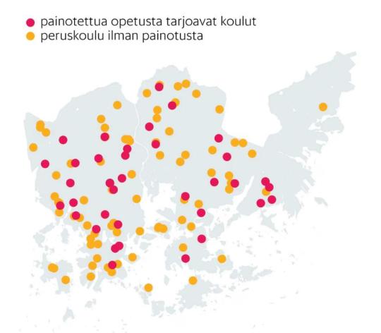
A Map of Weighted-Curriculum Education and Tufte’s Visual Explanations
On April 1, 2025, Helsingin Sanomat discussed how Helsinki has a division between students receiving weighted-curriculum education and students in ordinary education. Students are selected to the weighted-curriculum education, which creates inequalities between classes in schools. The article visualized this information by using a map of Helsinki that shows weighted-curriculum education in red and ordinary education in yellow.
The map shows that there are opportunities for weighted-curriculum education almost everywhere in Helsinki. What the map does not show is that this is due to middle class parents threatening moving outside of the school district if these opportunities were to be removed, which would create inequality between different areas in Helsinki.
In Tufte’s terms, this map includes encodings, meaning the color scales on the map, and self-representing scale, meaning that we know the size of Helsinki. As a map it expresses quantity due to the areal extent of the city. However, the map of Helsinki appears to be a mere base map for the data about schools. On a relative scale we know that the schools are not as big as the dots appear on the map. The map strives to answer only to the questions How many? and Where? Even though the image is not very precise, it follows some ethical standards as the sources and creators of these maps are credited in the article. It also visualizes effectively the extend of this division discussed in the text.
The effectiveness of this image is possible due to the journalist placing the data in an appropriate context for assessing cause and effect. If there are weighted-curriculum options throughout the city, the issue of “shopping” for a better class concerns the whole city. In the text the current situation is compared with what would happen if there were no such options, which would lead to middle class families moving to certain areas. However, this consideration is not visible on the map. As the map is presented for journalistic purposes, it does not express assessment of possible errors. I believe that in its simplicity it emphasizes the issue presented in the article itself.
Sources:
Tufte, Visual Explanations.
0 notes
Text
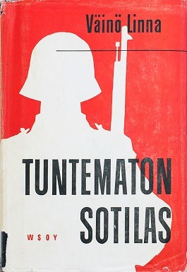
The Unknown Soldier and Epideictic Discourses
The silhouette of the unknown soldier is not epideictic in the traditional sense. According to Kenny, epideictic genre was used to celebrate the nobility (68). The silhouette, on the other hand, memorizes the common soldier and the variety of soldiers’ backgrounds, attitudes, and actions during the Continuation War. This is made possible by the anonymity of the character. Kenny also states that these epideictic discourses use clichés, stereotypes, and myths to unify audiences through depicting values and creating a favorable image. However, this silhouette is a stark opposition to the romanticized Finnish soldier created by Runeberg in The Tales of Ensign Stål. The reason that I consider it to follow epideictic discourses is that the image follows and creates stereotypes about Finnish people(s), reinforces perceived social reality and one’s place in it, and it is instantly recognizable. Even though the image is not romanticized, it connects people under the shared values of survival and sisu.
The representative form that this epideictic discourse takes can be considered to be an ideograph. Scenes from The Unknown Soldier are used in political discourse, it represents the collective goal for defending and developing our homecountry, it warrants the use of power, and it is culture-bound. The cover is familiar to everyone as it is often mandatory to read it in schools, and there are also three movies about its events that are watched yearly during Independence day. Currently, Russia holds an opposing view of the events of the Continuation War and the role of the Finnish soldier, which emphasizes the cultural specificity.
This silhouette intensifies feelings. When the image and the novel were first published, they evoked opposition as they created an opposing perspective to the polished view on war. Currently, the use of this image in other contexts like marketing creates opposition as it is considered to be disrespectful. These intense feelings show how well the image works as an ideograph.
Sources:
Kenney, “Building Visual Communication Theory”.
0 notes
Text

Municipality Marketing and Typography
The goal of today’s post is to explore how Akaa, my old hometown, uses typography to market itself. The logo of Akaa is a part of rebranding the city after a municipal merger of Toijala, Viiala, and Kylmäkoski. However, Akaa has existed since 1483 as a parish. Despite this, local identities are still tied to the old municipalities and the logo must work to unify Akaa. Akaa is also a municipality with migration loss, and the logo is an important marketing tool for prospective town residents.
According to Paul Lester, typography can “guide a viewer toward understanding the literal message of the words and toward perceiving symbolic meaning” (153). The literal meaning of the text is the name of the city. It is speculated that the name comes from an ancient Germanic word that meant water and there is lake Vanaja in Akaa. However, this connection is not seen in the logo typography. The symbolic meaning that the typography guides the viewer towards is that Akaa is the honey capital of Finland. The orange color hints towards the 20 million bees living in 40 hives in the city. This makes Akaa “a sweet city” to live in. This perspective may also appeal to the viewer through expressing environmental values.
The logo uses a script typography where letters are partly linked. Lester states that this mimicks handwriting and creates a sense of high-class (165). However, in the logo the appearance is more playful due to the eye-catching orange color. The size of the font is appropriate for display and the kerning makes the logo easy to read.
The logo has faced some critical perspectives in Akaa. In the beginning the locals questioned why honey was emphasized in marketing. Lester believes that it is important to match the expectations of an intended audience. I believe that the intended audience was not the locals but the prospective town residents.
Sources:
Lester, Paul. “Typography”.
0 notes
Text


Cigarette Advertisement and Visual Arguments
According to J. Anthony Blair, visual arguments are a type of persuasion distinguished by the fact that a visual argument includes a reason to modify one’s attitude, belief or conduct. I will discuss this idea through two very different examples of cigarette advertisement.
The L&M cigarette package argues that one should not buy or smoke cigarettes. This change of conduct is reasoned with the image of an amputated leg. The text below explains that smoking blocks veins. This closeness of the image and text creates a cause-and-effect relationship between them, where smoking has blocked a vein, which has led to an amputation. There is even a second argument on the package: one should not throw cigarettes in nature, because if they get into water, turtles may die. This argument is expressed in two parts. In the first part, the action of throwing away a cigarette is crossed and it is on a red background, which symbolizes a warning .The next image portrays the result, where there is a cigarette and a dead turtle in the water.
The Liberty cigaret add, on the other hand, encourages the viewer to buy this specific brand of cigarettes. The reasoning is that it is an American brand as seen in the outfit of the woman and in the design of the package.
For the argument to resonate, we must understand the context and the audience. The Liberty cigarettes poster is from a different time, when the dangers of smoking were not widely understood and when it was legal to advertise different cigarette brands. This poster could work both for the American and international market. For American audience the advertisement emphasizes that the product is local. For the international audience the appeal is that the cigarettes are made by the world power USA.
The L&M package is made for the current Finnish market, where there must be warnings on the packages. However, it is a universal desire to not become disabled and the image may resonate with wider audience. This image shows how powerful and forceful images can be in evoking emotions.
Sources:
Blair, “The Rhetoric of Visual Arguments”
0 notes
Text

Media Image and The Pictorial Turn
Mitchell identifies the pictorial turn, which means the rediscovery of the picture, spectatorship, and pictorial representation. He identified this turn already in 1992, and through new forms of media the presence of visual culture has only intensified. Before the dominance of textual forms of expression, people relied on pictures. This can be seen, for example, in churches that are designed to spread the gospel for the illiterate folk. I started to wonder what kind of information I am receiving through streams of pictures. As Ukraine war continues to headline in the news, I decided to find a picture about it that would also comment on Mitchell’s ideas about metapictures and help theorize his ideas.
The picture that I chose is from a residential area in the Kharkiv region where Russia has laid mines. The background of the picture is dull and ordinary, there are blocks of flats in the shades of grey and brown. However, in the forefront of the picture there is a picture of another kind: a warning sign. Returning to the idea of visual cues, the red and orange colors of the sign grab the attention of the spectator. The danger is communicated through text in Ukrainian and English, but also through the symbol of a human skull with two crossed bones. This is a known symbol that communicates hazard or possible death. The death is not only present in the sign, but in the Kharkiv area’s leafless nature, in the war that is going on in Ukraine, and in the mines that are hidden in this area.
The interplay between the sign and the background forms a metapicture where a picture contains a picture of another kind. The sign is nested into the background of Kharkiv. The reading of the background depends on the reading of the sign. Without the sign, the picture would be dull, it could be located anywhere, and there would be nothing that would grab the spectator’s attention. The sign uses colors and symbols to grab the attention and to communicate the danger of mines in the area. The languages in the sign posit the picture to Ukraine and war. The reading of the sign also depends on the background, and it is contrasted with the mundane residential area, which shows that war is not isolated.
Sources:
Mitchell, W. “Metapictures.” Picture Theory. The University of Chicago Press, 1994.
Mitchell, W.” The Pictorial Turn.” https://www.artforum.com/features/the-pictorial-turn-203612/.
0 notes
Text
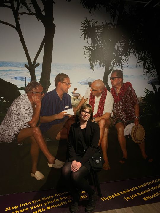
Nootti and Reflections on Photography
This photograph repeats what could never be repeated historically. The photograph was taken during the opening of Nootti Museum of Finnish–Russian Relations. It was a small historical moment that ended the era of Lenin museum and moved the museum towards understanding interactions between Finland and Russia more widely. On the background there is a historical photograph from 1961, in which a political crisis in Finland–Soviet relations started while president Urho Kekkonen was on vacation in Hawai’i.
This image has two operators: my sister and a newspaper photographer. The spectator of this photograph is you, my mom, and my instagram followers. The spectrum of the photograph is me posing in front of the previous Finnish president during a crisis.
Since Roland Barthes was interested in how death is present in photography, in this photograph the death is very much present in the image from the 60s and the presence of the late president Urho Kekkonen who died before I was even born. As Finland’s foreign policies have shifted since Kekkonen, I believe that the old system can also be called dead. The death is also present in the death of Lenin museum and in the death of this opening evening that can never be lived again.
How the spectator feels about this photo is dependent on their studium. Perhaps they know that I works as a museum guide and that I was present at the opening of Nootti. Maybe they remember learning about the Note Crisis and Kekkonen’s role in it. Maybe my followers as spectators find it humorous that I am positing myself in the middle of these important negotiations. For me, the punctum of the image can be found on the background, where the president is wearing a lei in this serious scene.
This photograph was taken for its “See” quality as I wanted to show that I was present at the VIP opening. I am posing to construct a professional image of myself and to show this side of myself as a museum guide. I am also showing myself in relation to a significant historical moment, and with this image I want to point out that also the opening of the new museum is a part of the flow of history.
Sources:
Barthes, Roland. Camera Lucida.
0 notes
Text

Wärtsilä Annual Report and Page Design
Annual reports are intended to give information about a company’s activities and financial performance to its shareholders. Today’s example image is from Wärtsilä’s annual report 2023. I will apply Kimball and Hawkin’s ideas about page design to analyze how the annual report communicates with the shareholders.
Annual reports are a part of general company culture and they carry certain conventions. This example of Wärtsilä is typical as it is a page that gives general corporate information. Annual reports also follow company culture and guidelines. For example, the images of water communicate clearly that Wärtsilä operates in the marine market. The company is also present in the logo in the bottom left corner.
The design objects of this page are framed by a horizontal page, which forms a coherent visual field in the document. The page is located in the document after the title page, table of contents, and Tämä on Wärtsilä page which starts the section. The viewer can see the location of the page in the top right corner of the page. Other design element on the page include the heading, texts, images, symbols, boxes, a logo, the name of the document, and a page number.
The design objects are connected to each other through relationship between similarity and contrast, enclosure, proximity, alignment, and order. Text objects that are on similar background images are connected to each other. Contrast between images in addition to text boxes create enclosures. There is no negative space between the main design objects. The design objects align in three horizontal rows. It is interesting how the enclosures that include goals and current demands create an arrow that points towards the company’s target position in the global market. This creates an order of viewing. The target, on the other hand, forms a wave, which is the symbol of Wärtsilä. On the bottom row the designer trusts that the reader will read the text boxes from left to right.
Through this page structure Wärtsilä aims to create an ethos that they are a global leader in moving towards sustainable energy solutions. The images of sea landscapes create a pathos that encourages the viewer to preserve such sceneries and the environment. Wärtsilä also offers factual information and statsitics to form a rational discourse that support’s the company’s mission.
Sources:
Kimball, Miles and Ann Hawkings. Document Design: A Guide for Technical Communicators. Bedford/St. Martin’s, 2007.
0 notes
Text

Metso Crushing of Rocks and Semiotics
De Saussure’s idea about a sign consisting of a signifier and a signified is one of the cornestones in linguistics and especially in semiotics. I wanted to challenge myself and analyze how a graph that consists of images, lines, text, and numbers can be understood in these terms.
The signified is the concept that is represented. It is noteworthy that for de Saussure the concept is not material but rather psychological. It is an idea instead of an object. Therefore, the reader of the graph should not focus on the details and objects that are represented in the graph but in the idea that the graph communicates. The graph depicts which impactors are used in different stages of crushing rocks and minerals. The curve communicates the product value in these stages. These are the ideas that are signified. Merely focusing on the materiality of rocks and impactors would disturb the reading of the graph.
The signifier is a graph with images of rocks and impactors, text describing the product types, numbers describing the size of the rock, and lines to help with the reading of the graph. De Saussure discusses the arbitrariness of the signs and how we must learn the meanings of signifiers. A graph is a perfect example of the relative arbitrariness of the sign as we must learn the common conventions to be able to interpret them. However, the sign is not completely arbitrary because then it would lose its meaning and power to communicate ideas. For example, the graph utilizes icons which resemble the impactors that are a part of what is signified.
Finally, Killingsworth and Gilbertson (1992) discuss that in technical communications it is the action that is the sign. The graph is a part of a Mineral Processing Handbook. It does not necessarily invite the reader to direct action, but it does encourage the reader to learn about different stages and different machines for rock and mineral crushing. The action would be choosing appropriate services based on the desired outcome of crushing.
Sources:
Chandler, Daniel. “Semiotics for Beginners.” http://visual-memory.co.uk/daniel/Documents/S4B/sem02.html. Accessed 3.2.2025.
Killingsworth, Jimmie and Michael Gilbertson. Signs, Genres, and Communities in Technical Communication. Routledge, 1992.
0 notes
Text

Konecranes and Visual Cues
In this post I discuss what kinds of visual cues Konecranes uses in this image for media and what kind of message they strive to send.
The color of the Konecranes brand is red, which is also present in this image in the color of the crane hook and in the color of the workwear. According to Paul Martin Lester, red is used for attention-getting purposes because of its long wavelength that allows the color to be noticed from farther away and the color stays longer in a person’s eye (17). Using the red color is therefore not only an issue of getting the viewer’s attention but also an issue of safety. This is important when handling big machinery. Subjectively red can be a powerful tool to communicate ideas and with the help of the red color Konecranes may want to be viewed as a company with courage and passion.
A cooler green color is used on the background. Green can symbolize many things, like money or nature (Lester 18). Konecranes takes pride in being a global leader in material handling solutions and productivity is important for the company. In today’s world it is also important to find sustainable solutions that consider environmental effects.
The colors partake in creating depth to the image and the warmer colors appear to be closer (Lester 18). The crane hook draws the attention of the viewer as it is centrally located and near the viewer. When the machine is compared to the size of a man, it appears to be larger in size. Therefore, the viewer knows to focus on the importance of the object instead of the human operating it.
In addition to the red color, circular shapes in the hook and the Konecranes logo are used as attention getters (Lester 26). According to Konecranes, the logo symbolizes “broadened role in global material handling”. The viewer’s attention is lead away from the man as he looks away from the camera, which shows disregard to being photographed and focus to his work.
There are also rectangular shapes in the photo, which express sturdiness and trustworthiness (Lester 25).
Finally, the vertical lines created by the ropes express stiffness and rigidity (Lester 24). For Konecranes this might mean following rules and regulations to assure safety. The diagonal lines in the machine on the other hand create a dynamic energy (Lester 24). The floor also creates a low horizontal line, which shows room for growth (Lester 24). Konecranes sends a message that they are a trustworthy global market leader and yet they strive to develop.
Sources:
“Konecrane’s new brand identity reflects its ambition to become a global material handling solutions leader.” Konecranes, 19.1.2024, https://www.konecranes.com/press-releases/konecranes-new-brand-identity-reflects-its-ambition-to-become-global-material-handling-solutions-leader. Accessed 28.1.2025.
Lester, Paul Martin. “Visual Cues.”
0 notes
Text

Kalevala Louhetar and Classical Representations
According to John Berger, all images are man-made and the ways we see them are affected by our experiences (8–9). The advertisement for Louhetar jewelry is an example of an image that can be understood differently if one is familiar with the imagery of Finnish mythology and the images of womanhood in Finland.
Making an image includes choosing the subject and the perspective (Berger 10, 18). The subject is a young and conventionally beautiful woman. The perspective is intimate and leaves out the subject’s eyes and most of her body. This is an interesting reproduction of Louhetar because in Kalevala Louhetar is an evil elderly woman. In reproductions images are isolated from their contexts and they are used for different purposes, but their meanings become transmittable (Berger 24–25). When Louhetar is transferred from the sphere of mythology to fit the conventions of jewelry advertisement, the viewer must ask what is the meaning that continues to be transmitted. Despite Louhetar shapeshifting from an elderly woman to a young woman, she continues to symbolize power. In Finnish mythology Louhetar has many roles as a ruler over Pohjola, a mother, and a witch. The advertisement image puts these roles on the young woman, who through jewelry can connect to her ancestors who also carried these roles. The power is expressed through ribbon braiding and jewelry through the ages.
Berger connects the question of power to gender. He states that “[a] man’s presence is dependent upon the promise of power which he embodies” (45), while “a woman’s presence expresses her own attitude to herself” (46). The way that Berger discusses men and women as the surveyor (i.e. man) and the surveyed (i.e. woman) reflects his experiences as a British man in the 1970s. Looking at the Louhetar image, I do not see a woman being displayed. Wearing the jewelry expresses power and privilege. The perspective of the image keeps her identity and aura as a mystery. As the image is a jewelry advertisement, the most likely spectator is another woman. As a final test, Berger suggests testing if the subject could be changed to a masculine one. In this case it would not work as the message of Louhetar would not be transmitted, but it does not mean that Louhetar is without power.
Sources:
Berger, John. Ways of Seeing. British Broadcasting Company and Penguin Books, 1972.
0 notes