wallaa02
20 posts
Don't wanna be here? Send us removal request.
Statistics
We looked inside some of the posts by wallaa02 and here's what we found interesting.
Average Info
Notes Per Post
158
Likes Per Post
85
Reblog Per Post
7
Reply Per Post
66
Time Between Posts
1 month
Number of Posts By Type
Text
17
Last Seen Tumblr Blogs


Fun Fact
Tumblr was acquired by Yahoo for $1.1B in 2013.
Text
في ظل الثورة المعلوماتية التي تدخلت في كافة جوانب الحياة والشاشات الرقمية، تأثرت الفنون التشكيلية مما نتج عن ذلك تداخلًا بين الفن والتكنولوجيا وعمل ذلك على تقليل الجهود التي يبذلها الرسّام لإيصال مضامين لوحاته، ويعود ذلك لما قبل اختراع الحاسوب، سجّل الفن الرقمي حضورًا كبيرًا من خلال اللوحات الأكثر شهرة في العالم مثل الموناليزا للفنّان ليوناردو دافنشي والتي يستحيل الحصول عليها إلّا ان الملايين من الجدران تمتلئ بهذه اللوحة، وبذلك تدّخل الفن الرقمي لعمق تاريخ الفن مما يشكّل تحدٍ إلى الفنان، حيث أصبح الحاسوب من متدرب إلى فنان مستقل.
إذًا ما إمكانية توظيف التكنولوجيا الحديثة في عصرنا وإشاعة هذه التجربة لإنتاج جيل يتعامل بشكل علمي مع الفن والتكنولوجيا في ذات الوقت؟
تنبع أهمية هذا الموضوع من أثر التكنولوجيا على الفن وحياتنا عمومًا كون أن الإثنان جزء مهم من حياتنا اليومية، كذلك يشير إلى أهمية ودور وسائل الإتصال في تغير الطابع التفردي للفن.
ويأتي هذا البحث بهدف بيان إمكانية توظيف التكنولوجيا لفن الرسم في المعاهد والجامعات المختصة والتجريب على أسس علمية.
بالحديث عن الفن والتكنولوجيا نتطرق للفيلسوف فالتر بنيامين بنظريته التي اعتبرت الفن سلعة يشترك في إنتاجها ناشرون لتباع في السوق وتحقق الربح، أشار فالتر إلى أن التكنولوجيا أداة تمكّن الفنّان من تسويق بضاعته وأكد على مهمة الفنان في تطوير عمله، كما أشار إلى التخلّي عن الطابع التفردي للعمل (القيمة الجمالية) والإعتماد على القيمة الإتصالية.
يمكن ملاحظة أثر التكنولوجيا على الفن بشكل واضح عند نقل فكرة معينة من خلال عمل فني بتقنيات الإتصالات الحديثة، ونرى تأثيره على كافة المستويات الثقافية بمعنى فكرة الفن للجميع.
أحد الأساليب الفنية الرقمية هي الإستنساخ التي من الممكن أن تُفقد العمل جماليته بسبب افتقادها لعنصري الزمان والمكان لأن خامات العمل وطبيعته لاتظهر في النسخ المطبوعة ويؤدي الإستنساخ بكميات ضخمة إلى لإختفاء مفهوم الأصالة في العمل، من ناحة أخرى يمكنه خدمة الفن عن طريق إبراز الأمور التي تغفل العين عن ملاحظتها عن طريق التكبير والتصوير البطيء، ويمكن القول بأن الاعمال الغير قابلة للإستنساخ تراجعت وتصدّرت الأعمال القابلة للنسخ على حساب القيمة الجمالية.
يُعد الفن الرقمي فنًا يعتمد على برامج الحاسوب كالفوتوشوب يتيح للفنان استخدامه في أي وقت باعتبار الشاشة بيئة محمولة، يمتاز الفن الرقمي بخاصية دمج الإختصاصات وبذلك يُعد توظيف التكنولوجيا في الفن انعكاس لوعي الفنان وتحضّره، للفن الرقمي أيضًا مدارس فنية ومنها البكسل والكولاج. يتطلب هذا الفن مجتمع افتراضي عبر الحاسوب لتوظيف الأعمال التي يعكس فيها الفنّان ابداعاته ومهاراته، كما يجب عليه الإطّلاع المستمر.
إذًا نستنتج ان:
وسائل الإتصال الحديثة تؤثر في رؤية الفنّان وفي تشكيل عمله الفنّي.
دمج الفنون مع الإتصال الجماهيري في القرن العشرين ويسمى ذلك بالصناعة الثقافية.
أصبح العالم قرية صغيرة يمكن الإطّلاع عليها عن طريق الشاشات لذا أصبح الفن للجميع من خلال نشره بالوسائل الحديثة.
التوصّل إلى التفاصيل بدقة عاليّة في العمل الفني تتيحها لنا التكنولوجيا
دمج الإختصاصات بالتكنولوجيا وتوظيفها مما يعكس تحضّر ووعي الفنّان.
ولاء عطية علي ضيف
202007900
@uob-funoon
3 notes
·
View notes
Text


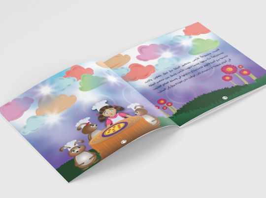
نبذة القصة:
بَريق فتاةٌ صغيرة تَقضي أغلب وقتها في اللَعِب بِالأجهزةِ الإلكترونية، مِما يجعل والدتُها تغضب عليها من هذا التصرُّف، إلى أن يأتي يومٌ تُلاحظ فيه بَريق بصيصَ نور يتوهج من صندوقِ ألعابها وتكتشف أنّها قَلادةً سحرية تَنقُلها فيما بعد للعالم العجيب الذي يُنسيها المللَ والحُزن حيثُ المُغامرات والأنشِطة المُختلفة، وبذلك تكتشف الفتاةُ الصغيرة أن البريقَ لا يتوهّجُ مِن شاشاتِ الأجهزةِ فقط؛ بل يَتوهّجُ منَّا إذا أطلق��ا الإبداع والمواهب الموجودة بداخلنا.
بإشراف الدكتورة سماء الهاشمي
@uob-funoon
8 notes
·
View notes
Text


Sayed Mohammed Al-Majed Graphic Designer Bahraini, born in 1990, a creative founding member of Mormedia Company. His beginning was that he used the Photoshop program on his device by chance and he liked it, which prompted him to try to get to know the program more because he was a drawing enthusiast since childhood . He studied design at the beginning by relying on himself through practice and experience, and also developed through his volunteer work in the mosque, then completed his studies at the University of Melbourne in Australia . He loves works that are elaborate, renewable and innovative, but he does not like a specific artist . Graphic Design students are advised not to be satisfied with what they study, but rather to practice, intensive visual feeding, patience, and not rush to describe themselves as negative or positive .Most of his works currently focus on the adoption of Arabic calligraphy as a basic element and focus on works that translate feelings and leave an impact .He believes that the graphic designer carries messages and makes an impact.
@uob-funoon
8 notes
·
View notes
Text


Duaa Ateya is a Bahraini interior design engineer, born in 1992, an interior design graduate from the University of Bahrain. She developed a love for design with the encouragement of her parents, especially as she lived in the midst of a creative family of a multi-talented mother who loved art and a father who mastered the profession of carpentry, which made her aspire to study interior design in addition to Her previous tendencies related to design and coordination, she now has 6 years of work experience, her beginning was with Al-Taweel Engineering Company for two years, after which she worked in Abdullah Mahmoud Company for Wood Products and currently working at Dom Design Company and developed in the field of interior design through practice and passion She also took part in courses to learn about design and the programs used by AutoCAD Max for Illustrator and Photoshop, her model in design, designer Zaha Hadid and Bodour Interior.
@uob-funoon
9 notes
·
View notes
Text

Coverage for Workshop / Lecture :
I attended this lecture by the designer Younes Attia during this semester, which Dr. Samaa Al-Hashimi introduced us to. The lecture was very effective and of high importance for specialists in the arts, particularly graphic design, as it dealt with necessary axes about the logo and commercial identity, through which I learned The basic principles and things that must be considered about logo design and the most that stuck in my mind is that the logo should be able to be drawn by a child! And this is to emphasize its simplicity in addition to containing the meaning. Younes Attia spoke and explained to us about the principles and foundations of design and different examples on every basis. The lecture was never boring as he was taking our opinions about the exhibits, and the lecture included a group brainstorming about Two forms and their names, and the interaction was very wonderful because the topic contained different points of view, through which we learned the importance of the name being consistent with the form.
In the end, he received all the questions and answered them. The lecture was excellent, and it would be better if it was not online via Microsoft Teams.
@uob-funoon
10 notes
·
View notes
Text

Coverage for Workshop / Lecture :
I attended this free course because of the skills required for this semester in Illustrator, and because I had no idea about this program, I attended this course to learn about the program. This enriching lecture was presented by the designer, Dan Scott, who focused on the practical side of the program and the basic tools that must be known , and it was possible to apply with him exercises on what he is explaining, at first he explained how to open the outline file and explain the settings, then he moved on to explaining the method of transferring a hand-drawn design on a sheet of paper and using the pencil and converting it to digital by explaining how to insert shapes and Using the selection tool to change the inserted shape. He also touched on the “stroke” settings and education on the different effects that can be applied to it. He also explained how to use the pen tool, as well as explaining how to put several elements in a group and the “arranging” of shapes and texts, He also touched on other tools such as the gradient tool, the brush and the pencil, he also shed light on the way to place or color the elements and control the colors and explain the difference between "RGB HSB CMYK", and the inclusion of texts, on the other hand, explaining in a simplified qualitative manner He designed a logo and made images, vector, and talked about how to insert the pattern.
The course is very useful for beginners, the explanation is clear and the basics in it are enough to get started and launch in Illustrator.
@uob-funoon
8 notes
·
View notes
Text

Coverage for Art Exhibition :
alriwaq art gallery space.
This project was established by Bayan Kanoo in 1998, it started in Manama "Adliya" and recently moved to "Al Gufool" area in Manama.
The design of this art space is not limited to the work of festivals and activities inside, but it contains an outdoor space for holding events related to the art exhibition.
Every week, various artistic programs are presented that will be held in the exhibition or if they are online, and some free lectures are also offered.
Several years ago, when the exhibition was in the Adliya area, I visited it. It was very special and attracting attention. The space occupied by the exhibition has its own vitality from what it contains of colors, inscriptions and drawings, but when I visited this time after they moved to the Gufool area, I noticed that it is less creative so far. From the previous exhibition, perhaps this is due to the fact that they have recently moved there and the work on it has not been completed. There were not many works displayed, I noticed that most of them are by the artist Abbas Youssef, these people on the wall of one of the rooms in there drew me, although I did not understand exactly what they meant, but it is a distinguished work in gray cartoon, in addition to the people there is a fan above them, Work is very strange.
Most of the paintings contain many random colored lines or draft style!
In general, the gallery is a wonderful artistic space for holding festivals and events because of the exterior design of the place. It really gives enthusiasm and desire for artistic works, and I think that it will develop in the coming days due to their transition from a short period and the work is still in it.
@uob-funoon
6 notes
·
View notes
Text

Coverage for Art Exhibition :
Baghdad Art Gallery
This gallery was established in 2004 and this gallery is concerned with Iraqi fine arts.
The exhibition contains a very large number of paintings and includes the works of artists who have their name in the field,
Where no painting is displayed unless the artist is famous and experienced and has multiple participations in the artist, meaning there is no work for beginners at all.
The works vary between cubism, impressionism and surrealism, and the topics of the paintings vary, including: religious, patriotic, and others.
This work drew me to the late artist Bahja Al-Hakim, which dates back to the year 2000 and was done in oil colors on canvas. The work contains very precise details of Arabic letters and inscriptions. I noticed the presence of domes in it, which gave it a religious character. The contrast with the black background is very wonderful, there are also other works of the artist in the exhibition, which are remarkable among the other works because of bahja different and distinctive style from the rest, especially her addition of the golden color in her works.
Also, the works of the artist Muhannad Al-Samir were distinguished by his distinctive style. His paintings have a kind of harmony, harmony and the correct distribution of elements in a comfortable way to look
There are works of art that contain Arabic manuscripts of verses or phrases, and their texture suggests that they were made by decoupage and not just by coloring.
This large painting is located at the beginning of the entrance to the exhibition, and when I touched it, I noticed that its texture is uneven, which means that many techniques and types of colors were produced in this way. Paintings with a black background are always attractive because of the wonderful contrast that they form.
In general, the exhibition is very rich in artistic works and interesting due to the large variety of topics and artistic methods presented
@uob-funoon
7 notes
·
View notes
Text

Project 1 :
-Logo Analysis:
SMSA is a freight forwarding company established since 1994 that provides logistics services.
In the beginning, the font used in this poetry is very distinctive, and the choice of colors is successful as they are complementary or opposite colors, which made the logo appear in a strong image because of the strong contrast between them, the design is very simple and smart, as after expressing the strength of the company through colors, the speed of The services they have or what expresses the service they provide, which is shipping by placing an arrow in the letter “A” which is heading upwards.
@uob-funoon
6 notes
·
View notes
Text

Project 1 :
-Logo Analysis:
This logo belongs to the international company Baskin Robbins specialized in the production of ice cream.
The colors of the logo are distinctive and harmonious, and just seeing them together comes to mind that they belong to Baskin Robbins, the font used is distinctive, the logo design is smart in terms of visual perception, where there is harmony between the blue and pink colors that make the letters “Br” complete in shape, although the single letter is divided into two parts that have different colors. There is also a contrast that carries a hidden message. In addition to expressing the two letters “r b,” when focusing on the pink part of each letter, we will notice its formation number 31, which expresses the number of flavors present in Baskin Robbins.
@uob-funoon
9 notes
·
View notes
Text

Project 1 :
-Advertisement Analysis:
This advertisement is for the very hot Tabasco hot sauce. This advertisement does not need a text to explain its meaning. The metaphor in the design is sufficient, as the intensity of the heat was expressed in the volcano, and the smoke also represents the taste of heat that we feel. I feel that if the background was in hot colors such as yellow and light orange, it would be More meaningful.
@uob-funoon
10 notes
·
View notes
Text

Project 1 :
-Advertisement Analysis:
In this ad, the metaphor was used in a wonderful way, this design is for tea flavored with orange and chocolate, it is true that the flavor is strange and it may not taste great, but the design attracts and excites me to try it.
The shape of the jug and the smoke was used to indicate that it was a hot drink or that it was tea in particular, but this jug was formed with orange peel instead of glass! There is also a tea mark at the end of the string for the tea bag. We notice the focus on the orange flavor and its creative expression rather than the chocolate flavor that has no metaphor or creativity.
@uob-funoon
10 notes
·
View notes
Text

In this assignment, we were required to make a design with code lines, at first I looked for things that contain or consist of lines such as the air conditioner and I thought of several things, but the idea of the radio was the best among them, I drew the radio in Illustrator and used the pen tool and shapes such as square and I also needed the text tool to write numbers on it, I did not add colors in the design only black and white, I used the code lines in width and not in length to give a shape similar to the original radio shape.
@uob-funoon
16 notes
·
View notes
Text

In this artwork, I drew the perfume bottle to illustrate the color contrast. I chose the contrast between dark and light, which makes the focus of attention for the viewer is the luminous white part in the middle of the black square. I also painted the perfume spray that forms the face of a woman to express that the perfume is female, and I I added the purple color as a feminine color as well, and it adds a beautiful and delicate touch to the design, in contrast to the yellow color, which is a contrast with the purple color as well, so we have a color contrast between white and black, and violet and yellow.
@uob-funoon
17 notes
·
View notes
Text

Assignment 5 :
In the beginning, I chose the Logo Box It because it needs to be developed in my personal
opinion. I noticed that the menu of this re staurant serves Asian food and specializes in
noodles, so I felt that the original logo did not explain this, so l chose the chopsticks
component, which contributed to creating a contrast with the color of the writing in The
purple logo, I reduced the size of the box and made it fit more with the rest aurant so that
drewitin a way that resembles the packag ing of the restaurant and not a sharp-angled and traditional square, l aimed to clarify the iden tity of the restaurant and make it more
lattractive by re-designing it
@uob-funoon
29 notes
·
View notes