
Statistics
We looked inside some of the posts by wanyiliu-webauthoring and here's what we found interesting.
Average Info
Notes Per Post
0
Likes Per Post
0
Reblog Per Post
0
Reply Per Post
0
Time Between Posts
6 days
Number of Posts By Type
Text
16
Photo
1
Last Seen Tumblr Blogs


Fun Fact
Kazakhstan’s Minister of Communications and Informatics has blocked the Tumblr site because it contained 60 sites of terrorism, extremism, and pornography in 2015.
Text
Web CSS images

The background-image attribute sets one or more background images for the element.
By default, the background-image is placed in the top left corner of the element and is repeated vertically and horizontally.
#header {
background-image: url("logo.jpg");
}
The element's border border will then be drawn above them and background-colour will be drawn below them. The relationship between the drawing of the image and the box and the box's border needs to be defined in the CSS properties background-clip and background-origin.
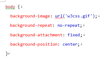
The background-repeat: property sets whether/how the background image is repeated. By default, the background image will be repeated vertically and horizontally.
repeat: (the default option, tiles the image)
repeat-x: (this will repeat the image along the x-axis)
repeat-y: (this repeats the image along the y-axis only)
no-repeat: (this will not repeat the image)
The background-attachment: Background images that do not scroll with the page
Fixed: Background images do not scroll with the page.
Scrolling: The background image will scroll with the page. This is the default
Local: The background image will scroll with the content of the element.
The background-position: property sets the starting position of the background image.
0 notes
Text
Web CSS typography

Initially, we want to insist on the importance of fonts and font styles on the user's machine. Web fonts, firstly, require a font file to be downloaded and included with other font files.
Common font file types include WOFF (Web Open Font Format) WOFF2 , which are supported by most modern browsers. Any browser that supports web fonts will have exactly the font you want to specify. Fonts can be loaded from remote servers or from fonts installed locally by the user.
@font-face { font-family: myFirstFont; src: url(sansation_light.woff); }

With this @font-face rule, web designers no longer have to use one of the "web-safe" fonts. In the @font-face rule, you must first define a name for the font (e.g. myFirstFont) and then point to the font file. Using @font-face does not add another CDN connection to your website, the font files are hosted on your own server. This means that your CSS rules and font files will be cached with the rest of your site. To use a font for an HTML element, refer to the font name (myFirstFont) via the font-family attribute.
This site teaches how to add fonts the easy way and (including custom fonts)
https://www.pagecloud.com/blog/how-to-add-custom-fonts-to-any-website
https://www.makeuseof.com/using-fontface-to-load-custom-website-fonts-with-css/
We can also set the normal and bold values for our fonts, between 1 and 1000 (normal is 400, bold is 700)
0 notes
Text
Responsive Web Design
Responsive web design is becoming even more important as mobile device users make up the majority of website visitors. Mobile devices will become a major source of web traffic. The web by its very nature is flexible.The best responsive websites essentially use fluid grids, flexible images and CSS styles to change the design of the site and render it according to the width of the browser.
Responsive web design is about creating web pages that look good on all devices. Responsive web design will automatically adjust for different screen sizes and viewports. It's about using HTML and CSS to automatically resize, hide, shrink or enlarge websites so they look good on all devices (desktops, tablets and phones).
Responsive images are images that scale nicely to fit any browser size. Display different images depending on browser width.
For responsive text sizes, the text size can be set using the "vw" unit, or "viewport width". This way, the text size will follow the size of the browser window.
Media queries, in addition to resizing text and images, it is also common to use media queries in responsive web pages. Using media queries, it is possible to define completely different styles for different browser sizes.
0 notes
Text
WordPress - Themes & Plugins
The lecture taught us how to choose and download our favourite themes and plugins in WordPress.
Both of these are important and need to fit with the design of our website. Everyone in our class has a Public folder on this server that is linked to our own WordPress accounts and websites.
The theme and plugin need to be downloaded and then the files dragged into the files for the theme and plugin respectively in WinSCP.
When changing the background image, I get an error reported. The lecture taught us how to fix it, need to go to the wordpress folder, then find wp-content, right click on it and select info. Elsewhere select white. Permissions need to be given for this file. Then the image can be successfully added to. The image position and image size can then be changed by customising it.
Installation of the countdown event plugin and how to add it to own page.
0 notes
Text
Researching & Planning A Website
When planning the website, the following seven steps will guide it through the process. 1. Determine the objectives of the website. 2. Identify the target audience. 3. Define a unique selling proposition. 4. Secure a domain name (and hosting). 5. Choose a website builder. 6. Create and collect design elements. 7. Create content for core website pages.
https://www.godaddy.com/garage/how-to-plan-a-website/
It is very important to plan a website and to research and plan it before building it. Firstly the Brief represents the starting point of a project and is a constant point of reference throughout the life of the project. Secondly the Creative Brief. this is produced by the designer in response to a client brief. Client Survey - What is the purpose of the website? What is the perception of what the website should do? Needs Assessment - what do you want to be perceived as through your website? Defining the audience and objectives - user characteristics, needs, interests and goals Task analysis - user tasks, content, features and functionality Competitor audit - who are your competitors? Virtual sketchbook - building an inspirational collection and a competitor's website. Planning and also usability.
Then apply what we have learnt before Navigation - The most crucial part of the page is the navigation, the main objective of the structure. It should be intuitive, natural and easy to use. Header - search bar, login options Context - the content/purpose of the site Wireframe diagram - A simple sketch of the basic layout of the site.
0 notes
Text
Installing WordPress
WordPress is an open source content management system, which means that anyone can use or modify the software for free. A content management system is basically a tool that makes it easy to manage important aspects of your website - such as content - without having to know anything about programming.
It is a very good take on thinking about wordpress, so wordpress is a really popular content management system that is built with php and mysql. It started out as blogging software. Lay people can easily create homepages. Server side The college has a server with access to Knuth to put files on and access them through a web browser.
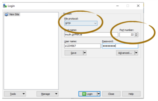
In the lab session we were given our usernames and passwords so that we could log in to Wordpress. there is a college server called 'knuth'. We needed to install an STFP client on our own computer to access and place files on the server. We were given our username and password. We can set up our own kuuth.griffith.ie/~sstudent number/wordpress/ or use this website knuth.griffith.ie/~sstudent number/wordpress/wp-admin/
And we must make sure that we add it to the "public.html" folder on the college server. All the files that are visible to the public on the site need to be placed in this folder.
WordPress has several customisation options to help improve the functionality of your website. From the dashboard, you can control almost all aspects. Different plugins (such as Yoast SEO) and widgets can be chosen to add functionality. I found it interesting to edit and set up my own WordPress site.
0 notes
Text
Dynamic Web Sites Server-side Web Development
So far, we have been working on client-side technologies such as HTML and CSS. Almost all websites are also made using server-side technologies, including scripting languages and databases. Databases are also essential in the modern world.Static websites are those where the content does not change from one viewer to another. However, almost all websites are also built using server-side.
The server-side is the system running on the server and the client-side is the software running on the user's web browser. the main forms of web development are client-side, server-side and full-stack development. Both client-side and server-side programs are necessary for the functionality of a website.
Dynamic websites are websites that contain dynamic pages such as templates, content and scripts. In short, dynamic websites display various content types with each view. Pages can change depending on the reader that opens the page, the nature of user interaction or the time of day.
Server-side scripts: Server-side content is generated when a page is loaded. Therefore, pages that change when the site is loaded use server-side scripts. This means that when a user downloads a different page, a website is created with the help of server-side scripts.
PHP is a widely used open-source, multi-purpose scripting language that can be embedded in HTML and is particularly suitable for web development.
A database is an organised collection of data. It is usually stored and accessed on a computer.
A relational database organises data into rows and columns of a table consisting of rows and columns. Each row in a table is a row. Rows in different tables can be related or linked to each other.
A content management system, often abbreviated to CMS, is software that helps users create, manage and modify the content of a website without the need for technical expertise. It is a tool that helps you build websites without having to write all the code from scratch (or even know how to code at all)
Secure File Transfer Protocol (SFTP) is a file protocol for transferring large files over the Web. It is built on top of File Transfer Protocol (FTP) and includes a Secure Shell (SSH) security component. SFTP is handy in all situations where sensitive data needs to be protected. For example, trade secrets may not be protected by any specific data privacy rules, but falling into the wrong hands can be devastating.
0 notes
Text
CSS grid
This week we finished our reading week and started learning about the most complex topics. Flexbox is also a great layout tool, but it has a different use case for unidirectional flow. CSS Grid is the first CSS module created specifically to solve layout problems and is a powerful tool that allows the creation of two-dimensional layouts on the Web.
All the major points that intersect with the horizontal and vertical lines, a very important point in CSS. We already have these lines and now the space between the lines on these tracks, so this is the track. CSS grids are made up of lines. The space between the lines is called a track. The space between tracks is known as the gap.
We define rows and columns in our grid with gridtemplate-columns and grid-template-rows. If we want to create a tracks, there are many ways to do it.
#container { display:grid; grid-template-columns: 200px 200px 200px; }
#container { display:grid; grid-template-columns: 1fr 1fr 1fr; }
#container { display:grid; grid-template-columns:repeat(3, 1fr); }
#container { display:grid; grid-template-columns:repeat(3, 1fr); }
We can define exactly where items are to be placed in the grid. The first method is to use grid lines.
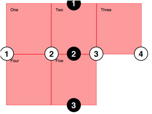
We use grid-column-start, grid-columnend, grid-row-start and grid-row-end to position items between lines. Or use simple way to show it grid-row: start / end and grid-column: start / end.
To understand these rows, it is possible to place exactly what is wanted on the grid, but by drawing precisely on the grid it has to make room for other components, so it is a balance somewhere in between.
0 notes
Text
CSS Flexbox
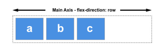
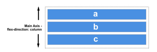
The Flexible Box model, often referred to as flexbox, is a one-dimensional layout model. It provides powerful spatial distribution and alignment between the child elements of a flexbox. A flexbox can only handle the layout of elements in one dimension at a time, one row or one column.
The main axis is defined by flex-direction and can take on four values.
- Row: items will run horizontally from left to right - row-reverse: you can switch the direction of the item - column: the item will run from top to bottom - column-reverse: you can toggle the direction of the item
The flex container
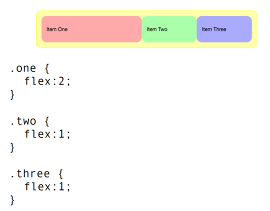
If these elements are expected to automatically expand to fill the remaining space, then it is necessary to control how the available space is distributed between the elements, and this is what the flex attributes on the elements do.
flex-basis defines the space size of the element. The space available in the flex container in addition to the space occupied by the element is the space available. The default value of this attribute is auto.
flex-grow If assigned a positive integer, the flex element will be based on flex-basis, which deals with the flex element adding space to the main axis. This causes the element to stretch and take up the available space on this axis.
flex-shrink property deals with the shrinking of flex elements.
A key feature of flexbox is the ability to align and align items on the major and intersecting axes, and to allocate space between flex items.
align-items has 4 possible values: flex-start: align-items:flex-start flex-end: align-items:flex-end centre: align-items:centre stretch (default)
This justify-content property is used to align items on the spindle, i.e. flex-direction sets the direction of the stream. Used to align items on the main axis.
justify-content:flex-start
justify-content:flex-end
justify-content:center
justify-content:space-between
justify-content:space-around
justify-content:space-evenly
0 notes
Text
CSS links and lists
A link or hyperlink is an important part of a website. It allows visitors to navigate the site. Therefore, setting the link style correctly is an important aspect of building a user-friendly website. A link can be in one of 5 different states.
Unvisited : The default state when a link is not activated, clicked or visited.
Visited: a link that has been visited (exists in the browser's history).
Focus: A link that is focused.
Hover: A link that is hovered over by the user's mouse pointer. a:hover {color:#ffff00;
Active: a link that is activated (e.g. clicked).
Some simple variations can be added to the activity. For example, setting the text to italic. Links can be styled by targeting the a tag a{color:#ff0000;}
Horizontal lists (usually for navigation/links)
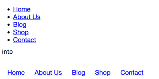
ul { list-style-type:none; padding:0; margin:0; }
When want to change any of the colours of the website, different fonts, remove the underline and make it all capitalised. CSS can be used to set the style of a link, just as it can be used to set any other element. All that needs to be done is to position the elements in the style sheet. want to use. These will make our website more detailed.
0 notes
Text
CSS box model and Layout
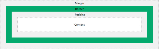
The CSS box model is essentially a box that wraps around each HTML element. It includes: margins, borders, padding and actual content.
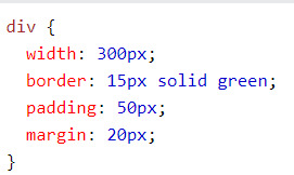
Content -the content of the box in which the text and images appear. The width and height of the content area can be controlled by the width and height attributes. aside { width:20rem; height:12rem; }
Padding -Clears an area around the content. Padding is transparent. The padding is between the content of the box and the edge of the box. The padding will have the background colour of the element. h2{padding:1.8rem; } Can specify a border for the padding. padding-top:10px padding-right:20px; padding-bottom:15px; padding-left:5px; or you can just write it in a line. padding: 10px 20px 15px 5px;
Border -A border around the padding and content. The colour and style of the border can be modified.
Margin -Clears the area outside the border. Margins are transparent. Margin surrounds a CSS box. Used to leave a margin around an object. #sidebar { margin-left:20px; }
After learning this, I learned how to lay out a website in a more aesthetic way.
Image Reference: CSS Box Model. (2021) W3schools. [Image] Available at: <https://www.w3schools.com/css/css_boxmodel.asp> [Accessed 31 October 2021].
0 notes
Text
CSS colour
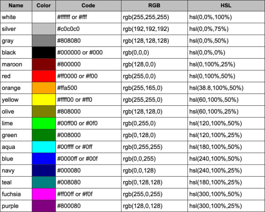
CSS allows us to control the colour of the font, the border width and the background.
To control the colour of the text, we use the colour attribute. This also includes hexadecimal colour codes, RGB and HSL values and HTML colour names.
RGB stands for red, green and blue and is the colour model used by monitors. Since in web design we are mainly concerned with the appearance of the page on the screen, RGB is the colour model we use. between 0 and 255. the first parameter is RED The second parameter is GREEN The third parameter is BLUE
h2{
color: rgb(255,100,6);
}
Hex Values Probably the most common way to specify colours in CSS is to use their hexadecimal values. Hex values can be 0-9 and A-F. Hex values are always prefixed with the # symbol.
h3{
color:#FF0099;
}
I have downloaded the software visual studio code on my computer. I like to apply hexadecimal values. When I type #white, the software helps me to find the corresponding code, which is very convenient. The lecturer has always stressed that we should remember to check the page every so often with the HTML Validator. This way we will always find our mistakes and can change them immediately.
After learning about css colours the web pages look great.There will be a lot of colour and the page comes alive even more. It makes me very excited.
Image Reference: Convert colors back and forth between string, RGB and HEX. (2021) [Image]. Available at: <https://community.plotly.com/t/convert-colors-back-and-forth-between-string-rgb-and-hex/52910> [Accessed 30 October 2021].
0 notes
Text
CSS typography Lab

We started a lab lesson on CSS, which was difficult for me and I had to keep looking through my notes. Had to add font settings, font sizes, colours and series and styles to the previous pages. It was very confusing at first and I couldn't get a clear idea of what I was going to do next. I wrote a lot of code but it didn't work and I realised that my computer was different from the one at school. I could only take my external style.css and change the formatting. Make sure that my html and css are being joined together. I need to practice more.
"Typography" refers to the appearance of all the text on a website. It includes basic CSS text properties such as what font to use and whether it should be italicised, but typography is much more than that. It is about the space between and around letters, words and lines. It's about the size of different text runs in relation to each other, and the history behind each font family. Typography is about style, proportion and spacing. Good typography is not only essential for aesthetic appeal, but also improves the usability of a website when applying the concepts of text legibility and readability. Typographic properties in CSS: colour, font family, font size, font style, font thickness, letter spacing, text alignment and decoration.
0 notes
Text
CSS
This week we learned about CSS. Cascading Style Sheets (CSS ), the language we use to style HTML documents, describes how HTML elements should be displayed. A language of style sheets, CSS describes how elements should be rendered on screen, paper, audio and other media. css is one of the core languages of the open web and css saves a lot of work. Styles can be saved in external .css files by definition, controlling the layout of multiple pages at the same time, meaning we don't have to go through the hassle of editing the layout on all pages. It also makes sense to separate them, more clearly creating separate websites.
CSS (Cascading Style Sheets) is used to set the style and layout of a web page - for example, to change the font, colour, size and spacing of content, or to split it up, or to add animations and other decorative features to the content.
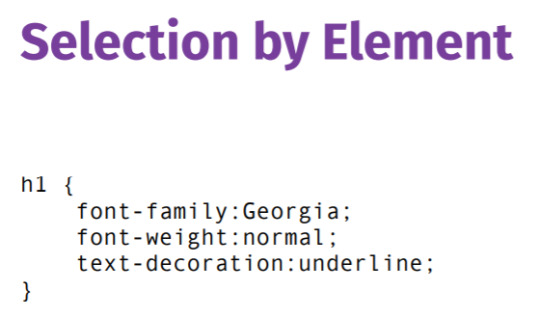
CSS selectors, in CSS, are modes used to select the elements to be styled.
Selection by Element
The most basic CSS selector is the element type selector.This is a name that simply uses HTML tags without the parentheses. For example, if we wanted all paragraphs to have green text, we would use the following CSS rule: p { colour: green; }
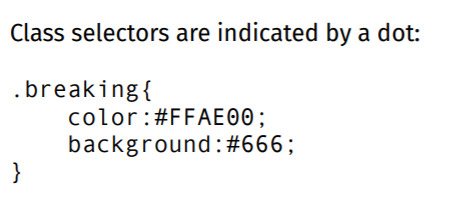
Selection by Class
Matches elements that have a specified class. To match a specific class attribute, we always start the selector with a period to indicate that we are looking for a class value. This is immediately followed by the class The value of the attribute we want to match. For example, if we wanted all elements with the class "highlight" to have a different background colour, we would use the following CSS rule: highlight { background-color: #ffcccc; }
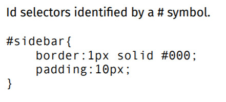
Selection By ID
Matches an element with a specified id. To match a specific id attribute, we always start the selector with a well symbol (#) to indicate that we are looking for an id value. The hash is followed by the value of the attribute whose id we want to match. Remember that we can only use the same id attribute value once, so the id selector will always match only one element in our document. For example, if we wanted an element with an id of "content" we would use the following CSS rule: #content { border: 2px solid green; }
0 notes
Text
interactive digital media industry
1.Email is becoming increasingly personal
Email is still the main communication channel and is still used by billions of people for personal, business, industrial, legal, scientific and academic purposes. In other words, email is here to stay, and email marketing itself is still important.
However, email marketing is evolving and generic marketing emails are no longer as effective as they once were. It is now a combination of automation and, more importantly, personalisation that makes email marketing important in 2021.
This can be very effective when you can trigger email marketing for specific content, such as a user viewing a specific product, and then follow up with a promotional price or demo video in a personalised email. Email is often the ultimate trigger for action, especially when used in conjunction with remarketing techniques.

2.Video is no longer an option
In a mobile-crazy world, people are watching more videos than ever before, using their smartphones to watch and share videos about everything, learning more about brands and what they have to offer. these statistics from
ImpactBND
70% of consumers have shared videos of brands.
52% of consumers claim that watching product videos makes them more confident and guides their online purchasing decisions.
72% of businesses believe that video content has increased their conversion rates.
Video marketing has a high appeal, especially live video. When combined with online marketing, live streaming is a powerful digital marketing method. Whether it's a new generation of social media influencers or traditional sources such as celebrities, athletes and musicians, live streaming with influencers who interact directly with comments is a huge draw for viewers.
Twitch has over 15 million active users every day, most of whom are there simply to watch live videos from influencers such as Ninja. Ninja, arguably the world's most popular gaming influencer, recently signed an exclusive deal with Mixer, a power play by Microsoft in recognition of the expected value of live video streaming in the coming year.
0 notes
Text
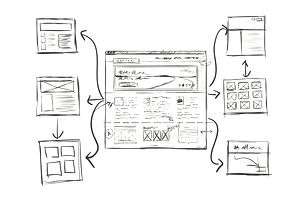
HTML Semantic Elements and Structure of web pages
In class, we looked at the full webpage and schooled to the fact that websites need to have header, navigation, main, content, sidebar, and footer.
This will make it clearer for me to produce the website and the whole thing will become clear.
<div id="nav"> <div class="header"> <div id="footer"> to represent the navigation, header and footer. In HTML, there are semantic elements that can be used to define different parts of a web page.
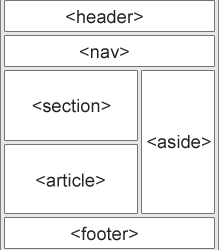
The HTML <header> element is used to display introductory content, usually containing a set of introductory or navigational utility elements. It may contain some headline elements, but it may also contain other elements such as a logo, search box, author name, etc.
The <nav> element defines navigation links. Not all links to documents should be within the <nav> element. The <nav> element is only used for the main navigation links.
The <section> element defines a section in a document. For example: section, introduction, news item, contact information. A web page can usually be divided into sections such as introduction, content and contact information.
The <article> element specifies separate, self-contained content. Examples: forum posts, blog posts, user comments and other text genres. A site can have many articles.
The <aside> element defines some content besides the one it is placed on (e.g. a sidebar). The content should have some relation to the content in the site.
The <footer> element defines the footer of a document or section. For example, author information, copyright information, contact information, site maps, links back to the top and related documents can have several <footer> elements in a single document.
The <div> element (or HTML document partition element) is a general-purpose container for streaming content that has no effect on content or layout when CSS is not used. The <div> element does not semantically represent any particular type of content. However, it can be used to group content so that the format of the content can be easily defined using the class or id attributes
The <nav> element defines a set of navigation links to be used only for the main block of navigation links. Browsers, such as screen readers for disabled users, can use this element to decide whether to omit the initial rendering of this content.
The ID global attribute defines a unique document-wide identifier (ID). It is used to identify elements in links (using snippets), scripts and styles (via CSS).
0 notes
Photo
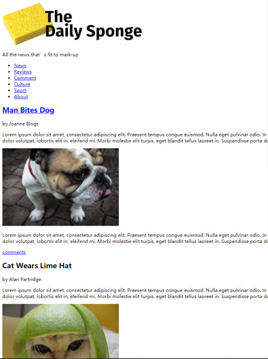
There is My Worksheet: HTML 02
After a detailed explanation by the lecturer in class, we started the lab course. It was very interesting and I successfully made a web page. But I always need to make sure that my files need to be changed to (.html) before I can convert the code into a web page. And when I adding images to the web page, make sure that the name of the image file is the same as the code typed on the website. I think I’m happy to have learned the basics of Web Authoring. I need to practice more.
0 notes