
Don't wanna be here? Send us removal request.
Statistics
We looked inside some of the posts by waterloo-uncovered and here's what we found interesting.
Average Info
Notes Per Post
0
Likes Per Post
0
Reblog Per Post
0
Reply Per Post
0
Time Between Posts
4 days
Number of Posts By Type
Text
17
Last Seen Tumblr Blogs


Fun Fact
In 2020, 27% of US Tumblr users had an annual household income of over $100,000.
Text
Final presentation
https://docs.google.com/presentation/d/12gllrkpsL_jQNVvWdQw99AHRxvSAc7RgJuc6s-BTsG0/edit
0 notes
Text
Final report
Overall, I found this project was so fun in the beginning and I was very excited about our group idea and very passionate about it. I was looking forward to the end product because it was something I’d never done before and we could enjoy the journey as a team unlike the other briefs. Unfortunately, due to uncontrollable circumstances we were unable to carry on with the initial project as a team because we didn’t have access to the workshop which was essential for the project to work and we could no longer meet in teams. I found the closing of uni very difficult because I sometimes struggle with change especially with routine so it was hard to deal with for the first couple of weeks and I seemed to lose motivation.
To overcome the obstacles we’re facing due to coronavirus, we have been using Microsoft teams to communicate with our course mates and tutors to figure out what the best solutions would be to the change in circumstance. In my individual tutorial, we came to a decision that the group project was no longer possible. So I chose to take an aspect of our group project and create something individually. I was mainly focusing on the advertising posters for the exhibition anyway so it hadn’t worked out as bad as it could. It’s just hard to work with no face to face support from either students or tutors.
I’ve decided to design a series of three posters to advertise the exhibition our group were originally planning on creating. I wanted to keep our group idea evident and show the concept through my posters.
The first poster I designed was inspired by a map of the battle of Waterloo which had red and blue rectangles to symbolise the British and French troops so I coloured half the page red and half blue. This is quite basic but I feel it is still symbolic of the project however if I’d have done it using a computer, I would have created a soldier in illustrator and gave half the uniform red and half of it blue and have that as my central image and work the text around it.
My second poster was also inspired by the map of the battle of Waterloo and I decided to redesign it in my own way and use it as a background image for one of my posters. This was probably my favourite of the three. However, if I was to do it with more access to resources I would create the map in illustrator and then transfer it to photoshop and layer it as a background. I would then add the text as separate layers over the top and fade the background image so that the text stands out more and probably play around with edits to make the text more noticeable.
My third design was inspired by the idea of projection mapping, I wanted to have a poster which focused on projection mapping so I tried to make the text look as if it was projected. This was more difficult using pen and paper than I expected so it ended up looking like 3D text with a light shining on it causing it to have a shadow. If I was to recreate this in photoshop I would have an image of a building as the background and overlay this with a dark grey and then I would put the text as if it was being projected onto the building and add a glow effect to make it look realistic.
0 notes
Text
Poster 3
As I wanted this poster to be focused on the text completely, I started by sketching the text out to the right of the page to add effect and and wanted to show the projection coming in from the right somewhere.

I used a faint grid to try and keep my text spaced and lined up nicely.

I went over the text with a black pen and added some thicker sides on some of the letters to try and change the font so that it looked a bit different from my other posters.

I then added a shadow behind the lettering and drew a projector. This idea is very hard to create with pen and paper due to now being able to add a glow onto my lettering. If I were to use a computer I would’ve had a black background and white text and then experimented with edits to make the text have a glow and look as if it was being projected onto something in the background.

I changed the angle of where the project would be due to the shadowing on the letters but now I am typing this up I have thought about it properly and the text would only have a shadow if it was 3D and there was a light being shined onto it from a certain angle🙄
At this point in to project, I am not going to redo my poster but I know where I have gone wrong and explained what I would do differently next time.
0 notes
Text
Research - poster designs
For my 3rd poster I decided I needed to do more research as I was struggling to come up with new ideas and something different from my previous 2 designs. I wanted it to show or symbolise projection mapping or at least projection in some way.


These 3 images insired me to try and create a poster which looked like the text was being projected onto the page.
From previous research, I found some brilliant images of projection mapping but I felt that these inspired the creation of the projection rather than a poster.


0 notes
Text
Poster 2 :
As my first poster design with the map as a background was quite detailed and had a lot going on with it, I decided I wanted to create something with more of a simplistic design like some I found whilst doing my research.

I started by drawing the lettering I wanted to use and then I would design around that. I thought that having the logo so big in the top, centre of the page didn’t look right so I decided to start again as I hadn’t gone too far yet.

This time I decided to draw out some basic grids so that my lettering was straight and I moved the writing to the right side of the page as I felt this looks a bit more professional.

I then added our team name ‘projection mapping’ a little further down and in slightly smaller tect but still big enough to stand out.

Next, I added the date and location of the exhibition. I drew the date quite big so that it could be seen from a distance and was easy for all audiences to read.

I realised that in the last photo I hadn’t drawn the Waterloo uncovered logo properly so I had to rework that slightly and managed to save it. I got rid of the markers around my lettering and decided that I wanted my background to be simple but symbolic.
From my research I decided I wasted to do something with the blue and red to get a bit of a theme going throughout all 3 posters. I wanted the text to be white so that I wasn’t using simple bold black font for all of my posters.

I think this poster would definitely stand out in a public place and would catch people’s eyes. I like the idea of using the blue and red but if I were to being designing this on a computer I would definitely be more creative with it and maybe have a soldier in the centre of the page and colour one side of the uniform red and one side of it blue. If I were to do that I would make sure the text was around the soldier and not over lapping the image.
0 notes
Text
Poster 1 :
I started to design my first poster based on my previous idea of having a map as the background.
I started by sketching out a basic map of the battle of Waterloo.

I added all the major annotations such as Napoleon and Wellington, hougomont and lahaye Saint. I started to colour in the rectangles which were to show the French (blue) and British (red) troops in Brussels.

I then started to add some more imagery such as trees etc to give a basic understanding of the area the battle was in. I also added papelotte as this is something which I remember being important when we first learnt about the battle of Waterloo.

I then added the information which was vital for the poster. I drew a faint grid on the poster to line up my writing. This is something I struggled with quite a lot and I definitely find that aspect of poster making much more precise on a computer. I also added the Waterloo uncovered logo on to the poster and copied it the best I could by hand.

To finish the design, I went over the letters with a thick black pen to create the same effect as a bold text on photoshop.
Overall, I like to map as a background however if I were to create the same design using adobe I would fade the map so that the text stood out more and I would have reliable grids so I could line everything up on the page nice and neatly. I would also move the location and probably have it at the bottom of the poster but the reason I didn’t do these things by hand is because I’d already spent a long time on the design and you can’t delete certain aspects like you’d be able to on the computer so I would have to keep restarting every time something was to go slightly different to how I would’ve wanted.
0 notes
Text
Poster designs
I started to think about what is going to be on my posters in terms of imagery and colour.


As we were going to create a physical map for our group project I decided that I definitely wanted to bring that in for my posters and thought that having my background as a map for one of the posters would be effective as it is eye catching to passers by and shows exactly what the exhibition is going to be about.
0 notes
Text
Research
I had a look at some more advertisement posters for events and compared them so that I could see qualities the all share.


Similarities:
Simple imagery associated with the kind of event.
Big bold lettering which takes up the majority of the posters.
Not too much writing.
Colours that are eye catching.
The title of the event usually being the area of the poster which stands out most.
0 notes
Text
Individual teams meeting
This week we had individual meetings with Juan and spoke about our individual worries. My main concerns around this brief are that I can’t access a laptop or computer and I don’t really know where to go with the project from now.
Juan said that due to the situation we are going to have to take more of an individual approach and although our original team idea was great and would have been amazing to make, it is literally impossible without access to uni rescourses such as the work shop and meeting our team face to face.
We went through what my main focuses in the team project were going to be which was to create the advertisement posters and work with Tom on creating the physical 3D table and map.
As I have little access to recourses Juan agreed that I could create the posters using pen and paper.
This has worried me a bit because I don’t think I will be able to achieve the same grades as if I were to create the posters digitally however in these circumstance we can only do our best.
0 notes
Text
I have not really managed to get much work done with all this going on as coming back home has had both a mental and physical strain on me. I am having to home school my 8 year old sister as well as trying to get my own work done and help to look after my mum as she isn’t very well at the moment.
The change in circumstances is definitely going to affect my work but I am going to try my best to keep going with uni work and keep my motivation as it is hard to find in a situation like this.
I am doing what I can to keep my work to a good standard but I am just unsure on how to create my posters digitally.
0 notes
Text
Teams Meeting
Today we had a meeting on teams with the class as a collective and Juan and Kat. We just spoke about general worries related to the coronavirus and asked any questions we had.
At this point it is still very uncertain as to if we will have extensions on our deadlines etc. However we have been told to carry on working on our projects and just wait for the next update.
Due to being furloughed from my job and uni closing I have come back home to spend some time with family and so I am not in lockdown alone.
My resources are very limited as I only have my iPad to work off and I cannot get any adobe cc apps on there which I was relying on the create my posters such as photoshop and illustrator.
0 notes
Text
What makes a successful poster to advertise an event?
Should create excitement for the event.
Readable from a distance.
Location of event.
Date and time of event.
Company logo - e.g Waterloo uncovered
Images - probably one main focus image or image as a background.
I have also been looking further into canva.com and piktochart.com for some inspiration as Alex mentioned them both for me to look into.
https://www.canva.com/design/DAD8y1zdP1o/37EHRMotcQwvfnHwfGuaaw/edit?category=tACZCj2_CiY
https://create.piktochart.com/poster
I found that both websites were to design posters so I had a go at using them and as I was very unfamiliar with both I was struggling to do basic things such as inserting images and moving things around the page and lining things up. I decided against using them for my final project.
0 notes
Text
Coronavirus- uni is closed
Due to coronavirus we have been told that the uni is going to be closed until further notice so we are having to complete all uni work from home. I think this is going to be a huge change for many people including students and tutors and I’m not really sure how this is going to effect each module yet.
My worries :
This is a team based project so how are we going to carry on as a team from such distance?
The artefact we were planning on making involved digital and physical content and if we cannot meet others from the team then we will not be able to put this project together as we all play an individual role.
How will we communicate with tutors?
How will we communicate with Waterloo uncovered?
I don’t have a laptop that supports adobe so I’m unsure on what I can create my artefacts on.
This is a very uncertain time so my plan is to keep going with my poster designs and just wait until we know more about what’s going to happen.
0 notes
Text
Poster Research
Before I started creating my poster, I decided to look for some inspiration by looking at examples of other posters. I looked on canva.com and piktochart.com and found the following examples interesting.
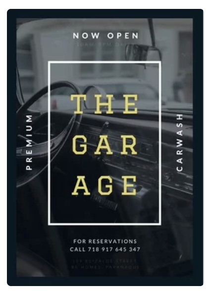
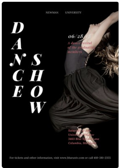
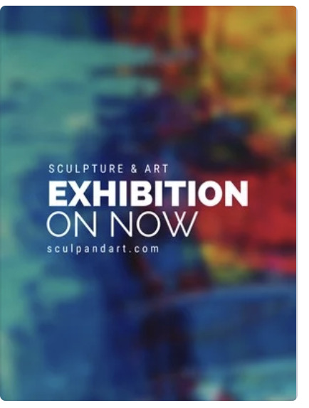

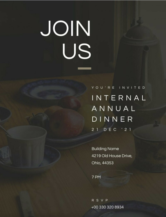
From looking at all of these posters, I decided that I wanted to have just one image on my poster as a background. Also, I think that the poster is more appealing with a small amount of text as no one wanted to stand and read lots of text. As our group is doing projection mapping, I decided that an image of a map would be most relevant to the poster.
0 notes
Text
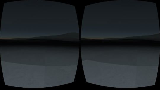
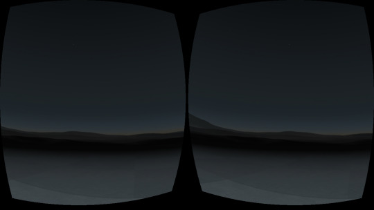
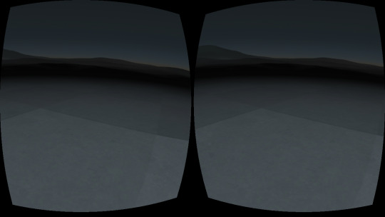
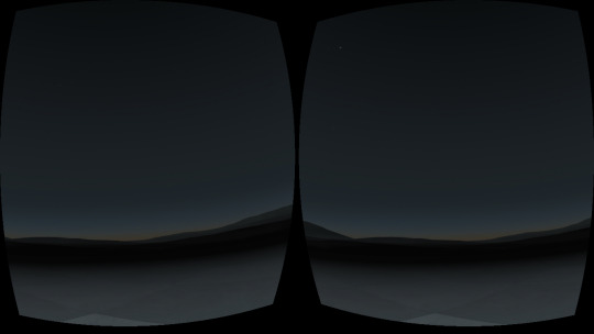
VR - creating a VR environment
This session, we learnt how to create a VR environment using Git Hub.

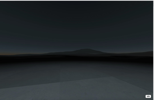

We made it work on our phones and tested it out using a Google cardboard.
This is what it looks like on a phone screen:
0 notes
Text
Week 7 - Mixed Reality Experiences
Virtual Reality :
Augmented Reality :
Mixed Reality :
Extended Reality :
0 notes
Text
Week 6 - blender session.
This afternoon, we had a blender session with Alex where we learned how to work with 3D in blender and started to look at short cuts of how to do the basics on blender.

0 notes