
Don't wanna be here? Send us removal request.
Statistics
We looked inside some of the posts by wcarterarts245-246 and here's what we found interesting.
Average Info
Notes Per Post
0
Likes Per Post
0
Reblog Per Post
0
Reply Per Post
0
Time Between Posts
18 days
Number of Posts By Type
Text
17
Last Seen Tumblr Blogs


Fun Fact
Tumblr was named as a finalist in Lead411’s New York City Hot 125 in Aug 2010.
Text
Final Course Reflection (245)
This course has been quite the experience, especially considering i completed it all out of order and finished 246 before 245. But despite completing the earlier course *after* the later one, I did still find myself still learning new skills and ways to approach a project I did not think of before as I continued to interact with our art programs and completed our assignments. Every project either taught me how to think critically while how to stop overthinking every step, or it taught me a new mini-skill that I could honestly find useful in the future. I've become more adept with Adobe Illustrator as I became used to the pen tool and how to make better curves, I got to get a lot of practice in with precise cutting and replication, I interacted with new materials and furthered my understanding of grids through physical application, and I got to experience something similar to working for an actual client with our moodboard activity leading into the final assignment.
I have to say that the final project (while stressful) was probably my favorite of the bunch, mostly because I was allowed a lot of creative freedom and I was able to produce something that I genuinely felt was some of my better work. Especially since I was able to work fully digitally (my specialty). The main hurdle I faced in this class (that wasn't physical media related) was always the first stages of every project: the figuring out phase. What should I do? How do I even go about it? How long will this take? It's always a hassle. In the end though, it was worth it as this felt like a very satisfying experience and I get to walk away with some works that I can be proud of. I enjoyed this semester, despite how busy it was.
0 notes
Text
Blog Post 9 Mood Board (245)
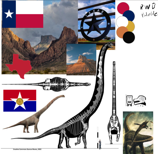
This week in 245 the class has started working on our final project which is a brand/logo redesign for one of the four WNBA teams that we were given. After scrapping my original idea, I have decided to focus on rebranding the Dallas Wings. Although founded in 1998, it wasn't until 2016 that the team was relocated to Dallas, Texas and and turned into the Dallas Wings. With a vibrant green and blue color scheme, the team's symbol of the Pegasus is the unofficial mascot of Dallas Texas with its history going way back to the creation of the Magnolia Oil Building and its signature red horse. While I love the messaging and the history behind the Pegasus, I felt that the colors were tacky and that I could do something more unique than a Pegasus (as there are plenty of teams and brands already using a horse/Pegasus in their design). The idea was to have the new symbol be connected to Texas, keep the feeling of power and majesty from the pegasus, but also be able to create a cool and strong visual. For this, I chose to look into state logos, animals, plants, etc and eventually found a list of state dinosaurs.
Considering the dinosaur for the state is interesting, the name for it gives room for creativity, and it’s design is iconic, I chose to go with the mascot of the Sauroposeidon. The Sauroposeidon (Meaning “Lizard Earthquake God”) has a recognizable and iconic shape like the rest of the sauropods with long necks and strong legs. The names I can immediately think of with this in mind are the “Dallas Dinos” or the “Dallas Quakes” which can represent how their presence 'shakes' the court. Sadly, sauropod footprints look more like blobs than anything else, so sticking with the actual dino will be the focus. I will be trying to create an interesting, yet simple logo design utilizing the creature's long neck and tail while also bringing in some imagery of the state it calls home. I will also be using the colors from the state (and city's) flag using primarily red/white/blue with potentially yellow accents and aiming for the Outlaw or Hero archetypes, whichever sticks more as both could arguably apply to the Wing's design language.
0 notes
Text
Blog Post 8 (245)
This week's reading was the appendix/final chapter of our assigned book: "Thinking With Type". There were a few things mentioned before in class, however the reminder was appreciated. The chapter, in summary, is a large list of smaller tips, notes, and tricks meant to help the reader with their writing and how they construct their text (both in a graphic design but also in a general/professional setting). I could honestly take a lot out of this chapter, and probably should take some notes as I'll likely need to use these in the future.
As for the latest updates on our projects, we have entered the final stages of our 27th letter project and are now designing and finalizing the 3 spreads/6 pages that showcase the letter and the font it is based on. I'm honestly enjoying this project, but constructing page layouts are always a struggle for me so it's been quite the effort. I decided to go with a blue and green split for my two letters, and trying to keep things simple with solid shapes to help block off the pieces of the pages I need and to help manage the amount of empty space. There's definitely some work still ahead of me though as I know I can do better and am glad I managed to get some critique on it before the weekend.

0 notes
Text
Blog Post 7 (245)
This week's reading was all about Hierarchy, Web Hierarchy, and Web Accessibility. This is a topic that both the class and I are familiar with at this point since our "gray readings" project was, in part, an exercise of hierarchy but of course understanding a grid. The short of it is simply a means of organizing data, so a reader knows where to look on the page especially if they are searching for something or even just following along the text. It's all about emphasizing what's important. This can be done in many ways, whether that be the size of the text, the thickness, the spacing, or the literal order things are laid out. This chapter wasn't anything groundbreaking, but still informing all the same as this is something I need to be more than aware of going forward.
Anyhow, we sidestepped away from our project to try our hands at developing moodboards for a "potential client", asking them various questions and using that information to collect together a series of images and colors to form a base of inspiration for the logo's design. It's used to help collect thoughts, create references, as well as plan out the initial stages of the job and doing it in a way that's sure to satisfy the client by sticking to their interests. This was a fun exercise for me, especially since our client's interests happened to line up with a lot of mine, both making this exercise easy and engaging.


0 notes
Text
Blog Post 6 (245)
This week's reading was all about the anatomy of type alongside all of the technicalities that are involved in a typeface and how it all interacts together. I sincerely need to commit the anatomy of letters/type to memory as it is not only useful to our current and upcoming project, but will more than likely be handy to know as the semester goes on. Outside of the anatomy, the chapter went over plenty of other attributes that fonts include such as their weight, the x-height, scale, and classification. All of this information is extremely relevant to both the previous and current project the class is working upon.
We have officially started working on our new project, which in simple terms involve us using letter anatomy from our chosen fonts (a serif and a sans serif) to create the "27th letter of the alphabet". We then have to name it, determine the noise it makes, and note where it goes in the alphabet order. There's more that comes after to showcase it but right now the focus is upon the creation and refinement of the letter. I have chosen my two fonts by looking through the already existing adobe fonts and selecting the two I thought looked best (and usable for this project): Verdana and Javanese text. I will attach below the two letters that are currently my best and will be worked on for the project going forward.


0 notes
Text
Blog Post 5 (245)
This week's reading was pages 80-94 of "Thinking With Type" which covered the concepts of kerning, tracking, line spacing, and alignment. The principle of each of these things were simple, all being reduced down to "spacing in type" with kerning being the space between letters, tracking being the space between words, line spacing being the distance between each stacked line of text, and the alignment being about where you place/how you arrange the text on the page. This is all an oversimplification of course. Anyhow, this perfectly lines up with the project we just finished as it was a hand-tracing assignment about the spacing between letters and words, where we had to kern the text we were given by hand.
Moving on, we were just assigned our next project which will take roughly all of October to complete and the first stage involves creating a brand new letter of our own in a type face of our choosing. I think that this is going to be an interesting yet very challenging assignment.


0 notes
Text
Blog Post 4 (245)
This week's reading was pages 61-80 of our assigned book, giving a solid overview of how the transition of handwritten all the way to digital text affected both the ability to make corrections to a piece of text, but also emphasis on things such as spacing and the flow of text. It gave a lot of examples of how certain artists and writers have played with the structure and flow of their text, making for some really unique reading experiences (I'll add some pics below). This feels pretty relevant considering our next project considering it's all about spacing and kerning. While I may not have gleaned anything really new from the text since we've talked about this topic on and off earlier in the reading and went over it in class, it was still an interesting read.
Aside from the reading, we have now completed project 2 and have moved onto project 3! I'm pretty proud of how my 3 arrangements came out (forgot to take a picture) but it certainly was a task finding the proper materials and things to scan to make it all happen. Considering the next project is essentially just tracing and re-spacing, I'm looking forward to this task as I feel I'll have a much more relaxed time with it.


0 notes
Text
Blog Post 3 (245)
This week's reading was pages 138-156 of our assigned book, which went over the golden section as well as single column, multi-column, and modular grid designs for page layouts. We went over this material in class as well, talking about the value of each layout and what each of their strengths were. Also, this leads us into our next project now that the 9 squares have been completed and turned in.
So far, the idea is to take snippets and pieces from physical media (newspapers, magazines, books, etc.) and Xerox them, then organize those pieces to form a unique page layout by the density/spacing of the page text. These will be asymmetrical designs that are meant to showcase our understanding of grids and how to assemble them. I will need to keep looking for material to use for this project over the weekend as I don't think I have a large enough sample size. I am not sure yet how hard or how time-intensive this project is going to be but it sure seems interesting.

0 notes
Text
Blog Post 1 (245)
This week's reading was the first chapter of our book: "Thinking With Type" by Ellen Lupton. The first chapter primarily talked about the history and origins of type as well as typefaces, listing numerous dates and names of those who were behind some of the most notable fonts still used today. It also talked about the early constraints of type and how it grew and changed as time passed, with each invention and advancement allowing for more creativity. I'm often not one for history, but I found this reading to be both very entertaining and informative.
Past this, the first project for this class is underway. We are doing a 9-square project where the goal is to take the face of a celebrity on a piece of physical media, and through the use of copy machines and hand tracing/cutting, and create 9 versions of their face each in a 4x4 inch square which will then be pasted neatly onto a large piece of black paper. The celebrity I have chosen for this project is Ben Affleck, who (for me at least) is most notable for his semi-recent role as the Batman in the DCEU.


0 notes
Text
Final Blog Post
Now that the course is ending, I realized that I learned a lot looking back at all that we’ve done. Firstly, I got to get pretty good at Indesign which will be helpful in the long run especially if I keep going into the graphic design route, and secondly I was taught in various different ways to think outside the box and was guided to start gearing my mind in a more professional manner when it came to my art. Regular check- ups and critiques are incredibly helpful, and the importance of deadlines has never been drilled into my head more than it has here. To say the least, I do think this class has helped me prepare for my future, whether it be in this particular field or not. And if not, then I think I’m at least a little bit better for it.
0 notes
Text
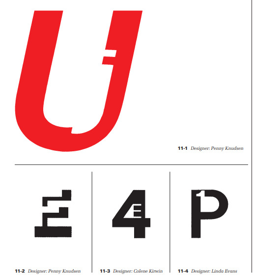
Blog Post 12 (Chapter 11 review/weekly reflection)
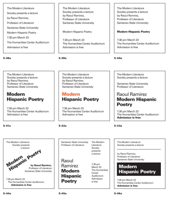
For this week’s reading we went further into our book and read chapter 11: “Typographic Design Education”. This chapter touches on quite a few things, mostly demonstrating various ways and styles of typography that can be put into use such as letter/digit configurations which I really liked (image below). However the lesson it was trying to teach was how typography is involved with the world as a whole, and how society is only becoming more and more focused on the use of visual media in daily living. Following that, the chapter highlighted the importance of having a good typographic education as technology as well as design advances and changes with the times, as well as developing a keen sensitivity to develop more effective designs no matter the state of the art is currently in.
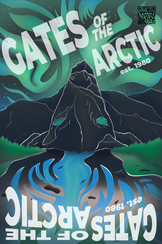
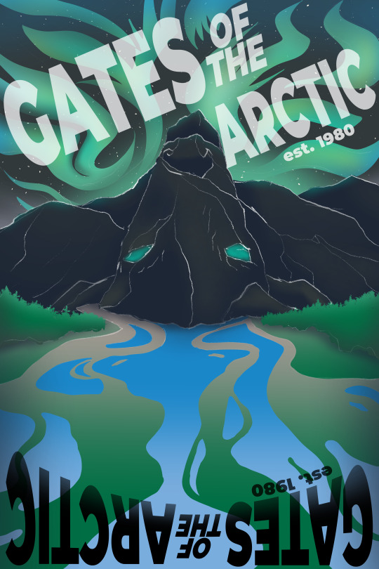
To recap this week, two things happened: we first got to the end of our TypeHike projects and turned them in this Thursday and we have officially gotten into the thick of our design process books. With the TypeHike, I’m actually proud of the final result that I was able to create as I believe it to be a satisfying design and honestly a poster I might hang up in my own room. The idea of the poster was to create a flippable design for the Gates of the Arctic National Park where both orientations show a different image, one side a mountain range with wild rivers and the northern lights in the sky, and the other showcasing a reindeer made out of the landscape. However the process books which are a means of showing all of this semester’s work and the process of how we made them is only now really underway. I’m taking a somewhat simple approach to this design utilizing simple blue shapes to create a more informational layout so that I can go fully into my descriptions while also having the space for images, all while hopefully not taking up too many pages.
0 notes
Text
Blog Post 11 (Chapter 10 review/weekly reflection)
For this week’s reading we continued onto chapter 10 of our books: “Case Studies in Graphic Design”. The chapter talks about some of the unique problems that graphic design artists run into when trying to create pieces that are both functional but also interesting in form to convey information in a unique yet entertaining way. This problem can stem from many things such as the density of the information, how the message is meant to be conveyed, and how quickly the audience is meant to grasp the idea. Through the use of selective typeface, alignment, spacing, sizing, pacing, and various other skills any artist should be able to deliver any sort of information or message through the creative use of type.

To reflect upon this week two major things occurred. Firstly we entered the final stretches of our TypeHike projects, we all now have solidified our ideas for our park and composition and are now mostly refining what we have so that we can get everything ready and printed by the now upcoming Thursday next week. I enjoy the concept that I came up with and do believe that if I nail down the contrast to fully cement the flipped poster idea, then I would have created something that I am genuinely proud to add to my own personal portfolio. Past that, we started up our design process books and submitted our cover designs and some basic planning for our spreads, so we will start working through the book in the coming week as I go back and make sure that everything is as perfect as I can make it.

0 notes
Text
Blog Post 10 (Chapter 9 review/weekly reflection)
For this week’s reading we took a look at chapter 9 of our assigned reading which was all about typography in time and motion. While most of the chapter’s teachings used examples of film and video formats using text, it still easily applies to still image formats. Through the use of placement and order, you can determine/influence what the audience will read first to convey a message in a unique manner or in parts; however what’s really important to this chapter is pace, movement, and rhythm and how each can affect the audience. Each of these aspects allows the artist to control how the viewer consumes the information or allude towards a specific meaning, all of of which are things I will have to experiment with going forward as I am unfamiliar and inexperienced with this particular use of lettering.

To recap this week we continue our work with our TypeHike projects, where we create a promotional poster for a national park of our choice. While I am still unsure which of the two directions would be more effective, I do know which one would be more interesting if performed well and communicated effectively. After listening to Tuesday’s critique, I got an idea to create a poster design where it works both rightside-up and upside-down while advertising the Gates of the Arctic national park. Considering the prominence of the Northern Lights at this park alongside the winding rivers and imposing mountains, I thought it would be a great idea to make a composition where one side shows a mountain range with the northern lights creating a simple yet effective landscape but when flipped shows an abstract deer make of the mountains with the rivers as it’s antlers. I’m playing around with the idea alot to try and produce something that effectively conveys both, but as a backup I’m also planning a simple composition where it’s a vast distance with a hiker, using layering and fading colors to establish distance.
0 notes
Text
Blog Post 9 (Chapter 8 review/weekly reflection)
For this week’s reading we continued with chapter 8 of our book which talked about typography on screen. Essentially it overviewed all of the aspects of type such as: fonts, sizing, and spacing to make sure that any text you apply on a digital format is readable on screens of all shapes and sizes. Especially worrying about legibility in differing resolutions, which is where I learned what exactly anti-aliasing and hinting actually is. Until now they were just keywords that I knew but couldn’t really define. Anyhow, some key takeaways that I got from this chapter is the effectiveness in simplicity, especially for body text because shrinkage leads to great loss of detail which can easily muddy the type. That and also the fact that the use of only capital letters slows down reading and comprehension, which I honestly neve really thought about. So keeping a healthy mix of upper and lowercase letters while only using capitals for emphasis and points of focus is vital.
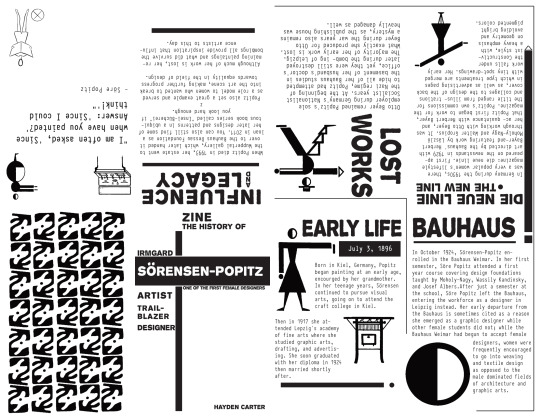
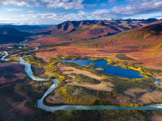
To recap all that happened this week and prior is that we have completed the “zine” project and handed them in this Monday then soon after announced our new project. Firstly, the artist I chose for my zine was Sore Popitz, a female German designer who worked in advertisement and magazine design then later painted for her late career. I chose her because I was attracted to her simple, unique, and very effective art style which was able to communicate so much with so little by using well placed text and minimalistic figures. The process of making the zine was one of the more enjoyable ones I’ve done so far in this class, especially with how the result looked in the end. Although, I was a bit devastated when I noticed a few small type errors in the body/info text right before I was handing it in (which I am honestly surprised I didn’t catch beforehand). Besides that, we started work on our new project which is creating a poster to represent a national park of our choice, of which I chose the “Gates of the Arctic” up in Alaska. My idea so far is to create something with a lot of perspective/focus to create this sense of depth due to how far and dense this park is. Either that or to make use of some of the wonderful phenomena such as the dark gray mountains, the snow, the winding rivers, or the northern lights that occasionally appear
0 notes
Text
Blog Post 7 (Chapter 6 review/weekly reflection)
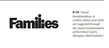
or this week’s reading, we took a look through chapter 6 of “Typographic Design: FORM AND COMMUNICATION” by Rob Carter. In this chapter, the text revolved around the use of typography as an art form and how to use it in a much more aesthetic and artistic manner rather than purely informational. The purpose of the text is to still convey information to the audience of course, however crafting them in such a way that the shape of the letters either further the message of the text or portray it’s own meaning. This can be used in a visual/verbal sense such as the zipper example in the chapter or even simply though transforming the text to suggest a visual such as the family example. Regardless, the use of text in a more dynamic/creative fashion in this way is definitely something I’m much more interested in and may be able to apply to my art in the future.

To recap this week, two main things happened: we completed our brand/logo project and we started up a new project. Firstly, I am quite happy with how my brand design and stationery came out as not only do I think that I managed to make a unique look through the BedBerries brand and was able to craft a very clean stationery set with the letter, business card, and envelope, but that I was also able to actually deliver the design on time. I am sad I wasn’t able to get a hold of some better materials to make proper physical drafts of each piece of the work as the normal printing using the machines on campus use standard print paper which is very floppy, smooth, thin, and gives off a shiny ink print which is honestly quite unsatisfying. If I could reprint everything with better paper/materials, I feel the vision would have come through fully. Secondly, the new project we started up was the “zine” project, of which I am only now starting. I had a bit of a late start due to an excused absence on top of a lack of an assignment sheet/rubric, but I should be able to catch up quite quickly (I hope). For now I need to choose a person to research and then make a Zine for them using only typography (which is heavily related to this chapter).


0 notes
Text
Blog Post 6 (Chapter 5 review/weekly reflection)
This week’s reading was on chapter 5 of our assigned book which was all about “Syntax and Communication”. Essentially, from my understanding at least, syntax used properly is meant to create a composition via text that is intuitive and fits well within the page. From there you can have fun with it and create some truly interesting ways to convey certain information. The smallest of changes within the text’s size, weight, or line length can affect the emphasis given to any line and effectively alter the whole composition. While this form of art certainly isn’t my type of thing, it is good to learn more so that I can perhaps apply some of this knowledge to some of my other future projects.
To recap this week, we were more or less just continuing our work on the logo project with the new focus being on creating a stationery to go along with our imaginary brand. So that means I need to work on creating a letter, envelope, and anything else that would be attached of which my company would send to our customers or advertising to potential customers. This is a very good challenge in terms of design, as I now need to carry over the aesthetic I created to a new medium and in different forms; however I do not like printing as printing does not like me. Picking out a specific paper, creating blueprints for a print, and then actually sourcing or hand creating this stationery is a big challenge. I can appreciate getting out of my comfort zone, but I’m very far from it here.
0 notes
Text
Blog Post 5 (Chapter 4 review/weekly reflection)
For this week our reading was on chapter 4 of our assigned book which focused upon “The Typographic Grid”. What this is, is in my understanding, the art of organizing a page through the use of grid systems accompanied with appropriate use of font, spacing, and size. We were introduced to this, as a class, at the beginning of the semester with our second project “Humans of New York” when we had to use a grid to design a poster/one-page using a picture of a person (or multiple people) alongside their story with a heading to match. Anyhow, there’s plenty of techniques in here that I feel apply directly towards my field when it comes to creating compositions without or not primarily focused upon text such as concept boards or comic books. The effective use of spacing and angles upon a page work towards making the spread unique and fun to engage while also directing the viewer’s eyes towards a certain direction. It’s a skillset I’ll need to develop going forward.

To recap this week, more progress has been made on the logo/brand development front. I have decided to choose the logo of a strawberry with a nightcap to represent my brand and to push forward with my design idea. While it may not be the most simplistic logo, it certainly is very aesthetically appealing and I feel it works very well in standing out from the rest of the brands while being straightforward in what it represents. "Bedberries" is a fruit-themed company that revolves around sleep/sleeping related products, both of these elements existing within the logo with the strawberry as the fruit of choice (iconic and easily recognizable) wearing a nightcap (symbolic of sleep/nighttime). The strawberry definitely shines through more as it is larger and very front-facing, potentially obscuring the idea of sleep/nighttime, however there are other very successful companies who use images of fruit for their branding that aren’t immediately clear towards their products (ie. Fruit of the Loom). So even if there is doubt as to what this company does, the existence of the symbolic nightcap as well as the name “BedBerries” should at the very least hint towards the idea of my brand. Past that, the design progress on that logo has been in short, cleaning up the design and adding a colored variant of it. I am still deciding on the text/font for the branding but I am aiming towards something either fun or relaxed as I feel that fits the tone well.

0 notes