
Last Seen Blogs

adee305
Untitled

aeiooou
개울가에 돌 던지기

marysrhetoricportfolio-blog
Rhetoric and Law Portfolio

thehollyraven
professional elfilis apologist

iamloved-by-you
FAITH without action is DEAD ^_^
Text
Evaluation
010520
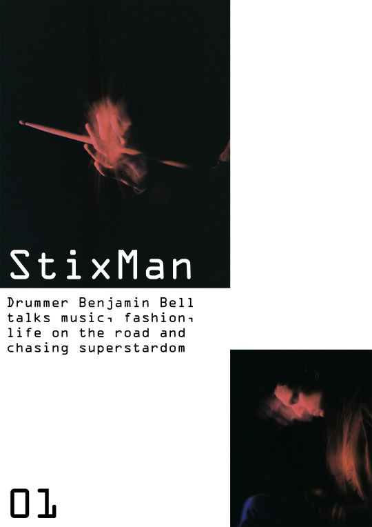
Project Title
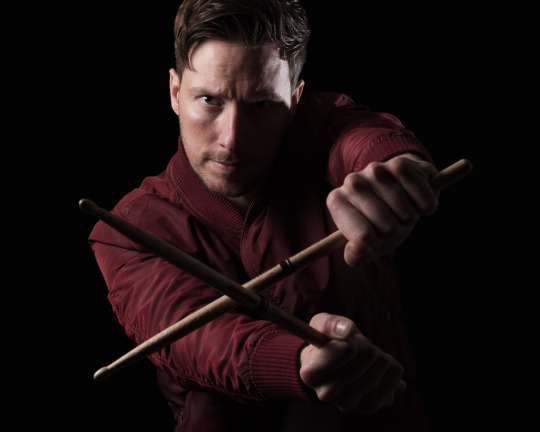
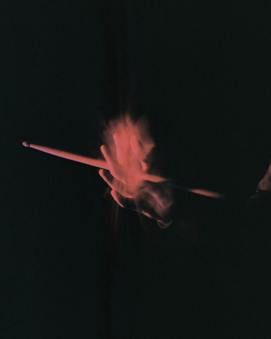
‘Visual Sound’ was the title that I selected in my project proposal. It is still a fitting choice for the theme of the work; however, ‘Stixman’ is the final title that appears in the magazine mock up of my submission. I thought the colours suggested that Ben was a superhero and the energy radiating from his drumstick was a superpower. There is also mirroring of this motion blur with the shape of the ‘x’ in the text.
Conceptual Engagement
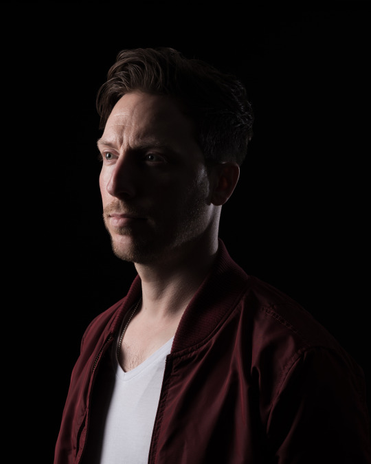
Characterising the rigour of Ben’s drumming in a portrait, while staying true to his likeness, was the idea that I explored in this project. Staged construction of an artificially lit series was also specified in the brief. I felt that creating a scenario where my sitter could express himself freely allowed me to introduce a reportage element to my approach. Smith’s London Calling (1979) and Andrew’s Mura Masa (2020) were the initial visual references that set the tone of the piece - collectively they brought together authentic and revived retro nostalgia for music photography. I am satisfied with the final three analogue images selected for the layout, which I thought were most appropriate.
Creativity
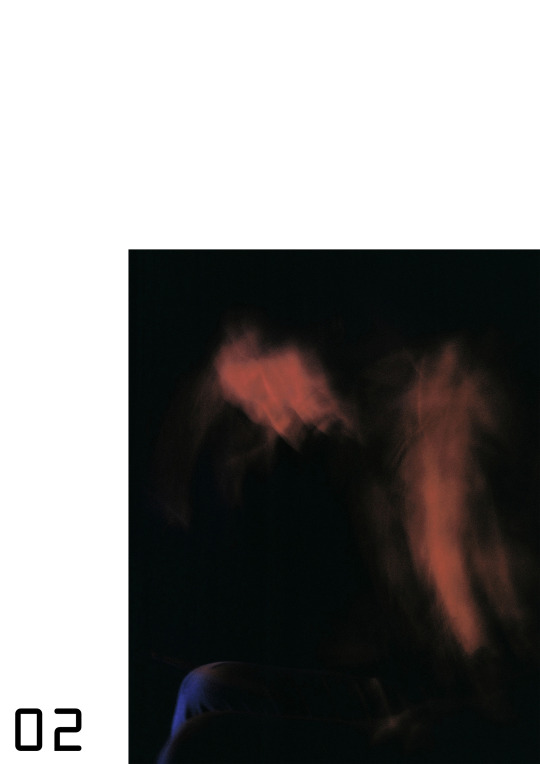
A digital version of the assignment was produced in parallel citing Martin’s Deontay Wilder (2019) editorial shoot for GQ. This style was so close to my current photography that I have abandoned it for the submission. It represented a safer choice with a guaranteed outcome. A passion for film photography has been rekindled during my studies at Westminster University. It reminds me of the freedom that I enjoyed as a younger photographer, who at the time, paid no attention to technical criteria. The result is a rework of my first Constructed Photograph project. On this occasion, I examined the use of motion blur to express visceral emotions. It was a personal challenge and the surface appearance of the photographs is almost unrecognisably me.
Coherence
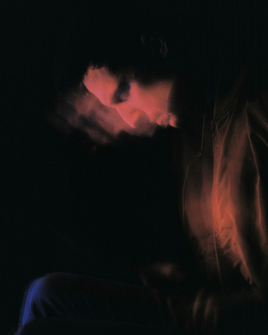
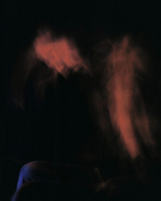
Two rolls of film were shot for the final piece. I did some digital tests to establish a baseline exposure setting then I sought results by pure intuition. Observing Ben’s actions allowed me to be selective of the moments that I photographed. There was a degree of choreography when I asked him to repeat ones that I knew to be visually stimulating. In the final edit, his drumstick is given the main focus by appearing first - it is the tool of his trade and a defining extension of his personae. The blurred images to follow, also in a furious red and colder blue, are further representations of him. It was commented during feedback sessions with my lecturer Ochi Reyes, peers, friends and family that I could perhaps have two triptychs of each composition. My justification for the final edit is that the series appears scattered in a similar manner to drumming itself.
Technical Control
The analogue process invites unpredictability and there is a charm to the faults that may arise. As a seasoned practitioner, I am comforted by technical boundaries and they have been conditioned in me to some extent. I was pleased with the approach I used for this project and it was a welcomed deviation. An analogue and digital hybridisation of photography is an avenue that I shall pursue further. This workflow gives me a balance between control and creativity. Colour darkroom printing was extremely demanding. Working in the dark took practice and an appreciation of colour balance is something that I will take away from this assignment. In the future, I welcome a return to the darkroom and perhaps producing photography of a larger scale.
0 notes
Text
Production Journal - GQ
060320
The final presentation of my photographs for this project should be appropriate for a men’s lifestyle magazine. GQ is a publication that would print an editorial shoot of this nature and I shall use it as a case study. The magazine’s focus is fashion, style, culture, fitness, music, travel, sports and technology for a male market. An article by photographer Matt Martin is the basis for my project and I will consider the requirements of print and digital platforms.
Gentlemen's Quarterly (GQ), formerly Apparel Arts, started as a men’s fashion magazine for wholesale buyers and retailers. It was launched in 1931 in the US for a limited run; however, its popularity promoted the advent of Esquire Magazine and other publications that built upon its success. Apparel Arts was rebranded as Gentleman’s Quarterly in 1958. The acronym GQ followed in 1967. It was later acquired by Condé Nast, who added articles beyond fashion. Various editors have influenced the reader base over the years - Nonnie Moore as fashion editor dressed up the pages to make the content approachable yet aspirational then Jim Nelson attracted younger and more casual readers. Finally, the term ‘metrosexuality’ was coined in response to the lifestyle that GQ promoted - ownership of an impulse to shop for high fashion. It is thought to trace back to a Mark Simpson piece for The Independent via his book Male Impersonators (1994), ‘The promotion of metrosexuality was left to the men's style press, magazines such as The Face, GQ, Esquire, Arena and FHM, the new media which took off in the Eighties and is still growing. They filled their magazines with images of narcissistic young men sporting fashionable clothes and accessories. And they persuaded other young men to study them with a mixture of envy and desire.’ (Condé Nast, 2020)
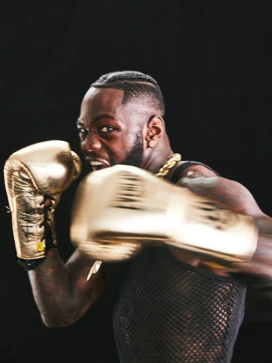
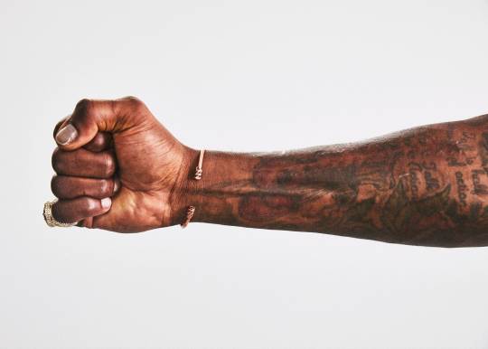
Matt Martin is a New York-based photo editor and photographer. At GQ Magazine he has held the positions of senior visuals editor and visuals editor from 2015 to 2019. As a former e-commerce and product photographer, there is characteristic precision to his style - colours are true to life with lighting that elevates the subject to appear pristine. In an editorial shoot with boxer Deontay Wilder, Martin worked as part of team involving a stylist, cinematographer and video editor. As a showman and undisputed champion in his weight class, Wilder has many visual traits that are the subject of tropes - a gold studded mask, crown, jewellery and boxing gloves. The styling of the shoot reflects his passion for luxury and he wears Bottega Veneta, Dolce & Gabbana and Versace. In the video footage, the sitter is playful yet physical. Poses are clearly those of a boxer as he flaunts his form. The lighting is low-key with a background that falls into darkness. A soft key light, absent fill light and carefully placed back light emphasise the broadness of his shoulders and angular musculature. Metallic-based textiles and a black skin tone complement these creative choices. Cropping is bold in the video footage and high key still images. There are some full length and profile shots; however, cropping at the chin to frame his golden chain and presenting a lone tattooed fist are signifiers that are all unmistakably Wilder. (GQ, 2019)
Matt Martin, Deontay Wilder, 2019
Summary
The list of photographers and cinematographers that I have blogged about for this project is extensive - Smith, Andrew, Refn, Sigel, Norwood and Kander. Martin is being added for his clean-cut editorial approach. The opening sequence of my series will aim to recreate his low-key Deontay Wilder lighting that I have described. It champions the look that GQ has come to represent. Back lighting exaggerates the masculinity of a subject because angular features become more pronounced. Reflective textiles in this shoot were successful and Ben’s red jacket should create a similar outcome. Acting in combination with the lighting, a sense of the luxury will be inferred. The innovative cropping is effective for Wilder as he has characteristics specific to him as a boxing personality. Ben and I shall search for framing that defines him. Furthermore, there needs to be some dominant statement expressed with his drumsticks.
Production Notes
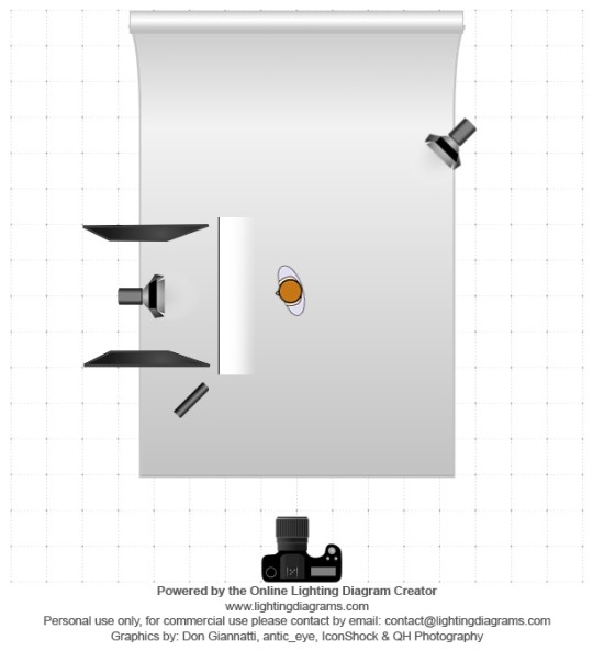
I have worked as a portrait photographer for the past eight years. Studio Photo Gallery is my preference of studio space. It is compact and well equipped for photographers on a budget. The owner provides Elinchrom heads with a variety of modifiers. Ben arrived with his clothing, drumsticks and hair product to prepare for the shoot. I set up the lighting as shown in the diagram. It refashions Martin’s design almost directly. There was a head with a soft box camera left and black polyboards either side of it. This prevented flare into the lens and flagged light from the background. A head with a snoot was placed camera right at an angle. Again like Martin, a hard back light enhanced Ben’s masculine characteristics. Finally, the black paper background was a few metres behind him. This imposed several stops difference between the subject and background, ensuring a pure black aesthetic.
My professional studio settings are f8.0, 1/125s and 100 ISO. I feel that this gives me the optimal performance of my lens and camera - Nikon D750 and 50mm lens. It is natural for me to work with people and empower them to present their personality. Ben had several ideas for poses. We started casually with his arms by his side and at an angle to me. There are variations between him looking at the camera and away. The way that he held the drumsticks came from him. Making a cross was aggressive and purposeful. We felt that worked well. Reaching with a single stick straight into the lens was another successful composition. I rejected poses that seemed forced, although I did not communicate this at the time. My final images have been retouched on Photoshop. His hair was reshaped and trimmed to remove any fly aways. His skin is free of most blemishes; however, I left some to maintain a rugged appearance. Otherwise there is relatively little post-production and the look I was attempting was captured as practical effects.
In a second phase of the shoot, I began to take more risks and to work outside of my comfort zone. I mounted my Nikon D750 and 50mm lens on a tripod and attempted long exposure motion blur. After many test shots the most efficacious combination was f8.0, 4s and ISO 200. If the shutter speed was too long then forms clumped together. If it was too short then there was no trace of a blur. Since my Mamiya 645 with 80mm lens is analogue, I had to wait until the film was processed to see if I was successful. The Kodak Professional Ektar 100 that I loaded performed admirably. It was pushed a stop to 200 ISO to reproduce the digital test shots. My lighting design was comparably simple. The head with a snoot was switched off and the head with a softbox had a range of gels taped to it. It was used as a constant light with the flash unit off and the modelling light switched on. Finally, a domestic table lamp with an open bulb was positioned under it. This had a contrasting gel taped to it. Red and blue was my preferred choice of gels. When it came to the movement, I asked Ben to be seated and to drum on his thighs to give the impression that there was a drum kit present. Music was played loudly and it was interesting to watch the movements that he would make. In the end, we selected several heavy metal tracks for him to drum to. Head banging added an extra dimensionality to the action. This definitively condensed the spirit of his music into a selective range of shots. It was Ben who suggested spinning the sticks in his hands and cropping him out. With practice he could hold still for 2s and then spin for the remaining 2s on the same exposure. This is how the solid outline of his hand was created with cyclical distortion appearing to emanate from it.
Using Photoshop, I pulled the saturation and vibrancy down on scans of these negatives. The grain gives the images a warmer and more vintage feel than a digital alternative. There was some clone tool used to remove excess blur, otherwise I felt it was necessary to preserve their rawness. A mock up magazine spread was created in the same vein as GQ. I kept the graphic design motifs minimal and made suggestions for where text could potentially appear. Each photograph is a different size to be indicative of the frenzied nature of drumming - back and forth, round and round. Ben is identified as a hand with a drumstick and two blurred profile images. I selected these latter shots because they were still identifiable as him amongst the chaotic blurriness.
Bibliography
Condé Nast (2020). GQ. Condé Nast. Available from
www.condenast.co.uk/gq
[Accessed 10/04/2020]
Martin, M. (2020). Deontay Wilder Always Prefers the Knockout. GQ. Available from
www.gq.com/story/deontay-wilder-tunnel-style-profile
[Accessed 10/04/2020]
Lighting Diagram
Digital Shoot, f/8, 1/125s, ISO 100
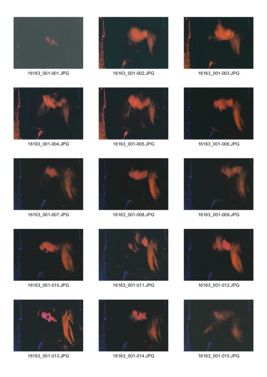
Contact Sheet 01
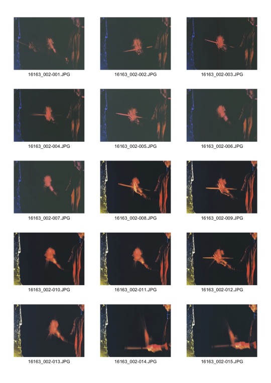
Contact Sheet 02
Analogue Shoot, f/8, 4s, ISO 200
Mock Up
0 notes
Text
Nadav Kander - The Meeting
210220
Nadav Kander (Born 1961) is the first photographer that I cite in conversation about which practitioner has influenced me the most. He was born in Tel Aviv and based in London, although he does not regard himself to be British. His photographs are a part of the collections at the National Portrait Gallery and Victoria and Albert Museum.
Kander began taking pictures at 13 years old with a Pentax camera. In the South African Air Force, he processed film and printed aerial photographs. In 1986, he moved to London where he currently resides with his wife and three children. Portraiture and landscape photography are the main genres that he is best known. I have an appreciation for the consistency in his career, which has traversed 30 years across fine art and commercial platforms. He has photographed celebrities, models and a multitude of other sitters. In 2009, his 52 portraits published in The New York Times Magazine portrayed President Barack Obama and his closest associates. It is the largest portfolio of work that the publication has ever showcased. Later that year, Kander was awarded the prestigious Prix Pictet Earth for Yangtze - The Long River (2008). The shortlist of nominees included Ed Kashi, Andreas Gursky and Naoya Hatakeyama. The list of his other awards is extensive and includes a World Press Photo Award 2013 and 2014, Honorary Fellowship from The Royal Photographic Society 2015 and Outstanding Contribution to Photography from Sony World Photography 2019. (Lens Culture, 2020)
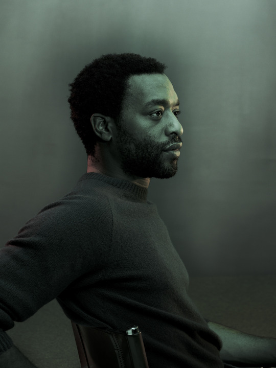
During the World Press Photo Exhibition 2014 at the Southbank Centre, London, I was particularly taken by Kander’s 3rd Prize entry of actor Chiwetel Ejiofor. The photograph first appeared in New York Magazine as a staged portrait to commemorate the British actor. Ejiofor, played a black man kidnapped in 19th Century America and sold into the slave trade in the film 12 Years a Slave (2013). He received an Oscar nomination for the role and won Best Actor at the BAFTA awards. Actors have a trained ability to respond to a camera. He appears poised yet relaxed. Kander’s characteristic turquoise key light is apparent with a red back light to highlight the outline of the sitter. The lack of a fill light leaves a proportionate amount of this face in an enigmatic shadow. This low-key lighting design gives the photograph a sombre tone. Emphasis is placed upon Ejiofor’s eyes, which reveals the complexity of his role in the film. As a viewer of the work in person, I felt a closer affinity to the subject when it was close to life sized. Its considered forms had a significant presence akin to a drawing, painting or sculpture. (World Press Photo, 2020)
The Meeting (2019) is a book that acts as a homage to Kander’s career, with photography from his early foray into the genre to illustrious works recognised within the fine art and academic communities. The annotations add insightful anecdotes about each piece and the man himself. The opening, entitled ‘The Triangle’ outlines a relationship of personal interest to me between sitter, photographer and viewer.
‘I don’t photograph to tell stories. I photograph to make stories. The viewer, if they hold their gaze long enough, becomes the author of the work’s meaning.
Consider there’s a metaphorical suitcase packed with white, grey and darker clothing that we carry around with us wherever we go. When we meet someone, we choose what items to show; maybe only clean white shirts, perhaps darker one. This unpacking is symbolic of a meeting. Much like when I work with a sitter. Our stories collide and change depending on the day, the weather, our emotional states.
If I manage to make a portrait that stirs a viewer then they complete what I call ‘The Triangle’ by bringing their own story or state of mind to the picture. This is fundamental to me, but often missed or misunderstood, because photography is still considered by many to be a record of an event. It is that; but it is not only that. How can it be?
Perhaps if we replace the word ‘photographer’ with ‘poet’ the point becomes clear. It is accepted wisdom when it comes to poetry that every individual reader finds his or her own meaning in the poem and this perspective is unique - no more less valid that yours or mine. The same, in my view, is true of photography.’
In email correspondence between 4th and 28th April 2019 with David Campany, Kander describes his photographic process. These extracts resonated with me as a practitioner of portraiture and landscape photography.
NK - I’ve walked down one road since I started photographing when I was 13. I feel I haven’t deviated at all. I still need my work to strike the same chords in me that I’ve always longed and striven for. My photographs (however varied a viewer might find them) come from the same inner place. I seem to revisit a slowed-down reality, which is very beautiful and important to me. Slow, quiet and slightly uneasy, alluding to more going on beneath what you first see. The subconscious need to express what feels meaningful and profound never goes away. I just try many ways to revisit it, to come at it from different directions.
DC - The portraits you’ve made seem to have quite a special place in your work. As if a face, or a person, is a way to get to the tension between surface and depth. I feel the human face is somehow already an image before it’s photographed. It’s already a kind of presentation, or representation of the self, although a very fragile and elusive one.
NK - That is beautifully put! Yes, my photographs of people are an essential part of my practice.
They follow on from my photographing landscape. When first dealing with landscape I realised it wasn’t the natural environment I was after, but the man-altered landscape. I focused on a darker nature, our destructive ambivalence to our surroundings, but I shrouded these scenes in beauty using compositions that, purely from their form, colour and weight, would have an effect on me apart from the information shown.
DC - Portraiture is often thought of as a two-way exchange, between photographer and sitter, but you’ve talked often of the viewer being crucial to meaning. That said, there’s a real intimacy to your portraits, as if these people have been given the freedom to forget their audience momentarily. We viewers can look, without feeling we’re being performed to. Is this how it is?
NK - I’ve had to think a long time about your question. Much of what I do is intuitive so finding the words is difficult. When I’m in front of a person (or a landscape for that matter), there’s nothing in my head that matters. I’m just looking with so much concentration that sometimes it feels as if I might explode. I do not want to be stirred so badly! All I want is for something to show itself, something that if I release the shutter will become an image that will stir me and unsettle me. To get close to this I must direct people very softly, subtly, and create the appropriate light so that they experience something of themselves. Any frivolous act for the viewer will never work; it would appear transparent. It has to be just for them and me. Only once this is successful does the viewer enter and make up the triangle. Artist, subject and viewer - each one a part of the whole.
From beneath the surface beauty, comes an existential call that touches on questions of destiny and the unknown. The works of Hans Bellmer, Man Ray, Raoul Hausmann, Dalí and Hans (Jean) Arp have also had a big influence on me. Although my work is not surreal, the feeling I get from the work of these artists is something I always search for. For example Jean Arp’s sculptures were very informative when I began photographing the nudes that became the series ‘Bodies - 6 Women, 1 Man’.
DC - It’s interesting that you put it that way. Very often I find myself wondering what landscapes your sitters were in just before they came to you, what it was - out there in the world - that is on their mind as you make the photograph.
NK - A portrait is one way of looking at some facets of our condition. There’s a precious and beautiful flicker of understanding, or the opposite, that shows itself for short periods and disappears. These periods, which I must see and try to photograph, are often responses to the light or the atmosphere that the light imbues. I must try to recognise them as an image that has what I love; depth of feeling, vulnerability and poise, pride and soul, a recognition of something more than just this moment now. Little of this clear to me, but this is the best I can do to explain it. (Kander, 2020)
Summary
It is an inevitability that a photographer emulates their heroes. Whenever I read that someone like Kander also had starting points for their practice, I am encouraged. I have covered in detail the practitioners that have inspired me for this project - Smith, Andrew, Refn, Sigel and Norwood. There are blog posts committed to each of them. However, I felt that Kander required more substantial meditation. There are parallels between his voice and my own - low key lighting and moody colour saturation delivered with a quiet temperament. He reveals that these attributes are the reflection of triangles that he forms between himself, his sitter and viewer. A sitter may choose to present themselves in any number of ways to his lens then this narrative is open for further interpretation by anyone that encounters his imagery. During his interview with Campany, he explains that he implements soft direction, free of frivolity to search for each photograph. He also explains a slow and quietened reality that he occupies beneath the surface appearance of what he sees.
The Ejiofor portrait inspired me during a formative stage of my photography. There is overlap with the other photographers and cinematographers that I have mentioned. Low key lighting is a continuous theme; however, Kander’s renderings have more depth. He is reluctant for media attention and I found The Meeting (2019) to be highly enlightening. His is the work of a ‘poet’ acting as a ‘photographer’, to use his own metaphor. As an analytical student, I have attempted to dissect what makes Kander, Kander. An awareness of his process is just the beginning. My lighting will resemble his, in addition my direction style is already collaborative instead of dictatorial. Any additional intricacies are unique to his voice. As I develop as a photographer myself, I am hopeful to have as reputable career and recognition. There are plenty more triangles that I am eager to construct.
Bibliography
Kander, N. (2019). The Meeting. London: Steidl
Lens Culture (2020). Biography. Lens Culture. Available from
www.lensculture.com/nadav-kander
[Accessed 10/04/2020]
World Press Photo (2020). 2014 Photo Contest. World Press Photo. Available from
www.worldpressphoto.org/collection/photo/2014/29789/1/2014-Nadav-Kander-PS3
[Accessed 10/04/2020]
Nadav Kander, Chiwetel Ejiofor, 2014
0 notes
Text
Production Journal - Location Study
140220
Prior to completion of my current project brief, I have decided to set myself a mini brief. Its purpose is to experiment with colour negative film and establish an appreciation for the different types that we have been provided. In addition, the subject matter is a digression from portraiture and location studies will not depend upon me practicing with a sitter. My colleague Daniel J Norwood, is the photographer that has prompted this investigation. I shall study his methods and adapt them for my own needs.
Portra 400 Vs Ektar 100
A photographer’s choice of film is a personal preference, and during my time as a student, I would like to have a broad understanding of the main kinds. In the first project, we were provided with Fujichrome Provia 100F. This is a popular variant of colour slide film. Kodak Professional Portra 400 is the world’s finest grain high-speed colour negative film and it is the starting point for my experimentation. The manufacturer comments that it delivers smooth skin tones, exceptional colour saturation and it is adaptable for a wide range of lighting conditions. Given its versatility, it is used for portraiture, fashion, nature, travel and outdoor photography where the action is fast and unpredictable.
During my final project, I shall be shooting in a studio. Kodak Professional Ektar 100 provides the finest, smoothest grain of any colour negative film available. Further specific traits include 100 ISO speed, high saturation, ultra-vivid colour and exceptional sharpness. It is considered the film of choice for professionals and advanced amateurs. It is not suitable for location studies shot with available light because its ISO is too low. Pushing the film several stops will interfere with its listed qualities. Both films have the following specification listed on the manufacturer’s website - ideal for scanning, extraordinary enlargement capability from a 35 mm negative, optimized sharpness, distinct edges, fine detail and printing compatible with other Kodak films. (Kodak Alaris, 2020)
The Angle of Descent
Daniel J Norwood is a documentary photographer and lecturer. He discovered photography via graphic design and illustration. Its ability to record a heightened sense of space and psychogeography guided his exploration into the medium. After undergraduate study at the University of Plymouth, Norwood worked as a forensic photographer - an appropriate match for his methodology. Postgraduate study at Westminster University broadened his understanding of documentary photography and photojournalism. He has exhibited at the University of Westminster, Truman Brewery and Cambridge University. (Lens Culture, 2020)
The Angle of Descent (2013) is a survey of the Heathrow area, which consists of annotated photographs and a self-published newspaper. It caught the attention of the BBC and received a Shutterhub Award at the time. Norwood documented the threat of the airport extension scheme by covering the impact upon the global economy, local communities and surrounding landscape. The series portrays the interactions between the environment and individuals affected by the development. However, my interest is in the compositions that are sparsely populated and implicit of human engagement. The South West Perimeter Wall (2013) is minimalist in its geometric forms. A divisive wall separates barrel grassland and a river from the blue of the sky. The inclusion of a solitary aeroplane tail fin implies a malignant threat from expansion of the airport. His formalist influence is evident in Outside the Sofitel Hotel, Terminal 5 (2013). A billboard intersects other artificial and natural divisions of the frame. The trees are perpendicular to the road and the horizon line is perfectly straight. In isolation, the semiotics of the photograph are ambiguous; however, as part of a series it is given an accumulative weighting. (Norwood, 2020)
In a text message conversation, we exchanged the following thoughts about his photography. It was an opportunity to ask direct questions about his style and learn about a colleague outside of work.
LD - What transferable skills are there from forensics to arts-based practice?
DN - That depends on what you mean - recognising the significance of the mundane perhaps. The forensic is bandied about in the art world. It’s part of the furniture, you could say. In fact, in my last project I took that sensibility but twisted it to focus more on the aesthetic.
LD - What is the starting point for each of your works?
DN - That poses quite a question. My starting point is perhaps the subject itself or myself or a combination of the two.
LD - Your photography is compositionally very precise. Is this a conscious choice?
DN - My composition is drawn from a mental image of what I am trying to achieve. I tend to quote Ansel Adams who said you have to see the image ‘in the mind’s eye’ before you make the picture.

Daniel J Norwood, The South West Perimeter Wall, 2013
Summary
No matter the subject, I have an inclination to arrange the contents of my frame. It is the consistency of Norwood’s photography that I would like to recreate during this mini brief. The film that he used for The Angle of Descent (2013) was Kodak Professional Portra 400. Its adaptable quality and faithful colour reproduction are apparent throughout. My Mamiya 645 Super is relatively compact and light compared to other medium format film cameras. I will be working without a tripod, so 400 ISO film should be appropriate for the daytime lighting situations that I encounter. Finally, given that it is so highly regarded, I would like to form an opinion about its performance. A suburb of South West London shall provide an exploratory cityscape. It is predominately residential and an abandoned gas works dominates the skyline. The silhouette of this structure is appealing and my intention like Norwood’s is to consider the relationship that exists between it and the residents that live nearby.
Production Notes
The Kodak Professional Porta 400 ISO film that I used was pushed to 800 ISO. This allowed me to shoot at f8.0 and 1/60s. This decision was made so that I could hand hold the camera and achieve a relatively shallow depth of field. The colour reproduction was accurate and only deviated due to different lighting conditions - sunlight seemed more yellow than shadows. I was content with the grain in each negative. The lab that processed it created low resolution scans and even in these there is a substantial level of detail across the whole dynamic range.
At the start of the shoot, I observed telephone pylons that created strong compositional lines. In one photograph, I looked upwards at a pylon with convergent cables directed into the middle of the frame. Lowering my camera and shooting along the length of the road was also compelling. Norwood’s approach in The Angle of Descent (2013) was the inspiration for my image portraying a tree and its shadow against a wall. Pure form is examined in this piece allowing the actual contents of the frame to become unidentifiable. This effect is intensified due to the hard lighting from the sun. A Mamiya 645 has a characteristic aspect ratio that was comfortable to work with. Favouring long, elongated prints comes from experimenting with test strips. Processing half a sheet at a time seemed like a waste of paper, so I decided to make the proportions into a creative statement. It worked well for the photograph with the abandoned gas works that appears as a silhouette against a blue sky and white clouds. If the full negative was used then a large area of green grass became too imposing. By detaching the grass, I felt that this made the photograph simpler and satisfying. The theme of human dependence upon industry and its connection with our survival is implied - it is the man-made structures that dominate over nature in the series.
Bibliography
Kodak Alaris (2020). Control. Expression. Creativity. Kodak Alaris. Available from
www.imaging.kodakalaris.com/photographers-photo-printing/film/color
[Accessed 10/04/2020]
Lens Culture (2020). Biography. Lens Culture. Available from
www.lensculture.com/daniel-norwood
[Accessed 10/04/2020]
Norwood, D J. (2020). Biography. Daniel J Norwood Photography. Available from
www.djnorwood.com
[Accessed 10/04/2020]

Contact Sheet

Location Study, f/8, 1/60, ISO 800

Location Study, f/8, 1/60, ISO 800
0 notes
Text
Colour Darkroom
070220
Colour negative printing is similar to black and white printing - apertures and exposures are controlled by an enlarger. There are a few differences, which take practice to become accustomed to. Total darkness is needed to protect the paper from tarnishing. There is no equivalent to a safe light; therefore, the location of controls and materials in the darkroom have to be memorised. Perfecting the colour balance is specific to this process. In a digital era, a DSLR has the capacity to accurately record colours at the time of exposure. Modern editing software also allows these to be further corrected without much dexterity or practical skill. When working in analogue, every factor that affects the colour of a print needs to be considered. The lighting source is the starting point - daylight, tungsten and flash lighting each have a characteristic tone. Discrepancies occur between enlargers and an aging bulb can be an issue too. Finally, the film, batch of paper used and viewing conditions of the prints are some of the other aspects that a practitioner needs to deliberate.
Blue, green and red are the primary colours of light. All three combine to make white light. Two primaries combine to form a complimentary colour. An understanding of the relationship between blue / yellow, green / magenta and red / cyan is required for printing making. In the subtractive printing system, an image is made by blocking increments of unwanted coloured light from white light using filters. Colour heads are operated to vary the yellow, magenta and cyan that are dialled in. All colours can be created from combinations of these filters alone. As a novice, it is encouraged to keep cyan the same and only change the settings for yellow and magenta. Three filters acting together will require more exposure time and this causes reduced contrast with a lower colour saturation. There is usually a darkroom display to give guidance about correcting colour cast - add or subtract magenta or yellow separately or together. With repetition a printer’s eye sensitises to these conditions and if the negative, enlarger, paper and viewing room are kept constant then the same settings can be reused for each printing session.
The remainder of the darkroom technique is similar to black and white. Test strips must be half a guillotined sheet of paper. Three second exposures are carried out across the strip. The final steps of processing are entirely automated. In darkness, paper is fed into a machine emulsion side down, lengthways and as straight as possible to avoid jamming. There needs to be at least a five second interval between sheets and a few minutes are needed to let them dry at the end.
The following samples were photographed from my preliminary sessions. Using negatives provided by the technicians, the first were corrected by eye and each attempt was documented. Once the rough proportions of yellow and magenta were identified for accurate colours, I purposely shifted the colour balance for creative effect.
Shift / Filters / Time
Neutral Nil Nil
Yellow -20Y -5%
Green +20M +10%
Cyan +20Y +20M +15%
Blue +20Y +5%
Magenta -20M -10%
Red -20Y -20M -15%

Colour Balance

Colour Shift
0 notes
Text
Drive
310120
As a lecturer, writer and photographer, my classes revolve around the art and media that has influenced me. Drive (2011) motivated me to understand the nuances of lighting and I direct my students to watch the opening scenes of the film. There is next to no dialogue and in its place are structured frames with consideration for the narrative. The viewer makes assumptions about the protagonist, who may be a hero or a villain and the plot unfolds to reach terrifying heights.
Drive (2011) was the first Hollywood movie from Danish director Nicolas Winding Refn (Born 1970), whose international profile rose with the Pusher Trilogy (1996-2005), Bronson (2008) and Valhalla Rising (2009). The crime novel by James Sallis was the basis for the screenplay and it centres around an unnamed Driver, played by Ryan Gosling. By day he is a stunt driver and by night he is the man behind the wheel for a criminal underworld. He becomes involved with his neighbour Irene, Carey Mulligan and her ex-con husband, Oscar Isaac in a heist that turns into an ugly rampage of ultra violence. Refn said in interview, ‘I loved Sallis’ book. It’s an existential story about a stuntman who’s also a getaway driver. He lives in Hollywood, he can’t quite deal with reality, and he goes a bit psychotic at the end.’ Newton Thomas Sigel was the Director of Photography (DP) behind the film’s stylistic visuals. ‘It’s almost a mythological story, not a story about today or yesterday or tomorrow, so it was important that the movie have an almost indefinable time period,’ he explained while working on Jack the Giant Killer (2013) for Bryan Singer.
‘When I met Tom, I really dug his energy and his background as a documentary filmmaker made me confident, we could make our seven-week shooting schedule work,’ declared Refn about his choice of DP. He cited Kenneth Anger’s Scorpio Rising (1963) as his initial reference for Drive (2011), ‘Ryan asked, ‘Why are you showing me a movie with a lot of guys working on motorcycles?’ And I said, ‘It’s how it’s shot - the sensual, sexual nature of it, the fetish, the objectification. That’s what we should try to go for.’ Sigel snapped potential locations on the Hipstamatic App on his Smartphone. Both Refn and Sigel were convinced that this was the aesthetic that should define post-production. ‘There are some colour palettes in that program that reference retro photographic looks, like Kodachrome or Ektrachrome. I showed Nicolas some of the photos and he wasn’t certain of the strange tonalities but he really responded to the vibrancy of the colours. We designed a lot of sets and costumes to make use of that kind of vibrant palette.’ commented Sigel. Refn added, ‘I’m colour blind, so I told Tom and Beth Mickle, the production designer, ‘I need contrasting colours and I like a lot of red.’’
Due to budget, and given that principal photography was due to take place in the evening, Sigel opted to shoot with ARRI’s Alexa digital camera. He explained, ‘I did some driving tests with the Alexa and it blew me away in terms of what it could do with existing light. I rated the camera at 800 ASA. I think the myth of digital is that you underexpose because it can’t hold the highlights like film. I find that when you underexpose digital more than a little bit, very often you increase your noise level significantly. What’s extraordinary about the Alexa is that even if I pushed the sensor to 1600 ASA there was very little noise, and I could actually underexpose quite a bit without introducing noise in the blacks. The dynamic range was mind-boggling.’ Furthermore, he diverged that he typically photographed night time scenes and interiors around T2.8 and day exteriors around T8.
Gaffer Anthony Nakonechnyj and the crew supplemented the practicals in corridors with Kino Flo 4' 2 bank fixtures and homemade solutions that housed dimmable Photofloods. Lighting Gosling in the car was important to characterise his silent rogue. Sigel elaborated, ‘As part of my test, I took Ryan out in a car, and Tony and I rigged the car with a rack overhead with all different kinds of tiny lights, such as LEDs and 150W ARRI Fresnels. We wired them all into dimmers in the trunk that could be wirelessly controlled, so we could turn lights off and on or dim them up and down. The lights were all so small and unobtrusive that they were never in shot, so Ryan could just drive around while Tony played the roof rack like a musical instrument. There were also times when we’d kill all of our lights - we’d pull up to a stoplight and you could see the light on Ryan’s face go from red to green.’
Summary
Benjamin Bell is the subject of my shoot. He is a drummer and a part time model, who is a fan of Ryan Gosling. As Sigel mentioned, Drive (2011) has an unidentifiable era, so I feel that this should be reflected in his clothing. I have asked him to bring a red bomber jacket, black jeans and a selection of plain tops. The sheen of the jacket material will light well and it could feature in the wardrobe of a contemporary or vintage film star. It also imitates Gosling’s costume, which has a similar appearance. I was encouraged to discover that the DP sought to emulate colour transparency films - Kodachrome was more iconic and Ektachrome had more variations. Apps, editing software and consumer cameras can recreate the appearance of both. However, it is fitting that this project will actually be shot on film and I shall experiment with several types. The final palette of the photographs will be determined by coloured gels placed in front of each light source. Refn’s closing remarks about being colour blind and expressing a preference for high contrast, red lighting is a media code that should transfer effectively into my still photographs. (Witmer, 2017)
Bibliography
Witmer, J. (2017). Road Warriors. The American Cinematographer. Available from
www.theasc.com/ac_magazine/October2011/Drive/page1.html
[Accessed 10/04/2020]


FilmDistrict, Drive, 2011
1 note
·
View note
Text
Project Proposal
240120
Project Title
Visual Sound
Subject
This extension of our module challenges us to construct photographic images, which combine staging and creative lighting. In addition, the final piece is anticipated to be a series with a coherent narrative. As an amateur guitarist, I am eager to photograph a sitter responding to musical stimuli instead of verbal or psychosensory direction. Drummer Benjamin Bell from the band Brightlight City has posed for several portraits with me in the past. He has a natural and distinctive camera presence that will be captured in a studio setting.
Aims / Objectives / Concept
My objective as a photographer is to portray the essence of Ben’s likeness with the energy of rock and roll drumming. The visual vocabulary of the film Drive (2011) is the basis of my production design. Its thematic colour palette is stylised, cinematic and transferable to stills photography.
Since completion of my previous project, I have invested in a Mamiya 645 Super - a medium format analogue camera. It is now a permanent part of my imagemaking process. Coloured gels were efficacious in the piece and they will appear again to recreate the neon lighting of the film. Furthermore, I shall explore studio lighting modifiers as a means to sculpt my subject’s features. It is my aim to accentuate Ben’s physicality by highlighting the angles in his face and clothing. He has some modelling experience; therefore, my photographs shall be inclusive of fashion and lifestyle imagery. With music of his choice playing in the background, I will assist him to find poses.
The final piece will be presented as a men’s lifestyle editorial shoot. Straight photography will be the basis of the work alongside an experimental triptych. The two artists outlined below inspired my initial photographic investigation.
Research
Pennie Smith (Born 1949) is a British photographer renowned for her music reportage works in black and white. Her image of The Clash’s Paul Simonon smashing his bass guitar featured on the cover of their London Calling record and it is considered one of the greatest rock and roll photographs of all time.
Born in London, Smith attended Twickenham Art School studying graphic design and fine art. Her early commissions were for Friendz Magazine - a passion project developed with Barney Bubbles and Nick Kent. However, her breakthrough work would feature Led Zeppelin on their 1970s tour. As a staff photographer for the NME, she became a cultural icon for other aspiring music photographers. Her camera lens has graced the presence of artists such as The Rolling Stones, The Who, Debbie Harry, U2, The Stone Roses, Manic Street Preachers, Radiohead and The Strokes. She resides in the railway station that she bought and converted as a student and continues to freelance as a photographer.
Standing at less than six feet away from Paul Simonon at the Palladium, New York, Smith could sense that the moment was about to unfold. Simonon was in a particularly troubled mood that evening and the shutter of her 35mm camera instinctively released as hell broke loose. This abstract photograph - raw, grainy and enraged - came to define the punk rock ethics of The Clash. In 1979, Joe Strummer selected it to be the cover of London Calling, itself a masterpiece and influential to a multitude of recording artists such as Nirvana, Bruce Springsteen and the Beastie Boys. Later in Smith’s career, it was recognised by Q Magazine as the greatest rock n’ roll photograph of all time. However, she almost dismissed the shot on the technical grounds - it was out blurry and out of focus.
‘He was in a really bad mood and that wasn’t like him. You can’t really tell it’s Paul but I guess that’s the point. It wasn’t a choice to take the shot. My finger just went off. I said, ‘It’s completely out of focus, it won’t work!’ But Joe wouldn’t have it. He said, ‘That one is the photo.’ So I thought, ‘Ok I’m not going to argue. It’s your bloody album, get on with it!’ I’m pleased I took it, but it’s a bit of a weight around my neck. It keeps coming back to whack me on the back of the head - nicely in some instances, but aggravatingly in others.
The Jam stood like Englishmen - shoulder to shoulder in every photo but The Clash were tactile. They seemed more at ease and made better shapes. They’d hug each other, grab each other’s shoulders, fool around. They were slightly artsy, definitely non-conformers.’ (Walker, 2019)
Tom Andrew is a London-based photographer with a portfolio spanning music, fashion and portraiture. He has a distinctive experimental lighting style bringing together a plethora of imaging technologies. This project is named after his self-proclaimed subject matter - visual sound.
An appreciation of analogue photography started early in Andrew’s career while he worked in darkrooms and as a lighting technician. Film was a rare commodity while he was growing up and his parents encouraged him to be selective of the shots that he would take. This attention to detail is still apparent in his photography today. In order to introduce predictability, his works incorporate choreographed movement and he often references contemporary dance practitioners. This aesthetic has caught the attention of commercial clients that include Nike, Puma, Aquascutum, Warp Records and Sony.
Andrew’s lifestyle editorial shoot for Mixmag featuring producer Mura Masa is the main inspiratory piece for this assignment. The sitter is presented as a balance between lines, colours and textures, with a composition that unites the abstract and figurative. It is a comparative reinterpretation of Smith’s London Calling record cover. Swatches of light illuminate the darkened studio background. Opposing orange and blue forms represent Mura Masa’s eclectic music - clubland pop, soul, punk, folk and hardcore edits. He appears in full length and in conventional portraiture poses; however, the back of his head is included in addition to other poses that occlude his face.
‘I compose images with strong graphic forms while also looking to capture a spontaneous point of elegance, which often involves exploring colour and movement. I will meticulously plan out lighting before taking most pictures. I like my images to quite often capture things that are rarely seen in moving image or real life. My lighting facilitates this through commonly capturing movement and enhanced colours.
In Applied Composition, I wanted to take a collection of photographs where the application of line and colour compliment found compositions on the body - in some cases structuring the images with a fine balance between both these elements - to question the area of skin used or to forget the idea that the body is even present. The objective being to create images with a flow in concept, the project sits between beauty and painted art.’ (Kent-Smith, 2020)
Summary
It will be a challenge to amalgamate the platforms of music, film and photography. My voice is rather formal; therefore, the influence of each may be subtle. Smith’s iconic photograph is the aspiration for every music photographer - genre defining and timeless. The authenticity of the motion blur and soft focus are a potent combination. Although I am not a reportage photographer, I will create a scenario in the studio that allows my sitter to perform without inhibition. Music playing during the shoot will be imperative without any direction from me. Andrew’s technical lighting requires a degree of choreography. Coloured gels will be matched to reflect his palettes and the nature of my sitter’s musical preferences. There is a fluidity to a drummer’s movement that is visually satisfying. I shall attempt some shots that are rehearsed to ensure specific movements are recorded. Drive (2011) as a film has many facets and I shall analyse it in the next blog post.
Bibliography
Kent-Smith, J. (2020). Turning The Wheel - Mura Masa Is Setting Off On A Whole New Direction. Mixmag. Available from
www.mixmag.net/feature/mura-masa-cover
[Accessed 10/04/2020]
Walker, R. (2019). ‘We Had the Same Brain’ - How Pennie Smith Turned The Clash Into Icons. The Guardian. Available from
www.theguardian.com/artanddesign/2019/nov/11/the-clash-london-calling-pennie-smith-photography
[Accessed 10/04/2020]

Pennie Smith, London Calling, 1979

Tom Andrew, Mura Masa, 2020
0 notes
Text
Evaluation
010520
Project Title
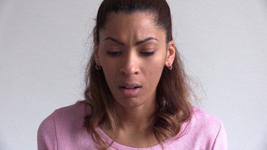
In one version of the film, the caption ‘Interview’ appears as filler until I could decide on a final title for the piece. I settled on ‘Natalie Boakye - Actor’ because it does not give anything away about the supposition of her portraying a version of herself. If a more meaningful title comes to my attention at a later date then I would consider changing it.
Subject
The subject of an interview went full circle as production developed. Shooting a straight interview had its challenges, and to ensure that I finished on time, my camera technique and post-production editing were kept simple. While watching back test clips of Natalie slipping from the script and regaining her composure, it was identified that these elements were almost more compelling than the content of the utterances themselves. The formulaic version of the film was abandoned and directorial scratch audio, interaction between Natalie and I and camera errors were kept in. The result is a more engaging conceptual piece that breaks the fourth wall of filmmaking.
Visual Research
Cinematography is an influential source of inspiration for my stills photography. I am often excited by films that I see at the cinema or when I discover a classic film that I may have overlooked. Jonze’s Being John Malkovich (1999) was recommended to me by my lecturer Teemu Hupli. If I was going to successfully break the fourth wall then I would have to reference a piece that does it with assertion. The levels of intricacy to the plot are reinforced by unyielding filmmaking and I found it rather thought provoking. Stylistic elements for composition and direction were taken from Yamada’s A Silent Voice (2016) and Wang’s The Farewell (2019) respectively. I learned to take my time with each scene and to allow them to unfold with minimal scripting.
Aims / Objectives / Concept
As the subject for my project changed, so did my key objectives. An actor playing an actor was the grounding principle that guided my creative decisions. The script had to be reworked and there were three production shoots in total. Her voice over monologue had a fluency to it because she was improvising while reading. Cue cards gave her some degree of familiarity with the interview sections; however, there was lots of stopping and starting. This provided plenty of moments where fourth wall breeches might be evident to the audience. There was no microphone on me at the time, so cleaned up scratch audio was used in the final cut when direction can be heard. I actually felt this enhanced the desired effect, almost like a record needle sliding and then resuming course.
Production
Using a camcorder and sound recorder were brand new skills for me to learn. I had plenty of guidance and I found that repetition was the only way to improve. There are no camera movements in the film. The fluid tripod that I had on loan did not have a satisfactory motion, so I felt it was a better decision to compose each scene as if it was a moving photograph. This allowed me to draw on a process that was already familiar to me. With additional camera and sound units, I can see how there could be a significant improvement to my production methods. During editing, I gave the impression that there was more than one camera at work. This was done by reshooting the same scene from different angles and searching for extracts that might overlap. In the future, I am eager to develop as a filmmaker.
Presentation
A general audience for one of the dominant online platforms was identified in my initial proposal. Reflecting on the film, there are very few signifiers that may be too small to be seen on a tablet device. Each frame is composed to be clear of distraction. The run time is also short enough for attention spans of viewers that may be in transit - on a commuter train or sat in a car passenger seat. Reproduction of the audio is of paramount importance because it reveals many of the details of the plot. Users often wear headphones during these situations and I hope that none of my sound design considerations would be missed. In summary, feedback from my peers has been positive and the nuances of my film appear in tact.
Evaluation
I set myself the challenge to be technically competent with the filmmaking process at the start of the project. I feel that this has been achieved and I catch myself watching films much more intently now. Many of the basic principles are no longer theoretical to me. It has definitely made me more appreciative of the art form. My nature is very precise and controlling and this is a better fit for stills photography. If applied to filmmaking then footage can appear lacklustre and offbeat. Musical ability is an advantage for cutting and general feedback that I received was that I was often late to catch the natural ending of a clip. Regarding the footage itself, the film would have benefitted from shooting more locations and variations of existing scenes. Much of the voice over was not used because suitable visuals did not exist to be tied to them.
0 notes
Text
Production Journal - The Farewell
060320
As a creative of British Asian origin, I am attentive of the perceptions of the Eastern community within Western mainstream culture. Crazy Rich Asians (2018) was an uplifting rom com that limited Caucasian actors to background fodder and reserved leading roles for those of Asian descent. Although glossy in its approach, it was a landmark victory for ethnic minorities in the film industry who have long been typecast to portray dated stereotypes. It suggested that we could be charismatic, comedic and above all desirable. Awkwafina is a rapper, comedian and writer who has successfully transitioned to acting. Her character Goh Peik Lin is a bleached blonde version of her gregarious stage personae. In The Farewell (2019) she plays another feasible derivative of herself as aspiring writer Billi Wang.
There was no shortage of story beats in the film that resonated with my own narrative. As well as a protagonist played by an actor with a similar background, the writer and director Lulu Wang is a Chinese American eager to accurately depict her upbringing. In the opening scene Wang walks the streets of New York while speaking to her grandmother on the phone. She confidently exclaims that she is wearing a hat for the cold weather, even though she is not. In response, her grandmother says she is at home when she is actually at the hospital for an appointment. ‘The back-and-forth makes for an elegant volley of disinformation; if love is kinetic, it’s best to keep things moving,’ wrote Chris Gayomali in his review of the film. It sets up the dynamics of the plot that eb and flow between familial ties with cultural expectations. In Chinese traditional it is regarded as moral to withhold the severity of a medical diagnosis from an elderly relative, even if the outcome is certain death. This clashes with the sentimentality of American born Wang as she struggles with the situation. In an emotive exchange, her mother asks her to conceal her feelings when she blurts, ‘Chinese people have a saying - when people get cancer, they die. But it’s not the cancer that kills them, it’s the fear.’ (Gayomali, 2019) (Ide, 2019)
Anna Franquesa Solano (Born 1984) is the cinematographer responsible for The Farewell’s (2019) sensitive visuals. After graduating with a degree in Art History from the Universitat de Barcelona, she later studied film in New York. Her other noteworthy projects include I Don’t Like Cinnamon (2009), Silent Notes (2020) and The Normal People (2020). To breech the fourth wall, the characters walk directly into shot in slow motion during select scenes. While centred in the frame they stare at the audience as if in a dreamlike trance. This picturesque device references the Asian understanding of the passage of time. Buddhist thought encourages its practitioners to bring attention to the present moment and cast aside a preoccupation with the past and future. Furthermore, Solano pays close attention to filling her frame with long, timely shots. In a heartwarming scene, Wang and her grandmother practise Tai Chi together. The differences between the characters are shown to be generational as well as cultural. Nineteen takes were attempted and it was nearly left on the cutting room floor. My interest in the footage is its semi-autobiographical nature with two actors playing versions of themselves. Although there is a degree of scripting, the director captures genuine emotion by allowing any candid spontaneity to play out. As a result, it is equal parts documentary and constructed. (Weber, 2020)
Summary
There are certainly media codes that I will recreate from The Farewell (2019) and I am hopeful to represent its semi-autobiographical aspects - setting up a situation and then letting it resolve on film appeals to me. My interview is not purely documentary because I need to extract enough footage for the project and make it appear real. My email conversation with Teemu Hupli also covered some of the spiritual themes in this blog post.
‘In another tutorial I mentioned that there have been arguments that the Western conception of time has tended to be that time is linear - that it moves in one direction from past to present to future - and this is essentially what Hollywood conventions of continuity are designed to represent illusionistically. You can find this kind of conception particularly strongly in the philosophy of Hegel, who saw history as a progressive movement towards an ultimate goal of what he calls ‘spirit’ gaining freedom (you can try to read more about this by researching Hegel’s Philosophy of History, but it is heavy going reading, and I would perhaps suggest not spending too much time on it right now). More importantly, however, it was therefore interesting that your work seemed to derive inspiration from Japanese filmmaking. It has been suggested that the Japanese, or more broadly, Oriental conceptions of time are less linear than the Western notion, and therefore it stands to reason that some films originating from those areas construct different ‘pictures' of time too. This would be quite a fitting connection if your project ends up playing with questions of what is ‘genuine' thinking and talking in the here and now of ‘natural time’ so to speak; what is rehearsed, memorised and edited acting of such thinking and talking; what is continuous shooting and what is not, etc.’
Production Notes
The cyclical nature of Eastern philosophy was not investigated in the final cut of my piece. The voice over covers events that are not necessarily linear; however, there is a progressive property to the clips that expresses a beginning, middle and end. This is sealed with Natalie giving advice to her audience before switching a television off at the end. In post-production, I made attempts to shuffle the order of events but my experience as a filmmaker made this edit confused and unconvincing. The dream sequences from The Farewell (2019) were appealing too but I was not proficient enough with my knowledge of camera techniques to present my version of this storytelling device.
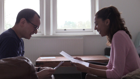
In several of the scenes of my film, Natalie and I are playing versions of ourselves in a similar fashion to Awkwafina’s portrayal of Wang. To film the section where we meet at the front door, I placed the camera in the kitchen and shot through the doorway. I was satisfied with this frame within a frame and then I left the flat to re-enter on cue. The events that occur on screen were not planned or scripted, and on some level, are representative of our real life interactions as friends. Following this, I found another shot in the living room that enabled us to speak to each other and remain seated on sofas. During an early screening of the project, I was given feedback that the burnt out window was distracting. I was not able to reshoot the scene and I feel that the way that it compartmentalises the composition is appropriate - I am respectful of her space as a performer that she may need to express herself. The chatting and laughing between us are spontaneous acts. She is actually showing me the Shakespeare script that we discussed beforehand and the enthusiasm is sincere. In the final cut, the voice over of her talking about improvisation seemed appropriately matched to this moment.
My initial proposal foresaw outside scenes shot on location - Natalie walking, on public transport and crowds. These were never produced due to time restrictions. As a result, the film comes across as more stagnant by being restricted to the confines of her flat. The scenes above contribute some spark to the footage and it would have been interesting to see how she engaged with strangers, other friends and family.
Bibliography
Ide, W. (2019). The Farewell Review - Beautifully Bittersweet Chinese-American Family Drama. The Guardian. Available from
www.theguardian.com/film/2019/sep/21/the-farewell-review-lulu-wang-awkwafina
[Accessed 10/04/2020]
Gayomali, C. (2019). How The Farewell Director Lulu Wang Stayed True to Herself. GQ. Available from
www.gq.com/story/lulu-wang-the-farewell-interview
[Accessed 10/04/2020]
Weber, J. (2020). The Farewell - 10 Things We Learned from The Director's Commentary. Screen Rant. Available from
www.screenrant.com/the-farewell-things-facts-trivia-learned-directors-commentary
[Accessed 10/04/2020]
Final Cut, Manual Mode, 25 fps, WB Natural Light
0 notes
Text
Production Journal - Being John Malkovich
210220
Being John Malkovich (1999) is a haunting film that asks viewers to surrender to a fantastically absurd premise. It was Spike Jonze’s directorial debut and he received an Academy Award nomination for such a bold undertaking. The plot follows Craig Schwarz, a struggling street puppeteer, his affectionate wife Lotte and his office infatuation Maxine. Relations between them cycle between attraction and repulsion when they discover a portal into the brain of John Malkovich. Its intrepid moments of comedy were met with praise and fascination from critics. ‘Put simply, Being John Malkovich just has to be one of funniest, cleverest films of the year, a Fabergé egg of comic delight,’ were Peter Bradshaw’s closing remarks in his review. (Bradshaw, 2000)
Director of Photography Lance Acord (Born 1964) is Jonze’s long term collaborator. Between them they have the hipster credentials to deliver trendy music videos, independent films and Hollywood blockbusters. With Being John Malkovich (1999) they developed a visual language which was darker derived from traditional set ups and framing. ‘We shot most of the scenes very simply. We didn’t have that much time to do them, and instead of breaking down each scene into ten setups, I wanted to spend my time getting performances from the actors,’ Jonze explained in interview. He continued, ‘That was a conscious decision, but I thought it worked for the movie - not to make it big, flashy and overly into technique. Lance can confidently and quickly work with little equipment. And, also, he doesn’t care so much what his peers are going to think.’ Given that the film explores such abstract concepts, it is largely due to Accord’s efforts that the viewer is able to suspend disbelief and lose themselves in the cinematography. (Macaulay, 2019)
Being John Malkovich (1999) has philosophical appeal for its portrayal of same-soul theory - a model of Cartesian dualism that suggests individuals identify with a consciousness unique to them. In essence, a person may be themselves within the vessel of someone else. The functionality of the portal may be likened to a cerebroscope - a fictitious device capable of relaying the contents of someone’s brain to another individual. The film addresses this phenomenon by switching to an occluded camera view analogous to peering through a periscope. The feeling of voyeurism is elevated by drawing attention to Malkovich’s bodily processes akin to the auditory effect of an isolation chamber. In a comically pedestrian scene, he orders a bath mat and scours his kitchen for Chinese food; however, the cinematography makes the act seem supernatural. Several levels of this interaction are explored when Maxine has a date with Lotte as Malkovich and Malkovich enters the portal to witness his own conscious mind in a perverse paradox loop. The filmmakers breech the fourth wall and meander either side of it to the point that it is accepted these characters are familiar with the real actor John Malkovich and his friend Charlie Sheen. (Koch, 2011) (Shaw, 2006) (Weinstein, 2008)

Summary
Jonze’s classic film takes time to develop layers of reality that act as a platform for facets of philosophy and science. In comparison, my film will be minutes long and undertaking anything of the same magnitude would be ambitious. I would like there to be a change in the rhythm of the footage that I will create with my own production technique. During an email conversation with lecturer Teemu Hupli, we discussed this issue and the potential avenues that I may partake.
‘Something has been ringing in my head since we spoke last Friday, and I want to voice it. You said a sentence in our chat to the effect that ‘the toil’ behind finished pieces of dramatic art (by which I understand films, plays, TV performances of various kinds) is ‘often not seen’ and your proposed project would expose that side of things. I am not saying it is often seen, but I would suggest you research the basis of this assertion. We do have films / representations of the work that goes into making pieces of dramatic art - cinema by now has a lot of them e.g. Synecdoche, New York, Being John Malkovich, Mulholland Drive, Inland Empire, and theatre has messed around with the fourth wall at least since the modernist times. In general, the idea of exposing the structures ‘behind’ finished products of art falls under the broader rubric of self-reflexivity, which has become a relatively widely used strategy for slightly more experimental dramatic art. I did mention structuralist film in our chat, which was based exactly on that idea, although it was not always about exposing the toil of actors alone, but often focused on the materials and editing structures of film e.g. Michael Snow’s Wavelength, which is essentially one very long inward zoom with marginal - literally in the margins of the frame - events occurring in the room.
I believe it would be important for you to acknowledge that your project might be operating in the context of such experiments in film / theatre. This is not to say that you should not follow your idea, but that you need to ensure that you are as fully cognisant as possible about the art / film historical context in which you work, in order to develop a clear sense of where you might be doing things similarly and / or differently from the context.’
Production Notes
An original musical score by György Englert provides some clue that Natalie might be an actor playing an actor. Lady Gaga’s Shallow (2018) and Joseph Arthur’s In the Sun (2003) were the inspiratory prompts that I gave him. I like the way both songs become more upbeat as they progress; however, melancholic accents are apparent throughout. Englert’s gypsy jazz roots contribute a playful quality that is also implicit of these shifting intentions.
After the title fades the film begins with a conventional shot seen in television interviews - framing tight to the subject and emphasising facial gestures. There is a second shot positioned further away to add some variation and then photographs from Natalie’s career roll across the screen. Momentum is broken for the first time when she slips and I encourage her to recuperate her thoughts. In the last scene of the interview there is an inaudible background comment from me, although this might be too elusive for the viewer to notice. These remarks were left in the final edit to break the fourth wall - the actor and the director are aware that they are part of a fictional narrative. In the scenes that follow, I added extracts from the scratch audio that are revealing of the filmmaking process. A focusing error while Natalie drinks tea was also left in. An early commercial cut of the film had these parts removed. It had a more mainstream tone and the intentions of the piece were lost. My peers encouraged me to be bolder with my post-production choices and this was the right direction for the project.
Being John Malkovich’s (1999) cerebroscope is recreated in the line reading sequence. The audience has a first-person view of Natalie’s performance as if they are me. There is a familiar fluidity to the play that she exudes. She waits in anticipation of her opening gambit and then launches into the role. Glances down to the paper script and then back to camera were the exact nuances that I wanted to capture. Scratch audio of me monotonously rattling off lines is heard at the start and then there is a fade away to a voice over. I selected the passages about her acknowledging nerves prior to a performance and method acting to superimpose over the visuals. Both give insight into the feelings that she may be experiencing in real time. Various edits exist where the scratch audio was omitted or faded out at a later frame. Feedback from these versions led me to believe that my speech was needed to frame the situation. Finally, I am pleased with the way that Natalie’s staring eye dominates the closing shot before the next scene.
Bibliography
Bradshaw, P. (2000). Bonkers but Brilliant. The Guardian. Available from
www.theguardian.com/film/2000/mar/17/1
[Accessed 10/04/2020]
Koch, C. (2020). Consciousness Redux - Being John Malkovich. Scientific American, 22 (1), 18-19
Macaulay, S. (2019). I’m In You - Director Spike Jonze and Screenwriter Charlie Kaufman Talk Being John Malkovich. Filmmaker. Available from
www.filmmakermagazine.com/107755-im-in-you-director-spike-jonze-and-screenwriter-charlie-kaufman-talk-being-john-malkovich
[Accessed 10/04/2020]
Shaw, D. (2006). On Being Philosophical and Being John Malkovich. Journal of Aesthetics and Art Criticism, 64 (1), 111-118
Weinstein, L. (2008). The Perverse Cosmos of Being John Malkovich - Forms and Transformations of Narcissism in a Celebrity Culture. Projections, 2 (1), 27-44
Final Cut, Manual Mode, 25 fps, WB Natural Light
0 notes
Text
Production Journal - A Silent Voice
140220
Anime is an integral part of Japanese culture and everyone from school children to business people appreciates the cells of these hand drawn comic strips. As a film art form, I find their storytelling troupes highly reflective of Asian society. Scenes take their time. While a Western filmmaker may tire of a shot and cut it down into a few weighted seconds, in the East, it may be left to linger to completion. A Silent Voice (2016) is one such a film that will not be rushed. The mundanity of every day routines such as walking to school, attending a tiresome class or making small talk are the foundation of the narrative. Impactful events cause ripples in pacing and the plot’s subject of teen bullying and depression are given the emotional space to dissipate.
Director Naoko Yamada positions Shoko Nishimiya, a deaf elementary school girl at the centre of classmate Shoya Ishida’s daily pranks. Despite repeatedly stealing her hearing aid, which at one point causes her ears to bleed, she still wants to be friends. In a seminal scene where she cleans his desk of graffiti, he provokes her into a physical altercation. The frames advance to a calm meadow, flowers swaying in the wind and then years passing. This metaphorical regard for plot progression finds its place throughout the storyline. When they meet again in a hallway at high school, Ishida reveals that he has learned sign language and his character begins an endearing redemption arc. Time is slowed down to place significance on this moment, alongside flashbacks to their complex past. Each act is crafted with attention to detail, stunning visuals and ingenious sound design. The audience is given an appreciation of a deaf protagonist’s world during inconsequential events such as the scrapping of a hand against metal grating or a pencil tapping on a desk.
Following the feet of characters struck me as a curious way to represent the interactions between them. Alex Osborn had the following thoughts on the matter in his review, ‘The camera's varying focus goes a long way in not only adding to the film's visual appeal, but outwardly reflecting Ishida's internal state. Shots of the ground provide a first-person perspective of Ishida's downcast disposition, and accompanying shots of the bustling crowd around Ishida, with only his face in focus, reinforce his detachment from those around him.’ In addition, the spacing of feet during a conversation imply other aspects of psychology - at times they brush by each other, cross over in different directions and even stand apart in romantic anticipation. There is similar care given to represent the movement of hands due to the importance of Nishimiya’s understanding of sign language. Each gesture is dynamically framed like in comic book. In a single sequence, there is equal precedence given to a hand or foot, face or eye line. This rule is followed even if the proportions of a character’s face are compromised. (Osborn, 2019)


Summary
It was not my intention to reference anime in my project. However, Yamada’s A Silent Voice (2016) left a lasting mark while I was coming up with ideas for this film. As a stills photographer, I am naturally inclined to document seemingly mundane events. Therefore, I will search for potential still life compositions in Natalie’s home when we film. The contents of the frame may feature interiors or belongings that seem insignificant at first viewing.
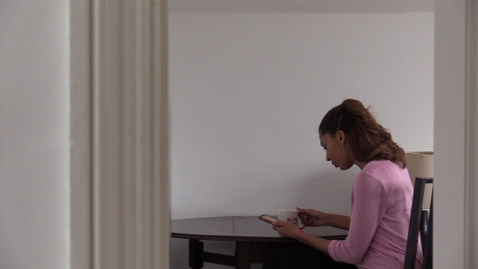
Production Notes
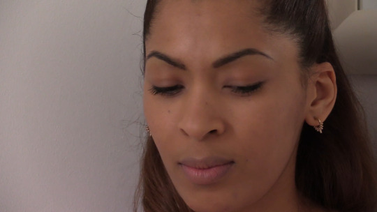
In the opening sequence of the film, there are several still life scenes brought together to set the tone of the storyline. A window, personal belongings and photographs are some of the signifiers presented. Each may be overlooked and some objects, such as the bannister in the hallway, are characterless. The impersonal nature of the setting is the first clue that something might be suspect. Time is given for the camera to remain at each shot and slight fluctuations in the lighting add life to each composition. The same is not experienced with a still photograph and this gives a sensation of the passage of time. Homage to Silent Voice’s (2016) anime framing occurs during the line reading scene. I intentionally dissected Natalie’s face in half. To do so, the camera was offset and I asked her to look directly at me. Like Yamada’s protagonist, the idea was that the viewer is scanning details of the character on screen. During real life conversations, eye movements are rarely static and perception is an accumulation of sensory information. It is such an unorthodox camera angle; however, I decided to take the risk and leave it in the final cut.
Bibliography
Osborn, A. (2019). A Silent Voice Review. IGN. Available from
www.ign.com/articles/2017/10/16/a-silent-voice-review
[Accessed 10/04/2020]


Final Cut, Manual Mode, 25 fps, WB Natural Light
0 notes
Text
Production Journal - Script Development
070220
During the early phase of developing our script, I decided to informally interview Natalie over coffee. This was mainly for research purposes and to give her a chance to gather her thoughts. I have a background in print journalism, so it was natural for me to ask leading questions and record her answers. However, the written word is delivered in a contrasting manner when it is read out loud. My first draft was too structured and formal. Natalie took this version and introduced hesitations, pauses and redundancy into the speech. Her background in stage acting was useful here. The result is a cross between a written and spoken response. I was clear that this script should be used as a guide only and I encouraged her to improvise where she felt it was necessary.
To begin, we recorded all of the script as a monologue on my Zoom Recorder HN4 Pro with a lapel microphone. This would set the foundation for shooting and editing the remainder of the project. Since it was being narrated, it has a rehearsed feel to it. The dictation is regular without any fluctuations in tone and her training as an actor meant that each syllable was well enunciated. It has been left unedited because I felt that it created the impression Natalie was reading from a diary. The utterances seem personal and the enforced cadences become more impactful - each thought is given space and time to sit in the mind of the listener. Only three takes of the monologue were needed. Out of the performances, I trimmed select phrases that were delivered with the most natural fluency. The premise of an actor playing an actor meant that there were generic topics we had to cover - training, working, peer support and other related issues. Her delivery was directed by me to be convincing but to leave some room for ambiguity. I wanted the audience to suspect whether the information was factually accurate and to reveal the mechanics of the filmmaking process.
The text that follows is our final script. To assist her delivery on camera, we printed extracts onto cue cards that she could glance at on her lap.
If people ask me what I do, I say, ‘I’m an actor.’ Sometimes I make excuses for myself because they say, ‘Ooooo what have you been in that I’d know?’ To fill that awkward silence, I feel like I have to justify myself. But saying I’m an actor should be good enough because it’s true - I am and I’m proud. I’m always working on projects, keeping myself in the loop with new plays / TV shows / film, I have an agent, I go to castings but if what I’m doing isn’t main stream people think, ‘You haven’t made it.’ or ‘You’re not really an actor.’ Things like that. Defining myself is important. This is such a tough industry and I have to believe in myself to keep driven and motivated. It’s the only way to survive.
I trained at the Royal Central School of Speech and Drama, which was where my confidence started to build as an actor. It’s true that not everyone needs to train but personally I did. Even though I’d always performed in school plays I was quite shy, so I definitely benefited from the training. Using the techniques, I learnt whilst training gave me the confidence to be able to quickly prepare scripts for audition. Drama school gave me plenty of skills but it didn’t necessarily prepare me for the actual industry. You have to be prepared to have no money and work a million / random odd jobs. I made lots of friends while training. We still see each other now and they are such a valuable source of support. We collaborate, write ideas down and always make time to meet up. We beat ourselves up enough in this industry so regularly seeing other actors to celebrate each other’s successes and console each other’s failures is a must!
My first professional acting job was actually before I attended drama school. I performed in Twelfth Night at the Lost Theatre. It was an amazing opportunity. I was the only one in the cast that hadn’t had any training yet so I learnt a lot from everyone about processes during rehearsals and the performances. I recall more excitement that nerves. Even now I experience ‘good nerves.’ One ritual I have is that I always have to read all my lines before I go on, during my warm up. I am not sure where it came from but I have never forgotten my lines yet.
If I haven’t had the same life experience as my role, then I’ll try to find someone who has. Drawing from real life is part of my process. I like to do my research. This will allow me to know my character inside out, giving me the freedom to then get lost in the world that’s created. I feel in a sense, each character is like me in some way. If I had the freedom to be a true method actor, and live in a different place or change my appearance for a role, I would do that.
I love to be in the presence of an audience. Even when a piece is scripted, you are always feeding off their energy. When they’re uplifted, you can feel that they are with you. After a show, that high is still there.
When improvising around a script you still need to know the lines really well. You need to know what you are saying and why you are saying it, as it can take you out of your comfort zone. This can be really scary and exciting at the same time. The challenge is definitely enjoyable.
Shakespeare is my passion in life. Every word, every line has so many subtleties. It is never straight forward. Every production that you see is a unique interpretation.
I am half Ghanaian and half British. Well Essex girl, if you want to be specific! In film and TV, ethnic minorities are getting more well represented. Probably because audiences are becoming more diverse too. Theatre is catching up. I feel that we are getting there slowly.
It is hard to comment on equal opportunities for men and women in the creative industry. The roles that are available do not compare. It is down to us as artists to write those roles as well. I need to write more than I do. There is a place for more strong female leading roles in theatre.
I am a South Londoner through and through. Brixton Market, Clapham High Street, Crystal Palace, the list of places that are a part of me are endless. I am often hanging out in one of the coffee shops. If you want to be an actor in the UK, London is the place to be. This is where it is at.
My aspiration is to appear at The Globe or The National. A BBC Drama or Netflix series are up there too. If I was giving advice to someone starting out, I would encourage them to trust their gut. Also avoid comparing themselves to anyone else.
I wanted Natalie to read lines on camera for one scene and I asked her to select a script that she knew well. Shakespeare’s A Midsummer Night’s Dream has come up in our past conversations. Her interest in the piece was apparent; however, the actual words were not as important as her performance. My idea was to use parts of the monologue as a voice over while the audience watches her act. I shall go into further detail about this in a later post. At the time, I asked Natalie about the significance of this particular play.
‘Helena has followed Demetrius into the woods because she is in love with him. At this point in the play he is telling her to leave him alone but she is persistent and not taking no for an answer. I love this scene. The dialogue is so potent and the things that he is saying to her present an actor with many possible reactions. There is truth in the way that she reacts to him. Yes, he says awful things to her but she believes that he is playing hard to get. This makes the scene even funnier because the comedy comes from the audience unravelling the truth.’
A Midsummer Night’s Dream, Act 2, Scene 1
Demetrius - I love thee not, therefore pursue me not.
Where is Lysander and fair Hermia?
The one I'll slay, the other slayeth me.
Thou told'st me they were stolen unto this wood;
And here am I, and wode within this wood,
Because I cannot meet my Hermia.
Hence, get thee gone, and follow me no more.
Helena - You draw me, you hard-hearted adamant;
But yet you draw not iron, for my heart
Is true as steel: leave you your power to draw,
And I shall have no power to follow you.
Demetrius - Do I entice you? Do I speak you fair?
Or, rather, do I not in plainest truth
Tell you, I do not, nor I cannot love you?
Helena - And even for that do I love you the more.
I am your spaniel; and, Demetrius,
The more you beat me, I will fawn on you:
Use me but as your spaniel, spurn me, strike me,
Neglect me, lose me; only give me leave,
Unworthy as I am, to follow you.
What worser place can I beg in your love,
And yet a place of high respect with me,
Than to be used as you use your dog?
0 notes
Text
Production
310120
Hardware
My background is in stills photography and filmmaking is a new avenue of expression for me. An understanding of photographic principles gives me some advantage; however, recording movement and sounds will be the main challenge. I intended on using my own camera, a Nikon D750 with a range of prime lenses, for this project. The first limitation that I discovered was its ability to record for only twenty minutes at a time. This may be an issue for some longer scenes. It also had to be manually focused and held with a gimbal to adapt it for filming. A Canon Legria HFG26 HD Camcorder presents much better options for the work that I want to create. It is a complete compact unit, meaning that I will not have to carry additional lenses while shooting. It can record indefinitely with enough memory cards and its autofocus can track a moving subject. Also, it is designed to be held without a gimbal, although I was not satisfied with the camera shake that I observed in test footage. For this reason, all the clips in my film will be shot on a tripod only. To keep the settings simple for me to use I will leave it in manual mode, 25 fps and WB natural light.
After using a Zoom H4N Pro Sound Recorder, I was so impressed with its operation that I bought my own. The scratch audio from the camcorder had a tinny feel to it. An additional microphone could be attached; however, its position was dictated by the length of the cable. Recording sound independently at 96kHz gave a much clearer result. The device could also be concealed on the subject or out of shot without an unsightly cable on display. To match the scratch audio with the recording, a loud clap has to be made before each scene. This is traditionally done with a clapper board. I will improvise by clapping with my hands during each shoot.
Artist and educator Sophie Alston allowed me to practice the interview process with her prior to filming with Natalie. It was an opportune session to note down any technical issues. The camera and tripod combination worked well. Her home environment had many interesting items that presented themselves as still life scenes. I found framing almost exactly the same as working with a stills camera. My inclination was to ask her to speak directly into the camera during the interview. This was effective some of the time, but with further experimentation, shots that presented her at an angle had more draw. In one scene, I directed my lens through some shelves and broke up the frame with artwork in the background. She spoke to me off camera to give her eye line some direction. The sound recorder performed as expected although the directional microphone on the unit needed to stay close by. For my shoots with Natalie, I shall attach a lapel microphone.
Software
There are many similarities between Adobe’s various packages. Premiere Pro is the most common editing software found in the film industry. The timeline is where clips and audio are assembled in layers in a similar way to Photoshop. I found the interface logical to use when completing the post-production on my test film. The clips and audio can be cut or trimmed to be displayed at the desired time. Since this film is so short, I will trim everything because this will leave the maximum amount of data available to construct a narrative. Advancing the footage, pausing and rewinding can be done with several shortcuts. Pausing and advancing frame by frame was also very useful. Editing within a frame at a time created subtle changes to the rhythm of the film. Effects, captions and music are some of the other features that can be added. As a novice, I shall use these basic functions of Premiere Pro when editing my final piece.


Test Shoot, Manual Mode, 25 fps, WB Natural Light
0 notes
Text
Project Proposal
240120
Idea / Subject / Interest
My personal and professional practice is centred around stills photography. It is the precision of focusing, framing and exposing a single moment that appeals to me. By challenging myself to investigate the screen option of this module, I will make work free from past inhibitions. There is considerable overlap between film and stills photography; however, recording movement and sounds represents new terrain.
Natalie Boakye is my collaborator for this piece. She is an experienced actor and model with her own creative practice. We have discussed several options and locations to film. However, the overarching theme will be to represent her personal narrative and the adversities that she faces in the performing arts industry. This is also an area of interest to me as a lecturer, writer and photographer. These are the following action points that I plan on completing, which will edit into a 3-5 minute short film.
1) Monologue (5-10 minutes) - I will record Natalie’s speech in response to questions and then script a formal monologue that she can read as a voice over. The sound quality will be the highest that I can achieve and become the foundation of the plot. Editing decisions for all the shots will be based upon the rhythm, pacing and cadence of her words.
2) Walking on location (1-2 hours) - There are several areas of London that I would like to shoot depending upon access and time limitations. Footage of her in busier crowds and on public transport will represent her daily movements across the city. It will imply that she is on her way to a rehearsal. Quieter introspective moments will be included to break up the commotion.
3) Reading lines (1-2 hours) - I plan on recruiting a second actor that Natalie is familiar with to read lines with her. This segment will involve faster transitions to represent the interplay between the artists. Furthermore, I would like to explore point of view shots to position the viewer as a recipient of Natalie’s performance.
4) Formal interview (1-2 hours) - The ability to record an interview has professional value to me and it may be a service that I provide clients in the future. I would like to light and film a simple interview from two different camera angles and edit them together with sound recorded at the location. My intention is to implement bold stylised framing.
5) Still life scenes (1 hour) - Presentation of personal effects such as photographs, props and mementoes will add insight to Natalie’s story. Push and pull focusing across the scenes are a technical challenge that I would like to set myself. The lighting will also have to complement the range of other shots.
Genre / Style
If the time frame of this module was longer, I would have preferred to shoot with a reportage style. As a compromise, I feel that the proposed scenes will cover the same content with an equivocal documentary impact. Staging some of the events and then allowing them to unfold will provide spontaneity to a scripted monologue.
Fields
The final piece will be part of a group exhibition at the University of Westminster. The majority of the works will be arts based. Given that a viewer may begin to experience the film at any time, I will present an edit that has a cyclical narrative. I shall simplify the sound design to allow speech to be audible in the exhibition space.
After consideration, guidance and shooting test footage, my idea began to evolve into something more conceptual. I intend on using the format of an interview to challenge the perceptions of my audience with an exploratory piece that reveals the truths about acting and the filmmaking process itself. By breeching the fourth wall, I shall infer that Natalie is an actor playing an actor. Over the duration of the film, the audience will question her more and more leaving the boundary between fact and fiction blurred.
Statement of Intent
This is a blurb to describe my short independent film. It is intended to appear next to an icon prior to downloading it.
‘Natalie Boakye is an actor. She went to drama school, attends auditions and dreams about her ‘big time’ debut on the BBC or Netflix. Like every aspiring creative, her days are filled with trials and tribulations that make her doubt her career path. Friends keep her motivated, random jobs keep her in employment; however, something lies beneath the surface of this seemingly uneventful interview. Is Natalie Boakye an actor at all?
Filmmaker Luke Das is also a lecturer, writer and photographer. Natalie Boakye - Actor (2020) is his debut commission following a return to academia at Westminster University. Deviating from his commercial background in photography, he examines a conceptual narrative that aims to tear apart the fabric of the filmmaking process itself. Out of all the potential roles in the creative industry, he chooses acting - a coveted avenue to fame and fortune unlike any other.’
Mock Up
As online platforms increase in popularity, original media is often seen in transit on mobile devices. Given that this is a short film with minutes to portray a plotline, I envisage that it would be discovered by a viewer via a social media link showing seconds of promotional footage. This would then direct them to watch it online on a service such as Netflix or Amazon Prime Video. It is possible that it might also be seen at home on a television; however, it is not intended for general release in cinemas.

Online Platform
0 notes
Text
Evaluation
121219
Project Title
Into The X-Files
Conceptual Engagement
A staged tableau constructed with actors, lighting and a medium format analogue camera was specified in the project brief. It has been a personal ambition to create a piece in homage to the television series The X-Files. The nature of the subject matter lent itself to the parameters of the project and presented many opportunities to express my creativity - paranormal activity investigated by FBI agents. The cinematographer John Bartley developed the visual language of the programme, which was my starting point for designing a concept. In addition, I also took influence from stills photographers Gregory Crewdson and Hannah Starkey. I am satisfied with the accumulative results of my research.
Creativity
The interior of a room was suggested with the use of suspended blinds and studio lighting. To allude that an alien abduction was taking place a smoke machine and coloured gels were added. The overall appearance of the final photograph was eerily atmospheric and in keeping with the science fiction aesthetic of the reference material. Due to all the practical effects involved, timing and attention to detail were crucial throughout each shoot. The smoke machine was particularly temperamental. Finally, it took a while to grow accustomed to using a medium format analogue camera. I enjoyed the challenge of working with one and began to accommodate to the physicality of its operation.
Coherence
This was the first project that I have completed, where it was compulsory to submit a stand alone photograph. Several variations were shot on the final roll and I feel that I captured an image that represented my intentions. The actor had a deadpan stare to reference Crewdson. Her predicament appears mysterious and precarious, which is a facet of Starkey’s photography. Furthermore, a lighting strategy was lifted and adapted directly from The X-Files season eleven. Hard light was projected through blinds and smoke as a key light with a back light to differentiate the subject from the background. The low-key design was coherent and respectful of Bartley’s contribution to the series.
Technical Control
I have extensive experience as a studio photographer. The practicality of assembling a flash head configuration was familiar; however, I could only use my digital single-lens reflex camera to test the equipment. A medium format analogue camera required my full attention to use effectively and I would like to return to this format in future productions. It was novel to not see the photograph that I was creating, and as a result, I was more inclined to experiment. The technical process of scanning a slide, editing a digital file and printing the final piece was novel to me too. I was vigilant to follow the tutorials delivered in class then adapt the techniques as required.
1 note
·
View note
Text
Tim Walker - Wonderful Things
081119
Tim Walker (Born 1970) is a British fashion photographer with a penchant for the extravagant and the romantic. His work concentrates upon photographic stills and more recently includes moving film.
Walker is of British descent and expressed an interest in photography before university. He worked alongside Cecil Beaton at the Condé Nast library archive and then completed a degree in Photography at Exeter College of Art. His freelance career began as Richard Avedon’s assistant in New York. Upon returning to Britain, he was predominately a photojournalist before shooting fashion for Vogue in the British, Italian and American editions. His other renowned credits are for W and LOVE Magazines. In 2008, he staged his first major exhibition at the Design Museum. In later years, the V&A and the National Portrait Gallery have housed his works in their permanent collections. Walker’s various awards include the Isabella Blow Award for Fashion Creator, Infinity Award and an Honorary Fellowship from the Royal Photographic Society. (Walker, 2019)
In an interview, he elaborated on his perceptions for the role of his photography, ‘They’re all dreams: every picture is a fantasy. Not so much the portraiture, but the set pieces definitely are fantasies and I think that the model or the sitter in a picture is the window for the viewer - for any person - to be a part of that fantasy. It’s me asking them, inviting them, to enter into that, whether it’s a dark and sinister mood or a beautiful fairytale. It’s escapism - that’s what it is.’ (Smith, 2012)
Wonderful Things is Walker’s latest exhibition and his process was of interest to me during the latter stages of my project. It features ten major commissioned works that are directly influenced by artefacts housed in V&A’s permanent collection. The artist was invited to visit the museum’s archive and meet with curators, conservators and technicians. He was given unprecedented access to 145 galleries and he selected stained-glass windows, Indian miniature paintings, jewelled snuffboxes, erotic illustrations, golden shoes, a 65 metre long photograph of the Bayeux Tapestry and several other pieces. The resultant monumental photographs were both highly creative and immersive. Curator, Shona Heath has described the exhibition as a passion project come true and this was clearly evident in the presentation. (V&A, 2019)
Lil Dragon (2019) was inspired by a snuffbox emblazoned with a dragon on it. The photograph features Walker’s signature wide-angle composition with vivid offerings of blue, purple and magenta brought into the fray. The figures in the piece are reconstructing the poses featured on the artefact; however they are dressed in contemporary fashion rather than period costumes. The stylistic props impose a satisfying clash with the clothing and the viewer is invited to become a part of the fantasy. This piece was exhibited close to life size and UV lighting was employed to punctuate the colours. Wonderful Things has received mixed and generally favourable reviews. I was moved by the visual spectacle on display, even if his approach does not reflect my personal taste.
Summary
Like Walker, I have created a photograph that was influenced by thematic source material. It was fascinating for me to witness another artist’s approach to this scenario first hand. During the Photoshop edit of my file, I meticulously removed each spec of dust with the clone and spot healing tool. Colour correction was not needed because of the stylised nature of the concept. The colours of Lil Dragon resemble those found in my photograph; however, I was faithful to the tones that were captured on my slide. I was taken by Walker’s presentation of his work at the V&A and I decided to print my piece on C Type Kodak Metallic paper. This surface has a rich metallic base and the colours appear more reflective and three dimensional. The manufacturer also notes high midtones and highlights with added luminosity and iridescence. (theprintspace, 2019)
Bibliography
theprintspace (2019). Professional Photographic C Type Printing. theprintspace.
Available from
www.theprintspace.co.uk/professional-photographic-c-type-printing
[Accessed 12/12/2019]
Smith, C. (2012). Interview With Tim Walker. The White Review. Available from
www.thewhitereview.org/feature/interview-with-tim-walker
[Accessed 12/12/2019]
Walker, T. (2019). Biography. Tim Walker Photography. Available from
www.timwalkerphotography.com/biography
[Accessed 12/12/2019]
V&A (2019). Inside the Tim Walker Wonderful Things Exhibition. V&A. Available from
www.vam.ac.uk/articles/inside-the-tim-walker-wonderful-things-exhibition
[Accessed 12/12/2019]

Tim Walker, Lil Dragon, 2019
1 note
·
View note
Text
Production Journal - I Want to Believe
011119
It was fortuitous that my test shoot worked out well and I am excited to assemble the components of the final piece. I have been debating the crop of my photograph, which will change the proportions of each constituent element. I was considering 16:9, which is the standard aspect ratio of HDTV, Full HD and analogue widescreen television. The X-Files season one and many of the early episodes aired on the Fox Network in standard definition with a 4:3 aspect ratio. At the time, vacuum-tube televisions were the most widespread and this was considered fullscreen. These episodes have since been restored to 16:9 and remastered in HD for digital distribution. True fans still prefer the original muted colours and low contrast of the 1993 original broadcast. Therefore, this will be the crop factor that I shall choose for the final piece. (Clarendon, 2018)
Production Notes
An aspect ratio of 4:3 resembles 6 x 6 film; however, some of the frame will be lost. This was one consideration during production of the final piece. The exact same light and camera settings were carried over from the test shoot and I was meticulous to recreate each detail. There were some subtle changes. I felt that more purple was needed on the key light, so I doubled up the amount of gel over the barn door on this flash head. A second sitter, Hayley Reece wore a black hoodie in the background to imply a paranormal presence. This was simple in theory; however, we attempted several angles and distances to Tashi to get this right. Finally, I was aware of the flashlight, FBI badge and smoke machine issues from the first shoot. The processed roll was scanned on an Imacon scanner in RGB 16 bit at 3200 PPI. The resultant TIF files are summarised in the following contact sheet.
In shots 01, 02, 03, 04, 09, 10 and 11 the flashlight features and I directed Tashi to not point it into the camera. This was a solution to the problem; however, it is still evident that it is not emitting light. For this reason, I have decided to not select one of these variations even though it is a prop associated with the character. Her right hand appears wider than her left hand when it is dominant in the frame and we all collectively preferred shots 07 and 08 for this reason. Her arm acts as a leading line, drawing the viewer into the photograph. It also covers the problematic detail of the FBI badge. When deciding between these final two images, it was Tashi’s expression in 08 that appealed to me the most. She has a classic deadpan stare that Crewdson has made famous in his works. Furthermore, it acted as a means to captivate the viewer and invite them to question the source of the mysterious light. One element that I noticed after the film was processed was the lens flare in the background. During my digital test shots a lens hood was attached. This was not available on the Hasselblad body in the final piece. In retrospect, I rather like the effect and it adds to the ambience of the photograph.
Bibliography
Clarendon, D. (2018). 7 Most 90s Things About The X-Files. TV Insider. Available from
www.tvinsider.com/717746/x-files-season-1-premiere-pilot
[Accessed 12/12/2019]
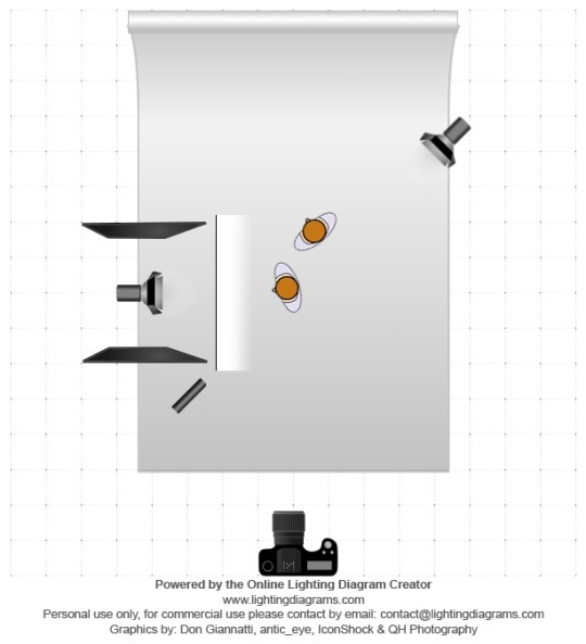
Lighting Diagram

Contact Sheet
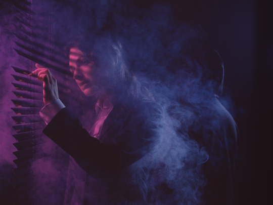
Final Piece, f/11, 1/125, ISO 100
1 note
·
View note