
Statistics
We looked inside some of the posts by wicweeeei and here's what we found interesting.
Average Info
Notes Per Post
11K
Likes Per Post
9K
Reblog Per Post
2K
Reply Per Post
104
Time Between Posts
6 days
Number of Posts By Type
Text
15
Note
2
Last Seen Tumblr Blogs


Fun Fact
In 2020, 44% of users from Denmark used Tumblr daily.
Text

Psa to all engineers
254 notes
·
View notes
Text

Butters murders everyone with a tap dancing shoe
14 notes
·
View notes
Text
more butters
i really like butters
37 notes
·
View notes
Text

fuck u underswaps ur spy
34 notes
·
View notes
Text

Butters
24 notes
·
View notes


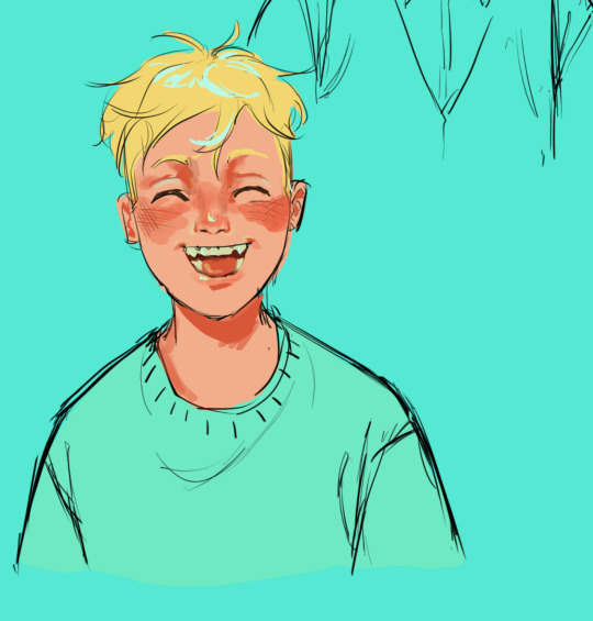
Text

More south park
47 notes
·
View notes
Text

Iam getting back into South Park and I love butters
117 notes
·
View notes
Text
popular tf2 artist @/qqqkrolek truyerabi is disgusting and proship
Huge trigger warning: Sexual Assault and incest
I don't support harassment or bullying I'm just sick of seeing so much support towards this artist when they draw nasty eroguro incest and post it in the public domain
These drawings can be found freely available on their art telegram channel (as always the nastiest things happen on telegram) I just want to keep people informed about who they're following and supporting


These aren't all their drawings, some of them I chose not to show willingly because they're too fucked up and disgusting (They drew a spy having sexual intercourse over a scout's open abdomen as a collab with another artist @/wormizette)
I'm not going to debate the topic of artistic freedom. it's not about that right now, even if there is a place for this kind of cursed art, it shouldn't be encouraged in the larger community
(What kind of art can we talk about in a drawing of a scout in a bunny suit being lured by his own father anyway)
It's your choice to continue to support this person's art or not. I just want to keep people informed
(Because this incestuous genius chooses to leave such shit only in Telegram knowing full well that only there they will find support from the same equally fucked up and disgusting people. In Tumblr they post only the most adequate thing haha)
I encourage you to reblog this post and spread awareness
845 notes
·
View notes
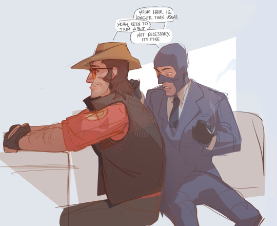
Text
Stop depending on it


296 notes
·
View notes
Note
May i request Spy and Scout just sitting eating some chips? Thank youu!

lollipop no chip
25 notes
·
View notes
Text

Happy new year
370 notes
·
View notes
Text
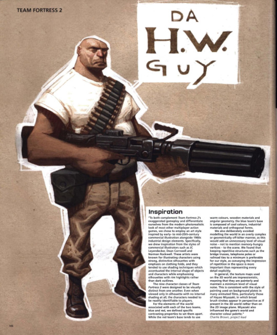

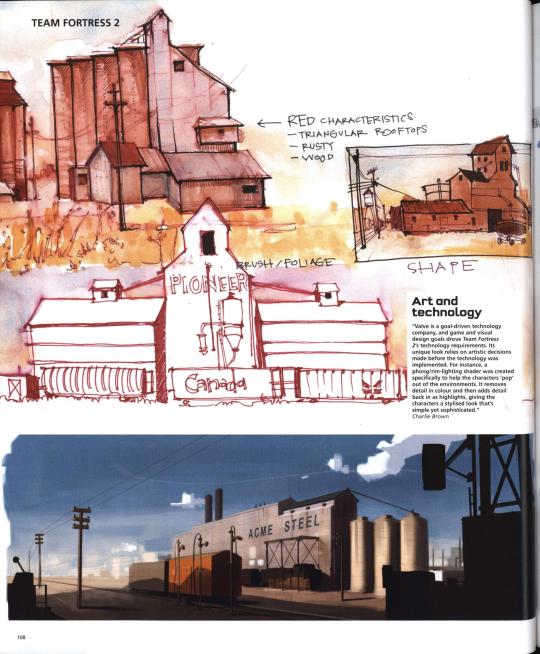

Team Fortress 2's concept art featured in The Art of Videogames (2007)
A transcription of the paragraphs shown can be found below.
Inspiration
"To both complement Team Fortress 2's exaggerated gameplay and differentiate ourselves from the modern photorealistic look of most other multiplayer action games, we chose to employ an art style inspired by early- to mid-20th-century commercial illustration alongside 1960s industrial design elements. Specifically, we drew inspirartion from the styles of commercial illustrators such as JC Leyendecker, Dean Cornwell and Norman Rockwell. These artists were known for illustrating characters using strong, distinctive silhouettes with emphasis on clothing folds, and they tended to use shading techniques which accentuated the internal shape of objects and characters while emphasising silhouettes with rim highlights rather than dark outlines. The nine character classes of Team Fortress 2 were designed to be visually distinct from one another. Even when viewed only in silhouette with no internal shading at all, the characters needed to be readily indeitifiable to players. For elements of the world associated with each of the two teams, blue and red, we defined specific contrasting properties to set them apart. While the red team's base tends to use warm colours, wooden materials and angular geometry, the blue team's base is composed of cool colours, industrial materials and orthogonal forms. We also deliberately avoided modelling the world in an overly complex or geometrically off-kilter manner, as this would add an unnecessary level of visual noise — not to mention memory-hungry vertices — to the scene. We found that keeping repetitive structures such as the bridge trusses, telephone poles or railroad ties to a minimum is preferable for our style, as conveying the impression of repetition in the space is more important than representing every detail explicitly. In general, the texture maps used on the 3D world are impressionistic, meaning that they are painterly and maintain a minimum level of visual noise. This is consistent with the style of painting used on background plates in many animated films, particularly those of Hayao Miyazaki, in whic broad brush strokes appear in perspective as if present in the 3D world rather than on the 2D image plane. Miyazaki also influenced the game's world and character colour palette." — Charlie Brown, project lead
Art and technology
"Valve is a goal-driven technology company, and game and visual design goals drove Team Fortress 2's technology requirements. Its unique look relies on artistic decisions made before the technology was implemented. For instance, a phong/rim-lighting shader was created specifically to help the characters 'pop' out of the environments. It removes detail in colour and then adds detail back in as highlights, giving the characters a stylised look that's simple yet sophisticated." — Charlie Brown
Bold outlines
"The specific characteristics we needed were mostly dictated by Team Fortress 2's gameplay. Foremost, we wanted players to be able to intuit each character's unique gameplay features at a glance. The Heavy Weapons character, for example, had to quickly convey strength, sturdiness, slowness, and the ability to pack a real wallop. To further aid in quick readability, each character class requires a bold, distinct silhouette shape." — Charlie Brown
412 notes
·
View notes


Note
hello can you draw pregnant radigan conagher please um

YOU BET!!!
...now... if you'll excuse me... i have to revise my choices in life...
363 notes
·
View notes
Text

the bug is back
237 notes
·
View notes
Text

Sleepy boys
119 notes
·
View notes