Photo

David Attenborough documentaries are good at capturing the environment and the impact we have on it. This is especially powerful in his documentaries because of how well the impact of humans on animals is framed, using provocative images that show the scale and harm of something. The fact that countless elephants are killed for their tusks is something that most people know, but actually seeing mountains of elephant tusks makes the impact feel much more real and makes the image memorable.
It feels like the type of imagery that you would see in a piece of concept art, because it effectively communicates an emotion without being incredibly elaborate. The way these documentaries are shot could be very useful for showing how to approach concept art and how simple and effective is usually the best way of creating concept art.
0 notes
Photo
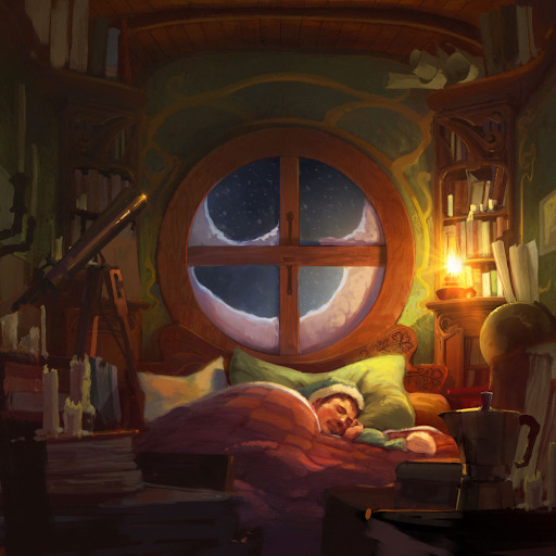

Tuomos Korpi is a concept artist and illustrator who generally depicts serene landscapes filled with vibrant, lively colours. What’s impressive about his work is that he manages this without letting his work fall into a generic “postcard” look.
His usage of colour is especially appealing, there’s a whimsical charm to his colour usage, most of his work will contain some kind of contrast colourwise. Glowing yellow rivers are offset by grey harsh rainfall, a warm candle light offsets the cold outdoors, this contrast gives his work a cosy feeling.
0 notes
Photo

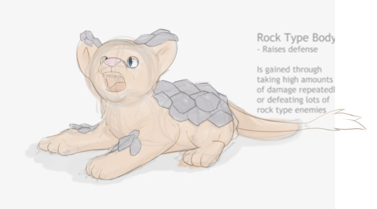


When creating this image I used a sketch from my final piece as a base for me to trace over since I didn’t feel familiar enough with Photoshop to make something from scratch. I’m surprised it turned out as well as it did because when copying over lines I imagined that I might lose some of the structure of the original image.
For the lines themselves I decided to make them compliment the colour they were outlining, for example using a light brown/dark yellow colour around the fur. To me, this makes the image more appealing since the lines blend in with everything else more. I also gave the lines some minor gradation to help make the shading look more convincing e.g making a line brighter in areas where light is hitting the character. To do this, I used the “clipping mask” and “lock transparent pixels” tools.
When colouring I decided to copy the colours from a previous drawing using the “eyedropper” tool since I thought they were very vibrant lively colours. However when simply laying down the flat fur colour, it didn’t look very vibrant in fact it looked pale. To avoid this pale look I airbrushed the lion cub with a richer, darker colour in areas that needed shading and I think it came out in a pretty good middle ground between the two tones.
0 notes
Photo
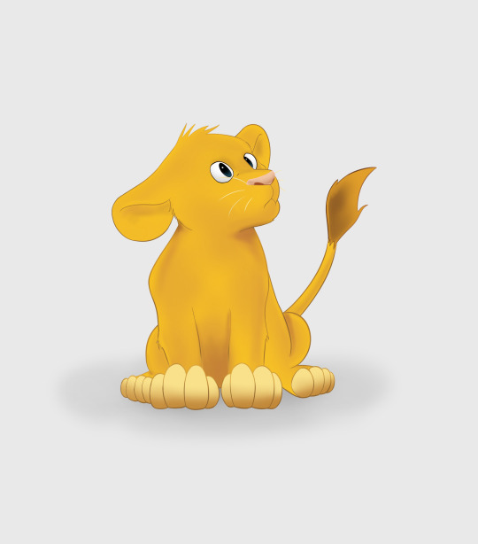
This Lion cub was used as a part of the box art for my game however I had to experiment a bit to get him to look as he does. The colours are the main thing that I messed with however I also tried to make my linework more varied in its shape. In Photoshop I would’ve done this by changing the shape of the brush in the brush settings but in the program I was using I was unable to change the shape of the brush which meant I had to focus more on pen sensitivity to get a sense of dynamism out of the lines. This led to me redoing lines often to make sure I got the right shape.
When I had used colours in previous concept art, I’d chosen colours that were quite plain and didn’t really feel like the kinds of colour a cartoony game should be using, I think this was because I was trying to avoid going to avoid making things nauseatingly colourful but I went too far in the other direction. This image feels like a good middle ground between the two approaches.
I found the shading difficult to do well since I was using an airbrush and therefore didn’t have as precise control as I would've liked but after making lots of small adjustments I think the shading looked very good, giving a good sense of three dimensionality and complimenting the initial colours I was using for the Lion cub.
0 notes
Photo

This is the box art for Pinnacle, I didn’t want it to be too cluttered and wanted to make sure it communicated the focus on evolution. I used a green background to match the colour of the logo.
0 notes
Photo
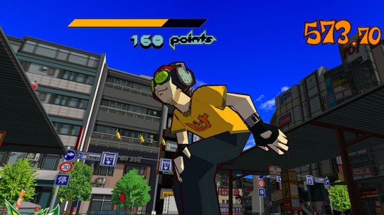
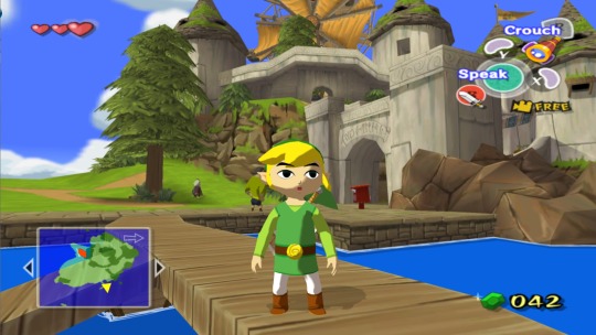
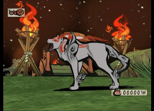
Cel-shading in games is a somewhat forgotten stylistic choice that was mostly popular in the early 2000s but is still used occasionally nowadays. Despite Cel-shading being quite a distinct style, different games that use cel-shading still have subtle differences from one another in how they use cel-shading to bolster their artstyle.
Jet Set Radio (top image) has a graffiti inspired artstyle that gives its character models bold, confident outlines that compliment the game's rebellious tone. Naturally, since the aesthetic of the game is based off graffiti using cel-shading made sense as a compliment to everything else.
Another game known for its use of cel-shading is The Legend of Zelda: The Wind Waker (middle image). Unlike Jet Set Radios' gruff and jagged artstyle, The Wind Waker is closer in presentation to a Disney film. The whole game looks very clean and colourful, using light to heighten the impact of certain scenes in a way a game without cel-shading couldn't do nearly as effectively.
Another notable game that uses cel-shading is Okami. Okamis' aesthetic is based on old Japanese artwork, especially focusing on the brushwork featured in most of it.
These three games pretty adequately demonstrate that cel-shading is just a tool in getting a game to look how you want it to, rather than something that defines a games artstyle alone.
3 notes
·
View notes
Text
Evo Encylapedia
One idea I had for Pinnacle was that every time you evolved in some way, you would unlock a new entry in an ecyclapedia that documents each type of creature you've turned into. This would show the animals' stats, a brief description and a rotatable model of the animal. This could act as something for completionists to do. However I think unlocking every form of every animal may end up being tedious in practice.
0 notes
Text
Creature Animation
Animation for this game would be tricky since most animals move in different ways and therefore you would have to create unique animation sets for lots of the creatures. This could end up limiting the total number of animals in the game severely, considering how long animation takes.
0 notes
Photo

Since my game is going to look quite stylised, it should be able to run on most modern systems. The demographic of my game skews young, a console that lots of young people own would be the best choice for my game.
0 notes
Photo


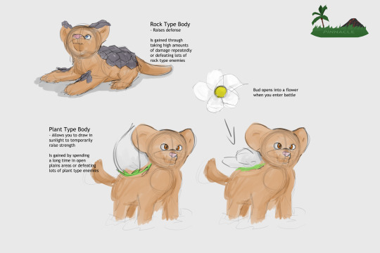

This is my pitch for Pinnacle, I wanted to make sure it outlined everything you would need to know about the game.
0 notes
Photo
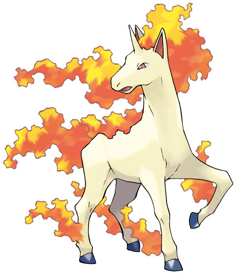
There are many different types of Pokemon and I think these different types are interesting becuase of how they impact the creature design of each Pokemon.
Fire type Pokemon tend to be covered in flames, which on its own isn’t very interesting but the way an element is integrated into a Pokemons design can show how effortlessley you can make elemental characteristics look on any animal. For example Rapidashs’ flames are turned into some kind of fiery mame. I think this is a good way to add elemental features to a design, by not just adding the element in question, but by making it fit into how an animal already looked.
This is useful for my project because I would like to let animals evolve elemental traits.
0 notes
Text
Animal Packs
I don't think including pack behaviour would fit with the design of my game, especially if it were the player joining a pack since this could trivialize the gameplay by giving the player too much power, especially early on in the game. Perhaps having some kind of respect stat that rises as you win fights would allow you to gradually amass a full party of all sorts of creatures.
0 notes
Text
Day/Night System
A day and night system would be interesting to implement, changing the time of day could allow for more variety as to why and when enemies appear. Since lots of animals also hunt at night, it could be an interesting added challenge for when night falls. This could incentivise the player to find some kind of safe place to hide at night.
0 notes
Photo
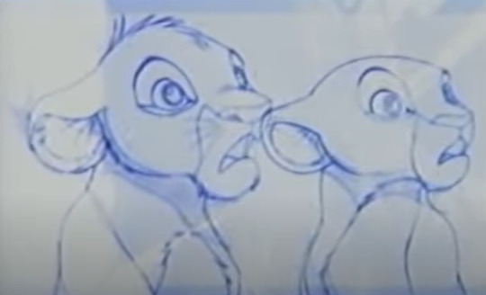

The Lion King pencil tests are pretty interesting to me because they highlight how important it is for animators to stick to a consistent art style on large projects such as The Lion King. Obviously since this is just a test, the different styles the characters are drawn in don't matter but I think it's important to appriciate the technical skill needed for a group of animators to draw the same characters with such consistency across a full movie. But I don't think there's anything I can draw from this with regards to my game.
0 notes
Photo
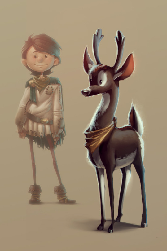
Adina Krause has a simple, innocent artstyle that carries lots of charm and technical skill. This deer for example, has a simple colour scheme and slightly exaggerated proportions. It looks pretty appealing and simple. The real skill comes in with the subtle lighting choices Krause uses to give this piece a joyous feeling. Even though we can't see a background the lighting of the deer tells us that it's standing in a soft sunshine. This adds to the pleasant feeling the image wants to give off.
I think this piece shows how lighting is more than just something used to ground a character in a setting but a tool in of itself that can be used to create a mood.
0 notes
Photo
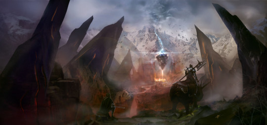

Karl Thiart makes huge landscape pieces that all have a palpable sense of atmosphere because of the way they use colour and other subtle lighting effects like mist. In the top image we see grey mist shrouding the centre of the image, containing some kind of fire, the red of which scatters onto the surrounding area which gives off a strong sense of atmosphere. This is because we don't just see the fire itself but also the effects it's having on the environment.
It's the same with the lower image, the darkness of the rocky structures surrounding the man on the horse seem to cast everything around them in a dreary mist.
I think this would be useful for drawing a viewers attention to a specific aspect of an image in my concept art.
0 notes
Photo


Johannes Helgeson makes character concept art usually grounded in fantasy. Her process for creating a render is quite time consuming, gradually refining her work and adding details that take her from a sketch to a finished render.
Firstly she'll create a sketch and then add colour to it. Next she'll add linework, then trace the linework she just drew to refine it further. After that she adds flat colours and then gives them a more natural feeling by giving the colours slight gradations. She then applies 5 different types of shading/lighting to her work, those being: ambient occlusion, strong shadows, sculpt key shadows, ambient light and rim-light. These 5 lighting aspects combined give her work a professional feel without sacrificing her art style.
I think Helgesons' process is useful to anybody interested in concept art because this kind of rendering is the exact types of things companies want to use for key art of characters and the exact type of thing I might want to use for key art in my game.
0 notes