Last Seen Blogs
stillinskisalvatore24-blog
Randomly Full Of Every Fandom 😍

amuseoffyre
A Muse of Fyre

xklosapphirex-blog
Kloe sapphire
cactus4444
الصبار

principessadosenhor-blog
Bruna Franco.
Text

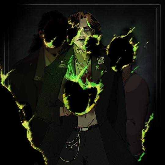
My recent order from ych.com
2 notes
·
View notes

Text
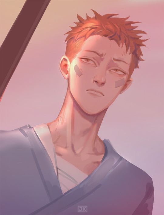
The Magnus Archives (Season One) Production Design Project
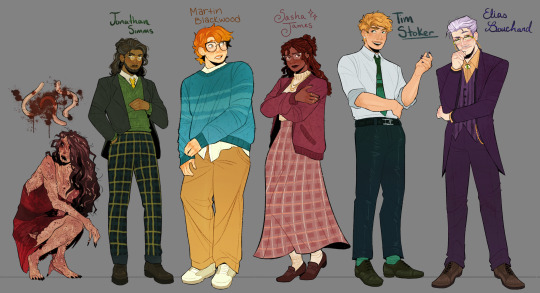

Hello everyone! Let me introduce myself- I'm Tilda (or Tilde), and I'm want to be a production designer.
Production designers create the overall look of a piece of media. From costumes, lighting, environments, props, etc., these designers make sure that everything looks cohesive and sets the mood.
So, I thought it would be fun to put my skills to the test by designing season one of The Magnus Archives. My winter break started as soon as I became interested in the show. Needless to say, a new obsession and an abundance of free time go well together.
You may have seen these illustrations posted separately, this is a master post of the whole project. My thoughts, processes, and critiques are all included under the cut. If you read them, I hope you enjoy! If, not, thank you for supporting my work regardless.
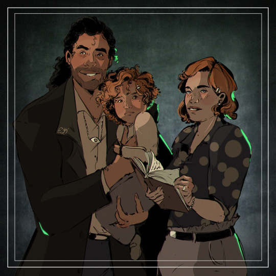
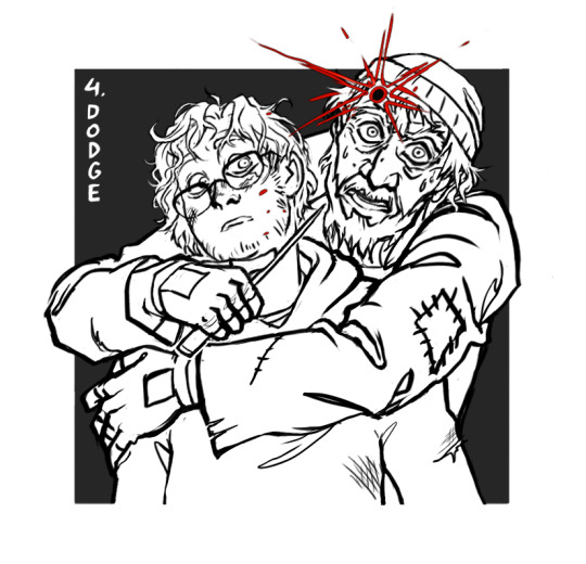
The Characters
When designing these characters, I tried to avoid being influenced by fan interpretations. Though, that was a challenge (especially with Jon and Sasha). I found that I looked to my friends for inspiration. Certain elements (Jon's glasses) were based off of what they wore.
Pinterest was also useful for finding clothing and pose references. Some looks were based off of different actors- in particular, Tim was inspired by Nicholas Galitzine and Elias inspired by Matthew Lillard.
Jane was the most fun to design! I believe in making terrifying characters actually terrifying.
Elias's design needs the most work. Having now finished the show, I see that it doesn't fit him. The purple is overly saturated, especially compared to the set. He looks out of place! I'd reverse the color palette to mostly green/yellow with purple accents instead. Although, I will forever defend the purple tint in his gray hair.
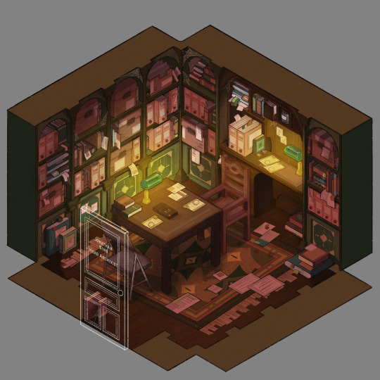
The Set
Jonathan's office was a treat to design! Balancing the color and clutter was especially important. This room is meant to be claustrophobic and uncomfortable, but not overbearingly so.
The wood looks to be full of splinters, but not so worn that it can be thrown out. The chairs offer no back support, and the shelves make the room smaller. The goal was to represented Jon's mind. Intricate, messy, and suffocating (Note: that is more of a season two description).
One goal was to capture the look of an actual archive. Valuable times was spent researching the different kinds of storage, files, paper, etc. The texture and color had to be accurate.
A split-complementary color palette of blue-green, yellow-green, and red was used. Of course, I had to get green in there, and the varying hues and desaturated reds worked well for the wood and filing supplies.
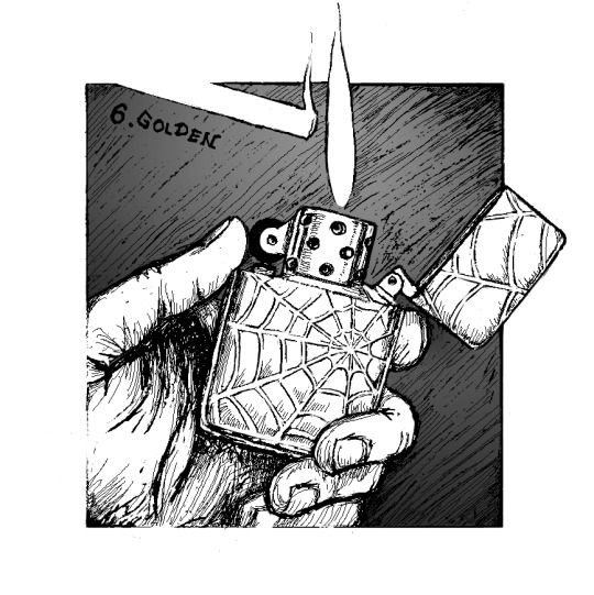
Jane's ashes and the Web lighter on the desk place this set at the end of season one. I find details like this to be important, it's one of my favorite parts of design. There is much needed abundance of eye imagery as well. Most obviously in the carpet, but eyes are carved into the table and watch from the shelves.
My main critique is the lighting- the filters used could be adjusted as to not distort the colors of the boxes. They look inconsistent. The Web lighter could also be more obvious, yet it is small and pixelated.
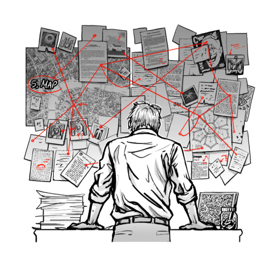
The Props
I designed these as I re-listened to season one, and it is the most recent piece I finished. Combining the details described in the show with what the objects would have realistically looked like was interesting. That was most useful for the clown, the Ming vase, and Ex Altiora.
Each of these objects came from a specific time with a specific look. Ex Altiora was bound in calf leather from the 1800s, so those books were referenced. Same with the frills on the clown's outfit.
The Ming vase was especially interesting, as it is from the Jiajing period. When looking at photographs of Jiajing vases, I found that many of them lacked handles and had an hourglass shape. That was fascinating to me, as many artists depict a standard oval-shaped vase. Also, the vase's design is described as straight lines that create distorted patterns when looking at it. That effect was achieved using chromatic aberration and the liquify tool (chromatic aberration was used to create a vertigo effect on Ex Altiora).
My critiques are... nitpicky. minimal. The shading on top of the garbage bag is unnatural. The thickness of the gold engraving on Ex Altiora is uneven. The "I" in "Immediate Consideration" is not capitalized. Other than that, I'm happy with how the props look.
Conclusion
First off, if you read everything, thank you!! It is a lot, I know.
My greatest takeaways are that 1) ask for critique, always 2) research skills are necessary for design 3) references are your friend! Seriously guys, use your references.
I hope you enjoyed this project and I'm excited to share more of my work in the future!
3K notes
·
View notes


Text
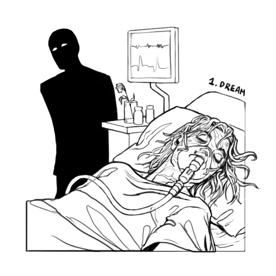
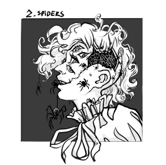
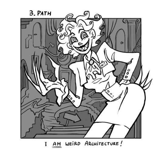
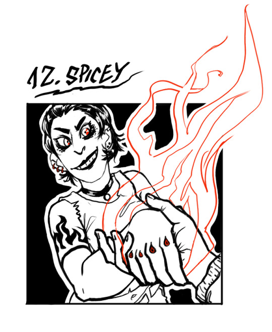
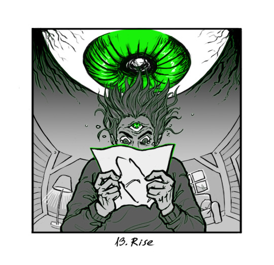

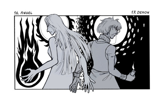
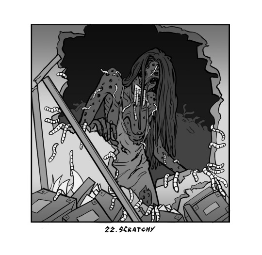
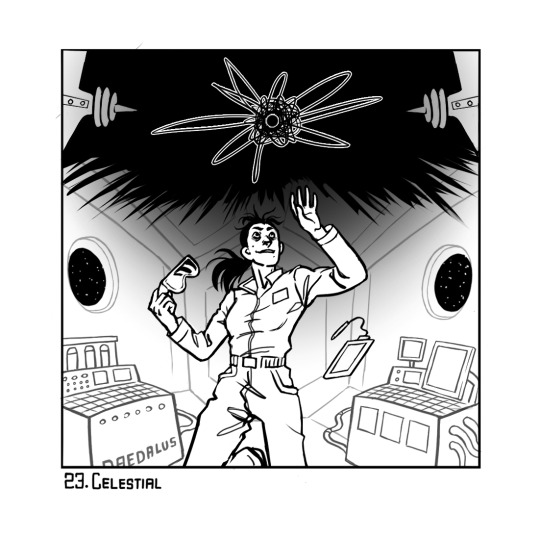
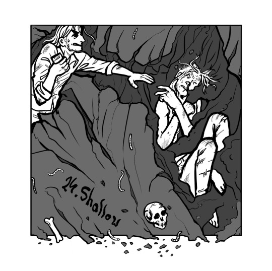

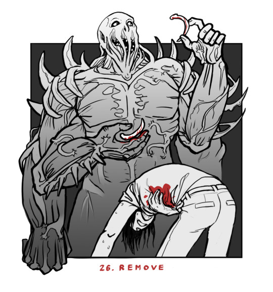
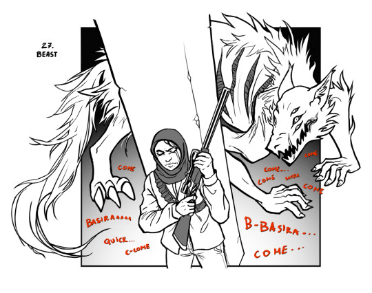
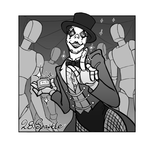

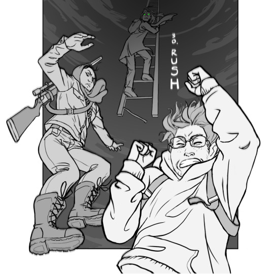
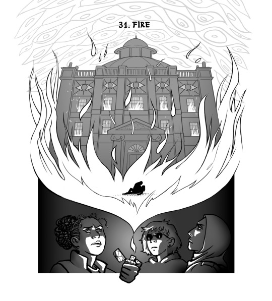
My 2023 Inktober, done all as Magnus Archives illustrations!
6K notes
·
View notes

Text

Happy to reveal my full piece for the Artsy Friends GROWTH art book! 🐉🌳 My piece was inspired by Peridexion Trees and the dragons associated with them.
🌷GROWTH is live now!!🌷 This is a collaboration artbook featuring whimsy illustrations from 19 artists, all themed around the word "growth"! If you're interested in snagging a copy you can find all the details here! 👀📚
6K notes
·
View notes
Text
Happy to reveal my full piece for the Artsy Friends GROWTH art book! 🐉🌳 My piece was inspired by Peridexion Trees and the dragons associated with them.
🌷GROWTH is live now!!🌷 This is a collaboration artbook featuring whimsy illustrations from 19 artists, all themed around the word "growth"! If you're interested in snagging a copy you can find all the details here! 👀📚
6K notes
·
View notes


Photo


That’s a deep… dock.
by Penzilla
Tumblr: @pennypenzilla
253K notes
·
View notes