
Don't wanna be here? Send us removal request.
Statistics
We looked inside some of the posts by wisconsingoestoflorida and here's what we found interesting.
Average Info
Notes Per Post
1
Likes Per Post
1
Reblog Per Post
0
Reply Per Post
0
Time Between Posts
4 days
Number of Posts By Type
Text
9
Last Seen Tumblr Blogs


experience-with-in-room-kitchens
The Comfort of Staying at Charltons Banff: A Hotel Experience wi
1 post
Fun Fact
Tumblr.com is the 103rd most visited website in the world.
Text
Final Exam: Reclaiming Democracy

I created this mixed-media piece to show the incomprehensible damage that Trump and his supporters have caused since his inauguration on January 20, 2025. The left side of the canvas is black and hopeless. The quote from "Hamilton" is appropriate, in that history does have its eyes on Trump. The black beads have holes in them, showing that even though he has tried to divide America, his hold over the American people is starting to crack. At first the rainbow is muddled with black in the colors, but then the rainbow colors become true to themselves. The rainbow is not perfect, as imperfection is in all of us. But it is up to the American people to exercise their First Amendment rights to free speech and the right to peacefully assemble. Finally, quotes are used to remind us all that we can't sit idly by. No one is coming to save us...it is up to us to save ourselves and our country.


0 notes
Text
Virtual Sketchbook 4 - Jackson Pollock
When you study Thomas Hart Benton’s work, many of his paintings reflect either wartime scenes, like “Morning Train (Soldier’s Farewell)” or landscape scenes that would have been familiar to Jackson Pollock, having grown up in California and Arizona. It was natural that Pollock felt constrained by the art of that time period and wanted to find new ways to express himself. However, he did take away one important inspiration from Benton and that was using dynamic compositions and large-scale paintings. Pollock’s paintings, as his style started to evolve, including borrowing elements of Modernist and Surrealist elements. By the time Pollock was creating his famous “Drip” paintings, he had come into his own. He had visions that ran much deeper than just flinging paint, which is what some people accused him of. His paintings were so large that he created them on the floor, but that gave him a true perspective of the entire canvas. If you study Number 31, there are so many patterns and ways to interpret what you are seeing. Pollock’s paintings were truly revolutionary when the world was ready for a new way of seeing things.

For my final art project, my piece is titled, "Dissolving heart shedding tears." It is a combination photograph/digital piece of art. My boyfriend and I are in the process of breaking up and I feel that my heart is dissolving, with the leaves representing all of the memories that once were held by my heart. The dew on the leaves represents my tears. What once was whole is now only an outline, and I'm unsure what will be left of my heart when this is all over.

0 notes
Text
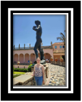
Virtual Sketchbook 3 - The David
I fulfilled the assignment to visit art “in its natural habitat” by visiting The Ringling Museum of Art (“The Ringling”) in Sarasota, Florida. The reproduction of Michelangelo Buonarotti’s David is in the museum’s courtyard, which is a bronze cast of the original 16th century marble sculpture completed in 1504 during the Italian Renaissance period.
The original David is housed in the Accademia Gallery in Florence, Italy, and is one of the finest examples of sculpture in the world. The government of Florence hired Michelangelo to create “a monumental statue for the Cathedral of Florence” (Accademia Gallery). I think Michelangelo was trying to say not to underestimate Florence, just like David should not have been underestimated when he took on Goliath and killed him with stones and a slingshot.
The David was carved from a block of marble that two other sculptors had already given up on, yet Michelangelo saw the potential in this piece of marble. I have this incredible vision of Michelangelo carefully chipping away at the marble until he released the figure inside. The statue isn’t perfectly proportioned because Michelangelo knew it was to be placed up high and people would be gazing upwards. He made the head and right hand larger. However, the statue ended up being housed inside the museum to protect it from the elements (Accademia Gallery) and a reproduction was placed outside for people to admire.
A piece of art like the David is priceless and not be for sale, so John Ringling had a bronze cast made of the original statue. His version is approximately 16’ 5” tall, slightly shorter than the original statue which measures 17’ tall. As the docent explained, John Ringling was a showman, so he wanted large works of art for that “wow” factor (personal communication).
I chose the David because I saw Michelangelo’s work when I was in Rome. I know that he was admired by popes and peasants alike, but I feel this appreciation has only grown over the centuries. While studying the bronze David, I found the details to be incredible. I could see the tension in his muscles and the way his body was positioned to use his slingshot.
My critique of the David is that it is one of the most famous statues in all of the world due to its beauty and perfection that was created by arguably the most talented artist to ever live. It is important to society and the world because it represents a very important time in the history of art, which was during the Italian Renaissance. I picked it because of a pre-existing love for Michelangelo’s work, especially the Madonna della Pietà in St. Peter’s Basilica in Rome.

Works Cited
https://accademiagallery.org/michelangelos-statue-of-david-ultimate-guide/
Docent at The Ringling Museum of Art. ��Personal communication.”
0 notes
Text
Virtual Sketchbook 2
Journaling - Visual Outline
The most important principles of design are unity and variety, balance, emphasis and subordination, directional forces, repetition and rhythm, and scale and proportion.
Unity is when a piece of art has consistent or similar elements that go together.
An example of unity is Composition in Red, Blue, and Yellow by Piet Mondrian because he uses primary colors and also repeated lines.

Variety is when a piece of art has diverse elements, which is the opposite of unity.
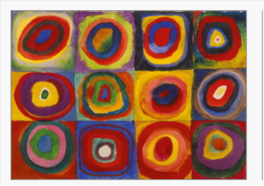
An example of variety is Wassily Kandinsky’s Composition VII. This piece is part of a series and focuses on figurative work. There isn’t any unity to this piece, but that is what makes you want to look for meaning in it.

Balance is a way of arranging different influences so that the end result is equilibrium.
I found another Kandinsky picture and wanted to use it to illustrate balance. I really like his art. I know that Squares with Concentric Circles technically was done as a color study, but I think it’s beautiful and it reminds me of Andy Warhol’s style.
Emphasis is the way an artist draws attention to a certain part of a work of art through placement, size, color, or a different color.

Subordination is used by artist to make some areas of a piece of art more important than others. This is accomplished through placement, color, or size to get the desired effect.
Directional forces are used by artists to draw the viewer’s attention along different paths.
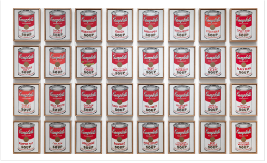
Repetition is when an artist uses the same elements more than once. Rhythm is an ordered repetition of dominant and subordinate elements in a design or work of art.
A famous piece of art that shows repetition is Andy Warhol’s Campbell’s Soup Cans. At first glance it looks like it’s just the same can of soup over and over again, but when you look closely, you will see that there are all different flavors. Each can was framed separately, but arranged in 4 lines of 8 cans each.
Scale is how the sizes of different objects relate to each other. Proportion is how different parts of a work of art relate to each other and the work overall.
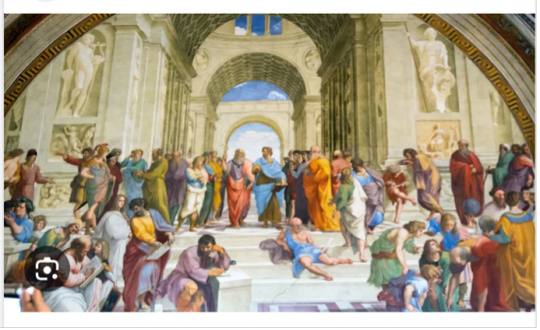
Scale is famously illustrated by Raphael in The School of Athens. I first saw this picture in one of my Humanities classes. Raphael painted Plato and Aristotle in the middle of the painting, where you eye is immediately drawn. They appear to be bigger than the other people in the background, which shows how important they are in the scene being painted.
Writing and Looking
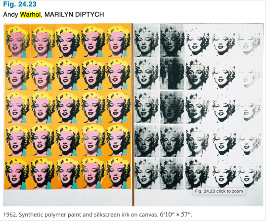
The artwork I chose to create a recipe for is Andy Warhol’s “Marilyn Diptych,” Fig. 24.23, from page 24.5. Warhol used the same image of Marilyn Monroe 50 times. The 25 images on the left are silk-screened using 5 colors – green, red, pink, yellow, and black. The 25 images on the right are black and white, and they resemble negative strips from a roll of film. There is unity and repetition because the same image of Marilyn’s face is the focal point of each rectangle, although each image is slightly different from all of the others in one way or another. Balance is achieved by having all of the color images grouped together on the left and all of the black and white images grouped together on the right. Additionally, when all of the individual rectangles are grouped, they create two larger rectangles that ultimately create one large rectangle of all of the images.
Connecting Art to My World
Color affected me when I used spray paint to create graffiti on the exit door of my mom’s dance studio. I used different hues that had been used to create the mural of a dancer on one of the walls. The values were both light and dark and the intensity was bright. I wanted the door to look cheerful for our students. The colors were highly saturated so they stood out against the door which was painted grey. I didn’t cover the entire door, so the grey would peek out and provide a contrast to the vibrant colors. If I had to pick a color scheme for my life, it would be monochromatic with different shades of blue. I find blue to be a peaceful and soothing color for me, and it reminds me of being at the beach.
Art Project
I decided to paint a canvas for this project, as I find painting allows me to be creative and clear my mind. I titled this piece, “Light Shining Through the Water.” To be honest, I had created another painting and I hated it, so I painted over the canvas and started over. My brother was very honest and told me I would be better off just pouring red paint over the whole thing and turning that in!
This is what it looked like as it was in process…the path was painted yellow (and it can still be seen even though I painted over it, but in the second painting it looks like a shaft of light).

It was a happy accident, because the second piece felt like it created itself. It represents shafts of light cutting through the water to reach the seaweed below. This is how memories of my Dad come to life for me. Each piece of seaweed is a memory I treasure. When the light shines through, that memory comes back to me and makes me smile. Missing him is represented by the dark areas of the painting, but the light reminds me that his spirit is still with me.

Group 4 - Interactive design allows users on apps or websites engage with elements like animations and videos to enhance the user experience. If the site experiences high engagement and/or users coming back to spend additional time on the app or website, the goal has been achieved. Interactive design takes a website from boring and passive to interesting and immersive, and can even sneak in educational elements!
THE TOP FIVE BEST INTERACTIVE DESIGNS ACCORDING TO GRACIE MAPPES: 1. https://www.cyclemon.com/
Links to an external site.
2. http://pierrehermenicolasbuffe.com/en
Links to an external site.
3. https://wakeup.isadoradigitalagency.com/
Links to an external site.
4. http://species-in-pieces.com/
Links to an external site.
5. http://weavesilk.com/
0 notes
Text
Interactive Design
Interactive design allows users on apps or websites to engage with elements like animations and videos to enhance the user experience. If the site experiences high engagement and/or users coming back to spend additional time on the app or website, the goal has been achieved. Interactive design takes a website from boring and passive to interesting and immersive, and can even sneak in educational elements!
THE TOP FIVE BEST INTERACTIVE DESIGNS ACCORDING TO GRACIE MAPPES: 1. https://www.cyclemon.com/
2. http://pierrehermenicolasbuffe.com/en
3. https://wakeup.isadoradigitalagency.com/
4. http://species-in-pieces.com/
5. http://weavesilk.com/ A good interactive design to me is a website or app where I can use my creativity to produce something, be entertained by the choices I make that end up making something, or just find what I'm looking at interesting or relaxing. My absolute favorite site is weavesilk.com. The intent is to provide a way for the user to relax and create designs which can also be shared with others. I feel that the site fulfills its purpose, as it is my go-to when I need to clear my mind for a few minutes.

0 notes
Text
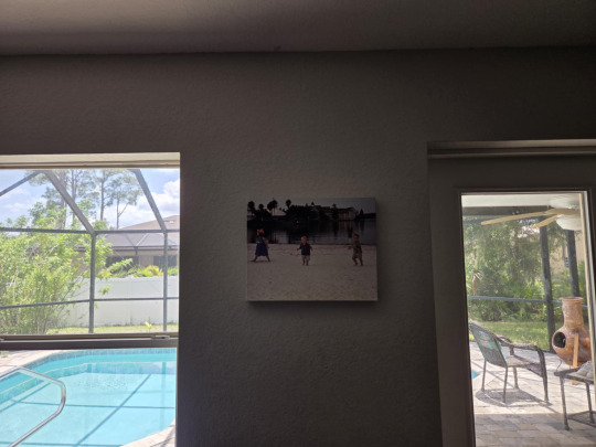

This is a photograph that my mom took of my brothers and me in Disney World after we had attended a luau dinner at the Polynesian Resort. The photo was made into a wrapped canvas and it hangs in our living room. The use that it serves is to remind my mom, brothers, and me of a very happy time we had together with my dad before he passed away. I think it's beautiful because my brothers and I were so young and innocent. We could hear the music playing from the second seating of the dinner, and we were just enjoying dancing on the beach. I had two of the leis from dinner wrapped around my head like a floral crown, and I was pretending I was one of the dancers we had seen perform. We weren't even paying attention to my mom taking our picture - all three of us were just in our own little worlds. Every time I look at it, I feel the love from my parents for all three of us and I'm reminded how very lucky I am.
0 notes
Text

This is my self-portrait that was taken with my cell phone, using the reflection of the mirror to capture part of me but also the evening sky. The moon was so beautiful and made the clouds look like they were lit from within. My cell phone is my lifeline, as it lets me connect with the people I love most in the world when I cannot be physically with them. My self-portrait wouldn't be complete without my mom, brothers, and boyfriend, for without them, I could not exist. They give me unconditional love, hope, and happiness, and make me want to be the best version of myself that I can be. I love the night sky and often spend time just looking up at the stars, feeling connected to my dad and hoping he is watching over me. In this way, my self-portrait includes him as well.
0 notes
Text
My Self Portrait
I am 22 years old and will be 23 in 15 days. The gender I primarily align with is female. I am originally from Madison, Wisconsin, but my mom, brothers, and I moved to North Port in June of 2013 after the end of the school year. My dad passed away in October of 2012, so we moved to Florida for a fresh start. My ethnicity is German on both sides of my family. I used to be a dancer and a professional musical theatre performer, but I developed Long Covid from the J&J vaccine. Before Covid, my mom owned a dance studio where I taught students from age 3 through adult and also took lessons. I started taking dance lessons at age 3, so dancing was my life. Long Covid has taken that away from me and also caused some of my medical conditions to worsen, so I do not currently work. It is enough for me to focus on being a student.
For fun, I like to spend time with my boyfriend, go to the beach, and help my mom transport rescue dogs. I think what makes me "me" is that I am very caring and empathetic. I always try to help where I can and I want my actions to help change the world for the better.
0 notes
Text
1. Hello, Everyone! I'm Gracie and I’m really looking forward to taking this class with all of you! One little known fact about me is that I traveled to Rome with my mom and brother during Thanksgiving week in 2019. Rome is a breathtaking city, filled with incredible works of art. I feel so fortunate that we were able to go there and make memories that I will have forever. I can't wait to go back!
2. The piece of art that I was assigned is “The Swing” by Jean Honorè Fragonard. It is an oil on canvas painting that measures 81 x 64 cm and it was created between 1767-1768. My first reaction was, I know this painting! I remember it from one of my Humanities courses. Five new facts that I was able to find out about this piece of art are:
1. Even though it is commonly known as “The Swing,” the actual title is “Les Hasards Heureux de l’Escarpolette” which translates to The Happy Accidents of the Swing.
2. The woman who is swinging was actually the mistress of a French nobleman. He was the one who commissioned Fragonard to create the painting, which put Fragonard on a whole new career path.
3. Many people consider “The Swing” to be the most famous French painting of the 18th century.
4. In the 21st century, “The Swing” was used as an inspiration piece for various images in pop culture and advertising, as well as contemporary artistic productions.
5. Fragonard used elements of danger in “The Swing,” including featuring an angel statue commonly known as “Menacing Cupid” and painting the rope holding the swing to the tree as beginning to fray.
3. Yes, the way I thought about “The Swing” changed from the first time I looked at it, because the first time I looked at it for this assignment I was just focused on the fact that I had already been exposed to this painting. As I studied it more (and found an excellent YouTube video about the piece to watch), I began to notice details that I had not previously. The background to me now seems menacing too, almost like there could be a storm starting to brew behind the three figures. I wonder if the fraying rope signifies either a relationship that is beginning to unravel or that harm will come to the girl on the swing.

1 note
·
View note