
Don't wanna be here? Send us removal request.
Statistics
We looked inside some of the posts by xslaughtersvad-gd and here's what we found interesting.
Average Info
Notes Per Post
2
Likes Per Post
2
Reblog Per Post
0
Reply Per Post
0
Time Between Posts
9 days
Number of Posts By Type
Text
8
Last Seen Tumblr Blogs


Fun Fact
28.6 is the average number of monthly visits per US mobile user.
Text
11/4 Weekly Blog Post

The badge design so far has felt too simplistic and lacks some notable design features that I haven't quite identified as characteristics of badges. The colors and font can be contributed to the feeling of an underwhelming and associated design, but I truly believe that this project is a representation of my lack of experience in typographic design.
The list of general ideas are also very helpful but ultimately simplifies to thinking more about creating a deliberate design/layout rather than trying to visually design something outside of the typographic method. The current version of my badge is more created to try and be a replication rather than execution of an idea I have in mind. I have general ideas but my lack of experience and refinement in artistic fields (combined with average levels of time invested into this specific design) leaves that represented product somewhat unfinished. Hopefully working towards the style guide and seeing a formal layout of colors and typefaces will allow me to critically evaluate the individual characteristics of the badge again to create a better version of the final product.
0 notes
Text
Final Project Process: 10/21

Hopefully I can solidify an official refined sketch for the newly coined Dentsville Double Dutching Drillers for the final project. I created this color palette originally for the general idea of dentists with a lighter blue and a darker beige to highlight general medical colors, but now I want to lean towards darker colors (that are still to bright and closer to primary colors thanks to my eye-saver mode screen) to denote the bolder idea of Drillers. Badge references are still needed as well for sketches, but I believe reviewing line art concepts as well as general badges should also be good inspiration.
In terms of pure typographic concepts, this section of this week's reading felt somewhat more advanced for this topic. The idea of creating letters with or without tracing and appropriate whitespace between letters seems like a difficult concept to implement with the packed style that comes with badge design. While tracking may not be directly applicable to this section of the project, the inverse can be applied to understand that minimal whitespace can be used to immediately present hierarchy without allotting a whole page of information while still adhering to general informational placement rules.
0 notes
Text

Project 4 eluded my expectations through the lack of understanding about magazine design layouts rather than difficulty depending on creating unique letter forms While I could easily create a new letter form that would be slight different than pre-existing characters, I can;t properly place the design elements on the magazine page if it's not properly formatted.
I have created a baseline for the magazine page that will most like have variation in title placement rather then an attempt at shifting informational hierarchy or calculating the value between content and white space. In the baseline, I have also yet to implement the letter forms I did create for fear of not leaving room for the actual content of the magazine page. While I do want the content and design elements to be visible, I don't want to risk the body being smaller than 10pt as the subheadings are at 14pt and the body is at 12pt. This baseline will evolve in the next few days so I can get to an official print version for the submission, but I need to critically evaluate where magazine space comes from first.
0 notes
Text
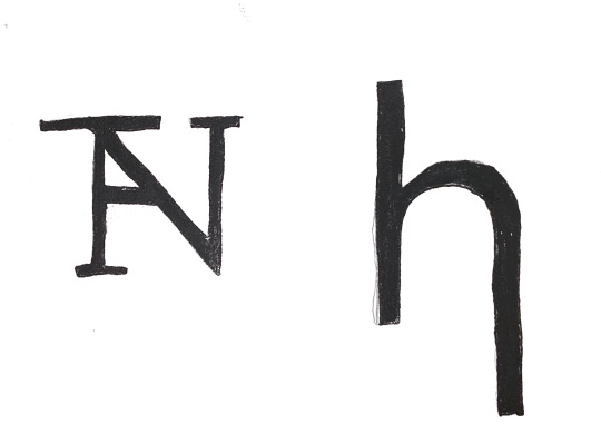
The newly introduced project seemed like a daunting tasked when first introduced. The project is simply a new letter form rather than creating an entirely new visual logic system regarding the communication of language, just simply creating the imagery that could initiate such a concept. Upon the suggestion of combining two letters, the preliminary task of creating new letter forms in both Serif and Sans Serif became much easier.
My first letter form was created with the font Stern Pro because of the almost exaggerated serifs on some letters. From this notable characteristics, I noted the wide serif on the apex of the letter A and added it to the letter N in addition to adding a crossbar between the stem and the hairline. In addition, I kept the serifs and crossbar parallel with the baseline of the letter to follow the conventional rule of type faces.
The second letter form was created from the simple idea of elongating a part of a letter, so I created a second main stroke on the lowercase letter H from the typeface Ofelia Display. While this idea was executed properly due to it's simplistic nature, it resembles the lowercase Greek letter eta without the spur on the upper main stem of the letter. While I initially was concerned about creating letter forms that resemble pre-existing letter, the joy of creating new letter forms is that simply turning the character 90 degrees in either direction would solve the issue and lead to a new perspective in addition to a successful execution of this milestone for Project 3.
0 notes
Text


This week’s work in Project 3 was a firm introduction to the trials and tribulations to using general Adobe products rather than just Illustrator. While I could easily adjust to learning new tools from my experience using Photoshop, the more technical aspects like deciding on fonts to use as well as packaging files is still a skill to acknowledge needs improvement for the future. While I could go through the list of fonts on Adobe’s website or provided “More Fonts” list, I frequently had issues where the font would not transfer to my home computer from the Gambrell lab or vice versa. Furthermore, I couldn’t find any rhyme or reason as to which fonts could transfer without any issues.
This created the problem that while I can settle on fonts that look decent enough to implement into one graphic, there must be more specific strategy involved as to the concepts conveyed by the typography. While I did decide that one flyer would be strictly formal and functional while the other would be more casual, I believe the success that should come after viewing and working with more typefaces and typographical projects is the outline what characteristics of type would help convey the concepts as well to further narrow down what types to choose from and evaluate if they can also produce technical success in packaging and manipulation later.
0 notes
Text

Project 3 provides the challenge of fully embracing Typographic Design in a pure form by creating a graphic with no illustrations. While this idea does fully engage with the focus of the course in a pure form, it creates an issue for representing ideas with written word rather than designated imagery.
Even the idea of recycling is denoted by an internationally recognized symbol that can easily be affiliated with holidays like Earth Day and efforts like climate change and maintaining the health of Earth's oceans. In order to compensate with the absence of illustrations I've tried to acknowledge the two greatest issues with not being able to execute the bare minimum illustrative depiction of recycling: White-space and Recognition of Concept. When quickly glancing over a flyer images can very quickly give a summary of what the flyer represents. Furthermore, the white-space that would have been recognized by illustrations has to be further filled by typographical representations.
I would like for my solution to these issues to be partially composed of color. While there can be no concrete illustrations, inclusion of greens, blues, and other nature/environmental affiliated colors and a purposeful typeface can be combined to indirectly convey the proof of concept for the flyer that can be further confirmed by the actual written content of the advertisement.
0 notes
Text


September 2nd, 2022
Project 1 was a legitimate introduction to how I should address ARTS 245 as a course both as a varied experience from my Computer Science and Math related coursework over the last 3 years and to understand what I can personally gain from the content being presented. I began creating designs for my six letter through Photoshop fueled by the misunderstanding that Traditional Medium meant Physical Mediums and thus had to quickly shift to making sketches with what little Traditional artistic affinity I possess and essentially progressed from thought to final creation in order to turn in the project on time. Due to this hasty transition, I have no photos to present the final outcome of my project and can only show drafts and sketches halfheartedly presenting the colors schemes I used with colored pencils and sketches with lack of commitment.
While I review my final project and come to peace with the work I have created, reading Thinking with Type and reflecting on the format of assignment helped me acknowledge the minute nuisances of the potential the assignment had and the graphic variety that could have been presented if the artist was aware. The usage of the Golden Square rule aligns with placing certain items in spaces on a grid layout that can allow the eye to navigate to specific parts of a presentation with intention rather than a basic progression. Furthermore the golden square rule also aligns with Fibonacci's Sequence, a mathematics series that has been linked with biological characteristics that all organisms follow through genetic code and innate behavior.
These concepts help intertwine both conceptual and applicative ideas that can be used to enrich information when presented both in this course and used to provide greater awareness when creating or analyzing subjects in the future.
0 notes
Text
For project 1, I've landed on deciding between BOUNCY and LOATHE for my two words. I wanted to choose a word that would have a well known connotation and have certain concepts affiliated with them. For example, the word Bouncy is associated with jumping, springs, and small items that move quickly but still have strength and energy. Furthermore, the word loathe (in my mind) has always had a negative, sour idea to it that represents dislike and in some instances hatred. In a more specific example, the author of the Series of Unfortunate Event stated in the first book that loathe was his favorite word, further enforcing the idea of a sour word under the pseudonym Lemony Snicket.
I hoped to solidify my own creative representations of these ideas but, unfortunately, I misplaced my previous art materials and have to purchase new ones in order to move forward with my own application of these ideas, so I have no original sketches or designs to show (for now)
In order to further foster ideas of words with defined connotations, I tried to find logos and images that were visually linked with the ideas they were conveying through either typographic design or word choice to determine what concepts were represented.
In my 6 photos-
Outspokin Bicycle's usage of making the I resemble a bicycle wheel (FONT: GOODLIFE)
A U Haul Logo utilizing wide lettering to show depth and structure to align themselves with a representation of large and qualified moving trucks (FONT: BRILLER BLACK)
The album cover of Lemon Boy by Cavetown to show both the bitter and sweet contrasting nature of lemons (FONT: HVD STEINZIT)
A logo for Ghost Oil using a clear and minimalistic design to reinforce the light and simple quality of their hair product (FONT: UBUNTU MONO BOLD)
A seltzer water logo from Trader Joe's (a substitute for the hand drawn Trader Joe's Lemon Stand Label that I failed to take a picture of) that has a variety of green and red to match the cranberry and like flavoring (FONT: ROGUE SANS MEDIUM)
and a ceramic shop logo emulating the whimsical nature of the Mad Platter referencing the theme and characteristics of Alice in Wonderland. (FONT: TBD)
Hopefully I will make fruitful progress this weekend in sketching and will produce something that I can work with to create something worthwhile.


2 notes
·
View notes