
Don't wanna be here? Send us removal request.
Statistics
We looked inside some of the posts by yanniks-learning and here's what we found interesting.
Average Info
Notes Per Post
1
Likes Per Post
1
Reblog Per Post
0
Reply Per Post
0
Time Between Posts
4 days
Number of Posts By Type
Text
4
Last Seen Tumblr Blogs


Fun Fact
Tumblr has 411 employees.
Text
Week 4: Peer Graded Assignment (Data Management and Visualization)

Univariate
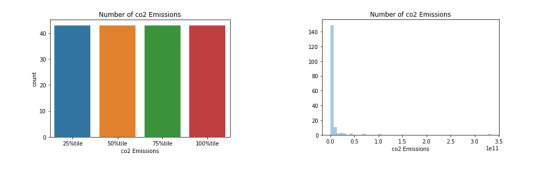
Above are two univariate graphs for the co2emissions variable. On the left is a bar graph of the categorical variable co2emissions range where the ranges are the various percentiles. It shows that there is an equal number of countries that fall into each percentile. On the left is a histogram of the quantitative variable co2emission. It shows that most countries fall in the 0 to 0.5 range and there is the outlier that is close to 3.5.
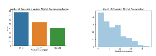
Above are two univariate graphs for the alcohol consumption variable. The bar graph on the left portrays the categorical variable alcconsumptionrange, which compares the number of countries with alcohol consumption in 3 ranges. 0-5 has the most, 5-10 has the second most and 10-25 has the least. On the right, the histogram depicts the quantitative variable alcconsumption. It shows that the data is skewed slightly to the right, and just like the categorical variable, most of the countries fall below 10.

The univariate graphs above portray characteristics of the Life expectancy variable. On the left is the categorical variable divided into 5 groups showing that most countries fall in the 70-80 range. On the right is the quantitative variable depicting a similar scenario to the bar graph on the left but shows that 45-55 seems to be higher than expected. The variable is slight skewed to the left.
Bivariate

Above are two bivariate graphs depicting the association between life expectancy and alcohol consumption. On the left is a scatterplot showing the relationship between two quantitative variables. From the best fit line, it can be said that there is a positive correlation between alcohol consumption and life expectancy in that as one rise, so does the other. However, the points on the graph are very spread out, depicting that the correlation is not very strong.
On the right is a bar graph showing the association between a categorical variable and a quantitative variable. It shows a similar view to the scatterplot in that the higher ranges of alcohol consumption have higher life expectancy, but the three ranges are so evenly distributed the association is not very strong.

The two bivariate graphs above show the association between life expectancy and co2 emissions. The scatterplot on the shows a concentration of points on the left and then the one outlier on right. The outlier causes the line of best fit to depicts positive correlation between the two variables. The spread of the points is scattered quite far apart from each other and form that it is hard to see a trend. On the right is a bar graph showing the association between a categorical variable and a quantitative variable. It shows a more even view than the scatterplot in that the points for various life expectancies across various countries are spread throughout the percentile ranges of co2emissions. There is a slight increase in the life expectancy as the ranges increase.
0 notes
Text
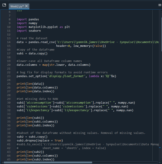
Week 3: Peer Graded Assignment (Data Management and Visualization)
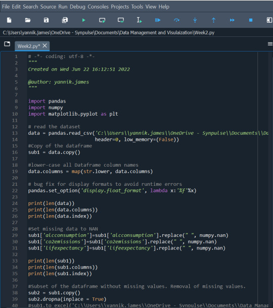
Program
import pandas import numpy import matplotlib.pyplot as plt
#read the dataset
data = pandas.read_csv('C:\Users\yannik.james\OneDrive - Synpulse\Documents\Data Management and Visulaization\Data Sets\gapminder1.csv', header=0, low_memory=(False))
#Copy of the dataframe
sub1 = data.copy()
#lower-case all Dataframe column names
data.columns = map(str.lower, data.columns)
#bug fix for display formats to avoid runtime errors
pandas.set_option('display.float_format', lambda x:'%f'%x)
print(len(data)) print(len(data.columns)) print(len(data.index))
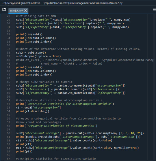
#Set missing data to NAN
sub1['alcconsumption']=sub1['alcconsumption'].replace(" ", numpy.nan) sub1['co2emissions']=sub1['co2emissions'].replace(" ", numpy.nan) sub1['lifexpectancy']=sub1['lifeexpectancy'].replace(" ", numpy.nan)
print(len(sub1)) print(len(sub1.columns)) print(len(sub1.index))
#Subset of the dataframe without missing values. Removal of #missing values.
sub2 = sub1.copy() sub2.dropna(inplace = True)
print(len(sub2)) print(len(sub2.columns)) print(len(sub2.index))
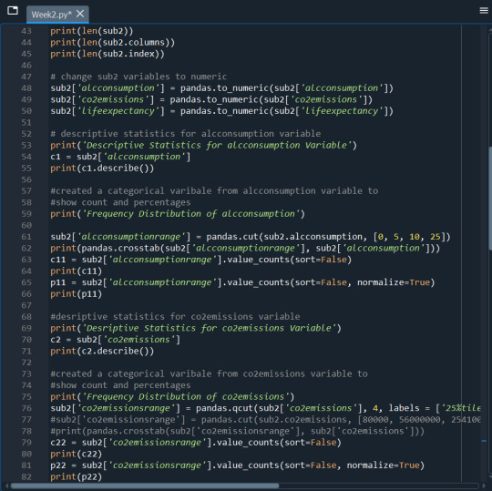
#change sub2 variables to numeric
sub2['alcconsumption'] = pandas.to_numeric(sub2['alcconsumption']) sub2['co2emissions'] = pandas.to_numeric(sub2['co2emissions']) sub2['lifeexpectancy'] = pandas.to_numeric(sub2['lifeexpectancy'])
#descriptive statistics for alcconsumption variable
print('Descriptive Statistics for alcconsumption Variable') c1 = sub2['alcconsumption'] print(c1.describe())
#created a categorical varibale from alcconsumption variable to #show count and percentages
print('Frequency Distribution of alcconsumption')
sub2['alcconsumptionrange'] = pandas.cut(sub2.alcconsumption, [0, 5, 10, 25]) print(pandas.crosstab(sub2['alcconsumptionrange'], sub2['alcconsumption'])) c11 = sub2['alcconsumptionrange'].value_counts(sort=False) print(c11) p11 = sub2['alcconsumptionrange'].value_counts(sort=False, normalize=True) print(p11)
#desriptive statistics for co2emissions variable
print('Desriptive Statistics for co2emissions Variable') c2 = sub2['co2emissions'] print(c2.describe())
#created a categorical varibale from co2emissions variable to show #count and percentages
···
print('Frequency Distribution of co2emissions') sub2['co2emissionsrange'] = pandas.qcut(sub2['co2emissions'], 4, labels = ['25%tile','50%tile','75%tile','100%tile'])
print(pandas.crosstab(sub2['co2emissionsrange'], sub2['co2emissions']))
c22 = sub2['co2emissionsrange'].value_counts(sort=False) print(c22) p22 = sub2['co2emissionsrange'].value_counts(sort=False, normalize=True) print(p22)
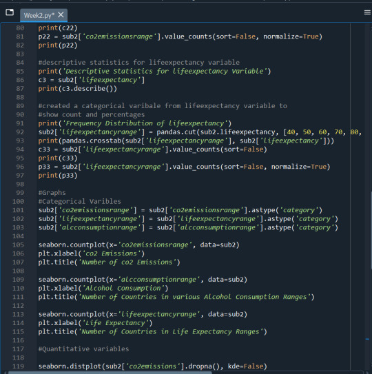
#descriptive statistics for lifeexpectancy variable
print('Descriptive Statistics for lifeexpectancy Variable') c3 = sub2['lifeexpectancy'] print(c3.describe())
#created a categorical varibale from lifeexpectancy variable to #show count and percentages
print('Frequency Distribution of lifeexpectancy') sub2['lifeexpectancyrange'] = pandas.cut(sub2.lifeexpectancy, [40, 50, 60, 70, 80, 90]) print(pandas.crosstab(sub2['lifeexpectancyrange'], sub2['lifeexpectancy'])) c33 = sub2['lifeexpectancyrange'].value_counts(sort=False) print(c33) p33 = sub2['lifeexpectancyrange'].value_counts(sort=False, normalize=True) print(p33)
Summary
The three variables I have chosen, alcconsumption, co2emissions and lifeexpectancy, are all continuous variables. The two main data management techniques I utilized for this dataset was grouping/ binning and dealing with missing values. Since the data was continuous, I had to group the data for each variable in order to create their frequency distributions. I also created a summary of their descriptive statistics summary.
For the variable alcconsumption, it was divided into three groups. Most countries fell in the “0-5” category, then the second most fell in the “5-10” category and the least prominent group was the “10-25” group which were countries with a reading over 10. The average reading was 6.63.
Second for co2emissions, I found that the highest emission was 334000000000 and the lowest was 850666.67. The mean was recorded at 5774913036.826859 and the median was 254030333.3. There were a few outliers that were significantly higher than the rest of the countries causing the stark difference between the mean and medium calculation. I also grouped this variable in percentiles; 25th, 50th, 75th and 100th percentile. There were 43 data points in each group, thus each group contains 25% of the total datapoints.
Third for lifeexpectancy, I grouped them just like alcconsumption. This time into 5 categories; less than 50, 50-60, 60-70, 70-80 and greater than 80. The 70-80 category had the highest frequency, followed by 60-70, then 50-60, then greater than 80 and finally less than 50.
As I said previously, apart from grouping, another data management technique I utilized was to deal with the missing values in my variables. All three variables above each had missing data and to deal with this, I removed rows with missing data. Since it was not that many rows, removing some row still kept the integrity of the dataset.
0 notes
Text
Week 2: Peer Graded Assignment (Data Management and Visualization)
My Program
import pandas import numpy import matplotlib.pyplot as plt
#read the dataset
data = pandas.read_csv('C:\Users\yannik.james\OneDrive - Synpulse\Documents\Data Management and Visulaization\Data Sets\gapminder.csv', header=0, low_memory=(False))
#lower-case all Dataframe column names
data.columns = map(str.lower, data.columns)
#bug fix for display formats to avoid #runtime errors
pandas.set_option('display.float_format', lambda x:'%f'%x)
print(len(data)) print(len(data.columns)) print(len(data.index))
#change variables to numeric
data['alcconsumption'] = pandas.to_numeric(data['alcconsumption']) data['co2emissions'] = pandas.to_numeric(data['co2emissions']) data['lifeexpectancy'] = pandas.to_numeric(data['lifeexpectancy'])
#descriptive statistics for alcconsumption variable
print('Descriptive Statistics for alcconsumption Variable') c1 = data['alcconsumption'] print(c1.describe())
#created a categorical varibale from #alcconsumption variable to
#show count and percentages
print('Frequency Distribution of alcconsumption') c11 = data['alcconsumptionrange'].value_counts(sort=False) print(c11) p11 = data['alcconsumptionrange'].value_counts(sort=False, normalize=True) print(p11)
#desriptive statistics for co2emissions variable
print('Desriptive Statistics for co2emissions Variable') c2 = data['co2emissions'] print(c2.describe())
#descriptive statistics for lifeexpectancy variable
print('Descriptive Statistics for lifeexpectancy Variable') c3 = data['lifeexpectancy'] print(c3.describe())
#created a categorical variable from lifeexpectancy #variable to
#show count and percentages
print('Frequency Distribution of lifeexpectancy') c33 = data['lifeexpectancyrange'].value_counts(sort=False) print(c33) p33 = data['lifeexpectancyrange'].value_counts(sort=False, normalize=True) print(p33)
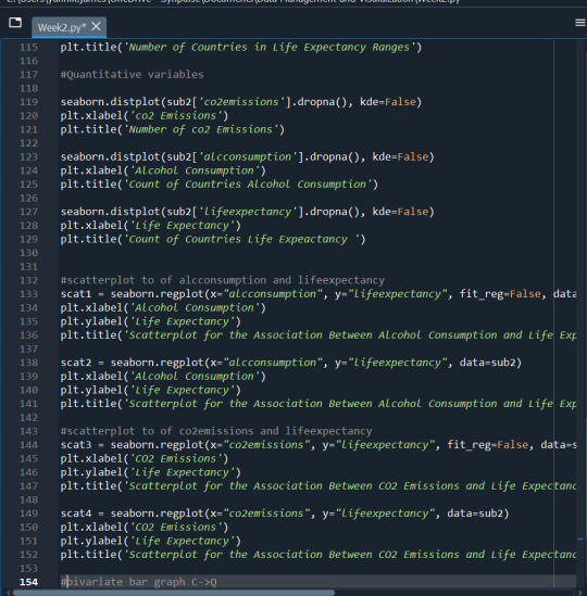
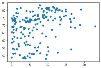
#scatterplot to of alcconsumption and lifeexpectancy
plt.scatter(data['alcconsumption'],data['lifeexpectancy']) plt.show()
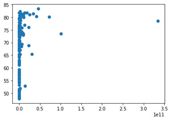
#scatterplot to of co2emissions and lifeexpectancy
plt.scatter(data['co2emissions'],data['lifeexpectancy']) plt.show()
Summary
Descriptive Statistics for alcconsumption Variable
count 172.000000
mean 6.631163
std 5.015301
min 0.030000
25% 2.390000
50% 5.865000
75% 9.810000
max 23.010000
Name: alcconsumption, dtype: float64
Frequency Distribution of alcconsumption
Counts
Low 77
Medium 54
High 41
Name: alcconsumptionrange, dtype: int64
Percentages
Low 0.447674
Medium 0.313953
High 0.238372
Name: alcconsumptionrange, dtype: float64
Desriptive Statistics for co2emissions Variable
count 172.000000
mean 5774913036.826859
std 27664356994.819237
min 850666.670000
25% 55778250.002500
50% 254030333.300000
75% 2319100666.750000
max 334000000000.000000
Name: co2emissions, dtype: float64
Descriptive Statistics for lifeexpectancy Variable
count 172.000000
mean 69.229465
std 9.803362
min 47.794000
25% 62.646000
50% 72.807000
75% 76.085500
max 83.394000
Name: lifeexpectancy, dtype: float64
Frequency Distribution of lifeexpectancy
Counts
Less than 50 8
70-80 79
50-60 29
Greater than 80 20
60-70 36
Name: lifeexpectancyrange, dtype: int64
Percentages
Less than 50 0.046512
70-80 0.459302
50-60 0.168605
Greater than 80 0.116279
60-70 0.209302
Name: lifeexpectancyrange, dtype: float64
Description
The three variables I have chosen, alcconsumption, co2emissions and lifeexpectancy, are all continuous variables. Therefore, in order to create frequency distributions for them I had to group the data for each variable. I did just that for two of the three variables. It was not done for co2emssions since the variable had such a wide range, grouping would have caused skewness. Instead of the frequency distribution, I did a descriptive statistics summary for co2emissions and the other two variables.
From creating these tables I first found that for the variable alcconsumption, most countries fell in the low category which is a reading under 5, then the second most fell in the medium category which is a reading of between 5 and 10 and the least prominent group was the high group which were countries with a reading over 10. The average reading was 6.63.
Second for co2emissions, I found that the highest emission was 334000000000 and the lowest was 850666.67. The mean was recorded at 5774913036.826859 and the median was 254030333.3. There were a few outliers that were significantly higher than the rest of the countries causing the stark difference between the mean and medium calculation.
Third for lifeexpectancy, I grouped them just like alcconsumption. This time into 5 categories; less than 50, 50-60, 60-70, 70-80 and greater than 80. The 70-80 category had the highest frequency, followed by 60-70, then 50-60, then greater than 80 ad finally less than 50.
The three variables above each had missing data and to deal with this, I removed rows with missing data. Since it was not that many rows, removing some kept the integrity of the dataset. Below you will find a couple scatter plots, plotting alcconsumpiton and co2emissions against lifeexpectancy. (ifeexpectancy on the x axis)
acconsumption vs lifeexpectancy
Co2emissions vs lifeexpectancy
0 notes
Text
Week 1: Peer Graded Assignment (Data Management and Visualization)
Step 1:
After analyzing the codebook for the Gapminder study, I have concluded that I am interested in life expectancy. I am uncertain which variables I will use regarding life expectancy (CO2 emissions or alcoholism), so at the moment I will include all the variables in my personal codebook
Step 2:
Life Expectancy
Step 3-5:
Country-level indicators of Health, Wealth and Development
Gapminder Codebook
Variables in personal codebook
lifeexpectancy
alcconsumption
incomeperperson
co2emissions
While life expectancy is a decent place to start, I still need to decide what about life expectancy I am interested in. What comes to mind when I hear life expectancy in various countries is the fact that it differs tremendously throughout the world. Two countries so close geographically can have such differing life expectancy predictions. Why is this? Is it because of the personal tendencies of the people? Is it because of the countries pollution habits?
I have decided that I am most interested in the association of personal habits and life expectancy. I have added to my codebook the variables reflecting personal habits such as incomeperperson and alcconsumption.
I would also like to also explore the second topic of the association between environmental pollution and life expectancy. Therefore, I will add the variables reflecting environmental pollution (co2emissions).
Step 6:
Literature Review
Ranabhat CL, Park M-B, Kim C-B. Influence of Alcohol and Red Meat Consumption on Life Expectancy: Results of 164 Countries from 1992 to 2013. Nutrients. 2020; 12(2):459. https://doi.org/10.3390/nu12020459 https://www.mdpi.com/2072-6643/12/2/459
Yu D, Lu B, Piggott J. Alcohol consumption as a predictor of mortality and life expectancy: Evidence from older Chinese males. The Journal of the Economics of Ageing. 2022;22:100368. doi:10.1016/j.jeoa.2022.100368 https://www.sciencedirect.com/science/article/pii/S2212828X22000019
Liu YT, Lee JH, Tsai MK, Wei JCC, Wen CP. The effects of modest drinking on life expectancy and mortality risks: a population-based cohort study. Scientific Reports. 2022;12(1):7476. doi:10.1038/s41598-022-11427-x https://www.nature.com/articles/s41598-022-11427-x
Probst C, Rehm J. Alcohol use, opioid overdose and socioeconomic status in Canada: A threat to life expectancy? Canadian Medical Association Journal. 2018;190(44):E1294-E1295. doi:10.1503/cmaj.180806 https://www.cmaj.ca/content/190/44/e1294
Chetty R, Stepner M, Abraham S, et al. The Association Between Income and Life Expectancy in the United States, 2001-2014. JAMA. 2016;315(16):1750. doi:10.1001/jama.2016.4226 https://jamanetwork.com/journals/jama/article-abstract/2513561
Step 7:
Countries with higher alcohol consumption have a lower life expectancy but countries with higher income per person expect their people to live longer.
1 note
·
View note