
Don't wanna be here? Send us removal request.
Statistics
We looked inside some of the posts by yazbrand-blog and here's what we found interesting.
Average Info
Notes Per Post
0
Likes Per Post
0
Reblog Per Post
0
Reply Per Post
0
Time Between Posts
2 days
Number of Posts By Type
Photo
17
Last Seen Tumblr Blogs


Fun Fact
Users from the US are the majority of Tumblr visitors.


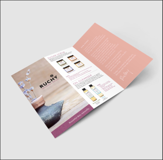


Photo

changed the colours of the chains to be an almost periwinkle colour a bit more blue than purple to keep it standing out but also complimentary
0 notes
Photo

Had to adjust the size and shape because when i resized in illustrator it got extremely distorted and the shape did not hold up at the smaller size, and the angle looked off compared to the type
0 notes
Photo

Logo redesign, In class we discussed turning circles into chains that are open almost like broken and interlocking at the same time, this is the design i came up with
0 notes

Photo

After discussing in class the purple was determined a little too close to a competitor so i made it a substantially lighter purple almost pink, and to avoid similarities to another brands logo I changed them to overlapping circles, which can symbolize chains and alls the interlocking can be also like a coming together holding hands type thing
0 notes


Photo

New logo with changes made from in class crit. It was suggested to make the R the same height as the other letters to make it a little more interesting. And that the boxes was a little weird above the “i” so I moved them to the side which I think looks quite nicer, also I uped the line weight of the boxes to make them more translatable and readable at different sizes
0 notes


Photo


Playing with different sans serif fonts to see which one works best with my brand and its attributes. Want to find one that can stand on its own as a word mark logo
0 notes