
Ellie Radcliffe - Year 1 Term 3Projects: Place of words, Theres an app for that, Communicating in colour and Process book!
Don't wanna be here? Send us removal request.
Statistics
We looked inside some of the posts by year1term3 and here's what we found interesting.
Average Info
Notes Per Post
3
Likes Per Post
3
Reblog Per Post
0
Reply Per Post
0
Time Between Posts
3 hours
Number of Posts By Type
Text
17
Last Seen Tumblr Blogs


Fun Fact
Tumblr.com rank in the US is 25.

Text
Hand in print outs:
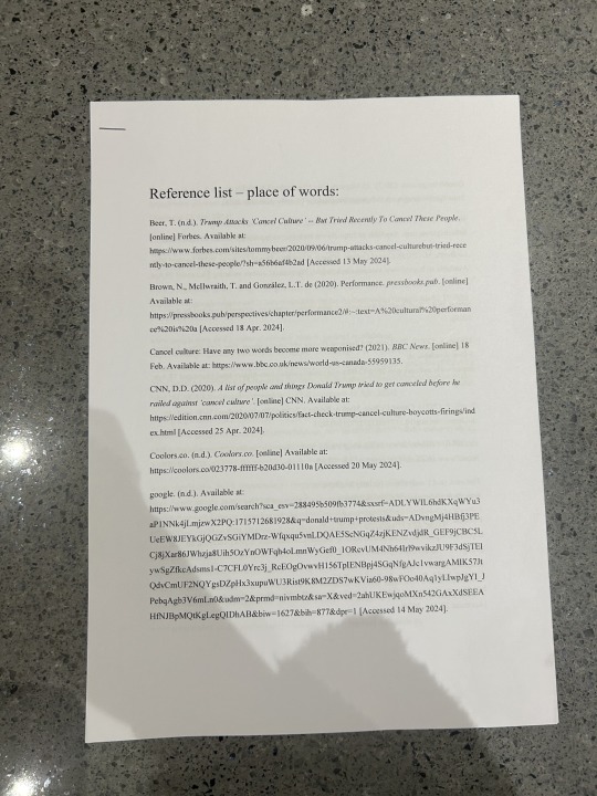

I worked out that for hand in (physical) i want and need to hand in: printed and bound Process Book printed double spreads and cover for Place of Words printed double spreads and cover with grids printed 4 postcards for Communicating in Colour brief printed mock ups (magazine in context) bibliography. So i printed all of these and added them into my box ahead of hand in as i knew i wouldn't be able to come into uni next week because of some appointments i have to go to.
0 notes
Text
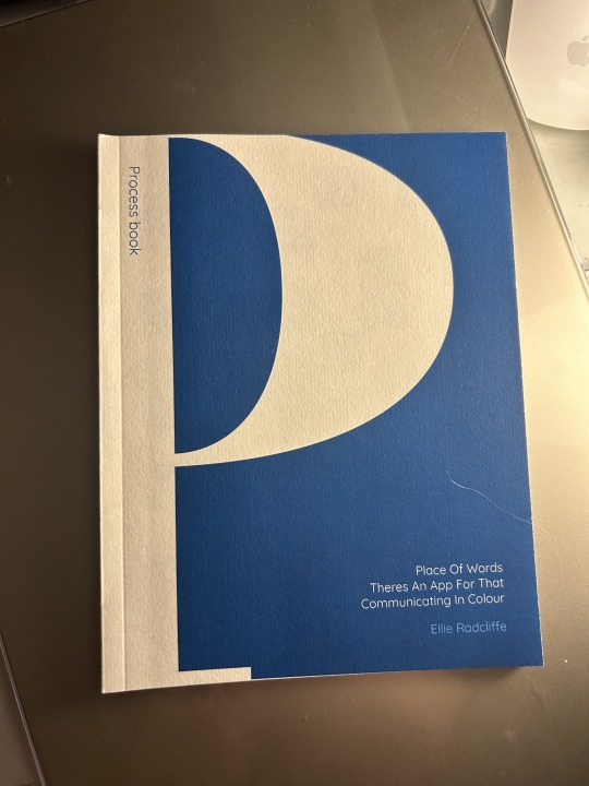
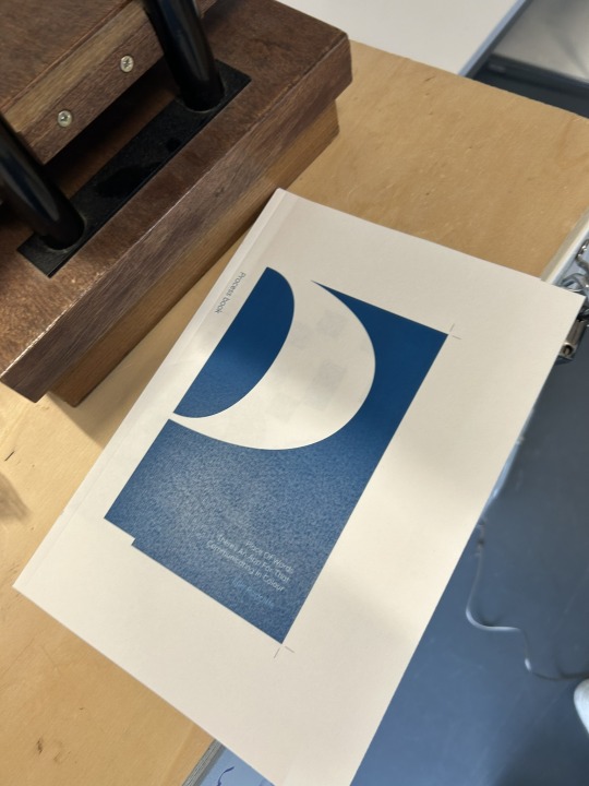
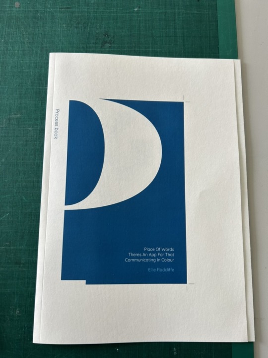
Process book (final book):

These are some images from my process book when i had completed it! Here it is fully printed, bound and ready for our hand in! Overall i am really happy with the final print and quality of my book, i feel it looks really professional which is the style i was hoping to achieve. Im looking forward to getting other peoples responses to it as i love the way it turned out!
0 notes
Text
Process book (binding my book):


Here jordy started to bind my book for me using the hot glue binding machine! We printed my book out on the 120gsm glossy paper for the internal pages and the 160gsm matte paper for the cover, and then i creased the cover spread on the spine and 7mm from the spine so that my front cover opens nicely! Jordy then roughed up my internal pages all together, applied the glue and pressed my internal pages into my cover. It was then left to dry for roughly half an hour so the glue didn't seep through my book. I did then have to rush off for work so Eleanor kindly got it cut for me as Jordy wasn't going to be in on the Friday to help me then! She then left it for me in the maker room, which i collected the next day!
0 notes
Text
Place of words (final magazine print & bind):
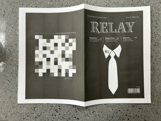
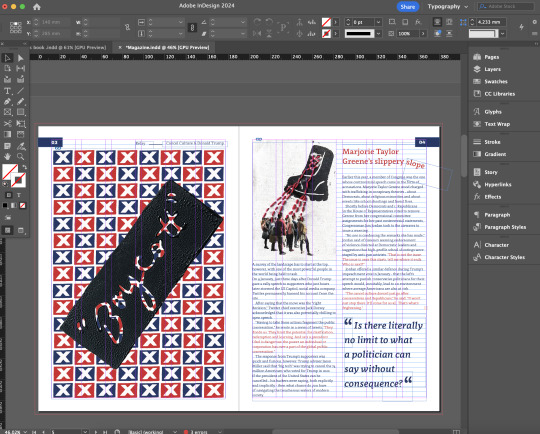
Here i wanted to not only print my magazine for the hand (both with and without guides) but i also wanted to bind it together so that i could see it as an actual magazine! To do this i saved my magazines as spreads (all pages) and then printed on the 'booklet' setting on acrobat, it would only print double sides with both sides being the right way up when printed on A4 so i chose to print on A4 paper for this as i will hand in the regular spreads true to size anyways! I also only printed this test in B&W to save my print balance, but i did then next once i had the print settings worked out print in colour. It was really good to see what my magazine looks like when bound together as an actual magazine as it put the project into perspective and felt like this drew a close to the project which was good!
These were the final pages when i stapled them together into an actual bound magazine! Again, this was only printed as A4 not true to size because for some reason printing on both sides of paper the right way up was only possible on A4!
0 notes
Text
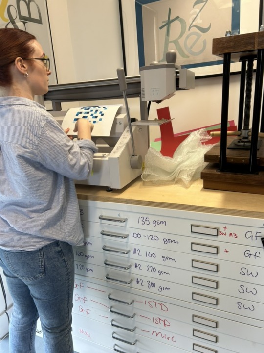
Process book (test printing & deciding on paper):

Here i started the process of printing my process book! I started by printing my pages as individual double sided pages instead of spreads, onto regular printer paper, to make sure my book came out in the correct order with all the correct content before i continue to properly printing! I then also printed my cover (outside and inside), this was done as spreads and also printed double sided, this was so my pages had something to be glued to. I then stapled together my pages so i could see what they would look like when all stuck together and Jordy helped me to work out what papers to use for printing. We settled on using the glossy 120gsm A4 paper for my internal pages and Matte 160gsm A3 paper for my cover spread. We chose for the cover to be thicker than the inside so that it felt sturdy and kept a good structure to the spine of my book!
0 notes
Text
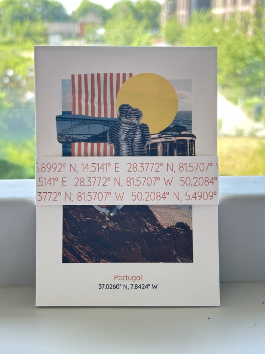
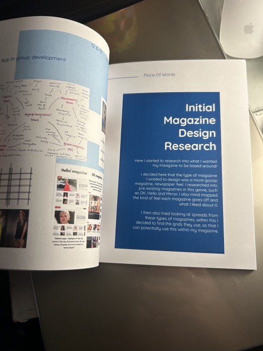
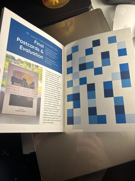
Process book (communicating in colour):
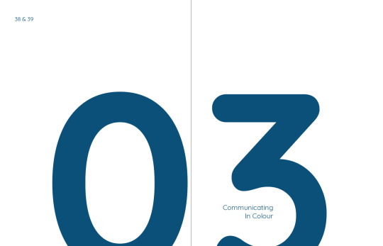

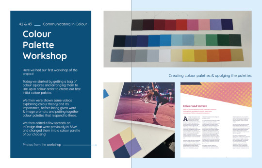
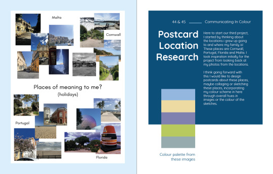
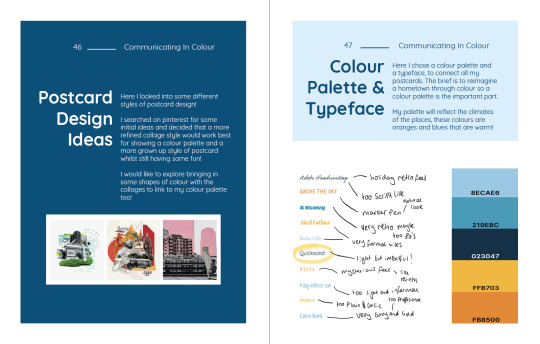
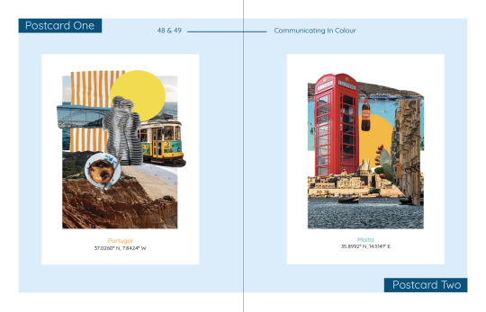
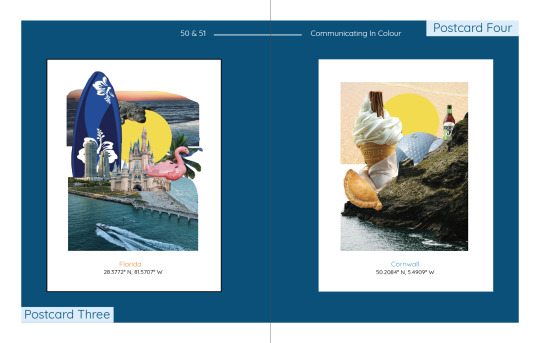
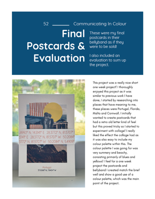
Here i had completed my process book pages for the communicating in colour brief! I included things like our colour workshops, research, development, chosen colour palettes & typography, final postcards.
1 note
·
View note
Text
Place of words (project evaluation):
Here i did my evaluation of our place of words project!
1 note
·
View note
Text
Place of words (final magazine cover & spreads in context):
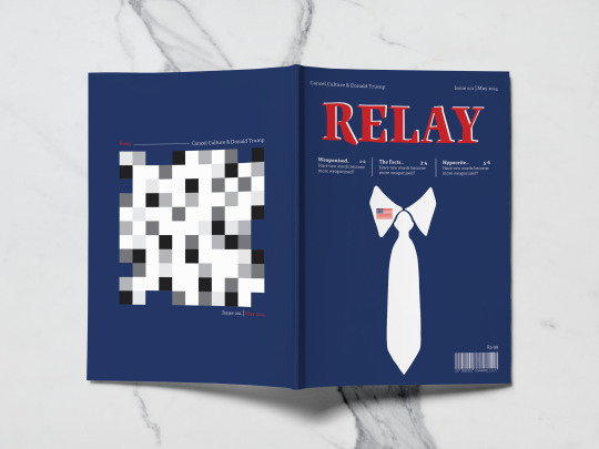
Here, I did some in context mockups of my magazine spreads and covers! I did this to show how my magazine would look printed and bound as a real magazine. It helped me to see what needs to change in terms of perspective and it helped me to see my magazine in a light of that its a real magazine, instead of the view i see it in which is a fake magazine for a specific brief! Overall i am happy with the way these turned out and how they look when applied into context like i did here! These were mockup templates i got from www.graphicsburger which i have referenced in my bibliography!
1 note
·
View note
Text
Place of words (final cover & spreads):
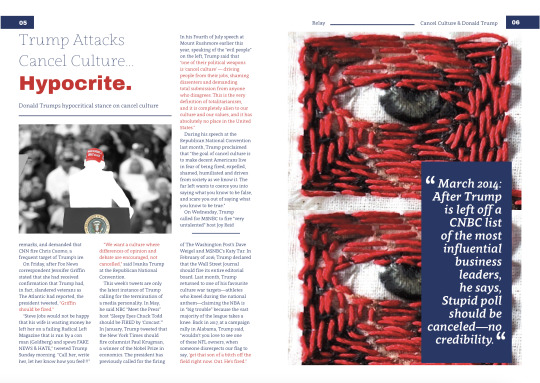
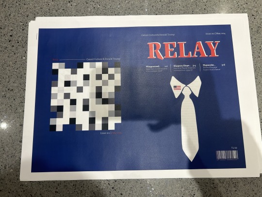
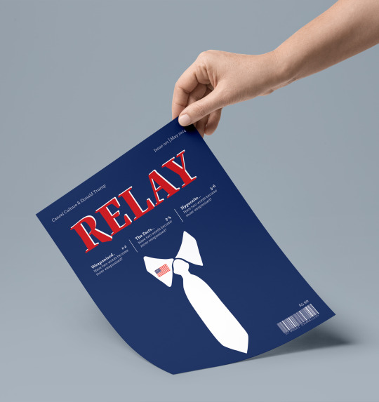
These are my final spreads and cover, i completed these with my peer feedback and i am really happy iwth the way that these have turned out! This term i was feeling pressed for time as in our final week of the project i wouldn't be able to complete too much work and i wouldn't be able to come into uni because of some dental work i'm having done, so i knew i had to work ahead of the deadline and finish it early to ensure i complete everything to a good standard and get everything printed and bound for the hand in on the 3rd! I am really pleased with my outcomes from this project in particular as i feel all my images i created work cohesively with the type, colours and overall magazine topic, even though the images themselves are different to one another (some are analogue and some are digital). I feel my magazine stands out and has a professional modern feel that communicates my theme of Donald Trumps involvement in cancel culture!
0 notes
Text
Place of words (peer feedback on spreads):
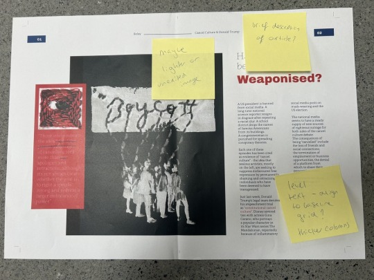
Today i was planning to get some feedback from our tutors but due to illness i couldn't so instead me and Eleanor decided to give each other feedback! This worked really well for us as we decided to be brutally honest with each other about what we liked and what needs to be changed from our perspective!
The feedback i gave Eleanor was mainly increasing her text size and moving some of her images away so they had more space etc. The feedback Eleanor gave me was mainly to try make my pull quotes stand out more, maybe by increasing size, and to potentially work on the work 'slope' which i have slanted on my 2nd spread, as currently it looks a bit out of place! It was really good to get and give some peer feedback as this helped me to see what i couldn't within my spreads. This has helped me to now be ready to do a final test print and prepare for hand in!
0 notes
Text
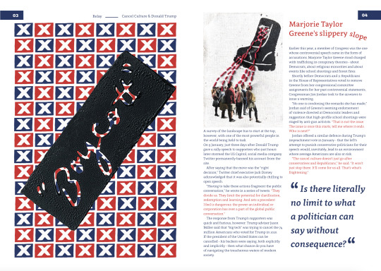
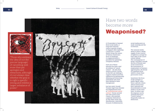
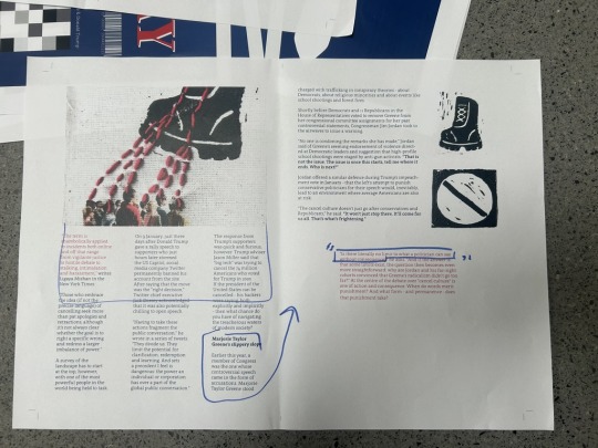
Place of words (3rd spread development):

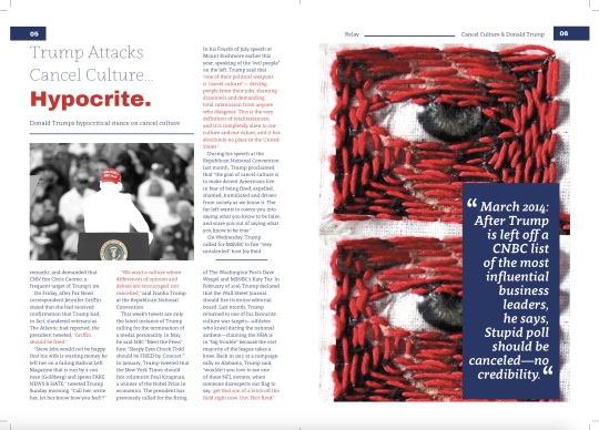
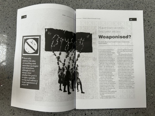
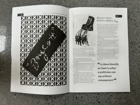
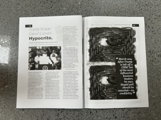
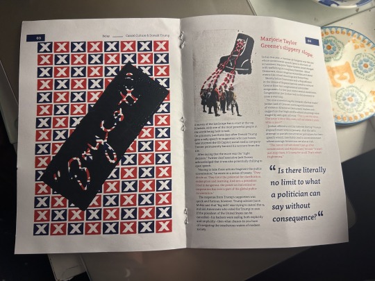
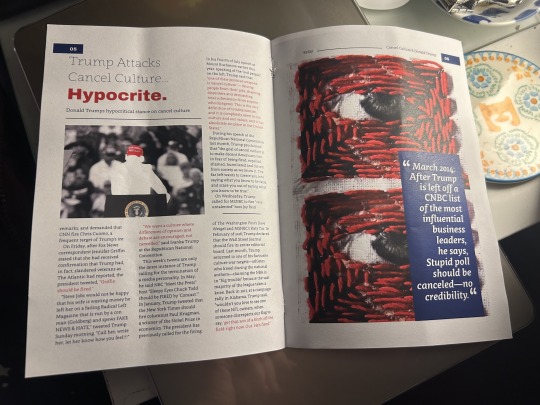
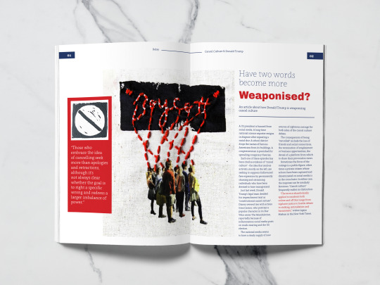
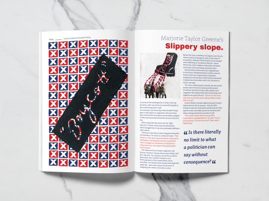
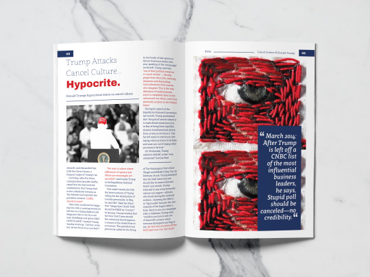
Here i worked on my 3rd spread of my magazine! I started by again following a similar layout to my 2 other spreads, placing in one of my extra images i made. I kept the quotes that are important that aren't pull quotes in red and the rest of the text in blue and at the same size as on each of the other pages too. As this page had a new article on it i repeated the heading and brief summary of the article like on the first spread to show continuity throughout. I also started to experiment with how i added in a full page image on the other side. I liked the eye that i had sewn into with image transfer and didn't want to loose it as i feel it communicates 'hypocrite' well so i decided to add it in twice, like a non conventional pair of eyes watching what you do. I then added in my pull quote, this time it was showing the list of times and dates that trump had tried to cancel other people. I wanted to include one of these time stamps of what he said as i felt it connected the two articles so i'm glad it goes against my image transfer and stitch experiment well.
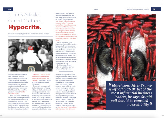

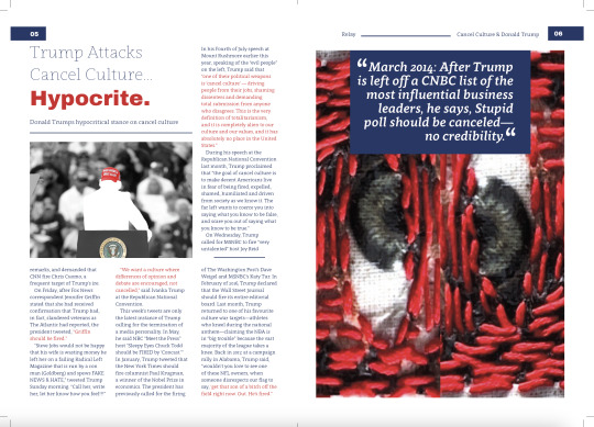
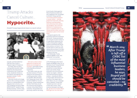
I then also played around with the layout of the eyes and the pull quotes, to see if it looked best when the eyes were placed next to each other like an actual pair of eyes, and to see where the pull quote looked best on the image within the box. I decided that it looked unnatural and made the image grainy and pixelated when stretched to look like a pair of eyes so will be sticking with them behind underneath one another. I also will be sticking with having the pull quote in the longer box just to the bottom right of the image!
0 notes
Text
Place of words (2nd spread development):
Here i started to layout my 2nd spread of my magazine, i kept the style the same as in the 1st spread, moving around different components until i was happy with it which i now am, and this is the result.
0 notes
Text
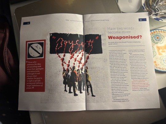
Place of words (More image making for my spreads):
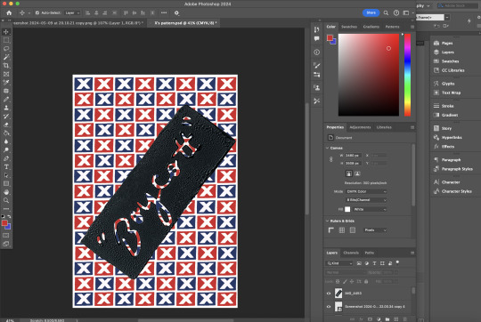
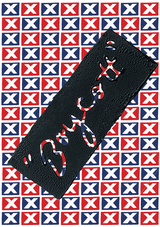
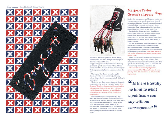
Here I started to work on some more imagery for my next spread as i didn't want to over use my image transfer and stitching, so instead i took in the colour Lino editing i previously did and changed the colours to be the red and blue i have been using throughout the magazine, this helped to link the imagery to the magazine in a more cohesive way which i like! I also like the layered boycott Lino print i did over the pattern as this makes the image have more of a meaning instead of just a pattern.
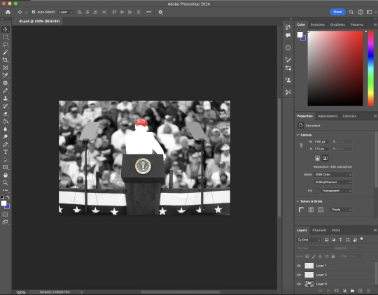
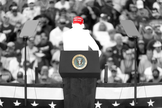
Here i also worked further on another image that i edited at the start of the project. Initially i used this as one of my image making trials when i was just starting the project, i then decided that i could use it again now as another image, so i brought it back into photoshop and then made it black and white (the cut out was there already in the initial edit) and left the cap and emblem on the podium in colour, to highlight who is in the image! I think this image could work strongly in the magazine as a gap filler again, so next i will try and slot these in to see how they work!
I did also try and draw over my lino scan to see what it would look like as a digital drawing, i don't like how this came out as the print as a digital drawing feels wrong as the reason i did lino in the first place was because i wanted that handmade physical feel! and doing a digital drawing takes away from that.
0 notes
Text
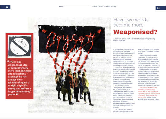
Place of words (making changes to spread one from feedback):
Here is what i started with before our latest tutorial, i had my text in different sizes, not aligned to the baseline grid, too thin, unreadable etc, there was many things that needed to be changed so it could flow better!
So here i began to make the changes that they recommended, Here i added in a bit of info of what the article was about before the article itself, i made all text smaller and thicker so it could be better read, and i changed my images around so my stronger images could be used else where and larger!
0 notes
Text
Place of words (tutorial feedback):

Here after my tutorial i was given some points to work on to improve my magazine. One of the major improvements i was given was a new grid as mine wasn't working, this grid was just 5 columns wide with no rows, this was so that i could place my text and images in line with one another so it all fits nicely, rather than just fitting to boxes! This really helped me going forward with designing the rest of my magazine. I was also recommended to split my text up with an indent in each new line instead of giving one big line between paragraphs! This was created with a paragraph style so i could apply it to every paragraph in the same exact style. I was also recommended to change the layouts and placement of certain images and text, using my best and most impactful images bigger leaving my gap filler sort of images for last so i can use them if i need to fill space! Next i will continue to make the improvements i was recommended and start designing my last spread too!
0 notes