
Don't wanna be here? Send us removal request.
Statistics
We looked inside some of the posts by year3ba3acollaborative-blog and here's what we found interesting.
Average Info
Notes Per Post
0
Likes Per Post
0
Reblog Per Post
0
Reply Per Post
0
Time Between Posts
50 minutes
Number of Posts By Type
Text
11
Photo
6
Last Seen Tumblr Blogs


Fun Fact
Premium Tumblr themes are available from anywhere between $9 to $49.
Text
Extra into which influenced my designs
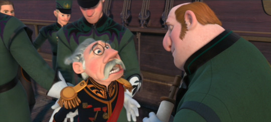
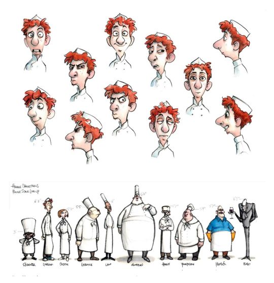
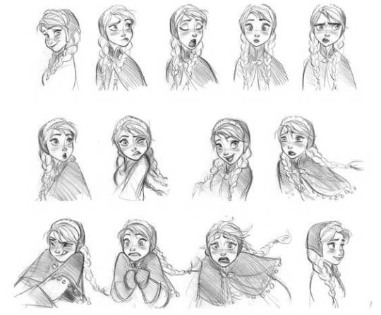
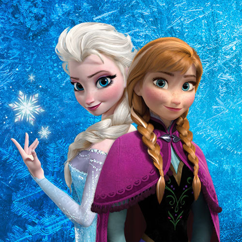
I looked at references for my character personalities and expressions. Examples such as Disney’s Belle and Alfredo Linguini. For the dad’s moustache I looked at eh Duke from Frozen. For the daughter I look at Anna from Frozen as her personality was similar to my character so I took some aspects of her description and looked closely at her expressions below: “Free-spirited, fearless, active, energetic, benevolent, awkward, playful, bubbly, optimistic, clumsy, talkative, feisty, silly, adventurous, perky, naive, loyal, impressionable, impulsive, fun-loving, clever, quick-thinking, intelligent, enthusiastic, loving, selfless”- http://disney.wikia.com/wiki/Anna
I did briefly look at archetypes but they did not fit with our animation very well as there is no villain and they are all protagonists.

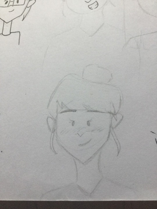
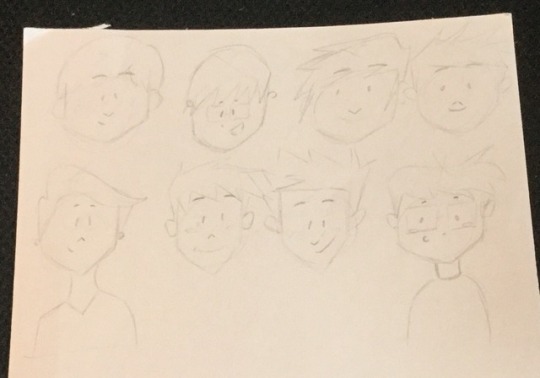
Below are iterations of the mum’s face and finally we all like the heart shape idea to suit her personality, which is the last one.
0 notes
Photo
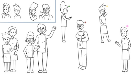
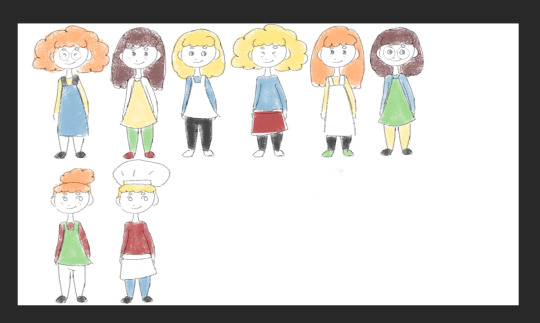
Final Designs
I am really proud of my designs, I found a way of creating characters that work for me!
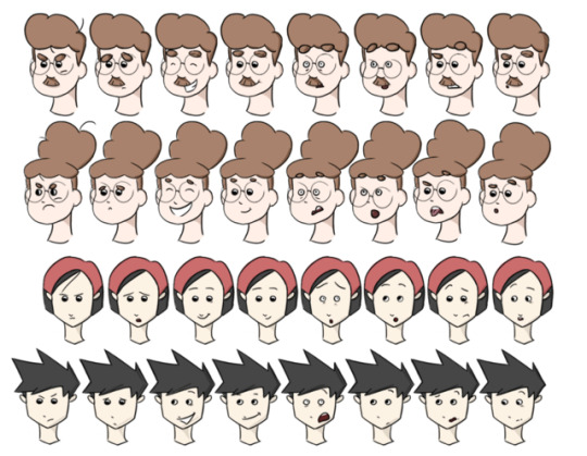
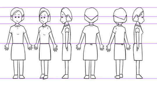
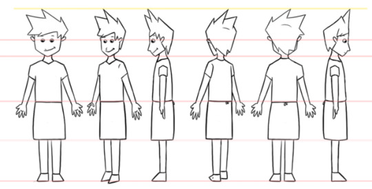
At the top are all of the characters together, then all of their facial expressions, then turn arounds and finally some gestures. At the top of the last picture they are all eating, then the little girl is offering food as she is sorry as per our storyline, the dad is mixing food, the boy is throwing food and the mum is gesturing “kids will be kids”. All gestures related to our storyline. For the facial expressions and poses I took myself as reference and also my nephews but I do not wish to put the pictures online. The facial expression i chose were angry, sad, happy, normal, scared, surprised, disgusted and interested.
The personalities of each character were as follows: the boy is happy, funny, cheeky, chill, clumsy, insecure. The mom is happy, sweet, shy, sturdy, caring, calm determined. The girl is happy, bright, sassy, smart, confident, playful. The dad is happy, geeky, confident, chatty, hard working.
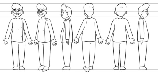
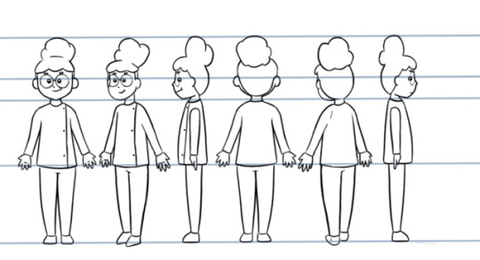
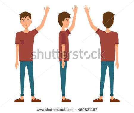
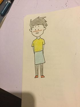
I really struggled with character turn arounds so tried using clay, getting others to pose for me, asked other animator, looked at images online and Yvonne sent me some links to helpful videos, below. My mother is good with proportions and maths so she helped me visualise the way a character should look on the side as it helped me to speak out loud on my thoughts.
youtube
youtube
https://images.google.com.au/imgres?imgurl=https%3A%2F%2Fthumb9.shutterstock.com%2Fdisplay_pic_with_logo%2F811570%2F249482938%2Fstock-vector-men-and-women-people-in-side-standing-view-vector-illustration-249482938.jpg&imgrefurl=https%3A%2F%2Fwww.shutterstock.com%2Fimage-vector%2Fmen-women-people-side-standing-view-249482938&docid=eAPpl83G8LKt4M&tbnid=NuYBqV3OuYnSCM&w=450&h=470&source=sh%2Fx%2Fim
I think as a group even though we had a little argument we worked really well and it’s natural to clash when working with others. We are all happy with the work we and the others produced and we are still great friends!!
0 notes
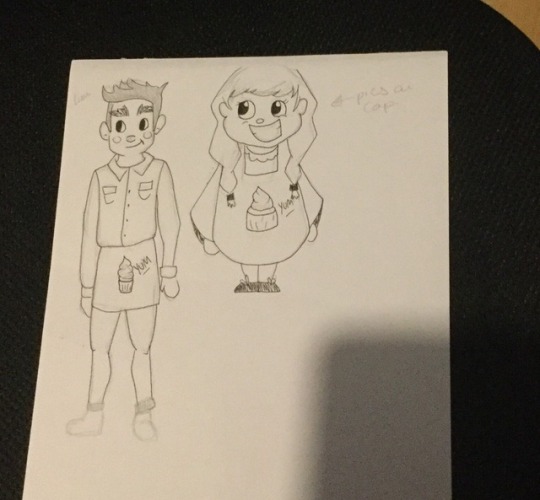
Photo
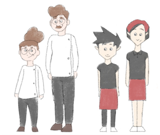
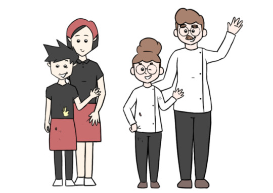
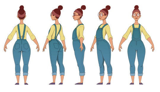
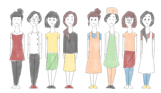
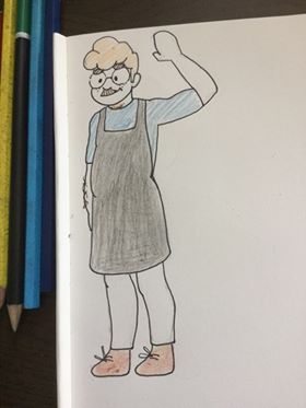
Final Character Designs
Above are what the finished product is for all of the designs. I again took everything on board and we decided as a group to go for simplistic colours, with about the same amount on each couple. Also in doing further research I found it was mainly the french that wore the buttoned up white shirts so I gave it to them. I then added the bandana on the Japanese mothers head as suggested by Yvonne and from what I found online. I gave them different coloured skin as the there is a variation of skin colour for the Japanese and French. Thinking about shape theory I stuck with the French being rounder and the Japanese more rectangular. As suggested by Yvonne’s link I left the French with light coloured brown hair but I kept the more curly hair as it suited with the shape theory. For silhouette since the mum is sweet I gave he a heart shape face. I felt the French patisserie owners would be better as a little chubbier to show they are into their sweet cuisine and the Japanese more square based on their stricter culture.
We were all really happy with the designs and could see the the parents and kids could relate to one another in terms of designs.
Emily reminded me that the line style we were going for were smoother but I wanted to try a more sketchy design but from now onwards the design outlines will be smooth.
0 notes
Text
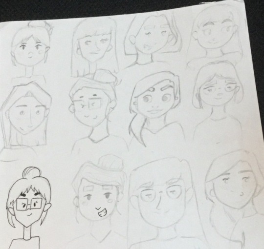
Continuing designs
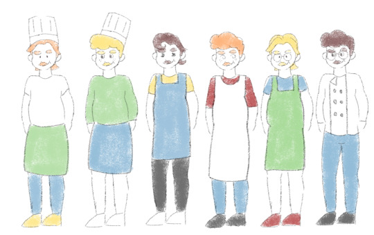
Above I continued with the character designs taking all of the research I did on board to influence their look. Again just messing around with different colours, hair styles, glasses/ no glasses, freckles/ not, size of the aprons, chef hat or not.... etc...! Yvonne found this sight which mentions a lot of French people have light brown hair, not as curly as some of my designs and light eyes. https://www.quora.com/What-hair-eye-color-combination-is-the-most-common-in-France-for-males-and-females
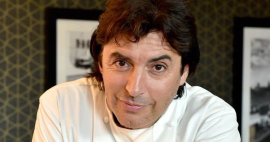
Examples of how I integrated my research into y designs can be found on the dad’s hair style as the less curly ones are inspiration of Jean-Christophe Novelli. The variations of the clothing are similar to ones I found references wore online.
Feedback from Yvonne and Emily: The mum’s neck could be shorter, the fourth boy looks cheeky. They liked the shorted hair for the mum and bigger eyes for all of them as designs. The little girl with the hair up! And so on.
Taking everything into consideration: the feedback I received and info I found I put it all together for a final look and added a variation of colour, image above.
The colours I took into consideration were the the first two designs were realistic to what I found online, the following two were based on the colour scheme Emily sent of her stalls so that they’d match and the last one was based on the countries flag colours.
0 notes
Text
Continuing inspirations- French
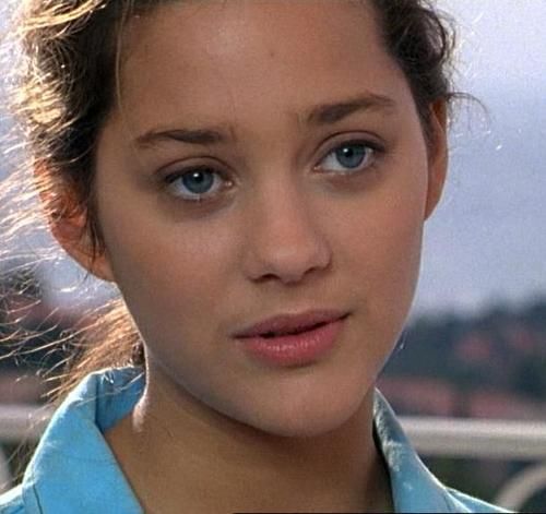
To get a more realistic style I also Googled things such as French patisserie owner, french actress which came up with Marion Cotillard ad Jean-Christophe Novelli who I took inspiration from. For my continuation of the designs I took on board features such as their hair.
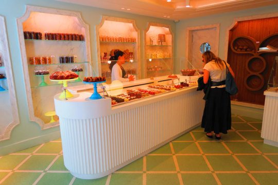
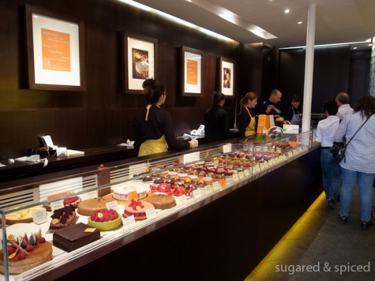
I then looked at popular patisseries to see how they dress, below.
Pâtisserie Stohrer and RNAUD LARHER are popular ones in Paris.
youtube
0 notes
Text
Continuing inspirations- Japanese
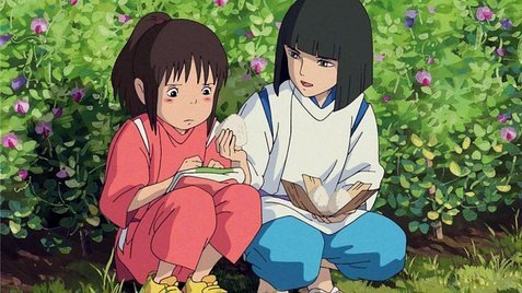
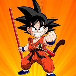
For the Japanese designs I took this picture below as inspiration and looked at popular food stalls in Japan such as the Fukuoka City and the Nishiki Ichiba videos below which showed me how they dress which is fairly casual. For reference I also just Googled Japanese people, looked at how Spirited Away characters were designed and Dragon Ball too, especially for the hair of the son.
youtube
youtube
youtube
0 notes
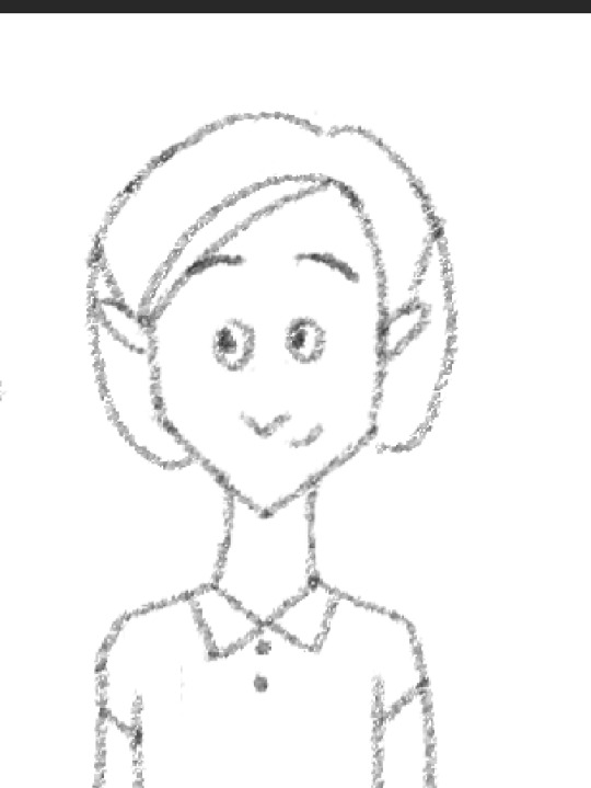
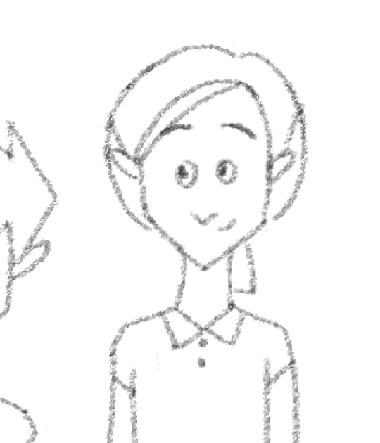
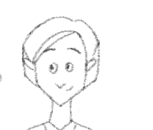
Photo

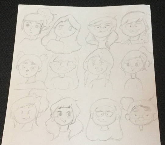
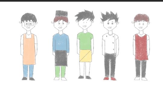
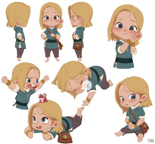
Character Design
These are character trials in the technique of Draw with Jazza. I took into consideration that the mum and dad were around 30-40 years old and the kids around 10 years old. The mum and son are from Japan and dad and girl are French. Then I messed about with different facial features and sizes.
Below are the look towards the final designs as I took what aspects of each character I liked the best and drew it below. I decided to give the dad and daughter more rounded shape and the Japanese more rectangular to give a variation.
Yvonne and Emily gave me feedback: are the lines on the faces of the Japanese supposed to be facial features or are they blushing? Will the dad have fingers which he will. The daughter maybe looks a bit young, maybe make her taller? But all in all they really liked the designs.
Inspiration
Inspirations I took on board when designing all of these designs. I was looking at Mayumi Nose’s variation of characters and facial featured which I tried on my characters. https://www.facebook.com/mayonose/ See example below.
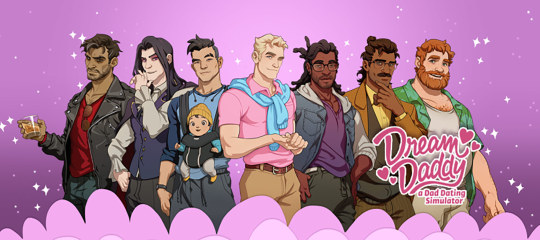
The game Dream Daddy also helped, especcially for the father design. Especially the red head towards the far right.
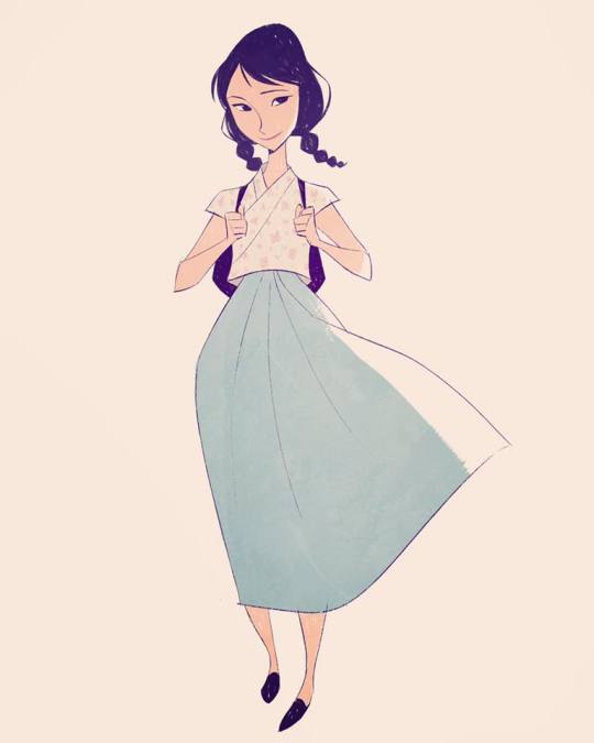
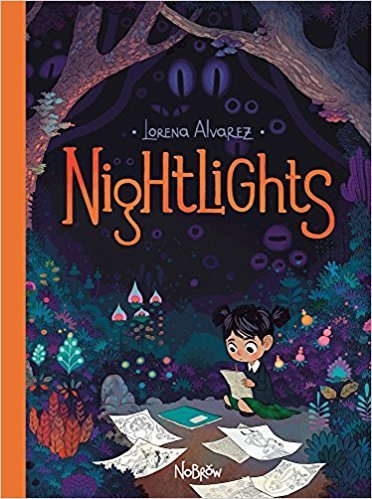
Larena Alvarez,s book Nightlights had some beautiful illustrations and I looked at the way she designed younger characters.
The designs below also helped designing younger characters.
Then also found this video of which I really liked the facial feature, especially the eyes design.
youtube
0 notes
Text
Character design
Draw with Jazza
As I mentioned in the showcase topic this is the same technique I used to construct my characters so here it is again:
His technique is establishing a few words to describe the character you are designing and then searching up real references online and cartoony inspirations. After that you start designing in a lose way different “facial constructions” so one with a larger nose maybe, another with small ears and so on to find what works. You then take the key parts of your design that you like and mix and match to again find what works. I took all of this on board and experimented above with different shapes to construct a something towards a final design which is almost the last design I drew but I still had to work on eyes for example.
youtube
This is just some quick character design research I did which applies to all three topics we did, essay, this one and the showcase (it is written the same):
https://graphicmama.com/blog/conveying-characters-personality/ This article talks about “How to Convey Character’s Personality Through Shape, Variance and Size”. It mentions that people need to connect with your character, the way your character looks will effect how the audience will perceive its personality traits and that story telling has always been about. The “tools they use are shape, variance and size”. Shape- Character designer David Colman discovered “that facial expression is really secondary when reading a character…. First thing to notice is the face shape, posture and body language ”. “Any character could be broken down into primary shapes onto which we are projecting our real life experiences”. -Square/ rectangle- in nature the square shape is found in solid shapes such as rocks and is “usually perceived as something stable and heavy”. Usually used for strong, heroic and masculine characters but also used to portray a solid, stable, confident, dependable and stubborn character. -Circle/ Oval- Speaking in terms of the feel of a a round shape it’s soft and safe. A lot of popular protagonists are rounder in shape as it is seen as friendly, naive, cute and harmless. Eg. Russel from Up “his whole body is made of soft, round shapes and it is used as a contrast to the square body of Carl. This is yet another technique to underline someone’s personality, by putting him next to another character”. -Triangle- danger as they are sharp and can bee seen in broken glass for example and are normally used on villains. “Triangles also give direction…. Artists also use them to show a hero’s determination”. By mixing shapes together you get a more complicated character.
The use of colour can also portray a character in a certain way as brighter colours ofter mean good and darker ones bad. This Tedx Talk goes more into detail abut colour in design as he mentions that for example red could signify danger or just make a character stand out, also by taking the colour blue you can convey a character to be heartless but also another character to just be passive depending on what you wish to portray. https://www.youtube.com/watch?v=WtIHVBzQcuY
0 notes
Photo
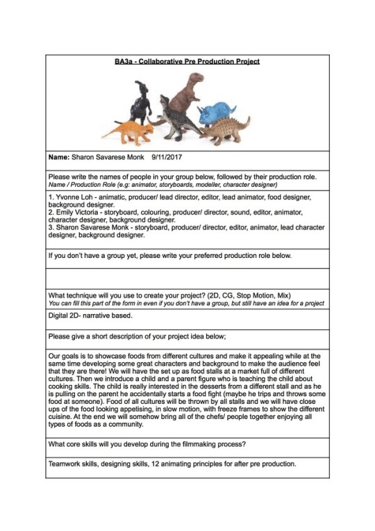
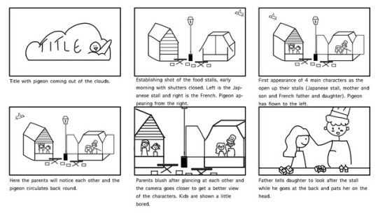
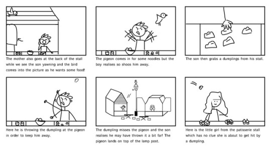

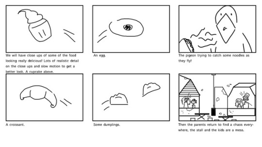
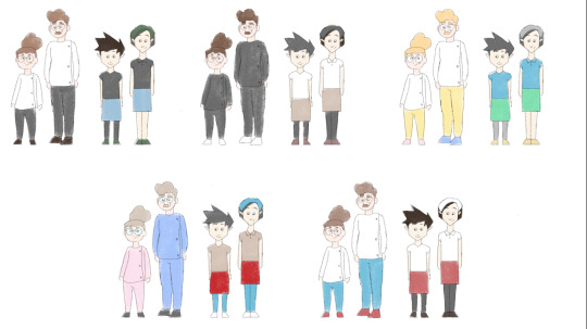
Above is the Collaborative Pre Production Project Form and under is the final storyboard.
Yvonne and I worked on the initial beat boards. I drew the characters and Yvonne drew rough sketches for the background which Emily later on finalised and made her own. For the final storyboard above I finalised it and continue to use designs from the initial beat boards.
0 notes
Text
Feedback from Helen
As a group we got a bit stuck at time as we would come up with an idea but when getting feedback it would change a few times and it would seem as though we were stating again over and over. Of course we appreciate the feedback and it always helps seeing what other have to say about your work but we were maybe a bit too hesitant as we were afraid we would have to redo things. In any case the last piece of feedback we received before the holidays was the following:
Ask yourself why the boy is bored and why does the bird want food?
Since we were now having the bird initiate the food fight as Ben suggested then think of cartoon timing maybe but give the pigeon the right timing. We decided the pigeon was going the swoop in to try to steal some food, so the boy get angry and throws something at him but it lands on her.... Now the timing between the pigeon stealing the food and landing on the lamppost with the food thrown at him missing him.... Need to be timed more realistically.
What is the backstory between the kids?
The angle of the two stalls is on a wonk so the audience can see what’s going on but we have to think they they will have to bend towards each other a little to throw the food.
It will be funny to see splatters everywhere and the kids covered in food.
Do we want dialogue and how much? The father can establish his relationship towards the daughter with a light pat on the head.
Put yourself in that scenario... How would you feel if you were there with your parent and how would you feel if you came out as a parent and you work was a mess.
We definitely need to add at least one of the parents at the start and thin carefully about they reaction towards the food fight!
Maybe the parents have a crush on each other but are too shy about it, so they get annoyed about the food fight but are sort of glad they got to talk. Maybe a kid can offer food as an apology and the parents react like ‘kids will be kids’. Bring people together instead of focusing on food?
For a comedic effect does the pigeon try to eat some of the flying food from the food fight?
Body language is key. Look at Pixar shorts which have no dialogue to see the body language. Also how do others establish relationships?
Character similarities will help establish the relationships too. Simplify character designs. Are characters opposites to each other or kind of stereotypical?
Since we had a minor fall out Helen suggested to focus on learning form the collaboration projects and produce the best work we can!
0 notes
Photo


Presentation Preparation
Above is our final presentation. We decided to go with the beat board and we added some reference photo’s of Emily’s trip. The beats are establishing shot, guy throwing food, food lands on her, she throws food back, it lands on a third person by mistake, food fight, food lands on cake as the dad comes out from the back, he tries the food and they all come together to celebrate.
This is the feedback we received from Kris before the presentation: It’s playful, think of details as in every slide should flow together by maybe having the same font. The intro reminded him The Simpsons intro, just with the clouds.
youtube
Feedback from Helen and Ben on the presentation
The close up shots of the slow mo food reminded them of an M&S advert. Narrow down elements as we have made it at times confusing, really focus on the writing and the conflict between the stalls. Ben suggested that the star of the show are the relationships between the people, while the food and cultures add to the plot something more. The climax point of the story is whether the dad is going to be mad or or whatever reaction once food lands on his perfectly crafter cake. The resolution is that he is happy in the end. He said that we can remove the third boy from the plot as he doesn’t add to it either. It’s about the people coming together and the pigeon can add a comical factor to the plot. Maybe the pigeon poos on him an he gets mad and throws the food and she misreads the situation? On top of that if we add a line such as “Look after the stool son” it will add tension for the viewer when the food fight starts. We need to establish the relationship of at least one of the families so audience understands. Title ideas such as “Noodles vs spaghetti”.
All we did basically was complicate it a bit so just simplify! Colour and shape will help with differentiating the cultures.
0 notes
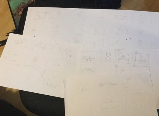
Photo
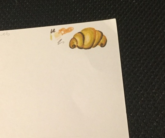
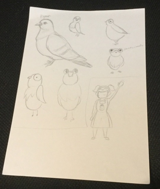
Group Skype
We shared initial sketches and said we needed to starts designing the characters, stalls and background ready for the presentation.
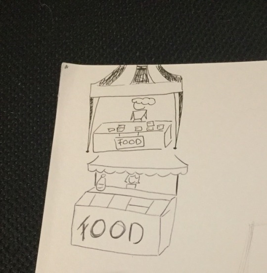
Above are my sketches for a starting point of a food stall (I looked at references online), characters, pigeon and croissant (took reference from online).
The last picture is our group attempt at knuckling down a storyline and storyboard so it’s messy.
0 notes
Text
Lynsey story feedback
This was the feedback from Lynsey:
Different cultures and have lots of stalls. Just don’t make it too stereotypical.
Think about food waste, maybe make it land in people’s mouths or perfectly on plates?
Posh patisserie vs rustic hipster stall?
A pan shot of each stall in slow with different music playing.
Add a pigeon for comedic effect, he might try to eat the food.
Thinking about a title- Lynsey the pigeon, community something, food related or market?
0 notes
Text
Group Skype call
We decided to change up the little boy’s character from either fussy or curious to bored, he doesn’t want to be at work with mum.
We were thinking of having the stalls as one healthy vs an unhealthy one so organic vs fast food!
The kid and parent should be opposite genders on each stall so father and daughter.
Maybe the boy wants the dessert from the girls stall but mum says not before dinner? Maybe his stall sell soup? But then we thought that it might not be easy to make soup look appealing while flying through the air.
What is the parent teaching the kid?
We established we want the mother to be around 35 years old and her son around 9. On the unhealthy stall there would be a father and daughter of similar age but she absolutely loves working there with her dad.
Storyline
Our storyline went though a lot of changes due to feedback and problems popping up with designs. Here were a few possibilities:
Boy is chopping or mixing ingredients for the soup as he sees the girl and her father having a great time and since he is bored he gets entertained by them. A ladle of something goes flying and lands on the girl. She turns around angry so the boy decides to hide and the girl by accident thinks it’ s different stall that through it so throws it at them. This starts the food fight of all cultures where we will have slow motion appealing food flying through the air. As the dad returns back to the front of the stall a bowl of soup lands on his head and he tries it and loves it which is what brings them together. - A few problems we encountered were is the boy too young to be near a stove or holding a knife? What and how would actually go flying through the air?
An alternative storyline we have was the boy gets distracted and leans on a frying pan which makes an egg go flying. As the dad comes out at the end something lands on his head and by chance just misses the cake he just prepared. The dad laughs it off and we fade to black and back the them all gathered together eating.
The dad is jolly, loveable, happy, loved to cook and spending time with daughter, they should have matching aprons.
0 notes
Text
Helen feedback and meet up
Helen told us to establish the characters age and relationships.
We decided we wanted a food fight between 2 stalls.
Decide what character the kid has, is he fussy with food? Does the parent want the kid to stay and the kid is curious or on the other hand does the parent want the kid to try other food but he won’t.
Decide the location of the stalls- market or mall? Then go to location to gather information- gather photo reference, think about smells and sounds. Sketches of people at the market, go talk to the stall owners, take pictures of the food.
Maybe think about having 2 food courts that are rivals- contrast in visuals. One could be healthy and another be gluten free or vegan? Or maybe a trending food vs a fell fat, nice looking one?
Do we want the 2 stalls to be food based so dessert vs cheese for example or culture based so Italian vs French or Japanese or....? Show a contrast to establish the designs. Maybe one is jealous that the other gets more customers and tries to persuade customers to his stall.
Think of the beats to the story- what triggers the food fight, have the two stalls been angry with each other for years?
Start doing loose storyboard to see what sticks, add a spot of colour.
Start designing characters that are opposite looking.
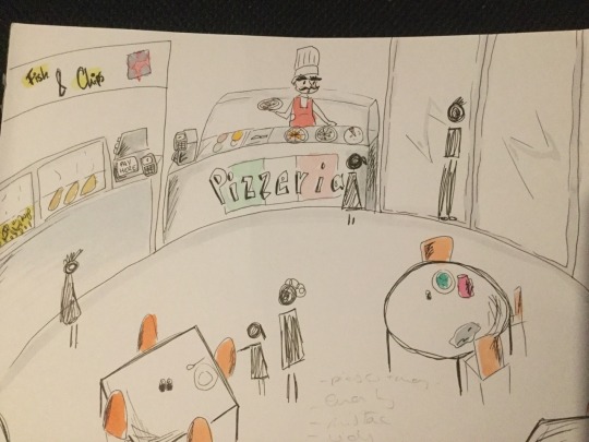
Below is a quick sketch I did of a good stall in a mall based on one I went to in Italy and Melbourne. Just an experiment!
Group meet up
We established our roles in the group pretty early on even though they may have intertwined at moments in this project.
Yvonne- food designer, animator, animatic.
Emily- back up character designer, background designer, back up animator, sound, colouring, story boarding.
Myself- lead character designer, back up animator, storyboarding.
All of us were in charge of producing, editing an directing.
Style
2D.
Cartoony.
Studio Ghibli style food.
A storyline idea was having two rivalry food stalls who were competing for customers so we had a vote of the cultures: From Mexican, Italian, Chinese, Japanese and so on.
The food looking cartoony far away and then more realistic up close.
Busy market? Where? what time of the year is it?
We were still throwing ideas about such as food fight was brought up, a love story, a clumsy guy in the kitchen kind of like Ratatouille, a cowboy showdown of two stalls.
We liked the idea of cultures coming together over food. Initially we thought maybe there could be a parent and their kid which work in one of the stalls and the parent is trying to teach the child about the business but the child is more interested in dessert. No dessert before dinner.
Start design a character in front of a their food stall- subtle hints of where they are from- go to food stalls to see real life references.
Our initial storyline was a kid and their parent setting up the stall but the kid really wants dessert from the opposite cart and the patently mentions having a meal before dessert. In some way the kid trips and begins a food fight and we see food everywhere. At the end someone tastes the food from the opposite stall and then we see them all sitting together.
0 notes
Text
Continuing
youtube
I think this one is real food but the colours are really eye catching/ pleasing.
youtube
The dog one is funny and cute in the one above.
youtube
This one is a cool concept.
https://www.buzzfeed.com/norbertobriceno/nomnomnomnomnom?utm_term=.gj0D038vx#.ehrpDelPM This link leads to come wonderfully drawn cuisine.
0 notes
Text
Facebook chat ideas
Us three are good friends so throughout this entire project we spoke on Facebook and Skype all of the time as well as meeting up.
We began by sharing videos we liked with each other to see if anything clicked and here they are:
youtube
From the video above which Yvonne shared I liked the minimal music and background noises and the high angles of how they cook the food and close ups of them eating!
youtube
Emily then shared this animation above which I liked how they showed the process of cooking the food and I loved the idea that he was tempted by different foods.
youtube
This one was the drawing style like the best and we like the comedic effect.
youtube
I then shared this one as I I like the idea of having a little miniature chef.
youtube
In this one I like the detail in the food, how we can see everything close up and the effect the slow moving falling food has.
After seeing a few we all agreed we like to pursue a narrative based animation with minimal sound.
0 notes