
Don't wanna be here? Send us removal request.
Statistics
We looked inside some of the posts by yoabnart and here's what we found interesting.
Average Info
Notes Per Post
9
Likes Per Post
8
Reblog Per Post
1
Reply Per Post
0
Time Between Posts
5 days
Number of Posts By Type
Text
13
Last Seen Tumblr Blogs


Fun Fact
The most popular pages on Tumblr are about Minecraft, GIFs, and David J. Peterson.
Text

This is a poster for a Lo-fi music concert night that will remix popular 90s songs. I chose Swiss Design as the main approach because I'm a big fan of this minimal style that promotes using grids, structures, simple shapes, and basic colours.
The challenge here is going with Swiss design means having a conflict with the 90s design trend, which tends to utilise bright, highly saturated pop colours and plenty. To overcome this, I used red, yellow, and blue as accent colours, then I reduced the saturation of accent colours and added a noise texture to the background ( to stimulate the old newspaper effect).
What I love most about this poster is those midi notes that visualise an iconic 90s song - “Smell LikeTeen Spirit” by Nirvana. This is the intro melody that is visualised by the 16px grid. Each 16x16 square represents a music note from the Midi sheet.
4 notes
·
View notes
Text

This artwork was created by Kumi Yamashita back in 2021. The artwork sponsor was American Express. Those origami represented 22 Amex employee faces that were chosen by Kumi Yamashita. I thought these pieces were paper, it turns out they are made by resins meticulously. As a part of Light & shadow concepts, Kumi Yamashita used light & shadow to illustrate the face. Such a brilliant, genius concept that I have ever seen.
Kumi Yamashita is a talented Japanese artist who creates breathtaking art pieces using light and shadow. She makes use of single or multiple objects and positions them at specific distances from a single light source to create artwork that consists of both the physical objects and the shadows they cast.
1 note
·
View note
Text
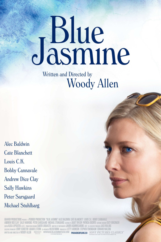
Step into the enchanting world of Blue Jasmine, where dreams and secrets collide 💙🌺
One possible designer of this poster is Gravillis Inc., a creative agency that specializes in movie posters and has worked with Woody Allen on several of his films, including Midnight in Paris, To Rome with Love, and Magic in the Moonlight. With the thin, elegant serif typography, we can tell the genre of this movie is drama. Based on the Hierarchy, the selling point of this movie should belong to Woody Allan & Cate Blanchett
What I find amusing most about this poster is the simplicity by having a portrait of Cate Blanchett as the main objects. She is clouded by a white layer and the blue shades, which may suggest the loneliness, and confusion of "Jasmine", the character portrayed by Cate Blanchett. Without knowing the plot, by looking at this poster, we can tell this move is about this woman and her journey to figure something.
0 notes
Text

This is one of logos that I designed for the faculty of Creative Arts & Screen Media of Griffith College Dublin, and this is the one that I love most. CASM is the abbreviation of "Creative Arts & Screen Media". I think CASM sounds pretty cool so I am trying to introduce this term to the target audience of CASM faculty. This logo looks modern, bold, and a bit playful, yet, still maintains the professional vibe. These characteristics are based on the faculty's values. And, it works well on any background. While working on this project, I found it most enjoyable to explore creative ideas on Pinterest that embody both creativity and professionalism. Some of the ideas that I discovered were so simple yet brilliant that they blew me away.
Note: This has yet to be the official logo. Let's hope it will become one soon.
0 notes
Text

This picture belongs to Bombas Spring 2023 collection, taken by Mari Juliano.
Mari Juliano is a Brooklyn based photographer from Brazil. She worked as a photo assistant for 21 years. Its finally paying off and now she became an established commercial photographer. Now, She works out of a studio in Bushwick. I think how this picture is organized is genius. Using high contrast colors , the Bombas socks placed in the center easily catch our eyes. I appreciate how the author used flowers to cover the rest of the model's body, which focuses the eye on her legs and socks while maintaining a feminine and sensual vibe.
1 note
·
View note
Text

This picture belongs to the "LOVE" collection of Emi Anrakuji. Emi Anrakuji is a Tokyo-based legally blind Japanese photographer who makes self-portraits. Anrakuji consistently uses her body as the subject of her photography projects, never revealing her face.
Most of her collections were taken in Black and white. The great contrast of these 2 colours makes her pictures very bold. The picture above, without other colours, can easily tell us it's a sunny day by the shadow of the balcony. I think the picture layout follows the rules of third, with her feet as the main subject.
Among those in the LOVE collection, this picture caught my eye because of its positive vibe, I can feel her joy while she was standing on the balcony under the nice weather.
1 note
·
View note
Text

Looking for a picture that can make you drool? Check out this awesome pic of donuts! Who doesn't love donuts (unless you're on a diet)?
The thing I dig about this picture is the layout - it's got that cool 2/3 thing going on, and the colours blend together great. And get this, even though the Red Velvet donut is the brightest and most colourful, your eyes are actually drawn first to the white, creamy donuts. But don't worry, your eyes will eventually land on the Red Velvet one before checking out the rest.
Picture credit goes to The Rolling Donut Dublin
0 notes
Text

This artwork is simple, yet, smart. I like how they use the lyric lines to replicate the vintage dish. This is a print artwork on Esty, created by Stella Design.
0 notes
Text

This is Maschine, an electric instrument / device used to create lo0fi music. I captured this from a tutorial video of Native Instruments as a piece of material for a Lofi Music concert poster.
0 notes
Text

Initially, I wanted to create several triangle shapes using circle/dot points. While I tried to put these dots into different sizes of triangles, It made me feel annoyed a bit. Because I wanted these triangles to be the same size. That’s the moment I thought of …. pizza with uneven cuts. Do you feel triggered looking at this artwork? well, I do... pretty much haha.
0 notes
Text

I have been deeply inspired by “minimalistic” styles that are quite popular on… Esty. This style amazed me on how the artist uses simple shapes, minimal colors to portrait a concept or express their feelings.
My minimalist artwork portrait a full moon night on the mountains. I created it using 2 design principles:
Contrast ( The moon vs the mountains & the night)
Proximity ( 3 mountains vs the lonely moon ).
The color palette is grayscale. I chose this tone to highlight a lonely, dark night. Even The Moon, an object that has the highest level of hierarchy, is still filled with the lightest shade of gray.
1 note
·
View note
Text


Title: The construction of space-time III, 1924
Author: Theo van Doesburg The original artwork was created in 1924, this artwork well presents the styles of De Stijl, that was encompassing painting, architecture and design. De Stijl advocated a minimal, pared down aesthetic consisting entirely of non-objective form, premised mainly upon the most basic visual elements of horizontal and vertical line and primary colours. However, I more prefer the artwork in 1966 as the poster of "THEO VAN DOESBOURG ARCHITECTURE EXHIBITION". It removes most of the colors so that we can focus on the structure of these shapes, bringing it close to what De Stilj stands for than the original one
0 notes
Text


The below picture is the original one that I took. The above one is manipulated using playgroundAI to express my feeling better.
I can't help noticing this house every time I take a walk on South Circular Road. It has a great contrast between red and green colors. The red door pops up in the center of the view, becomes the main and first object that draws our eyes to.
The red door hides behind those trees and huge brushes stirs up a mysterious feeling, and my curiosity.
It reminds me of Grimms' Tales. What would it possibly be behind that closed door? Is that a treasure or something that would make me regret?
1 note
·
View note