
Don't wanna be here? Send us removal request.
Statistics
We looked inside some of the posts by yolivyo-blog and here's what we found interesting.
Average Info
Notes Per Post
0
Likes Per Post
0
Reblog Per Post
0
Reply Per Post
0
Time Between Posts
13 hours
Number of Posts By Type
Text
14
Video
3
Last Seen Tumblr Blogs


Fun Fact
Tumblr Inc. has $15.1M in annual revenue.
Text
Reflection
This project was actually very different from previous projects I have completed because I have ended up in a completely different place than I thought I was going to end up at the beginning of the semester. At the beginning of the semester, I really wanted to develop a solution surrounding the issue of negative advertising within the beauty industry. My how might we question at this point was “HMW help women buy makeup while avoiding manipulative advertising?”. I think I struggled to let go of this idea as I felt really passionate about the topic having researched it for an entire semester already. I think this was the reason I was still trying to incorporate and twist my interview responses to relate to this issue at the stage of our formative presentation. I wish that I was able to present my new idea at this point and if I was to do the project again I would want to let go of my old idea sooner.
When I eventually let go of my initial idea, It opened my eyes to what the people I was interviewing were actually saying. I took a step back and went through my synthesising again. I was quite worried that I wasn’t going to be able to find something so late within the semester that I actually cared about (I think it is really important to actually care about the issue that you are designing for or else you won’t create anything meaningful). Luckily, I was able to take my research results and head down the path of conscious makeup consumption. My HMW became ‘HMW give women an easy and affordable way to make ethically conscious makeup purchasing decisions?’ Gray Galloway was an expert that I was able to interview for this project and I think after her interview was when this project really started taking shape. I knew at that stage that I wanted to create something to do with ethical makeup, as she was so passionate about the issue and I wanted to be too! If I was to do this again, I think I would spend a lot more time within the research stage, particularly the secondary research area, as I had to rush through this slightly since I decided on an issue so late within the semester. I have really enjoyed designing something that is attempting to make the planet a better place. There was a purpose behind this project compared to the other projects that I have worked on where I just thought the idea was cool. I think that’s what made this process so interesting for me.
0 notes
Text
Contextual doc nightmares

So I had a bit of a rough time actually making my contextual doc. I am going to re-print this for the exhibition but sadly don’t have time to do it before hand in.
I saddle stiched the book which actually went okay! However, the printers cut my book and the pages were cut unevenly therefore the edges aren’t straight..
Printing really isnt my strong point! I want to work on this for the future as I think it is a great skill to have.
(sorry about my numbers being on the inside lol)
0 notes
Text
Pitch Video in After effects
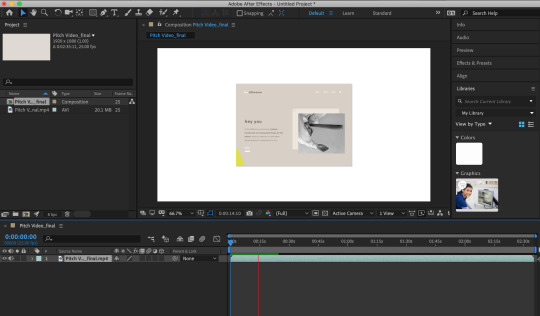
I decided to make my pitch video in after effects. I found this actually kind of difficult as I hadn’t used it it a long time (since first year) I might bring the final video into premiere pro as I am way better at that because I use it for work. My video is going to be very simple. I want to touch on the key points of the solution in my voice over and navigate through the website to show how it achieves these points.
Music
I found a royalty-free background soundtrack that I wanted to use for this video. I needed something that was relaxed and somehow relatable to my topic. the genre is what some call chill hop.
https://www.bensound.com/royalty-free-music/2
0 notes
Text
Pitch Script
The difference is a digital beauty platform that provides makeup consumers with a super-easy way to purchase affordable ethical makeup.
We believe that even the smallest steps towards conscious consumption make all the difference which is why we think it is super important that makeup lovers are given alternative channels to purchase their makeup.
At the moment, people are often seen ignoring their desire to shop ethically due to price and convenience.
At the difference, we curate cruelty-free and vegan products from many amazing ethical companies into a one-stop shop to make it easier for people to consume their makeup consciously. Along with this, we offer further purchasing options for buyers such as plastic-free packaging, product samples, delivery options and more.
We have a heavy focus on providing affordable products so that we can also reach the makeup consumers out there who may want to consciously consume however think that they can't afford it.
We want to show these people that that isn’t the case. Because affordable ethical products are out there! you might just not find them on the shelves at places like Mecca and Sephora.
But you can find them at the difference. We think that beauty shouldn’t come at the cost of other living things. which is why we only supply vegan and cruelty - free products on our site We also understand that ethical doesn’t mean just one thing which is a reason we are always trying to think of ways to lower our waste as a company too. starting with compostable delivery mailers and using zero plastic in our sample box deliveries, that are sent out to our difference club members each month. We understand that it can often seem difficult to incorporate conscious consuming into your daily life and that it can be hard to find ethical brands with a large range of shades for different skin tones. this is why we have incorporated a foundation finder that can match your old foundation type and shade with our selection of affordable ethical foundations. If a product is available on our platform it means we think it has a place in our store and it has met our requirements for ingredients, brand ethos and has been made with lots of love. so if you want to make a difference shop at the difference for all of your ethical beauty needs
The difference the conscious beauty platform you’ve always needed
0 notes
Text
Content gathering and style for Hi-fidelity
For my final prototype, I need to get all my images together to add to the pages. I am going to find free images to use from unsplash for the majority of the pages in my prototype. For the product page, I will collect images from their websites and APA reference the images within my prototype (in the acknowledgments page that I will place into the prototype footer or something)
I also did some playing around with the style that I wanted to go with. I did some random shapes and decided I wanted to go with the squiggle as it worked well with the organic-like idea I was going for. I played around with the colours I was going to work with. I kept the neutral browns etc for the background as the users like this in my user testing but I added a pop of colour as the users also said they would like to see this.
I also did a quick mockup of what one of the sample box’s could look like that members would receive is they joined the club. I didn’t want to go too far with this however I think it was good to show what it could look like and I wanted it for a section of the homepage. I might actually make one of these for the exhibition and put in some fake samples


0 notes
Text
Final Iterations
“I really like the simple aesthetic, think it goes with the brand idea and messaging you are trying to convey. I think I prefer the bright green because it gives it a bit of flare which I think aligns with the messaging you are using. I think a bolder colour contrasts nicely with the neutral other colours you have gone for.”
“I would go for the bold colour because you want people to notice your website and be like hmm i wonder what that is. It would draw their attention compared to the lighter blue and is more youthful and fun”
“I really like how you are using language like “sign me up baby”. I think you should try to be a bit more consistent with this throughout. Like either go all serious or all fun and playful”
“I like how you are using imagery in a playful way, not just the boring box you would usually get for an image. I would just say be careful with it getting too crowded with the pattern in the background and the images.”
“I think the aesthetic related the target audience (like younger generations) and I also really like how even though its a makeup brand, you haven’t chosen colours that aren’t usually considered ‘girly’ like pink. That’s really cool.”
With the feedback I received, I went back through my high fidelity prototype and made sure I was being consistent with the language I used as this was something that came up in user testing. I tidied up the pages and made sure they weren’t too busy as I wanted to keep the minimal like my other prototypes but I wanted it to also feel fun!
0 notes
Text
Hi-Fidelity User testing
1. All users preferred the yellow over the lighter blue because they said that it needed a pop of colour since the other colours are so neutral. One actually said the green yellow was more ‘me’ which I thought was funny but also that didn’t really matter because I’m not designing the website for me. One user said that the green speaks to a younger audience so I think I will go for that since I am aiming my solution and millenials and gen’zers.
2. Out of the shapes, the general consensus was to just pick one or two shapes and not try to go too crazy with heaps of different shapes and it could look cluttered. People mentioned avoiding making the pages look too crowded with too many shapes, images and text all in one area.
3. People really want hover states still which I can't do in sketch so this is a priority when I move the file into principle.
0 notes
Text
Hi-Fidelity User testing Script? Kind of
Once I had finished enough of my high fi prototype I just wanted to test the overall look, feel and flow with a few more users so I could make final adjustments. I did this by completing a more informal user testing scenario. I also asked people what they thought of the colours (I showed them comparisons of the green yellow and the blue option)
I also asked them to tell me which they preferred out of the shapes and whether to do a mix of the different shapes or keep to one as I was unsure myself which I liked best.

0 notes
Text
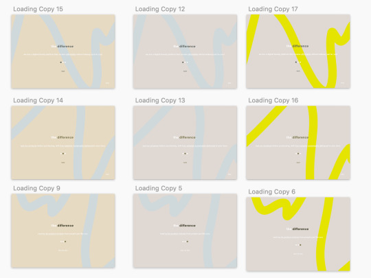
Hi Fi Prototype
I am having issues with the colours changing when I was exporting videos as you can see with the yellow in this video compared to the images . I need to figure out what is going wrong here for my pitch video because that yellow it YUCK with the other colours I have chosen...
I have also moved my file from Sketch over to Principle so I could add hover states and better animation because Sketch is pretty limited in this sense.

0 notes
Text
Iterations from Mid fi User testing
“I think it needs to be a bit more obvious that it has converted your shade from like Maybelline to the ethical brand because I was like what does 1p mean ya know”
“Could you do a hover and a dropdown menu”
“I would like a hover state, it changes colour when you’re on it”
“you need to somehow make the keywords stand out in this page because obviously, it’s really important for people to read so they know what the site does but I think I would just scan it and nothing is jumping out for me. Like the keywords like consciously consuming etc.”
“I think the free sample is a great idea and its a good incentive but I think you should change the sample with any purchase to a more subscription type thing. Kind of how Mecca does it. So you sign up to a sample sub and get like 3 samples a month for like $5 a month. Because otherwise, people would be able to hack it somehow and keep getting free samples”
Iterations:
- Menu, add a drop down menu when you hover.
- Add a subscription system for samples each month like Mecca does but ethical products.
- Skip for onboarding.
- Skip for select your previous foundation.
- Develop a way to highlight the keywords on a page.
- Emphasise the process of converting your old makeup to ethical makeup.
- More emphasise the affordable factor.
- Develop a playful tone of voice for the website.
- Including a physical store to the concept that users can go and pick up their sample package. Also for people who do not know their shade range in foundation.
0 notes
Text
Mid Fi User Test - 4
Hey how is it going?
Good!
Thank you so much for taking the time out of your day to user test with me. I just want to reiterate that this is a mid-fidelity prototype, so it isn’t the final polished version yet and therefore there will be some buttons that don’t work and also there are boxes where images may be placed in the final output. If you are struggling with anything because of this let me know.
What I want to get out of today is your honest opinion on the concept and really just anything that comes to mind. For this, I want you to talk through what you are doing with the prototype and just let me know your thoughts out loud.
I really want to understand what you are thinking because I am designing for you, the user. Do not be afraid to be honest because I promise I won’t be offended, I am actually wanting you to be critical so I can make the prototype as user-friendly as possible.
Are you cool with that?
All good
Okay, so start whenever you’re ready and I will just be giving you some questions and things to do along the way.
What do you think of the general look and feel of the prototype?
yeah its simple but sleek, could add something to spice it up a bit
What about the onboarding process would you think needs to be changed?
“Simple enough. Maybe you need to say what the website is first before going straight into the features”
In the homepage:
Navigates through reads copy.
“Maybes that text is a bit too long”
Can you please show me how you would go about buying a $15 foundation if you currently own Fit me Dewy Smooth foundation by Maybelline and you are the shade classic ivory.
- clicks shop
- clicks foundation
- Slight confusion. Needed to explain.
“Maybe that needs to be a bit more clear”
What do you think about this product page?
“Needs more detail I think. Like ingredients and descriptions, reviews”
Can you show me how you would go about getting a sample of this foundation?
- Clicks sample
Can you show me how you would go about signing up to the website and also let me know your thoughts about the process?
Goes straight to log in
Clicks into sign up
“Yeah, that was straight forward. I would always know to click the login if I wanted to sign up even if it didn’t say sign up.”
Would you use the sample section of this site if you were really buying makeup?
Uh well I wouldn’t but I am sure heaps of girls would. That’d be sick
Now that you have seen the project, In the onboarding process, is it clear to you what the website does?
I think it needs a bit more! to draw the user in
How obvious is it that you can buy affordable products on this site?
Uh kind of. Maybe make it more obvious in the onbaording

0 notes
Text
Mid Fi User Test - 3
Hey how is it going?
Great how are you?
Im good thanks! Thank you so much for taking the time out of your day to user test with me. I just want to reiterate that this is a mid-fidelity prototype, so it isn’t the final polished version yet and therefore there will be some buttons that don’t work and also there are boxes where images may be placed in the final output. If you are struggling with anything because of this let me know.
What I want to get out of today is your honest opinion on the concept and really just anything that comes to mind. For this, I want you to talk through what you are doing with the prototype and just let me know your thoughts out loud.
I really want to understand what you are thinking because I am designing for you, the user. Do not be afraid to be honest because I promise I won’t be offended, I am actually wanting you to be critical so I can make the prototype as user-friendly as possible.
Are you cool with that?
Yeah sounds good
Okay, so start whenever you’re ready and I will just be giving you some questions and things to do along the way.
What do you think of the general look and feel of the prototype?
“I really like the minimalistic feel. And the browns are cool since its a makeup website. Prob could add a pop of colour. “
What about the onboarding process would you think needs to be changed?
Reads through the text
“it’s pretty straight forward”
In the homepage:
“Oh nice. Are you going to add some images? I think in those spaces you could have some cool images”
Can you please show me how you would go about buying a $15 foundation if you currently own Fit me Dewy Smooth foundation by Maybelline and you are the shade classic ivory.
- clicks shop
- clicks foundation
-confusion around how to type in the mid fid prototype
- Clicks page and goes to next
What do you think about this product page?
“I like it, again a product page needs pics of the product. but I can see youre going to add that with those boxes. Ummm I think maybe the buy should be up more the first thing you see. And it needs to be clearer how you matched the old foundation to this one.”
Can you show me how you would go about getting a sample of this foundation?
Completes
Can you show me how you would go about signing up to the website and also let me know your thoughts about the process?
Clicks log in. “Maybe there should be a drop-down with sign up?”
Can you show me how you would go to learn more about the company?
Goes to page with ease
Would you use the sample section of this site if you were really buying makeup?
100%. I do it a Mecca so it would be cool to have an ethical version of the same thing!
How obvious is it that you can buy affordable products on this site?
I guess you say it at the start. Maybe more emphasis with your copy throughout would be good
0 notes
Text
Mid Fi User Test - 2
Hey how is it going?
Really good thanks
Thank you so much for taking the time out of your day to user test with me. I just want to reiterate that this is a mid-fidelity prototype, so it isn’t the final polished version yet and therefore there will be some buttons that don’t work and also there are boxes where images may be placed in the final output. If you are struggling with anything because of this let me know.
What I want to get out of today is your honest opinion on the concept and really just anything that comes to mind. For this, I want you to talk through what you are doing with the prototype and just let me know your thoughts out loud.
I really want to understand what you are thinking because I am designing for you, the user. Do not be afraid to be honest because I promise I won’t be offended, I am actually wanting you to be critical so I can make the prototype as user-friendly as possible.
Are you cool with that?
Yep chill
Okay, so start whenever you’re ready and I will just be giving you some questions and things to do along the way.
What do you think of the general look and feel of the prototype?
I like it but I think it might sometimes be hard to read the white writing.
What about the onboarding process would you think needs to be changed?
Reads through the text
“I think it maybe needs to be a bit more exciting because the points are really great but there is nothing drawing my eyes to the keywords like affordable and ethical and free samples. They’re all really good things but I would just scan it probably”
“I think you need how many pages there are. Like the three dots or a bar to see where you are at in the onboarding process”
“Let’s do this in another colour. So you know you’re finished with the onboarding”
“The text is quite close to the edges so maybe you could bring the end of the line under it to make it more in the centre.”
In the homepage:
“I think again, you need to somehow make the keywords stand out in this page because obviously, it's really important for people to read so they know what the site does but I think I would just scan it and nothing is jumping out for me. Like the keywords like consciously consuming etc.
Cool thanks, Can you please show me how you would go about buying a $15 foundation if you currently own Fit me Dewy Smooth foundation by Maybelline and you are the shade classic ivory.
- clicks shop
“I think you could do like images or illustration that change when you hover over the different options like a face when you’re on the face or eyes blinking when you’re on the eyes”
- clicks foundation
- “I think you need another colour added for your whole thing to make things pop. Like you don’t know where to go and I think the colour would help”
“I think on a website I would normally start typing in my product within a filter like this. I think you should be able to so you don’t have to scroll through all of the products.”
“I think if it was me going on this website, I would start typing in fit and it would direct me to all the fitme products”
“there should be a flashing cursor”
“I think I would want to see the colour when I have selected the shade I am so maybe that should be on the foundation page before you see the products available.
What do you think about this product page?
“I would move the next section up so you know to scroll”
“Would be cool to see your colour in that range that had been matched over from your maybelline”
“Ooh, I think you should have an incentive tied into the sign-up system where if you review a product you get something?”
(was thinking perhaps you would get a discount when you review something. The reviews would be reviewed and approved t by the people who work at the difference before you get the code”
Can you show me how you would go about getting a sample of this foundation?
- Clicks sample
“Let’s get you sampled up, ooh I like that”
“Yeah this all seems legit”
“You’re wording is really cool”
Can you show me how you would go about signing up to the website and also let me know your thoughts about the process?
“Would it be log in? could you do a hover and a drop-down menu so that sign up isn’t always there but you can still see its an option”
“I think there could be a hover drop-down menus actually for all of these nav options”
Clicks into sign up
“i think the form should be visible on the page just slightly on the right”
Can you show me how you would go to learn more about the company?
“Oh cool yeah just need to have a hover state for the buttons”
Talking about the style:
“I think just adding more colour, images. Like at least one colour to this.”
“The font is the same as the logo’s font but I think it needs to be different in the body. You could use that font for just buttons and link. It is a little confusing because of this”
Would you use the sample section of this site if you were really buying makeup?
“Oh yeah, definitely I would. I think the free sample is a great idea and its a good incentive but I think you should change the sample with any purchase to a more subscription type thing. Kind of how Mecca does it. So you sign up to a sample sub and get like 3 samples a month for like $5 a month. Because otherwise, people would be able to hack it somehow and keep getting free samples”
“You could even have a card that subscribers get to take into the store and get their products or something”
“I think when you get the free sample, you should take it back to the store and get another free sample if you bring it into the store”
Now that you have seen the project, In the onboarding process, is it clear to you what the website does?
How obvious is it that you can buy affordable products on this site?
“Yeah it is, but again I think you just need to be highlighting the words and price words around the website”

0 notes
Text
Mid Fi User Test - 1
Hey how is it going?
Thank you so much for taking the time out of your day to user test with me. I just want to reiterate that this is a mid-fidelity prototype, so it isn’t the final polished version yet and therefore there will be some buttons that don’t work and also there are boxes where images may be placed in the final output. If you are struggling with anything because of this let me know.
What I want to get out of today is your honest opinion on the concept and really just anything that comes to mind. For this, I want you to talk through what you are doing with the prototype and just let me know your thoughts out loud.
I really want to understand what you are thinking because I am designing for you, the user. Do not be afraid to be honest because I promise I won’t be offended, I am actually wanting you to be critical so I can make the prototype as user-friendly as possible.
Are you cool with that?
“Yep I will try”
Okay, so start whenever you’re ready and I will just be giving you some questions and things to do along the way.
- The user reads the onboarding steps out loud
- The user easily navigates through onboarding
What do you think of the general look and feel of the prototype?
“I really like the aesthetic”
“It all seems good. Are you going to add like images to the image page?”
Yes I will! I’ll be adding those to my next version of the prototype. What images would you like to see?
“Probably just some someone relatable, not like perfect models everwhere and then maybe like images linking to the ethical stuff”
Cool, Can you please show me how you would go about buying a $15 foundation if you currently own Fit me Dewy Smooth foundation by Maybelline and you are the shade classic ivory.
- navigates to buy first, selects face
“what if I don't have a current foundation”
“maybe it could have a thing like are you pale, are you cool toned kinda like that. And you can just select the shade you think you are. Or have pics of other girls and you can choose the ones closest to you”
- Slides price down and select the $15 option
Awesome thanks. What do you think about this product page?
“I think you need the shade description next to the colour shade result you are”
- Slight confusion how the shade range converted
“I think it needs to be a bit more obvious that it has converted your shade from like Maybelline to the ethical brand because I was like what does 1p mean ya know”
- (on the product page. There is a description drop down area. )
- The user asked what the information was further down the page.
What information would you want to see here?
“Maybe you could have like this is a dewy finish in the description area. Underneath you could talk about the brand and the ethical-ness”
Can you show me how you would go about getting a sample of this foundation?
- User reads through page
“Cool I like that”
- reads privacy thing.
“Oh its not major, but when you write the difference you could always put that in the different colour like it is in the logo area”
- User successfully orders a sample of the foundation
“cool that’s so fun”
Can you show me how you would go about signing up to the website and also let me know your thoughts about the process?
Clicks log in, clicks sign up
“Initially when I clicked on sign up I was like Oh where did the form go to fill it out, I would expect to see it first and then maybe the description below”
“I like the language you are using”
Can you show me how you would go to learn more about the company?
- Clicks about
how do you think you would go about showing they are buttons
“I would like a hover state, it changes colour when you’re on it”
Do you have anything you would change about the process within this prototype?
“i think there would defs need to be lots of images for the products because people want to see”
- talking about where the text is on the scroll selection page for foundation
“I think that this needs to come up a little because it feels like its kind of stuck a little. Maybe put the scroll list in a box
“Are you going to have more fields in the face, eye, lips?”
“I think you could add in brushes. because a lot of brushes are animal fur so people would be looking for ethical ones”
Would you use the sample section if you were really buying makeup?
“Yeah 100%”
Now that you have seen the prototype, Is there anything you would change about the onboarding page?
“There needs to be a skip. I think I would read through this though. I would because it's just a quick little sentence and doesn't drag on. Maybe have three dots showing the user that its only three pages to read through. Or it could even just be like a loading page where it fades sort of through the three pages for like 5 seconds”
“Did you want to mention that you can buy lips and eyes as well because you just talk about foundation. Make it more obvious that it is the everyday makeup. the basics”
“You’re daily makeup neccessities”
How obvious is it that you can buy affordable products on this site?
“Not really actually. I think it needs to be more obvious that it is affordable in the homepage. Put like a price like nothing is over $50 or something”

0 notes