
Last Seen Blogs


Photo
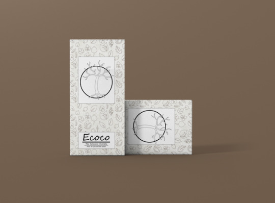
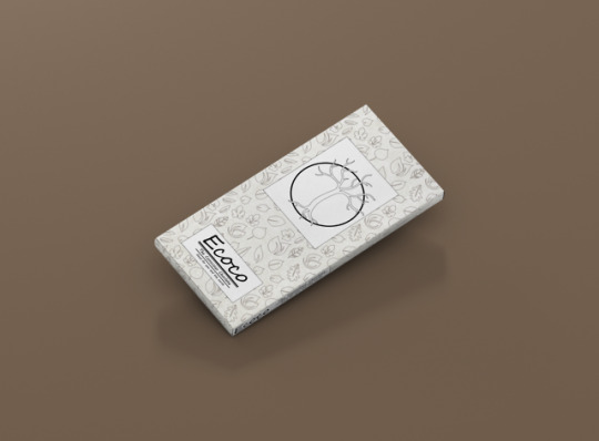
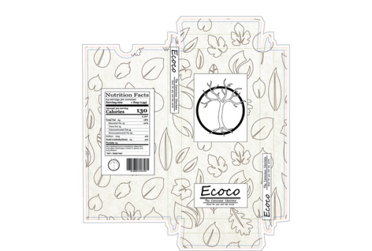
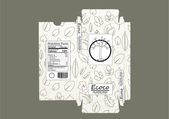
PRELIMINARY LOGO VERSION 3 - Feedback
Due to feedback I redesigned my logo to be more in theme with my pattern themes.
0 notes
Photo
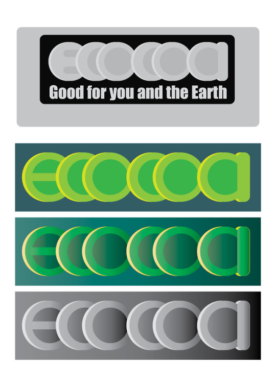
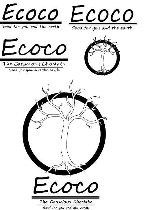
PRELIMINARY LOGO VERSION 2 - Colour contrast
After filttering the previous incarnation through greyscale you can see that the lack of contrast reduces legibility. These changes of colour aimed to improve visiblity.
0 notes
Photo
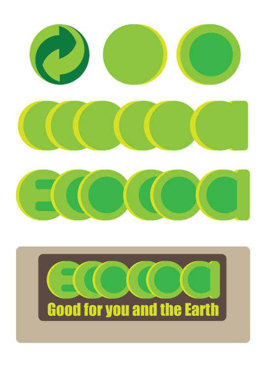
PRELIMINARY LOGO VERSION 1 - Recycling sign
This logo is based off the recyling sign to keep in theme with environmental sustainability.
0 notes
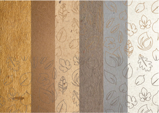
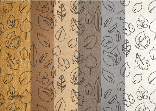
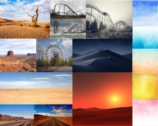
Photo
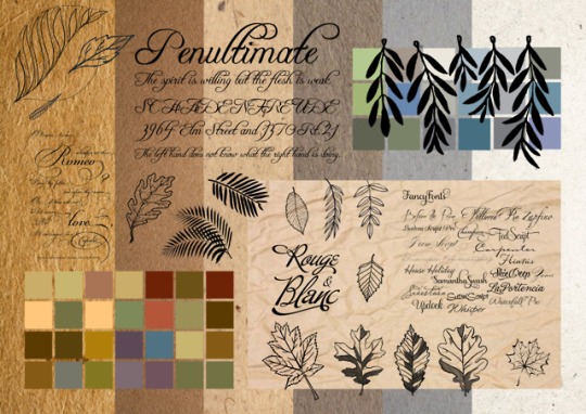
PRELIMINARY PROCESS - Moodboard
Elements:
recycled paper
earth tones
pastel colours
natural themes
0 notes
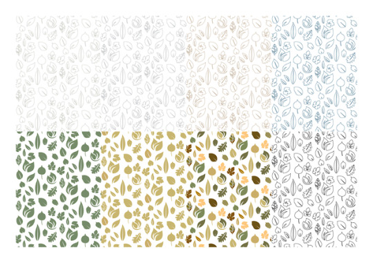
Photo
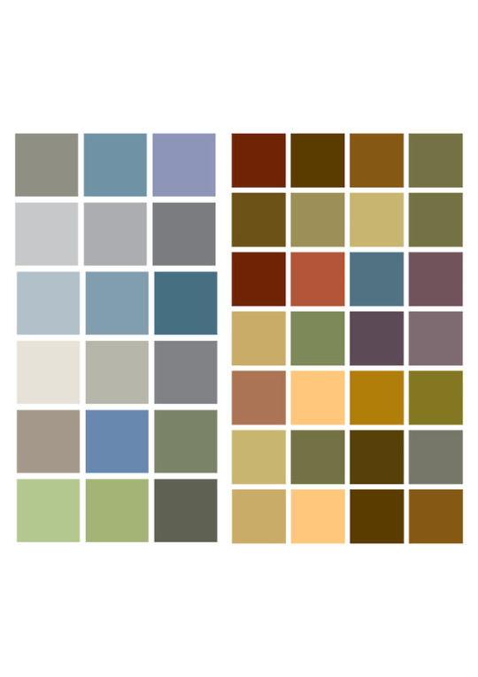
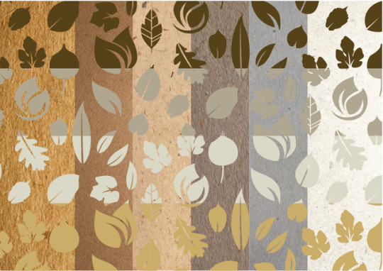
PRELIMINARY PROCESS - Colour palette
Part of the minimalist theme of the company will need t o be reflected in the colour palette; earthtones and desaturated pastel colours will help reinforce efortts of the brand to remain low-key while also conecting to the overall eviromental sustainability aspect of the branding.
0 notes
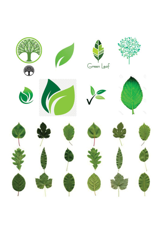
Photo
PRELIMINARY PROCESS - Logo/ pattern research
Looking into more stylised logos and illustrations.
0 notes
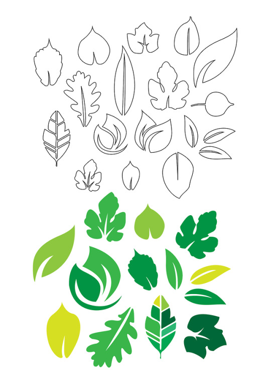
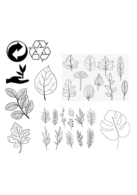
Photo
PRELIMINARY PROCESS - Logo/ pattern research
Gathering insperation/ subject matter for logos and patterns: Leaf and nature based logos and interstingly shaped leaves that could for the basis for a pattern or logo that ties into the themes of the company.
0 notes
Photo
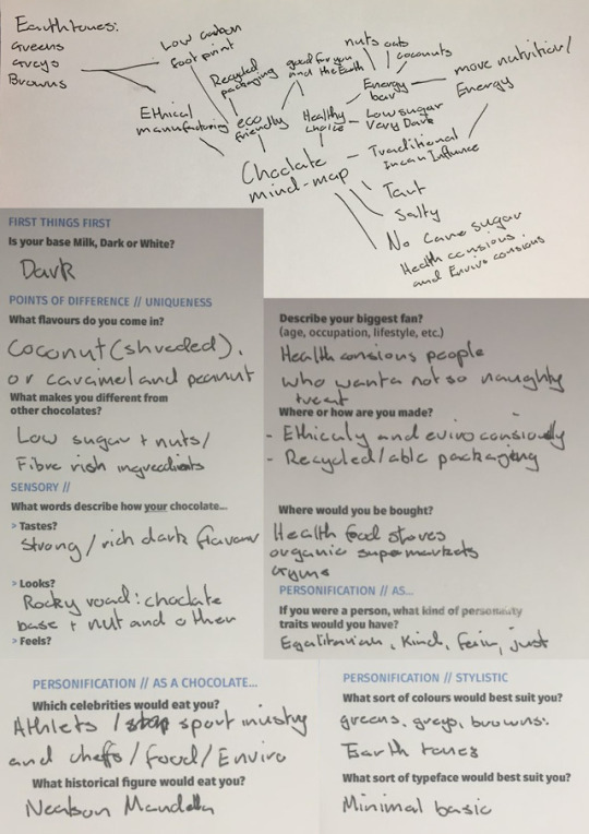
PRELIMINARY PROCESS - Brainstorming
The overall idea is a minimalist choclate company that has two main focuses; health and impact reduction whether ecological or human.
0 notes
Photo
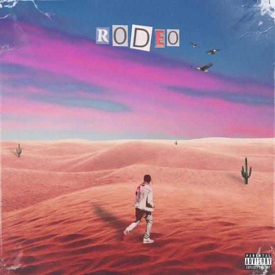
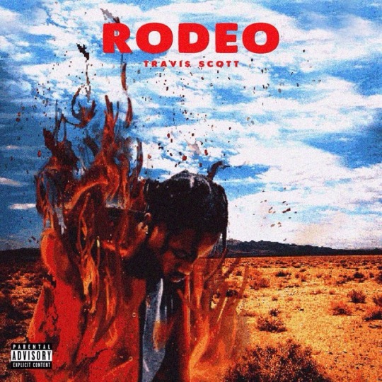
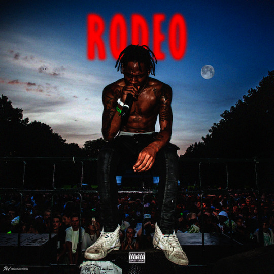
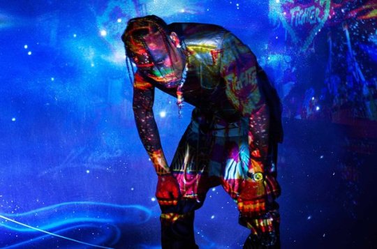
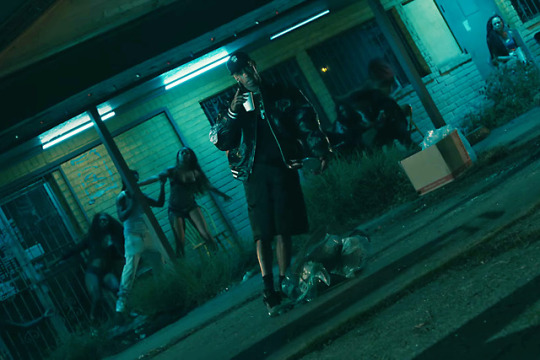
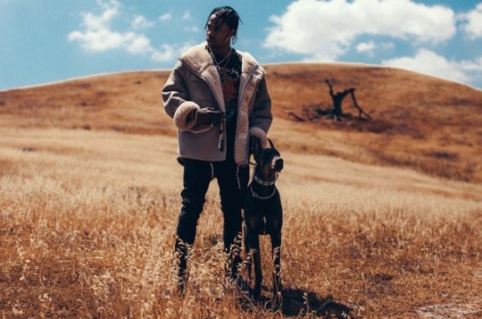
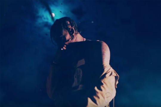
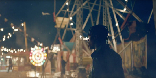
Album cover inspiration:
Taken from marketing material and music videos
0 notes
Photo
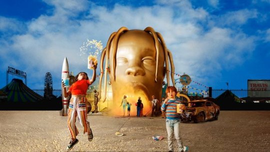
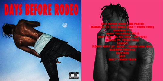

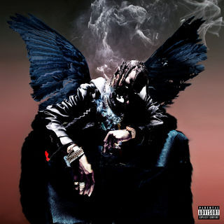
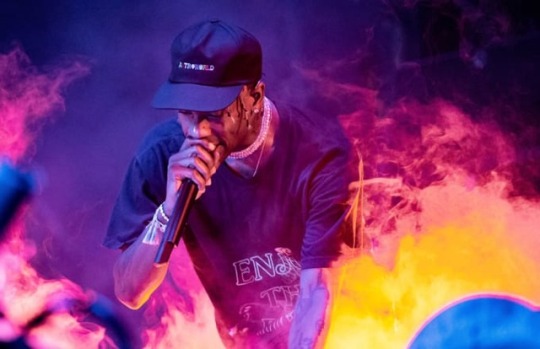
Inital ideas for A1 Assesment task
Realeased in 2018 Astroworld is the long awaited final part in Travis Scott’s three part series of albums that includes the earlier realeased Days Before Rodeo ( 2014) and Rodeo (2015).
0 notes