
Statistics
We looked inside some of the posts by yuxin-xu-blog and here's what we found interesting.
Average Info
Notes Per Post
2
Likes Per Post
2
Reblog Per Post
0
Reply Per Post
0
Time Between Posts
8 days
Number of Posts By Type
Text
11
Last Seen Tumblr Blogs


Fun Fact
Premium Tumblr themes are available from anywhere between $9 to $49.
Text
Final Project
For the final project, the topic I choose is self-identity. To find out things that can represent my identity, I search for my Chinese name’s meaning. One of the characters has the meaning of the universe or roof of the building and another character has the same pronunciation as the star in Chinese. Having these in mind, I crafted out my first draft for the logo, which is a Chinese character and a bird, this portrays my identity as an explorer.

However, after the first consultation, I noticed that when I created this logo, I did not take my target audience in mind. When they saw this image, they might not be able to get the meaning I want to portray. Hence, based on the idea of explorers, I think about what kind of identity I wish to show my future employers when I apply for a job. And I notice that I am a data-driven and analytical person who like to draw insights and idea from data. Based on this idea, I created the second draft which consists of a letter Y formed by numbers, which is the initial of my name as well as birds that represent ideas and insights that were draw from the data and numbers.

After the presentation, my classmate had given me some valuable suggestions. For the final draft, I used binary numbers instead of random numbers. Furthermore, I changed the logo to a moon which represents the database and a star that is drawing out of the moon represents the insights I draw from the data. I also utilize the idea of the moon phase to represent how insights are been drawn from the moon.


Overall, this is a very interesting project, I learned a lot from the process of making a logo from scratch. This also allows me to apply the concepts taught in the lecture such as color and typography. Even though it is sometimes challenging to create the perfect logo in my mind using adobe illustrator and InDesign as I am completely new to this software, however, I find myself learn a lot through practice.

0 notes
Text
Assignment 3
Draft 1: For the first draft of the infographic, I used a hemisphere to show how the above-ground activities affect the ocean environment. I separated the infographic into causes and consequences with the upper half showing the causes and the lower half showing the consequences. To show the causes and consequences, I have used different icons to represent each of them, for example, for industrial waste, I used different shapes and rectangles with a cloud above them to show that these are the factories. To make sure the text is associated with each icon, for the important statistics, I enlarge the size of the text and ensure that the color of the text matches the icons they represented. For the title of ocean pollution and consequences, I make them as large as possible and use bold to emphasize the importance.

First draft
Critiques: During the critique section, the main problem with the infographic is that there is an information overload which makes the entire infographic seems disoriented and clustered. People might simply don’t want to read it when there are too many texts and too much information.
Final product: For the final product, I decided to focus on the causes of ocean pollution and choose only 4 types of causes which are littering, industrial waste, plastic, and noise. The infographic is separated into the upper half and lower half, with the upper half showing the land-based causes which are littering and industrial waste, and the lower half showing the inside water pollution which is plastics and noise. Instead of showing a hemisphere, I decided to show a 3D landscape, this is to show a flow from the land to the ocean. For each of the 4 subtopics, I used the same color but a larger text to show that these are the main subtopic. For the text below, whenever there are statistics, I will enlarge them and change the color so that these numbers make more impact on the audience.

Sketch of the second draft

Final product
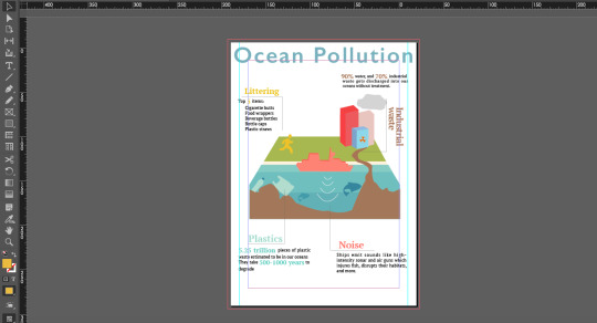

Adobe Illustrator and InDesign screenshots
0 notes
Text
Assignment 2
Draft 1: For the first draft, the storyline I was thinking of is about a lonely man who finds himself very different from other people. I had used colors to differentiate the character and other people. There is one day where the lonely man opens a book, and he was dragged into the book. From the world of the book, he will always find different views and find people who are the same. And finally, he will make friends with these people and stay in the world of the book. After I have taken pictures for draft 1, I found out that it can be very hard for other people to understand the story if I did not explain it to them. After several considerations, I try to retain some ideas from the first storyline as well as some photos and change the story structure so that it is easier to be understood.

Draft 2: For the second draft, the storyline I was thinking of is about a character from the book taking a trip in the real world. The character is white because the book is in black and white. When he came to the real world, he will meet people of different colors, he will also see colorful views. At night, the character had finished his trip and went back to the book. To present the storyline, I have cut some paper men to represent the character and use colorful paper men to represent the people in the real world. For scene 4, I have used an umbrella to show a river and make paper boats to represent that the character is taking a boat on a river. I think this story is clearer as compared to draft 1. I have created a more distinct beginning and end so that to prompt the audience to think that the paper man is a character from the book.

Critiques: However, during the critique section, the problem of difficulty understanding was been pointed out. It seems that in scene two, people cannot see the connection between the paper man and the character of a book. And the whole story still needs some explanation before people could understand. Furthermore, the storyline is easier to show if this is a video project. It is hard to execute my idea and storyline in a photo project. After careful considerations, I decided to change the entire story so that my photos can show the story without explanation.
Final product: The final product storyline is about friends helping each other. Eeyore wants to drink some water from the cup, and he finds out that he cannot reach the straw. After getting help from his friends, he finally gets to drink the water from the straw by stepping on his friends’ back. I have tried to utilize the camera angles that we learned during the lecture. For example, for scene 4, I have taken the photo in a bird’s eye view. This is to show that the straw is so tall that Eeyore can’t reach it. Overall, this assignment is a very fun experience. I have taken the chance to be creative yet have to stay practical so that my photos can construct a storyline by themselves without explaining.


Use of Adobe InDesign for the layout
0 notes

Text
Assignment 1
Step 0: Selection of the object The image that I have selected is a CD player. Looking at image 0, it can be seen that there are multiple objects in the background. As the CD player is the main object, I have excluded all the background objects in step 1.
Step 2: Abstraction After selecting the object and image, I have made use of adobe illustrator to outline the CD player and draw out its essential features. Firstly, I change the transparency of the original image so that I can see what I have drawn using the pen tool more clearly. At the first stage of abstraction, I have kept all the essential features of the CD player, such as the entire machine, the cables which act as the switch of the CD player, the CD that is exposed, and the texts and image on the CD. At this stage, I used the black dots to represent the speaker which originally is a series of small holes on the CD player. I have also used small dots to represent the smaller texts on the CD instead of typing them out.
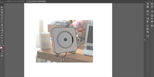
Step 3: Abstraction In step 3, I have changed all the black dots that represent the speaker to fill with black color, as without these dots, people can still recognize that this is a CD player and hence is not an essential thing.
Step 4: Abstraction In step 4, I changed the title and the production details of the CD to two music symbols to show that this is a CD that can play music. And these music symbols are drawn using the brush tool in AI.

Step 5: Abstraction (from 3D to 2D) At step 5, I changed the entire image from 3D to 2D while retaining the rounded corner square to represent the machine and a circle with two rings at the center with music symbols to show that this is a CD player. Together with a wire at the bottom to show that this is the switch of the CD player.
Step 6: Abstraction At the last step, I have eliminated the double ring at the center of the CD and change them to two arrows to show the motion of the CD when the device is turn on. I also make the shape of a circle and rounded corner triangle more standardized. Instead of sticking to the shape that I draw from the original image, I have used the ellipse tool to draw the CD.

I have also used the rectangular tool to create a rectangle and change the cable to a straight-line.

After all the steps have been created, I used Adobe InDesign for the layout.

Critiques: During the critique session, it seems that at the last stage, the cable makes viewers confusing about what the device is. The straight-line cable may make the entire device be misinterpreted as a signboard. Furthermore, the removal of the double ring at the center also makes the disc feeling to be lost. On the other hand, the round corner of the device is a distinct feature, and I was recommended to keep it. After the critique session, I have taken the advice to remove the straight line and restore the double ring at the center of the CD while removing the arrows. I have also used the rectangular tool to create a rectangle for the device and select the corner to change it to a rounded corner.

Below were the before and after change:


0 notes
Text
Ex.F

Most part of the candy box is dominated by the blue color to convey a sense of refreshing after eating the candy as the candy has a soda and mint flavor.The designer of the candy box also uses complementary color such as orange and yellow which is opposite of blue in the color wheel. This is therefore creates a high contrast which gives a vibrant look, it also direct the consumer’s attention to the orange circle at the bottom right of the sugar box as it stands out from the blue background. The designer also uses the color pink for the texts, together with orange and yellow, these warm color create a sense of energetic and these color advance to attract potential consumers.
0 notes
Text
Ex.E
The choice of typeface is making audience hard to read the content. While this can be used in the title, with a big size to emphasis, it has become a hassel to read the body paragraph with only the outlines of the text. Furthermore, the central alignment of the text is also making audience very difficult to read as they have to work harder to find the start of each line.In addition, all the letters in the body paragraph is been capitalized, which makes the text less readable. To improve this typographic representation, I will change the typeface of the body paragraph to a more readable one such as Serif, and the typeface of the title to San-serif. I will only capitalized the start word of each sentence and convert the whole body paragraph to left alignment instead of central alignment.

0 notes
Text
Ex.D

A worm’s eye camera angle give the subject a sense of power to the audience, which can make the subject looks threatening by putting the audience at a lower level.

However, a bird’s eye look at the object at a higher point of view, now the audience have a power over the subject, which makes the subject looks weak.

An eye level shot makes the subject looks familiar and neutral. It is usually what audience see the object normally.

A long shot shows the entire subject as well as the relationship of the subject with the environment.

On the other hand, an extreme close up focus on a section of the subject. This is used to show a specific feature of the subject.
0 notes
Text
Ex. C
The printed advertisement shows a ketchup bottle that is build by multiple slices of fresh tomatoes, the signifier of slices of tomatoes signified that Heinz ketchup is made by fresh tomatoes that does not include any artificial flavors or chemicals in it. The tomatoes also signified naturalness and health.
The phrase “no one grows ketchup like Heinz” also shows the freshness of Heinz ketchup. The use of word “grow” emphasizes the point that Heinz ketchup is made by fresh tomatoes or give customers an impression that the tomatoes used to make Heinz ketchup is grow by Heinz, not imported from anywhere else.

0 notes
Text
Ex.B
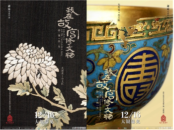
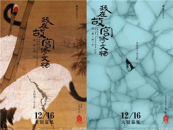
A series of posters was designed by Huang Hai for the movie Master in the Forbidden City. At first glance, each poster depicts a cultural relic collected by the forbidden city, such as porcelain, a figure of Mercy Buddha, and paintings. Every cultural relic has some form of damages. When we look closer at these posters, we can see that within those damages, a small person is trying to fix it.
The film Master in the Forbidden City is a documentary that focuses on the everyday life of the restorers who work in the Forbidden City. The restoration of cultural relics and antiques is time-consuming and sometimes boring. Yet these restorers fixed each cultural relic with peace of mind. They have to endure hours of work sitting on a chair and to be very careful when dealing with the cultural relics. With the context of the movie, the cultural relics in the poster implies the long and fascinating history of China. The craftsman in the past has created various great artworks that are still fascinating today. The small person fixing the damages are the restorers depicted in the movie, it could also represent generations of restorers who are trying to fix the damages. With their hands touching the cultural relics, this also implies their communication with the craftsman in the past. Through restoration, people in the present learns about the history and culture that is associated with the artwork. Before the film was released, we might not know there was such a group of people trying to protect the cultural relics. Their work-life might also seem mysterious to the general public. However, we can see from the poster design that although this group of people is so small in the poster and might not get noticed by others, what they do is very great. Hence, with the poster design, people can therefore appreciate the work done by these restorers.
These are very successful posters that resonate with the content of the movie. By representing restorers in a very small size, the poster depicts their 'craftsman spirit'. Even though they might not get noticed when people visit the Forbidden city and appreciate these cultural relics, they are doing a great job in protecting and restoring the culture and history.

1 note
·
View note
Text
Ex.A

A creativity machine that enhance my creativity by providing me with different ideas. The only thing that I need to do is to press the button and the idea can be collected just like using a normal vending machine. To pay for the ideas, I have to earn experiences from my daily life and give them to the vending machine.
1 note
·
View note