
zahraa-saleh
zahraa saleh
UOB | Art & Design ♡
32 posts
Don't wanna be here? Send us removal request.
Last Seen Blogs


shadypizzastatesmanwobbler
Untitled

designvlog
Digital Marketing

juna-from-luna
mlem

in-camille-we-trust
Dreams of Music & Dystopias
Text
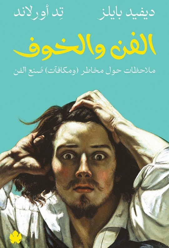
تلخيص لكتاب الفن والخوف
اسم الكاتب:ديفيد بايلز، تِد أورلاند
سنة النشر:2023
تلخيص الطالبة:زهراء صالح احمد
عدد الصفحات: 167
يسعى كتاب الفن والخوف إلى تفكيك مشاعر الخوف، في محاولة لفهم تأثيرها على صناعة الفن. ويُرجح الكتاب أن مصدرها الأول خوف الفنان من نفسه، وذلك ضمن مخاوف أخرى يستعرضها الكتاب من خلال طرح تساؤلات حول الطريقة التي يُصنع بها الفن، وأسباب عدم صُنعه في كثير من الأحيان، وطبيعة الصعوبات التي تؤدي بكثير من الفنانين إلى الاستسلام وسط الطريق عبر تأمل تنويعات الحالة الفنية كالموهبة والحرفة وفهم الخامات، والتوقعات،والأفكار.
يحتوي الكتاب على العديد من الفصول مثل مخاوف بشأن نفسك والفن والخوف ومخاوف بشأن الآخرين.
يتحدث الكاتبان عن المخاوف الخاصة بصنع الفن تنقسم إلى عائلتين: مخاوف بشأن النفس، ومخاوف بشأن استقبال الأخرين للعمل الفني، وحسب قولهما: تمنعك المخاوف بشأن نفسك من إنجاز أفضل أعمالك. بينما تمنعك المخاوف بشأن استقبال اللآخرين لك من إنجاز عملك. ويربط الكتاب ذلك بهاجس النظر للفن باعتباره منحة أو هبة أو عبقرية، على الرغم من أن الفن يصنعه ناس عاديون يواجهون مصاعب صناعته الشائعة والمألوفة، ويعتبر الكتاب أن أسطورة صناع الفن غير العاديين توفر ذريعة جاهزة للفنان كي يكف عن صناعة الفن.
شمل الكتاب أيضا جميع المعلومات التي تخص الطريقة التي يصنع بها الفن، وأسباب عدم صُنعه في كثير من الأحيان ويشمل ايضا طبيعة الصعوبات التي تؤدي بكثير من الفنانين إلى الاستسلام على دى الطريق.
@uob-funoon


8 notes
·
View notes
Text
FA327 FINAL PROJECT (SILKSCREEN,POP ART PRINTING ANDY WARHOL)
In this work we are required to choose a famous person or an artist and then we transform it in the way of Andy Warhol’s pop art and I chose Audrey Hepburn because she is my favorite actress. At the beginning of the work I went through a little difficulty🤕then I started to get used to the method of this art. It was a fun and special experience and I hope it will be repeated again❤️✨️.
Supervised by Miss Patricia Barakat
@patriciabarakat
@uob-funoon
#silkscreen #silkscreenprinting #serigraphy #printing # popart #andywarhol #FA327 #colorseparationandprintingtechniques #printmaking #graphicdesign #art #universityofbahrain #audreyhepburn #audery
11 notes
·
View notes
Text


نبذة القصة:
تدور أحداث القصة حول فتاةٍ غنيةٍ مغرورةٍ تعيش في منزلٍ كبيرٍ مع والديها، وتملك الكثيرَ من الملابس الجميلة والمجوهرات الثمينة، ووالدها تاجرٌ ذو نفوذٍ ويمتلك الكثيرَ من المال. وعلى أطراف المدينة تعيشُ فتاةٌ فقيرةٌ يتيمةٌ محبّةٌ للخير ولمساعدة الآخرين، إلاّ أنّ الفتاة الغنيّة تتكبّرُ على الفتاةٍ اليتيمةٍ والفقيرةٍ؛ فينقلب حالها من الغنى إلى الفقر.
تحت إشراف: د. سماء الهاشمي
(FA224)مقرر فن الرسم الرقمي
@uob-funoon
12 notes
·
View notes
Text

PRINCIPLES OF GRAPHIC DESIGN-FA222
project1
Advertising
It is an advertisement for a shopping store and there are our offers and it has many different clothes.
Ad analysis
An ordinary advertisement for the simplest, but the colors are good. There is nothing remarkable for those who want to buy from it. It is very simple and needs many improvements and development to attract the attention of people and customers.
@uob-funoon
17 notes
·
View notes
Text

PRINCIPLES OF GRAPHIC DESIGN-FA222
project1
advertisement
It is an advertisement for a detective to appear. There is a lentil shop of various flowers and different shapes.
Ad analysis
The advertisement is normal, and there is nothing special about it except for flowers. Also, there is not much discrepancy, and everything is not arranged and scattered, and the colors are inconsistent with each other.
@uob-funoon
17 notes
·
View notes
Text

PRINCIPLES OF GRAPHIC DESIGN-FA222
project 1
Logo Analysis
Spotify is one of the most popular music player.
Logo Analysis
1-There is a clear and strong contrast as the image is dark and the logo is green.
2-Simple and unattractive logo.
3-Ordinary logo and not attractive to the eyes.
@uob-funoon
11 notes
·
View notes
Text

PRINCIPLES OF GRAPHIC DESIGN-FA222
project 1
Logo Analysis
The Apple logo is one of the most famous logos in the world.
Apple logo analysis:
1-The logo is very simple.
2-There is a change, but the design is not attractive and ordinary.
3-Ordinary and unobtrusive colors.
@uob-funoon
10 notes
·
View notes
Text


PRINCIPLES OF GRAPHIC DESIGN-FA222
project 1
Artist interview
@uob-funoon
10 notes
·
View notes
Text


PRINCIPLES OF GRAPHIC DESIGN-FA222
project 1
Artist interview
@uob-funoon
9 notes
·
View notes
Text


PRINCIPLES OF GRAPHIC DESIGN-FA222
project 1
2 workshops or lectures
I watched this video about how to design a portrait, and it was very useful, as it focused on defining and lighting parts in an accurate manner, and how to organize the structure of the drawing, and so on. Really suitable for beginners, but it is good on the other hand, as it is considered simplified to the rest of the clips. And I loved this video tutorial and I recommend you to watch it.
@uob-funoon
9 notes
·
View notes
Text


PRINCIPLES OF GRAPHIC DESIGN-FA222
project 1
2 workshops or lectures
I watched this workshop on how to design a character. First, I drew the layout and anatomy of the face and how to draw the features in a correct way. And she explained the details in a very precise and detailed way, and she explained the selection of appropriate colors for the character and so on, and we learned how to draw a character and minute details in it, .. The explanation was very clear, it was an entertaining workshop I advise you to watch and it is useful for beginners as well.
@uob-funoon
9 notes
·
View notes
Text


PRINCIPLES OF GRAPHIC DESIGN - FA222
project 1
2 art/design exhibitions.
I went to the Busaad art gallery , it was a big place and there are two floors and the paintings were very beautiful, the paintings were really great and there are many paintings, but the problem of some paintings does not contain meaning, you have to take a longer time in this exhibition so as not to miss anything From the greatness of the paintings. It contained very beautiful and wonderful details. The place was beautiful and contains many lightings that match the paintings. The color is a very elegant place and there is a lot of furniture. The problem is that it is a hot place and there is no good air conditioner and the place is a little dark. But I advise you to go to him and it was an enjoyable experience.
@uob-funoon
12 notes
·
View notes
Text


PRINCIPLES OF GRAPHIC DESIGN-FA222
project 1
2 art/design exhibitions.
I went to the Dar Alfann, the shop was dimly lit yellow and the lights were arranged beautifully on the panels. The art gallery contains 30 paintings, the works were the work of artist Leena Al Ayoobi. The art gallery took care of everything in terms of arranging a place and its beauty, and I noticed that the paintings have no names in the painting and there is no meaning in the painting. In the paper or near the work. The paintings were close to each other. The details of the art gallery were great and beautiful, as the furniture and venue were carefully selected and also the artworks. And all the paintings I liked, but the two problems are drawings, they are all the same drawing style and are repetitive and similar. It was an enjoyable experience. I advise you all to go, the pictures cannot reflect the beauty of the paintings and the exhibition.
@uob-funoon
12 notes
·
View notes
Text

Assignment 6, FA222
In this work, I chose the contrast in terms of repetition to design this poster, so I drew many cats and made it all in a dark color, but one cat made it in a light color to achieve this principle.
@uob-funoon
28 notes
·
View notes
Text

Assignment 5, FA222
This work is my favorite, while the search for the logo to modify it came up in my head the idea of amending the slogan Baskin Robin, a shop known.
At the beginning you choose to modify this slogan because I felt there was something missing and so I modified it and added more colors and choose special line and put it attractive colors and eye-eyes to attract customers' attention and Ice Cream sign designed to become the best.
@uob-funoon
25 notes
·
View notes
Text

Assignment 4, FA222
In this work I picked up a picture of a garden and you draw different birds and was the first experience for me to do this.
@uob-funoon
20 notes
·
View notes