
Last Seen Blogs
incorrectpussinbootsquotes
Who is your favorite quotable hero?
somewhat-insane
What Did You Expect

cihodafivefi
Untitled

ultraschlumpf
Untitled
pearlman-boy
pearlman baby
Text
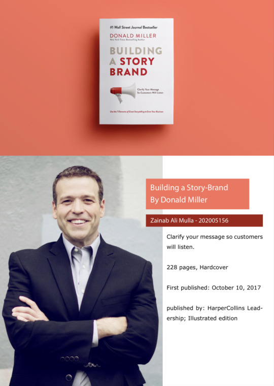
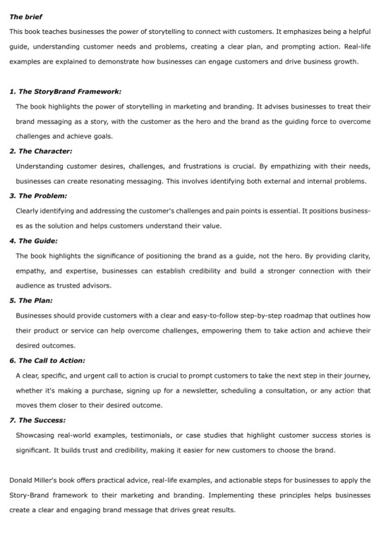


Building a Storyboard book by Donald Miller
Donald Miller's book provides practical advice, real-life examples, and actionable steps for businesses to use the Story-Brand framework in their marketing and branding.
By following these principles, businesses can create a clear and engaging message that gets great results. The book focuses on the power of storytelling, where the customer is the main character, and the brand helps them overcome challenges.
It emphasizes understanding what customers want and need, addressing their problems, and positioning the brand as a trustworthy guide.
It also highlights the importance of giving customers a clear plan of action and urging them to take the next step. Sharing success stories is important too, as it builds trust and helps attract new customers.
You can preview the book brief on the “Modern literary and scientific works in the fields of arts and graphic design.” Webinar session.⬇️
Supervised by: Dr. Sama'a Al Hashimi
@uob-funoon
2 notes
·
View notes
Text
FA327 Final project
Supervised by Mrs.Patricia Barakat.
The main idea of the project is to introduce us to Screen printing, and Pop art that the artist Andy Warhol was known for.
Personally the experience was a bit challenging at first, but eventually I got the hang of it.😃
We also had to choose a celebrity to create the print, So I choose Audry Hepburn.
I’m pretty satisfied with the results, and I’m looking forward to creating more pop art prints in the near future.
Artwork info:
Size: A2 paper
Materials used:
Ink water substitute.
A3 Acetate paper.
A4 200gsm papers for each print.
Screen frame.
Squeegee.
@uob-funoon
@patriciabarakat
#silkscreen #silkscreenprinting #serigraphy #printing # popart #andywarhol #FA327 #colorseparationandprintingtechniques #printmaking #graphicdesign #art #universityofbahrain #audryepburn
11 notes
·
View notes
Text

المقابلة الثانية كانت مع المتميزة و الفنانة حنان الشهابي، سبب اختياري لها كان لتميزها و ابداعها في الرسم واهتمامها في نشر حب الفن للجميع،
كانت مقابلة جداً لطيفة و استفدت منها شخصياً.
نصت محاور المقابلة على التالي:
١- من هي حنان الشهابي؟
٢- ماهو الفن بالنسبة لها؟
٣- بعض التجارب التي أثرت في شخصية الفنانة.
٤- أحد الفنانين الذين تقدرهم.
٥- الرسالة الموجهة من الفنانة حنان الشهابي لجميع الفنانين.
اضغط على الرابط للإنتقال⬇️
المقابلة مكتوبة كاملاً في حسابي على الانستاجرام
https://instagram.com/z_alimulla?igshid=YmMyMTA2M2Y=
5 notes
·
View notes
Text
Al bareh Art gallery
It is an exhibition of the two artists Resmi Alkafaji and Nazar Yahya.
In this art gallery you will see all kinds of paintings form mixed media, watercolor, digital painting and even Indian ink artworks that are done by Resmi.
There are total of 21 paintings, but
the one that I liked the most was the “Composition” it is made of Indian ink on paper, in 2016, size 130 x 60 cm,
And the “Cypress” which was created in 2015, with Indian ink and watercolor intervention on paper, size 55 x 75cm.
@uob-funoon
4 notes
·
View notes
Text


On the wall
الموقع: سيف المحرق
تاريخ التغطية: ١١ مايو،٢٠٢٢
يتواجد معرض "ألوان الشرق" في منطقة المحرقة في مجمع السيف، ويتبع للمنصة الوطنية الأولى لعرض و تسويق الفنون الجميلة و الفنانين البحرينين .
يشارك في المعرض العديد من الفنانين البحرينين المعروفين مثل عباس الموسوي، بلقيس فخرو،زهيد السعيد،لينا الأيوبي، جعفر العريبي، مهدي الجلاوي، عمر الراشد، أحمد عنان�� عدنان الأحمد، مريم علي فخرو،إلياس رستي، مروة راشد،
و يشارك أيضا نخبة من الشباب البحريني مثل مريم عبد الكريم، زهير محمد، طيبة فاضل، آمنة محمود، غدير مجيد، مريم عبد الزهرة، آلاء عبدالله، نبراس إبراهيم،
ويضم المعرض أيضا منحوتات خشبية لفنانين مثل عبدالله الحايكي، مهدي البناي، د.أسامة السروي.
تنضم هذه المنصة العديد من الورش الفنية كالرسم و التشكيل أو النحت و التدوير أو الخط و الزخرفة أو التصوير و السينما.
و تضم أيضا المعارض التي تشملها بعض الحملات مثل حملة التشجير، أو قد تضم دورات تعليمية و عرض حي للأعمال الفنية المتعددة.
@uob-funoon
4 notes
·
View notes
Text
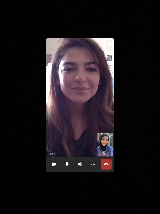
For the first interview I chose dr.Dalal Alsindi, due to her lovely personality and influence as an artist and a mentor.
And she’s one of the few people that will always leave a good impact on everyone around.
____________
What is the interview about?
1- who is dr. Dalal Alsindi?
2- what is art to dr.Dalal?
3- what made you choose to study arts?
4- why do you choose realism style over many other?
5-what was the hardest part of learning art?
6- is there any artist that you look up to?
7-what is a massage you would like to send to all artist?
____________
Dalal AlSindi, took her Bachelor's in Fine Arts from Loughborough University in 2006; and then got her master's in Art Psychotherapy in 2008: where She completed 250 training hours in working with low functioning adults with autism for a year, and then with mental health patience for another year(addiction, schizophrenia, depression and anxiety) also with adults.
Art for her is a reflection of our abstract feelings and thoughts, it is how we connect our reality to our imagination and vise versa,
art is our gift from god and it is like our thumbprint. It is what makes things beautiful and ugly in our eyes.
The reason that made her study arts was because it is the most field that She could fully master and it is the one field that She keep challenging and challenges her back.
In terms of realism, it is also like a challenging way of reflecting what She sees, she likes to notice details in our beauty and ugliness and this is reality.
The most difficult thing in arts, is first, ego of which jealousy stems from and that damages the heart and mind, but the more you understand it the better it gets.
the second would be the artist's block and third is the journey it takes you or the existential dilemma of "what can I do with my art to better my society or people"
Dr.Dalal looks up to many artists one of them is the Bahraini artist “abdulla muharraqi”, because of his dedication to his work, his truth in his work and his personality that encompasses being down to earth and patient.
Other artists like “Egon schiele”,
because his paintings are visionary, and his work back then can be seen now as contemporary.
Also admires Ribera , Carravagio and rembrandt as they are masters of light and shadow, but what she admires more is their subjects which are courageous and dark.
Her massage for artists was to not own their work, but the audience does.
the message that art brings is for other people to say what it means to them and that is the 'giving' part of art in general.
@uob-funoon
5 notes
·
View notes
Text
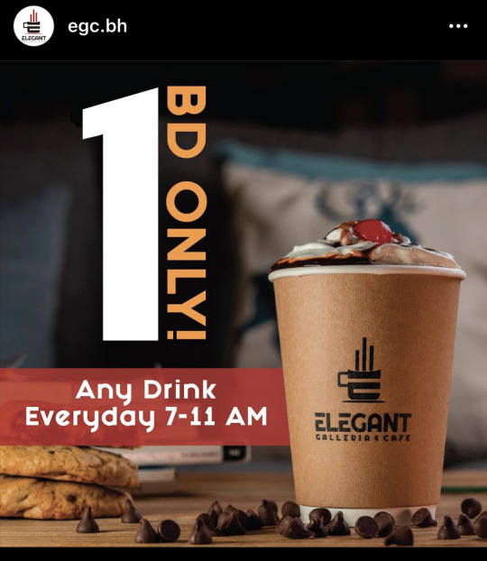
About Elegant Cafe:
Elegant cafe is a Comfort students study space. There you can have a unique experience that feels like home.
Advertisement analysis:
1- alignment: there is alignment in both the top text and coffee cup, the number “1” is center aligned next to a vertical type text.
Then there is the red text box that is horizontal center aligned next to the logo on the cup.
2- repetitions: it is represented in two parts, the cookies and the fallen chocolate chips.
3- variety: elements are scaled in different sizes.
4- contrast is applied to the number “1” and the bold text next to it.
Conclusion:
Overall the ad is pleasing and good, it is also simple and easy to remember.
@uob-funoon
3 notes
·
View notes
Text

About the advertisement:
This ad was created in 2016 its main purpose was to let people know that there is a sale going on.
The duck symbolizes to the Sale in “Bath and body works”, therefore whenever there is a sale going on there will be this yellow duck.
Advertisement analysis:
1- Proximity: all elements in this advertising design are close to each other.
2- there is scale contrast with the variety of ducks involved.
3- repetitions is applied by ducks.
4- alignment: all elements are aligned horizontally and vertically to center.
Conclusion:
Bath and body works have created a good poster advertisement using a few of the elements of design, it is simple, colorful and memorable.
@uob-funoon
3 notes
·
View notes
Text
The habits of effective artists
Andrew price at blender conference
Nov 8,2016
There are five habits according to Andrew Price which are:
1- Daily work
It always trumps short sprints, agree to do the smallest amount of work possible.
It can be as simple as taking a pencil and a paper and draw one line, because in the process of getting everything ready you probably will get into the drawing mood and won’t stop at only one line.
Keep in mind that getting started is the hardest part.
2-Volume, not perfection
Get on with your next work.
Being a perfectionist undermines your growth, because it prevents you from reaching the next step.
The majority of the learning comes from the very first stages of creating a drawing, when you are putting down the big shapes, getting the anatomy..etc, that’s the learning part not the final details part.
3-Steal
Steve Jobs once said “Good artists copy, great artists steal. We have always been shameless about stealing great ideas”.
How can you steal like an artist?
Stealing from many versus stealing from one person, when stealing from one person that’s called plagiarism, if you steal from many, everyone will say your original.
(Take references)
4-conscious learning
It’s not always fun, but it’s the fastest way to improve.
Just practice doesn’t always make perfect, you have to actually learn sometimes to make progress.
5-Rest
Take a break to see your work with fresh eyes.
6-Get feedback
It’s worth it’s weight in gold!
7- Create what you love
You will make better work, and stay motivated.
Art is one of the few fields where you get to do what you’re interested in.
@uob-funoon
3 notes
·
View notes
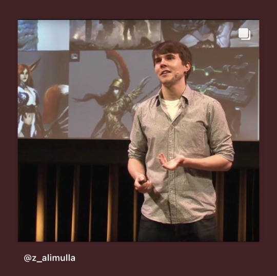
Text
The first secret of great design by: Tony Fadell
First of the speaker starts off with an example from the movie 1980s “The Blues Brothers” When there is a scene where Jhon Belushi goes to visit Dan Aykroyd in his apartment for the first time in Chicago, it’s a cramped, tiny space and it’s three feet away from the train tracks.
As John sits on Dan’s bed, a train goes rushing by, rattling everything in the room.
Jhon ask’s “ How often dose that train go by?” Dan replies “ so often, you won’t even notice it.”
Therefore as human beings, we get used to everyday things really fast, and as graphic designers we should see those everyday things, to feel them, and try to improve upon them.
Then he brings his example of the everyday thing, which is an apple and asks the audience if they notice the little stinker on it.
He then says that this sticker was put to solve a problem which is organizing fruit in the grocery store so that people then can easily check out, but now there is another problem which is when you get home and see that apple you can’t eat it right away you have to look for that little sticker, and dig at it damaging the flesh, then trying to flick it off your fingers.
So the first time you do it it’ll be annoying but the more you do it the more it will be normal for you.
Why do we get used to everyday things?
As human beings we have limited brain power, so our brains encode the everyday things into habits, it’s called Habituation.
For a product design it is important to see the invisible problem, not just the obvious problem.
A few tips to fight the Habituation:
1- To look broader
Take a step back and look at the whole problem, then you can make it simple.
2-To look closer
focus on those tiny details
3-Think younger
People with young minds cause everyone in the room to think younger.
Conclusion:
Our challenge is to get back there, to feel the frustration, to see those little details, to look broader, look closer, and to think younger, so we can stay beginners.That is not easy it requires pushing back against one of the most basic ways we make sense of the world, But if we do we can create amazing things.
My opinion:
I really recommend every designer to watch their Ted talk of Tony Fadell, it’s very eye-opening for new and professional designers.
@uob-funoon
4 notes
·
View notes
Text

First logo created was a capital “D” and the puma is jumping through it, it is a direct reference to the name “Dassler”.
Logo analysis:
1- First of all the logo is very simple, using negative and positive space.
2- Contrast is represented with the use of black and white which retained from the first logo, therefore there is history and meaning behind it.
3- Because of the logos simplicity it is easily rememberable.
Reference:
Logos-word.net
Puma official website
@uob-funoon
3 notes
·
View notes
Text
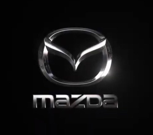
According to Mazda’s official website their logo stands for a winged shaped letter “M”.
The symbol sands for their determination “to pursue ongoing improvements to powerful contentious growth”
The logo was adopted in 1997 and got a visual improvement in 2015.
Logo analysis:
1- the logo symbol and name are very simple and unique, therefore it stands out in the field.
2- the logo meaning refers to its past.
3- the applied font gives the logo more balance and contrast.
4- alignment is also applied where the logo symbol is aligned center with the name font.
5-there’s is a symmetrical balance in the symbol logo.
@uob-funoon
2 notes
·
View notes
Text
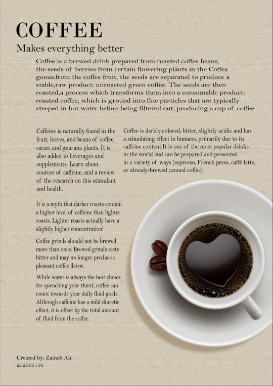
Assignment 6
In this assignment we had to make a group of two and each had to explain one of the elements of design, then create a design based on the chosen element.
I choose Alignment, and created this poster about coffee, I used the grid method where I aligned the headings with the name below, and the illustration with the paragraph above it. Also I added two columns to organize all the paragraphs.
@uob-funoon
17 notes
·
View notes
Text

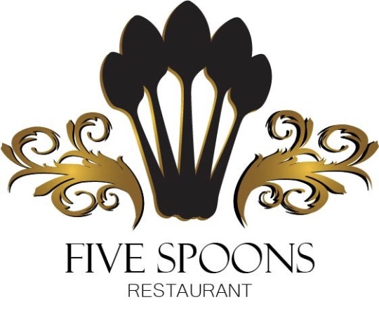

This is a Logo redesign it was our fifth Assignment for FA222, I choose (5spoons restaurant) logo to recreate because I saw that it needed a new one.
I’ve added the five spoons in the center and besides it is a decorative design with the gold gradient to make it fancy. 💁🏽♀️
@uob-funoon
24 notes
·
View notes
Text
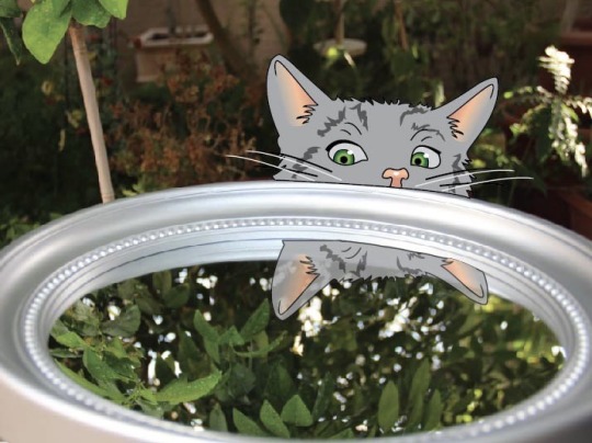
As for the fourth Assignment it was a Photography Metaphor, where you take photos and add draws to them.
I took a photo of a mirror in the garden and added a curious cat trying to see its reflection. 😸
@uob-funoon
26 notes
·
View notes
Text
 third Assignment was to create a barcode design, so I drew a man and made his mustache as the barcode. 😆
@uob-funoon

24 notes
·
View notes
Text
Second Assignment in FA222
To create a Typographic Logo design, as we were asked to choose a word and turn it into a logo with the same manning of it.
I choose the word (Magic) and turned the (I) into a magic wand, and colored it with violet.
@uob-funoon

23 notes
·
View notes