
Statistics
We looked inside some of the posts by zed-eye-enn-ee and here's what we found interesting.
Average Info
Notes Per Post
314K
Likes Per Post
126K
Reblog Per Post
187K
Reply Per Post
165
Time Between Posts
2 days
Number of Posts By Type
Text
3
Photo
14
Last Seen Tumblr Blogs


Fun Fact
When “GIF” was named word of the year in 2012, Oxford Dictionaries U.S.A. credited Tumblr for pushing the word.
Text
evaluation
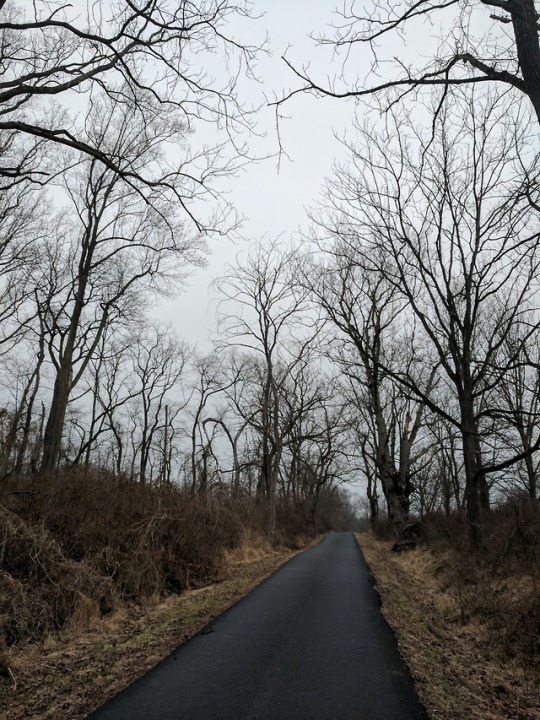
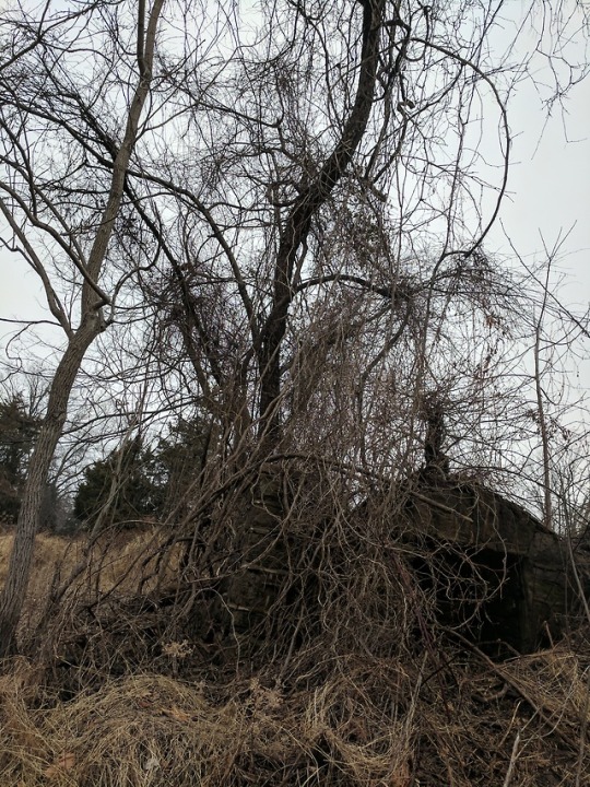
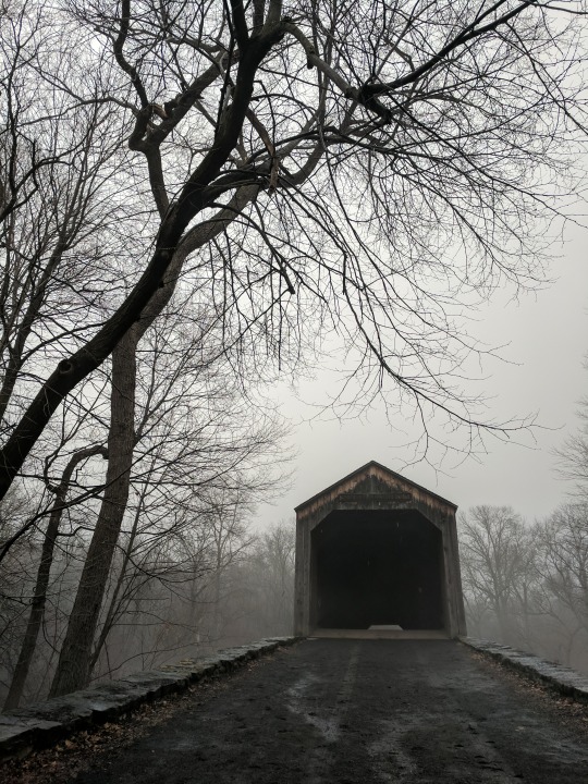
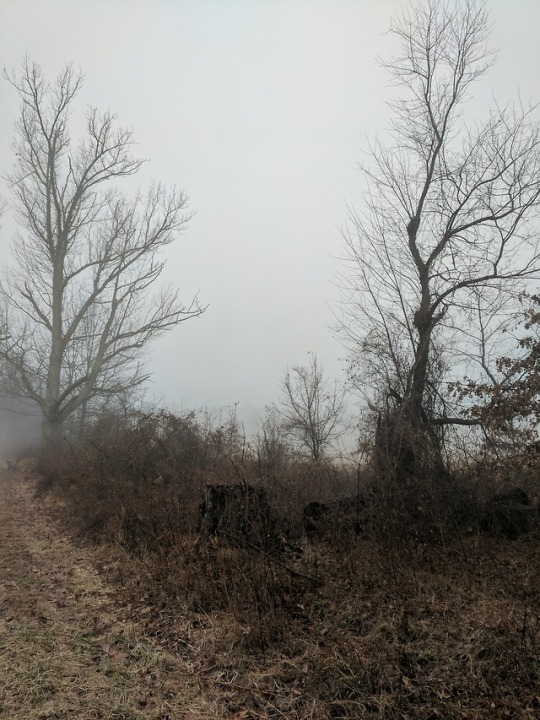
The aim of this project was to create a themed zine, and blog our creative process. I chose to do my theme as “how to be unhallowed” and centred on dark creepy photos with a loose but intentionally ambiguous narrative. On a whole, I really liked this assignment and the work I managed to produce. I found it quite an exciting challenge to think about how to compose a set of themed photos, and my biggest challenge making the whole zine cohesive and work together.
This project had a lot of firsts for me. This is the first time I have tried night photography, or used a projector as a composition element. I also explored layer mask editing to create double exposures, and to alter aspects like making the reflection in a mirror face the wrong way. I would however like to develop my night/low light photography skills as the majority of ideas I had in mind, I wasn’t able to actually execute to a standard I feel I’d be happy to present.
For research I used inspiration from cinematographers like Tim Maurice-Jones rather than solely normal photography, and transferring those ideas back into still photos meant I got to be quite experimental. I found early on that the kind of atmosphere and story telling that i was trying to angle towards wasnt foumd as much in photography as it was in film, so i thought it would be interesting to see what kind of result experimenting with film tropes in my photos. A lot of the work produced was the result of myself thinking about the photos i wanted to take from the point of view not dissimilar to the way a director would go about creating a scene in one of the movies and videos ive used as inspiration. For example, I printed a portrait photo onto glossy paper at boots and used my house key to scratch the eyes out and scanned it back in. It would have been easy to take that original image in photoshop and superimpose a stratch effect, but i think actually printing and manually doing it gave a more authentic result and also i think challenged the way i personally think about the way i compose the photos i want to take.
I also drew a lot of inspiration from the artist justin taylor phillips, and his music project CRYWOLF which served as all the text in my zine. visually, i wanted to go for something akin to an artzine in the style and composition of magazines like dazed and i-D which were my main inspirations in terms of magazine composition. I used these as references for a lot of the text placements and fonts, and also for page layouts when using multiple photos.
i also learned a lot about the print process. for example, manually printing double page spreads that arent going to be printed onto the same piece of paper was a lot of trial and error, and smaller issues in the print process such as making sure the edges of the pages and the center fold lining up on both sided on a double sided print just produced additional learning curves that, again, took a lot of trial and error but ultimately furthered my understanding of my method of going about producing work.
overall i am pretty confident with the standard of the zine i produced. i feel if given more time i would work on the colour balance, because i found the printer was printing daarker than displayed on screen. i would also iron out details like making the borders cut more cleanly and neatly with the guillotine, and making the staples line up better with the center fold, but i dont feel smaller details like this detract too much from the final result.
2 notes
·
View notes
Photo


when printing double sided i realised quickly the my double spreads werent corresponding to the right pages when folding. so after making a paper mockup by folding paper with the right amount of pages id need, numbering the pages then disassembling the mock zine, i found the pages had to be printed as follows:
back page / front page page 1 / page 12 page 11 / page 2 page 3 / page 10 page 9 / page 4 page 5 / page 8 centre page (6 & 7)
after realising this, i used my spreads and a blank a4 photoshop file with the same guide splitting the page into 2 a5 pages, and then copied and pasted the halves of the spreads into the order they needed to be printed in. by doing it this way it became easy to ensure the images lined up exactly
0 notes
Photo
after printing and looking through, the text on the 3rd double page looked out of place, so i decided to go back and change it, to make it more inkeeping and consistent with other fonts used


these are the final page layouts i intend to print
1 note
·
View note
Photo
these are the final page layouts i intend to print
1 note
·
View note
Photo

i made this double exposure using a stock photo of a skull online that i edited with liquify to appear at the same angle as the models head, then layer masked it in. this was inspired by photos of rick genest, who has a skull tattooed onto his face, only i wanted it to look a lot more subtle
2 notes
·
View notes
Photo

heres an example of how i used the guide setting to split my pages into two spreads. i would crop the image i wanted to use so both sides of the spread would fit on the half page created by the guide, essentially making 2 a5 sized page on one a4 display
0 notes
Photo

the main varience in this shoot came from myself trying to find the colour balance for the theme, as i didnt want it to look too bright, but at the same time i still wanted the images to be correctly exposed
0 notes
Photo

for this shoot i had a lot of trouble finding the right shutter speed, as i was attempting to catch the drops of fake blood dripping off the hand as it fell, however this obviously effected the light balance and some shots caught the shutter in as the shutter speed was too fast
0 notes
Photo

i was pretty happy with this shoot, and was mainly tring to give myself as many angles as possible to work with in the editing phase. one thing i would change is how because of the lighting in the studio and the angle, the corner of the studio cast a shadow that i later had to edit out, so in future ill know to avoid that
0 notes


Text
found this image on tumblr and decided to do something similar as one of my pages


9K notes
·
View notes


Photo

heres one of my edited page spreads. i chose to do a quite asymmetric layout and i put the title text justified to the right to balance the height and to occupy the space. to keep the colour pallete cohesive i used the dropper tool to match the text to the backdrop of the photos and the background to the model’s shadow. i spaced the text in a way that it would fit the page well but i made a couple stylistic choices with the text, like spacing “sleeping” into “s l e e p i n g”, because i think it adds more visual interest and its reminiscent of non traditional poetry in the way its written out, which i really like
0 notes
Photo

an example of a basic a5 double page spread using two unedited shots, just to show the photoshop method of splitting a page with a guide to create the two pages. Im going to import the final spreads into Microsoft publisher to print, just because i personally find it easier to work with.
0 notes
