zhalfirin-binds
261 posts
Don't wanna be here? Send us removal request.
Statistics
We looked inside some of the posts by zhalfirin-binds and here's what we found interesting.
Average Info
Notes Per Post
542
Likes Per Post
396
Reblog Per Post
143
Reply Per Post
3
Time Between Posts
12 days
Number of Posts By Type
Text
17
Last Seen Tumblr Blogs


Fun Fact
Total funding amounts to $125.3M.
Text
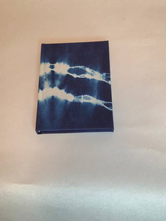
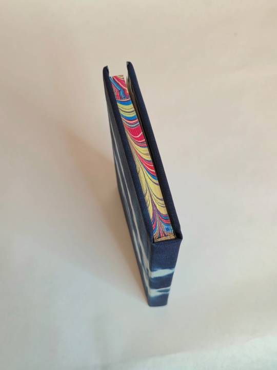
LOOK AT THIS BOOK!!! @finalfrontierpublishing made this lovely little book for me. I can't believe it's covered in hand dyed silk. The colour is a luxurious dark blue parted by ribbons of cloudy white and looks even better in person <3 It even has marbled edges! I've never done marbled edges, but man do I want to now that I've seen a couple of them in person. I also love the stark contrast of marbled edges to the dark blue of the cover. I can totally understand why you packed it up again @finalfrontierpublishing. Thank you so much for this gift, I love it very much.
The Rock and The River - Pi (Rhea)
by @rhea314


guys!!! this book! one of my most favourite to make, a teeny little quarto guy.
some stats if you will.
17441 words// 123 pages
Body text: Adobe Jensen Pro 10 point
Accents: Beon, EB Garamond
so my buddy @zhalfirin-binds is a professional who made us all real parchment leather books when we met in January last year. the parchment book is my precious and is hiding in my drybox as we speak. personal pride meant that i had to pull out all the stops because i was EXCEEDINGLY LATE to give her a book. i had intended to do 2, but as you can tell with my usual bookbinding habits, i usually only finish 1 by the skin of my teeth.
some time back, i had arranged to do a marbling class when @celestial-sphere-press visited me, so i decided i would get some marbled edges done.
well guess who's boo boo the fool huh - i DID NOT plan my colour combinations properly nor did i know exactly which text blocks got marbled because there was a massive time and drying crunch as IT TOOK SO DAMN LONG TO DRY and i only brought a limited number of dipping boards (basically 1 set in A5/legal quarto/A6 each). thankfully the two books meant for Zhal got dipped and looked pretty good.
The con was, i was left with the inexplicable horror of 'why the hell did i use so much yellow???'
it worked out in the end. in this fic, chihiro ends up working at a bar, and though it never explicitly mentions bar lights, i tend to associate bar lights as neon red, blue and yellow lighting, which fits?? is probably why i reached for the yellow in the first place.
the problem with using so much yellow was IT IS SO HARD TO MATCH MARBLED EDGES GUYS. i was crying the entire time. my whole collection of marbled paper? CLASHES. my collection of duo bookcloth? not going to work, especially with the two tones. chiyogami??? also a no go. you can guess why i sat on this textblock for so long.
then a stroke of luck - des and i wanted to go for an aizome (indigo dyeing) experience when i visited japan. des said, "let's go all out and buy some silk cloth to dye, like half a yard to share." Silk was bought. Silk was dipped. the actual technique is called shibori (i had a little giggle cause at the renegade retreat i got mildly confused as shibari also involves tying things). Silk is fantastic and has great texture, and wow did it turn out nice.
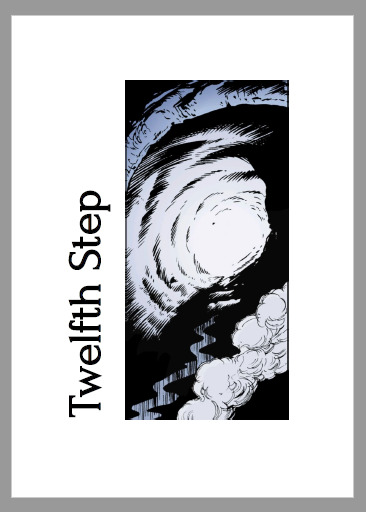
In this fic, Haku becomes an atmospheric river, and i thought that deep indigo blue was a perfect match for how their satellite images look, and did my best to create the streakiness you get from the clouds onto tie dye cloth.
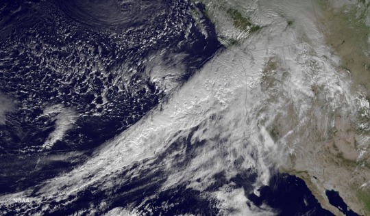
Image from https://www.wunderground.com/cat6/Cat-1-Cat-5-Scale-Atmospheric-Rivers
Cloth is backed with heatnbond, and endbands were done in white, off white and pale gold. i didn't want to distract too much from all the other colours and patterns going on. endpapers were also a blue chiyogami, which didn't stand out much against all the blues - absolutely my fault because i stuck the endpapers on before i had actually made the bookcloth.
by the end i refused to title it, because why fuck it up at the last step (this happens to me a lot, as you can tell). otherwise, minimal hiccups and i was so happy to give this book to Zhal! it turned out so good!
we both had a good laugh at the end of the renegade retreat as i almost ended up kidnapping this book back home when we were packing up - Zhal had to remind me it was HER book now.
@zhalfirin-binds i hope you love this ridiculous book, which is half as ridiculous as ME :D
A big thank you to @rhea314 for writing this amazing fic and allowing transformative works off her writing.
72 notes
·
View notes
Text
I always love to see your macro shots. This was not an easy, but a fun bind and I enjoyed reading more about the theory behind the different colours in MTG and their aspects.


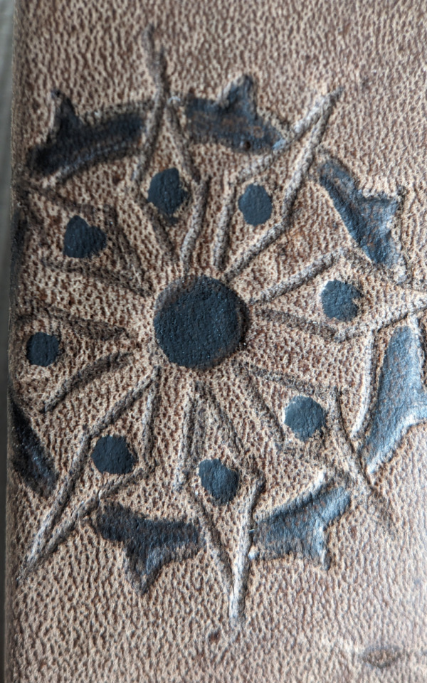


In honor of @renegadeguild's 2025 Tiny Books Bang typeset deadline closing yesterday, here's some macro photos of the book I received from @zhalfirin-binds as part of last year's exchange!
Frank Lantz's Wheels Within Wheels, bound in wallaby -- a much cherished lil book that sits on my bookshelf to greet me when I come home and see me off on my way out. So neat! Check out Zhal's posts about the progress here, here, here, here, and here (and learn about working with leather along the way!)
This year's entry is less, ah, "respectable" but I just as eagerly await it's manifestation (bwhahahaha! exchange rules ensure at least 1 typeset bound per typesetter so someone's gotta' make that baby for me!)
33 notes
·
View notes
Text

WIP - Delve
Design choice (aka hiding mistakes)
The trouble of juggling a couple of binds, that are all only a tiny bit different, at the same time is, it's easy to forget a step. In this case I forgot to trim the boards to the text block before covering it.

Look at those squares! they are enormous! Sadly the book block is too narrow to allow enough room for a pencil though.So I made a design choice


I trimmed the already covered edges to size and, instead of getting a fancy jagged paper river in the middle, I chose to use the paper to cover the fore edge. Not the usually recommended method. Traditionally one would pick the sturdier material for the more used areas (which fore edges are), but in this case I had 3 options. - keeping the ridiculously large squares, - making a new case and - covering up my mistake and call it a choice.
I'm actually quite happy with my choice.
19 notes
·
View notes
Text


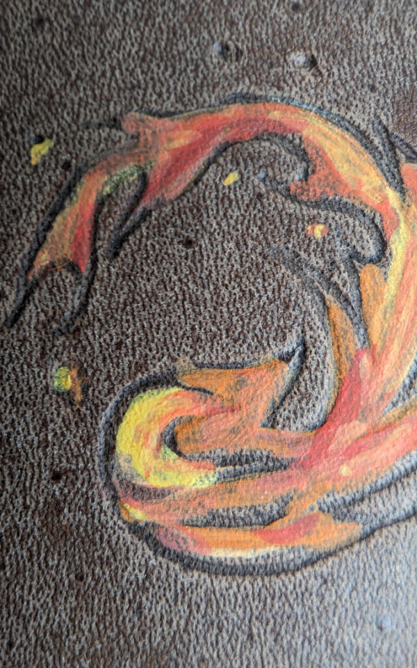
Extinction - Ver
(see the finished book here)
Process and things to look out for the next time
I greatly enjoyed making this one. I wanted to try putting the paper onlay on in a different way. (No pictures of the process since I had my hands busy and no time to spare for taking photos.)
First was again to pick the part of the paper that I needed gone. I felt like all colours played nicely into the colour palette of the comic, but I needed room to put a title on and wanted the cover less busy. I felt like the red and orange area would be a better fit than wave themed one, so I cut that way. I painstakingly tried to keep the feathers of all those birds intact (so so many birds... ) but this time voted against cutting along the legs as well, there were too many legs and they rip easily off when wet or glue down crooked. So off with the legs it was. (I also got rid of a few birds to make room for the spine and front title.)


When laying down the onlay I decided against putting the onlay on the cover and instead placed the cover onto the onlay. I marked the cover position on the back of the onlay glued the paper up and hit my first challenge. Which was to transfer the glued up onlay to a clean sheet of waste paper so I would not ruin the cloth. To work in the hinge I used sheet of plastic (I cut open an old plastic sleeve for documents), which worked well enough to start with. I had time to get the paper nicely set into the hinge and over the spine stiffener and then I had to peel the sheet away form the paper onlay. Which would have been much easier if there weren't so many tight curves and edges in the design. I got it off almost intact and with no visible issue when I was done. The glue had still dried a bit too fast, but I think it's the way to go. (Next time I will try adding some paste.)
When the paper was on I pressed it shortly, and then put the book block inside and weighed down again, this time between metal edged boards that have a lip to hold down the hinge.

The ledge is actually quite large on my boards (those were self-made by a friend). You can see where the wood ends and boards start. I have 3 different boards on each side to completely even out the protruding edge so I can adjust those lips to the case's board thickness. I neither want the book dangling without support just being pinched tightly at the hinge nor does it help much if the lip is so short it doesn't reach down the full board thickness at the hinge.
Btw, the boards for evening out are exactly cut to size of the pressing boards and I marked each thickness so I know I'm using the corresponding boards on each side.
Now to the issues and possible future issues with this bind. Again I was a bit late and some parts were to dry already to adhere nicely to the case so I had to shove some glue under the paper. Thankfully, the cloth was very forgiving in that area. It doesn't look like it but it's sort of coated and not paper backed at all. (Naturally I have only a tiny bit left of it.)

I also made this case, hot stamped the title and cased in in one day. The case was not entirely dry when I stamped the title which can be seen by the slightly too deep indentation of the letters. Especially at the 'n' at the end.

The paper feels like it sits more on top than it has in previous binds. Which makes it a bit more prone to scuffing, also, all the pointed angles are not ideal. Even less the ones in the hinge area. It would have been preferable to have none of the small bits situated in an area with motion. I already had to glue down a few beaks and feather tips there. I will see how it holds up to in the long run.

#bookbinding#fanbinding#extinction#sticksandsharks#paper onlay#full cloth binding#possible future issues#attempt plastic sheet for case protection was a success#I'm still baffled what a difference it makes to replace one area with a different area#I really enjoy the dramatic lighting in some of those shots XD
115 notes
·
View notes
Text


WIP - sacred bodies
Full cloth binding with paper onlay
Wdym I already bound that story? It's not my fault I had another idea for Sacred Bodies that I could not leave alone. Looking at this detail on the sleeve I had a chiyogami paper that was too close a match to not use it.
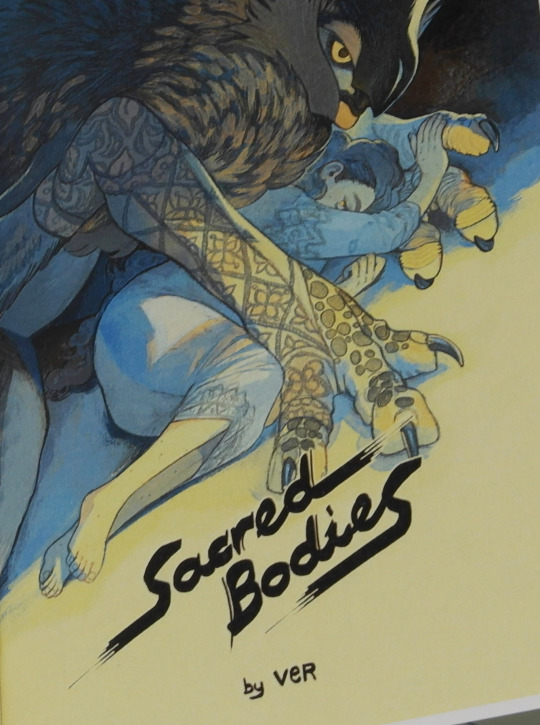

I picked the parts to cut away pretty much on the go. I knew what parts needed to go for the title and the look I was going for with the onlay so I cut, checked, marked the size of the case on the back of the paper, cut some more, checked, cut more, checked. Until I was happy with the result.
This time I added enough glue to make the paper stick... a little bit too much though. I got a glue stain on the back of the cover. I still love how the case turned out, but still -_-
See the finished book here
#bookbinding#wip sacred bodies#chiyogami#full cloth binding#paper onlay#yes I know I already have a copy - now I have two#:3
61 notes
·
View notes
Text


WIP - Extinction
Picking materials and covering the case (with one failed attempt, one working)
So this was my second attempt on using home made book cloth. This time it was backed with a thin but strong tissue paper and paste. The fabric was a rather thick one and stretchy (I know, not ideal, but that's what I had and I wanted to give it a shot and the colour worked with the paper I chose)
Same issue as before though. when I spread glue to the paper backed side the paper started to come loose (I assume the moisture reactivated the paste glue again). I decided covering the case anyway and check if the glue would dry and stick the cloth to the paper backing again. It mostly did, but there were these corner tufts that I could not get glued down and on second checking there were also still air pockets. When I pulled lightly on the cloth it came off way too easy for my liking too, so I pulled it all off. The case was still good to use though so I went with commercial book cloth again.
Adding the paper onlays was a bit finicky because I wanted to have them centered as bands, but not cut as strips with straight edges. To still achieve an equal distance and avoid skew I measured the distances from the fore edge and used sellotape as a guide and to protected the cloth from glue stains. Even with a little skew I could adjust the paper without ruining the cloth.


See pictures of the finished bind here
20 notes
·
View notes
Text


Full cloth binding with paper onlay
My latest path to explore on cover decoration. After another bind that I enjoyed greatly I have gotten some more papers that make it easy to be cut in a more organic shape instead of straight lines.
For this bind I had 2 papers to choose from that would both play well with the book. Each in different ways. First was challenge was to determine which field to cut away to make room for a title and make the paper less busy.
Eventually I decided for the one that is not quite as fitting colour-wise, but that I liked more for the cut outs. Cutting the fields away was a slow process, not only because I cut around the bird wings, but also because I checked again and again if I liked the look or if I wanted more of the cloth shining through.


There are no pictures of the actual covering of the case because I had no hands or time for that. It was a challenge though. It sure is easier to work with multiple parts of paper and just see to get them on the case evenly than having the whole flimsy wet paper and try to keep the glue side off the board until it's exactly where it's meant to be. Things to try another time. I'm also considering to try and use a sheet of plastic to keep the case clean. I'll see if that's an option or just sounds like a good idea.
Eventually, like always I tidied up the uneven turn-ins before covering the case with paper. I often use the width of my ruler because it's sufficiently broad and I know the squares will be covered even if I glue the text block in a bit uneven.


30 notes
·
View notes
Text


WIP - Apothecaria III Covering the case - take 2
This time I relied on a commercial book cloth with a lokta paper covering the lower half of the case.
To not waste the cloth I covered only the area that would be visible later with cloth. Now I could have just pasted the paper on as well and be done with it. But even with thin cloth there is a visible step from board to cloth and it shows under the paper. When working in straight lines I usually don't mind that step. There's a just a small overlap of maybe 2-3 mm and that's fine by me. I decided to use the natural edge of the handmade paper so that overlap had to be enough to cover the whole area where it was needed (and also allow for some skew, because I know myself and how easily I get some skew in). I learned from experience that I do not like the edge when it's wider or combined with an irregular edge though.
Now getting the cloth on was the easy part, I drew a line with a compass and made sure I hit that line when covering the top half with the cloth. Then I took care of the step by pasting on a paper that had the same thickness as the cloth. I cut the paper a bit larger than needed to make sure the board was completely covered. It's also simply easier that way and I'd have to cut back anyway since even if I had cut it exactly to size, the paper stretches the moment glue is applied and will be wider than the board anyway. I checked in advance if it was square to the cloth and luckily it was so I could just paste it on, press and let dry before cutting the excess paper off.


Now I could add the lokta paper to finish the case, as pretty much expected I got some skew. No board was visible though and it actually plays into the design quite nicely, so I only cut back the turn in where cloth and paper did not align and called it done.


I should also mention that with all that layering of paper and cardstock and cloth on top of each other, I always keep grain direction in mind! If you start mixing the different materials and their pulls can cause serious warp in the book.
#wip apothecaria#bookbinding#covering the case#evening out cloth#and don't forget to mind the grain direction
14 notes
·
View notes
Text

WIP - Apothecaria II
Covering the case with self-made book cloth
which was not a success. I'm still not sure if the issue was with the fabric (a synthetic fiber) the backing material (a Japanese tissue paper that comes with a layer of glue on one side and is actually intended for paper repair) or the method of applying glue.
I did it the usual way, spreading glue on the thinner material and pasting it to the sturdier, when I got the cloth on the board and working it into the hinge and smoothed it onto the boards I noticed airbubbles though. I hoped it would still work out once it was dry, but there was already glue seepage and after drying a bit I had to admit, this would not work.
Curiously only the fabric came off completely and without any issue or resistance. The paper layer was stuck to the boards though and I could still see where the glue had not completely dried out yet.


I decided to not do that again and added a cardstock to counter the one sided pull I had now and that would only get worse when adding a new cover material.


I cut the cardstock a little bit wider and when gluing it on the inside of the case, I only aligned it properly at the hinge side. Everything else could be cut back later. After a good press and letting it dry sandwiched between boards and with a weight on top for maybe 30-60 minutes (I wanted the boards to really stick together) before I kept working.
12 notes
·
View notes
Text


WIP - Apothecaria I
Backing endpapers I made the experience that lokta paper can comes in varying thicknesses and is often rather uneven within one sheet as well. That makes it no always suited for endpapers. I really wanted this pattern for endpaper though.
To have a sturdier paper and also mute the light colour a bit, I cut it roughly to size and glued it to a black Ingress Bütten paper for backing. I did not expect that amount of cloudiness, but the effect is lovely imo.
18 notes
·
View notes
Text

Happy Edible Book Day everyone!
Again I took part in @renegadeguild's Edible Book Day event and proudly present my Book Suzette. I had a lot of fun making it and then dousing it in alcohol to set it on fire.
This whole book is made from crêpe the 'cover' with the crêpe-flower inlays. The 'pages' glued together with more crêpe batter. Only the text is cut from carrots an then baked into the batter (which worked a lot better once I cut the whole letters from one piece instead of cutting thin stripes and trying to to assemble them in the skillet while the batter was not yet baked through but yet solid enough to keep the letters from floating away)
#edible book day#edible book day 2025#bookbinding#sort of#crêpe book#book suzette#renegade bookbinding guild event#burning books and eating them that's what I do sometimes#I'm a devour of books
26 notes
·
View notes
Text

ANBU-Legacy 3.1 & 3.2 trouble-shooting
Those look neat, don't they?
I had to fix them a bit to get there because naturally something went wrong in the last steps. The first and major accident is not photo documented because, well, I panicked and went straight to 'fix-it-mode'. When I hot stamped the title I managed not to notice I had the titling height misaligned. So the title was waaaay too far at the bottom. Which could have been a feature... if it wasn't a book in the middle of the series. I considered a few options: a) keeping it and titling the second book the same way to somehow make it a feature again, BUT, and that's a but I'm happy about, the ANBU Legacy writers are not done yet! So it would be 2 books in a series of x-many.
b) leaving it until I've cased in and then cut the title out and replace it with another piece of titled cloth that now gets the correct height.
c) gluing a titled piece of cloth on top.
I kind of went with (c) or a variation of it. Since I hadn't cased in yet, I added a piece of cloth over the whole length and width of the spine stiffener. Set back from the hinge, just enough to avoid it getting scuffed loose by normal use, and long enough to do turn in the ends. This worked actually pretty well. It is visible, but not at first glance.


The only issue was due to the coated book cloth. Since it's coated it is great to clean and wipe off, this also makes it hard to get something to stick to it though. I had an air pocket on the the glued on piece of cloth. That was a easy fix though. I lifted the cloth ever so slightly and pushed some more glue under and pressed it down again before I left if for the night so I could not mess it up again. (Below you can see the air pocket before it was glued down again. It's that part on the spine where the light catches a bit and goes all the way down to the tail of the book.)

The second was, of course, in the other book. Because we can't have one good copy and one that needed a bit fixing. I must have gotten a bit of glue between the endpapers when I cased in. Luckily I used chiyogami and learned the hard way, that it has a bit of a coating tat will make it stick together if pressed hard enough. So I had a piece of waste paper in between paste down and fly leaf and only had some of the waste paper stick to the paste down. Since I only press the book for a few seconds when casing in and always check the endpapers right after pressing, I noticed quickly what happened and only a bit of the waste paper got stuck. I left it to dry and decided it blended in well enough with the pattern that any attempt to save it would probably make it stand out more. So I just scrapped off the loose bits with a knife gently and left it.


#fanbinding#bookbinding#trouble shooting#messed up titling#full spine label#endpapers glued together#sort of#a bit at least
25 notes
·
View notes
Text


Refilling an old notebook case with a new inner book
I got this notebook with the inner book cut out already from a friend with the request to make a new inner book for it.
First of all I went to prepare the case. Which meant to take out the old endpapers, or what remained of it anyway, to check how big the inner book has to be to cover up any possible marks from the former endpapers and get rid of the pocket that way never in use anyway. I also get rid of the cardstock they used for endpapers to avoid warping from gluing in another set of endpapers on top of the old.
In the process I also peeled off the top layer of the board as well, which was not intended but not a bother either. Once I was done I smoothed down the boards again with a bonefolder and they were smooth enough to not show marks through the new endpapers later on.


For the inner book I know it's going to be a notebook so I went for a double fan binding. Instead of gluing it up with a rounded spine, as the case demands, I went for a straight spine first for ease of working after the glue had set enough to not be sticky any more I trimmed the edges to the final size and rounded the spine.
For rounding it's much the same as rounding a sewn book. One wacks the spine area gently with the flat side of a hammer until it gets a rounded spine on one side, then flips the book over and works the other side. I usually have to repeat this a few to get a nice shape.


I did a quick fitting test before going on, but after ll looked fine I went on.

Then I add another layer of glue, some mull and put it back between boards and under weight to dry completely before adding endbands and an oxford hollow.

28 notes
·
View notes
Text


Making paper endbands
Sometimes I just want quick endbands instead of sewing them, but I don't have anything that quite fits. In those cases I make endbands from cloth or paper (the procedure for both is exactly the same).
I usually use cut offs and scrap pieces and don't care too much for grain direction there. One could argue that grain direction parallel to the core is best, because it's easier to wrap the paper around the core. But one can just as well argue that the grain should be parallel to the spine to make it easier to attach the endbands to the book block and have them bend with correct grain direction when opening and closing the book. For narrow spines it probably does not make much of a difference, but I can imagine how the 'parallel to the spine' version is more durable and likely to stick to the book in thicker books when there is more motion in the spine and the endbands.
Here I just cut a piece of my thickest sewing linnen, a 10/3 linnen thread, to size a bit longer than the paper was wide. (What thread I use for core largely depends on how hefty the book is.) I used scraps so I didn't bother to cut the paper down, but if I had I'd still see that it's larger the the book is wide so I can cut it back in the end and make them fit perfectly without trouble. I covered only half of the paper in glue, placed the thread on the glue and folded it over light.


At this point the thread is often somewhat curved so I gently pull it straight and work it into the typical endband shape with a bonefolder. How much glue is needed depends a little. In case the glue is rather dry it can be a bit difficult to work it neatly into the fold with no air pockets left. If there is a lot of glue the thread will be more or less swimming in it. The problem with too much glue is that it takes up too much space in the fold and to get the paper worked around the core the glue needs to be pushed out at the ends left and right. Which can take a moment and often causes a bit of a mess.


Once the paper endbands are made they only needs a bit drying. To keep them in shape I wedge them between finnboard (any sturdy board with a clean edge will do though) and let it dry weighed down.


When they are dry enough I curve them a bit with a bone folder. Just curve them a little bit so they follow the shape of the spine (if used on a rounded book like I did here). Then I glue them on, and let them dry. It's not shown here, but I let the book sit on a board or at the edge of the table so there is no pressure on the endbands while the glue is drying.


After the glued one endbands have dried completely the last part is to cut the excess parts clean off. I find this easiest to do with scissors and rest the broad and flat side of the scissors on the book block. before cutting. That way there's no chance to accidentally snip off or cut into the endpapers.


And that's pretty much it. Now one can dab a bit of colour on the edge of the core to hide the different colour, but it's often not necessary because they fit so neatly, the core doesn't show at all.
16 notes
·
View notes
Text


wip square antiprism box
A last one on how to assemble the lid (for a change I did not forget to take pictures... mostly).
This time I wanted the lid to fit as seamless as possible to the box.


These boxes have a bit variety in how they come together though. At least they do when I make them and I never get them to be really all symmetrical. So I marked one corner and made my adjustments from there to make the lid fit to the box. Same was for the other other pieces. All pieces I had to assemble got marked too before making any adjustments in order to make them fit together in the end.


Next, after cutting a slit into the center of the lid was to prepare the recessed area for the handle. I went for leather again for ease of use (and cleanability... ).
All parts covered and ready to assemble I had to redraw some of my markings because they got cut away or covered up. A thing I was not happy with in the previous boxes was how I positioned the outer and the inset part of the lid and then had to move them in order to get both parts pressed together. Each time they shifted a little bit and didn't fit as neatly as I had wanted them to.


So this time I tried a different way. I cut some thick scrap paper a little less wide (only 1mm less!) as the box was high. Then I rolled it up in a wide roll and used that to support the inset part while gluing the outer lid on top. This is sturdy enough to put some weight on top until the glue starts to stick. I went for 2 smaller ones for initial pressure. That also allowed for a bit of room to not squish the lug. Once it had dried a bit I took the lid carefully off and added another weight, just for good measure and let dry completely.


#bookbinding#square antiprism box#box making#boxmaking#square antiprism box lid#last one on the lids#promise
12 notes
·
View notes
Text

WIP - Herbst im Mumintal
Finally I got around to do the last moomins book (moominvalley in november). It took me forever to decide on a leather and cover art but at last the leather is pared and on.
The darker parts in the picture above are from where I pressed the moist leather down with thick iron rulers (like 5mm thick!). I like to do that instead of paring to press down the edge of the leather (tbh a combination of paring and pressing down would probably give an even smoother result, but it's not a fine binding and this will do nicely) another up of this method is, that, if the rulers have been placed carefully, they create a nice guide of where to put the cover papers.
Before hot stamping the title I evened out the backside of the spine stiffener. This doesn't need to be done, but I don't like how the spine curves otherwise and I also wasn't sure if my title stamping would fall on the edge of the turn in. If it did, it ended me up with uneven pressure and could possibly ruin the stamping. To prevent that I picked a thin piece of cardboard the thickness of the leather cut it about 1mm more narrow than the spine stiffener (to avoid a visible edge on the covered spine in case there was the smallest bit of skew). I also cut the piece to even out a bit longer. so it covered a bit of the leather turn ins. I do that to cut the leather away and have a perfect fit for the cardboard piece to even out the leather. It's just way easier to cut the leather straight along the inset piece than trying to cut the inset piece the exact shape of the leather.


#bookbinding#wip herbst im mumintal#gold tooling#title stamping#evening out turn ins on the spine#also; behold my self made gold tooling tool to make the dots#it's an awl handle with a brass rod instead of the needle
32 notes
·
View notes
Text


Details of my bind of L'Esprit de L'Escalier
This was a rather quick and fun bind of a different take on the myth of Orpheus and Eurydice by Catherynne M. Valente. In this one Orpheus succeeds to bring Eurydice back to the land of the living.
I like how the covers turned out. It's just the title over and over again and in hindsight I like the backside a little better than the front (naturally).
The technique for both sides was stamping the title with brass letters and heated blocking press wherever I felt like it. I tried it blind tooled first, but that barely showed so I went for a white foil instead If you look closely you can see that one cover has been tooled first white then black and the other first black and then white. Both has nice effects, but I find the black over white is easier to read. Another thing I'd do differently the next time is the time when I hot stamp. This time I had the case completely finished. Tooling would have been a lot easier (and adjustable) if I had tooled that cardboard ahead, cut it to size and glued on after that.

Another thing that I noticed is that the boards warp slightly. Out of the 2 options it could warp, this is the favourable one. I'd still rather have it not warp at all. I know the one-sided pasting of (end) papers causes it, but I'm not yet sure how to oppose it. Perhaps the sequence of what is glued to what makes a difference. I shall mark down what exactly I did the next time. Perhaps working from the inside out and letting each of the layers stretch and relax before laminating them on might work.
Speaking of layers. I like how that worked out a lot. 3 layers of board, grey-blue-grey, perhaps red would have been a better choice, seeing how that pops out, but I didn't have a nice red the same shade as the cloth (just as I did not have a blue the shade of the blue board) and I wanted something blue again to take up the colouring of the chapter headers.

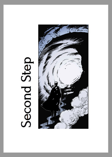
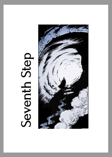
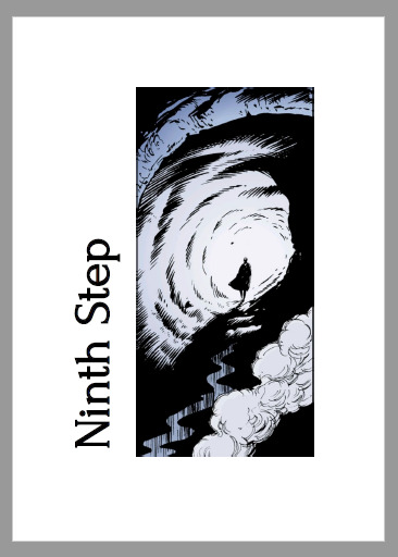
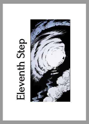
For the chapter headers I picked up the idea of steps, first I thought stairs. Following the many pictures of the myth that show Orpheus and Eurydice on their way out of the Underworld. This story is more about how both grow apart though, so I went for a picture to reflect that.


9 notes
·
View notes