
Don't wanna be here? Send us removal request.
Statistics
We looked inside some of the posts by zulekhasheikhcipm-blog and here's what we found interesting.
Average Info
Notes Per Post
7
Likes Per Post
5
Reblog Per Post
2
Reply Per Post
0
Time Between Posts
3 hours
Number of Posts By Type
Text
3
Photo
14
Last Seen Tumblr Blogs


Fun Fact
Tumblr.com is the 103rd most visited website in the world.
Text
Final Evaluation - 1500 words
.
Rationale of the Project
.
I instantly knew I wanted to work with someone who I have constant contact with, this brought on the idea of choosing Tahmina Mughal, a local cake baker based in London. Tahmina is an inspirational baker who has a talent but lacks in technical experience. She explained she just wanted to promote her business further and give it a brand that is recognisable to her customers. I proposed the project to Tahmina and she was happy for me to help her, and I knew I could rely on her to give me some of her time in order to complete the project successfully. Together we were able to scope the project and agreed on these artefacts to produce:
.
1. A promotional video to show what Tahmina does
2. Business cards to be handed out at events, weddings and birthdays
3. An Instagram page to get her business on the social media scene
4. A logo to feature on her video, Instagram and existing website to give Cake Arrangements a brand and consistency
.
Half way through the project, the client had also asked to make some changes to her existing website to make it follow the same theme that the logo and business cards featured, I also made these changes to the client’s existing Facebook page.
.
Before starting the project, I undertook extensive research to see what similar companies were doing to promote their businesses, I found colourful websites and a running theme across their online presence. I had to ensure I was comfortable using software’s Adobe photoshop and Illustrator. Premiere Pro was also new to me, so I watched tutorials on Youtube so I could learn the basics. Once I was comfortable with using these software’s, I downloaded them and started on my logo. The client had requested pastel colours for this and after doing some research I found that bright pink was a popular choice, the client was happy for me to go ahead with that and I created a logo on Adobe Illustrator making sure it was simple yet joyful. During the project, people saw issues with my logo as the text was difficult to see and it did not look professional. So I collaborated with a graphic designer to take the look of my logo and simply make it better. This gave the logo a better image on social media.
.
I then created the promotional video, the client had told me she wanted to explain to customers that she makes everything at home and why she has such a passion for baking while also demonstrating her baking skills. My client and I arranged a date when I could go to her home and film material for the video. I had planned to use a mobile phone to film the video however decided on a Sony Camcorder for better quality. I filmed the client’s whole process of making delicately decorated cupcakes and would filter out the best clips to feature in the video, I then filmed the client herself in an interview style. The film was put together on Adobe Premiere Pro which was easy to use after watching tutorials. By adding transitions and music, I was able to produce a professional looking video which the client was happy with.
.
The business cards were initially made on moo.com, the first design that I created was not liked by the client as she did not like the image used. As there was a slight delay with not ordering the business cards on time the client decided she no longer wanted them, however I had designed new ones and I had given the client the option of taking them when she needs.
.
I had made the Instagram account for the client about a year ago, however the client did not do well in keeping up with the maintenance so I took over and gave it a revamp by adding the logo and uploading 15 second videos that I filmed whenever I saw the client working on something new. During research I came to realise the importance of social media and the benefits it gives to a business.
.
Group Organisation and Participation
.
Initially, I had planned to not collaborate with anyone on this project and to produce the artefacts myself. However after receiving feedback, I realised the design elements could be improved if I collaborated with someone more experienced. Therefore with the help of a graphic designer, the logo was redesigned. Communication between myself and the client was very strong. The communication contributed towards the success of the project. With constant messaging and phone calls, I was able to ensure that the client was happy with everything I produced as we went along rather than the client giving me a list of amendments at the end. This also contributed towards the success of the project as it helped me stick to time and make small alterations without falling behind.
.
Merits and Problems
.
Throughout the duration of the project, I was fortunate enough to not have come across any major issues that would delay the completion.
.
The first issue I had to overcome was consistency of the brand. Although the client’s website and Facebook page was not part of my brief, they were not consistent with the brand. I overcame this adding the logo and colour theme to the Facebook and existing website.
.
The second issue for me was not being familiar with the software’s that needed to be utilised for this project, I quickly overcame this with online help. Another issue I faced was the first design of the business cards not being liked by the client. This delayed the delivery process as I had to design new one’s to suit the client's needs.
.
Changes and Future Improvements
.
If I had more time for this project, there are definitely some changes that I would make to the artefacts. Firstly I would have done more research to give myself a better understanding of what similar companies are doing to promote and generate sales.
.
I would have liked to spend more time on Premiere Pro editing the video to make it look more professional. I tend to ignore little adjustments that would have made the final piece better, this is something I have learnt about myself and hope to change in the future. Although I feel with more practice of the software, I have the potential of making some well edited videos.
.
I would also have liked to have more face to face meetings with my client as I felt she was more honest with me when we physically met than over messaging and phone calls. This was only due to a travel distance between myself and the client however I did try to go to London whenever I could.
.
I would have definitely planned better, I would have liked to draw up more designs and mockups so that I could improve my art skills. Upon reflection, I can see how that would have benefitted me.
.
I would have also liked to have make more changes to the client’s website rather than just changing the homepage. The client’s existing website was dull and did not look a part of Cake Arrangements.
.
Changes After Feedback
After receiving some constructive criticism from the unit co-ordinators, it was clear that I needed to make some changes. I applied these changes as quick as I could. I collaborated with a graphic designer to create a better looking logo as the one before wasn’t perfect in shape and the font was difficult to read. I also changed the website homepage a lot, to make it look completely different so that it matches the rest of the business theme. Changes were also applied to the Facebook page, the client made me the admin and I uploaded the logo along with making the cover photo the same as the background image in the new website. The client was happy for me to make all these changes and glad that I offered to change a lot of what wasn’t part of my brief.
.
To conclude, I believe the client was pleased with the outcome of the artefacts and in turn has asked me to upkeep the social media side of things and help to help her with anything she may need in the future. The project has been a real eye-opener for me and showed me what it can be like to work with a client who has demands that may not follow what you what want to do. I have learnt a lot and gained a whole new experience. I have learnt how to use software’s, how to take instructions and also how to meet deadlines. These are all qualities that will benefit me in the future. I have learnt that a lot goes into managing a project and there is a lot to consider however with the help of tools like gantt charts, it can help you execute a task on time and follow a planned structure.
.
Although I faced a couple issues along the way, I have taken a lot from this experience and look forward to working with my client again.
2 notes
·
View notes

Text
Feedback of Video Testing
Here are some quotes I picked out from the response sheets along with the ratings of what the video got.
.
“The video looks really good, I think it could help the owner with sales as it really shows what she sells and the image she wants to portray, 7/10″
.
“Those cupcakes look super yummy, I like that she has passion for what she does. I reckon she’s good at what she does, 7/10″
.
“The video has been filmed well although I would say it’s a little shaky, other than that you’ve put a great video together, 6/10″
.
“Such a cute video, the music fits in so well! I actually just checked her instagram out to see more of what she does. Good job, 8/10″
0 notes
Photo

Testing
For feedback on the video, I sent this via email to 5 people. I received feedback from 4. This was done in order to get an insight of what people think of this video and if they think it presents the business well.
0 notes
Photo

This image is of a screenshot taken on a mobile phone to show that the video can be viewed on multiple devices. This was tested on 4 mobile phones and 1 tablet.
0 notes
Photo

PROMOTIONAL VIDEO ON YOUTUBE
This is a screenshot of the video on Youtube. It can be accessed using this link: https://www.youtube.com/watch?v=u8UohRe9aAM&feature=youtu.be
1 note
·
View note
Photo

This screenshot shows the video being uploaded to the Cake Arrangements Facebook page.
0 notes
Photo
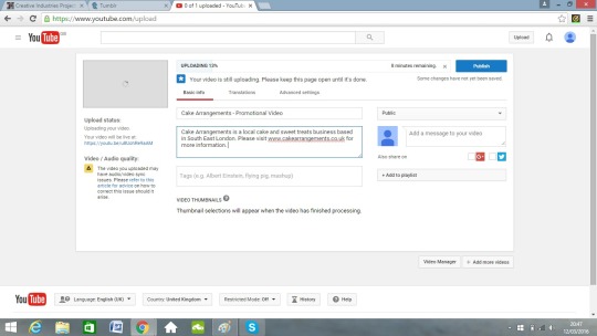
Here is a screenshot showing the image being uploaded onto Youtube. It will be public so that everyone can view it whenever and wherever they are.
0 notes
Text
Promotional Video
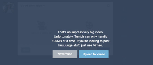
The video that I created can not be uploaded onto Tumblr due to it’s size. I will upload it onto Youtube and onto the client’s Facebook page.
0 notes
Photo


The client had suggested small changes for the business cards, to put quote marks around the slogan and to make the font a little bigger. Also to remove ‘cake business’. These changes have been made and stored for then the client chooses to place an order.
0 notes
Photo

SIGNING OFF THE PROJECT
I created a document which required both the signature of myself and the client to indicate the project artifacts have been completed and delivered to satisfaction
0 notes
Photo

This image shows the before and after of the mobile version of the website. The old version didn’t feature the logo, the background image or the social media buttons. This would have made it difficult for customers to recognise. Chaning the settings for the mobile section on yola, made it easier to view and make it look a lot more like the pc version.
2 notes
·
View notes
Photo

On the website homepage, I added links to the social media pages as this was also something I noted from the feedback, the Facebook button has the mouse hovering over it in this image which is why it highlighted pink. I tested this and both the links worked perfectly fine.
2 notes
·
View notes
Photo

This screenshot shows the website that the template was made on, Yola.com. I was able to choose new themes to apply to the site and changes images, background and colours.
0 notes
Photo

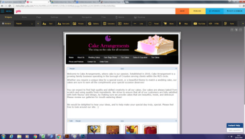
These images show a before and after of the client’s website. Again this was not part of the brief however changes had been made to her whole brand and it was appropriate to apply that to the website. Using yola.com, I changed the whole image of the home page. From feedback it was clear that people thought it was too wordy and didn’t look like a website for a cake business. I incorporated the feedback into the new page. With pastel colours, and the same background image as the cover photo on Facebook; this looked a lot more fitting, The new logo has also been added to the new website. Here is the link to the new and improved website:
http://www.cakearrangements.co.uk/
0 notes
Photo

This screenshot represents a small part of the research I undertook to see what other cake websites are like and what kind of colours they featured. I also tried to see what sort of layout they use to show their products and services. I tried to add all these elements to the changes I would make to the clients existing website.
0 notes
Photo


My client did have an existing Facebook page but she did not ask me to do anything with it or create her a new one.However one of my client’s objectives was to create a brand for her business. Her Facebook page did not fit the brand and she made me admin of the page which enabled me to change the whole look. I added the logo and the cover photo is the image that I used as the background of the new website. I edited the image slightly increasing the hue and saturation. I also googled the dimensions of a facebook cover photo so that I could get the size right.
0 notes