
Statistics
We looked inside some of the posts by 7070-mailbox and here's what we found interesting.
Average Info
Notes Per Post
660K
Likes Per Post
379K
Reblog Per Post
280K
Reply Per Post
810
Time Between Posts
5 months
Number of Posts By Type
Text
17
Last Seen Tumblr Blogs


Fun Fact
In Q3 of 2020, 31% of US users access the Tumblr app daily.
Text
Some day I want to see a show that does the “no filler episodes” thing from the opposite direction. Just a whole season worth of low-stakes character pieces that seem to move the overall story absolutely nowhere, then episode 26 pulls all the triggers at once and this massive Rube Goldberg machine of a plot the show’s been quietly setting up in the background the whole time hits you like a truck.
168K notes
·
View notes
Text
Body language cheat sheet for writers
As a writer, understanding and incorporating body language into your storytelling can greatly enhance your characters and their interactions. Here's a cheat sheet to help you describe body language effectively:
Facial Expressions:
* Raised eyebrows: Surprise, disbelief, or curiosity.
* Furrowed brow: Concentration, confusion, or frustration.
* Smiling: Happiness, amusement, or friendliness.
* Frowning: Disapproval, sadness, or concern.
* Lip biting: Nervousness, anticipation, or tension.
Eye Movements:
* Eye contact: Confidence, interest, or honesty.
* Avoiding eye contact: Shyness, guilt, or deception.
* Narrowed eyes: Suspicion, skepticism, or concentration.
* Wide eyes: Shock, fear, or surprise.
* Rolling eyes: Exasperation, annoyance, or disbelief.
Gestures:
* Crossing arms: Defensiveness, disagreement, or discomfort.
* Nervous fidgeting: Anxiety, restlessness, or impatience.
* Pointing: Assertiveness, emphasis, or accusation.
* Open palms: Honesty, openness, or sincerity.
* Hand on chin: Deep thought, contemplation, or evaluation.
Posture and Movement:
* Slumped shoulders: Defeat, sadness, or fatigue.
* Upright posture: Confidence, attentiveness, or authority.
* Pacing: Restlessness, agitation, or contemplation.
* Tapping foot: Impatience, annoyance, or frustration.
* Leaning in: Interest, engagement, or curiosity.
Touch:
* Hugging: Affection, comfort, or warmth.
* Handshake: Greeting, introduction, or agreement.
* Patting on the back: Encouragement, praise, or camaraderie.
* Clenched fists: Anger, determination, or frustration.
* Brushing hair behind the ear: Nervousness, coyness, or flirtation.
Mirroring:
* When two characters unconsciously mimic each other's body language, it indicates rapport, connection, or empathy.
Nodding:
* A subtle nod can convey agreement, understanding, or encouragement.
Crossed legs:
* Crossed legs can indicate relaxation or a casual, nonchalant attitude.
Tapping fingers:
* Impatience, anticipation, or nervousness can be expressed through rhythmic finger tapping.
Hand on the chest:
* Placing a hand on the chest can convey sincerity, empathy, or a heartfelt emotion.
- Tilting the head:
* Tilting the head to the side can suggest curiosity, attentiveness, or interest.
Rubbing the temples:
* Rubbing the temples can indicate stress, fatigue, or a headache.
Chin stroking:
* Stroking the chin while in thought can portray contemplation, decision-making, or intellectual curiosity.
Arms crossed behind the back:
* This posture can indicate authority, confidence, or a composed demeanor.
Tilted body posture:
* Leaning slightly towards someone can suggest interest, attraction, or engagement in a conversation.
Biting nails:
* Nail-biting can reveal anxiety, nervousness, or tension.
Foot tapping:
* Rapid or impatient foot tapping can show agitation, restlessness, or eagerness.
Squinting:
* Squinting the eyes can signal suspicion, doubt, or an attempt to focus on something.
Shifting weight from foot to foot:
* Shifting weight can imply discomfort, unease, or anticipation.
Covering the mouth while speaking:
* This gesture can indicate hesitation, embarrassment, or the desire to hide something.
Remember that body language can vary across different cultures and individuals, so consider your character's background and personality while describing their movements. Additionally, body language is best used in combination with dialogue and internal thoughts to create a more nuanced portrayal of your characters.
Happy writing!
6K notes
·
View notes
Text
When writing about childhood trauma in a novel, it's important to handle the topic with sensitivity and nuance. Here are some quick tips to consider:
1. Research and understand: Take the time to research and understand the specific type of trauma you're addressing in your novel. This will help you portray it accurately and respectfully.
2. Show the impact: Explore how the childhood trauma has shaped the character's thoughts, emotions, and behaviors. Illustrate the long-lasting effects it has had on their development and relationships.
3. Use flashbacks sparingly: Utilize flashbacks strategically to reveal key moments from the character's past that contribute to their trauma. Ensure that the flashbacks serve a purpose in the narrative and provide deeper insights into the character's experiences.
4. Depict coping mechanisms: Show how the character has developed coping mechanisms to deal with their trauma. This can include avoidance, dissociation, or seeking control in certain areas of their life.
5. Allow for healing and growth: Give your character opportunities for healing and growth throughout the story. Show how they confront their trauma, seek support, and gradually find ways to overcome the impact it has had on their life.
6. Avoid sensationalism: Handle the portrayal of childhood trauma with care, avoiding excessive graphic or gratuitous details. Focus on the emotional journey of the character rather than relying solely on shocking events for impact.
7. Show support systems: Include supportive relationships and resources that aid the character in their healing process. This can involve therapists, friends, or mentors who offer understanding, guidance, and empathy.
8. Highlight resilience: Illustrate the character's strength and resilience in the face of their trauma. Show how they find ways to persevere, grow, and rebuild their lives despite the challenges they have faced.
9. Offer hope and redemption: Provide a sense of hope and the possibility of healing for your character. Allow them to find moments of redemption and transformation, demonstrating that healing is attainable.
10. Approach with empathy: Approach the topic of childhood trauma with empathy and compassion. Treat the characters' experiences with respect, acknowledging the complexity and individuality of each person's journey.
1K notes
·
View notes
Text
Tips to help you describe love and attraction in your novel:
1. Show, don't tell: Instead of directly stating that a character is in love or attracted to another, demonstrate their emotions through their actions, thoughts, and interactions. Describe their reactions, gestures, and expressions to convey the depth of their feelings.
Example: "Her heart raced as he entered the room, a smile spreading across her face that she couldn't contain. In that moment, she knew she was helplessly in love.
///////
2. Engage the senses: Use sensory details to immerse readers in the experience of love and attraction. Describe the sights, sounds, scents, tastes, and textures associated with the characters and their interactions to create a rich and immersive atmosphere.
Example: "As they danced, the soft melody filled the air, intertwining with the sound of their laughter. She caught a whiff of his cologne, a mix of warmth and familiarity that sent a shiver down her spine. The touch of his hand against hers was electric, igniting a flame of desire she couldn't ignore."
///////
3. Use metaphor and symbolism: Employ metaphorical language and symbolism to convey the intensity and depth of love and attraction. Compare the characters to natural elements, use imagery to describe their connection, or associate their emotions with colors, seasons, or other evocative symbols.
Example: "Their love blossomed like a garden in spring, vibrant and full of life. Each touch was a brushstroke on the canvas of their hearts, painting a masterpiece of desire and longing."
///////
4. Explore internal thoughts and emotions: Provide insights into the characters' internal dialogue, thoughts, and emotions to convey the complexity and nuances of their love and attraction. Show their vulnerability, doubts, and the transformative power of their connection.
Example: "Her mind was filled with his presence, his voice echoing in her thoughts. Doubts melted away as her heart whispered, 'This is love, undeniable and all-consuming.'"
///////
5. Highlight the unique qualities and chemistry: Describe the unique qualities and characteristics that draw the characters to each other. Focus on their shared interests, intellectual connection, shared values, or the sparks that fly between them to emphasize their compatibility and chemistry.
Example: "Their conversations flowed effortlessly, their minds dancing in perfect sync. They understood each other in ways no one else could, their connection a magnetic force that pulled them closer with each passing moment."
///////
6. Capture the range of emotions: Love and attraction encompass a wide range of emotions, from joy and passion to longing and vulnerability. Capture the various emotional states the characters experience, both the highs and lows, to create a multidimensional portrayal of their relationship.
Example: "In his arms, she felt a sense of belonging she had never known. The world melted away, leaving only the euphoria of their love. But as the distance grew, an ache settled in her chest, a yearning for his touch that consumed her thoughts."
2K notes
·
View notes
Text
How I Modify My Google Doc for Outlining and Drafting
I previously talked about setting up my document to look like a formatted paperback book to help writing not feel so daunting.
Today, I bring you a different way I change my document that is more appealing to me than the standard Doc.

For Drafts
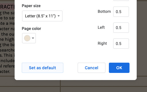
first, go to Page Set Up
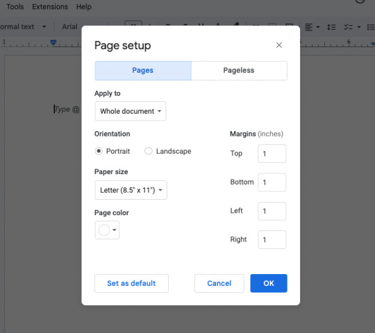
this is what the default is
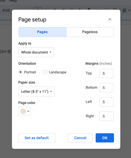
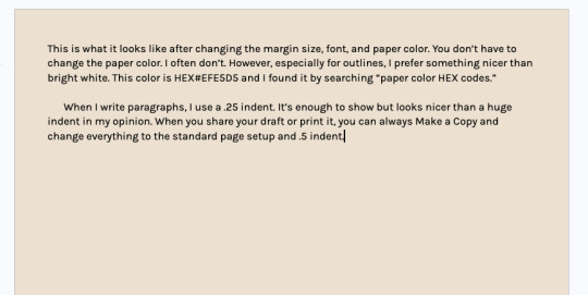
For my setup: Margins will change to .5" for top, bottom, left, and right.
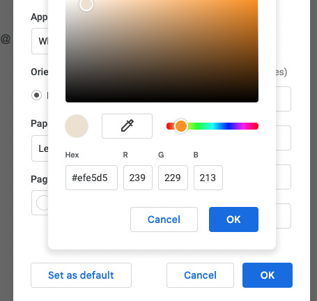
this is the page color I chose but it's totally optional.
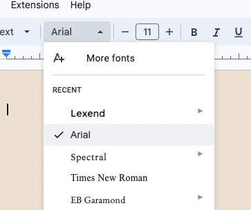
Then, I change my default font. Here is how to find the ones I like. Go to the font option, then click More fonts.
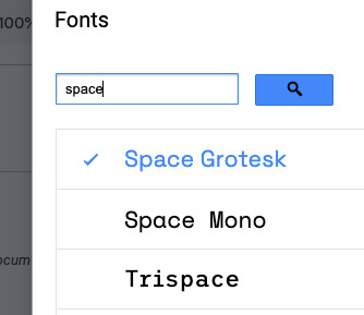
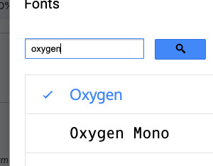
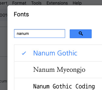
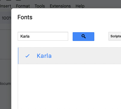
These are the fonts I love. You can search them or browse for ones you like.
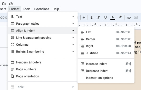
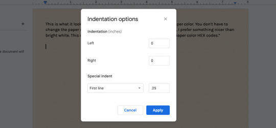
next, i change my first-line paragraph indent to .25"
For Outlining
(and also character profiles, world-building, etc.)
You are going to follow the same steps as above first. The only difference is you don't need to mess with any of the indent settings.
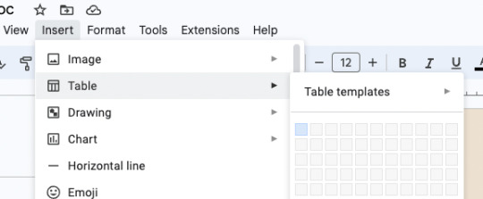
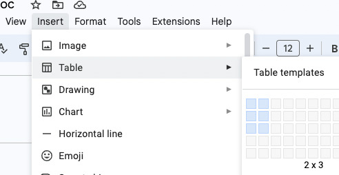
I use boxes as dividers and organizers. To do this, go to Insert > Table > 1x1.
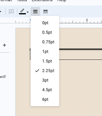
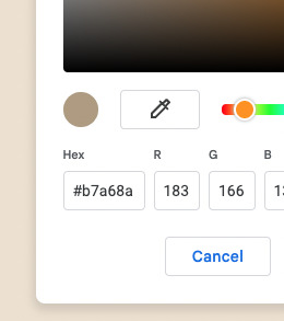
Then, change the border thickness to 2.25pt. I usually have a color palette for these, so I'm choosing a darker brown than the background for the borders. But white paper and black table lines work just as well and are more print-friendly ;)
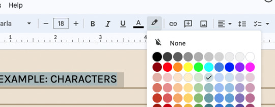
Next, I change the Headings, Subheadings, and Subtitles. To begin, I am changing my Title heading. I choose my font, how big I want it to be, and then I like using a highlight color as well. Here, I'm using a standard light/pastel color and 18pt font.
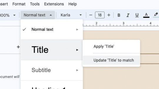
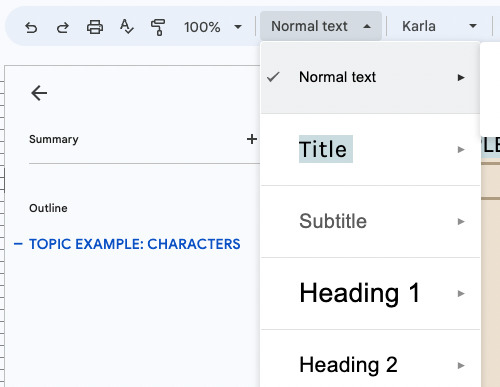
Highlight to select this new title. Go to the dropdown menu that says "normal text", hover over "Title", then choose "Update 'Title' to Match". Now you can click that every time with no hassle. And it will begin an outline for you to the left.
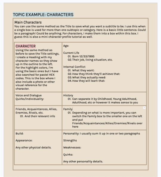
Let's make that box within a box! Make sure you are typing inside the first box. Then insert another table. I am going to use a 2x3.
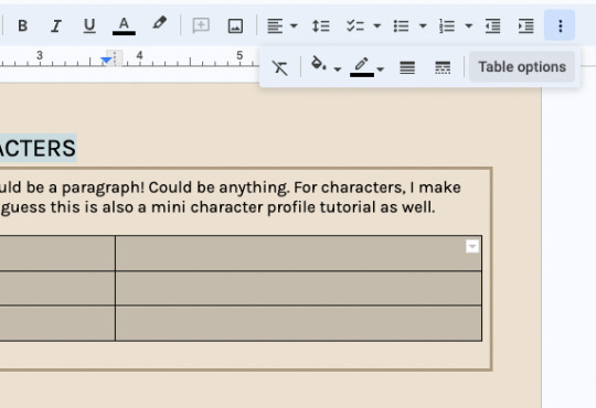
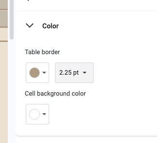
Because this table is more than one cell, you can go to the three dots up top and click "Table Options" to change every table border selected at once. Again, 2.25pt with the same color as before. The cell background color says white but you don't have to change it to match the page color.
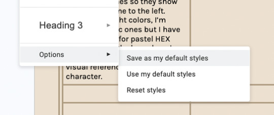
You can save both your Heading preferences and page setup as your default style. Every new document you make will use these settings automatically.
I really hope this was helpful and/or interesting!
As always, take what you want and leave the rest. Happy writing!
[call it good] writing
6K notes
·
View notes
Text
Writing Tips
Punctuating Dialogue
✧
➸ “This is a sentence.”
➸ “This is a sentence with a dialogue tag at the end,” she said.
➸ “This,” he said, “is a sentence split by a dialogue tag.”
➸ “This is a sentence,” she said. “This is a new sentence. New sentences are capitalized.”
➸ “This is a sentence followed by an action.” He stood. “They are separate sentences because he did not speak by standing.”
➸ She said, “Use a comma to introduce dialogue. The quote is capitalized when the dialogue tag is at the beginning.”
➸ “Use a comma when a dialogue tag follows a quote,” he said.
“Unless there is a question mark?” she asked.
“Or an exclamation point!” he answered. “The dialogue tag still remains uncapitalized because it’s not truly the end of the sentence.”
➸ “Periods and commas should be inside closing quotations.”
➸ “Hey!” she shouted, “Sometimes exclamation points are inside quotations.”
However, if it’s not dialogue exclamation points can also be “outside”!
➸ “Does this apply to question marks too?” he asked.
If it’s not dialogue, can question marks be “outside”? (Yes, they can.)
➸ “This applies to dashes too. Inside quotations dashes typically express—“
“Interruption” — but there are situations dashes may be outside.
➸ “You’ll notice that exclamation marks, question marks, and dashes do not have a comma after them. Ellipses don’t have a comma after them either…” she said.
➸ “My teacher said, ‘Use single quotation marks when quoting within dialogue.’”
➸ “Use paragraph breaks to indicate a new speaker,” he said.
“The readers will know it’s someone else speaking.”
➸ “If it’s the same speaker but different paragraph, keep the closing quotation off.
“This shows it’s the same character continuing to speak.”
123K notes
·
View notes
Text
Want to learn something new in 2022??
Absolute beginner adult ballet series (fabulous beginning teacher)
40 piano lessons for beginners (some of the best explanations for piano I’ve ever seen)
Excellent basic crochet video series
Basic knitting (probably the best how to knit video out there)
Pre-Free Figure Skate Levels A-D guides and practice activities (each video builds up with exercises to the actual moves!)
How to draw character faces video (very funny, surprisingly instructive?)
Another drawing character faces video
Literally my favorite art pose hack
Tutorial of how to make a whole ass Stardew Valley esque farming game in Gamemaker Studios 2??
Introduction to flying small aircrafts
French/Dutch/Fishtail braiding
Playing the guitar for beginners (well paced and excellent instructor)
Playing the violin for beginners (really good practical tips mixed in)
Color theory in digital art (not of the children’s hospital variety)
Retake classes you hated but now there’s zero stakes:
Calculus 1 (full semester class)
Learn basic statistics (free textbook)
Introduction to college physics (free textbook)
Introduction to accounting (free textbook)
Learn a language:
Ancient Greek
Latin
Spanish
German
Japanese (grammar guide) (for dummies)
French
Russian (pretty good cyrillic guide!)
337K notes
·
View notes


Text
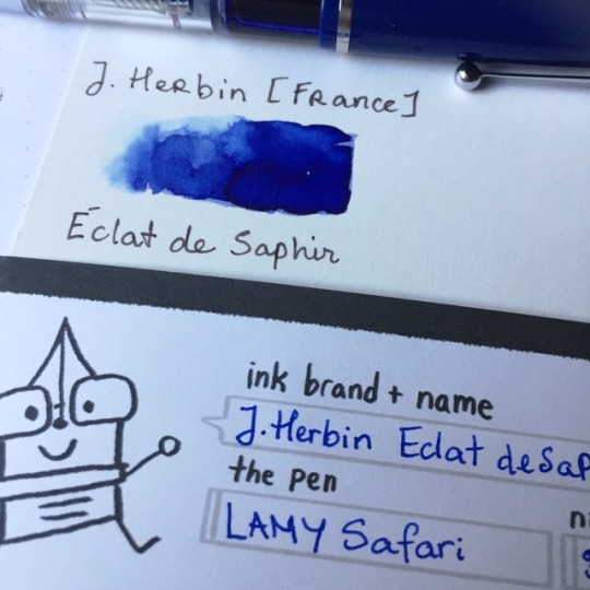
Ink Review: Éclat de Saphir by J.Herbin
To conclude the end of this first (and very behind) week we’re looking at a classy as well as classic ink: J.Herbin’s Éclat de Saphir as I’m honoring my time growing up in French education. Ever since my elementary school attendance, our default writing ink has always been blue (in contrast to Vietnamese school’s default ink being eggplant purple) so I think it’s appropriate to be reviewing a similar blue hue ink by a French manufacturer.
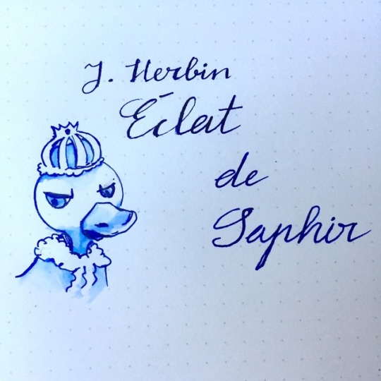
Image sketched on Rhodia pad with brush and Stipula Splash V-flex
J.Herbin is known as one of the oldest still running stationery manufacturer in Europe. First known as La Société Herbin, it was established in 1670 by a sailor by the family name of Herbin who brought back inks and ink and sealing waxes formulas from India to be manufactured in Paris for royalties such as King Louis XIV and later on, Victor Hugo.
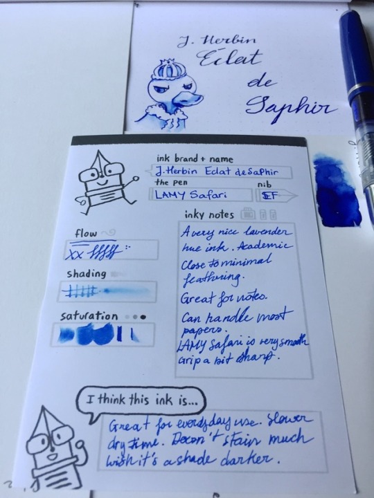
Tested on Rhodia Pad, Strathmore 300 Smooth Bristol Pad, and photocopy paper. Featuring a Stipula Splash V-flex.
Close up on photocopy paper and bristol swatch.
Éclat de Saphir (a glint of sapphire) is part of the regular J.Herbin line up as its 30ml bottle has a peculiar shape with the opening being more leaned over one side of the bottle to prevent said bottle to fall over. If you are that person who likes everything to be dead center the bottle’s shape can be...mildly annoying.
As previously stated, I have a huge weakness for blue hues. Sapphire blue, however, can be a strange territory for me as sometimes and it looks “too warm” rather than cool. This one is just at an off middle ground, as it actually looks pretty close to how actually sapphire looks hue wise but I can never bring myself to really think of a perfect use of it. This color isn’t “serious” enough to be used for documentation neither is it playful enough to write a card with. It’s more like an ink you’d sign some royal order with and that’s just my opinion.
Drying Time: Average to Slow (10-20 seconds)
Water Resistance: Low
Feathering: None/Minimal
Bleeding: None
Pricing: $9-12 (30ml) carries by most retailers
$22-24 (50ml) at Goulet Pens and Pen Chalet
$6 (10ml) at Pen Chalet
$4-6 cartridges (6 counts) at Vanness Pens and Pen Chalet, and Anderson Pens
Samples offered at Vanness, Goulet Pens, and Anderson Pens
Thoughts:
J.Herbin’s Éclat de Saphir is an interesting ink that works well in most circumstance (except in an extra fine or Japanese fine nib which will refuse to cooperate, I said as I look at my Pilot Cavalier), which color did take me a while to warm up to. It looks fancy and can be pretty a mildly fancy addition to your academic use or add a bit of spark onto your calligraphic congratulation card.
What are your thoughts? I won’t be writing for a while but I would love to hear how others would put this ink to use.
#blue ink#french ink#inktober 2018#ink review#fountain pen ink#fountain pen ink review#sapphire ink#sapphire#j.herbin#jherbin#j.herbin ink#jiherbin ink#warm blue ink#gemstone
3 notes
·
View notes
Text
Temporary delay on Inktober
Hey guys, the upcoming inktober posts will be delayed by a few days as I’m getting my wisdom teeth pulled Monday’s afternoon and will not be conscious enough to make coherent speech not to mention writing. Hope y’all enjoy what I have so far and I promise that I’ll try to make up for the late posts.
1 note
·
View note
Text
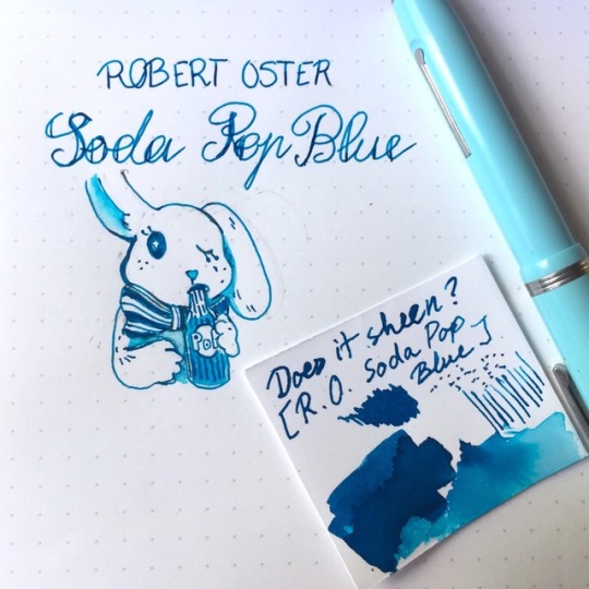
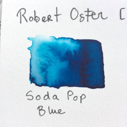
Ink Review: Soda Pop Blue by Robert Oster
When it comes to painting, I always have a thing for cerulean bright blue color and since Robert Oster well known for their blue and teal color choices, why not pick up a bottle?
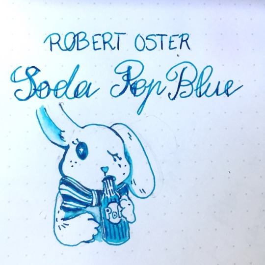
Image sketched on Rhodia pad with brush and an Esterbrook Pastel (F)
Robert Oster came to my radar back in 2015-2016 with their well-known blues such as “Fire and Ice” being praised as sharing contrasting sheen almost to the same degree as J.Herbin’s Emerald de Chivor as well as their beautiful array of blue and teal inks. Advertised as a homemade ink, the brand Robert Oster Signature was created in 1989 and now based in the Coonawarra district of South Australia. Their inks are advertised as inspired by the “Australian palette” as well as using recycled eco-friendly plastic bottles. Hey, I’m never opposed to using recyclable materials, that’s how I got back into fountain pens in the first place.
Tested on Rhodia Pad, Strathmore 300 Smooth Bristol Pad, and Borden & Riley Paris Paper for Pens paper. Featuring an Esterbrook J series Pastel (F).
Swatch made on Strathmore 300 Smooth Bristol Pad.
My first experience with Soda Pop Blue was absolutely love-at-first-sight. The color is teal blue with a definite lean toward the blue hue that’s neither too bright nor too dark. I’ve been using it for my daily notes in my Esterbrook (which I’ve now learned to clean out every two weeks as the ink will darken in this one after a while). It has a very low amount of sheen but like most Robert Oster blue inks, it’s there.
Drying Time: Somewhat average
Water Resistance: None
Feathering: None
Bleeding: None
Pricing: $17 (50ml) carries by Goldspot Pens, Vanness Pens, Pen Chalet, and Jetpens
Samples offered at Vanness, Pen Chalet, and Anderson Pens
Thoughts:
I have a big weakness for blue ink and Soda Pop’s witty and happy color which reminds me of a NukaCola Quantum bottle definitely make my inner nerd glow with joy. I even ignore the fact that its water resistance is nil but hey, you won’t have to worry about water resistance if you’re just going to use it on your personal journal, quick sketch or even grocery note (unless you’re dunking your notebook in a fish tank which is definitely NOT recommended).
#blue ink#teal ink#blue teal ink#Robert Oster#Robert Oster ink#fountain pen ink review#fountain pen ink#ink#ink review#australian ink#sheening ink#inktober 2018#eco friendly
1 note
·
View note
Text
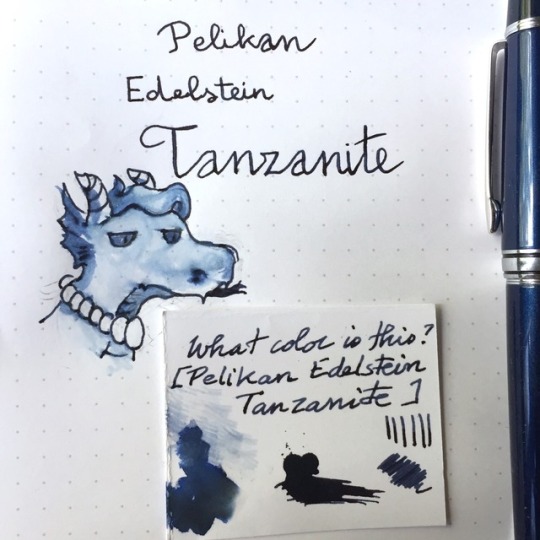
Ink Review: Endelstein Tanzanite by Pelikan
Today we’re going to look at one of my favorites blue-black ink: Tanzanite. I got a few cartridges of it from my trip to Atlanta Pen Show and decided to syringe fill some of it into my Pilot Stargazer (sadly now discontinued) as I’ve always wanted to give it a try although Pelikan Edelstein inks tend to be pretty expensive by the bottle.
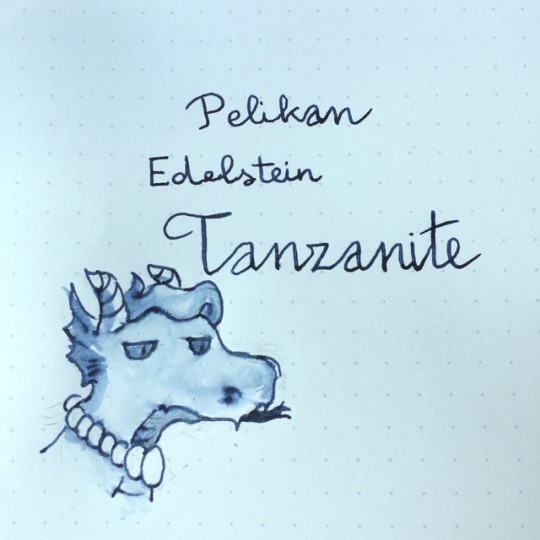
Image sketched on Rhodia pad with brush and Pilot Stargazer/Stella90s (M). This image is a tad bluer than it should despite my endless configurations.
Pelikan (officially Pelikan Group) is a fountain pen, ink, and office company which headquarter is located in Berlin, Germany with many international branches. The company was first founded in Hanover by a chemist by the name of Carl Hornemann who produced his own ink colors in 1838.
Tested on Rhodia Pad, and Borden & Riley Paris Paper for Pens paper. Featuring a Pilot Stargazer (M).
Tanzanite is part of Pelikan’s Edelstein (Gemstone) series which started with 8 colors and each additional color was to be released once per year and only available for that year, each inspired by a different precious gemstone and voted by the public. Due to their popularity, some inks such as Aquamarine ( 2016 ink of the year) became part of the regular line up.
The color of this ink a blue-black that leans more purple, similar to a tanzanite gem, although a lot more desaturated. The color itself feels complex can be a tad difficult to capture in photos as there is a light amount of sheen in it that gives illusions to warm brown-black in combination with the fact that this ink has quite a bit of shade as well (providing variations in ink density within the same stroke ).

Photo of a tanzanite gem from geology.com
Edelstein Tanzanite is more of a formal color fitting for signature, art or special recording use. I mean you can use it for daily writing as well if you can afford to buy multiple bottles. The ink itself flows well and take a moderate amount of time to dry and has some very mild feathering.
Drying time: Normal (10 seconds on Rhodia)
Water resistance: Low
Feathering: A bit
Bleeding: Low
Pricing: $25-30 (50ml) carries by most ink and pen retailers
$7-10 per pack of 6 long cartridges carries by most ink and pen retailers. Works with pens that accept international converter
Samples offered at Vanness, Goulet Pens, Pen Chalet and Anderson Pens
Thoughts:
As previously stated, this is one of my favorite blue-black inks and if you can’t afford the bottle right away, you can always go for the sample or cartridges version of it if you want to give this ink a try. It works well so far with my medium nib Pilot Stargazer (which writes really wet) without ink blurbing out of the feed so it might be recommended to the wet/broader nibbed pens.
#ink#ink review#fountain pen ink review#pelikan ink#pelikan#edelstein ink#edelstein tanzanite#tanzanite ink#tanzanite#blue black ink#blue ink#dark blue ink#sheening ink#shading ink#german ink#expensive ink#inktober 2018
0 notes
Text
Inktober delay
Hi everyone! Just a short notice that due to some schedule issues going on so I will be posting both #5 and #6 inktober posts later tonight!
1 note
·
View note
Text
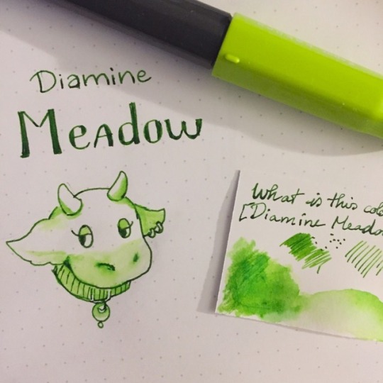
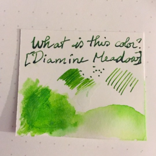
Ink Review: Meadow by Diamine
A few months ago, I joined Massdrop out of curiosity as well as looking for some nice deal in ink (I was on my beginner ink purchasing streak). One of which was to get a set of 5 Diamine inks, which I’ve always curious about trying some more of. After a lot of consideration (I’m that person who will sometimes unreasonably spend 1-2 days to make up my mind about my online purchases) I picked out my set of 5, one of which was Diamine Meadow.
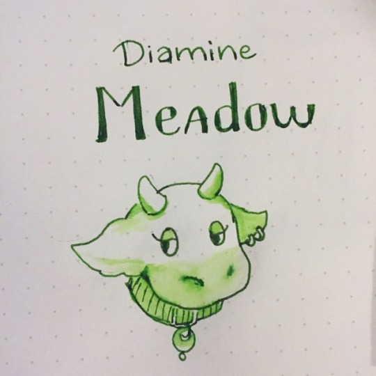
Image sketched on Rhodia pad with brush and Pilot Kaküno (M).
Tested on Rhodia Pad, Strathmore 300 Smooth Bristol Pad, and Borden & Riley Paris Paper for Pens paper. Featuring a Pilot Kaküno (M).
Diamine is one of the very well known as well as long-standing ink manufacturers between western fountain pen fans due to their easygoing ink flow and a great array of colors to pick from, including their own selection of shimmering inks (which we will talk about in another post). Based in Liverpool, UK, Diamine Ink has been manufacturing their products since 1925 using traditional methods and formulas. Diamine Meadow is part of their regular ink line in comparison to their Shimmertastic or 150th Anniversary ink.
Swatch made on Borden & Riley Paris Paper for Pens paper.
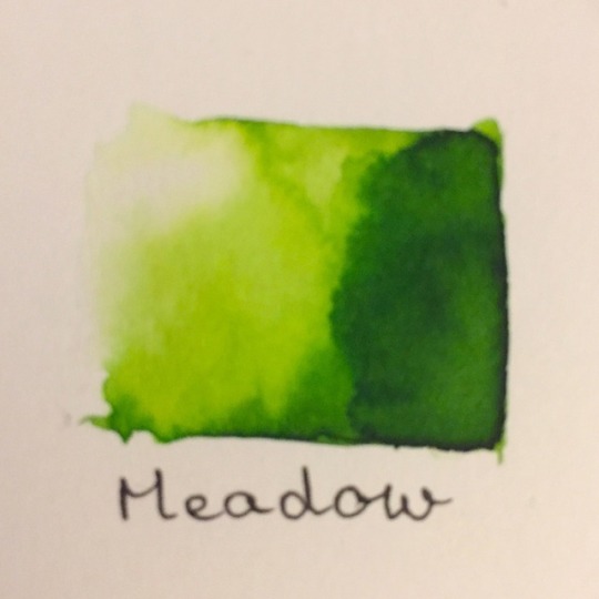
Swatch made on Strathmore 300 Smooth Bristol Pad
This is one of the normal but versatile ink that I can pretty much pop in my carry on pens. The color reminds me of the meadow and valley color used in Ghibli movies or Heidi posters which is nice. The ink dries relatively fast, isn’t picky and can add a bit of fun to your daily writing.
Drying time: Fast
Water resistance: Close to none.
Feathering: None
Bleeding: None
Pricing: $7-8 (30ml), $14-17 (80ml) carries by most ink and pen retailers
Samples offered at Vanness, Goulet Pens and Anderson Pens
Thoughts:
I picked up this ink after reading Mountain of Ink‘s review of it and it definitely makes up part of my small array of green ink and an even smaller array of bright colored ink that isn’t red or blue. I’ve used this ink for my daily writing before and it’s a just-right green that is bright enough to not be too serious while staying legible.
Stay tuned for my day 5 of inktober review!
#green ink#Diamine Ink#diamine#meadow ink#diamine meadow ink#UK ink#british ink#pop color#daily writing#inktober 2018#ink review#fountain pen ink review#fountain pen ink
0 notes
Text
Ink Review: Nitrogen Royal Blue by Organics Studio
Today we’re looking at a popular ink from Organics Studio: Nitrogen Royal Blue, otherwise known as a “Sheen Monster.”
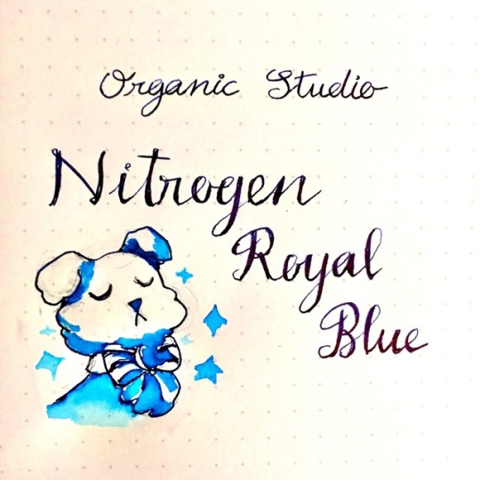
Image sketched on Rhodia pad with brush and Pilot Stargazer (F).
Organics Studio is an American ink manufacturer based in Maryland. Their inks were originally created from vintage ink recipes using modern ingredients back in 2012. In 2014 the manufacturer halted all production until their founder completed their college degrees and open again for business in 2016. Nitrogen Royal Blue is one of Organics Studio’s “Elements” series’ new addition in 2016 which colors and properties inspired by chemical components.
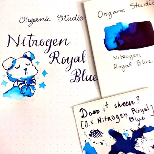
Tested on Rhodia Pad, Strathmore 300 Smooth Bristol Pad, and Borden & Riley Paris Paper for Pens paper.
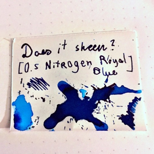
What is sheening ink? The word “sheen” is used for ink with properties in which the color will change in different angles under the light, similar to how Interference or Duochrome paint. Typically it is caused by a chemical reaction within the ink itself, especially in concentrated pigmented ink.
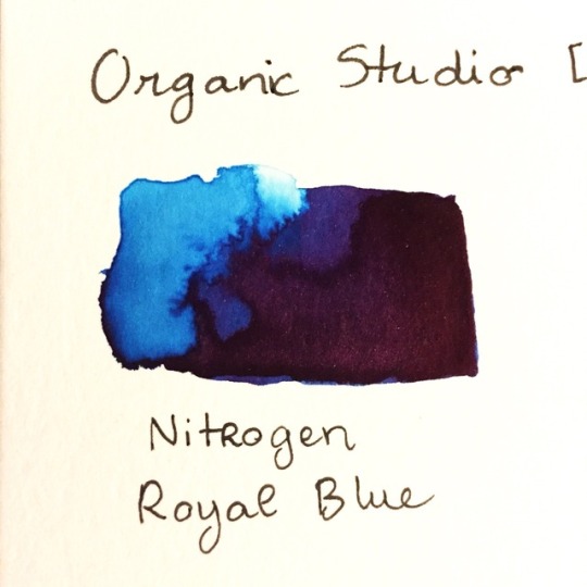
Swatch made on Strathmore 300 Smooth Bristol Pad. The diluted part display it’s true teal blue color while the concentrated area looks more like a dark purple in the light.
Swatch made on Borden & Riley Paris Paper for Pens paper.
I finally obtained my box of Nitrogen Royal Blue at my first Pen Show (Atlanta Pen Show). This ink came in a very modest plastic bottle with a brown cardboard box compare to the punch that it packs in term of popularity and ink property. Nitrogen Royal Blue sparked a whole wave of interests toward sheening inks.
Drying time: Very slow (we’re talking a whole minute here, even on photocopy paper)
Water resistance: None.
Feathering: None, even on photocopy paper
Bleeding: None
Pricing: $12-15 (55ml) at Goulet Pens and other retailers
Also available as 2-4ml sample for $1.50-3 at Goulet Pens, Vanness Pens, and Pen Chalet
Thoughts:
Nitrogen Royal Blue has a lovely color with a lot of sheens, although it’s ink property are compensated by the ink flow, water resistance, smudge resistance and drying time. It has clogged every fine nib pen that I own (including the Pilot Stargazer which makes it a hard start and the Pilot Cavalier that makes it a pain to write with). For that, I would recommend a flex nib or broad nib pen that you don’t need to use for quick note because boi this thing has ZERO water resistance and will smudge on you if you need to jot something down quickly. Using a broad nib pen will also allow this ink to display its full range of glorious sheen that you can make some really cool calligraphy and art with.
#ink review#fountain pen ink review#ink#blue ink#sheening ink#usa ink#american ink#teal blue ink#organics studio#organics studio ink
0 notes
Text
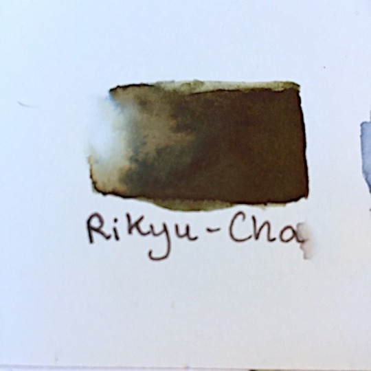
Ink Review: Rikyu-Cha by Sailor
Hey guys! Sorry for the late update but today’s ink of choice is Rikyu-Cha, part of Sailor’s Jentle series which suppose to depict colors from Japan’s season shifting. It was later re-released to as part of Shikiori line on smaller glass bottles.
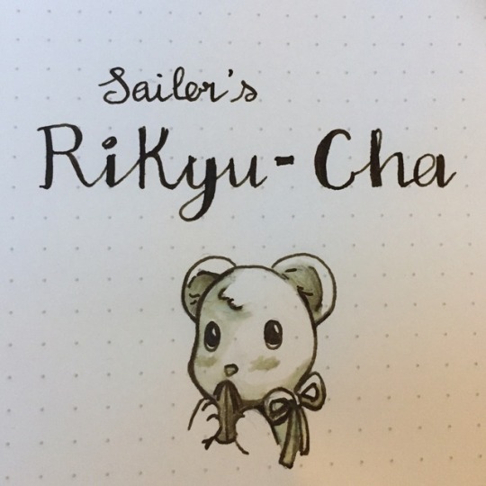
Image sketched on Rhodia pad with brush and Wooden Custom Pen with German Bock nib
Sailor is one of the most well know Japanese ink and pen manufacturer from their own line of pens and ink to exclusive inks made for specific department stores such as Bungbox/Bungubox.
Tested on Rhodia Pad and Borden & Riley Paris Paper for Pens paper.
Swatch made on Strathmore 300 Smooth Bristol Pad
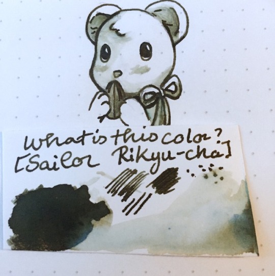
I managed to get the 50ml bottle when it was on closeout at Jetpens.com ( some other stores such as Anderson Pens are still carrying it at the moment). This ink is now sold as part of the Shikiori line which comes in a 20ml glass bottle instead. What impresses me about the old 50ml bottle compare to the new classy 20ml ones was that it comes with an ink feed that I can fill my pen without any possible accident although 20ml definitely saves me a lot more cubicle spaces. My first impression with this ink (and other Sailor ink I’ve used so far such as Sailor Jentle Sakura-Mori and Sailor Shikiori Shimoyo) is the strong plastic like smell coming from either the bottle or the ink itself. The ink’s color is fantastic as it reminds me of dried tea leave that my grandma likes to brew into drinks in the evening. When diluted it gives a full gamut of brown, dark green and a tinge of blue that would be interesting if you like to do a wash with it.
Drying time: Very Fast (3-5 seconds)
Water resistance: Pretty good (Will fade but still very much readable)
Feathering: None
Bleeding: None
Pricing:
$15-20 (50ml) at Pen Chalet, Anderson Pens and The Nibsmith
$12 (20ml) at Jetpens [Clearance]
(All pricing listed are taken off online information at the moment this post was written and only to be served as reference)
Thoughts
I’ve seen a lot of positive reviews on this ink and the actual product does not disappoint me at all. It flows really nicely on my M size bock nib and maybe next time I will fill this ink on a broad or even flex nib to fully showcase its range of colors.
This week’s color theme is blue and green so stay tuned for the next update!
#ink#fountain pen ink#green#green tea#dark green#brown#green brown#brown green#sailor ink#shikiori#sailor jentle#sailor shikiori#rikyu cha#rikyu-cha#sailor rikyu-cha#japanese ink#fountain pen ink review#ink review#inktober 2018
3 notes
·
View notes
Text
Ink Review: Calle Real by Papier Plume
Thoughts: Hi everyone! Sorry for the lack of update last week but since Inktober is so close, I’ve decided to do one review per day for the entirety of this month! Starting with another ink bottled in the U.S.A.: Papier Plume’s Calle Real! You guys might have noticed that I’ve swapped the position between the ink name and the manufacturer on my ink review title, it’s because I think it would be easier to classify/ find with the url being the ink’s name instead of the brand to avoid duplications/confusion.
Well, onto the good stuff!
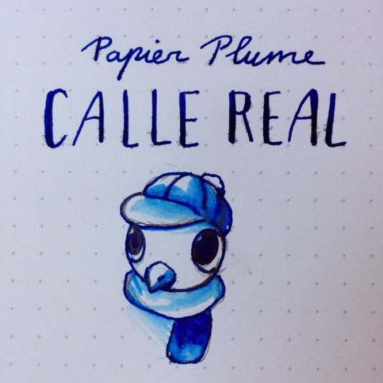
Image sketched on Rhodia pad with brush and LAMY AL-Star (M)
Papier Plume is an U.S.A. based stationery and gift store in New Orleans, Louisiana. They sell wax sealing tools, journals, ink as well as bottled their own line of ink (produced in France).
Last spring/summer, I had the opportunity to attend the Atlanta Pen Show for the first time and acquired some Papier Plume goodies from their booth.
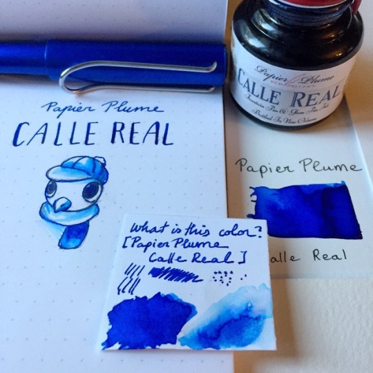
Tested photocopy Rhodia Pad, Borden & Riley Paris Paper for Pens and Strathmore 300 Smooth Bristol Pad. Feature a LAMY Al-Star (M)
Inside a glass bottle topped with red sealed waxed cap (featuring a Fleur-de-Lys seal), Calle Real is a very vibrant warm blue ink that is part of Papier Plume’s 2016 New Orleans ink collection. The ink is inspired by Calle Real, a street in New Orleans that was named after the time the city was under the Spanish rule as the capital of Louisiana. Even when diluted, this ink leaves a nice icy blue stain. My biggest complaint is the feathering and bleeding of this ink making it mildly annoying for quick notes.
Drying time: Average
Water resistance: Somewhat.
Feathering: More than average
Bleeding: Quite a bit
Pricing: $8 (30ml) at Papier Plume online store
Also available as 4ml sample for $2.50 at Vanness Pen
Thoughts:
At first, I was thinking to myself like “ah sure, let’s get a middle of the color wheel true blue ink for painting purposes” but wow did I warm up to it. My biggest hangup to the ink is the fact that yes it flows well but also bleeds quite a bit even on paper such as Rhodia but whew does it look beautiful on bristol. I would recommend to either use a fine nib pen if you want to use it on daily basis, although I would imagine this ink being perfect for either art use or card stock calligraphy.
Stay tuned for tomorrow’s Inktober post!
#ink#Fountain Pen Ink#fountain pen ink review#papier plume#calle real#blue ink#blue#sapphire#warm blue#warm blue ink#inktober 2018#usa brand#french ink
2 notes
·
View notes