
Don't wanna be here? Send us removal request.
Statistics
We looked inside some of the posts by aaronnieh and here's what we found interesting.
Average Info
Notes Per Post
103
Likes Per Post
100
Reblog Per Post
3
Reply Per Post
0
Time Between Posts
9 hours
Number of Posts By Type
Photo
17
Last Seen Tumblr Blogs


Fun Fact
Users from the US are the majority of Tumblr visitors.
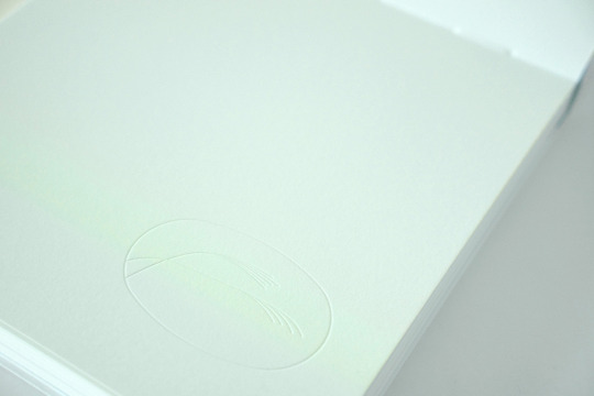
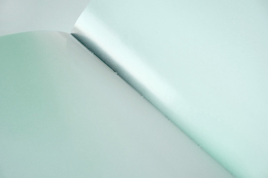
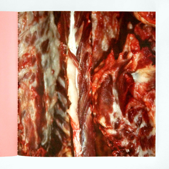
Photo
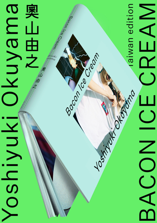
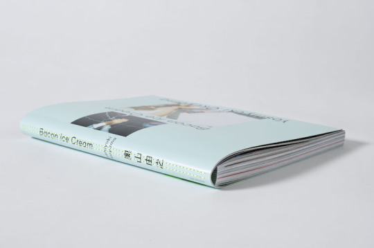
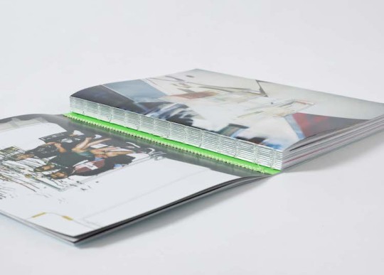

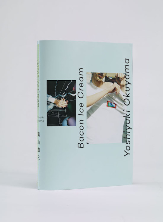
奧山由之 Yoshiyuki Okuyama — BACON ICE CREAM Taiwan Edition | Art Direction of Book 原點出版 Uni-Books 2021
2021年是日本攝影師奧山由之(Yoshiyuki Okuyama)攝影生涯的第10年。面向台灣讀者,他選擇重新出版攝影集《BACON ICE CREAM》,力邀設計師聶永真(Aaron Nieh)合作,加入日本版未收錄的34張新作,讓攝影集脫胎換骨,以嶄新面貌呈現。
不同於日版設計師服部一成充滿飽合度與新鮮輕盈的視覺,聶永真設計出兩冊一套、兩種用紙的形式,搭配特殊車線加工,來挑戰攝影書製作的細節極限與新鮮感;完整全文及書影請見:
重新建立觀看的儀式 聶永真談奧山由之攝影集《BACON ICE CREAM》台灣版設計 https://meet.eslite.com/tw/tc/article/202107290003
__
成書翻攝|林茂榮,原點出版提供
#BACON ICE CREAM#奧山由之#Yoshiyuki Okuyama#攝影#Uni-Books#原點出版#Book#Photo Book#photographer#Taiwan Edition
16 notes
·
View notes
Photo


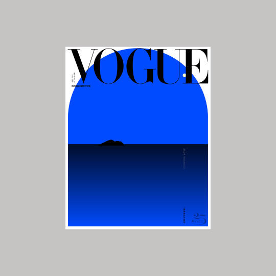
VOGUE Taiwan〈Formosa Love〉2021 July Special Edition Cover Magazine cover (paper) / NFT VOGUE Taiwan 2021
Design for the special edition cover of VOGUE Taiwan July issue, and later listed for the auction as VOGUE Taiwan’s first historic NFT on 25 September 2021. Echoing the subject ‘Formosa Love’, the image depicts the Pacific Ocean and Guishan Island scenery overlooked from the northeast coast of Taiwan on a peaceful night.
The bid for the NFT closed at 30 ETH (Approximately USD 80,000, according to the spot exchange rate at that time) on Foundation.app as the first NFT sold collection from VOGUEs worldwide.
7 notes
·
View notes
Photo
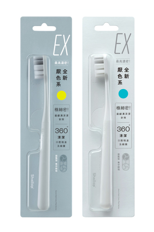
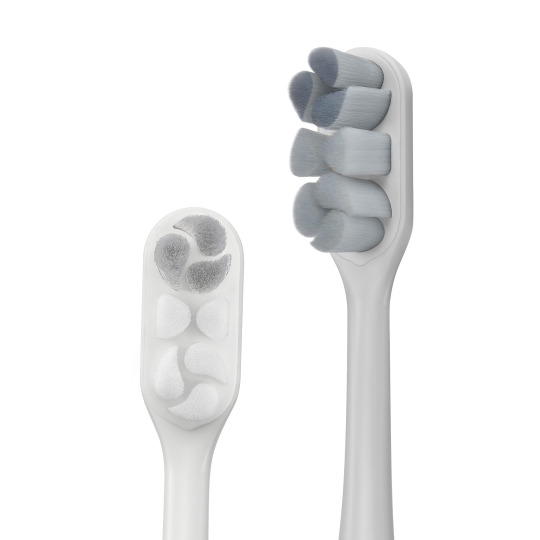
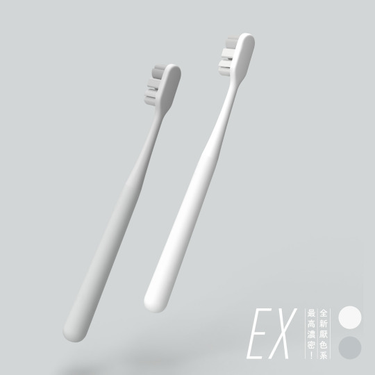
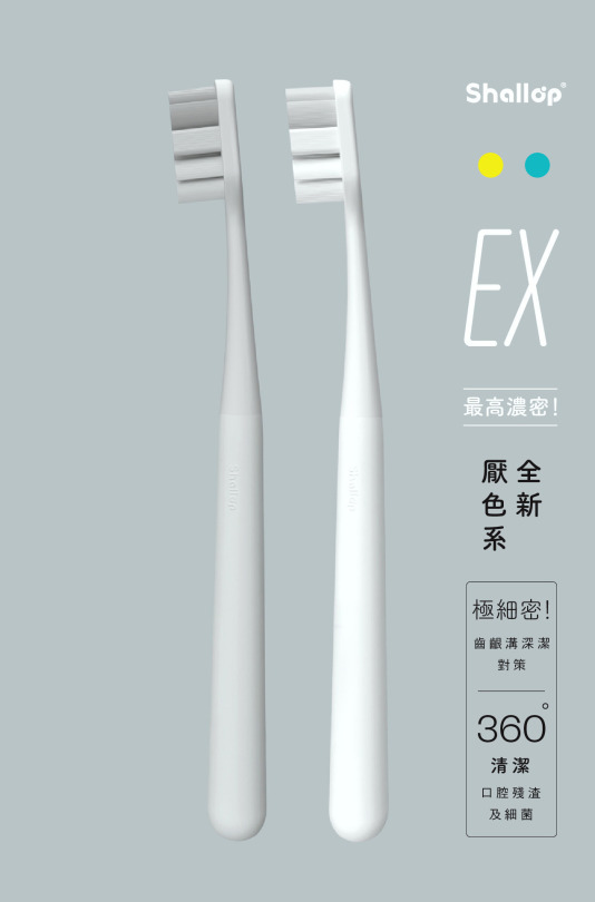
全新厭色系 — EX濃密深潔牙刷 A Brand New Non-Colour Plan — Super Dense Deep Clean Toothbrush 聯名包裝設計 Co-branded Design 刷樂 Shallop 2021
打破長久以來台灣牙刷市場從本體至外包裝,廉價用色及誇張造形的僵化品味,刷樂聯名設計師聶永真,從最親密且經濟的民生用品出發,透過品牌通路遍及率與研發資產,將牙刷外型、色彩與包裝導入減法思考;同時藉由中性用色去除性別刻板符號、為民生用品帶來全新美學景觀。
Since the market for toothbrushes in Taiwan stays the status quo in favour of overcolour and exaggeratedly shaped products. Shallop co-branded Aaron Nieh aims to offer a new facade a toothbrush design can reach, in the way of simplifying the figure, colour and package to break the conservative outdated aesthetic type and gender stereotype, through Shallop's properties of high market coverage and product R&D. The project meaningfully translates signifier into signified for a daily commodity.
13 notes
·
View notes
Photo

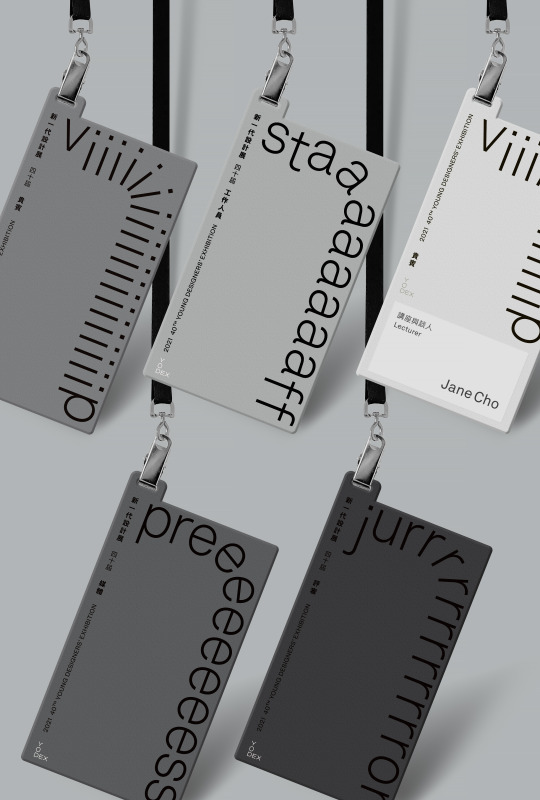


對話 Dialogue
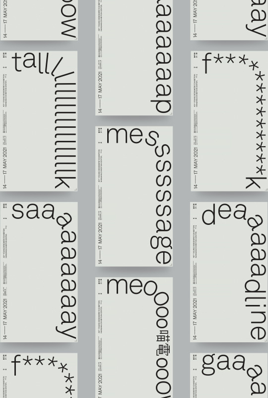
新一代40 | 2021年度主視覺 YODEX 40 |2021 Visual Campaign 台灣設計研究院(TDRI)/ 新一代設計展(YODEX) 2021
新一代設計展長期致力產學互動合作,是每年吸引萬名學生參與交流的重要平台,亦是設計界關注的大型展覽活動之一,2021年更邁入第40屆,藉由「對話」傳達雙向溝通拉近彼此連結。
主視覺概念以文本對話形式,運用設計師共通性語言字詞,將文字結構圖像化、基線極端上提,保持整體平衡空間和畫面節奏感;透過單詞轉折前進、重複性文字意境,具象化作品產製過程中的溝通反覆、冗長和曲折。文字排列略帶神經質、靈活彈性非通俗的表現手法,導入可變性識別(dynamic identity)、參與式設計(participatory design)概念,與參展校系透過互文行動開啟對話空間。
配合依序的活動宣傳階段,在基於主視覺的版式上堆疊、置入迷因、時事乃至於圖像,讓活動在前中後宣傳期具有可被識別面貌外,保有視覺新鮮度。讓整體視覺於不同媒介相互傳遞行為同時,簡單直接地識別、傳播與擴散。
The annual Young Designers' Exhibition (YODEX) is one of the largest design exhibitions in Asia. YODEX is now entering its 40th year. With “Dialogue” as the visual concept for 2021, through the designer's relevant experience and common language words, convey the communication of designers at different stages.
With uniformly raising font’s baseline, the concepts of dynamic identity and participatory design are deliberately introduced on the posters to leave space for dialogues and intertextuality for participants. Exhibitors were asked to cast their voice, philosophy or grumbles by offering us one representative vocabulary as our design material. We promised to produce over 140 custom-made posters for all design departments in correspondence with the format of visual identity. Memes, symbols, social issues, or queer images will be intentionally put on some posters if appropriate.
Besides physical outputs, the complete visual outcomes were digitally made in motion at the exhibition's entry. As well as online key-visual generator on Facebook let netizens share what is on their mind in the same visual way. As an atypical key visual - its clear recognition in this campaign is perfectly made by participants' diverse messages.
-
youtube
YODEX Visual Identity 2021 | Official Edition
youtube
YODEX Visual Identity 2021 | Custom Motion for Schools
9 notes
·
View notes
Photo


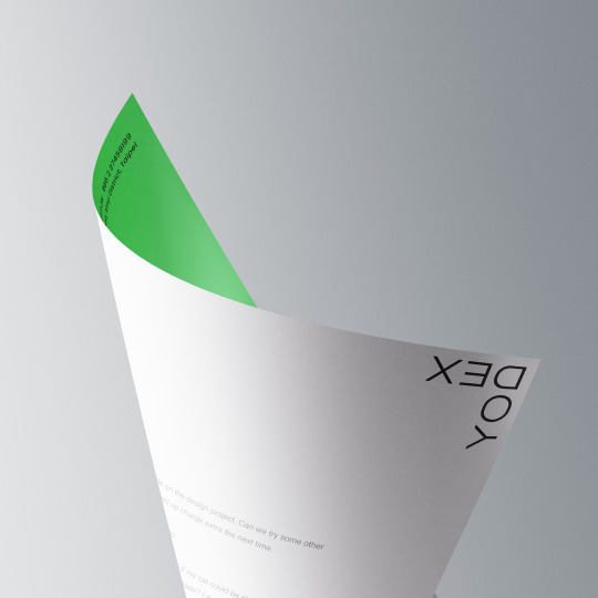


新一代設計展 YODEX(Young Designers' Exhibition) Brand Identity 台灣設計研究院(TDRI)/ 新一代設計展(YODEX) 2021
新一代設計展創立40週年,以全新Logo識別展現新一代新型態與突破。因應新世代美學和符號溝通信息氛圍,重新建構識別形象,塑造出適性強、機動性和易識性品牌識別,為新一代設計展注入創新形象。
運用品牌英文字縮寫構成標誌主體,與中英標準字機動性配搭,著重整體字型諧和、平衡度與字間、字句排列細節感。定位於「邊緣」及「角落」特性,多元視角、彈性靈活的可變性標誌(Dynamic Logos),更寓意著「The Same Difference」,識別標誌的取用可存在於不同情境組合與媒介中,而不侷限於單一形體,也正呼應新一代設計人自由不設限和不拘ㄧ格的特質。
The 40th Young Designers' Exhibition (YODEX) has announced its rebrand of logo identity, symbolizing a change in the evolution of YODEX.
For adapting to the new generation of aesthetics and contemporary symbols, the new logo reflects a new era with adaptability, mobility, and legibility identity of the brand. Stylized the logotype by an abbreviation of the brand, combining the features of "edge and corner" with multiple perspectives, which represent "The Same Difference" as the dynamic logo.
-
Context & visual plan by 永真急制 Workshop Team members for the visual/ 陳燻雞 Even Chen, 魏仁祥 Xiang Wei, 聶永真 Aaron Nieh Project Manager/ 林彥君 Janice Lin Motion graphics/ 江品緒 (Chiang PinHsu)
5 notes
·
View notes
Photo
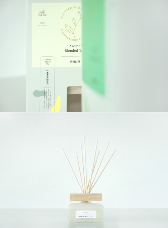
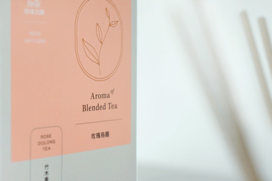
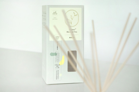
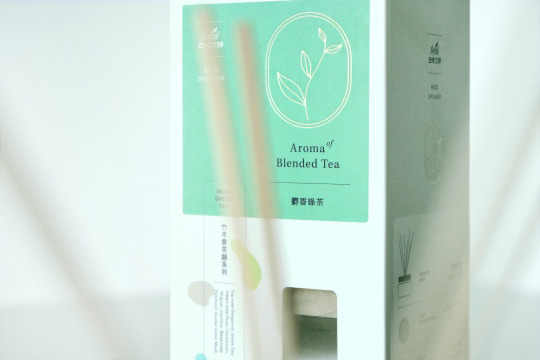
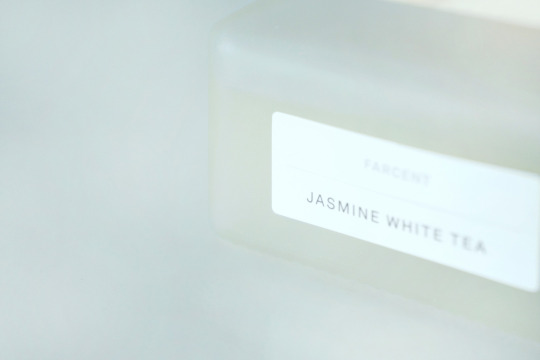
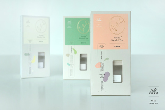
植感茶香氛系列(擴香)Aroma of Blended Tea(Reed Diffuser) 聯名包裝設計重塑 Co-branded Rebranding Design 去味大師 Farcent 2021
為開架式國民品牌〔去味大師〕所重新設計的經典擴香系列包裝。
以全新打造的霧面擴香瓶器,傳遞「茉莉白茶」、「玫瑰烏龍」及「麝香綠茶」三種經典花香調合之清新茶韻,並透過視覺識別及包裝的翻新,賦予去味大師經典擴香產品系列全新的品牌表情。
4 notes
·
View notes
Photo

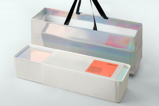
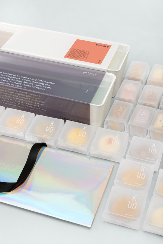
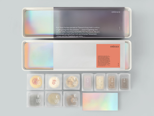
embrace 郭元益 X 聶永真 155周年紀念禮盒 KUO YUAN YE x Aaron Nieh 155 Anniversary Souvenir Box 郭元益 KUO YUAN YE 2021
心意,沒有規則 ● 對你的好,不拘一式
對這座島嶼上多樣價值的並存感到驕傲、為我們的選項自由、觀點自由、理念自由、依存自由、心自由與新自由——精心訂製全新形式的糕點餅乾組合,融合經典味蕾及風味創作,收存配得上每⼀個多元靈魂的美學喜悅。心意很感性、偏執很稱職,這是我們雙手奉上的最美致意。
郭元益承襲臺灣傳統的送禮⼼意,同時擁抱當代。郭元益聯名聶永真設計全新訂製款155周年紀念禮盒 ,同時帶來品牌對文化禮俗辯證與深層思考。新款禮盒以「embrace」命名,象徵承襲傳統送禮心意,也擁抱當代價值。
Thoughtfulness has no rules or limits - the best gifts come from the heart.
Kuo Yaun Ye has carried on Taiwan's long-held tradition of gift-giving into the present – never forgetting who we are while marching resolutely into the future. We are immensely proud of our rich and diverse Taiwanese values and the freedoms we enjoy – freedom of choice and expression, and freedom of the heart. Kuo Yuan Ye's latest pastry giftset was painstakingly and meticulously designed to innovate upon the signature flavours and textures with a touch of fusion – combining the best of the past and present – a true expression of our hearts and souls – a gift born of our utmost regards to you.
4 notes
·
View notes
Photo
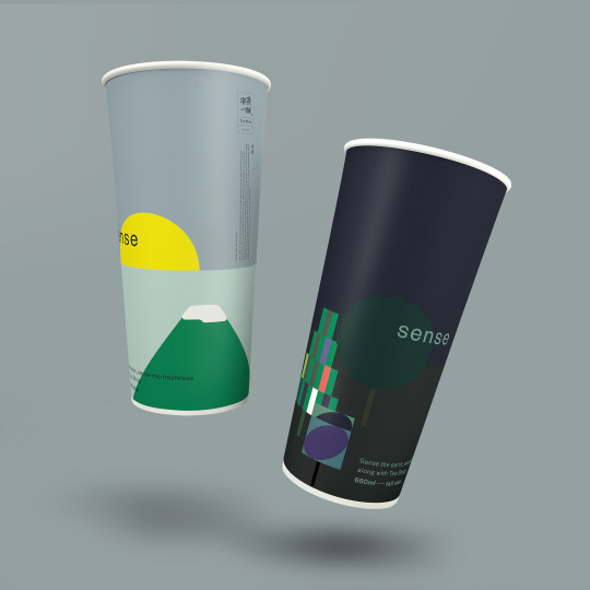


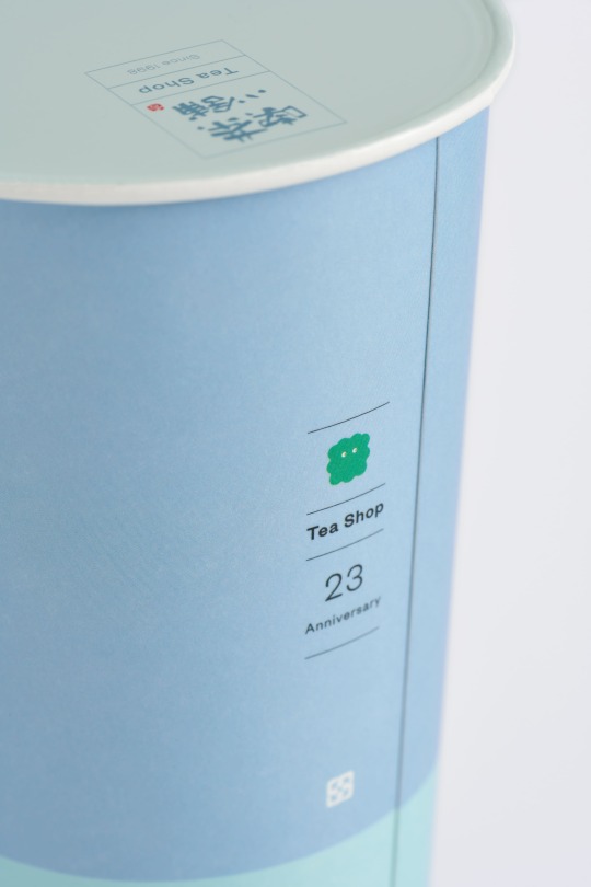
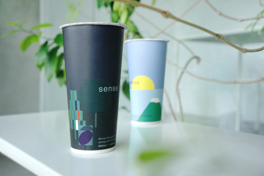
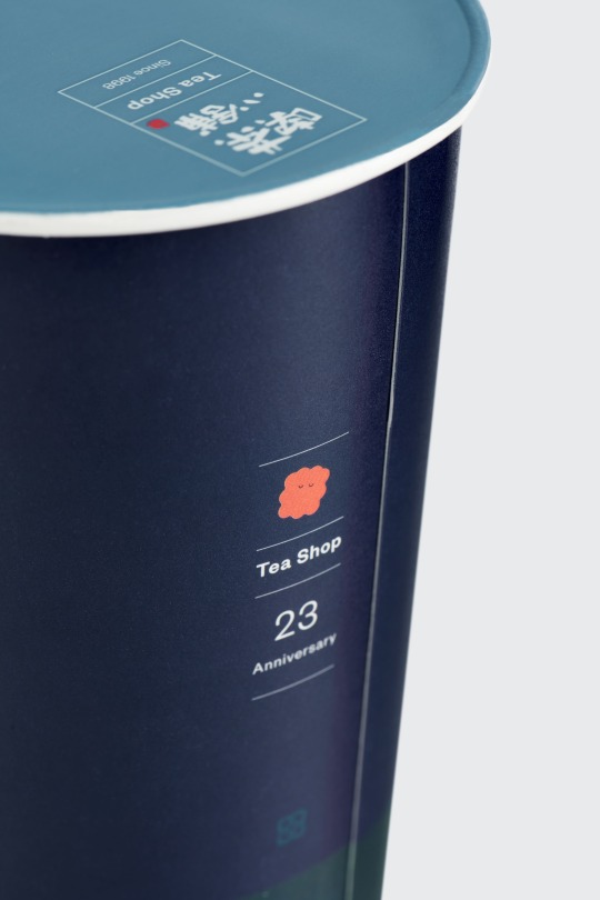

SENSE 聯名限量杯設計 Co-branded Cup Design of Limited Edition 喫茶小舖 Tea Shop 2021
手搖茶飲品牌「喫茶小舖」2021年季節限定新裝;以「SENSE」為設計概念、白天與黑夜兩款杯身主題之設計,分別象徵著孕育茶葉的陽光、空氣和水,以及茶山與富饒土地。同時也將「喫茶小舖」深耕台中20多年來對品質的堅持與理念融入其中 — 用心感知與感受季節變化與飲品之間的緊密關係,反轉品牌的老牌印象,也預告品牌未來的全新發展。
7 notes
·
View notes
Photo


youtube
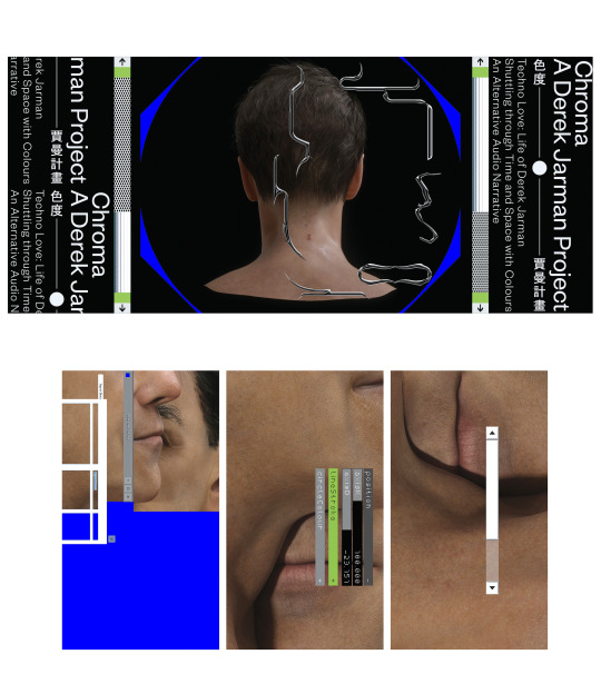
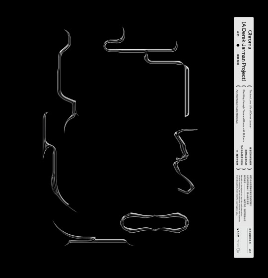
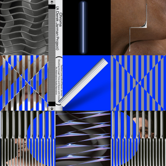
色度—賈曼計畫 Chroma—A Derek Jarman Project Key Visual & Programme booklet
3D modelling by Mark Chang C-LAB / Director Baboo Liao 2020
The graphic design of key visual, for the VR experiencing piece "Chroma: A Derek Jarman Project" including in warming-up visual and banners promoting in social media, and programme booklet (prints).
10 notes
·
View notes
Photo

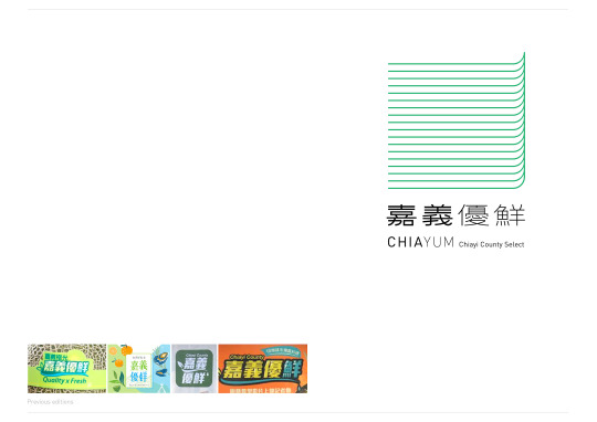


嘉義優鮮 CHIAYUN Brand Identity 嘉義縣政府 Chiayi County Government 2020
嘉義縣政府致力推動在地農特產品商品化,為翻轉傳統農業既定印象,重新定義「嘉義優鮮」品牌形象,提升農業轉型創新能量,打造嘉義縣高品質新農業實力。
「嘉義優鮮」品牌視覺識別重塑,結合農業精神與當代設計元素,將嘉義優鮮原英文副標「Quality & Fresh」捨除,新加入「Chiayi + yummy = CHIAYUM」之品牌英文名。識別標誌設計概念則將嘉義縣轄內囊括18鄉鎮市做為視覺骨架,在極簡易於記憶的形態中,以18條清爽梳理的綠色線條描繪出「田」及「田埂」的意象,從起點萌芽滋長,象徵農作的基線、施培、育成及韌性。並延伸出漁業專用之視覺標示,保有視覺一致性的同時兼顧多元產業的使用。
透過當代設計闡述傳統農業創新理念,感受嘉義縣優質、可口、精緻農業的核心價值。
Along with the rebrand of specialty goods launched by Chiayi County Government, the new visual identity combines agricultural spirit with contemporary design elements comprises 18 green stripes. The form of the mark represents the number of townships in the county and resembles the "田" suggesting paddy fields in Chinese character, symbolizing the germination and unity of agriculture in the way of abstraction and transformation. The specifically applicable version made for the aquatic product on an equal basis as the main logo, offers both flexibility and coherence of the need in diverse industries.
Besides the new logo, the naming replaces the previous “Quality and Fresh” with “Chiayum” as a new brand addressed, which is a combination of “Chiayi” and “Yummy”. Signify the expression of delicious and taste feelings in a smarter way.
#嘉義優鮮#嘉義縣#CHIAYUN#Brand Identity#chiayi#chiayi county#Visual Identity#Fruit package#agriculture design#agriculture branding
10 notes
·
View notes
Photo


盧葦〈新港的風〉Lu Wei The Wind of Xingang Album Design LuLu Reed Studio/ Ho Vision Entertainment 2021
The album of "The Wind of Xingang" is presented by musician Lu Wei, graphically designed in a minimalistic style with graceful tones of gradient colour throughout the album, giving the impression of the sea and the breeze.
The album packaging is bound with the particular hardback softcover, as well as UV printing on mat acrylic sleeve. Printing required several months of processing with proofing, colour correction, and testing binding structure by the specific materials and printing technology.
在每一個離家的旅途上、每一秒身在異鄉的記憶回返裡,越想封存的,越是抽象模糊;只記得拂在身上的風、太平洋上的月——溫潤氤氳、薄霧隱隱。而我們都知道記憶是不牢靠的東西,那些都只是情感的修辭,我們用遠行換取必要詩意的甘願,在鄉愁中迷路、在距離裡飢餓、在孤獨時睡著。
優雅色調、極簡的封面設計,全專輯圖像以漸層構成,多一份對海的想像和微風吹拂輕柔的氣息。專輯構成媒材以軟精裝紙本裝幀加上霧面壓克力直噴方式,為克服特殊材料和印刷製作技術難度,專輯設計印製過程歷時數月,經過無數次外殼打樣、校色、結構討論以及藏在紙本中特殊裝幀工法的測試,最終順利將這份歷經各種印刷製作磨練的實體唱片完成、順利發行。
3 notes
·
View notes
Photo


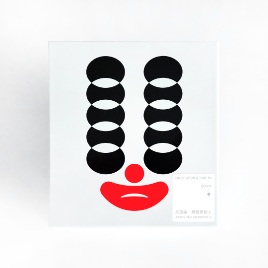
炎亞綸〈摩登原始人〉Aaron Yan Metropolis Album Design Sony Music 2020
Christened “Metropolis”, the singer Aaron Yan’s album not only carries songs of various genres but reinterprets relativity by Juxtaposing a number of opposite images representing concepts of time, media and evolution.
With simplicity and pure white tone of the design elements, the album package brings out the style of the monochromatic icon on the cover and contrasting images on spread pages in the inner booklet, along with a distinctive way of binding another booklet which lyrics are colorlessly embossed.
“Metropolis” has won the Best Design of 2021 Golden Pin Design Award and the Red Dot Design Award of Germany.
專輯設計從封面到詞本內外,以白色做為整體基調,襯托出封面上單色帶點可愛療癒抑或邪氣的ICON設計。純白包裝外盒搭配內頁全歌詞打凸加工之特殊印刷技術而成。
在「摩登」與「原始」時間論對照關係概念下,歌詞本內頁視覺則透過左右對比滿版圖像,一一呈現各種同時共存但概念互斥的時空、情境及事件。
此作品雙獲2021年金點年度最佳設計獎及德國紅點設計獎。
3 notes
·
View notes
Photo

Sign Switching For Brussels Station Self-initiated work 2020 A Tokyo TDC Prize Nominee Work of 2021
The idea is made for international travellers to solve their confusion in recognising the station name, as there are two official languages of French and Flemish Dutch in Belgium while Brussels station is one of the most important hubs in Europe with displaying its station name in two spellings of languages but not fully understood by all.
This demonstration aims to make the station sign visually movable to help the travellers arriving by train to catch the station names in a very short moment.
#brussels station#Brussel-Zuid#Bruxelles-Midi#Brussels-South railway station#TokyoTDC#Sign Switching
3 notes
·
View notes
Photo
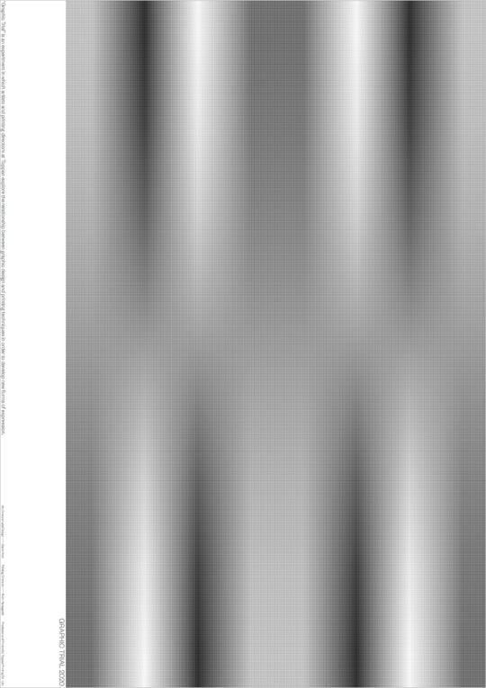
Series | OUT OF SIGHT
GRAPHIC TRIAL グラフィックトライアル 2020 ‘Baton’ A poster work co-exhibited at the P&P Gallery, Printing Museum B1 (728mm x 1030mm) 2020/ 2021
Organization/ Printing Museum, Tokyo & Toppan Printing Co., Ltd. Planning/ Toppan Idea Center & Toppan Printing Co., Ltd. Endorsement/ JAGDA (Japan Graphic Designers Assoc. Inc.)
3 notes
·
View notes
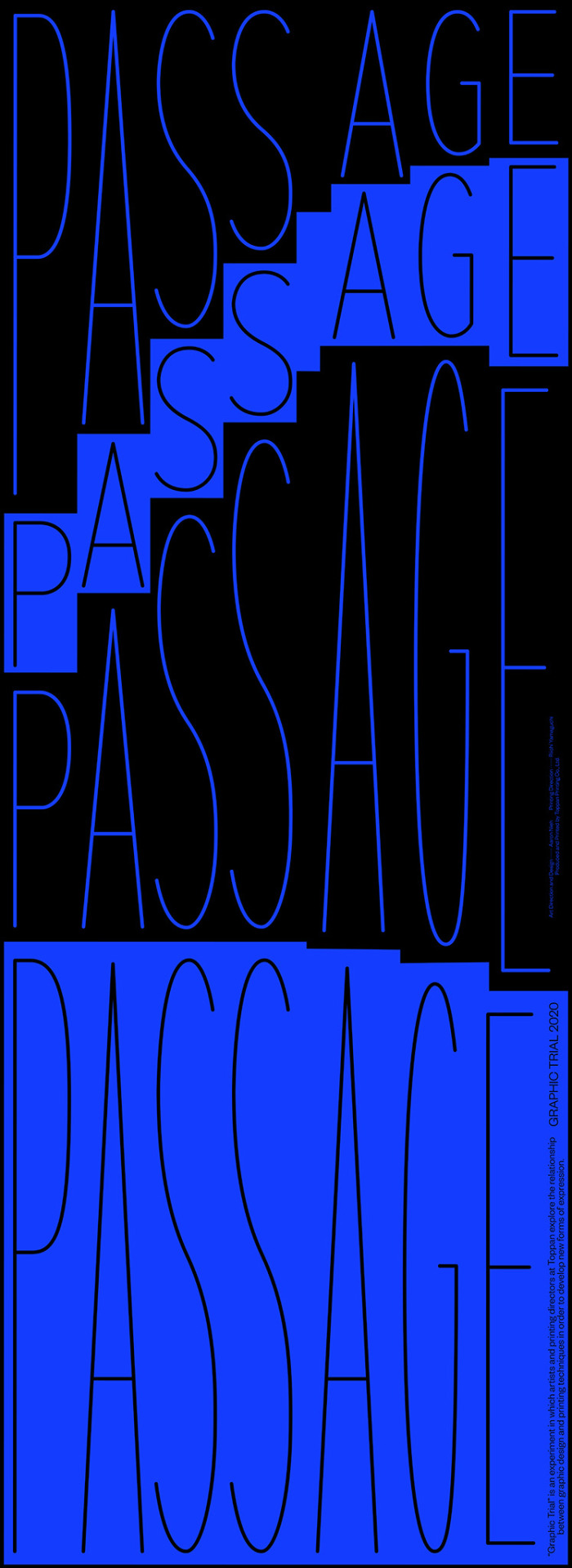
Photo

Series | OUT OF SIGHT
GRAPHIC TRIAL グラフィックトライアル 2020 ‘Baton’ A poster work co-exhibited at the P&P Gallery, Printing Museum B1 (728mm x 1030mm) 2020/ 2021
Organization/ Printing Museum, Tokyo & Toppan Printing Co., Ltd. Planning/ Toppan Idea Center & Toppan Printing Co., Ltd. Endorsement/ JAGDA (Japan Graphic Designers Assoc. Inc.)
2 notes
·
View notes
Photo
Series | OUT OF SIGHT
GRAPHIC TRIAL グラフィックトライアル 2020 ‘Baton’ A poster work co-exhibited at the P&P Gallery, Printing Museum B1 (728mm x 1030mm) 2020/ 2021
Organization/ Printing Museum, Tokyo & Toppan Printing Co., Ltd. Planning/ Toppan Idea Center & Toppan Printing Co., Ltd. Endorsement/ JAGDA (Japan Graphic Designers Assoc. Inc.)
2 notes
·
View notes