
Statistics
We looked inside some of the posts by bdpowers-blog and here's what we found interesting.
Average Info
Notes Per Post
1
Likes Per Post
1
Reblog Per Post
0
Reply Per Post
0
Time Between Posts
4 days
Number of Posts By Type
Text
3
Photo
12
Link
2
Last Seen Tumblr Blogs


Fun Fact
Mobile US users spent an average of 115.8 minutes on Tumblr app monthly.
Text
Week 11 Reflection
Through this module, I learned to think about photography in new ways that I have never considered before. I think more carefully before I take pictures now about what I include in my pictures and the angles in which I take them at. Framing is one of the most important skills I have taken from this module, as what you include or do not include in a photograph can totally change its meaning. Angles in which I take photographs matters as well, I can’t just take a picture at whatever angle is most convenient for me. For example when I take a picture of my friends from a low point looking up at them, it give them a sense of power while it would be the opposite if I was take one from above. Although I am not one to take many photographs in my daily life, I am trying to incorporate these specific skills into my photography when I am called upon.
0 notes
Photo


For “The Londoners”, I chose to record tube travel since it is such an important part of the daily life of a London commuter. My particular version of this records the tube at night, including two friends joking together and then the tube passing by. I cropped the image of the two friends joking around so the viewer can really focus on their interactions, with the blue poles acting as a frame for the picture. On the picture of the tube passing by, I took multiple pictures but I felt the one show the door was the most appropriate representation of the tube from the outside. The orange color of the door contrasted well with the bright white of the tube.
0 notes
Text
Week 10 Photography Analysis
1. He chose to highlight the expressions on the peoples’ faces, how war is not glorified. It is a terrible thing and people suffer from it.
2. The larger texts gave me a background to understand what the people in the photographs may be going through. It helps give me a sense of sympathy for these people although I will truly never understand how it feels.
3. I think it is controversial that the photographer captures photographs of people struggling without helping. On one side, this gives the viewers the blunt truth that the world can be a dark place, but on the other hand, it feel wrong that he gets to photograph some of these peoples’ last moments without helping.
4. As privileged people, we often see the benefits from what humanity has accomplished, but we don’t see the bad sides of what humanity has done. We don’t witness those that struggle from hunger and war, and this photography wants us to understand that.
Cambodia Exhibition:
5. McCullin took these brutal war photographs for the people back home to understand how war is a terrible thing.
6. He photographed people under fire and people dying to show viewers that war is not the glorified thing we often make it out to be. He takes the photographs in a way that seem real, like we are right there in war with him.
8. The photographer almost seems like he is not there taking pictures. Each photograph seems like a memory that is somehow caught on film.
0 notes
Text
Week 10 Activity
Chose image of old man:
1. The image highlights how the draught affected millions of people over Africa. It shows an older man traveling with children behind him.
2. The image proves that although it is true that these people were going through tough times, they were not weak. It is an empowering image of the older man as the camera is pointed upward towards him. He is standing up straight and looks strong, although he is most likely struggling to survive in these tough times.
3. The image helps us recognize that although these people may be going through tough times, they are still strong and powerful. They do not want to be depicted in a weak way so we feel bad for them, even though they are going through something worse than most people will ever experience, as shown by the text.
0 notes
Photo

This photo has bright green colors which contrast with the sad nature of the photo. The graves are highly visible as the pale colors also contrast with the vegetation. The area seems to not be kept up.
0 notes
Photo


1st pic*: A Look Between the Hedges
2nd pic: The Lost Boy
I took the original photo in Belsize Park because I enjoyed the view of the city. As I took it, I wanted to incorporate the dog playing near the bench, as it gave the photograph more life. It was only later that I came up with the idea that I could use the isolated dog for the idea of abandonment, hence my first title. The second title is simple and to the point. The third title compares the nature of the park to the modernization of the city. I cropped the photo in two different ways, one emphasizing the view between the hedges, looking toward the city. I got rid of the dog and bench, because in this version I wanted all the focus to be on the city, although it was partly obstructed by the bushes. The second crop (which was a better idea than final product) captured the lonely dog while taking the emphasis off the city in the background. I couldn’t completely get rid of the city in the background though, since the photo would be too narrow and didn’t look good.
0 notes
Photo

The Abandoned
The Beauty Beyond the City
London Parks
0 notes
Photo


In recreating the above photograph, I chose one of my friends that had a black turtleneck similar to the man’s in the photo. I chose a blank background because I couldn’t capture the plain background the way I wanted it when I was outside. I had my friend copy the serious facial expression and changed the color scheme to be black and white as well. In my own interpretation of the photo, I had my friend in the same position but smiling for a change. I think the two photographs contrast well, as they are the same except for the facial expression, and in response I added color to the second picture. Although simple, I felt as though this was an accurate depiction and interpretation of the original photograph. The idea to style the photographs the way I did took much more time and effort than taking the photographs themselves.
0 notes
Photo

This is Daido Moriyama’s photo #5 on the Japan Photo Theater gallery. This is a portrait photo of this man against a light blurred out background. The image is in black and white and the man is the only thing in focus. It is a headshot from just below his shoulders up to the top of his head. His black turtleneck contrasts with his pale face, and then back to his darker hair. The mood of this photographic is serious and calm. The photograph is only of the man wearing the turtleneck since the background is blurred out. The photograph is about this man and possibly his life struggles. His face is serious, and maybe hints at a bit of regret. He is well kept but looks to be at least late 50s. He seems to be thinking about something and all the focus is on him and his expression since the background is blurred.
0 notes

Photo


These 4 photographs show something thought of as ugly, in a beautiful way. A bathroom is never really thought of as a beautiful place, but I tried to change that perspective through the ways in which I captured these images. Going through the bathroom, I took images of the appliances in ways that complimented the appearance of them. The sequence in which I took these photos gives the person a 360 appearance of the main features of a bathroom without taking one large photo. From entering the bathroom, you seeing the sink, then toilet, then shower, and finally door if turning clockwise. I took the pictures as close ups to help capture the beauty of the clean, shiny appliances without showing too much of the bathroom.
0 notes
Photo


These images of the railway taken from the Shard shows different angles of the railway from above. These images offer a different perspective on something many probably view as ugly, as it is lit up and beautiful when taken from above at night. The different shots show the unique shape of the railway as it converges into one as it goes further away from the point of view of the shot.
0 notes
Photo


In the first picture, the entire photograph is lit up, causing for a plain bland look to the picture. In the second photograph, there is very minimal light in the picture, making it hard to distinguish the features on the subject, giving a more eerie mood. In the third photograph, only half of the subject is lit up, giving the photograph an interesting aspect to it. It appears mysterious that exactly half of the subjects body is lit and clearly visible. The fourth photograph with the pink light gives the picture a prettier look. The mood is calming, as the soft pink light does not give off a strong message as the white light does. The photograph with the horizontal lines of light gives the photograph a complex aspect to an otherwise simple environment. The subject’s eyes are covered in darkness while the rest of his face is lit up. The final photograph shows the subject’s face lit up in an otherwise dark room. This causes the subject to cast a shadow on the wall behind him, and the feeling is more secretive.
0 notes
Photo


Cecil Beaton
Self Portrait
1930
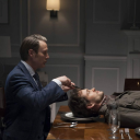
I think the use of light is one of the most important elements in creating this photograph. Beaton compares a skull to a man holding up his arms by placing the skull over the dark image of the man. The man is in the dark, and this gives the opportunity to place the eerie white skull over his dark outfit in the editing of this image. This creates a frightening image that was intending to compare life and death. It is meant to serve as a reminder to the living of mortality. This photograph was most likely taken with a large aperture although it is hard to tell because there is not much of a background to this photograph.
0 notes
Photo


Brassai
Graffiti
1933-1956
This photographic series is of different pieces of markings or carvings on walls throughout Paris. The purpose of this series is to show the different forms of graffiti, and represent them in a way which gives the carvings “character”. Most of the pieces represented above show a face in some sort of way. Each carving has a unique style with separate shapes or designs. But, each of these pieces are similar in the way that they all create a mood, with the silly faces that can be seen within the designs. I do not believe sequencing is particularly important in this series, as there is no timeline to when each of these pictures was taken, and each photograph is taken from a different place most likely.
1 note
·
View note