
Statistics
We looked inside some of the posts by htkinetictype and here's what we found interesting.
Average Info
Notes Per Post
0
Likes Per Post
0
Reblog Per Post
0
Reply Per Post
0
Time Between Posts
46 minutes
Number of Posts By Type
Video
7
Photo
8
Link
2
Last Seen Tumblr Blogs


Fun Fact
If you dial 1-866-584-6757, you can leave an audio post for your followers.
Video
tumblr
Final
This is my finished kinetic type video. I’m pretty pleased with the result considering the amount of problems and struggles I had along the way while learning how to use After Effects for the first time and running out of time to explore other ideas I had in my storyboards. But overall, I think its clean and fits the context and topic of Helen Clarks speech.
0 notes
Photo


Credits My credits page is very simple, I wanted to keep it in line with the style of the Title Page and Referendums Date page that follows the end of the speech. So I kept it to one page, still animation, and retained the leaf. I did edit this slightly though. Initially the credits were wide set, with ‘Credit’ in the center. But after watching it, it looked a little bottom heavy, so I decided to push the two columns closer together, moved it upwards, and kept an equal box around the outer edges using the proportional grids as my guides. The bottom picture is the end result.
0 notes
Photo

Paper Texture I used this image of creased paper by Marjan Blan, found on Unsplash. I wanted to use my own paper but because I don’t currently have access to a scanner where I could get a clean image (instead of photograph with poor lighting) I thought this was my next best option. I wasn’t sure if this was something I needed to credit in my animation, but I wanted to make sure I give credit to the photographer here.
0 notes
Video
youtube
Adding Texture I felt that my project was quite flat and needed some subtle texture. I found this video on YouTube that showed how you could create a subtle textured background the moved around and followed along. Some of the other background ideas I had included making a pattern of weed leaves, check boxes, leafy textures. I went with the creased paper look because it made me think of how people use cannabis, and one way is through smoking and using papers. It was also subtler than creating an illustrated pattern which I thought may take away from the text which is the focus of this animated video. The effect is so subtle its also almost unrecognizable, but adds depth and enhances overall animation and aids with the movement of the text.
0 notes
Video
youtube
Music Finding backing music or sounds for this speech was difficult. I browsed all the websites that were shared with us in class. I knew I needed to find a free one, which further limited my options. The Youtube Audio Librarys selection was quite good, and I ended up finding two songs that I thought might work. Timelapsed Tides by Asher Fulero and Pure Potentiality by Benjamin Martins. I knew the parameters of the sort of sound I needed to have: avoid something that sounded scary, avoid music that sounded too psychedelic and trippy, find something that sounded informative, informational, and a little bit futuristic/hopeful trying to convey a better future to our current moment. I considered having no sound, but decided the empty space, especially in the beginning and the end of the clip may be too much considering the audio clip is very abrupt in the way it starts and ends. Trying my best to describe sound, I chose Timelapsed Tides because of the beeping sound at the beginning, it sounded inquisitive, and reminded me slightly of the music used for newsrooms. The middle of the song has a synth sound with chimes that rise, which made it sound hopeful and relaxing rather than scary. I shifted the levels in after effects so the music was more obvious at the beginning and end of the clip, and softer in the middle while Helen spoke so the music didn’t overpower and become the focus.
0 notes
Photo
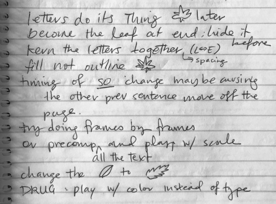
Feedback Some of the feedback I received in the group critiques. I took a lot of this on. Including: - Changing the tracking of the spacing of my words (I realized it was originally set at VA50 which is too much. Changing this shifted my words around the page and how they fit within the leaf slightly, but I adjusted them around so I could get the overall look still similar to what I wanted.) - The fill in the leaf instead of an outline. - Adjusting timing - Creating a serrated edge on the leafs edge.
0 notes
Photo

Say No To Dope
The Say No To Dope website uses a color palatte similar to mine, which I thought most people would use for anything cannabis related. But they’ve also created this image of an angry CBD gummy bear smoking a joint (which I think is quite clever) that sits next to different slogans.
This campaign is also quite effective and also carries several valid arguments on why you should vote no from a health & public safety standpoint. I don’t disagree with the comparison to the tobacco industry! They’re video campaign also focuses on people, using an interview/personal story style. Their campaign uses a lot more dark colors compared to the Yes Campaign video, and has more cannabis related imagery (smoke, joints, buds, etc.)
https://youtu.be/UwTdRzvSWCU
Neither videos had any animated type I could look at and compare to my finished project. I’m glad I didn’t see either of these campaigns until I had already finished my own project as I think they could have influenced me directly or indirectly in some way when I was conceptualizing.
0 notes
Video
youtube
On Our Terms Advertisement NZ Drug Foundation
This advert was interesting because when I saw it for the first time I didn’t realize it was about the cannabis referendum until they said so. It removes all weed-related imagery and depends more on a variety of kiwi faces narrating why they’re voting yes. Theyre website is also interesting because of the color and type choices are purple unlike the say no to dope ads.
0 notes
Photo


Using Opacity as a Transition & Reflections on my Design Shift Screenshots of the transition from the speech to the credits.
While my design was simplified massively from my original storyboards and original ideas, I am quite happy with the turn out. Because my speaker is a former Prime Minister, Cannabis already has a certain image attached in the media and pop culture, and this is a current topic that is discussing the near future, I needed my video to be informational, and exclude the negative associations attached to cannabis to explain to viewers the benefits of legalization go further than the recreational reasons. The way that Clark is straight to the point about her reasoning why she supports the referendum, the text follows this - no frills - just facts. I also looked at some other campaigns that surround the referendum and the treatment is very clean and minimal. The camera movement of zooming in on the words and then revealing the weed leaf is also metaphorical for “looking at the bigger picture”.
0 notes
Video
tumblr
Rotation Tool I used the Rotation Tool several times in my project, it took a few go’s to get the rotations looking like I wanted them to and the keyframes needed toggling to either slow or speed the movements up. The rotation at the end after the speech ends was one of the key rotations. One of the problems I had with my speech was that Helen speaks quite quickly and there weren’t many moments for slowing things down. One moment I had more time to play with was the end of the speech. I extended the rotation by taking a little longer to also fade the text before moving on to create a bit of a break between the speech and the credits.
0 notes
Photo

A screenshot of mid-masking when I was attempting to create the handwritten effect on the outline of the marijuana leaf.
0 notes
Video
tumblr
The Leaf Dilemma Prior to this version, I had the leaf outline visible through out the clip, listening to the advice I got in the critique sessions I kept it to the very end of the clip so the viewer follows the journey of the text, wondering where it’s going only to see the full image at the very end. This version of my project has the animated handdrawn effect on the leaf at the end. I followed the Youtube tutorial for getting a handdrawn effect for type, but it didn’t work so well on my vector illustration. I didn’t like the way it distorted the line. I tried to figure out why that was, but was unsuccessful. I also didn’t like the way it started at the top of the leaf, when I had started the outline with the pen tool at the bottom on the stem.
This led to me trying the work around of changing the outline illustration to a filled green leaf that transitioned by the text bleeding into the leaf using opacity which was suggested in one of my feedback sessions.
0 notes
Link
Youtube and rewatching the Weekly Video Tutorials were my saviour. This was the video I found the most helpful when learn how to keyframe color the way I wanted.
0 notes
Photo


Keyframing Color By the time I had finally got my text moving properly, I realized I wasn’t going to have enough time to add the illustrations I had originally planned to do on some of my words. I tried some simple animation, for example, making Police flash red and blue, but the color clash against the green looked terrible, and the legibility was poor. Because of this I immediately scrapped the color usage on the other words I had planned using it (drug, young maori).
This experiment gave way to a new idea though. Originally, all of my text was going to remain black and pop up one by one as Helen spoke. But as I watched it and as the camera moved from extreme close ups to mid-shots, I realized that it was hard to follow the speech and some of the words would fall into the abyss of text. I wanted the viewer to be able to follow each word, and thought a way to do this was by switching the color of the text after the word had been spoken. This became quite a tedious process, but I think it came out quite nice and enhanced the clip.
0 notes
Video
tumblr
Camera Tool Here is an example of the struggle I was having using the camera tool. The timing was no longer aligning with the words as they appeared on the screen. And as you can see most obviously with the “tobacco and alcohol” frame is that it was moving off the screen when I wanted it to be on the center of the screen. The class critique was really helpful and helped me move forward from this issue. Logan suggested I try doing this by precomping all the text, and then playing around with keyframing with rotation and scaling. This was a great work around, and I was able to have more control over the movement of the text that I was losing trying to learn how to use the camera tool properly.
0 notes
Link
To follow my text around the page, I read to do this I needed to use the Camera Tool and Null Object Tool.
This was one of the Youtube videos I referenced a lot while I was trying to do what I envisioned. Using the camera tool was really hard, I had split my sentences into different sections and spent hours trying to make the first sections move properly. I was finding that if I was zooming in or out that the following text would for some reason start moving even though I had keyframed it to a different place. I couldn’t figure out what I was doing wrong and sought out some help from my peers and the lecturers during our critique sessions.
0 notes
Photo


Title Two of my ideas for the opening sequence. Going with the style thats clean, easy to read, and minimalistic that you often see used in election campaigns.
0 notes