
Multifandom fics and masterlists of my fave writers mixed with some awsome gifs, gifing tutorials and resources. Tutorials // Gif resources // Writing resources // Gif inspiration
Don't wanna be here? Send us removal request.
Statistics
We looked inside some of the posts by moonflower-library and here's what we found interesting.
Average Info
Notes Per Post
10K
Likes Per Post
6K
Reblog Per Post
4K
Reply Per Post
11
Time Between Posts
14 days
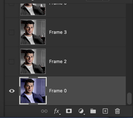
Number of Posts By Type
Text
9
Note
5
Photo
3
Last Seen Tumblr Blogs


Fun Fact
Hackers stole 65M passwords from Tumblr in 2013.
Text
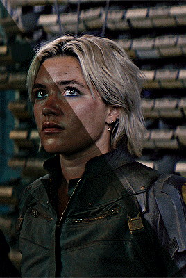
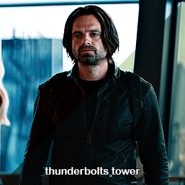
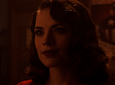
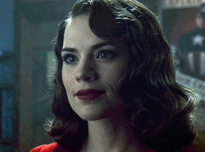
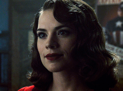
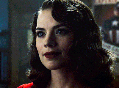
THUNDERBOLTS* PSD PACK requested by Anon, created by tana
includes [ 8 ] psds made by me. i tried to include various scenes from the movie. if you need a particular scene from thunderbolts, don't hesitate to reach out. i used the 4k movie, colored for general monitors. not hdr compatible. click to download. please credit or tag me in your sets if you use. can probably be used on other dark movies!
90 notes
·
View notes
Text

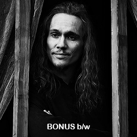
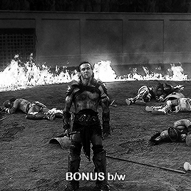
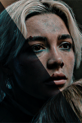
Eli's big preset pack!
Finally I have decided to make a little pack of some presets Includes:
7 colour presets
+ a bonus b/w preset
+ and another bonus captions (font: Ariel Rounded MT Bold)
Let me know if there's a specific scene you want a preset of, or a particular show. Please like/reblog if you download. I can be tagged in your creations at #userdickon Notes on the presets below the cut Download here!
The presets may need modifying to truly suit certain scenes, but hopefully this will be a helpful starting point.
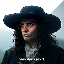
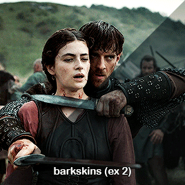
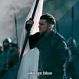
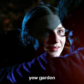
My personal favourite here is the barkskins preset. As you can see, it can be used in multiple different shows. I discovered making this, that the thundbolts tower preset may also work for similar scenes, although I found it a little magenta for them (easily fixed though) The vikings preset may not work for every shot of those (hellish) scenes.
88 notes
·
View notes
Text

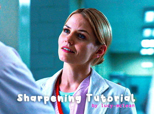
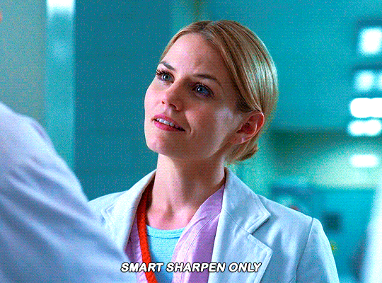
COLORING + SHARPENING TUTORIAL
someone asked for a coloring tutorial and my sharpening settings, so here it is! there are also a few tips to achieve more HQ gifs. :)
tutorial under the cut!
FOR HIGH-QUALITY GIFS
FILE SIZES
it doesn’t matter what your sharpening settings are if the file you’re using to gif is too low quality, so i tend to look for the best that i can get when downloading stuff.
usually, movies (+2h) look better if they’re 5GB or more, while an episode (40 min/1h) can look good with even 1GB. the minimum definition i try to find is 1080p, but i gif with 2160p (4k) when available. unfortunately, not every computer can handle 4k, but don’t worry, you can gif with 1080p files just fine if they are big enough. contrary to popular belief, size does matter! which means sometimes a bigger 1080p file is better than a smaller 2160p one, for example.
SCREENCAPPING METHOD
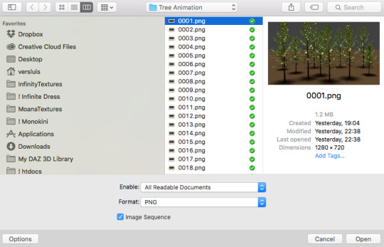
this can too influence the quality of your gifs. as a gifmaker, i’ve tried it all: video frames to layers, directly opening video clips, loading files into stack, and i’ve finally settled down with opening screencaps as an image sequence. with bigger files, it doesn’t matter much what technique you use, but i’ve noticed with smaller files you can do wonders if you screencap (either by loading files into stack or opening as an image sequence) instead of using video clips. for example, this gif’s original video file was only 4GB (so smaller than i’ve usually go for), if you can believe it!
here’s a tutorial for setting up and screencapping with MPV, the media player i use to screencap. again, you can keep using video clips for bigger files, but you’ll find this useful when dealing with dire causes. i don't file loads into stack, though, like the video does. i open as an image sequence (open > screencap folder > select any image > click the image sequence button). just select OK for the speed. this will open your screencaps as a video clip (blue bar) in timeline mode (i'm a timeline gifmaker, i don't know about you). you will need this action pack to convert the clip into frames if you're a frames gifmaker. i suggest you convert them into frames even if you're a timeline gifmaker, just convert them into a timeline again at the end. that way you can delete the screencaps right away, otherwise you will delete the screencaps and get a static image as a "gif".
ATTENTION if you’re a Mac Sonoma user, MPV won’t be an option for you unless you downgrade your system. that is, if you have an Intel chip. if you have M1 Max chip (or even a better one), here’s a fix for MPV you can try while keeping that MacOS, because nowadays MPV is skipping frames in its latest build. or you can use MPlayer instead for less hassle. here are two tutorials for setting and using MPlayer. Windows users are fine, you can use MPV without trouble.
FOR EVEN MORE QUALITY
ADD NOISE
here’s a tutorial for adding noise as a way to achieve more HQ gifs if your original material is too low quality.
REDUCE NOISE WITH CAMERA RAW
instead of adding noise, you can reduce it, especially if your gif is very noisy as it is.
the path is filter > camera raw > detail > nose reduction. i do this before sharpening, but only my video file isn't great to begin with. because it’s a smart filter, you can reduce or increase its opacity by clicking the bars next to its name in the layers panel.
TOPAZ AI
i use Topaz Photo AI to increase the quality of my screencaps when i need to. it’s paid software, but there are… ways to find it for free, usually on t0rrent websites. if someone’s interested, i can make a tutorial solely about it in the future.
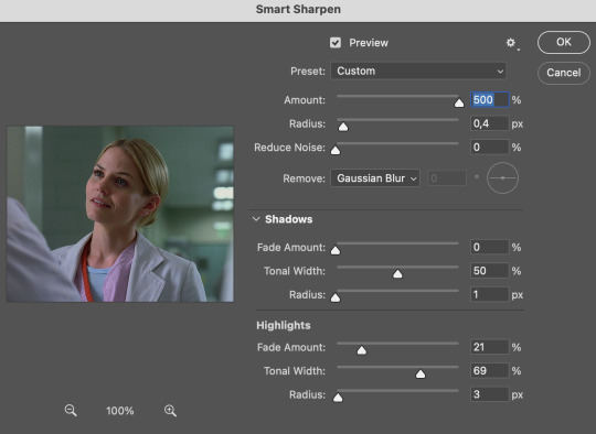
SHARPENING SETTINGS
here are my sharpening settings (filter > sharpen > smart sharpen). i sharpen things twice: 500% 0.4px + 10% 10px. here's an action for it, for more convenience. here's a tutorial on how to use Photoshop actions. for animated stuff, i use this action pack.

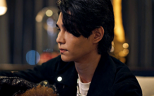
COLORING
here’s the gif i'm gonna use as a base. it’s already sharpened like the way i always do it.

LIGHTNING THE SHOTS
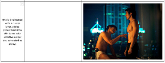
half of the secret of a good coloring is good lightning. i always useCurves (layers > new adjustment layer > curves) and Brightness & Contrast (layers > new adjustment layer > brightness & contrast). the settings depend on the scene you’re giffing, but i always try make my gifs bright and with high contrast to make the colors pop.
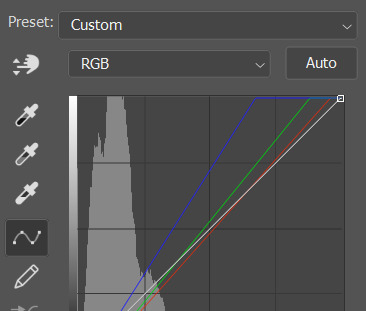
CURVES
besides lighting your scene, the Curves adjustment layer has four automatic options that will color-correct it for you. it’s not always perfect and it doesn’t mean you won’t need to do further coloring, but it’s a great start. it’s a lifesaver for most ridiculously yellow scenes. look at the difference! this gif uses the 3rd automatic option (the screenshot below isn't mine btw so that's why the fourth option is the chosen one), from top to bottom. what automatic option you need to choose depends on the gif.

sometimes i like to tweak my Curves layer. not everybody does that, it’s not that necessary and if you’re not careful, it can screw your gif up. to modify your layer by hand, you will need to click and drag points of that straight line in the position you desire. this is the concept behind it:

basically, the lower part of the line handles the shadows, while the upper part handles the highlights of the image. if you pull a highlight point up, the image’s highlights will be brighter. if you pull it down, it will make them darker. same thing for the shadow points. you should play with it to get a grasp of it, that’s what i did when i first started giffing.
BRIGHTNESS & CONTRAST
then i added a bit of brightness and contrast.

CHANNEL MIXER
the scene looked a bit too yellow, so i used the Channel Mixer (layer > new adjustment layer > channel mixer) adjustment layer. here’s a tutorial of how it works. not every scene needs the Channel Mixer layer though, i mostly use it to remove heavy overall tints. in this particular case, the Curves layer got rid of most of the yellow, but i wanted the gif to be just a bit more blue so the Channel Mixer tweaks are very minimal.

SELECTIVE COLOR
now, this adjustment layer i always use: Selective Color (layer > new adjustment layer > selective color). this is THE adjustment layer to me, alongside the Curves one. this is how it works:

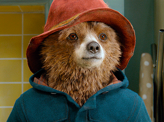
ie, you can separately edit a color this way, giving it tints. for this gif, i wanted to make the colors more vibrant. to achieve that, i edited the selected colors this way:
for the reds, i added even more red in them by moving the first slider to the right, making the color more vibrant. for his hat to have a more warm tint, i added yellow to the reds (third slider, moving it to the right). finally, to make the reds stronger, i moved the last slider to the right (more black).
for the yellows, i made them brighter by adding white to them, thus making the tile wall and Paddington more bright as well.
for the cyans and the blues, i just added the maximum (+100) of black that i could.
i wanted for Paddington's nose to be brighter, so i added more white to the whites.
lastly, i added depth to the blacks by increasing their own blackness.
you should always play with the Selective Colors sliders for a bit, before deciding what you want or need. with time, you will automatically know what to change to correct the color grading. it all takes practice!
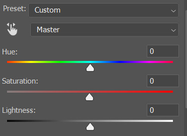
HUE/SATURATION
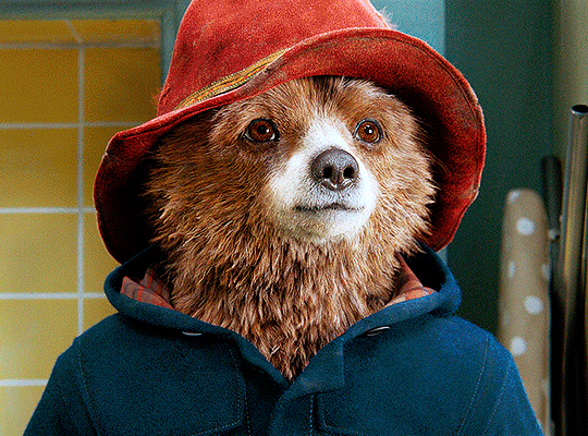
i don’t know if you noticed, but there are some green spots on the blue wall behind Paddington. to correct that, i added a Hue/Saturation adjustment layer (layer > new adjustment layer > hue/saturation) and made the saturation of the greens 0%, making that unwanted green disappear from the background.

while the green spots on the wall are specific for this gif, i use hue/saturation a lot to tweak, well, hue and saturation. sometimes someone’s skin is too yellow, i made it redder by tweaking the reds and the yellows, or vice-versa. the hue bar follows the rainbow bar, so the maximum settings (+100 and -100) give the selected color to change its hue to something more red or pink (the rainbow extremities). changing hue can give pretty whacky results, like turning someone’s skin tone to green, so you will need to play with it to get the hang of it. you can also tweak the opacity of your hue/saturation layer to further improve your gif’s coloring. i didn’t do it in this case, the opacity is still 100%. the reds and the blues had their saturation increased to make them pop just a bit more, without affecting the other colors.
COLOR BALANCE
the highlights of the gif still had a green tint to it due to the automatic correction of the Curves layer, so i used Color Balance. this is how it works: instead of giving specific colors some tints, you can give them to the shadows, highlights, and mid-tones. if your shadows are too blue, you counterbalance them with the opposite color, yellow. same thing with the cyan-red and magenta-green pairings. in my case, i added a bit of magenta.


B&W GRADIENT MAP
now, if this gif was a dish, it’s time for the salt and pepper. i always add a Gradient Map (layer > new adjustment layer > gradient map) (black to white gradient) with the Soft Light blending mode, thus giving my shadows more depth without messing with the mid-tones and highlights. it also doesn’t “deep fry” (you know those memes?) the gif too much by adding even more contrast. usually, the opacity of the layer is between 30% to 70%, it all depends on the gif. it always does wonders, though!
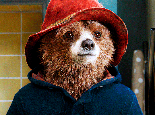
COLOR FILTER
finally, i like to add Color Filters (layer > new adjustment layer > color filter) to my gifs. it’s very handy when giving different scenes for the same minimalistic set because it makes them kind of match despite having completely different colors. in this gif’s case, i added a “deep blue” filter, opacity 50% density 25. you can change the density and the opacity of the layer for further editing, again, it all depends on the gif.

VIBRANCE
if i feel like it, i add a vibrance layer (layer > new adjustment layer > vibrance) to make the colors pop. this can ruin your coloring sometimes, especially when regarding skin color, so be careful. i didn't do it in this gif because i felt i didn't need it.
TA-DA! 🥳
AN OTHER EXAMPLE
the color grading of the original scene it’s pretty good as it is, to be honest. let’s see a worse scenario, a VERY yellow one:
no channel mixer this time because the automatic curves option dealt with the yellowness, but you can see it made the gif too green. i needed to correct that with the following adjustment layers:
curves (automatic option) (gif 2) >> same curves layer (tweaks) (gif 3) >> brightness & contrast (gif 4) >> hue/saturation (tweaked cyan+blue+green) >> selective color >> color balance (gif 5) >> b&w gradient map >> (sepia) filter >> vibrance (gif 6)
i added a hue/saturation layer to remove the blues & greens before my selective color layer because i thought that was more urgent than tweaking the tint of all colors. color balance (gif 4) was the real hero here, though, by removing the green tint. the selective color layer was meant to make the red pop more than anything else, because the rest looked pretty good, especially her skin tone (despite the green tint). you can notice that tweaking the curves layer (small gif 3) also helped A LOT with the green problem.
tl;dr 😵💫😵💫😵💫
here's a list of my go-to's while coloring and lightning gifs. it's not a rule, just a guide. there are gifs in which i don't use all these adjustment layers, or use them in a different order. it all depends!
1. curves (automatic option + tweaks) 2. brightness & contrast 3. channel mixer 4. selective color 5. hue/saturation 6. color balance 7. b&w gradient map 8. color filter 9. vibrance
i'll suggest that you study each adjustment layer listed for more info, either with other Tumblr tutorials or YouTube ones. the YouTube ones focus on images, but you can translate what they teach to gif making very easily. you can ask me to further explain any adjustment layer, too! i was brief to keep this short (which i kinda failed lol).
feel free to ask me for clarification or something else about gifmaking wise, i always like to help. ❤️
807 notes
·
View notes
Text
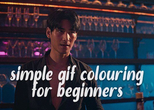
✨ Simple Gif Colouring for Beginners ✨
I wrote up my basic gif colouring process for a friend recently, but a couple of people here mentioned they'd also find it helpful! so, as requested, this is a beginner-friendly walkthrough of the way I colour my gifs :) it's aimed at brand new gif makers with no prior experience with photoshop or photo editing.
when I first started gif making I found colouring and photoshop in general suuuper daunting, so I've tried to simplify everything here as much as possible. hopefully this will be relatively easy to follow and not too intimidating!
a couple of things to begin with:
I'm only talking about colouring here - this is not a full gif making tutorial. I've linked to some of my favourites of those here!
I personally like to make bright, 'clean' looking gifs with vibrant but natural colours, so that is the style of colouring this tutorial is geared towards. most of gif colouring is subjective and about personal taste - the only thing that I'd say is possible to get wrong is skin tones, which I talk about a lot in this guide.
as I mostly gif Thai dramas, most of the advice is geared towards colouring for East Asian/South East Asian skin tones - but the techniques should be fairly universally applicable (and here are some tutorials that talk about gif colouring for other skin tones).
I'm not an expert! I'm not claiming this is the best or the only way to colour gifs - it's just how I do it.
this post is very image-heavy. if the images aren't loading (or the gifs are running slowly or cutting/looping weirdly), then try viewing the post in its own tab (rather than on the your dash or someone's blog) and refreshing the page.
okay, full walkthrough beneath the cut!
contents:
1. intro a. natural gif colouring goals b. very very basic colour theory 2. super simple colouring (the essentials) a. curves b. selective colour (and skin tone correction) c. hue/saturation d. saving and reusing colouring e. another simple colouring example 3. other adjustment layers a. brightness/contrast b. levels c. vibrance d. colour balance e. channel mixer 4. troubleshooting a. curves b. saturation 5. fin!
1. intro
the colouring part of gif making can be super overwhelming, especially if (like me when I first started!) you're completely new to photoshop and/or have no experience with colour theory or photo/video editing.
if you're opening photoshop and making gifs for the first time, I highly recommend getting used to making a few basic, uncoloured gifs to begin with. just to practice, rather than post anywhere (though you can always come back and colour them later if you want) - but it'll make the rest of the process much easier if you're already beginning to get used to working in timeline mode of photoshop. give yourself a bit of time to practice and get a feel for things like how many frames you tend to like in a gif, where you like to crop them for the best loop, what kind of aspect ratio you like etc* - so that you're not trying to navigate all of that for the first time on top of everything else!
* frames: for me between 60-90 frames is ideal, but 40-120 frames is the absolute min-max I'd personally use in a normal gifset loops: for the smoothest loops, try to avoid cutting someone off mid-movement or mid-word if possible. aspect ratio: for full-size (540px) gifs, I tend to go for either 8:5 (slightly 'skinnier' gifs), 7:5, or 5:4 (particularly big, thick gifs lmao)
✨ natural gif colouring goals
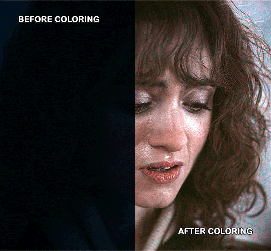
part of what can be so daunting about starting gif making is not knowing where to start or what you want to achieve. this is definitely something that gets easier with practice - the more gifs you make, the more you'll get a feel for what kind of look you like and the more instinctively you'll know how to get there. it also helps to see if any gif makers you like have made "before and after colouring" posts - these can help with getting a sense of the kinds of changes made through gif colouring. here's one I made!
in general, I like to make my gifs bright and 'clean' looking, with vibrant but natural colours. these are the things I'm usually hoping to achieve with colouring:
brighten dark scenes
remove muddy, yellowish lighting or filters
saturate colours
correct any skin lightening filters or overexposure
make lighting and colours as consistent as possible between gifs within a single gifset, especially gifsets featuring gifs from multiple scenes/episodes/videos
this guide is focusing on natural colouring, but of course there are many cool ways to make stylised/unnaturally coloured gifs. imo you'll need to master these basics first, but if you want to learn how to do things like change the background colour of gifs or use gradients or other cool effects, then @usergif's resource directory has loads of super helpful tutorials!
✨ very very basic colour theory
[disclaimer! I don't know shit about fuck. I do not study light or art. this is just an explanation that makes sense to me exclusively for the purposes of gif making.]
the primary colours for light/digital screens are red, blue, and green. having all three colours in equal measures neutralises them (represented by the white section in the middle of the diagram).
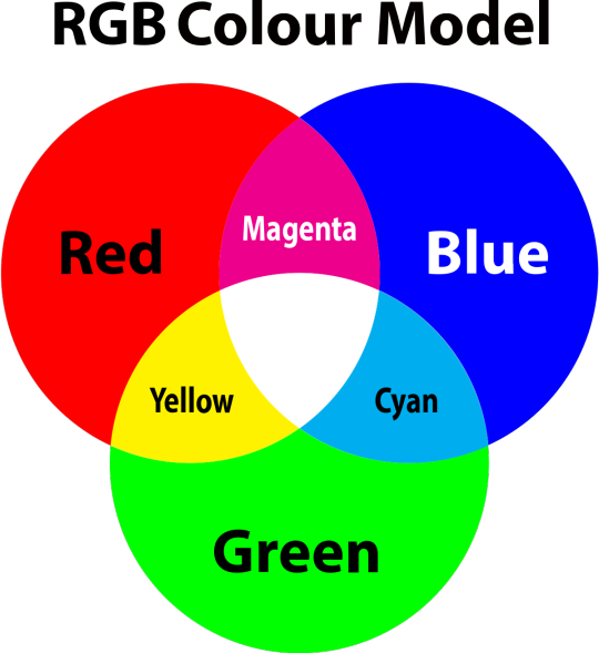
so to neutralise a colour within a gif, you need to add more of the colour(s) that are lacking.
in practice this usually means: the scene you want to gif is very yellow! yellow is made of red and green light, so to neutralise it you need to add more blue into your gif.
it can also mean the reverse: if you desaturate the yellow tones in a gif, it will look much more blue.
looking at the colour balance sliders on photoshop can make it easier to visualise:
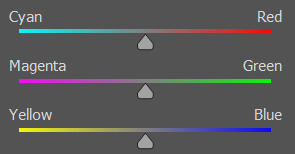
so making a gif more red also means making it less cyan.
removing green from a gif means adding magenta.
taking yellow out of a gif will make it more blue.
tl;dr:
neutralise yellows by adding blue (and vice versa)
neutralise reds by adding cyan (and vice versa)
neutralise green by adding magenta (and vice versa)
2. super simple colouring (the essentials)
starting with a nice sharpened gif in photoshop in timeline mode. (these are the sharpening settings I use!)
some scenes are much harder to colour than others - it helps to start out practising with scenes that are bright/well-lit and that don't have harsh unnaturally coloured lights/filters on. scenes with a lot of brown/orange also tend to be harder.
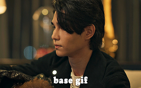
I usually save a base copy of my gif before I start colouring just in case I end up hating it, or find out later that it doesn't quite fit right into a set and need to redo it etc.
so here is my base gif!

it's an okay gif, but it has a bit of a yellow tint to it that I want to reduce.
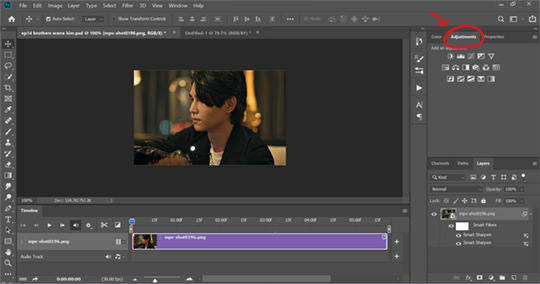
colouring is easiest to do in adjustment layers, which can be found under layer -> new adjustment layer - or for me they are here:
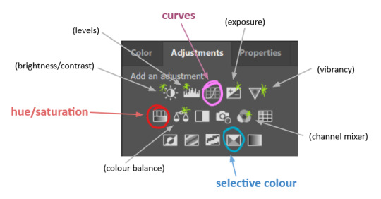
there are lots of different types of adjustment layers that do lots of different things - but for me the absolute essentials for colouring are curves, selective colour, and hue/saturation.
I also use brightness/contrast, levels, exposure, vibrance, colour balance, and channel mixer sometimes, depending on the gif - but I use curves, selective colour, and hue/saturation on every single gif.
✨ curves layer
the first thing I always do is a curves layer. when you first open one it will look like this:
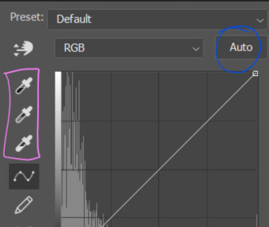
first I usually click the ‘auto’ button, just to see what happens. sometimes it makes a big difference (it usually brightens the gif a lot) - but on this gif it didn’t do much.
if it had made the gif look nicer then I would have kept it and added a second curves layer on top to do the rest of these steps.
the next step is selecting the white and black points with the little eyedropper tools.
the bottom eyedropper lets you pick a white point for the gif. click somewhere super light on the gif to see what happens - for this gif, I clicked on the lampshade on the left. if it looks weird, I just undo it and try somewhere else - it usually takes a few goes to find something that looks good.
here's what that did to the gif:

then I pick the top eyedropper and use it to pick a black point by clicking somewhere really dark, again playing around until I find a black point that looks good.
here's what the gif looks like after picking the white and black points:

this can take some experimenting, but you can make super easy drastic changes to your gif just with this. in this case, the curves layer took out a lot of that yellowy tint.
and this is what the curves graph looks like now:
you can click and drag those lines to make further changes if you want - I usually leave them alone though. the colours of the lines indicate which colours have been changed in the gif - for example, you can see from that steep blue line on the graph that blue has been added to neutralise those yellows.
next I usually do another curves layer and just press the ‘auto’ button again to see what happens. usually it brightens the gif a bit more, which I like.
‼️if nothing is working: usually with a bit of fucking about a curves layer works well - but sometimes you can’t find a good white and black point anywhere, and instead your gif turns wacky colours and nothing looks good. this happens more often with very heavily colour tinted scenes :( the troubleshooting section at the end goes over some options, including starting with a levels layer instead.
✨ selective colour (and skin tone correction)
skin tones are made up of a mixture of yellow and red.
removing yellow (or adding blue or red) to a gif will make the skin-tones too red - and removing red (or adding cyan or yellow) to a gif will make the skin-tones too yellow.
adding blue to this gif with the curves layer took out the yellowy tint, which I wanted - but it also took the yellows out of Kim's skin tone, which I don’t want. so I need to put yellow back into the skin tones specifically - without putting it back into the rest of the gif.
selective colour layers let you select an individual colour and adjust the levels of other colours within that colour. you can change how yellow the green shades are, or how much cyan is in the blues, for example.
I need to add yellow back into the red tones to correct the skin tones on this gif. this is the case for most gifs in my experience - the vast majority of the time, unless a scene is very heavily tinted in another colour, a curves layer will add blue/remove yellow.
in the 'colors' dropdown, select the 'reds' section and drag the 'yellow' slider higher - this will add more yellow into just the red shades within the gif.

the amount of yellow you need to add back into the reds depends on how much yellow was taken out of the gif initially - I just play around with the slider until it looks right. if you're not sure, it helps to have some neutrally-coloured (not white-washed!) reference photos of the people in your gif to compare to.
here's the result. Kim's skin is a lot less pink toned and much more natural looking:
✨ hue/saturation
this adjustment layer lets you adjust the hue and saturation of the gif as a whole, and also of each colour individually.
I don't use the hue or lightness sliders unless I'm trying to do something more complicated with the colouring.
clicking the dropdown menu that says 'master' lets you edit the saturation of each colour individually. this is useful if your gif is still super tinted in one colour.
I thought the yellows on this gif were still slightly too bright, so I switched to the yellow channel and desaturated them slightly. (remember if you do this then you need to go back to selective colour and add more yellow into the red skin tones to balance out the desaturation!)
then I increased the 'master' saturation of all the colours to +5:
I usually find the right amount of saturation is somewhere between +5 and +12, but it depends on the gif.
‼️if the gif feels undersaturated, but the saturation slider isn't helping/is making the colours worse, try a vibrance layer instead.
done!
✨ saving and reusing colouring
you can copy and paste adjustment layers between gifs to make your colouring even across each of your gifs for one scene - so if you're making a set of multiple gifs of the same scene, or you think you might want to gif the same scene again in the future, you can save it as a psd so you can reuse the colouring again later.
each gif's colouring will then still need tweaking - different cameras/angles/shots of the same scene can still start out with slightly different colouring.
I recommend uploading the gifs as a draft post on tumblr so you can see what they all look like next to each other and catch any inconsistencies.
✨ another one! (speedrun!)
HI KEN!
the white point for the curves layer was in the window behind them.
the curves layer removes the muddy yellow tint, but again it makes their skin tones (especially Ken's) very red toned, which is adjusted by the selective colour layer.
3. other adjustment layers
imo many many gifs can be coloured really nicely with just those three adjustment layers, but some need different adjustments.
✨ brightness/contrast
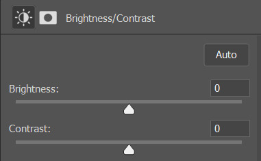
pretty self explanatory!
I personally usually avoid using the 'brightness' slider because I rarely like the effect - I only tend to use the 'contrast' one.
the 'auto' button is sometimes useful though, especially if you’re struggling with the curves layer.
✨ levels

levels alters the white and black points of the gif, like curves - but unlike curves it doesn't also alter other colours.
use the sliders beneath the graph to alter how dark/light the gif is. you can slide the black slider further to the right to make the blacks darker, and the white slider to the left to make the whites lighter.
levels is a good place to start if your curves layer isn't working.
(I'm going to hit the image limit for this post lol so here are some screenshots of a table I made to demonstrate this rather than actual gifs. sorry!)
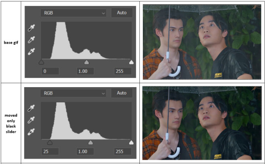

on both sides, I dragged the sliders up to where the big jumps are on the graph - this is usually a good place to start!
✨ vibrance
vibrance... makes the colours more vibrant. it's more subtle than saturation.
it's really helpful for gifs that feel grey. sometimes adjusting saturation just makes the greys kind of weirdly tinted, but a vibrance layer can fix that.
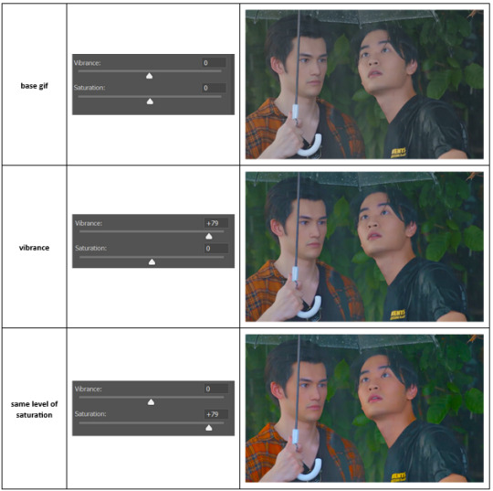
vibrance is much more subtle!
✨ colour balance
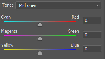
colour balance affects the overall balance of colours within a gif.
it's good for scenes with heavy tints.
I tend to stick to the 'midtones' dropdown, but you can also alter the colour balance within the shadows and highlights if you want.

✨ channel mixer
I avoided channel mixer for such a long time because it scared me. but it's great for scenes that are very heavily tinted in one colour.
basically, it works with the levels of red, green, and blue within a gif. you select an output colour and then play around with the levels of the colour you selected within each other colour.
kind of the reverse of selective colour?
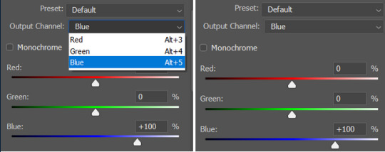
so in the 'blue' channel, the levels of blue are at 100%, and the levels of red and green are at 0% - but you can impact how much blue is in the reds and greens and blues.
this tutorial explains it well - but imo the best way to get to grips with channel mixer is just to play around with it a bit (sorry)
(when I made this guide for my friend, I also made a slightly more complicated gif colouring walk-through that included using channel mixer. there isn't space to include it within this post, but if anyone is interested I could always upload it as an 'intermediate' gif colouring tutorial - lmk!)
4. troubleshooting
‼️curves
usually with a bit of fucking about a curves layer works well - but sometimes you can’t find a good white and black point anywhere, and instead your gif turns wacky colours and nothing looks good. this happens more often with very heavily colour tinted scenes :(
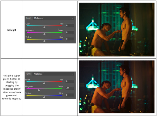
for example, with this base gif:
using many of the brightest points as a white point turn it wacky colours, like this:

yikes :(
some options for these cases:
try brightening the gif first with the 'auto' button on the curves layer or with a levels layer. having a brighter gif to start with can give you better options for picking a white point.
try finding an alternate, whiter/brighter white point. look for places the light reflects - on this gif, using the light on Porsche's cheekbone works well as the white point. it also helps to find places that would be white if the scene wasn't tinted - the lightest part of a white shirt is often a good place to start, for example.
skip the curves layer, and instead use a levels layer to alter your white/black points, and colour balance or channel mixer to balance the colours.
‼️over/undersaturation
if your gif (especially the skintones) is looking a little washed out or lifeless, it might be undersaturated. boost that saturation - or if that's not working, try a vibrance layer.
oversaturation is often easiest to spot in the mouths and ears of any people in a gif. if the mouths are looking unnaturally, vibrantly red, then you've gone too far with the saturation.
5. fin!
and done! I hope this was coherent helpful to somebody.
if there's anything that I've missed or that doesn't make sense pls feel free to shoot me an ask or a message and I'll do my best to help! I've also collated a bunch of additional reading/resources below.
happy gifmaking 🥰
✨ some links!
photoshop basics by @selenapastel
gifmaking for beginners by @hayaosmiyazaki
gifmaking guide for beginners by @saw-x
dreamy's gif tutorial by @scoupsy-remade (includes instructions on how to blur out burned-on subtitles or annoying video graphics)
beginner's guide to channel mixer by @aubrey-plaza
how to fix orange-washed characters by aubrey-plaza
colour correcting and fixing dark scenes by @kylos
does resampling matter? by usergif
how to put multiple gifs on one canvas by @fictionalheroine
watermarking using actions by @wonwooridul
resource directory by @usergif
903 notes
·
View notes
Text
My GIF Making process: Screen capturing using MPV player, Organizing files, 3 Sharpening settings, Basic Coloring PSD + Actions set

This is a very long post so heads up.
I’ll try to be as thorough and true as much as possible to the way I make my gifs (I already use Photoshop Actions which I’ve long since set up but now for this tutorial I’m reviewing them to show you the exact steps I’ve learned to create my gifs 😃) and present them to you in a semi-coherent way. Also, please bear with me since English is my second language.
First things first. Below are the things and tools we need to do this:
Downloaded 4K or 1080p quality videos (let’s all assume we know where to get these—especially for high definition movies and tv series—so this post doesn’t get removed, okay? 😛)
Adobe Photoshop CC or the CS versions can work as well, but full disclosure I haven’t created gifs using the CS versions since 2020. I’m currently using Adobe Photoshop 2024.
mpv player. Use mpv player to get those frames/screenshots or any other video player that has a screen grabber feature. I’ve used adapter for the longest time but I’ve switched to mpv because the press to screenshot feature while the video is playing has been a game changer not to mention ultimate time saver for me. For adapter you need to play it in another video player (like VLC player), to get the start and end timestamps of the scene you want to gif which takes me ages before I can even open Photoshop.
Anyway! Please stop reading this post for a moment and head over to this amazing tutorial by kylos. She perfectly tells you how to install and use mpv player, both for Mac and Windows users.
One thing I have to share though, I had a tough time when I updated my MacOS to Sonoma since MPV is suddenly either duplicating frames or when I delete the duplicates the player seems to be skipping frames :/ I searched and found a solution here, though it didn’t work for me lol. My workaround for this in the meantime is decreasing the speed down to 0.70 then start screenshotting—it’s not the same pre Sonoma update but it works so I’ll have to accept it rather than have jumpy looking gifs.
Now, after this part of kylos’ tutorial:

you can continue reading the following sections of my gif tutorial below.
I want to share this little tip (sorry, this will only cater to Mac users) that I hope will be helpful for organizing the screenshots that MPV saved to the folder you have selected. Because believe me you don’t want to go through 1k+ of screenshots to select just 42-50 frames for your gif.
The Control + Command + N shortcut
This shortcut allows you to create a new folder from files you have pre-selected. As you can see below I have already created a couple of folders, and inside each folder I have selected screenshots that I want to include in one single gif. It's up to you how you want to divide yours, assuming you intend to create and post a Tumblr gifset rather than just one gif.

Another tip is making use of tags. Most of, if not all the time, I make supercorp gifs so I tag blue for Kara and red (or green) for Lena—just being ridiculously on brand and all that.
Before we finally open Photoshop, there's one more thing I want to say—I know, please bear with me for the third? fourth? time 😅
It's helpful to organize everything into their respective folders so you know the total number of items/frames you have. This way, you can add or delete excess or unnecessary shots before uploading them in Photoshop.
For example below there are 80 screenshots of Kara inside this folder and for a 1:1 (540 x 540 px) Tumblr gif, Photoshop can just work around with 42-50 max number of frames with color adjustments applied before it exceeds the 10 MB file size limit of Tumblr.

Sometimes I skip this step because it can be exhausting (haha) and include everything so I can decide visually which frames to keep later on. You'll understand what I mean later on. But it's important to keep the Tumblr 10 MB file size limit in mind. Fewer frames, or just the right amount of frames, is better.
So, with the screenshot organization out of the way, let's finally head over to Photoshop.
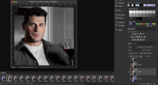
Giffing in Photoshop, yay!
Let’s begin by navigating to File > Scripts > Load Files into Stack…

The Load Layers window will appear. Click the Browse button next.
Find your chosen screenshots folder, press Command + A to select all files from that folder then click Open. Then click OK.
After importing and stacking your files, Photoshop should display the following view:

By the way, I'll be providing the clip I've used in this tutorial so if want to use them to follow along be my guest :)
If you haven't already opened your Timeline panel, navigate to Windows > Timeline.
Now, let's focus on the Timeline panel for the next couple of steps.
Click Create Video Timeline, then you’ll have this:

Now click the menu icon on the top right corner then go to Convert Frames > Make Frames from Clips

Still working on the Timeline panel, click the bottom left icon this time—the icon with the three tiny boxes—to Convert to Frame Animation
Select Make Frames From Layers from the top right corner menu button.
So now you have this:

Go and click the top right menu icon again to Select All Frames
Then click the small dropdown icon to set another value for Frame Delay. Select Other…

The best for me and for most is 0.05 but you can always play around and see what you think works for you.
Click the top right menu icon again to Reverse Frames.
I think Photoshop has long since fixed this issue but usually the first animation frame is empty so I just delete it but now going through all these steps there seems to be none of that but anyways, the delete icon is the last one among the line of feature buttons at the bottom part of the Timeline panel.
Yay, now we can have our first proper GIF preview of a thirsty Lena 😜

Press spacebar to watch your gif play for the very first time! After an hour and half of selecting and cutting off screenshots! 😛 Play it some more. No really, I’m serious. I do this so even as early (lol) as this part in the gif making process, I can see which frames I can/should delete to be within the 10 MB file size limit. You can also do it at the end of course 🙂
Now, let’s go to the next important steps of this tutorial post which I’ve numbered below.
Crop and resize to meet Tumblr's required dimensions. The width value should be either 540px, 268px, or 177px.
Convert the gif to a Smart Object for sharpening.
Apply lighting and basic color adjustments before the heavy coloring. I will be sharing the base adjustments layers I use for my gifs 😃.
1. Crop and Resize
Click on the Crop tool (shortcut: the C key)

I like my GIFs big so I always set this to 1:1 ratio if the scene allows it. Press the Enter key after selecting the area of the frame that you want to keep.
Side note: If you find that after cropping, you want to adjust the image to the left or another direction, simply unselect the Delete Cropped Pixels option. This way, you will still have the whole frame area available to crop again as needed and as you prefer.
Now we need to resize our gif and the shortcut for that is Command + Opt + I. Type in 540 as the width measurement, then the height will automatically change to follow the ratio you’ve set while cropping.
540 x 540 px for 1:1
540 x 405 px for 4:3
540 x 304 px for 16:9
For the Resample value I prefer Bilinear—but you can always select the other options to see what you like best.
Click OK. Then Command + 0 and Command + - to properly view the those 540 pixels.

Now we get to the exciting part :) the sharpen settings!
2. Sharpen
First we need to have all these layers “compressed” intro a single smart object from which we can apply filters to.
Select this little button on the the bottom left corner of the Timeline panel.


Select > All Layers
Then go to Filter > Convert for Smart Filters
Just click OK when a pop-up shows up.
Now you should have this view on the Layers panel:

Now I have 3 sharpen settings to share but I’ll have download links to the Action packs at the end of this long ass tutorial so if you want to skip ahead, feel free to do so.
Sharpen v1
Go to Filter > Sharpen > Smart Sharpen…
Below are my settings. I don’t adjust anything under Shadows/Highlights.
Amount: 500
Radius: 0.4
Click OK then do another Smart Sharpen but this time with the below adjustments.
Amount: 12
Radius: 10.0

As you can see Lena’s beautiful eyes are “popping out” now with these filters applied. Click OK.
Now we need to Convert to Frame Animation. Follow the steps below.
Click on the menu icon at the top right corner of the Timeline panel, then click Convert Frames > Flatten Frames into Clips
Then Convert Frames > Convert to Frame Animation
One more click to Make Frames From Layers
Delete the first frame then Select All then Set Frame Delay to 0.05

and there you have it! Play your GIF and make sure it’s just around 42-50 frames. This is the time to select and delete.
To preview and save your GIF go to File > Export > Save for Web (Legacy)…
Below are my Export settings. Make sure to have the file size around 9.2 MB to 9.4 MB max and not exactly 10 MB.

This time I got away with 55 frames but this is because I haven’t applied lighting and color adjustments yet and not to mention the smart sharpen settings aren't to heavy so let’s take that into consideration.
Sharpen v1 preview:

Sharpen v2
Go back to this part of the tutorial and apply the v2 settings.
Smart Sharpen 1:
Amount: 500
Radius: 0.3
Smart Sharpen 2:
Amount: 20
Radius: 0.5
We’re adding a new type of Filter which is Reduce Noise (Filter > Noise > Reduce Noise...) with the below settings.

Then one last Smart Sharpen:
Amount: 500
Radius: 0.3
Your Layers panel should look like this:

Then do the Convert to Frames Animation section again and see below preview.
Sharpen v2 preview:

Sharpen v3:
Smart Sharpen 1:
Amount: 500
Radius: 0.4
Smart Sharpen 2:
Amount: 12
Radius: 10.0
Reduce Noise:
Strength: 5
Preserve Details: 50%
Reduce Color Noise: 0%
Sharpen Details: 50%
Sharpen v3 preview:

And here they are next to each other with coloring applied:
v1

v2

v3

Congratulations, you've made it to the end of the post 😂
As promised, here is the download link to all the files I used in this tutorial which include:
supercorp 2.05 Crossfire clip
3 PSD files with sharpen settings and basic coloring PSD
Actions set
As always, if you're feeling generous here's my Ko-fi link :) Thank you guys and I hope this tutorial will help you and make you love gif making.
P.S. In the next post I'll be sharing more references I found helpful especially with coloring. I just have to search and gather them all.
-Jill
799 notes
·
View notes
Note
Hey! Do you think you could please make a tutorial on how to add image over a gif? as demonstrated, for example, here: galindaelphaba/post/749133493751169024/insp
Sure! It is pretty simple so should be easy to follow tutorial is below the cut :)
First start with your getting your gif ready and coloured
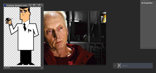
search for the image/shape you would like to appear on your gif. in this case i searched for professor utonium
make sure the image has no background and save it. You can usually tell if an image has no background if it has a white and grey check background.
if needed go to https://www.remove.bg/ and remove the background from the image then save it. You could also just copy the image in and remove the background yourself in photoshop but i find that to be more of a hassle.
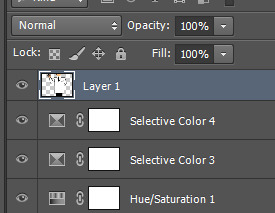
once you have your image ready open it in photoshop and drag it out so it is in a separate window.
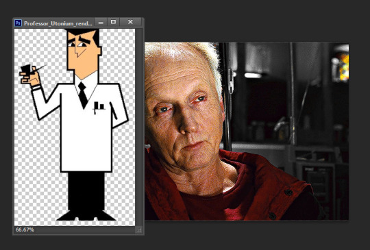
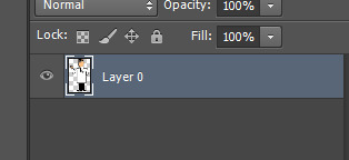
you should see a layer for your image
drag this layer onto the window with your gif. try to drag this onto the gray area off your gif as this will place your image in the centre.
make sure this new layer is on top of all your gif + colouring layers. make sure the length of this layer is the same as your gif layer.

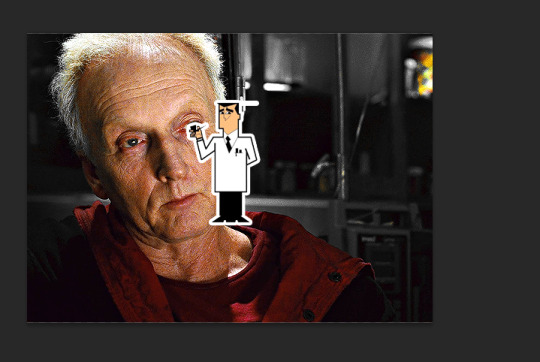
this is the result of what my image on top. as we can see this is too big and will need to be resized.
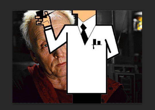
to resize your image use the transform function (ctrl + t). I always resize from the corner of the image while holding shift to maintain the correct proportions of the image.
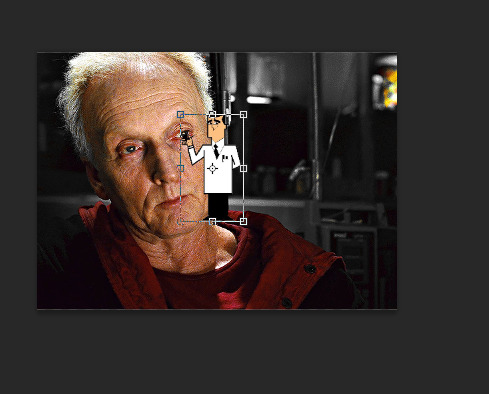
once resized press enter to save the changes on your image.
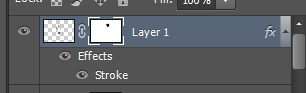
for the gifset you linked i wanted the images to look like stickers so i went into the blending options of the layer and added a thick white outline to the image.
to do this right click the image layer and go to "Blending Options" (you can also do this by double clicking the layer (but not on the layer name as this will prompt renaming the layer)

go to stroke and make the colour white and the thickness about 3-4
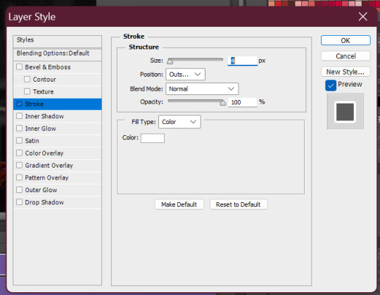
click ok to save your changes.
this is our current result and there is a bit of extra outline we will have to fix
the easiest way to do this is by adding a layer mask and masking the area which has the extra outline. the reason i prefer using a layer mask is it is easier to go restore part of the image if you accidentally erase it by painting the part of the mask you need back white (idk if this makes sense or not).
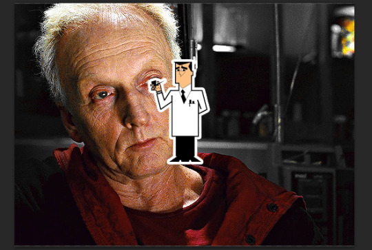
now the image part of the gif is complete and all we need to do is add any text and tweaks we may like to finish the gif :)
this is the final result:
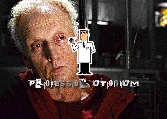
hope this makes sense and that it has been helpful to you <3
60 notes
·
View notes
Note
How exactly do u make those dividers??
I'm more than happy to put up a more in depth tutorial with pics but the essentials are (and I use Canva)
1. Open a project that's 1920 x 260 px.
2. Find a symbol in 'Elements' that represents your chosen theme/character or download a vector image from Google.
3. Search 'decorative line' in 'Elements' for the lines either side.
And it's done!
I'm more than happy to tutorial anything I make aesthetic wise if people would enjoy that!
6 notes
·
View notes
Note
Coloring anon here, yes, I would definitely like to know more about how you color frame by frame and the other techniques you mentioned! It would be much appreciated, thank you!
Hi anon! I'd be happy to go over my preferred methods for colouring!

First resort (ideal):
Painting over shots with little movement (the first method in this tutorial)
Colour manipulation using selective colours (the second method in this tutorial; alternate tutorial -> i also sometimes add a hue/saturation layer on top to manipulate the cyans/blues as well)
Second resort:
Keyframes for shots with consistent movement where it's easy to hide "imperfections" (tutorial 1, tutorial 2)
Last resort:
Frame by frame colouring -> DISCLAIMER: the way I do this method is the easiest way I've gotten it to work for me but that also means that it's very inflexible when it comes to editing any of the colouring afterwards. Once you start colouring in frame animation mode you're basically locked in so you need your gifs to be exactly the way you want them prior to adding your colour
So in this tutorial I'll go over how I do my frame by frame colouring as well as how I create actions to automate the repetitive parts of this process! (Some resources that explain how to create actions are here: 1 2)
To use the select subject feature you will need Photoshop CC 2018 or later
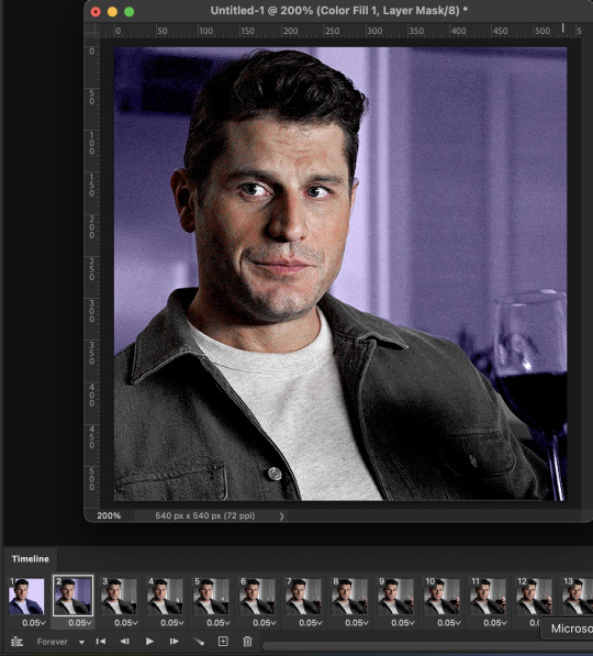
Step 1: Preparing your gif with base colouring
So first you want to do your base colouring for your gif in timeline mode, which I've explained here. I keep my gifs short (ideally 40 frames or less) since this colouring process is tedious!
I make sure that in my hue/saturation layer, I turn the saturation in the yellow, green, cyan, and blue tabs all down to -100 (and for the yellows I usually add around +20 to +60 in lightness)
Here's my gif with the base colouring that I'll be starting with:

Note: turning down the saturation in almost all the colours gives you that nice silver/grey neutral background to paint on top of. It's a lot less noticeable when your painted layers aren't perfect
Step 2: Converting to Frame Animation Mode
I use the save action from this action pack to convert my gif from timeline mode to frame animation mode
Step 3: Using Select Subject
If you're recording an action this is the step you would *start recording*
This is what your window should look like:

Making sure your first frame and first layer are selected, go to Select at the top of your window and click Subject

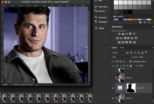
You should then see the marching ants outline around the person in your gif

You then want to create a new solid colour fill layer (which can be found when you click that little circle icon at the bottom of your layers panel), and set the layer blending mode to colour.
The layer mask will automatically be created since you had the marching ants outline.

Since my person is in colour and not the background, I want to invert the layer mask by clicking on it and using command + i (or ctrl + i), and now this is what it looks like:

If you're recording an action, it's at this point where I would *stop recording*
Note: Select subject isn't always perfect!!!, depending on how cluttered the scene is and how much contrast there is between your person and the background, select subject could either do a really good job like it did here, or screw up a little like it did here:

That's okay though because it still gives us a good base to start from! We can fix any issues by painting with black and white brushes on the layer mask.
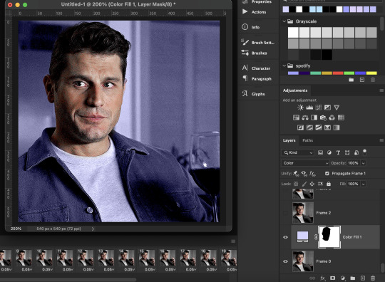
Step 4: Fixing the layer mask if needed
So now back to the gif I was working on, I want his jacket and t-shirt to also be purple. I make sure the layer mask is selected, and paint with a white brush at 60-70% hardness (painting with black erases the colour, painting with white shows the colour). User smaller brush sizes to paint smaller details!
And now this is what my canvas and layer mask look like
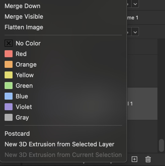
Step 5: Merging Down
I then right click the solid colour fill layer and select merge down to merge the colouring with the frame, and this is what your layers panel will look like
This is the part where you're locked in, you can't go back and edit this colouring unless you undo your previous steps and start over.
Step 6: Repeat
Now I click on my second frame and second layer, and repeat steps 3-5.
This is where an action is super helpful in cutting down all the repetitive steps and clicks you need to do. So at this point I'd just play the action I created, paint on the layer mask as needed, and merge down. Your previous frames are going to look wonky briefly, but once you merge down everything will look normal.
Repeat for all your frames and then you're done! After this I convert it back to timeline mode again so that I can add my text and do any other effects such as blending or transitions. Hope this helped!!
254 notes
·
View notes
Photo
i’ve been asked a couple of times about how i color my gifs and if i have a tutorial on coloring, so i thought i’d make one. the only things you need for this are photoshop (i use cc 2018, but any ps will do!) and basic gifmaking knowledge, since this tutorial is only about coloring. i’m leaving the tutorial under the cut:
Keep reading
1K notes
·
View notes
Note
Friend, I wish to know your secrets to how you do such bright and beautiful coloring on your gifs and edits! Lol, do you have any tutorials?
Hi!! First thank you so much for asking, I’m honoured that you love my gifs so much 🥺🥺🥺.
I haven’t made any tutorials myself, but I did put together this list of resources that I used when first learning to gif. Everything on that list is what I followed to the letter when I was first starting out, and I still use a lot of those techniques now. The coloring tutorials are really good at explaining how to get your gifs to pop. But if you want a more TLK oriented tutorial I can put one together!
My usual process is:
brightness/contrast ->
curves ->
levels ->
color balance and selective color (black) (depends on the gif which layer comes first) ->
Hue/saturation ->
selective color (for whatever color I want to pop)
After these steps, I may add more brightness or vibrance. But to me, out of all of these layers the key to coloring scenes is using Curves, Color Balance, and Selective Color.
Curves is really important for me because it’s my first step, I use it to lighten the gif and remove as much awful color filters as possible, and whatever I end up with after is really my starting point for coloring.
Selective coloring I use throughout the coloring process. I usually use it first after the initial lighting and with the “Blacks” selected as the color. I do this to change the shadows of the gif very subtly, color balance can also change shadows but it will affect all colours while using the “Blacks” of the selective coloring it will only affect the truly dark colours and it does make a difference for the gif. Once I have my gif at a mostly neutral color, I’ll then start to decide what colors I want to be the main focus of the gif and then I’ll use selective coloring to really make that color pop.
Color Balance I will use usually one or twice after the “Blacks” selective coloring. I mainly use “Shadows” and “Midtones”, but for the very filtered tlk scenes I’ll sometimes dip into the “Highlights”. For this I’m really trying to remove whatever filter residue is left over after the Curves layer.
And that’s basically how I color my gifs in a nutshell.
Let me know if you have any questions, my inbox and dms are always open!
8 notes
·
View notes
Text
Coloring Tutorial
Hello, this tutorial is for the wonderful @djoharrington and those of you wondering how I colored this set. I’m going to be talking about how to color the first gif only to keep this tutorial from getting too long. The other two used the same coloring method with only minor adjustments made to keep them looking similar.
Yes, this scene really is that dark before coloring.
Quick notes on what I’m using:
mpv player for screencapping — not mentioned in tutorial
Photoshop 2021 for editing
I mention mpv player because I’m giffing 4k, and it’s one of the few players I’ve come across that take continuous caps that don’t end up looking washed out. It makes for easier coloring.
Keep reading
1K notes
·
View notes
Photo
Alright y’all, today is the day that I’ve finally managed to make a tutorial! I’m going to be showing how I created the effect in my lotr and the witcher sets!
For this tutorial you need to know how to make gifs and have a lot of time on your hands!
this is really long and really image heavy oops
Keep reading
1K notes
·
View notes
Photo
a couple of people have asked how i colour shots that have an awful yellow tint, and it was requested by an anon that i make a tutorial today, so… here we are.
this tutorial will detail on how i remove the yellow tint and touch on my basic colouring, and i’ve tried to make it as concise as possible. it’s aimed towards heavily tinted shots, though you’re welcome to also follow along with shots that are more subtle (you might not find step 3 necessary though). please keep in mind that the more in-depth explanations are only applicable to the example shot i used, and when colouring your own, the settings will be different.
tutorial under the cut, please reblog if you can!
Keep reading
2K notes
·
View notes
Text
GIF LAYOUT/TEMPLATE PACK!
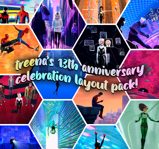
i've had my beloved blog for what feels like forever, but today it turns 13, so in celebration and as a little thank you to all of you for following my nonsense and sticking around, i've decided to share some of my favourite layouts that i've created.
PLEASE credit if you use any of these! either link to this post or the original sets linked below!!! (except of course the sharpening actions!)
HEXAGON LAYOUT - this is my favourite kind of set to make so i hope y'all have as much fun with this as i do. there's two folders of the layout, one is just the reverse of the other depending on how you want your gifs to look, just clip your gifs to each hexagon and watch it all take shape! [first seen here]
PALETTE MOVIE POSTER - this psd has folders for each element, so the text layers are labelled in a group, and then the palette boxes are grouped together too, just fill each layer clipped to a palette square with your chosen colour! [first seen here]
LETTERBOXD TEMPLATE - i almost didn't share this one because of the labour of love it was to make, but feel like i'm so proud of it, it deserves to be shared. each movie space is split into a group, and within that there's the folders for the star ratings. you can toggle on/off the heart/review/date (as the ratings change you'll just have to shift over these logos to keep things uniform!) and clip your gif over the shape for the movie poster. [first seen here]
DIAMOND MULTI GIF LAYOUT - the most simple of all the layouts, but it got a really great reaction so i'm throwing that in here too, again like the hexagons, there's two versions. one being the reverse of the others, just clip your gifs to each shape. [first seen here]
SHARPEN ACTIONS - VERSION #1 & VERSION #2 - have been asked about sharing these recently so thought i'd add this in, i mostly use version one but occasionally it's too sharp for certain media, so i use version two, which is just the same thing without the last extra sharpening!
1K notes
·
View notes
Note
hi sole! your sharpening is always so soft and pretty, i was wondering if you would be open to share it? hope you are having a wonderful november so far <3
Hi, Anon! Thank you so much <3 Yeah, sure, tutorial under the cut:
What you'll need:
Photoshop (I use Photoshop 2023)
Basic knowledge on how to make gifs
Camera Raw filter installed
Okay so, first of all, I use two different methods depending on the size of the gif. Let's start with the one I use for most of my gifsets which are big gifs (examples: x x x x.)
METHOD #1: Smart Sharpen + Camera Raw
I started using the Camera Raw filter last year and let me tell you, I'm obsessed! It completely changes the game of sharpening. I use this method for all gifs with a 568px width.
We're going to work on timeline so get your gif ready and convert it for smart filters. I'm using this scene from my last set as a base:

Here's the gif after I color it (I usually sharpen my gifs before I color them but for the sake of the tutorial I'm showing you this so you guys can see the difference):

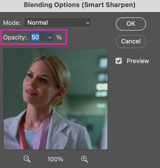
(1) Smart Sharpen Layer: Let's start by adding a Smart Sharpen layer (Filter > Sharpen > Smart Sharpen) with these settings:
Disclaimer: I didn't come up with these settings myself I got them from these sharpening actions forever ago so I don't know which one it is :/. I also wasn't able to find that person's new blog (if they even have one since they've been inactive since 2021) so if anyone knows please let me know and I'll give them proper credit!
Now we're going to go to the 'Layers' panel and click on this little thingy:

This window will pop up and we are going to change the Opacity to 50%.
(2) Camera Raw Filter: Here's where the fun begins. Go to Filter and click on Camera Raw Filter (you'll need to have the plugin installed for it to show up.) I don't know how the Camera Raw window will look like the first time you open it but good thing you only need to change a couple of things!
If it isn't opened yet click on 'Effects' and we're going to change the Texture and Clarity:
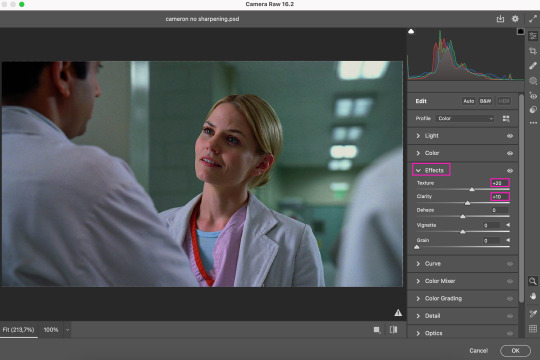
Depending on the scene/show/film I'm giffing, or if I want a stronger or softer sharpening, I'll use two different settings, but 99% of the time they are these:
First setting: Texture (+20) Clarity (+10)
Second setting: Texture (+40) Clarity (+20)


As you can see the difference isn't huge but the first setting gives a "softer" look. As I said I'll use one or the other depending on how I see the scene (it's almost always about the vibes yk.)
Feel free to experiment with these two and see what works best for you (although I wouldn't go higher than 40 on texture because the sharpening will look too fake imo.)
Also this filter is soooo good at making low quality videos look 1080p! Every time I've had to use 720p videos the Camera Raw filter has saved me 🫡
METHOD #2: Smart Sharpen
I use this method for smaller gifs. For example, 8 gifs of 268px x 180px sets (like these) or small-ish gifs in complex sets (like the second gifs in this set.)
This process is much simpler since it's the one I explained before but without adding the Camera Raw filter. That's it that's the method. Just a Smart Sharpen layer with the Opacity turned down to 50%.
As I said this method looks best on smaller gifs but to be honest it looks good on big gifs too? Depends on what you like most!
Anyway I hope this was easy to follow and if anyone has any questions please feel free to dm me or send an ask! ♡
242 notes
·
View notes
Text
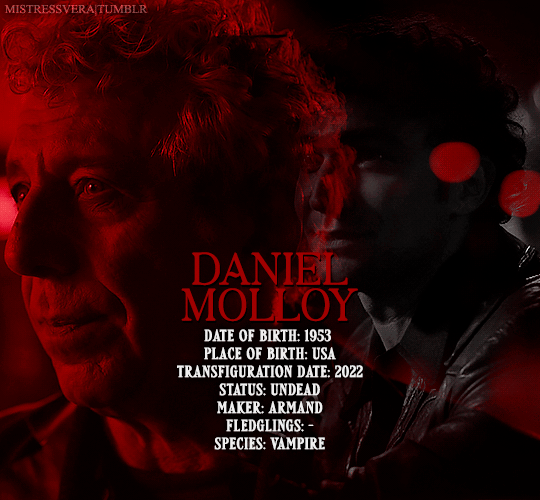
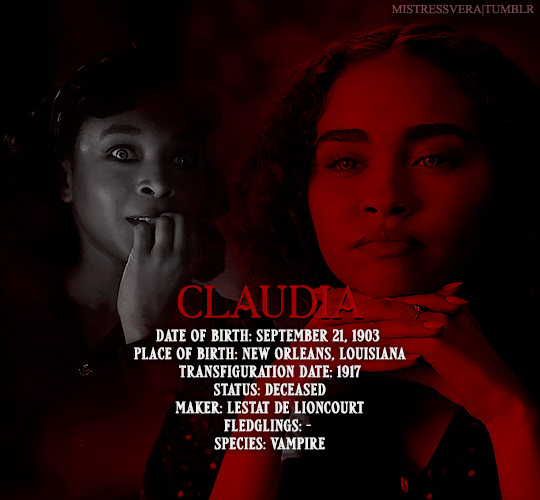
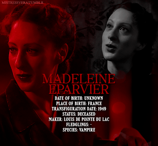
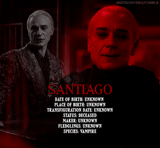
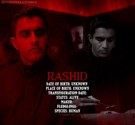
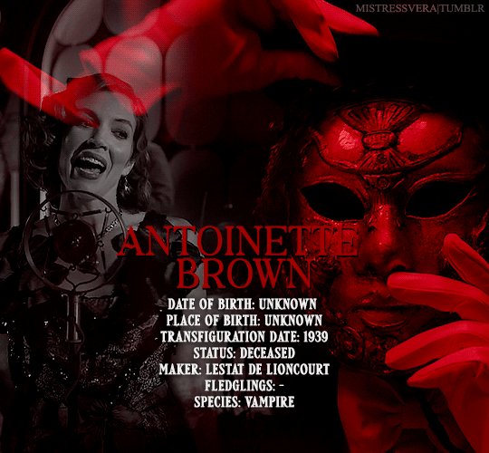
FILM & TV YESTERDAY, TODAY, TOMORROW | Day 3: Characters
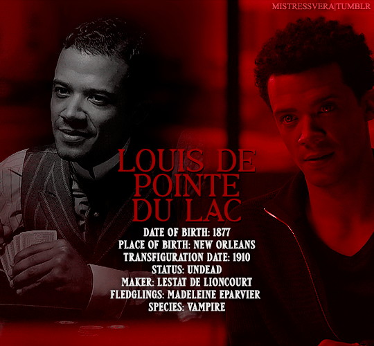
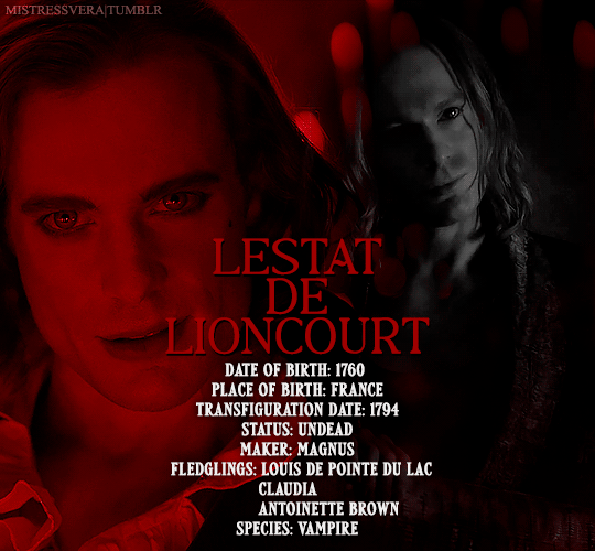
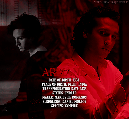
Interview with the Vampire (2022–)
695 notes
·
View notes
Text
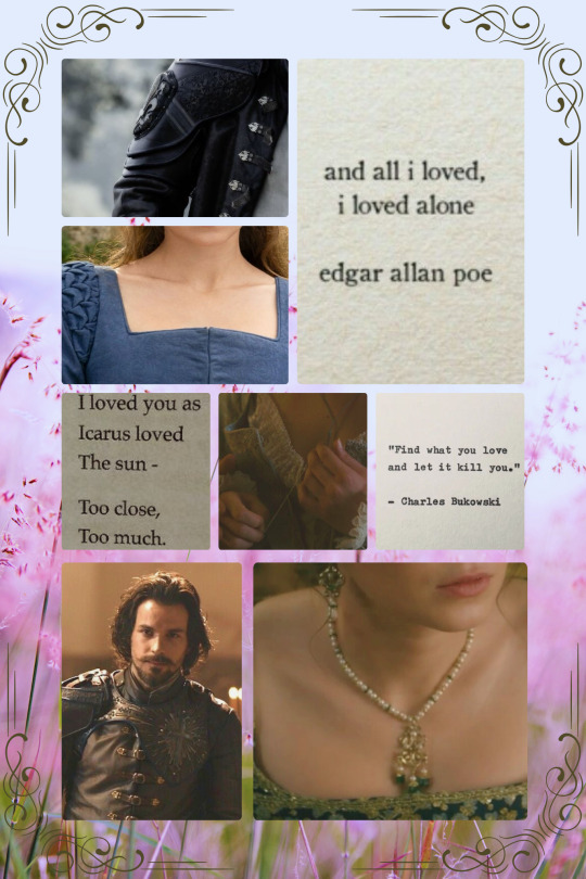
Happy Musketeer Monday!
Bonus moodboard under the cut… does it have to do with the chapter? Is it foreshadowing?….
Who knows! Not me lol
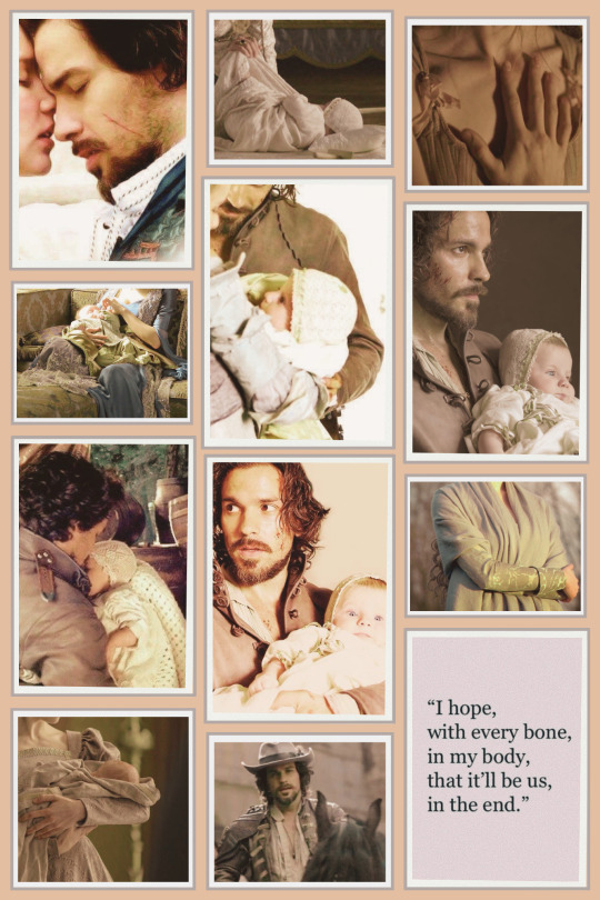
#to read#oh I need to catch up with this#I'm so behind 🙈#how you guys manage it all#I'm constantly running out of time#24h are just not enough 😫
13 notes
·
View notes