
Hello! My name is Edward and I'm here to show my pursuits/understandings as a growing designer. I hope you enjoy my page, thank you for coming. :)
Don't wanna be here? Send us removal request.
Statistics
We looked inside some of the posts by notim and here's what we found interesting.
Average Info
Notes Per Post
53
Likes Per Post
52
Reblog Per Post
1
Reply Per Post
0
Time Between Posts
4 days
Number of Posts By Type
Text
14
Last Seen Tumblr Blogs


Fun Fact
Celebrities use Tumblr as well.
Text
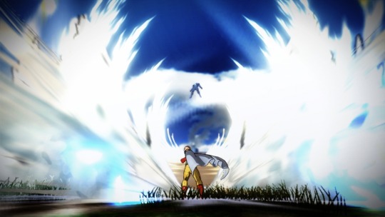
Scale & Proportions

The image above is from the game God of War 2018
Analysis
Scale & Proportion’s are both prevalent in the image above, and I have a simple way to prove this. What is the largest being in this image? If you said the snake, why? At first its odd to define but here are some terms found in the image to help! First and foremost Human scale, Look at the snake in relation to the person. Although the perspective might be odd its easy to see that the snake is in fact larger in the image than the person, you could say but what if the snake is closer to the camera? Well, look at the lower half of the snake. There’s fog around it meaning that it is in fact further back in the image, this is proven by there being no fog on the two people in the image. Geometry is also in the image. Look at the simplistic shape of the mans head. It’s a circle, his arms are cylinders, all are simple geometric shapes just added upon. Okay now I briefly mentioned my final way to prove that the snake is larger earlier. But where is the Snake in relative to the people? Having proven its further back its simple now to define and see that the snake is further back. I plan to use the different subtle nods to scale and proportion in my works from now on, to add on to them. In interest and precision.
Glossary
Scale
is the size of one object in relation to other objects in a design.
— a certain relative or proportionate size or extent (A human is 7.5 heads tall.)
— a standard of measurement or estimation (The UFO was as big as a football field.)
— point of reference by which to gauge or rate (My puppy is twice as big as your chihuahua.)
Aspect Ratio
refers to the proportions of the height and width of an image. It defines its overall shape, and it is usually shown as W:H (W is the width and H is the height).
Geometry
spheres, cubes, cylinders can be used to build more complex objects
Hierarchy
Arranged according to importance or power. What’s bigger or taller is often more important or harder to kill.
Human scale
sets the stage for the story happening to human-sized characters
Proportions
The size of the parts compared to the whole. Relativity.
Ratio
a ratio tells us what proportions mean to each other. Measuring one thing in terms of another. That monster is twice the size of the human. Their ratio is 2 to 1.
Relative
how objects appear in context with each other
22 notes
·
View notes
Text
CMYK: Emphasis

The gif above is from the anime One piece
Analysis
The GIF above is a perfect example of Emphasis. Can you tell why? The scene for instance is dominated by a single character, or simply One Element. So I ask what grabs your attention about this scene? To me its the character mentioned prior. The gif also uses placement to its advantage as the character shown is promptly in the middle of the image. This also means that due to the character being the focal point of this gif, everything else takes a back seat. This is defined as Subordination. I believe that using these different methods to create emphasis would help immensely in adding to any composition I create. I also believe that these different methods to create emphasis will help you the reader as well. Make sure to read below for other methods not listed here as well!
Emphasis Glossary
Emphasis
Pow! Something in a scene dominates. In other words, the designer gives visual priority to part of a scene in order to draw the eye there first.
Contrast
in size, color, texture can make one thing stand out from the many things around it.
Focal Point
The focal point demands attention, it is accentuated, contrasted -- the star or the most prominent component of a scene.
Isolation
Feature a single element alone, away from other elements to create emphasis.
One Element
Eliminate everything else in the composition and the thing that’s left will grab the attention such as a bold title or symbol.
Placement
Position your most important design component in a place to grab attention, such as the center of a poster.
Subordination
The focal point has the visual power while other elements of the scene are subordinate.
Whole over Parts
Sometimes we don’t want the eye to go somewhere specifically such as in an establishing shot at the beginning of a story. We want to show an overview of the environment before we jump into the story. We might look at a map with lots of details. The whole map is the important thing. When we select a place on the map to visit, then that spot becomes the focal point and the Emphasis shifts from the whole to the specific. Another example is that the whole game is more important than its levels.
1 note
·
View note
Text
Contrast

The gif above is from the anime Castlevania on Netflix
Analysis
The gif above is entirely made up of contrast. Black on a white canvas to make a legible animation. This is known as high contrast, of course meaning an extreme difference in the colors used. There is also asymmetrical contrast in the gif. This is shown in the stark differences between the humanoid character shown and the demon characters shown. They are different but undoubtedly of the same story. Contrasting camera angles are also an interesting way to create contrast for instance if you were to be looking up at someone it gives the idea of power to that character but if you look down at someone it has the opposite effect. In this case however the camera is used to show an imposing character and the demons who are running from him it’s as though they’re being chased. I could imagine using these different techniques as a way to increase the level of intensity at a moment in time, for instance if I were to animate a major impact of something like an asteroid. Or in general to add dynamism to a work. How might you use the different ways to create contrast in your work?
Contrast Glossary
Contrast
refers to the arrangement of opposite elements (light vs. dark colors, rough vs. smooth textures, large vs. small shapes, etc.) in a composition so as to create visual interest, excitement and drama.
Contrast
creates variety within a unit, draws the eye to a focal point, creates a sense of adventure or mystery. Contrast is a unifier. Value contrast is when a character or object has a strong darks and lights compared to the scene around it. Size contrast is a gigantic space cruiser compared to much smaller fighters.
Asymmetrical
balance is a dynamic compositional strategy in which each side of the axis are distinctly different yet belong to the same story.
High Contrast
is strong dissimilarity such as black letters on a white background. The high contrast setting is an accessibility feature built into interfaces to assist people with vision impairment. In visual perception of the real world, contrast is determined by the difference in the color and brightness of the object and other objects within the same field of view. Because the human visual system is more sensitive to contrast than absolute luminance, we can perceive the world similarly regardless of the huge changes in illumination over the day or from place to place.
Low Contrast
means a minimum of contrast between light and dark, so that the image is either predominantly dark or predominantly light. The sun sets, dusk sets in and in the gloom there is low contrast in the landscape.
Symmetrical
is a form of balance in which both sides of the axis are the same, a mirror image of each other, creating stability and formality.
Contrasting camera angles
Part of your story is how you show as well as how you tell. The camera is your audience’s view of your story and should be well planned to reveal the story in the most effective way possible.
9 notes
·
View notes
Text
CMYK: Rhythm
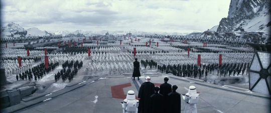
The Image above is from the Star wars Series
Analysis
Rhythm is movement, a tone, what defines an experience. The Image above imposes a level of dread when looked at. It makes its presence known through it sense of danger. The tension in this image is brought on by its Alternating rhythm, the most notable example of this is the black and white soldiers lined in the image. The image also has a Repeating Rhythm allowing it to continue with its tension by repeating it as much as possible. By repeating itself it rather than creates a sense of predictability it adds to its dread, an unending army. The Repeating Rhythm can also be seen as Visual Rhythm as it uses the same lines to build on its army. Overall this image repeats itself constantly however it uses it in a way add to itself, not to be consistent. I can imagine using this form of constant addition to add to my own works.
Rhythm Glossary
Rhythm
is caused by patterns in movement. What are those footsteps in the dark room? Arethey slow or fast? Running or sneaking up on you? Rhythm controls the pace of action in yourstory. Rhythm can be repeated character types, weapons, or color strategies. We see and hearrhythm throughout nature as well as in our digital environment. Rhythm organizes units intopatterns. Rhythm is created through repetition, alternation, and progression.
Alternating
Alternating rhythm is a form of repetition and is predictable. We switch back andforth from one thing to another like a tennis match. Alternating rhythm can create tension, suchas switching close up head shots of one character arguing with another.
Audio Rhythm
sounds that create patterns such breathing or shooting rounds of ammo.
Conceptual Rhythm
Intensifies, moves along, or calms the story. Conceptual rhythmcoordinates visual and audio rhythm with the pace of your story.
Contrasting Rhythms
are two or more sounds or motions at obviously different tempos.
Legato
means music in a smooth flowing manner, without breaks between notes or a smoothflowing motion.
Polyrhythmic patterns
use of simultaneous contrasting rhythms. A battle scene has many(poly) rhythms such as big guns, small guns, shouts, rumbles, footsteps, and explosions.
Progressive
rhythm is a pattern that changes over time to more or less intensity. Progressive rhythm makes us feel that. something is in an evolving state of change. We can tell when the battle is heating up by the rhythm of the sounds and the actions of the characters runningtoward or away from the fighting
Repeating
The same thing again and again gives us a feeling of predictability
Rhythm and motion
When a motion repeats, speeds up, slows down it creates a rhythm. Therhythm of tai chi is slow. The rhythm of Kung Fu is fast.
Staccato
derives from the Italian verb staccare, meaning "to detach," and can now describeanything - not just sounds - made, done, or happening in an abrupt or disjointed way.
Visual Rhythm
When motifs such as lines or shapes repeat visual rhythm forms.
1 note
·
View note
Text
CMYK: Unity

The Image above is concept art for the game Destiny by Bungie.
Analysis
Unity is wholeness. This concept art is undoubtedly whole. The different elements in the image for instance the colors used or the lighting in the right of the image create a sense of impending danger. They work together in unity to create something, in this case a feeling. The feeling this image gives is due to the different elements in the image, which allows this to be categorized as Conceptual Unity. There exists a magnetism in the image as a result of Proximity. The figure who is looking out to the city, is connected to the outer world ready for it. Do you agree with my Idea of there being a level of magnetism between the closer figure and the outer world? There also exists a form of structure through unity. For instance the city. The city creates visual unity through its repetition of sky scrapers, a staple of a city.
Glossary
Unity
is an entity that is a systematic whole. A fusion or union of parts in harmony to create aloneness. A game is a unity based on a fusion of levels.
Alignment
a common axis creates relationship, the line up creates meaning. Alignment in games can help you find your way on the map or aim true with your weapon. Alignment of troops or vessels indicates organizational strength. Maps are visually aligned with the edge ofthe frame. Your stats are aligned in a table.
Beat Boards
are used to illustrate major story points before the rest of the storyboard is completed. Beat boards are a series of single drawings that depict key focal points in a scene. Beat Boards can be compared to a children's book illustration because an individual picture shows a complex story. Beat boards can serve in art direction to indicate how the shot is staged and show color strategies, using shapes and colors, but are not detailed sketches. (paraphrasedfromhttps://roshnikakad.blogspot.com/2012/02/ss2-discovering-beat-boards.html)Making sure the beat boards relate to each other creates unity.
Composition
is the arrangement of visual elements within a shot. The three basic shot compositions in filmmaking are long-shot, medium-shot, and close-up.
Conceptual unity
a palm tree, an ocean beach, and a beer unify around the concept of 'vacation'
Contrast
creates variety within a unit, draws the eye to a focal point, creates drama. Contrast is a unifier. Contrast is when a character or object has a strong darks and lights compared to the scene around it. Size contrast is a gigantic space cruiser compared to much smaller fighters.
Proximity
closer distances connect elements and far apart elements create separation and sometimes magnetism
Repetition
things that look alike relate to each other. Shapes or colors that recur in the image create rhythm and recognizable situations.
Unifying Strategies
Designers manipulate contrast, repetition, alignment and proximity to create visual unity and to pull a story along.
Visual unity
is a group of repeating or similar elements that create balance or form a structure
3 notes
·
View notes
Text
CMYK: Point

Analysis
Points make up everything! It is in fact the smallest visual component. For instance every image you view from your device is made up by a pixel. Pixels are small areas of programmable color which allow the recreation of any and every visual possible. Pixels however are not all points are defined by, Points can have purpose apart from the physical they can be more of a notion like that of Focal point. Focal points are areas of importance in an image. They are where you look first or most in depth or where the artist put emphasis, look at the brightest stars in the image they are great examples of Focal point. How might point be used by you? or how have you seen it used that was either impressive or interesting?
Glossary
Point
is the smallest visual component.
Pixel
is a recently invented groovy word. The word "pixel" was first published in 1965 by Frederic C. Billingsley ofJet Propulsion Laboratory to describe the picture elements of video images from space probes to the Moon and Mars. A pixel is the basic unit of programmable color on a computer display. Think of it as a logical - rather than a physical - unit. The physical size of a pixel depends on how you've set the resolution for the display screen. Each visual composition on your screen is made of thousands of illuminated points of hue and value.
Focal point
is the feature of adesign or work of art that is the most interesting or important or the most strongly emphasized.
The Point
is what a player will tell a friend about the game if they like it.
The point
is the mission or a moving target.
The point of no return (PNR or PONR)
is the point beyond which one must continue on one's current course of action because turning back is dangerous, physically impossible or difficult, or prohibitively expensive. The point of no return can be a calculated point during a continuous action (such as in aviation). A particular irreversible action (such as setting off an explosion or signing a contract) can be a point of no return.
1 note
·
View note
Text
CMYK: Pattern & Texture

The image above is from the movie Incredibles 2
Analysis
Pattern and texture are both easy to define when they are present whether it be the scratches found on brushed aluminum(texture) or the 80’s design on the floor of the skating rink you visit(pattern). The image above does an amazing job at displaying Pattern and Texture. The material making up elastigirls suit is expressing a visual texture, as well as a pattern, one might also say that this image depicts texture mapping as well due to its 3D format. Visual texture basically means its texture which is not really there, for instance if you were to touch your screen at this very moment would you feel the texture of elastigirls shirt? No you wouldn’t, however you can perceive the texture because your screen displays it. Texture mapping works in synchronous with visual texture as it is the process of creating the image which you see as texture, in the 3D format. The pattern shown in the image is once again elastigirls suit, look at it. What do you see repeating on her shirt? The almost knitting, you can see it and it does something great, it adds to the overall perception someone may have of it.
Glossary
Pattern
is an arrangement, configuration, array, formation, guide, matrix of repeated forms. Patterns create rhythm and can be used to predict and organize design elements such as using a grid. In Software development patterns are conventions for describing and documenting recurring design decisions within a given context.
Alternating pattern
means to occur in succession, such as day alternating with night. To pass back and forth from one state, action, or place to another such as alternate between happiness
Chiaroscuro
is a technique of painting or drawing using a predictable sequence of light and shade to achieve a three-dimensional quality. Chiaruscuro has been digitalized to give depth and dimension in every 3-D video game or animation object.
Collage
is a technique of an art production, primarily used in the visual arts, where the artwork is made from an assemblage of different forms, thus creating a new whole. Collage is a prototyping process used to assemble colors, textures, silhouettes and other assets to test ideas, colors, size relationships.
Gradient
is continuous change, darkening, lightening, increasing or decreasing color saturation. A gradient is created when two or more different colors are layered to paint one element while gradually fading between the hues or values.
Grid
means a rectangular system of coordinates used in locating the principal elements of a plan.and depression.
Progressive patterns
create active change, momentum by shifting in a direction, increasing, escalating, or accelerating.
Radial balanced patterns are based on a circle with its design extending from its center. A few examples of radial balance are; a star, the iris in one's eyes, and a wheel with spokes.
Texture of something is the way that it feels when you touch it, how smooth or rough it is. The
Texture
of an object depends on the unique structure of its molecules. Fur may feel soft or coarse, metal may be oiled and shiney or rusted and rough.
Tactile
tactile textures are physical, touchable textures that you can actually feel on your skin in the real world, like when you pet a cat or dog.
Texture mapping
Texture mapping is a process in which a two-dimensional surface, a texture map, is wrapped around a three-dimensional object. When wrapped, the 3-D object acquires a visual surface texture. Texture maps create high frequency detail, surface texture, or color information on a computer-generated graphic or 3D model.
Visual texture
is an illusion of texture. Pixels or traditional drawing and painting media can be manipulated to give the impression of texture, while the surface actually remains smooth and flat. The texture on an ancient wall, a vehicle, or a creature's scaly or slimy skin increases the immersiveness of a game. Texture artist is a career path. Texture artists are close observers as they collect, organize, and use textures to create believable surfaces.
2 notes
·
View notes
Text
CMYK: Motion
The image above is an enhanced version of a frame from The Anime One Punch Man.
Analysis
The image above is interesting, because it displays immense amount of motion yet breaks one of the rules of motion.The rule the image breaks is that of the 180-degree rule, to an extent. The reason the image doesn’t break the rule entirely is due to the having lifted one of the characters up. Apart from that the image is sound, it displays a line of action in both of the characters shown. For the guy closest to the camera the person is in a lunge foward having punched, while the person further from the camera is in a position of having been punched flying back from where he was hit. And a another form of motion shown not in the image but in the scene it is associated with is that of anticipated action. In the scene due to the immense gravity of the punch the impact of the hit is built on, primarily before the hit has even been thrown, the character who throws the punch charges his fist back pausing for a moment then unleashes the powerful attack shown above. I really enjoy the idea of finding work around s for the rules of design, like the 180 degree exception I spoke of previously, I would most likely attempt to find work arounds when in the pursuit of something interesting, like that of a specific composition. I imagine using lines of actions to my advantage as well as they are ways to add a level of gravity to a motion. And lastly I would use anticipated action as a way, similar to the last, of growing on an action.
Motion Glossary
Motion is action, reaction, energy, what’s happening, gestures, dynamics, mobility,exertion, labor, and progress through space. Motion varies with your story. Motionindicators In storyboards are arrows, blurred lines, smears, zooms in and out. Your character is dramatized and embodied as a personality through gestural actions.
180-Degree Rule
In filmmaking, the 180-degree rule is a basic guideline regarding the on-screen spatial relationship between a character and another character or object within a scene. By keeping the camera on one side of an imaginary axis between two characters, the first character is always framed right of the second character. Moving the camera over the axis is called jumping the line or crossing the line; breaking the 180-degree rule by shooting on all sides is known as shooting in the round.
Anticipated Action
A dramatic action frozen in time, the tension mounts, we feel anticipation. We expect the sword to swing or the finger to pull the trigger or the couple to kiss. Camera Motion
Arrows are standard cues, a simple and recognizable way to show motion or progression in a storyboard.
Kinesthetic Empathy
A player’s actual movement when responding to action in a game. Leaning into a curve in a driving game is kinesthetic empathy
Line of Action Line of action is an artistic concept, an invisible line that captures the thrust and vitality of the movement. The line of action can be drawn by artists as the first element to capture or exaggerate the pose. Tip: Create the line of action as layer 1 so that you don’t downplay the pose. When you have the full energy of the drawing delete the action line layer.
Motion Blur
When your eyes or objects are in motion, the image will suffer from motion blur, resulting in an inability to resolve details. To cope with this, humans generally alternate between saccades (quick eye movements) and fixation (focusing on a single point). How is this biological situation useful in storyboard drawing? How do storyboard artists use motion blur? How does a smear function in animated motion?
Optical Movement
Optical movement is an optical illusion. Although the image is not moving, it appears to move. To see examples search “Op Art
Stillness
Stillness is calm, quiet, inaction, and peace. Stillness is the opposite of motion. It can be used to contrast with motion.
0 notes
Text
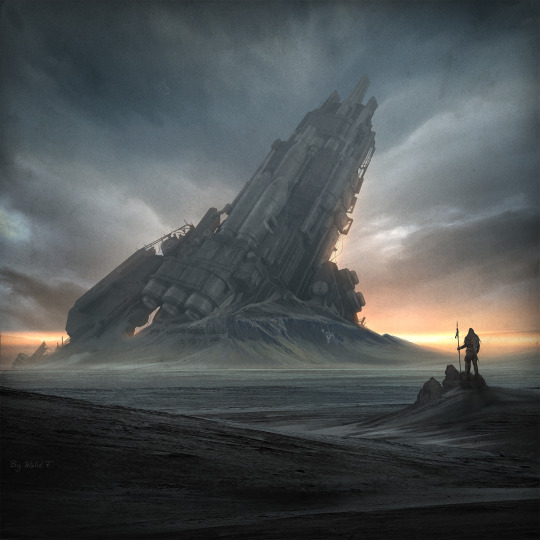
CMYK: Space & Depth

Art by Walid Feghali
Analysis
The Concept art above displays many forms of Space & Depth, all of which are used to create a cohesive and understandable work of art. One of the most notable uses of Space & Depth in the work is that of Atmospheric perspective. Atmospheric perspective in the work creates an interesting background, it also highlights the castle like structure as it is not affected by the Atmospheric perspective to the degree of whats behind it, instead it keeps its contrast and pops in the image. A second form of Space and Depth in the image is Foreground middleground & Background, this is obvious to see, the foreground is what is directly in front of us, from our point of view, the middleground is where the person is and where the light hits closer to us on the water, the background starts at the castle and goes further back. Another form of Space & Depth is Vertical Position In the image this is used to get a sense of gradeur to the castle, the way it does so is by lifting the object higher in the image to make it larger as wall as further away. Possible uses of the forms of Space and Depth above, for works of my own for all of these combined would be to create a level of emphasis, similar to the emphasis on the castle. Atmospheric perspective behind the “subject” of a work. Foreground middleground & Background will help me guide my self to an interesting composition, furthering the idea of emphasis. Lastly, Vertical positioning to create grandeur and an emphasis on the subject once more like in the image shown above.
Space/Depth Glossary
Space is an area, expanse, territory, distance or range. Variable spaces expand orcontract as our stories unfold. A closeup has a short range. A wide shot covers a lot of territory
Atmospheric Perspective
Value contrast and color saturation decrease with distance. Brightness increases asobjects fade further into the background. In addition, objects such as mountains mayappear more blue.
Diagonal Shapes
Diagonal shapes pull the eye in a direction to create the illusion of depth. If the diagonalis going back like a railroad track or fence-line the eye will follow it into the perceiveddistance.
Elliptical Perspective
An ellipse is an oval shape. Elliptical perspective provides visual clues to the location ofcurved surfaces in space. Look straight down on a glass of water. The rim of the glassis a circle. Move the glass to the side, the rim now appears as an ellipse. Line up the rimat your exact eye level, the ellipse now appears as a straight line.
Foreground, Middleground, & Background
The 3 treatments of objects in space support design to achieve depth. This template forplacing and sizing objects in the picture plane shows variations on the foreground,middleground, background configurations.
Foreshortening
Foreshortening is when an object's dimensions appear shorter when angled toward theviewer. At the same time the part coming toward the viewer is enlarged.
Linear Perspective
Linear Perspective is a system used by artists in which the relative size, shape, andposition of objects are determined by drawn or imagined lines converging at a point onthe horizon.
Overlapping
Overlap is when part of one object is obscured by another object. The obscuring objectappears to be in front.
S-Curve or Winding Path
In an image of a landscape, S-curve or winding path will draw the eye of the viewer intoa perceived distance.
Size relationships (Also in the image write in the comments if you see it!)
Objects appear smaller as their distance from the observer increases.
Transparency or Opacity
Transparency or opacity is when we feel like we can see objects through a glassy,gauzy, smoky, or dusty layer. The transparent/opacity adjustment affects the saturationand color of objects to give a feel of depth.
Vertical Position
Vertical position places objects higher up in the composition to appear further away.
Volume
Volume is the amount, expanse, extent, magnitude, size, aggregate, bulk, dimensions,or mass of an object. The volume variable indicates the amount of territory needed foreach object in a scene.
0 notes
Text
Value
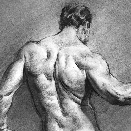
The drawing above is by Proko
Analysis
The drawing above is completely and utterly a value drawing. Value in Design is the use of different levels of dark’s and light’s to create a complete image. The dark is to create shadows while the light is to create highlights and as shown above the work is easy to understand due to the use of both. Chiaroscuro the use of strong contrast to indicate volume is heavily prevalent in the image above, it allows the viewer to differentiate the different muscles in the back aswell as the arms, one could immediately tell where the arm begins and ends by viewing the image. As stated earlier this work makes use of different levels of dark and light, this Is called Light and Dark and it is exactly that different levels of light and dark used by the artist to create a cohesive and understandable work.
Glossary
Value in design
Value in design is lightness or darkness on a scale of white to black (with white being the highest value and black being the lowest value). Value is widely considered to be one of the most important variables to the success of a design.
Chiaroscuro Chiaroscuro (English: kee-AR-ə-SKOOR-oh, -SKEWR-, Italian:; Italian for "light-dark"), is the use of strong contrasts between light and dark with bold contrasts affecting a whole composition. Chiaroscuro is a technical term for the use of contrasts of light to achieve a sense of volume in modelling three-dimensional objects and figures.
Light and dark
Light and dark Every element in your design has a value from 1% black (almost white) to 100% black. Value is relative to everything in the composition. Every color has an underlying value somewhere between white and black.
Value as emphasis Value as emphasishappens when a strong contrast in value draws attention to itself such as on this ancient Greek vase illustrating value contrast in the service of visual storytelling. Kylo Ren’s red light sable shows value contrast against the dark background.
Value and space
Value and space Designers use dark and light values to create the illusion of light as it falls on objects. Value is used to create the illusion of highlights and shadows. Highlights and shadows combine to create the illusion of a light source. The pattern of light and dark can create dimension, volume, and mass.
Value patterns
Value patterns appear regularly in the world, in human-made design, and even in abstract ideas such as stories. The elements of a pattern repeat in a predictable manner. Night and day is a value pattern common in stories.
0 notes
Text
Color

Art by WLOP
Analysis
The digital painting above is by the artist WLOP, and it contains amazing uses of color as do all of the works I have seen by WLOP. One of the color strategies used in the work is Warm & Cool. Warm & Cool is exactly as it sounds it is the contrast of two colors, one which is warm and another which is cool, in this instance the cool is everything but the jellyfish and the face of the person in the image, these instead are the warm. This strategy is used to create a dynamic, and almost a drama. The Warm & Cool also does something interesting it makes you feel something on an emotional level. It draws you in to the image with the intent of exploring it, it provides a zen state to those who view it. Color is a major reason for this, it is known as color psychology. I want to ask you as a person, how does the image make you feel? What images do you feel attached to. Feel free to think on your own or comment below, I would be more than interested in hearing from you all. Lastly this image has an amazing palette. The image although consisting of a relatively limited palette consisting of different shades of blues, blacks, skin tones, and oranges. It is extremely well planned for this exact painting.
Glossary
Visible light spectrum
is the segment of the electromagnetic spectrum that the human eye can view. This range of wavelengths is called visible light. Typically, the human eye can detect wavelengths from 380 to 700 nanometers.
Color Psychology
Color psychology is the study of the effect that colors have on emotions, behavior and feelings of people.
Color Systems
Color systems classify color and analyse their effects.
● The additive color system is used for colors of light such as light emitted from computers, phone screens, and projectors. Red, green, and blue are the primary colors
● The subtractive color system is used for pigments such as ink, dye, and paint. Cyan, magenta, and yellow are the primary colors.
Color to Show Depth
Change in Color is to use color to separate the foreground, midground, and background planes to create the illusion of depth and is commonly used in animation.
Local Color
Local color is the natural color of an object unmodified by adding unrealistic light and shadow or any other distortion. The color that the eye observes is altered by lighting conditions such as time of day or the surrounding environment. The local color of a lemon is yellow.
Palettes
The definition of a palette is the range of colors used in a particular composition or by any person who uses color such as an artist, house painter or interior decorator. An example of a palette is Vincent Van Gogh’s limited palette of hues in his Starry Night painting. Starry Night’s palette is a variety of blues, greens and yellows. Close up video of Starry Night lets you come closer than you could at the Museum of Modern Art.
Properties of Color Properties of color are hue, saturation, and brightness.The H, S, and B in the
Photoshop Color Panel stand for hue, saturation, and brightness.
● Hue is the named color around the color circle such as red, orange, green, yellow, violet, and blue.
● Saturation is the intensity or purity of a hue. Fire engine red is more highly saturated than brick red or the color of red wine.
● Brightness is the perceived intensity of light coming from a source such as a screen. On a color screen, brightness is the average of the red, green and blue pixels on the screen. Brightness is important to both color perception and battery life on mobile devices. Brightness of a screen can be adjusted.
Symbolism of Color
Symbolism of color in art and anthropology refers to the use of color as a symbol in various cultures. There is great diversity in the use of colors and their associations. Diversity in color symbolism occurs because color meanings and symbolism occur on an individual, cultural and universal basis. Color symbolism is also context-dependent and changes over time.
12 Color Strategies
1. Monochromatic means variations of a single hue such as a light blue and a dark blue or a greenish aqua blue and a lavender blue.
2. Achromatic color strategy integrates variations of black, white, gray, and a full range of neutrals.
3. Full Spectrum Strategy represents the full circle of spectral colors by incorporating at least five of the base hues.
4. In the Achromatic/Chromatic Mix strategy Achromatic colors dominate the composition with a chromatic hue accent.
5. Warm/Cool: Contrasting ‘temperatures’ of warm & cool. Cool colors appear on the green/blue/violet side of the color wheel. The colors on the red/orange/yellow side of the color wheel are called warm. Emphasis is on the contrast between warm and cool achromatics: brown - gold (warm), grays - silver (cool)
6. Saturation Similarities/Saturation Contrast
● Saturation Similarities: Hues may vary in this strategy, but all colors must have the same or very similar saturations.
● Saturation Contrast: Hues may vary but all colors must have significant contrast of saturation.
7. Value Similarities/Value Contrast
● Value Similarities: Hues may vary in this strategy, but all colors have the same or very close values.
● Value Contrast: Black (or dark desaturated hues) contrast with white (or very desaturated tints of hues). The Value Contrast strategy demonstrates strong distinction of value with the strongest example being between black and white.
8. Complementary Dyad creates a strong hue contrast. Complementary hues are located directly opposite each other on the color circle
9. Split Complementary strategies are based on two complements. To create a split complementary color strategy select one hue and contrast it with the hues on either side of its complement, such as Red & YellowGreen/BlueGreen.
10.A Tetrad strategy uses four equilateral hues from the color circle, such as Red, Orange, Green, Blue.
11.A Triad strategy uses three equilaterally balanced hues from the color circle, such as primary, secondary, or tertiary.
12.Analogous strategies collect 2 or 3 neighboring hues on the color circle.
0 notes
Text
CMYK: Shape

Drawing from comic Solo Leveling.
Analysis
The Image above is a great example of many different forms of shapes in design. The most notable use of shape in the image is that of silhouette. Silhouette consists of simply a shape which is easy to define even without detail. For instance the arms of the almost alien looking being in the picture are made up in some places, just black. Nonetheless, the arms are still recognizable. Another form of shape found in the image is Positive and Negative shapes. Positive and Negative shapes are used to create interest in an image, an example of this type of shape would be the aura of the character. (The red swirly thing behind them), by using the Positive and Negative shapes properly in this image the alien looking monster looks even more menacing. A use of shape in this type of artistry is that of rectilinear or a boxy shape created using straight lines. Although found in the subject of the drawing, to me the most prominent use of this is in the framing of the drawing. Although the artist had no control over the format of the digital canvas used due to the requirements of a webcomic of this sort, the artist made the absolute best use of it, to frame his work.
Glossary
Abstract Shapes and Abstraction
Abstract means no recognizable objects. Abstraction is a sliding scale from realism to completely non representational. Abstract shapes can be used in backgrounds and textures.
Biomorphic
Biomorphic is a free-form pattern or design with a shape suggestive of a living organism, especially an amoeba or protozoan.
Curvilinear Shapes
Curvilinear shapes are s-curves.
Distortion
Distortion is exaggeration, contortion, reform, slant, twist, or warp in ways that depart from reality.
Idealism
Idealism asserts that the physical world is less important than the mind or the spirit which shapes and animates it.
Non-objective Shapes
Non-objective shapes have no object as a reference and no recognizable subject matter. Non-objective shapes are often used to simplify design shapes. Geometric shapes such as a triangle, square, and circle are abstract until you put them together to represent a house or a smiley face.
Positive and Negative Shapes
Positive space is the subject, focal point, or areas of high interest in any composition. Negative space is the area around the areas of interest. All compositions balance positive and negative space. Yes, stuff in the negative space can point to the focal point to make it most obvious. Positive and negative create a whole. Every composition is a combination of positive and negative space. Wield the positive and negative spaces with control and story-telling magic to become a design master.
Realism or Naturalism
Realism, or naturalism, attempts to represent subject matter truthfully, without artificiality or exotic or supernatural elements. In the visual arts, illusionistic realism strives for the accurate depiction of lifeforms, perspective, and the details of light and color.
Rectilinear Shapes
Rectilinear is a boxy shape made with straight lines. For example, the screen you are looking at is a rectilinear shape filled with little square pixels, and pixels are also rectilinear. A storyboard is a series of drawings in a linear set of rectilinear frames.
Representational
Representational means objects that players can name. The object represents something from the real world, or something that has the verisimilitude of realism.
Silhouette
Silhouette is a profile or shape that is easy to identify.
Squash and Stretch
Squash and stretch are shapes profiles that emphasize motion. The stretched position shows the form in an extended condition. When you do a sit up your belly squashes and your back stretches.
13 notes
·
View notes
Text
CMYK: Lines
Art by Walid Feghali
Analysis
Lines are a tool used by all artists to create works of art, How might lines express something not explicitly shown? In the concept art above by Walid Feghali there are lines which are not explicitly shown, these lines are known as Psychic Lines. The Psychic Lines are what guide the viewers eyes, starting from the ship, to the person viewing the ship and eventually back. There also exists line quality in the work most notably to the sides of the ship where the light softens the line. The lesser line quality to the sides of the ship increases the 3 dimensionality of the work by making the center piece (the ship), more pronounced. An extremely well used asset to this work is that of line as a value, the best example of this is anywhere contrast or shading is achieved, for instance, the ship itself. Due to the ship being backlit, the ship has almost a dull lighting to it, while the sides are lightened to create a contrast. In a work which I might produce I would use the many forms of line to create, at first interest using Psychic lines, I would get a viewer to look around and be drawn in. Secondly, I would use Line Quality to emphasize the 3 dimensionality in a work, for instance making something in the foreground look blured to create an out of focus look. Lastly I would use Line as a Value to create contrast as well as create different lighting opportunities for myself.
Line Glossary
Lines have both a direction and a length. Line means a mark, streak, stroke, slash, path, stripe, border, contour, striation, course, route, and track. Curved, bent, thick, wide, broken, vertical, horizontal, blurred, or freehand, lines delineate shapes, forms, and spaces, volumes, edges, movement and patterns. Not only that -- lines create both 2D and 3D objects and figures.
Contour Lines
Contour lines indicate the edge around an object or the changes in volume within an object. Contour lines dramatize changes of plane within the form. The curve of a belt around the waist is a contour line.
Diagonal Lines
Diagonal Lines are useful to draw the eye into a composition such as toward the vanishing points.
Three common types of diagonals are:
1) actual diagonal lines
2) objects placed diagonally in a scene
3) a diagonal line created by the viewpoint such as the Dutch tilt.
Dutch Tilt
Dutch Tilt (known as a Dutch angle, canted angle, or oblique angle) is a type of camera shot that has a noticeable tilt on the camera’s “x-axis.” The Dutch tilt camera technique was introduced by German Expressionists in the 1920s — so it's not actually Dutch. Directors often use a Dutch angle to signal to the viewer that something is wrong, disorienting, or unsettling.
Explicit Lines
Explicit means clear, direct, and obvious. If a drawing is easy to read it may be that the lines are explicit, clean, with efficient use of variety. There are explicit lines around the frame of the Dutch Tilt illustration.
Gesture Lines
Gesture Lines capture motion, such as in an action pose when gesture drawings are used in storyboards. The figures at the head of the Rembrandt Elephant drawing show the quickly sketched human gestures responding to the elephant.
Implied Lines
Implied lines in 3-D scenes a line in a scene that is not physically there but is suggested by points in the art. Implied lines suggest the edges of an object or planes within an object. The line may be broken such as a dotted line, it may be defined by value, color, or texture, or it may not be visible at all. With implied lines, our brain interprets that a line exists.
Line as Value
Line As Value has a long history. Artists have used line drawings to create value, or shading, and to achieve the impression of volume.
Line of Action (Also see motion)
Line of action is an imaginary line that extends through the main action of the figure. When you draw an action figure you can capture the line of action on one layer then draw the figure drawing on another layer.
Line Quality
Line quality is the expressive essence of lines. Varying the line quality makes objects appear more 3-dimensional and exciting. Range in line quality heightens descriptive and suggestive potential. A single line can change in darkness and width, can vanish all together to mentally reconnect later on an edge.
Line Weight
Line weight refers to the thickness or thinness of a line.
Lost and Found Lines
We don’t really need a strong contour line around every part of an object because our brain will fill in the blank where the edge disappears. When a line fades out and then restarts further along the edge it is called a lost and found line.
Psychic Lines
Psychic lines are invisible. Psychic lines form between characters or between a gun and a target, or a hand pointing in a direction. There is no real line yet we feel a line. Eyes looking in a direction, especially characters looking at each other create a psychic line.
0 notes
Text
Welcome to my Blog!
Hey everyone! My name is Edward Ramon an I am currently enrolled at the University of Texas at Austin in the Arts & Entertainment Technologies (AET) Major. My goal in life is to become a well rounded creative, to be able to create without limitation. This is a start to that goal, and a way for me to share what I learn. With you, as well as future me. Thank you!
1 note
·
View note