#((edit corrected the text in image 3))
Explore tagged Tumblr posts
Visit Tumblr Blog
Explore Tumblr blogs with no restrictions, modern design and the best experience.
Last Seen Tumblr Blogs


Fun Fact
After the announcement of the deal with Yahoo!, there were 170K signatures of unhappy Tumblr users petitioning to prevent the sale in 2013.
Text

^ iterator projection tutorial!! ^
this post follows on from this one made by @prismsoup, intended to cover my slightly more extended process (including post-processing)
step -1 : pre-requisites
this tutorial is designed around clip studio paint for PC because its what i work with. its probable that whatever other program / platform you're using has these features but under different names
i use a rainworld typography font for text. find it here (or do it yourself)
i use scanline textures as a part of this. find them here
step 0 : select a base image

maps, blueprints and diagrams are favourable due to lots of detail without it derailing into noise. get experimental though, my favourite one came out from a picture of a nebula, and another from a friends factorio screenshot
step 1 : binarise & flip
this command can be found under edit > tonal correction (D) > binarization. this forces every pixel in the image to be either black or white. adjust its sensitivity to your liking
step 2 : remove background

add in a black layer below (not just paper layer, as will become important later). wand select the background colour and delete it. if the remaining colour is black, CTRL+I to invert it to white
step 3 : add details

replace any text with rainworld font or simply remove it. add in blueprints or other complex decals (drawingdatabase is a decent source). during importing remember to binarise (after resizing). for "lower layer" elements such as contour lines create outlines for higher layers to retain clarity
step 4 : add multiply layer(s)
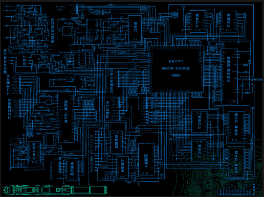
if you want to have multiple colours, put everything in the "higher" layer into a folder and set the top multiply to clipping above it
step 6 : post processing setup

copy all existing layers, create a new folder on top, and paste into that folder. right click the folder and "merge selected layers" set the resultant layer to add(glow). copy+paste and hide duplicate for now. from filters > blur apply a guassian blur with a strength of 130-170 (this creates the base bloom layer). set opacity to ~50%
step 7 : chromatic abberation
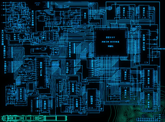
unhide not-blurred layer. guassian blur with a strength of 2. duplicate again. select top layer and move 1px up and 1px left (with arrow keys). CTRL+U then change the hue by 30. select bottom layer and move 1px down and 1px right, CTRL+U then change hue by -30.
stronger chromatic abberation can come from stronger gaussian blur and more change in hue
step 8 : scanlines
add the scan lines on top, invert so that they're white and set to add(glow). copy a multiply layer over it and make sure clipping is on. decrease layer opacity to ~10%. if it does not cover the whole image initially, paste more in and merge them together into one layer
tada! you now have one iterator projection. if you want to give it an extra affect, re-import the final PNG and filter > distort > convert to panorama. set distortion to 10 and scale to 101 (note that this drastically blurs the image)
299 notes
·
View notes
Text


GeminiPixel's Wall Decor Dump ✨✨
❖I'm back with another download for the month of October. I have been preoccupied with Frequent Exams and University coursework, so hardly had time to do anything Sims related. But I have been working on small CC projects such as creating wall decor for my kid and teen sims in mind. The majority of them are music related, but this is just the first collection I made and will be sharing publicly.
Credits: Pinterest for Image, and here for poster mesh used 💕
Info:
Includes 7 packages to pick and choose from
Each package has around 18 to 21 variations.
Price range for wall art is anywhere from $5 to $12. I was not paying attention when setting in game prices.
Found under Paintings category in Buy mode.
Known Issues:
To keep the file sizes reasonable, I did edit the .dds within the package before exporting to double-check if I added the right images and deleted duplicates. As a result of this, In the Disney collection and Female Singer posters, in-game some swatches may look blank but when placed are the correct photo.
Download: Folder
If you encounter any other issues or problems, please let me know. Thank you for downloading :). Previews can be found under the cut if you want an overview of what's inside each package file.
@pis3update @simfluencer-network @eternalccfinds

Package 1: 90s Black Music artist

Package 4: Disney Kid posters

Package 3: Female Singer poster set 1

Package 2: Male singer poster set 1

Package 7: Netflix Framed Posters


Package 6: Black Female artists framed


Package 5: Black Male artists framed
Images may look blurry in preview photos, but in-game are relatively HD and the text is clear. Also may seem a bit more saturated due to my in-game G-shade which I didn't turn off.
#sims 3 simblr#Sims 3#Sims 3 cc#Sims 3 custom content#GeminiPixelDownload#Sims 3 Wall decor#Sims 3 Posters#b:decor
214 notes
·
View notes
Text
Installing Scriptorium for Legacy Users
So you're a Sims 2 Legacy player who wanted to install some modular stairs? Maybe a lighting mod? You installed Scriptorium and you enter your game and suddenly your foundation is missing or crashes your game whenever you try to place it. Or maybe your pools and rooves have fences in them?


(images sourced from Lazy Duchess Discord server)
WTF did I do?
You've broken your script files!
Currently they look like this:

When they should look like this:

What do the script files do?
They give the game instructions and settings for certain build items that are generated by the game engine such as walls, foundations, pools, modular stairs, fireplaces, rooves, awnings and more. Lighting also uses scripts for some things. Some of these items require the scripts to display in catalog or at all.
How did this happen??
So i've seen two different ways, firstly, the auto installer installs in the wrong location. So what does the player do? They moves the files into the correct location.
The issue with this is the script files that Scriptorium creates when it can't find your game files are missing ALL of the original script lines. Then when you replace your existing script files with these, you basically are replacing your script files with a blank one (minus the Scriptorium lines).
Second way, when manually installing, the player deletes the contents of the original script files and replaces it with the Scriptorium lines.
This results in the same outcome shown in the example script.
Why does this affect only Legacy players?
Legacy uses different file paths. Scriptorium was last updated after M&G came out. The auto installer was made to work with the discs in both their original and compilation file paths. For example, Double Deluxe\Base or Sims 2, or Fun with Pets\SP9 etc. All other versions up until this point have used these paths so they never experienced this issue. EA decided to do something different this time and go by EP/SP numbers. So the installer gets confused and places them in the wrong place.
How do I fix this??
A few options, reinstall or repair your game, or replace the broken script files with the ones below. Place them in your C:\Program Files\EA Games\The Sims 2 Legacy\Base\TSData\Res\Catalog\Scripts folder. You may need to delete the files first that you are replacing and cut and paste the new ones in.
Download Original Scripts
But I still want to use Scriptorium?
Once you have replaced your broken scripts, follow these manual instructions that I have modified from the original Scriptorium post for Legacy users.
Go to C:\Program Files\EA Games\The Sims 2 Legacy\Base\TSData\Res\Catalog\Scripts
And open the fireplaces.txt and copy and paste the line below at the bottom of this file without deleting the existing text.
wildInclude "Scriptorium_Fireplaces*.*"

Then save.
If you have issues with saving due to permissions, cut and paste the files to desktop while you are editing them and move them back after
Next open modularstairs.txt and add the text below
wildInclude "Scriptorium_ModularStairs*.*"
Then open walls.txt and add the text below
wildInclude "Scriptorium_Walls-Fences-Arches*.*"
While remaining in your Scripts folder, Create 3 new folders and call them
Scriptorium_Fireplaces Scriptorium_ModularStairs Scriptorium_Walls-Fences-Arches
Select these 3 folders and right click and choose copy.
Now go to Documents\EA Games\Sims 2 Legacy\Downloads (if you do not have a Downloads folder, create one)
Then right click and press paste shortcut
If you want to use custom lights as well, follow these steps
If your lighting.txt is also empty, this is a copy of the original version
Download Lighting Script
Go to C:\Program Files\EA Games\The Sims 2 Legacy\Base\TSData\Res\Lights
Open lighting.txt and add
wildInclude "Scriptorium_CustomLights*.nlo"
While still in the Lights folder Create a folder called Scriptorium_CustomLights If you already have a folder called CEP3_CustomLights, rename it to Scriptorium_CustomLights
Right click on this folder and copy it
Then go to Documents\EA Games\Sims 2 Legacy\Downloads and paste shortcut
And you are all done :D
If you have any issues, feel free to leave a comment or send a message!
115 notes
·
View notes
Text


Ryoko Kui Exhibition & ''Delicious in Dungeon'' Exhibition pamphlet
Transcript under the cut
Disclaimer is that I used an image to text website and then proof-read it myself and made corrections where it got the text wrong. There was a few typos in the original text (like writing fied instead of fried) but I kept those in just in case I interpreted something as a typo but it wasn't.
[page 1]
Ryoko Kui Exhibition & "Delicious in Dungeon" Exhibition Introducing Ryoko Kui (1) Manga artist. After working through her website "Nishi ni wa ryū ga ita" (A dragon in the west) and her own dojinshi (self-published works), Kui made a debut with "Ryu no gakko wa yama no ue: Kui Ryoko sakuhin-shu" (The dragon's school is on top of the mountain: Ryoko kui works) published with EAST PRESS in 2011. Then published "Kui Ryoko sakuhin-shu: Ryū no kawaii nanatsu no ko" (Ryoko Kui collection: Seven Little Sons of the Dragon) in 2012 with KADOKAWA, and "Hikidashi ni terrarium" (Terrarium in Drawer) in 2013 with EAST PRESS. In 2014 she started her first long-running series "Dungeon Meshi" (Delicious in Dungeon) in KADOKAWA's magazine Harta. In January 2024, she released her book, "Kui Ryoko rakugaki bon Daydream Hour" (Ryoko Kui's sketchbook: Daydream Hour) of illustrations she made while working on "Delicious in Dungeon" as well as illustrations from before her debut. She has a diverse range, from science fiction and fantasy to historical dramas. The world building in her fantasy works is particularly unique, as they merge the extraordinary into the everyday to create an overwhelming realism and persuasiveness through meticulously refined settings. Kui won the Excellence Award in the Manga Division for "Terrarium in Drawer" at the 17th Japan Media Arts Festival by the Agency for Cultural Affairs, and "Delicious in Dungeon" has been awarded numerous accolades, including the 2015 Comic Natalie Grand Prize, TAKARAJIMASHA's award for This Manga is Amazing! 2016 Men's category 1st place, the Nationwide Bookstore Employees' most Recommended Manga of 2016, and the 55th Seiun Award in the Manga category, which is awarded to outstanding science fiction works. Introduction (2) Delicious in Dungeon" is a hugely popular manga; over 14 million copies have been sold.* To celebrate its anime adaptation, the large-scale exhibition "Delicious in Dungeon" Exhibition was held in Tokyo and Nagoya from April 2024. This exhibition is a continuation of the touring "Delicious in Dungeon" Exhibition, with the addition of the Ryoko Kui Exhibition; the first exhibition of artwork by the original artist Ryoko Kui. In the Ryoko Kui Exhibition, you can see her outstanding character designs, realistic settings and the unique narrative developments which have captivated readers, through reproductions of manga manuscripts and interview exhibits. We hope that you enjoy exploring the fascinating world of Ryoko Kui. In the "Delicious in Dungeon" Exhibition, you can enjoy photo spots, and impressive three-dimensional monster displays from the labyrinth adventures undertaken by Laios and his companions in the first season of the anime. We hope you will enjoy the fun of the original manga, the anime, and the exhibition to your heart's content. We would like to express our sincere gratitude to Ryoko Kui and the original editorial team, including everyone involved in the anime production and everyone who helped with the planning of this exhibition.
Ryoko Kui Exhibition & "Delicious in Dungeon" Exhibition Executive Committee
As of April 2024, including digital editions.
The dragon's school is on top of the mountain (3) This is Ryoko Kui's debut work, and her first collected volume of works. Published in 2011, it collects seven of her stories previously published on her website and in doujinshi (self-published works), as well as two new stories. It includes a trilogy of tales which may have taken place behind the scenes of the heroes' adventures in a Role-Playing Game; and which follow the conventions of an RPG. These are "Kikyō" (Return home), which portrays the sorrow of a hero having returned to his hometown after defeating the Demon King; "Mao" (The demon king), which tells the tale of the Demon King from his birth to his downfall; and "Maō jō mondai" (The problem of the demon king castle), which depicts the course of events surrounding the demon castle having lost its master. The story "Gendai shinwa" (Modern myths) depicts the daily lives of coexisting horsepeople (centaurs) and ape-people (homo sapiens), told from the perspectives of a centaur and homo sapien married couple, and a female homo sapien company employee and her junior male centaur. It comically depicts real-life issues such as anti-labor regulation demonstrations, and the disparity between retirement benefits and life expectancy, and as such can be considered satire of the diverse issues faced by modern society. The title story "The dragon's school is on top of the mountain" is set in a university that has the only "Faculty od Dragons" in Japan. It depicts the members of the dragon research society who seek out ways to use dragons, which apparently have no demand in modern society. They explore uses for dragons, such as for food, as pets, and as advertising media. Other highlights include Kui's sad love stories, told from unique perspectives, such as the fairytale-esque "Daikon yama no yome sagashi" (A bride for Daikon mountain) which tells the tale of a man's efforts to marry a female god in order to bring fortune to his poor village, and "Shingaku tenshi" (School-going angel) which depicts the woes of a high school girl with angel wings.
[page 2]
Seven Little Sons of the Dragon (4) This collection of short stories includes self-published works and short stories published in KADOKAWA publishing's magazine Fellows! throughout 2011 and 2012. The collected volume was published in 2012. The stories are set in different countries and time periods, featuring supernatural beings such as dragons, mermaids, gods, and werewolves. "Ryū no Shōtō” (The dragon turret) is set in two neighboring mountains and sea kingdoms. A dragon builds a nest and lays eggs on the border at the only crossroad connecting two warring nations. The nations declare a ceasefire in fear of the dragon, but as peddlers are also unable to come and go, supplies become scarce. A Sea Kingdom soldier who was taken as a prisoner of war by the Mountain Kingdom is tasked with transporting supplies between the kingdoms, and in time he becomes close with a girl of the mountain Kingdom. But the time for the dragons to leave their nest is approaching, meaning that the war will begin again. “Ōkami wa uso wo tsukanai" (Wolves don't lie) starts out with the premise of being a parenting manga by a manga artist whose son has "werewolf syndrome", then suddenly turns into a story told from the perspective of the son, who is a werewolf. The feudal drama "Kane nashi Byakuroku" (Byakuroku the penniless) tells the story of an elderly gifted artist who always leaves out one eye because otherwise his creatures come to life and pop out of the paper. He is deceived by his apprentice and left penniless, so paints both eyes into the only work remaining, counterfeit picture of a samurai. He enlists the somewhat incompetent fake samurai who has come to life, to help him raise money, and misadventures ensue. Each of these precious seven stories depict the bond between parents and children, family members, and loved ones. While humorous, they are also emotionally stirring.
Terrarium in Drawer (5) This is a collection of short stories that were published in the literary web magazine MATOGROSSO (EAST PRESS), as well as the cat anthology “Nyansolo” (EAST PRESS), Aoharu (Shueisha) and doujinshi. The story “Ryū no gekirin" (Wrath of the dragon) portrays the process of cooking dragon cuisine from preparation to seasoning with trivia about the ingredients. "Kigō wo taberu" (Eating symbols) depicts unique ways of cooking symbols such as circles being fied whole, while squares are sliced thinly and served with sashimi soy sauce. A motif that is also common in "Delicious in Dungeon" can be found in these stories. Other chapters include “Kawaiku naritai" (I want to be cute) which depicts the makeup techniques of a cat who wants to be beautiful; "Shōtoshōto no shujinkō" (A short, short story's protagonist) which is a meta perspective comedy while having many twists and turns; and "Yume no aru hanashi" (A dreamy story) set in a Santa Claus temping agency during the busy season. You can enjoy 33 diverse stories with creative perspectives and approaches, ranging from science fiction to fantasy and fairy tales. Another charming aspect of this book is the wide variety of styles it showcases, from shojo manga, to horror, gekiga, and even a simple touch of experience-based manga. The homages to famous authors and their works are also quietly amusing. In 2013, this collected volume won the 17th Manga Division Excellence Award of the Japan Media Arts Festival, organized by the Agency for Cultural Affairs, which is awarded to outstanding works of art and entertainment.
Delicious in Dungeon (6) This is Ryoko Kui's first long-running series. It began serialization in Harta published by KADOKAWA from February 2014 to 2023, spanning a total of 14 book volumes. The story is set in an expansive labyrinth that suddenly appeared on an island one day. The main character Laios is an adventurer whose sister Falin is devoured by a Red Dragon while exploring the labyrinth. Falin casts a final magic spell which lets Laios and the rest of his companions escape the labyrinth, but they return to rescue and resurrect Falin. However, having lost their equipment and supplies, the group decides to become "self-sufficient” by cooking and eating the monsters they defeat along their way, as they adventure deeper into the labyrinth. Grounded in the familiarity of classic fantasy RPG elements, the series adds its own unique settings and meticulous world building. Its monster cooking scenes are illustrated alongside detailed cooking instructions, making it a never-before-seen labyrinth gourmet manga, which has become an overnight sensation. According to Kui, the motif of "cooking monsters" was born from an idea she had of wanting to depict what falls between the lines of adventures, such as meals and camping, which are typically not depicted in roleplaying games*. The manga has been adapted as a television anime series to run for two seasons from January to June 2024. A second series has also been announced. The series was produced by TRIGGER inc., who also produced and animated a commercial for the manga in 2019.
First published in an interview in Newtype, February 2024 issue.
[Map showing the numbers from each ection from 1 to 8]
[page 3]
"Delicious in Dungeon" Artwork (separate post with pics) Cover illustration draft, vol. 1 Since this was the first volume, I tried out a few different drawings and had the editor and designer choose which ones they wanted, then made small adjustments. I personally liked the top-down draft, and the one of the cooking processes (back cover) the best. But looking back, I sincerely think it's good that we didn't go with those. (Kui)
Cover illustration draft, vol. 2 The format was decided for volume 1. So, volume 2 came together quickly. (Kui)
Cover illustration draft, vol. 3 I thought it might be cool to make the character Chilchuck darker in the foreground, and the background brighter! But it didn't quite work out the way I had imagined. I think it could have been a bit better. (Kui)
Cover illustration draft, vol. 4 I remember that the overall shape of volume 4 came together very quickly. The character Senshi's hands didn't fit nicely, so I moved them backwards and to the side. (Kui)
Cover illustration draft, vol. 5 I thought people might start to think "how many have I bought?" so I wanted to create a slightly different impression with this volume. I decided to put the character right in the center and try putting it together all in blue and green hues. (Kui)
Cover illustration draft, vol. 6 With the Red Dragon defeated, have we reached the halfway point in the story? With this in mind, I thought of how many volumes were left to go, and the number of characters, and decided to pair up the characters Namari and Shuroiro. In hindsight, it would have been fine to have them on one cover each. (Kui)
Cover illustration draft, vol. 7 The image is of focus lines converging on the character Izutsumi. This is the kind of cover, with upside down characters, which I've always wanted to try once(?) I submitted it as a trial, thinking that at this point the cover wouldn't dramatically influence sales. However, in the end, we decided it would be better not to have it upside down. (Kui)
Cover illustration draft, vol. 8 I tried blurring the mushrooms in the foreground, then I accidentally saved over it, and couldn't go back to the original. I remember apologizing that it was probably tacky, when I submitted it. (Kui)
Cover illustration draft, vol. 9 I don't think snake meat is marbled at all, but if it has an unfamiliar look, people might not recognize it as meat… so I made it look like beef to make it easier to understand. (Kui)
Cover illustration draft, vol. 10 I thought it might be interesting to have more than one of the main characters on the cover again, so I added the character Falin. I remember it wasn't badly received, but it still ended up just being Thistle on his own. (Kui)
Cover illustration draft, vol. 11 I wanted this cover to be covered in shiny gold. After I finished it, it didn't have enough color, so I painted the tablecloth green, and it ended up looking like Christmas colors. (Kui)
Cover illustration draft, vol. 12 Up to this point, the covers have featured one of the main characters holding cooking utensils in the foreground and a monster in the background, but I thought it might be interesting to reverse the format just before the final volume, so I drew this cover with that in mind. (Kui)
Cover illustration draft, vol. 13 volume 13 was meant to be the final one, but it was too thick to be published as a single volume, so we decided to split it into two. The question of “so, what should I draw next!?" may be at the forefront of volume 13. (Kui)
Cover illustration draft, vol. 14 I had decided that the final cover definitely needed to have everyone eating together on it, but because I was publishing two books at the same time I was pressed for time, and it was difficult to have a cover with so many characters on it. I also submitted a rough for an illustration that didn't need me to draw any crowds, but such obviously easy ideas are never adopted. (Kui)
TV anime "Delicious in Dungeon" About the ending illustration. I drew these based on the director's instruction "This kinds of pictures." I hardly ever have the chance to draw color illustrations, so it was a valuable experience for me. (Kui)
©Ryoko Kui ©Ryoko Kui,KADOKAWA/Delicious in Dungeon PARTNERS ©Ryoko Kui/ EAST PRESS CO.,LTD. Translation by Kyoto International Manga Museum
[page 4]
Interview to celebrate the opening of the Ryoko Kui Exhibition (7) (separate post) About Delicious in Dungeon: Story making
Q1. Your first long-running series has lasted for about 9 and a half years. Has it been different from your previous experience drawing short stories? A1. Compared to short stories, the series has been easier because the same characters appear each time. But I was surprised to find that I got tired of drawing the same characters too many times.
Q2. You have said before that the overall structure of the story was decided before serialization began, but how much of that had you communicated to your editor? Also, what kind of communication did you have during the series production? A2. The goal was something we discussed and had decided on from the beginning. The goal itself was simple, but the path to get there was more difficult and took longer than imagined.
Q3. Regarding the overall story concept and development, did you write out or put anything down in writing (such as the plot)? A3. I did, but it was simple.
Q4. Did you come up with the dishes based on the monsters you wanted in the story? Or did you come up with the monsters based on the dishes? A4. It depended on the story, but usually the story came first followed by the monsters or food. I feel like that was most often the order.
Q5. As you progressed in drawing the series, what elements of the characters, story, or world expanded or grew in the most unexpected way? A5. Nothing particularly unexpected perhaps. When I used to draw web manga, I tended to think up inconsequential settings. So, from the beginning I tried to restrain myself as much as possible and not expand too much. I was surprised when my editor said "Let's expand it more," in the second half of the series.
Q6. "Delicious in Dungeon" starts with a relatively simple setting, but as the series and the labyrinth exploration continues, the map slowly expands little by little in the readers' minds. It becomes more three-dimensional, revealing the secrets of the world, and taking on a multilayered structure. Are there any sources that you used as a reference, or which influenced you in creating this multilayered structure? A6. A long time ago, when I was working on my personal web manga (fantasy), I drew it however I wanted, thinking that "Only people who can read this will read it," but I regularly received feedback that it was "unreadable", so I tried to make it as easily. accessible as possible.
Q7. The series combines many elements, including "fantasy", "gourmet", "battles", and "puzzle solving", but I think it's also important that it is a "comedy" which makes people laugh. Could you let us know if you have a creative commitment towards depicting humor? A7. My hopes are that I can make it fun for people to read.
[page 5]
About Delicious in Dungeon: Drawing manga
Q1. Please tell us about the drawing tools you currently use, both digital and analogue. A1. In terms of analogue tools, I use a light box, a G pen, a round pen, and a brush pen. And for digital, I use CLIP STUDIO PAINT and a Wacom LCD tablet. Screentone pasting is always done on the computer, so ultimately it all ends up as a digital manuscript. Q2. Do you have any rules or reasons for using digital and analog separately? A2. I'm always looking for ways to draw better and save time, so the exact approach is probably different for almost every chapter. Personally, I feel that analogue methods create more appealing lines, but I feel like digital saves time, so maybe I'll do a digital rough sketch and do the inking by hand… I might have been using a G pen, and maybe I'll try out a turnip pen, or this time I'm short on time so I'll draw it entirely digitally, but with digital I can redo it over and over, so maybe analogue is still faster, and so on and so forth. I'm indecisive in this way and so haven't developed a consistent process.
Q3. I understand that you prepare 3D data for your assistants to draw the backgrounds. What kind of data did you make for "Delicious in Dungeon" ? A3. You could call it 3D, but it's not a proper model, just something to help with the rough sketching. I line up cubes to share the perspective and sense of scale, and they use it as a reference.
Q4. At the beginning of the series, the characters and backgrounds were somewhat simply drawn, and it seems like they became richly detailed over the progression of the story. What was your intention behind using these different styles? A4. It's simply that my technique isn't stable. I thought I'd put a lot of effort in at the start. I remember being confused when my editor asked me to add more in to the drawing, and I wondered "Where…?"
Q5. Thinking about the food, were there any menu illustrations that you were particularly satisfied with, or which you struggled with? A5. I've never liked my own food illustrations. But the times when I read other people's manga and thought "That looks delicious," I think it's been more an influence of the movement, the staging, and the situation than the drawings.
Q6. For the world maps and the terrain of each continent, did you refer to any maps of the real world? I feel like the shape of the 'island' is similar to the shape of Fukuoka Prefecture or Kyushu. A6. I didn't reference any specific geography, but I did try to put thought into things like whether a developed city would be near a river or the sea, and what the coastline would look like. I'm pleased if it feels similar to a real place, because it means my interpretation was pretty accurate.
About Delicious in Dungeon: Other
Q1. Which is your favorite monster? A1. Nightmare.
[page 6]
Q2. I'm sure you have received a lot of feedback from readers in countries and regions outside of Japan. Please tell us if there was anything from them that made you happy, was unexpected, or which made a lasting impression on you. A2. When you play foreign games, there are times when you think "Why did they translate it into Japanese like that?" But having been on the side of having something translated, I've realized some things are unavoidable, or endless, and there are many things that don't matter either way from the author's perspective, so it was interesting.
About Ryoko Kui's short story collections and herself Q1. Dragons are a consistent and important motif in your work. Was there any particular work or experience which inspired this? Also, are there points about drawing dragons which you find interesting or have had to work hard on? A1. It's less about liking dragons, and more that I'm interested in the worlds in which dragons exist. When I draw dragons, the depiction in itself has a sweet feeling to it. I have never had a pet reptile, so I don't have a very good understanding of them.
Q2. Unomiya University in your story "The dragon's school is on top of the mountain" has a Faculty of Dragons, Department of Environmental Studies, and Department of Technology Studies, and a Faculty of Veterinary Medicine. If you were to enroll in the university, which department or faculty would you like to enter? A2. I probably wouldn't be accepted….
Q3. The collection includes a short story staged as an essay manga. Are you a fan of essay manga? Please tell us about any genres of essay manga that you like. A3. I love all kinds of essay manga. I read them often.
Q4. If you were to make your own game, what kind of game would you like to make? A4. I prefer being a player when it comes to games.
Q5. When did you first start drawing illustrations (doodles)? A5. I don't exactly remember when I first drew a picture, but I think I started drawing manga around the fourth or fifth grade of elementary school. in my notebooks and had my friends read them.
Q6. What is the most fun part about drawing manga? A6. Every part is fun and hard in its own way.
Q7. Please tell us if there is anything you "just can't stop no matter what". A7. My procrastination habit.
Q8. Could you please tell us if there's something you want to draw now? A8. I've been working continuously since the serialization, so I'd like to take about 2 to 3 months to just draw whatever I want.
[end]
#Dungeon Meshi#Ryoko Kui#Dungeon Meshi Exhibition#Ryoko Kui Exhibition#Delicious in Dungeon Exhibition#Delicious in Dungeon#Im gonna make the transcript of a few sections their own posts#exhibition
121 notes
·
View notes
Text
WoL Magic Cards Tutorial!
I'd made a custom Magic: the Gathering card of Johnny recently, and shared it in the Seafloor discord, and since there was a lot of interest in the concept I figured a tutorial might be nice so we have something to do while we wait for plugins to come back. Here goes!

Download CardConjurer This is the tool I use to make custom cards. It's just a web app developed by a college student; he got DMCA'd by WOTC so it's not hosted on the internet anymore, but you can still run it locally.

Just unzip the contents somewhere, and then run launcher.exe when you're ready. It should open up the app in a browser tab.
2. Navigate to the Card Creator


3. Pick out a Frame
Enter this search box on the right. We're going to be using the Nickname ("Godzilla") frames. These give us a small subtitle box below the card name that indicates what the Magic card's actual name is.
If you want to create a custom card instead, use the Borderless frames.

In the menu below, you should see the different colors of the borderless frames. You'll have to add three of these elements to the card: the text box, the card name, and the power/toughness box. Do them in that order, by clicking each element and then Add Frame to Card. If your card is legendary (or if you feel like it), use the Crown option rather than just Title.

You'll have to choose the correct color. If your chosen card is monocolor or >=3 colors, this is very easy since you can just choose that color or gold, but for two-color cards the process is slightly more involved. First, add the color that goes on the left using the Add Frame to Card button, and then add the right color using the Add Frame to Card (Right Half) button. Use the gold power/toughness box.
If any of the card elements get out of order, you can reorder them using the layers controls at the bottom of the page.

4. Import the card text

Navigate to the Import/Save tab, and type in the name of the real card you're putting your OC over. Select the specific version of it using the dropdown afterwards.
(For some reason, Firefox suggests completing this field with my credit card information. I think it knows more about Magic than it's letting on.)
After the card is imported, navigate back to the Frame tab, and click Load Frame Version. This will force the text on the card to fit into the frame set that's currently selected in the bar on the right, which should still be the Nickname ("Godzilla") from earlier.

We should have something closely resembling the real card in the editor, now.

5. Make it yours!
First off, go to the Art tab, and upload your image. Once it shows up, you can adjust it by clicking the actual card in the editor. Clicking and dragging pans it around, shift+clicking scales, and ctrl+click rotates.

Next, pop over to the Set Symbol tab and remove it, since this is your own card and isn't from a Magic set.

And now, go over to the Text tab to finish this off! Start by entering your card name into the Nickname tab.

If your chosen card name is too long and ends up clipping the mana cost, you can reduce the width of the text box with the Edit Bounds menu until it fits.
Next, go to Rules Text to update the name if the card refers to itself. I changed all instances of "Vadrik" to "Johnny". Since this card is really just to look at and not to play with, I also renamed the Day/Night mechanic to fit the Black Mage flavor even better. Feel free to get creative!

You can use {flavor} to add flavor text as well. I added the {lns} commands after some words to add line breaks to make the text blocks look better.
You can also edit the typeline in the Type tab, if the creature type doesn't match your WoL. Johnny is already a Human Wizard though, so I didn't have to do that. Technically this would be a mechanical change of the card, but since these aren't real cards anyway I think it's a valid concession to make. Just don't go abusing it if you actually end up printing these out LOL
6. Download the card image
Finally, head back over to Import/Save, scroll all the way to the bottom, and hit Download you card.

And you're done! There's obviously a lot more that's possible with CardConjurer, and tons of avenues for creativity. If you end up following this tutorial, or creating any other FFXIV-related MTG cards, I would really love to see them!

143 notes
·
View notes
Text
how the fuck does tumble work
ok damn big text anyways
they thought school was for only one day 😂😂😂they mad as hell!!!!!! 😂🤣🤣😂
would it hurt these two to fucking smile god damn. oh, a picture for mother?? gotta lock in. SOME STITCHED UP PIG COMING BACK TO LIFE WITH THE HELP OF SOME OTHERWORLDY PLANT?? 😍😍😍😍😍😍 I hate these two so fucking much (no I don't)
rushed doodle based off that one picture in the game because I've seen people pointing it out. shout out to all 6 of you in this fandom lmaooo
also my headcanon for William includes giving him sideburns <3
(edit: thank you for correcting me about the lore, random person who reblogs my art <3 I get a lot of things mixed) also also a bonus image of an interaction I think they'd have

#the butchery roblox#roblox the butchery#I dislike William I'll be honest je posses me off#MOVE OVER BITCH. HEY JACKSON😻😻😻
192 notes
·
View notes
Note
hello! do you have any tips for creating your own psds? right now I'm just sort of throwing things at the wall and hoping it sticks!

Hi hi nonnie! I am NOT the best person for you to ask this (not in a miiile) BUT I tried making this in the most concise way I could and prayed to god it didn't get too confusing since a lot of the times I too just throw things at a wall and call it a day. I'll teach my usual psd making style and a more general one just in case that's what you were looking for! They're under the cut since it probably will get a tiny bit long but I hope it's helpful to you! <3 as always reminder that there is no correct way to make a psd this is just how i do etc etc
This has a lot of text and images so beware of the big scary maica


First of all: While you certainly *can* make a psd based solely out of one image or a compilation of your own edits (as i have done on the past), I'd say in general it's more useful and easier to make something when you have more than a singular image to check and a color spread to use. I made this little template in 5 minutes (which is a lie because my photopea crashed at first and so I had to re-do it) and I'll link it here alongside the psd itself so you can poke around and check how I do things! If you want to do your own template or anything, though, here's the color spread I use! :]

It has a spectrum, a bar line and some skin tones so it should be helpful! You can also use Travi3sapsd swatches if you'd like, since I know some people would prefer having a view of the colors before and after the psd to check!
Talking about skin tones, Amemcth also has a nice collage with characters of varying skin tones so you can check how your psd look on different skin tones. I don't think it's obligatory for all psds to look fine with every skin tone, however, I think if you're not doing it for a singular character and are indeed posting that psd for public use, making it work with darker skin tones is something good and that I encourage. If it doesn't work, remember to always indicate it by adding a "Works fine on most skin tones" or "Doesn't work on poc characters". Those warnings can also be useful for other things, like not indicating the usage of the psd on irl pictures, cartoon pictures etc.
So, final thing before we get into psd making itself (if you are using a image mask template to check colors) is adding the images! I always recommend adding characters from different sources and irl images to be sure, and with either varying colors across the spectrum so you can be certain the psd is working nicely OR images that feel similar enough in vibes so you can be certain the vibes of the psd are going towards where you'd like them to. However, it's also important to consider which colors you will be working with to make the psd, since I think it's easier to make a psd for a character when you have something in mind. For my own psds, I usually limit myself to a maximum of three colors + black and white (which I'll mess with to change their tones), so for this tutorial I'll be using yellow, purple and pink! This is the where we start. (I won't be trying to keep skintones working for this since it's all pale characters, but please have the common sense to make psds that work if you're editing a black character. don't make them white and for the love of god don't make them grayish)
Also reminder before anything that if you're editing a card and that card works weirdly with the psd you can always add adjustment layers to the card itself and mess up with the hues on it hashtag editing some characters just are a pain in the ass to edit because of colors being too similar etc so don't be afraid to fight them

First: Make A Folder for your psd to be built on. It makes things a lot easier to drag around once you have it done and arranged. Name it after the psd name, name it psd folder, whatever, just put your layers under that folder. Onto the layers.
My autistic ass mostly does psds only following one single pattern, but in case you want to mess around and play, feel free to have fun and mess around. A lot of psd making really is just messing around. In my case, these are the main adjustment layers i use: Threshold, Selective Color, Hue/Saturation, Photo Filter, Color Balance, Vibrance and, on occasion, Gradient Map and Curves. You can use others but I am >not< the best person to tell you what they do and how to work with them.
So, you now have your pretty little image layout down and the colors you want to work with in mind (pink purple yellow + bw), so what now? Well, I usually like to think on which direction I want to take this psd towards. People will always have different methods and directions on psd making. Some of them like to make some of the most eyestraining things I've ever seen which somehow work, some of them like to make a pastel so bright I can feel my eyes burning, some of them prefer to make desaturated tones, some of them like to lower the vibrancy of the image so much I almost can't see shit. Everyone has their own preferences and I work w pretty much anything, but for this I'll try to keep a standard bright view, if a little pastel and desaturated, for this.
So now, we have our colors, our images, our color swatches and a direction in mind.
First thing I like to do whenever I'm making psds is to add a threshold layer. However, not in the way I usually see around editblr. When you add a threshold layer, it should look like this

Don't just do that. Go there on that little normal bar and click it. I know people who use others, but I usually settle with either Multiply or Soft Light for it, then lower the opacity down until it's somewhere I'm satisfied with.


So this is where we end up at. I don't let my threshold opacity go any higher than a 30%. threshold basically serves to bring out the shadows on your images and bring out the shapes on them. it helps make the focus on the image clearer yadda yadda yadda. Be careful when using it on darker images, but for brighter ones it sure helps w making everything easier to see.
After adding a threshold, I add my Selective Color layer. With this you'll basically be playing around with the sliders until your colors look the way you want them to. This messes *slightly* with the hue without fully changing them (we'll get there soon), so it gives you some chance to balance out the initial shades of the psd. For the current method i'm teaching (focused colors), i usually recommend you to make the colors you >dont< want on your psd brighter or in a shade that still feels coherent with the colors you dont want in it. we'll be dealing with them soon.

So we get there. HOWEVER! don't think we're done once you mess with the main colors. the 1st selective color white is, what i'd say, one of the most important parts of psd making. you know how most anime characters in gacha games these days look pale white? Yeah. this can change it. What i usually do is bring the black slider on the white layer to the right and then increase a bit of the magenta and yellow. Boom.

It's quite tricky to use on images with heavier shadows, but for the standard pale white anime gacha character? it helps give some life to them. its quite subtle, but can help a lot to make the image get more lively. A counter thing to this is that yeahhh this can mess a lot if you want to make, you know, a >white< psd since it will also mess with the white tones themselves, so there's no 100% settled need to mess with it, just keep it in mind in case you wanna make the character a bit more tan or, you know, have a normal skintone. It also helps a lot with defining shadows, so keep it in mind :]
I usually don't mess with the neutral since it can fuck around a lot w skintones and, if i do, i always make sure to keep them on less than 20% for all levels. be careful when playing w it.
Black is a tricky one. I know a lot of you pastel girlies across editblr and psd making communities like turning it all the way down so theres no black but honestly, contrast is important. I usually make sure to bring the black scale to the right and then mess around w the other three so the black is still visible and bringing contrast to the image, but w the help of the other three, make it so the black looks softer and matches the psd itself. So, here we are!

After the selective color in my psd process, that's where we erase any unwanted color and shift the hues to where we'd like them to be. Make a hue/saturation layer and go to the colors you dont want (in our case, green and cyan) and move that hue slider to a color you want babyyy. I encourage to mess around with the color scale on the specific color so you have more power over what colors change or don't, in case it's messing with colors close to it on the scale (cyan messing with greens, greens messing with yellows etc). Be aware that doing this will fuck uppp certain images with those colors, cry about it for a bit, and go back to making your psd

If you're a picky mf just like me, you WILL add 1 or 2 more hue/saturation layers to fully clean that bar of any color you do not want. If you're normal, you'll be chill with how this looks and call it a day, so onto the next step.

After arranging your colors and possibly finding out how green is an absolute shit color to try and erase traces of, we get to color balance which is, well, where you balance the colors. go around and mess w the scale until your colors lean more towards what you want them to look like. I personally don't mess much here and the difference will be suuubtle subtle, this is more if you're just picky with colors like me and want them to look perfect in the idealized version of the psd you hold in your head.

Photo filter will basically bring the whole thing together. It serves as a filter to bring eeevery tone you have going on into a cohesive line. Always remember to lower down the density of it so the other colors are still noticeable. a lot of the time i will add more than one photo filter and play with it until I'm satisfied with how it looks <3

Then this is the time where I'll usually add ANOTHER selective color layer just to mess more with the tones and finally get them down to where I usually stop playing around.

A few more touches and you should be done! I really don't know how to even explain curves and gradient maps so play around with them for a bit and you should at least understand how they work. One thing I do a lot with my psds is make toggles to make colors darker/bring more focuses etc etc, so if you're someone who struggles to make decisions, toggles might be a good thing to add to your psds!
Now... If you don't want to limit yourself to a set number of colors? Quite simple! Simply skip the hue/saturation layer steps or delete them altogether once you're done with your psd and there, a psd that plays with the tones of the image to make them more harmonious while keeping everything cohesive! You can mess around a bit more on the two selective color layers you have if you do this by deleting the huesat layers, but it should generally look pretty nice still!

This should be it! So, to summarize everything Ive been yapping about so far...
Before diving head in, decide if you want to limit your colors or not. Also decide on a set type of psd (bright, pastel, desaturated, dark...) you want to go towards
Use multiple images to make your psd, either with similar vibes so you can ensure it's becoming something you wanted or with varying colors so you can cover your ground
Use a threshold layer with lowered opacity before anything else so the shadows on your images have more contrast
You can use a selective color layer on the white part to darken pale characters skintone and bring some more life to them, but be careful when doing this because of cards with heavier shadows, if you want to keep white as a color on the psd etc
Don't lighten the black part on the selective layer as that messes with contrast and might make your psd harder to comprehend when looking from afar
Try to still make your colors distinct enough so you're able to tell apart shapes if from afar, it can be a difficult thing to do but it helps a lot with readability
Don't be afraid to go back and forth between layers! If you're on a photo filter layer, you can always go back to make a specific color more prominent if you miss it overall
Use hue/sat as a way to change colors you don't want instead of replace color. It's tricky, but it covers more ground
Use photo filter to bring all colors more cohesion and make it so they look more harmonious
Have a headache trying to work around cards with harsher shadows
DO NOT make poc characters gray or straight up orange/red for the love of god
Feel free to make different toggles for your psds if you can't decide on which path to go towards, you can always duplicate layers and make different paths depending on what you want!
If a specific image you're using has difficult shadows or different tones to work around with the overall set, you can always just mess with that image alone and make adjustments to make it work out with the rest of the set
Remember that psds work differently on photopea and photoshop, so make sure to check that out if making them/using them/posting them anywhere and make it clear for which app they were made for!
Good luck with psd making and have fun overall! <3
Here's my psd test yet again if you'd like to mess around with it! Just don't repost and it should be fine ^^
47 notes
·
View notes
Text

THE SIMS 3 TUTORIAL
HOW TO CREATE DEFAULT REPLACEMENT MOD USING CUSTOM MESH & TEXTURE FOR SIMPLE OBJECT
⚠️ Tumblr has 30 pictures limit, so I cannot include too many pictures. If you want to zoom in the pictures, click the pictures to enlarge, or save the pictures into your PC, zoom the pictures on picture viewer or zoom in the pictures on your mobile phone. ⚠️
----------------------------------------------------
I create this tutorial to make easier to follow because there are older tutorials available before but scattered on internet and usually only say "Export to replace s3asc" without explaining how to export the edited object properly.
My method is using TSR Workshop instead of exporting the object using Sims 3 Object Export/Import plug in because exporting to replace the s3asc using that plug in always giving error notification "ERR: Model has 1 groups; original had 0" and cannot be exported.
For beginners who are very new using s3pe and haven't created default replacement mod before, better start from simple object first.
Simple objects I mean in-game object that has single MODL and single texture with no morphs, no GeoStates, no presets, no CAS colour channels, and easily cloned from OBJD on catalogue. Usually as utensils that Sims holding in their hand, not buy/build objects. For example: Pencil, pan, fork, spoon.
----------------------------------------------------
Tools to prepare:
s3oc
s3pe
Milkshape 3D for bone assignment (Version I use 1.8.5 beta, discontinued by its developer, therefore feel free to download the full version with its license key provided).
Sims 3 Object Export/Import 1.01 by Wesley Howe (Milkshape plug-in. Download msS3ObjPluginsV101.rar )
TSR Workshop (Older version for TS3 only version 2.0.88)
TSR Workshop plug-ins for export.import TSRW Object.
3D Program (Blender/Maya/3dsMax)
Editing images software (Photoshop, make sure you have to install .dds plugin by Nvidia. For free software alternative, you can use GIMP with its .dds plugin)
This tutorial will not teach you how to:
Meshing object ❌
Create alpha texture ❌
Change thumbnails in-game ❌
Install programs and plug-ins ❌
This is how I created Chinese chopsticks replacement mod using custom mesh and texture.
In summary, this tutorial has 10 steps:
Step 1. Clone the Object using s3oc
Step 2. Open S3PE to Copy the Original Resource Code and Export the Files
Step 3. Export the Original Mesh as Base Mesh to .obj format
Step 4. Create Your Custom Mesh
Step 5. Bone Assignment & Create Group
Step 6. Create custom Texture
Step 7. Import the .wso of Edited Mesh on TSR Workshop & Export the package
Step 8. Export MODL file from Package saved from TSR Workshop
Step 9. Finalizing in s3pe & Replacing the Original file with Edited File & Correcting the Code As Same As Default Code
Step 10. Test the CC in your game.
-----------------------------------
✳️ Step 1. Clone the Object using s3oc
Before cloning the object, check the Game Folder for in-game object file location. Settings > Game Folders...
Take a look if the Base Game or Expansion Pack for object file you want to clone is in the right folder. For example, my The Sims 3 game are all bought from Steam, so the location is D:\SteamLibrary\steamapps\common\The Sims 3
If you want to clone object from Expansion Pack, make sure input the folder location. For example, the location for World Adventures EP is D:\SteamLibrary\steamapps\common\The Sims 3\EP1

If you are done, close the pop-up box. You can continue click Cloning then choose Normal Object...
Wait until you get the whole catalogue. Click Search...

For example, I clone object from World Adventures Expansion Pack. You can clone object from Base Game or other Expansion Packs as long it is considered as "utensil" that Sim holding on hand. For example: "Pencil" or "Pan"
Search for text: chopsticks
or if you want to clone object from Base Game, search: utensil
Tick check marks for Resource Name, Object Name, Object Desc then click "Search button"
Search result gives you results with name "chopsticks". Here is the object we are looking for: UtensilChopsticks
We need the OBJD file to clone. OBJD = Object Data.

Click "Clone or Fix" at the right bottom. Then you see the next page to determine if you want to clone with renumber or not. If you want to make default replacement, then do not check the Renumber box. Keep it blank.
Tick check box means the s3oc will generate new resource code for new item. Not tick the check means the s3oc will overwrite the same resource code, it is to replace object you cloned in-game.
I am personally a detailed person, so I usually tick as many as I want: tick "Deep clone" "Missing String Tables" and "Include Thumbnail" to include more details. Then click "Start" to proceed.

It will give you file name [CreatorName]_ObjectName_Number
Then save your package file in "DBPF Package" format in your project folder. Always make folder for any file to make everything organized.
✳️ Step 2. Open S3PE to Copy the Original Resource Code and Export the Files
Open S3pe, locate your package file you cloned from s3oc. Find the MODL of Utensil Chopsticks, Right-Click, "Details..."

On Resource Details, click "Copy TGI" to copy the Resource Code. Type, Group, and Instance will automatically be copied on clipboard. Then open Notepad, Right-Click to "Paste".
Click GRID on bottom of the s3pe (I mark it red on picture), it will give you pop-up box with Data Grid. Click "Resources", it will be highlight blue and there's 3 dots button appeared on the right side. Click the 3 dots button. It will give you TGI Block List Editor.
Inside MODL's TGI Block List Editor only has IMG. You may wondering why, but that's how the game coded. Type, Group, Instance of _IMG inside TGI Block List Editor should be the same as _IMG on the package.
Copy the TGI, Group, Instance to your Notepad.

After you copied code of MODL, do the same for the texture image (_IMG), but only copy the code from Resource Details. You cannot edit TGI Block List Editor for _IMG as the Grid button for _IMG is greyed out.
The main task is the code of your edited mesh and texture should be the same as the code you copied now from original package you cloned with s3oc.
Keep the code on notepad. You will need this code later.
Export the MODL file. Right-Click, "Export to s3asc". The file appears in long string such with name for example: S3_01661233_08000001_B619DB2238C3430B%%+MODL_filebase
Do not rename the file. Save.

Export the texture file. Right-Click "Export > To File..." The file will be saved in .dds format. Do not rename the file. Save.

✳️ Step 3. Export the Original Mesh as Base Mesh to .obj format
Open Milkshape. Import the s3asc file you saved before.
More steps click spoiler tag "Read More / Keep Reading" below
File > Import > Sims 3 Object Import v 1.01 by Wesley Howe

Locate the s3asc file, then the original chopsticks mesh appears.
Click the "Joints" tab. It has 4 codes. Check box "Draw vertices with bone colors" It will show Bone Assignment colors on the original mesh. Yellow on top chopstick and light blue on bottom chopstick. The colours are to make the object has rig and movement following the Sim's interaction.

Take a look at the 4 codes on Joints Tab. You can play around to see which colour of the code will appear, after that copy paste the code to Notepad to make it easier to comprehend.
Click Select from Tools menu, Select Options: Face. On "Right/Left/Top/Bottom 2D View", Left-click make selection of one part of chopsticks. While the part of object being selected (Red), click Joints then Choose "Assign".
0x96239247 --> Yellow 0xFEAE6981 --> Purple 0xCD68F001 --> Light Blue 0xD0DECA8E --> Red
Your edited mesh must have the exact same Bone Assignment colour later. Check again if the code and colour are correct.

You can save object mesh as .obj to other 3D software such as Blender or any other 3D software.
✳️ Step 4. Create Your Custom Mesh
Use the original .obj as base model. While you can create longer mesh or any edited version as you wish.
Make sure the scale and position of the edited mesh is same as base original mesh, because the edited mesh will be used on Sim's hand.

If you are done editing the mesh, export the UVmap.
You can export the uvmap in higher resolution, as long as it is Power of 2. 64x64, 128x128, 256x256, 512x512, 1024x1024, 2048x2048, 4096x4096. I export in 1024x1024 pixels to make the size of texture larger and have more details.
Then export the mesh object in .obj format.
✳️ Step 5. Bone Assignment & Create Group
Open Milkshape. Import the original mesh.
Check the Groups Tab. Original mesh has 1 group, "group 00". Group 00 means it is the main mesh. There is no shadow beneath the object.

Import the edited mesh as .obj file.

My edited mesh has one single name "default" name on the Group Tab. While edited mesh may have a lot of file name scattered on Group Tab. Regroup the file name to simplify your edited mesh into one single name. Select > Regroup.
The main task is replacing the EA's original mesh with your edited mesh.
Before you delete anything, you must do Bone Assignment first to the edited mesh you created.
Your edited mesh does not have Bone Assignment, so it appears white.
Remember the 4 codes you copied earlier in Notepad.

Copy Bone Assignment from original mesh to your edited mesh.
This case, your want to Bone Assign Yellow colour.
Select > Face to select one part of chopsticks of your edited mesh. On Joints Tab, double click the appropriate code 0x96239247 in blue highlight then the code box on the right side of "Rename" will appear 0x96239247. Make sure the code is correct. Then you can click "Assign".

Your edited mesh will appear in Yellow colour. Then do the same for another part of chopsticks.
Select another part of chopsticks of your edited mesh. On Joints Tab, double click the appropriate code 0xCD68F001 in blue highlight then the code box on the right side of "Rename" will appear 0xCD68F001. Click "Assign".

Your edited mesh will appear in Light Blue colour.
Then what's the other code for? With colour purple and red?
Leave them. Let the codes have the same exact codes as appear in original mesh and let the colours only assigned Yellow and Light Blue. The colours are to determine rig for interaction in-game, which only use Yellow as upper part of chopstick and Light Blue as bottom part of chopstick.
You can safely delete the original mesh with name group00 until it remains your only your edited mesh.

Rename your edited mesh to group00. Type group00 on the box then click "Rename" on the left side.

Export to TSRW Object in .wso format. .wso is format with bone assignment on object attached.

Save your .wso in your project folder.
✳️ Step 6. Create custom Texture
Import original texture you exported from s3pe to your editing image software.
Look at the original texture made by EA. 32x64 pixels. It is very low resolution, blurry and stretched, because the texture should be compressed as low as possible by game designer. As player you want it has higher detail to look realistic as possible and your PC of course can handle high resolution content, sure you can make the resolution much higher than EA's.

Import the UVMap you saved from 3D software. For example, UVmap I imported has 1024x1024 resolution. Add your custom texture. Then save it to .dds format in the same name as original texture. Save in separate folder, name it "Edited Texture" to keep it separated from original texture.
✳️ Step 7. Import the .wso of Edited Mesh on TSR Workshop & Export the package
Open your TSR Workshop.
Create New Project > New Import >Next...

Then Browse original mesh by EA in package format in your project folder.
On Open file box, you cannot see .package file because the filter is .wrk (TSR Workshop Project). Choose the .package dropdown.

Then you can see .package file.
Open the .package. After the file is located, then Next. On Project Details I usually skip without giving name of Project Name and Title. Next.
You must have seen green land with white blank sky.
Where's the mesh? It is actually there... just being zoomed in too close. You need to zoom out by scrolling down mouse.
You can see the original chopsticks mesh by EA. You can save the project file in .wrk format. After you save the file, import the .wso of your edited mesh. Mesh tab > High Level detail. Click green arrow folder icon to import. Then your edited mesh will appear replacing the original EA mesh.

As you see, the texture is messed up because the texture is still using original EA's texture. But then you check Textures tab and it has blank dropdown...
I cannot change the texture on this TSR Workshop!
Don't worry, we can replace the texture on s3pe later.
No need to change anything other than importing mesh. Click Edit > Project Contents to save as package.
You will see pop up box with number or files DDS, FTPT, LITE, MODL, OBJD, OBJK, etc. Export > To. package. Give name such as "EditedChopsticks_TSRW"

✳️ Step 8. Export MODL file from Package saved from TSR Workshop
Open S3PE, File > Open package "EditedChopticks_TSRW" that you saved from TSR Workshop.
Export MODL. Right-Click, export. It gives you file name with [StringOfNumber] .model .
Save it on project folder. Keep it organized and separated from original MODL. Name the folder "Edited MODL". Do not rename the file.
✳️ Step 9. Finalizing in s3pe & Replacing the Original file with Edited File & Correcting the Code As Same As Default Code
Open s3pe, File > Open original package that you cloned from s3oc. [CreatorName]_ObjectName_Number
Find the MODL. Right-Click > Replace...
Locate to your edited MODL with filename .model .
Then click Open.
The original MODL of the package should be replaced with your edited mesh.
Do the same for the texture.
Locate to your edited texture with filename .dds
Then click Open.
The original texture of the package should be replaced with your edited texture.
Take a look at MODL's Type, Group, Instance. It has the same code as original MODL in the original package cloned with s3oc (because it has been replaced)
Don't forget to see the code inside TGI Block List Editor.
Repeat step 2 how to check the code. Right-Click on MODL/IMG > Details... and click GRID > Resources > TGI Block List Editor.
The Type, Group, Instance of the _IMG are different compared from IMG from original package clone, which means that is the evidence of edited mesh replaced the original.
Rename the Instance with default/original Instance you copied on notepad from Step 2. Type, Group, Instance should be the same as default/original Type, Group, Instance.

Open notepad with resource code you copied from Step 2. Make sure the Type, Group, and Instance are all the same.
If the codes are the same, then your edited mesh and texture will overwrite the default mesh and texture with the same code in the game. Save, Commit, Save the package.
Check again if the texture is replaced properly. Right-Click on _IMG > ViewDDS.
ALTERNATIVES!
Yes, you can delete unwanted files in your edited package, to keep the package clean. Simply Right-Click>Deleted.
The only files needed in package are: MODL, _IMG, _KEY
They are the only files with your edited mesh/texture including codes to overwrite the default codes.
You can Start new fresh blank s3pe. Right-Click>Import from file...
Locate your edited MODL and _IMG (texture) file.
On Resource Details box, tick mark "Use resource name" > OK.
Make sure all the Type, Group, and Instance of MODL and _IMG including in the TGI Block List Editor are all the same as the code in original package.

Save the package.
✳️ Step 10. Test the CC in your game.
Put the package to your CC folder in your The Sims 3 document folder to see if the CC is working or not.
If the CC is working as your intended, with your custom mesh and texture, then test the animation. Are the chopsticks animation working as the same as original EA's? If the animation are working well too, then congratulations!
Your default replacement are working. Give applause to yourself. 👏
-------------------------------------
QUESTIONS!
Q:
Can I use this tutorial for making default replacement for buy/build object?
A: This tutorial covers basic method of using TSR Workshop and replacing the default codes (Type, Group, Instance), so you will understand the basic principle of doing default replacement mod.
Keep in mind that different object has different case. Buy / build object has MLOD (not just MODL) more than one, texture images more than one, has presets, and CAStable colour channels.
The TGI Block List Editor for buy/build object has a lot of codes, so have to spend a lot of time to do trial-and-error to make the default replacement working properly, because a lot of times the texture doesn't work (still using default EA's texture), or when the object appears right with your edited mesh and texture, after you choose the presets, the object reverts back to your edited mesh with default EA's texture.
Q:
Help! The texture is black! / still using same EA's texture when tested in the game!
A: The texture codes must be not the same. Check the Type, Group, Instance of _IMG. Do the codes are the same like codes in original package? Check the TGI Block List Editor for MODL, is the _IMG inside has the same Type, Group, Instance as in original package.
Q:
Help! The object disappears when tested in the game!
A: You must be replacing OBJD in your package. Do not replace OBJD. Just MODL and texture only.
#tutorial#the sims 3#the sims 3 tutorial#thebleedingwoodland#the sims 3 default replacement mod#modding#s3pe#s30c#TSR Workshop
120 notes
·
View notes
Text
Maxi Muffin Chocolat Intense Dupe
(2024 Olympic Village Chocolate Muffin Recipe)

Original dupe recipe by Becky Krystal of the Washington Post
Instructions based off of a video by @jordan_the_stallion8
Typed up by: @LegendsCookbook
EDITED 8/12/24 to correct misinformation! The recipe was a dupe but passed off as the OG!!
The rest of the image text is under the cut! Also a little rabbit hole on the whole correction at the very end.
Prep Time: 30 Minutes
Bake Time: 20 to 24 Minutes
Yield: 12 Muffins
Muffin Ingredients:
¾ cup milk
¼ cup water
2 tsp instant coffee
½ cup unsweetened cocoa powder
½ cup chocolate chunks
¼ cup butter
2 cups all-purpose flour
1 tbsp baking powder
¼ tsp salt
½ cup dark brown sugar
½ cup granulated sugar
¼ cup vegetable or canola oil
2 large eggs
1 tsp vanilla extract
⅓ cup chocolate chunks + more for garnish
Chocolate Ganache Filling Ingredients:
½ cup heavy cream
¼ cup chocolate chunks
pinch of salt
Instructions:
1. Preheat the oven to 375°F.
2. In a medium saucepan over medium heat, add in the milk, water, and instant coffee. Bring the mixture to a simmer.
3. Once simmering, add in the cocoa powder and stir until smooth. Then add in the ½ cup of chocolate chunks and the butter and stir until both are completely melted. Remove the chocolate mixture from the heat and transfer to a large mixing bowl. Set aside to cool slightly.
4. In a separate mixing bowl, add in the flour, baking powder, and salt and stir to combine. Set aside.
5. Once the chocolate mixture is slightly cooler, stir in the brown sugar, granulated sugar, vegetable oil, eggs, and vanilla extract until smooth.
6. Add in about ⅓ of the flour mixture into the chocolate mixture and stir until smooth. Add the rest of the flour and fold until just combined. Do not overmix! Lastly, fold in the ⅓ cup of chocolate chunks.
7. Grease a muffin pan or line it with muffin cups. Add the batter to the muffin pan, filling each cup about ⅔ full. Add a few chocolate chunks to the tops as garnish.
8. Bake the muffins for 20 to 24 minutes. The muffins will be done when a toothpick inserted into the muffin comes out mostly clean. Set aside the muffins to cool slightly.
9. For the filling, in a small saucepan over medium heat, add the heavy cream. Heat until just simmering before removing from the heat. Add in the chocolate chunks and salt and gently stir until the chunks are melted.
10. To fill a muffin, add the ganache to a piping bag. Pierce the muffin with the tip of the piping bag and fill with as much chocolate as desired. If you don’t have a piping bag, you can fill the muffin by carefully carving out a small chunk of the muffin from the top and spooning in the filling.
11. We may not be Olympians, but we can try to eat like them!
Additional notes:
Bake time will depend on how big the muffins are. Are they jumbo muffins? Cupcake sized? Mini muffins?
For richer muffins, use whole milk but 1%, 2%, and skim milk will work as well.
---
After doing some research, it looks like this recipe is actually a dupe! While the original video by Jordan the Stallion was vague enough to have you think it was from the original bakery, Coup de Pates, it is actually taken from Becky Krystal of the Washington Post. That recipe can be found here: https://www.washingtonpost.com/recipes/olympic-chocolate-muffins/
The Maxi Muffin Chocolat Intense at Coup de Pates are mass produced, frozen, and sold to bakeries all over. As of 8/12/24, they have not officially released their recipe but that hasn’t stopped chefs from trying to recreate the chocolate goodness! https://www.coupdepates.fr/produit/maxi-muffin-chocolat-intense-831295
The blogger Kassie Mendieta was able to get locate an ingredient list and has based their dupe recipe around that. Give that recipe a peek too: https://ibakemistakes.substack.com/p/the-highly-sought-after-olympic-chocolate
Currently, we’ve reached out to the bakery to ask if they are willing to share their recipe, though we’re sure that we are one of many who want to know. We’ll keep everyone updated if they respond!
We decided to do this update to correct misinformation and to give credit where credit is due. If you make any of these recipes, please share photos and your experience making them! We love food and sharing meals with others 😊
#olympics#chocolate muffins#henrik christiansen#olympic chocolate muffin#Jordan the stallion#Recipe#m
90 notes
·
View notes
Note
How to change text colour?
here you go !
• first use this site to get your hex codes !
• then use this site to do the following:
- step 1: enter the text you want in the box
- step 2: select the color effect you want ( i use the “three colored gradient” )
- step 3: enter your hex codes ( depending on the color effect you chose, you may need a different number of hex codes )

- step 4: copy the HTML code ( the second box NOT the BBcode )

• after that, open tumblr ( this only works on the web version NOT the app & i recommend doing it on a computer, simply because i find it easier ! )
• go to your draft ( or i recommend creating a new draft specific for the gradient ) and :
- click settings and scroll until “text editor” then switch to HTML

- then paste your copied HTML code and save
• it should result in looking like this:

• and that’s it ! if you directly added the code into an already established draft, you will need to reorganize your images, but if you created a new draft for the code, just “edit” the text draft and copy and paste the text into the correct draft !
• hope that helps !!
21 notes
·
View notes
Text
Akechi's taste in Literature
I've taken an interest in the books Akechi reads. Obviously from the first time you talk with him, you can already tell what he tends to: psychology, philosophy, and mythos. Also, I read at least a little bit from every text. One of my professors out there is proud of me. I hope. So: let's talk about it!
Ok, but why care? Quick Introduction
No particular reason. I simply want to tinker with his brain. I think it could give us insight on the character! And there's an easy way to dismiss this conversation: Akechi uses books as a way to appear intelligent. I don't think that's wrong per se, but he does express an interest in psychology and philosophy in his third semester Jazz Jin discussions. His thieves den conversations also point to interests in mythos. Use this as a "Annoying Person Bookshelf" if you'd like, I certainly will.
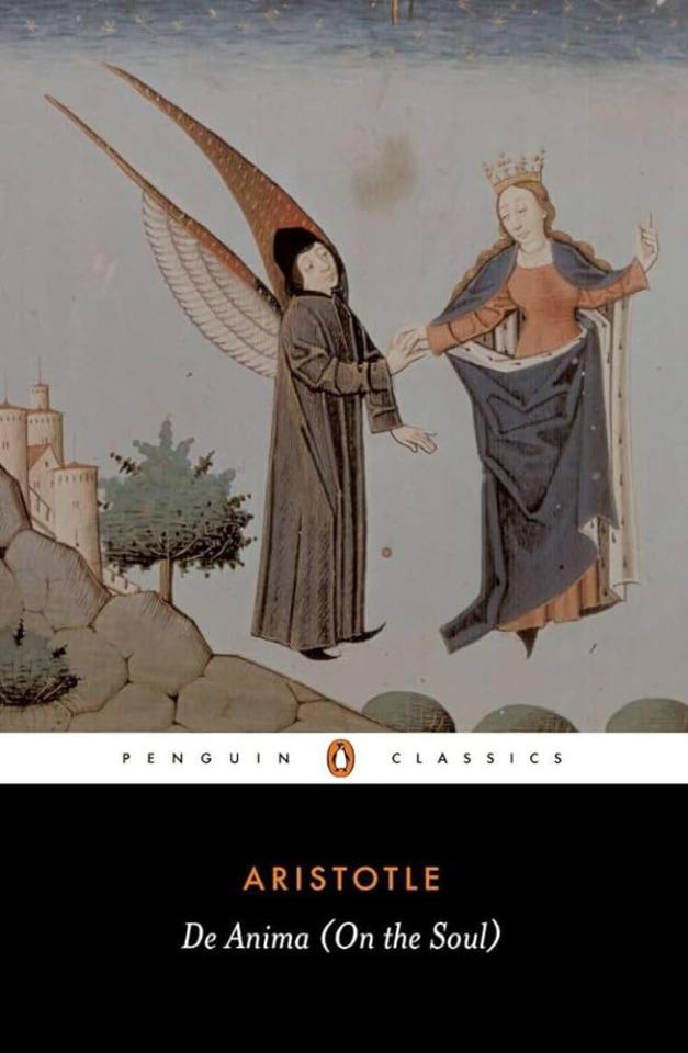
Aristole's De Anima (Mementos Mission - Chapter 3)
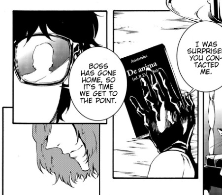
De Anima, or "On the Soul" [Leob Classical Library], is an examination of the soul and how it functions within the body. It's pretty dense but easily accessible. On page 15,
"There are times when men show all the symptoms of fear without any cause of fear being present. If this is the case, then clearly the affections of the soul are formulae expressed in matter."
Now, I'm not going to read every book, that would be a huge investment. And unfortunately I am still a university student, so I'll stick to the introduction/first chapters or so. But anyways, to the point of the quote, De Anima tends to get metaphysical. Theory time: Akechi has morbid fascinations with the soul. Not only because he well, kills people, but also messes with the restraints on their heart. I choose this quote because it's a good summary of the kind of body horror someone messing with you in the metaverse is like. It's fear and anger unchained, but it manifests in reality through subway accidents... for example.
Hegel's Dialectics (did Akechi misquote Hegel?) - Rank 1
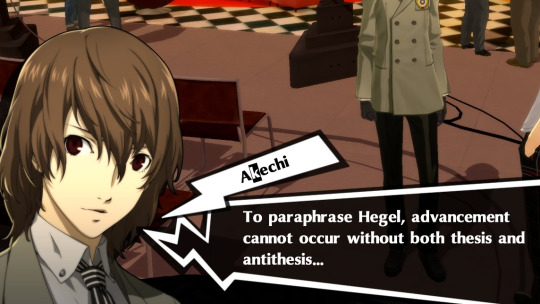
Look, almost all of these texts are slogs to get through, so I wouldn't blame Akechi for not catching this. Or not reading the 2017 in-universe equivalent of cliffnotes. Note: Dialectics refers to the structure/strategy that Hegel uses, not a text itself. Looking at the Stanford Encyclopedia of Philosophy we see that Hegel never makes mention of the thesis, antithesis, and synthesis idea. Rather, thesis-antithesis-synthesis is a pattern in his arguments. These are also projected by people reading his text, so we can't fully be sure he's using this to formulate most of his arguments. So not only has Akechi forgotten synthesis, the "unification", but also the fact that Hegel doesn't talk about this. Did he read Hegel? Probably. Did he retain the information? Questionable. Do I blame the writers for making the mistake? mmmm. Maybe. If you're asking me to guess which book he read, I would estimate it was The Phenomenology of Spirit [Google Books]. And yes, I'm going to say it was just because of this quote on page 9 that just, screams Black Mask:
"The force of the mind is only as great as expression; its depth only as, as deep as its power to expand and lose itself when spending and giving out its substance."
Maurice Leblanc's Arsène Lupin vs Sherlock Holmes (Herlock Sholmes) (P5A)
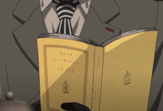

This book I read because my curiosity definitely got the better of me. Since I've gotten into Persona 5 again, I've been DYING to read this one, but never got around to it. I think this one is also interesting to look at based on how it was represented in the anime, a crow escaping a bird cage. I can say that this doesn't happen in the book, but this is why I think Akechi is self inserting on Holmes/Sholmes here. Holmes is much freer as a person in this text than Akechi, but also in a deep rivalry with Lupin. Their banter is also pretty reminiscent of what they [Joker and Akechi] have, but... with older language. Longer quote, so here's an image in its place:
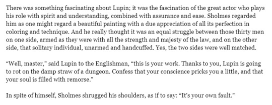
Edit/Correction: Edogawa Ranpo's Kogoro Akechi Series!
As pointed out by a couple people, we can't leave out this series. (credits to @heavy-metal-papillon) I don't know why my mind blanked and left this out. Because when I was doing research for this post someone had mentioned it. Just by name, it should be obvious why this is here! Here is a part of the preface that explains Kogoro Akechi, Arsene Lupin, and their presence in Edogawa's novels (written by Ho-Ling Wong):

Literature he makes references but doesn't mention (note: headcanon/my opinion)
John Stuart Mill's On Utilitarianism

Because Akechi knows how to flirt, he recommends philosophy to Joker. [Early Modern Texts] In my eyes he definitely doesn't agree with this philosophy (in fact some quotes are definitely more aligned with Maruki's philosophy). Page 8:
"That’s because the utilitarian standard is not •the agent’s own greatest happiness but •the greatest amount of happiness altogether; and even if it can be doubted whether a noble character is always happier because of its nobleness, such a character certainly makes other people happier, and the world in general gains immensely from its existence."
Yes, Akechi reads Freud. Freud's essays: Beyond the Pleasure Principle & The Ego Principle
In an offhanded comment about Personas in the Thieves Den to Ryuji, Akechi says:
I love you Akechi. I will not read Freud for you. My love has limits.
Carl Jung's Two Essays on Analytical Psychology
Okay I'm NOT reading this (a lie, i did. [Internet Archive]) but this was the foundational text on the Jungian Archetype of the Persona as well as addressing concepts such as "the will to power." Going to leave this quote from page 78 for you to munch on:
"Logically, the opposite of love is hate, and of Eros, Phobos (fear); but psychologically it is the will to power. Where love reigns, there is no will to power; and where the will to power is paramount, love is lacking. The one is but the shadow of the other..."
There's a couple things here that point to Akechi reading this, but ultimately I just headcanon that he wants to reason through why Personas exist.
Generally reads about the casts Personas!
Similarly to how Joker can read about the other PTs Personas, Akechi does as well. Well, if his morbid discussion about Captain Kidd in the Thieves Den is an indicator. Does this mean Akechi is familiar with the Carmen stage opera? I think so. Besides, it's also the smartest move. Akechi (head)canonically reads lovecraft.
Conclusion
Akechi really enjoys psychology and philosophy, and while some of it seems like he's doing it for attention/to appear smarter, he DOES continue to show interest in third-semester/thieves den. I still can't forgive him for reading Freud.
The List (of ones directly mentioned here)
De Anima, Aristotle
The Phenomenology of Spirit, Hegel
Arsène Lupin vs Sherlock Holmes, Leblanc
On Utilitarianism, John Stuart Mill
Beyond the Pleasure Principle & The Ego Principle, Freud
Two Essays, Carl Jung
The Fiend with Twenty Faces, Edogawa Ranpo
Other notes and headcanons I can't justify giving sections to:
he probably read that fuckass billiards book
definitely stuff on justice. i was just lazy. Some of these texts do cover these ideas, but definitely not all of them
he likes detective novels. he's probably read a fair share of sherlock holmes.
he probably reads adjacent literature to some of the philosophers mentioned (for example: Nietzsche to Jung, Plato to Aristotle)
#goro akechi#p5 meta#p5r#p5#akechi goro#akechi#thinking emoji#making goro akechi's philosophies everyone's problem
154 notes
·
View notes
Text
THINGS THAT BOTHER ME ABOUT THE CURRENT TUMBLR POST EDITOR
(and that @staff will probably never fix, because it's literally been 5+ years for some of these)
Editing a post with a "read more" tag will make the "read more" bar creep down the post. So if I put a "read more" between paragraphs 1 and 2, post it, then edit the post, the "read more" will shift so its between paragraphs 2 and 3. If I edit it again, it'll shift to be between 3 and 4. I have to constantly move the "read more" line back to its correct position every time I edit a post.
You cannot hold down the shift key to select multiple paragraphs. In a normal, rational text editor, you click the last part of the final paragraph, hold shift, and click the top of the first paragraph, you'd select everything between those two points. Not so, on Tumblr. It'll put a funny little blue box around all your paragraphs but nothing will be selected. The old post editor used to do this just fine, but ever since they made the switch to the new post editor in 2020 or so, it's never worked right ever again.
Similarly, CTRL+A to select all doesn't work anymore and hasn't since the new post editor in 2020. It'll only select text in that specific paragraph, not the entire post. Even though CTRL+A is the universal "Select All" command.
Even just clicking and dragging your mouse to select text doesn't work right. The only way it works right is if you click and drag your mouse slowly. Dragging even slightly too fast will cause your selection to miss the start or the end of your selection. If you are selecting large blocks of text, you have to treat it like a 90 year old grandma driving to church on a Sunday afternoon.
Sometimes you'll click and start to drag and find that Tumblr thinks your cursor started in a completely different place than it actually was. So you'll have to click, start to drag to select text, then re-click AGAIN to start selecting, just to make sure you get it right.
While writing point 5 just now Tumblr shifted the text view to the bottom of my screen and then back to the middle for no reason at all. It just did that in the middle of me typing, all on its own.
Similarly, if you want to DELETE large chunks of text? Forget about it. Not only do all your methods of selecting text basically not work right, but if you try to delete more than one paragraph at a time, it just straight up won't do it. Again, the old post editor had no problem with this, but this clownshoes "Neue Post Format" editor makes you delete paragraphs one at a time.
Despite Tumblr claiming you can fit "one third of Moby Dick" (70k words) into a post, in my experience you will start getting mysterious "There was an error saving your post" messages at significantly smaller text amounts. No information on what the problem is or how to correct it, just "There was an error saving your post" after only, say, 2,500 words. Sometimes significantly less than that, too, like when I tried to do a wrap-up post for my Letterboxd.
Tumblr very easily gets confused about where I am in a post at all. Dragging images into a post often defaults to them posting at the top (why???) but if I click into the post editor to write text and it doesn't know where I am it'll start adding text basically wherever. Even if I clicked somewhere specific inside the post!
Tumblr is constantly trying to make me generate links to "tumblr.com/myblog" (e.g. tumblr.com/blazehedgehog) instead of "myblog.tumblr.com" (blazehedgehog.tumblr.com) because it's easier to nag users to log in/sign up for tumblr that way. They've also taken away the ability to successfully hide that nag message at all, when that used to be an option for blog owners. Their desire to juice numbers means more than your individual existence.
10 notes
·
View notes
Text
Comic-Con 2008 - Enhanced Edition of Supernatural Panel
youtube
Direct link. Warning: Some of the special content I added has big spoilers for season 4 beyond the original videos.
This video features Jared, Jensen, Eric Kripke, Sera Gamble, and Ben Edlund. If you've already seen the original videos and you're wondering why you'd want to watch this, see the details about the enhancements below. For other enhanced videos, check my YouTube channel or my Tumblr index post.
Video Improvements - Upscaled, fixed bad aspect ratios, improved colors

I received a great deal of help from @sensitivehandsomeactionman on the color correcting. They gave me tips on how to achieve better colors and they even took a screen shot from my video and corrected the colors on it with their own software to provide me with an example of what was possible. Having that example to reference was invaluable for me, because I'm not good with colors.
Without that help, Jared and Jensen would have looked like they were in training to become the world's tallest Oompa Loompas. Any remaining color wonkiness (Wonka-iness?) is due to my own failure to apply what I was taught and my failure to see the colors properly. But look at that difference! I was pretty excited about this.
Combined Videos to Cover Entire Event
As with my other enhanced videos, I combined multiple videos to create as seamless a video of the event as possible, from beginning to end. For my earlier videos, that meant combining maybe 5 videos. For this one, I used a total of 19 videos from 3 different sources. A lot of those were used for the talking head bubbles, explained further below.
None of the videos are my own. My video description on YouTube has links to the original videos I used.
Good, Color-Coded Subtitles
As with my other enhanced videos, I attempted to provide accurate and as-complete-as-possible subtitles. They're color-coded to make it easier to tell who's speaking. This is especially helpful when people are speaking at the same time, or when the speaker is off camera.
Since there were so very many people talking in this video, I doubled up on a couple colors if I thought I could do so without it being too confusing. Here's the complete color key:
Red = Jared Blue = Jensen Brown = Eric Kripke Pink = Sera Gamble Purple = Ben Edlund Green = General audience Yellow = The person asking the questions. In the first half this is the moderator, Alynda Wheat. In the second half, this is the fan at the mic. White = Mostly the publicist (Holly Ollis), but a couple times it's used for people off camera who I believe were Comic-Con staff. Two shades of orange = surprise guests
Additional Clarifying Content
As with my other enhanced videos, I've added some images to help add clarity to the references used by the speakers. I added images of characters and scenes referenced from the show, images to explain various pop culture references, as well as some explanatory text to help add details or clarity when I thought it might be useful.
I mostly kept this extra content to the sides so that, if it doesn't interest you, you can hopefully ignore it and focus on the main part of the video. Unlike my previous videos, sometimes this is on the left side and sometimes it's on the right side. The margins shift depending on where the talking head bubbles are.
Talking Head Bubbles - Jared and Jensen front and center, but other speakers visible too
This "enhancement" isn't anywhere close to perfect, but it sure as heck isn't from a lack of effort. This represented at least half if not two-thirds of the time I spent working on this video.
I always find the Comic-Con videos frustrating to watch. When the camera moves to other people who are talking, I want to see Jared and Jensen instead. I like to see their reactions and sometimes they do funny things that get missed. But when the camera is steadfastly focused on Jared and Jensen, I also get frustrated because I can’t see the people who are talking. Nope, you can’t win with me! I want to see everything.
I attempted to mitigate this frustration by adding talking head bubbles. The main source videos I used were the ones with the most constant and stable focus on Jared and Jensen. However, if one of the other source videos had a decent focus on another guest, I inserted a small window into that other video as seen below. Eric shows up on the left, because that's where he was seated relative to Jared. Sera and Ben show up on the right, because they were on the other side of Jensen.
Like I said, it's not anywhere close to perfect. Trying to make the bubbles look stable was an enormous challenge for me. Behind the scenes the person in the bubble was bobbing and weaving all over the original video frame, so I had to constantly adjust the position of the secondary video to keep the subject centered in the bubble. They also aren't always bubbles. The people taking the videos often had the writers on the edge of the frame because they wanted to capture Jared or Jensen too, so the bubbles start to collapse when they get too close to the edge because there isn't enough video surrounding them to form a circle.
I haven't decided if the end result was worth how much effort I put into these darn "bubbles", so I'd welcome any feedback -- good or bad.

#enhanced edition con video#j2#jared padalecki#jensen ackles#eric kripke#sera gamble#ben edlund#comic con#comic con 2008#Youtube
123 notes
·
View notes
Text
[dw] theme code
for @fractalkiss's anon who asked about ren's dreamwidth theme - i'm the creator and here's how to install it :) feel free to message me if you run into problems setting it up or if there's something you need help with etc. this theme is free for everyone to use btw
1. APPLY BASE THEME
Go to your theme customization page, and search for the "Tabula Rasa" theme. Apply the Plain version, and "2 Column (sidebar on the left)" for the Page Setup.
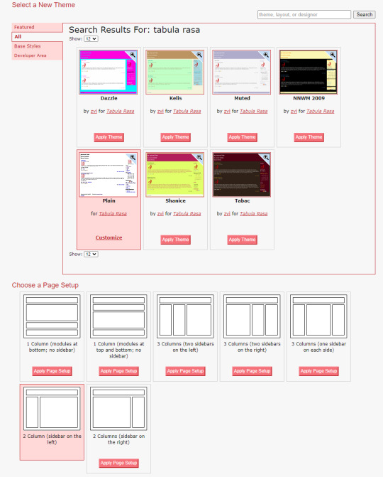
2. SET UP MODULES
Go to the modules page, and uncheck all the modules except for the following:
[1] Profile
[2] Custom Text
Make sure the numbers match as well so everything displays in the correct order.
[5] Link List
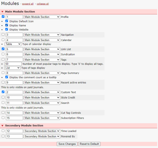
3 COPY & PASTE CUSTOM CSS
The most important part: adding the actual custom layout to modify Tabula Rasa.
Go to the Custom CSS section, and paste the code below into the Custom Stylesheet URL box.
https://fonts.googleapis.com/css?family=Material+Symbols+Outlined|Material+Symbols+Rounded|Inter:400;500;600;700
Make sure Use layout stylesheet(s) is checked.
In the Use embedded CSS box, copy and paste the entire code HERE.
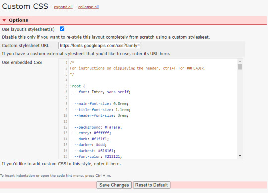
4. EDIT TEXT SETTINGS
If you check your theme, you'll notice some glaring errors. Go to the text section, and input anything you want in the Text for the 'Custom Text' box for it to be displayed on your blog sidebar.
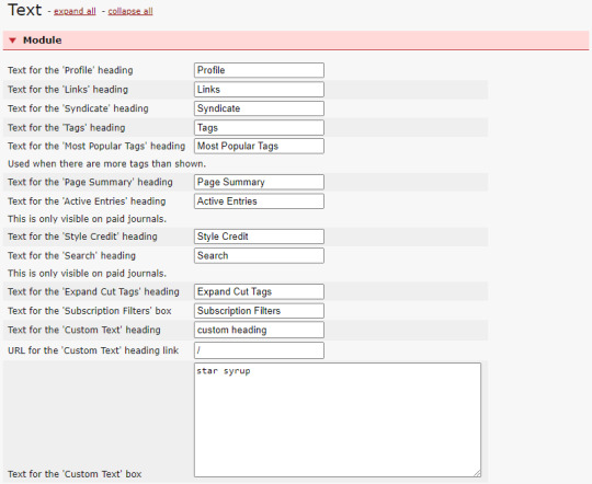
To fix the icons, make sure the settings under the Entry section match the image below.
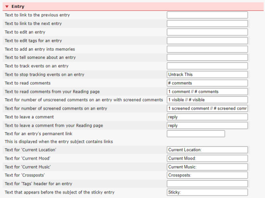
5. ADD YOUR LINK LIST
In order to add the navigation links to your sidebar, go to Link List and fill out the link details like so: (recommended to have max 4)
# HOW DO I CHANGE THE COLOR SCHEME?
In the theme code, under :root, you can change the hex code for the folllowing variables:
--background
-- entry
--dark
--darker
--darkest
--font-color
--accent
--darker-accent
that's pretty much it! again, if there's something you need help with when setting this up, do send me a message. note that this theme is for dreamwidth and dreamwidth only, and will not work on livejournal. enjoy anons and friends!
36 notes
·
View notes
Text


Welcome to the 39th installment of 15 Weeks of Phantom, where I post all 68 sections of Le Fantôme de l’Opéra, as they were first printed in Le Gaulois newspaper 115 yeas ago.
In today’s installment, we have Part VII of Chapter 14, “La Lyre d’Apollon” (“Apollo’s Lyre”), and Part I of Chapter 15, “Un Coup de maître de l’amateur de trappes” (“A Masterstroke of the Trapdoor Lover”).
This section was first printed on Tuesday, 23 November, 1909.
For anyone following along in David Coward's translation of the First Edition of Phantom of the Opera (either in paperback, or Kindle, or from another vendor -- the ISBN-13 is: 978-0199694570), the text starts in Chapter 13 with, “'Christine,' said Raoul as he got to his feet, 'you say you love me but it was only a matter of hours after you were free again that you went back to him',” and goes to Chapter 14, “Then she rushed out in a state of near-panic, still pulling and smoothing her fingers as if she thought the ring would somehow mysteriously reappear of its own accord.”
There are some differences between the Gaulois text and the First Edition. In this section, these include (highlighted in red above):
1) Chapter XV was printed as Chapter XVI. This numbering error was made in Chapter VII, and was not corrected, so it was propagated throughout the Gaulois publication.
2) Chapter 15 in the Gaulois text is Chapter 14 in the First Edition, etc.
3) Compare the Gaulois text:
… vous dites que vous m'aimez et quelques heures à peine s'étaient écoulées depuis que vous aviez recouvé votre liberté, que déjà vous retourniez auprès d'Erik !…
Translation:
“… you say that you love me and yet scarcely a few hours had passed since you had regained your liberty, and you were already going back to Erik!…”)
To the First Edition:
… vous dites que vous m'aimez, mais quelques heures à peine s'étaient écoulées, depuis que vous aviez recouvé votre liberté, que déjà vous retourniez auprès d'Erik !…
Translation:
“… you say that you love me, but scarcely a few hours had passed since you had regained your liberty, and you were already going back to Erik!…”
4) This passage was added to the First Edition (indicated by the red arrow above), and does not appear in the Gaulois:
Soudain une silhouette bizarre se dressa devant les jeunes gens, leur barrant le chemin :
« Non ! pas par ici ! »
Et la silhouette leur indiqua un autre couloir par lequel ils devaient gagner les coulisses.
Raoul voulait s’arrêter, demander des explications.
« Allez ! allez vite !… commanda cette forme vague, dissimulée dans une sorte de houppelande et coiffée d’un bonnet pointu.*
Christine entraînait déjà Raoul, le forçait à courir encore :
« Mais qui est-ce ? Mais qui est-ce, celui-là ? » demandait le jeune homme.
Et Christine répondait :
« C’est Le Persan !…
– Qu’est-ce qu’il fait là…
– On n’en sait rien !… Il est toujours dans l’Opéra !
Translation:
Suddenly, a strange silhouette loomed before the two youths, blocking their path:
“No! Not this way!”
And the silhouette pointed to another corridor by which they must reach the wings.
Raoul wanted to stop, to ask for an explanation.
“Go! Go quickly!…” ordered this shadowy figure, enshrouded in a sort of houppelande and capped with a pointed hat.*
Christine was already dragging Raoul away, forcing him to run again:
“But who is that? Who is that man?” asked the young man.
And Christine replied:
“That is The Persian!…”
“What is he doing here?…”
“No one knows!… He is always at the Opera!”
* NOTE: Leroux's character of "The Persian" was based on an actual French historical figure, the Persian gentleman and expat, Mohammed Ismaël Khan. This image below depicts the houppelande coat and Astrakhan cap that Leroux was likely imagining when he was writing his novel.
This image is from Les Célébrités de la rue, by Charles Yriarte, published in 1864, a book that listed notable figures in Paris in the early to mid 1800s. It was published during Mohammed Ismaël Khan's lifetime, as M. Khan passed away in 1868.
It is worth noting that the Opera House that M. Khan frequented was the Salle Le Peletier, which was destroyed in a fire in 1873 (five years after M. Khan's death). Two years later in 1875, the Paris Opera was moved to the newly opened Palais Garnier (aka Erik's Opera House). So, contrary to Leroux's narrative, M. Khan never actually frequented the Palais Garnier. This is an example of faction (fact+fiction), one of Leroux's favorite literary devices, which Leroux used throughout Le Fantôme de l'Opéra to build a feeling of verisimilitude into his fictionalized narrative.

5) Compare the Gaulois text:
C'était Erik. Il avait les yeux de braise dont vous m'avez parlé. J'aurais dû le clouer sur la lyre d'Apollon…
Translation:
“That was Erik. He had the fiery eyes that you told me about. I should have nailed him to Apollo’s Lyre…”
To the First Edition:
Si vraiment nous avons aperçu Erik j'aurais dû le clouer sur la lyre d'Apollon…
Translation:
“If that truly was Erik that we saw, I should have nailed him to Apollo’s Lyre…”
6) Compare the Gaulois text (this was likely an error on Leroux’s part, since earlier, Raoul agreed to be in Christine’s dressing room at midnight sharp):
… à minuit et demi ! fit le jeune homme …
Translation:
“… at half past midnight!” said the young man …
To the First Edition:
… à minuit je serai dans votre loge, fit le jeune homme …
Translation:
“… at midnight I shall be in your dressing room,” said the young man
7) Compare the Gaulois text:
Jamais ! répondit-elle avec énergie. Je la renverrai à Erik en la déposant dans la loge du fantôme. Il faut qu'Erik puisse rentrer tranquillement chez lui le soir…
Translation:
“Never!” she replied forcefully. “I shall return it [the key] to Erik by leaving it in the Phantom’s box. Erik must be able to return calmly to his house in the evening…”
To the First Edition:
Jamais ! répondit-elle avec énergie. Ce serait une trahison !
Translation:
“Never!” she replied forcefully. “That would be a betrayal!”
8) Minor differences in punctuation.
Click here to see the entire edition of Le Gaulois from 23 November, 1909. This link brings you to page 3 of the newspaper — Le Fantôme is at the bottom of the page in the feuilleton section. Click on the arrow buttons at the bottom of the screen to turn the pages of the newspaper, and click on the Zoom button at the bottom left to magnify the text.
#phantom of the opera#poto#gaston leroux#le fantôme de l’opéra#le gaulois#phantom translation#apollo's lyre#mohammed ismaël khan#15 weeks of phantom#phantom 115th anniversary
17 notes
·
View notes
Note
If not for the 3 paged book, what details on the image itself gave it away?
Let's look at it! For those who missed it, this is the image in question:
we already have a bad habit of disconnecting this sort of over the top high fantasy work from its creators (Angus McBride, Dave Mattingly, etc), which makes it easy to pass around in a memetic manner and kind of forget it's art in the first place. We tend to think of it almost as clipart, something generic, thomas kincade for people who play d&d. this makes it easily replicable and ripe for misuse, because people are less likely to seek out the source for something that already feels familiar and ubiquitous-- surely this is just public domain stuff, right?
Well, of course not. These days its easier than ever to just slap in a prompt that gives you something ALMOST familiar but not able to be meaningfully reverse searched, and that's how you end up with the current crisis on print sites and sellers like craggyscorner dot com, from where this image comes.
So how can you tell the familiar from the outright false? Some of the other images on the site this is from have better examples, but I'll stick with this one. Here are a few things to spot!
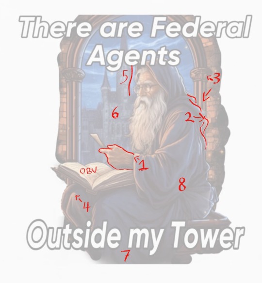
1.) I'll get the meaty, weird hand out of the way first. Hands aren't a reliable tell every time, but the fucked-up little thumb makes this one nice and obvious for us.
2.) There is hair randomly visible despite his being hooded; the ripples of the fabric and the hair also seem to merge.
3.) The columns do not match in pattern or width, nor do the capitals on them make any sense. The brickwork also follows no pattern-- mistakes not made by someone of this ostensible rendering skill.
4.) His knees extend way, way far out from his body and he appears to have three of them.
5.) This is a big one: AI struggles with defining edges on things, and often contours edges of background items to warp and match ones in the foreground-- think of how edited instagram photos warp bricks behind the subject. The visual is similar to that. This can be seen to a lesser degree in many places on the image, such as the book by the hand, or the bricks along his backside.
6.) Escher architecture. Again, not a professional mistake.
7.) ?????? He does not appear to have feet. The image politely fudges itself behind the text.
8.) Lastly, the robes are just a mess. AI doesn't really understand seams, or layers, or really how clothes work at all, which is how he ends up with what appears to be two hoods and a chiffon wrap around his waist. The folds and shadows are busy enough to be believable at a glance but they hide that nothing appears to look.... correct.
Also just for fun I tried to do my most charitable drawover of his anatomy. Yeah.
Can you spot more problems? You probably can.
194 notes
·
View notes