#B: make some general things with it either basics apps or design a web page etc etc
Explore tagged Tumblr posts
Visit Tumblr Blog
Explore Tumblr blogs with no restrictions, modern design and the best experience.
Last Seen Tumblr Blogs


Fun Fact
130K people were victims of a chain letter scam that affected Tumblr in May 2011.
Text
I literally decided to learn like the very basics of python today which apparently awoke my brain so now it wants to do EVERY.SINGLE.THING i haven't done these past last //waves incoherently-time....at once
this is good on one hand because yay motivation really bad on the other because if I don't tread carefully i will loose motivation for all those things because idk choice paralysis or whatever it's called
too many things, too little time
#txts#we got#general just get into programming and see if ANYTHING there is fun and could be useful-but in a job way#also learn some things for game dev stuff#also make a game#not a big complicated one#but i do wanna go back into my old lil rpg maker style idea just to have something-anything#so also make art and flesh out ocs#and story and puzzles etc#i am combining game+coding+learning unreal basically in parts#why unreal for a top down rpg 2d game?#because i have ambitions beyond the realm of 2d and wanna familiarize myself with it#instead of having to still learn from scratch#i KNOW rpg makers vx and ace well enough#but they arent gonna help me transfer anything to unreal#thats entirely different worlds#so...................yeAH#w/ programming or possible work futures relating in any way to it#i decided on a 'fuck it we ball' approach of A:just learn it first#B: make some general things with it either basics apps or design a web page etc etc#to then C: see what you actually liked the most from each bit to decide where you can dip your toes in#IF it all works out#look my coworker who also trained me and whom i adore and trust with...well everything#decided i am smart enough for more than retail#so we are gonna do this#idc how long it takes#less because my brain is a fart and more because i will not be able to find the time between working 10hour shifts#BUT THATS OKAY#....i hope.....look i am really holding onto ye wise 30 to 40 year olds who say it gets better#do not disappoint me
0 notes
Text
The Death of Print Magazines : In the Middle of Coronavirus Pandemic, May I Propose A Vaccine Against This Other Kind of Epidemic ?
Abstract
In 2020, the world is fighting against the coronavirus pandemic, and many people share the same mind that it may be the end of the world as we know it. The virus has not merely infected humanity, but also many corporations and their employees. A lot of magazine and newspaper publishers are not immune either, as they have been suffering from the collapse of the advertising industry, not only since the coronavirus hit, but in fact, as noticed by many, since the invention of the internet. As the race to make a coronavirus vaccine is currently in progress, another race to find another vaccine against this other kind of epidemic is being proposed.
A. Introduction
I. The Rise of Magazines & Newspapers Before The Internet Era
The modern print media such as magazines and newspapers is no doubt product of European invention. Magazine & newspaper publishing began in the early 17th century in Germany, France, Italy and the Netherlands; approximately two hundred years later after Johannes Gutenberg invented the printing machine. Afterwards, word of mouth was no longer the primary source of news.
In the late 19th century, monthly magazines covering general interests gained popularity. In contrary to their predecessors, magazines published in this era were targeted for mass circulation and wider public, and thus they were less expensive, and in the end of the century, they began to cover not only general interests, but mainly aimed to provide amusement to readers.
Along with television and radio, magazines and newspapers in the 20th century became very essential in the life of every person in the world. For instance, Vogue magazine – the American monthly fashion and lifestyle magazine, was unofficially named as the fashion bible in the eyes of many women in the fashion industry, and it possessed the largest authority on fashion, beauty and lifestyle.
The newsprint newspapers such as The Guardian, The New York Times etc., achieved similar success to print magazines. It is very common in this era in popular culture to find such clichés: a man reading a newspaper next to their morning tea, or a woman reading it while waiting at the bus stop; or a businessman reading it while flying on a plane, or even a husband while watching TV at home with his wife and children. Reading newspaper as a lifestyle gave those ultimate impressions that its readers were intelligent and important.
II. The Decline of Magazines & Newspapers After The Invention of The Internet
In May 1990, Tim Berners-Lee, a British scientist, proposed the implementation of WWW (World Wide Web), which is the internet as we currently know it. Decades later, the invention of the World Wide Web could prove as significant as the invention of printing press. In early 2000s, according to The Guardian, newspapers and magazines have been toppled as the main alternative to television in every household that has access to the internet. Since 2009, the rise of smartphones and tablets has enabled every one of us to get online without the need to be sitting in front of any personal computers. The internet has become the main source of news, entertainment, lifestyle and communications. Google has revolutionized the way people search for information. Instagram has replaced fashion magazines, and enabled celebrities to interact directly with their fan base. Facebook and Whatsapp have set a new standard in social communication. Youtube and Netflix have replaced the traditional television, and so have Spotify to radio. Free online newspapers and magazines have made lots of printed magazines and newspapers technically redundant. Ironically, some of these successful online newspapers or magazines are in fact products of transformation from printed media to digital one, e.g. New York Times, Wired, The Guardian, Vogue, The New Yorker etc. To many other print publishers which have not met similar success in the shift, the downward spiral is as real as the existence of Kim Jong Un to South Korea, or the UK way of Brexit to the European Union, or the existence of Donald Trump to journalism in The United States.
III. The Death of Magazines & Newspapers During The 2020 Coronavirus Pandemic
Since early 2020, the world is fighting against the coronavirus pandemic, which originally started in China, and has now spread to nearly every continent on earth. The coronavirus has infected many print publishers as well and many of them have now been in life support, and in desperate need for government bailouts or donations from readers. For instance, Playboy magazine has decided to suspend print publications indefinitely, or Bauer Publisher decided for shutting down its whole operations in New Zealand. Some have been trying to speed up the shift from print publication to digital as the last-minute effort to survive.
In fact,
magazine publishers are now seeing print sales boost due to coronavirus
, yet, the advertisers have decided to shun any coronavirus coverage, and tighten any marketing budget, based on the assumption such as : who needs a Gucci bag in the middle of this crisis ? is it ethical to have a Lamborghini advertisement on the page next to a story of a dying coronavirus patient ?
Despite the efforts to shift from print media to digital, Google and Facebook still account for 70% of the U.S. market for digital ads prior to coronavirus pandemic, which left publishers the rest of the chunks, and it implies their loss, not only to the internet giants, but to the internet, in general. Now their loss has been worsened further. Finding the right business model in the virtual era, in which people don’t usually pay for reading online news or getting any information, is indeed as tough and complex as finding the vaccine against the coronavirus.
IV. The Future of Newspapers & Magazines : A Proposal – www.klippingdb.com
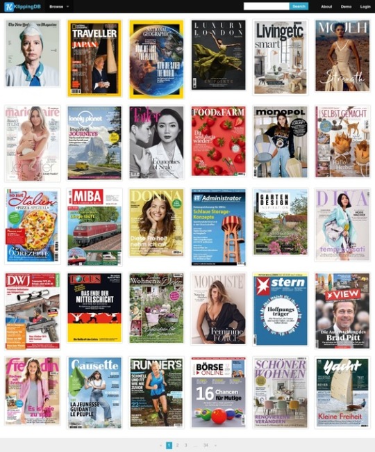
B. Business Analysis Behind The Proposal of The Alternative Future of Magazines & Newspapers
I. The Failure of Existing Digital Magazines & Newspapers Publishing Platforms
Nowadays, there are so many startups in the publishing platform business, which have been trying to be the market where publishers can distribute their work. Some of them are Issuu, Scribd, Magzter, etc., and even Apple And Google have released their own apps. Their main purpose is basically to simplify the transformation process from print magazines or newspapers to digital ones, so that each one of those can be conveniently displayed on many devices, such as Android phones, iPhones, iPads, or even PCs or Macs.
Nevertheless, as noticed by many, reading them on these mediums which is supposed to be a child’s play, has become one of the hardest things to do on this planet. People have to zoom in and zoom out on the smartphones or tablets, as they can not read the text on those magazines or newspapers. Meanwhile on personal computer which has enough large screen generally and makes reading simple, yet, it still loads slow and is unreadable, either because the file is too large, or as the existing publishing platforms are trying to mimic a real-life print magazine.
II. The Problem with PDF File Format For Viewing Digital Magazines & Newspapers
The power of the PDF file format is undoubtable, as it has become industry standard in the information technology. It is merely not suitable for distributing digital magazines or newspapers. Magazines, for instance, can comprise of hundred pages and all of those can be full of high-quality images embedded, thus these PDF files can be so large to download. In this era where people can get everything instantly, they tend to be unwilling to exhaust another hour simply to read so-called digital media.
III. Returning The Focus To Desktop PCs, And Not Mobiles Phones or Tablets
As for the problems with the PDF file used as file format for viewing digital magazines or newspapers on many publishing platforms, the focus is now the mediums or devices people use to read, namely smartphones, tablets or PCs. Instead of creating a technology to read magazines or newspapers on smartphones or tablets which in fact do not have adequate screen size based on their physical size, the industry should instead focus on the desktop PCs or Macs. The internet already has pure online format magazines or newspapers such as http://www.wired.com, or http://www.nytimes.com, or http://www.newyorker.com which are based on HTML, and thus, it is not a smart way for digital magazines or newspapers under PDF file format to pretend to behave like those, as PDF particularly is not built and designed for that purpose.
IV. The Importance of TOC (Table of Contents) In Digital Magazines & Newspapers
Since Google was founded, it has revolutionized the way people search for information on the internet. People nowadays tend to search for news or information they want to read based on the specific keywords. If people want to find “Harry Potter”, they will then input the keywords “Harry Potter” on Google, and then it will show the results, and let them read about it on the their desired websites which they will click. Once they are done with it, they will just leave for the next interesting website.
The assumption that people nowadays will read digital magazines or newspapers the same way they read print magazines or newspapers tends to be out of fashion. According to Forbes, millennials and gen Z have even lost trust and loyalty with business. In the world where people can get everything instantly thank to the internet, it has made things simpler for these generations to jump from one business to another, to whichever offers better, simpler, or cheaper.
Hence, it is inevitable to have a table of contents for every digital magazine or newspaper, which people can click and go directly to the content they are interested in. And publishers should not expect people will read each item from page to page as in traditional way.
V. The Possible Business Model To The Proposed Technology And The Impact To Print Advertisement
Subscriptions have been the most common way to sell magazines or newspapers, but nowadays, magazines are struggling to maintain the steady revenue. Paywall, where readers have to pay in order to be able to access and read the arcticles, may have been working for some well-known publishers such as New York Times, yet to many, it is another failed business model. The Guardian, for instance, relies instead on reader donations, in order to maintain their own independence. Many publishers have also tried to be innovative by trying to generate revenue from events, or by producing and publishing video contents on Youtube, etc.
While Google and Facebook thrive with their digital ads, print ads are in fact still the primary revenue for many print publishers, although the trend tends to favor digital ads. Therefore, many online publishers which still publish print media offer their advertisers omnichannel marketing experience, in which their campaign will be published both on print and digital media across various platforms such as mobile phones, tablets, or PCs.
The proposed technology running on www.klippingdb.com can behave as one of the omnichannel marketing medium which allows readers to read the print magazines or newspaper online / digitally, and on the other side, also allows publishers to display the print advertisements. On the proposed platform, they may have to adapt the position of each ad or may put it on best viewing position in the way that it will not disturb readers’ convenience.
C. Conclusion : The Willingness To Share As The Key To Survival
30 years ago, Tim Berners-Lee had very good idea and intention by inventing the internet, and he knew it the only way to make it work is by the willingness to make it free and allows people to share the technology with each other. It may not make him the superrich guy on Earth, but it has allowed life to transform from one era to another, from a traditional to a modern one. Print publishers have met the similar fate, as it is now time to decide whether they want to keep all the resources they have by themselves and face the death of magazines or newspapers, or are they willing to share those they have with everyone and be survival ? The first option will let them be the victims of the internet era, and slowly but sure, all print media will be forgotten by readers. The second option requires them to adapt to technology, and to share with people. If they can not release the latest edition for free as they have to monetize it, then at least the back issues of any magazines or newspapers are absolutely still meaningful resources people can consume and still find interesting to digest. The thing is many readers just do not have the willingness to pay for these back issues. Of course, in the perfect world, publishers would expect readers to pay for everything, and it should not be matter, whether it is the latest magazine issued or it is a back issue one. But unfortunately, without its free and open accessibility, internet culture as we know it wouldn’t exist.
1 note
·
View note
Text
What Are Retargeting Ads and Why Should Your Business Use Them?
Website visitors are fickle. There, I said it. The majority of people entering your website will very likely leave without taking the action you want them to take.
There are tons of factors that drive people away from your website, whether it’s an unappealing message, poor design, difficult-to-use navigation, a confusing checkout process, or unexpected shipping costs.
Keeping visitors engaged with your brand after they leave your site is incredibly important.
[Enter stage left] – Retargeting ads.
Retargeting is a key tactic for bringing visitors back to your site to complete their purchases or inquire about your services.
This post walks you through various forms of retargeting ads, why they’re useful for your business, and how much you should allocate to your retargeting ad campaigns.
Table of Contents
What are retargeting ads?
Display Retargeting Ads
Search Retargeting Ads
Dynamic Remarketing Ads
Why is retargeting important?
Brand Reinforcement
First-time Inquiries and Purchases on Your Website
Upsell or Cross-sell Opportunities
Does Retargeting Actually Work?
How Effective Is Retargeting?
How Much Should You Spend on Retargeting Ads?
Interested in digital advertising and retargeting?
What are retargeting ads?
Simply put, retargeting ads are those ads shown to a person after they visit your website, browse, and then leave.
As they navigate to other websites, like a news website, you can then show ads to draw them back into your site or generally increase brand awareness.
Being able to serve retargeting ads is accomplished by placing a pixel on your website.
A pixel is a small snippet of code that tags the visitor and captures their behavior, like which pages they visited, which products they viewed, whether they finished checking out, how much they spent, and more.
Facebook, Google, Bing, TikTok…all of these ad networks have retargeting pixels.
Before we dig into the effectiveness of retargeting ads, let’s talk about a few of the common types.
Display Retargeting Ads
Display retargeting ads are the typical static banner ads you see as you visit other websites or use mobile apps. Here’s an example you might see from us.
These ads are great for generally improving brand awareness and response rates during a promotional period. They’re also extremely affordable, meaning you can get tons of impressions for a fairly low ad spend.
Search Retargeting Ads
Search retargeting ads offer a great blend of paid search and display ads. These ads serve based on a person’s search queries. You might hear these often referred to as in-market audiences.
If someone visits Google and searches for “mobile phone cases,�� Google places the searcher into a category of people in the market for phone cases. You can then serve display ads targeted at this category as they navigate around the web.
Search retargeting is an exceptional prospecting tactic, as the people “in-market” have shown intent and are likely a short step from making a purchase.
Even better, this tactic isn’t restricted to e-commerce businesses.
If you’re running a local spa, you can retarget people who have recently been searching for massages, skincare, and similar services.
Similarly for home renovations. If you’re a residential roofing, electrical, or plumbing company, you can retarget searchers who have recently been searching for things like bathroom remodel, kitchen remodel, roofers in xyz city, and so on.
Effective advertising is reaching people at the right time with the right message. Getting your business in front of these in-market audiences — people who are indicating they’re ready to buy — checks that box better than just about any other advertising tactic available.
Dynamic Remarketing Ads
Dynamic remarketing ads, or dynamic product ads, are a lot like display retargeting ads. The only caveat is they have more focused use for e-commerce businesses.
For example, if someone visits your e-commerce website and views products and leaves the site, you can later “remarket” to them with the specific products they viewed.
We’ve all been the target of these ads, as we browse shopping sites like Walmart or Wayfair and subsequently receive ads on other websites for the exact products we browsed.
The dynamic element simply refers to the fact that the products shown in the ad will change dynamically based on the individual user’s behavior. In other words, they’re personalized to the individual shopper, instead of being static.
Why is retargeting important?
All things considered, increasing familiarity with your brand and attracting more return visitors to your website will naturally improve sales.
Retargeting efforts provide an economical way to check these boxes. Most importantly, you’re creating a holistic marketing strategy.
Brand Reinforcement
Making multiple touchpoints with customers is key to being top-of-mind. There are tons of customers who are either:
a) In the market for your business, but not quite ready to buy.
b) Not yet in the market, but will be soon/eventually.
When either of these groups does enter that “ready to buy” stage, do you think they’ll choose the product they’ve only seen once and are unfamiliar with?
Or will they more likely choose the brand they’ve seen three, four, or five times?
Probably the latter.
And, to be clear, it’s not one-dimensional.
Those multiple impressions of your brand might come in the form of a customer hearing a radio ad, then visiting your website, then getting a retargeting ad on YouTube, then doing a Google search of your brand name, and then, finally, they buy.
That’s what is meant when you hear “multichannel marketing.”
Yes, it sounds like a meaningless buzzword, but it really is the modern method behind effective marketing and business growth.
Retargeting ads are one component of a great multichannel marketing strategy.
First-time Inquiries and Purchases on Your Website
A huge percentage of the traffic to your website will be new visitors and new customers.
Like we mentioned earlier, new website visitors (new customers) are tough to please.
They’re shopping, cleaning the house, and tending to the kids all at once.
Maybe they’re in-between meetings and killing time.
They could be watching the newest Netflix series and messing around on their phones.
They’re distracted.
All the time.
They may spend 60 seconds on your site and barely remember anything except the name.
Retargeting ad campaigns then start serving. They see your name again while reading an article online. Or they catch your video on YouTube.
You start to build a relationship. They click one of your ads and browse your site again.
Even if they don’t buy or inquire then, you can see where this is going.
You now have even more behavioral data about them and can continue serving better and better ads that finally do entice them to buy.
Upsell or Cross-sell Opportunities
A final reason retargeting ads are important is the ability to upsell or cross-sell your products and services.
You can get very particular with retargeting. Say a customer buys a nice pair of dress shoes from your website. You can enter that customer into a segmented audience, then serve them ads for your shoe cleaning kit. Or maybe a new belt to go with the new shoes.
Similarly with services. If someone signs up for weekly lawn mowing on your website, you could then show them ads for mosquito lawn treatment.
Maybe that’s a terrible example, but you get the point

The ability to segment customers that you’re certain trust your brand and then show them ads for things you know they have a propensity to buy…
That’s a gold mine.
Does Retargeting Actually Work?
Short answer, yes.
At a basic level, again, exposing your brand to customers at a consistent, healthy frequency keeps you on their minds. So, when they do need your product, they have a better understanding of your brand than your competitor’s brand.
More analytically, particularly in e-commerce, we can trace retargeting ad effectiveness down to the dollar. Our e-commerce clients historically see a sizable chunk of revenue directly attributed to retargeting ads.
We can even see if retargeting ads “assisted” a sale. Meaning a customer engaged with our retargeting ad at some point in their buying process — even if it wasn’t the last touchpoint that closed the sale.
We’re confident retargeting ads work. And on the off-chance they don’t, we can also see that relatively quickly, so you’re not wasting budget.
How Effective Is Retargeting?
Retargeting ads have much higher clickthrough rates (CTR) and conversion rates than traditional display ads.
The average clickthrough rate for traditional display ads is 0.07%. The average clickthrough rate for retargeting display ads is 0.7%.
In that respect, retargeting campaigns perform 10 times better than regular display/banner ads. Additionally, they offer better opportunities to convert website visitors, because you’re increasing the percentage of return visitors.
How Much Should You Spend on Retargeting Ads?
How much of your advertising budget you should allocate to retargeting depends on the stage of your business.
If you’re just getting started and your website isn’t generating much traffic, your retargeting audience is small.
You’re in a prospecting and brand awareness phase, in that case.
So, you’re going to have to allocate more budget to search and display ad campaigns, in order to attract new traffic to your site and build your retargeting audience.
Now, if you already have sizable traffic coming to your website from organic search, social media marketing, PR, or otherwise, it won’t take long at all to build your audience and start serving retargeting campaigns.
If you have an existing audience, I’d recommend retargeting falls anywhere between 20-40% of your ad budget. If you’re spending more than that specifically on retargeting, you probably need to up your overall ad budget.
The good news is display and retargeting ads are generally inexpensive. Unless you’re using more complex methods, like IP targeting, you can get a significant number of impressions spending just $700-1,000 per month.
What Are Retargeting Ads and Why Should Your Business Use Them? published first on https://wabusinessapi.tumblr.com/
0 notes
Text
A Short Guide to Launching a National/International Google Ads Campaign Correctly

Launching a fresh new ad campaign is thrilling as it could involve trying out a new strategy, platform, or even market!
That being said, new campaigns are costly too. They can be volatile as they get over the learning phases.
At times, account managers will invest copiously in the initial periods to dodge the learning phases, which means the return on ad spend (ROAS) will be lesser.
Suppose you want to launch a B2B Google Ads campaign that appears globally. It is highly advisable that you begin with limited locations. Start with a single market to test your ads and keywords and prove your ROAS, strategies, etc. And then, later on, you can expand to additional locations.
Typically, all ad campaigns need anywhere between 2 to 4 weeks at the minimum to get ramped up. At that point, you can then evaluate if you’ve got a winning strategy to implement in other markets.
In this blog, we will discuss everything you need to know to launch national/international Google Ads campaigns in the right way.
NATIONAL/INTERNATIONAL CAMPAIGNS: RULES OF ENGAGEMENT
National/International campaigns have very particular rules of engagement. These are as follows:
Accounting for market nuances in the way users think or search
Market demand for various products or services
Regulatory considerations
One can quickly fall into the trap of making a campaign overly complicated simply because it’s ��business.” But what “really” matters is that the basics are well-grounded.
Long story short, begin with a single market, prove your path to scale, strategies and ROAS and then expand to other geographical locations eventually.
BASICS: BUDGETS, CAMPAIGN SETTINGS, AND MORE
The success or failure of a campaign depends on its settings to a great extent. If you target multiple geographical locations in one campaign, you attract the following risks:
Budget allocation is determined by the highest search volume rather than profitability.
Ad delivery could be low because of time-zones being set at the account level.
Generally, it is advisable to limit campaigns to a single time zone only. This helps ensure the accuracy of ad scheduling (dayparting) and that the ad budgets are not pushed to cater to too many markets.
In fact, some businesses prefer to create a different ad account for each country (mainly if a notable currency is not available in a stated country).
Based on the individual company, this is either a critical step because of the unstable exchange rates or merely an organizational choice.
On the contrary, certain features such as household income and specific extensions are available in a few countries only.
You will want to take time zones and currency into account to cash in on particular markets (like the US) where the features rolled out before time.
MARKET DEMAND AND NUANCES
When it comes to performing keyword research, Google Trends stands as one of our outright favorite free tools available in the market.
It lets you view trends and volume for search terms by geographical location over time.
One of the most common yet biggest mistakes seen in the new accounts is that they run proven ad campaigns in new markets without making adjustments for how that particular market thinks or searches.
Even two similar keywords like marketing tools and marketing software have pockets of influence. And these nuances are all the more crucial in B2B as the auction prices tend to be overly high.
Launching ad campaigns in multiple countries calls for more than merely using Google Translate for translating winning keywords.
The meaning is most often not entirely correct, and you will end up blowing valuable marketing bucks on terms that don’t even add up.
It might be quite enticing to use the extremely flexible close variants or match types to justify performing careless translations. But you will get a far better ROI when you invest in a native translation of ads, keywords, and landing pages.

CREATIVE CHOICES PLAY A VITAL ROLE
Simply because a campaign works wonders in one market does not mean it will necessarily rock all the other markets.
Let’s say leading with questions and using language that addresses the user works well in your domestic market. Now you shouldn’t implement this on your campaigns for other markets without experimenting against different innovative strategies first.
To put things into perspective, let’s look at an example. In the US, people are more inclined towards a cleaner design and want the landing page to guide them to the conversion action.
On the other hand, in Japan, the landing page can be a bit more crowded (primarily if it makes way for more trust symbols).
Implementing either landing page layout blindly to the other market would result in your campaign failing.
Take out some time to perform an A/B test on creative choices and research the latest design trends in the market you are planning to enter.
REGULATORY CONSIDERATIONS
Undoubtedly, digital marketing would have been way more straightforward if all of us lived under the same set of laws.
What classifies as illegal in one market might be 100% legal in another, meaning that advertising eligibility may vary in different markets.
Before you launch a campaign, make sure you have verified whether or not a market permits advertising on the platform you are looking to run your ads on.
For instance, suppose you want to advertise a betting app. In some markets, you would have restricted advertising eligibility with certifications, but it may be entirely prohibited in others.
Even though different markets will differ in eligibility criteria, they are unified in privacy protections. Compliance with GDPR, CPPA, and other laws alike is essential for advertisers if they want to steer clear of crippling violation penalties.
This is mainly necessary as the cookie deprecates, and we are more dependent on email accumulation.
Privacy policies need to be a significant ingredient in a landing page design or theory (as against a disposable footer).
WRAPPING IT UP
Rolling out Google Ads campaigns in new markets calls for research and adjustment, mainly when they comprise numerous locations. This makes it essential for you to ensure that your strategy is on point.
Instead of launching campaigns in multiple markets at once, utilize the ramp-up phase to carry out the legwork for the next geographical location.
Doing so will help make sure you invest the 2-4 weeks (at the minimum) your upcoming campaign deserves.
Nevertheless, make sure your legwork incorporates:
Proper keyword research to account for various search trends and patterns
Creative adjustments for landing pages and ads
Legal and compliance considerations according to location
That was all you needed to know about this. Be sure to keep this short and quick guide in mind when planning to launch your next (new) national/international Google Ads campaign, and you’ll be all set to go!
Hariom Balhara is an inventive person who has been doing intensive research in particular topics and writing blogs and articles for Tireless IT Services. Tireless IT Services is a Digital Marketing, SEO, SMO, PPC and Web Development company that comes with massive experiences. We specialize in digital marketing, Web Designing and development, graphic design, and a lot more.
SOURCE : Google Ads Campaign
#Google Ads Campaign#Google Ads#campaigns#keyword#ROAS#business#Google Trends#marketing#Tireless IT Services#digital marketing#SEO#SMO#PPC#tirelessitservices
0 notes
Text
Off Grid Development blog 8.11.2017 - Changing Times!
The times-they-are-a-changin.’ New horizons, a shake up, big things happening - this has been a heck of a sprint!
Blocktober
Completely unaware of our social media surroundings, Rich managed to spend a good portion of this sprint during October whiteboxing and completely miss the whiteboxing trend on Twitter that was #Blocktober! Nothing nearly as fancy as the timelapsed art passes from the Naughtly Dog team on how they constructed key hero sequences in the latest Uncharted, but we do have a new building for the intro scene in the player’s apartment. If you haven’t seen this yet at a demo I won’t give away any spoilers, but this level is where your hacking journey begins!

Indies Unplayed
We were extremely fortunate to be asked along to Indies Unplayed at Secret Weapon Loading Bar in Stratford. It’s always great to show the game and get player feedback. Many thanks to Lauren Francis for having us along, it was a very cool little event and we had some really inspiring titles along side us. Below you can see a player learning the setup to our hero’s story in the intro cutscene we are currently making playable.

We got to play some fun new indie games and catch up with some old friends too, including old chum Tim Constant, who we last saw at Nottingham Gamecity in 2013!!!
Tim is working on a very cool dystopian job sim. It’s a #PapersPlease-like game, where you play an immigrant bouncer in a post-Brexit apocalypse:

‘Settings’ it up
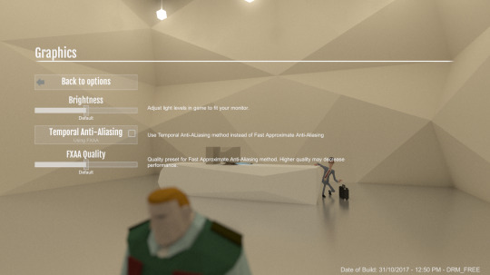
It’s been quite short and quick sprint, so there are no new amazing game features to talk about from Pontus. But as promised, our settings system has now evolved from a bunch of background systems and code into an actual menu. With some actual settings you can adjust!
The graphics will definitely need more work, but the plan is to fill in more options and then do a second pass on the artwork and layout to make sure everything works well with the content. For now, everything is functional at least.
Web work
Apart from that, things were polished up in the web side, with some imrpovements and additions to our wiki and to automate our newsletter. That’s going to make our life easier, and hopefully also help any players/modders to find the right Lua API and instructions for how to set things up in LevelKit in the future. I would say “go and check it out” but there’s not really much interesting things in the wiki yet, at least unless you are one of the lucky ones who have access to our builds and the LevelKit already. In which case, you of course should go and check it out to get you started testing how to create your own content for the game!
No funny bugs fixed by Pontus this sprint, and no interesting game design work either. But there definitely will be next time, he’s already spent the past few days with XMind open for plotting some pretty big changes for the game…
Mod testing
This sprint Josh, our modding and level design intern, challenged himself to build a level using the modding tools. The aim was to learn how to build a typical level with a focus on the Lua scripting side of things rather than art, and then take those learnings and see where he could fill in the gaps on the wiki that he found wanting.

We’ll let him tell you a bit more himself though:
��So I started out by blocking out the map that I wanted to create. Once I had the basic level that I was happy with I got stuck in with the Lua scripting with which I managed to learn a great deal upon completion of the level.
One of my favourite parts of creating the mod was the conversations, as it was super simple to create but also great fun generating branching dialogue between characters. Following this, I began work on a guide to building a level mod which has been added to the wiki.This is something that I felt would be important for potential modders to have to help make the modding experience more accessible.
This also resulted in a few new pages being created to explain some sections not covered on the wiki yet, such as the ability to add characters to your level. This is a very exciting and interesting feature which will allow you to create many gameplay elements, from conversations to patrolling guards.
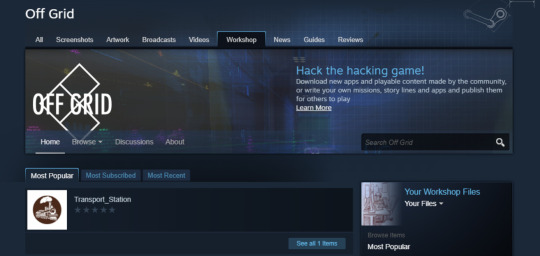
I also had the pleasure of testing the new ability to upload mods to the steam workshop using the Level-kit tools.
Shortly after that it was decided that we should create a mod level that people can download that would demonstrate some of the pre-made devices that any modder can essentially drag and drop into their own mod. It will also be playable which I will turn into an interactive tutorial of how these devices were made to help new modders create their own from scratch.”

Farewell Harry
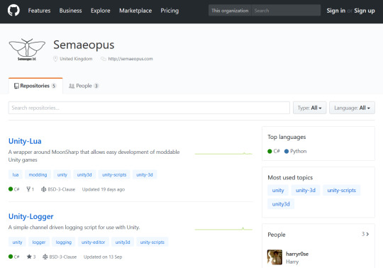
Harry had his last sprint with us this month as he is moving to join the development team at Unity, but we made sure he had time to part with a gift for any of our followers who are devs interested in making their games moddable too.
In his time on the team, Harry's done great work pushing modding in Unity 3d, and so we’ve open sourced his work on the Lua framework that makes Off Grid moddable, enjoy!
https://github.com/Semaeopus/Unity-Lua
Out with the New in with the Old ;)
And with our youngest team member Harry heading to Unity we have gained the wonderful Steve Allen in his place. Steve comes with a bundle of AAA and Indie experience, so much so that he qualifies for ‘industry veteran’ status, and we are pumped to have him aboard the good ship Semaeopus. I’ll stop rambling and let him introduce himself though:
Hello! I’m new here. I’ve joined the Off Grid team as a programmer, though will no doubt stick my nose in elsewhere. I’ve been programming games for, well, rather a long time, and am really excited to be part of the project. There’s lots of interesting stuff that still needs to be done and it’s already been a welcome change from the larger, corporate games I’ve been working on over the last few years. And who knows, next time I write one of these updates I might have done some work! - Steve
You’ll hear a lot more from Steve in the coming sprints, he’s already made good strides into impletmenting and extending new features in the Lua API for modders to play with, so watch this space!
Fixes and additions
Harry’s last couple of weeks were also a great opportunity for us to dig into some of the bugs in our backlog that haven’t been top priority, but would be welcome fixes with a little effort. We had a fantastic flurry of small fixes from the team, with Harry leading the charge.
Main game:
Messaging with CryptoChat
We setup a small notification to say that a character is typeing while you are waiting for them to respond to you in a conversation. It’s essentially a ‘Smedley is typing’ animation much like you’d see when using a messaging app like whatsapp or imessage.
We also and fixed the pause time between messages, which just needed a little finessing to feel more real.
And most importantly, we set up ‘B’ to skip single messages instead of all of the incoming messages from another character.
Include Mods in use, in save games
We now have save games recording what mods you have subsribed to so you can progress with your mods intact!
Saving NFC
NFC data is now being saved correctly.
Trailer video
We fixed a strange long wait at the end of our trailer that had been bugging us.
Player Phone
We fixed a bug to do with interactions when the player phone didn't appear when doing swipe interaction or scanning things.
Stuck Running
We had a somewhat funny but awkward bug in our animation state machine where the player can get stuck if you were crawling and spammed the run button while getting up - the player would get stuck runnning in circles! That is now fixed ;)
Look around you
The player character’s look-at IK needed more restriction on target height so that you didnt look at interesting objects on the floors above or below you.
Invisible walls and soft bathroom sinks
Lots of missing colliders were fixed.
LevelKit:
UV Warning
We updated asset importer post processing script to warn about missing normals and UVs on new models. This means as you are modding and making new geometry, the LevelKit tool will tell you if it is missing anything that could cause a later error.
Mod Content structure
We re-structured level directories so that the content a modder makes is in a neater structure.
Non Steam works / DRM free mod exports
Added Export as Zip option to build tab so that you can upload your mod anywhere for anyone (with a copy of the game) to try it out.
That’s all folks
Lots of big things happening so we’ll look forward to catching you next time.
Pontus, Rich, Sarah, Steve & Josh
#offgridthegame#stealthgame#hackinggame#moddablegame#modding#moddable#modded games#dataisyourmostpowerfulweapon#data privacy#infosec#github#unity#madewithunity#Unity3D#steamworkshop#steam games#Lua#videogame#video games#gamedev#indiegames#indiedev#indiegamedev#Indiegame#indiesunplayed#loadingbar#semaeopus#game design#game settings#blocktober
1 note
·
View note
Text
CSS Transitions In Vuejs And Nuxtjs
About The Author
Front-end developer based in Lagos, Nigeria. He enjoys converting designs into code and building things for the web. More about Timi …
Transitions are a nice way to remove, change, or update data in an application because their occurrence adds a nice effect and is good for the user experience. In this tutorial, we’ll look at the different ways to apply transitions in both Vue.js and NUXt.js applications.
Transitions are a module of CSS that lets you create gradual transitions between the values of specific CSS properties. The behavior of these transitions can be controlled by specifying their timing function, duration, and other attributes. Using these transitions in your applications and websites create a better visual experience and sometimes draws and holds the user’s attention while a piece of information is being introduced to or leaving the screen. According to Can I Use, transitions are supported by most browsers, although there are some minor issues with Internet Explorer and Safari.
Source: caniuse.com. (Large preview)
Vue.js is an open-source JavaScript framework for building client-facing web applications and single-page applications (SPA). One of the features of this framework is the ability to add transitions to an app seamlessly, to switch between either pages or components, and we’re going to look at how to do that in this tutorial.
NUXt.js is also a JavaScript framework, built on top of Vue.js (and often referred to as a framework of a framework), for building server-side web applications, static-generated websites, as well as SPAs. It works the same as Vue.js, so if you know Vue.js, you shouldn’t have many issues getting started with NUXt.js. NUXt.js comes with two properties for adding transitions to an app, and we’re going to cover those as well in this tutorial.
This tutorial requires basic knowledge of either Vue.js or Nuxt.js. All of the code snippets in this tutorial can be found on GitHub.
What Is A Transition?
According to the Oxford Dictionary, a transition can be defined as:
“A passage in a piece of writing that smoothly connects two topics or sections to each other.
The process or a period of changing from one state or condition to another.”
In terms of physics, a transition is defined thus:
“A change of an atom, nucleus, electron, etc. from one quantum state to another, with emission or absorption of radiation.”
From these definitions, we get an idea on what a transition is. The definitions all involve two different things or states. In terms of code, a transition is not so different.
What Is A CSS Transition?
According to Mozilla’s web documentation:
“CSS Transitions is a module of CSS that lets you create gradual transitions between the values of specific CSS properties. The behavior of these transitions can be controlled by specifying their timing function, duration, and other attributes.”
This means we can define a CSS transition as: the change in the CSS property of one or more elements from one value to another.
The CSS transition property enables us to add a transition effect to any valid element. It consists of up to four other properties (five, if we count the transition property itself) that can be used individually or combined as a shorthand. Each property has a different function.
transition-property
The transition-property accepts the name of the CSS property that we want to watch out for changes on and whose change process we want to transition. It looks like this:
.btn { width: 200px; height: 50px; transition-property: width; background-color: red; color: #fff; border: 0; }
But this property does not do anything without the next property.
transition-duration
The transition-duration property specifies the time that the change of the element(s) in the transition-property should go on for. This property is required in order for the transition to work. If it is not set (with a value greater than 0s), then the default value of 0s would mean it would not run. So, let’s set a duration for this transition:
.btn { width: 200px; transition-property: width; transition-duration: 2s; background-color: red; color: #fff; border: 0; }
Here, we have an element with a class name of btn that has a width of 200px. We are using both the transition-property and the transition-duration properties here. What this means is, “Hey, CSS, watch out for when the width property changes, and when this happens, let the effect take 2s to change.”
So, if we have a button with a class name of btn, then the index.html file would look like this:
<!DOCTYPE html> <html lang="en"> <head> <meta charset="UTF-8"> <meta name="viewport" content="width=device-width, initial-scale=1.0"> <title>CSS Transitions</title> <link rel="stylesheet" href="./assets/styles.css"> </head> <body> <Section> <h1>Hi CSS Transitions</h1> <button class="btn">Hover on me to see a cool transition</button> </Section> </body> </html>
Here, we have an HTML file that contains a button with a class that has transition-property and transition-duration properties watching out for changes to the element’s width.
One thing to note is that, in order for the transition on our button to work, we have to actually change the width of that element, either by manually adjusting the width with the developer tools in the browser, by using one of the CSS pseudo-classes, or by using JavaScript. For the purpose of this tutorial, we’re going to use the CSS pseudo-class :hover to change the width of the button:
// existing styles .btn:hover { width: 300px; }
Now, if we hover over this button, we should see the width of the button gradually increase over the set time, which is 2s.
See the Pen transition-property and transition-duration by Timi Omoyeni (@timibadass) on CodePen.
transition-timing-function
The transition-timing-function property determines the speed at which the transition effect occurs. Five values are available for this property:
ease This (the default) specifies a transition effect that starts slowly, then gets fast, then ends slowly.
linear This specifies a transition effect with the same speed from start to end.
ease-in This specifies a transition effect with a slow start.
ease-out This specifies a transition effect with a slow end.
ease-in-out This specifies a transition effect with a slow start and end.
cubic-bezier(n,n,n,n) This lets you define your own values in a cubic-bezier function.
So, if we add ease-in to our button, we should notice the speed at which the width and height change, compared to the speed at which the button returns to its normal state. Here is our updated styles.css sheet:
.btn { width: 200px; height: 50px; transition-property: width; transition-duration: 2s; transition-timing-function: ease-in; background-color: red; color: #fff; border: 0; }
If we want a more dramatic speed effect or the freedom to set a specific speed effect, we can use cubic-bezier(n,n,n,n):
btn { width: 200px; height: 50px; transition-property: width; transition-duration: 2s; transition-timing-function: cubic-bezier(0.075, 0.82, 0.165, 1); background-color: red; color: #fff; border: 0; }
See the Pen transition-timing-function by Timi Omoyeni (@timibadass) on CodePen.
One interesting thing about this value is that you can edit it directly in the browser using the developer tools.
Cubic bezier in the browser’s developer tools. (Large preview)
If you click on the highlighted part of your developer tools, you’ll get an interface to modify the cubic-bezier options:
Cubic bezier interface highlighted in yellow. (Large preview)
As you move the two points around, the values of (n,n,n,n) change, and you’ll see a representation (highlighted in red) of how the speed effect will appear. This can be very useful when you have a specific speed effect in mind.
transition-delay
The transition-delay property sets how long (in seconds) the transition has to wait before its effect starts to occur. This time is different from the transition-duration property, which specifies how long the transition effect will take place.
.btn { width: 200px; height: 50px; transition-property: width; transition-duration: 2s; transition-timing-function: cubic-bezier(0.075, 0.82, 0.165, 1); transition-delay: 5s; background-color: red; color: #fff; border: 0; }
If you try this in the browser, you will notice a delay before the element’s width starts to change. This is because of the transition-delay property and value that we have set.
See the Pen transition-delay by Timi Omoyeni (@timibadass) on CodePen.
Shorthand Property
The individual transition properties can be tedious to use. For this reason, we have the shorthand property: transition. It accepts all of the properties in a defined order:
{ transition: a b c d; }
Here, the letters correspond as follows:
a: transition-property
b: transition-duration
c: transition-timing-function
d: transition-delay
We can refactor our existing transition to work using this shorthand property:
// from .btn { width: 200px; height: 50px; transition-property: width; transition-duration: 2s; transition-timing-function: cubic-bezier(0.075, 0.82, 0.165, 1); transition-delay: 1s; background-color: red; color: #fff; border: 0; } // to .btn { width: 200px; height: 50px; transition: width 2s cubic-bezier(0.075, 0.82, 0.165, 1) 1s; background-color: red; color: #fff; border: 0; }
If we try this code in the browser, we will get the same transition effect that we got when we used the individual properties.
See the Pen using shorthand property by Timi Omoyeni (@timibadass) on CodePen.
Transitions In Vue.js
Vue.js comes with two different ways to add transitions to an application. This doesn’t mean we cannot use transitions the CSS way. It just means that Vue.js’ developers have built on top of CSS to make it easier to use transitions. Let’s look at them one by one.
Transitioning Individual Elements and Components
One way we can use transitions in Vue.js is by wrapping the transition component around an element or component, using any of the following:
conditional rendering ( using v-if),
conditional display (using v-show),
dynamic components,
component root nodes.
When we are developing an application, there are instances when we want to display data to the user depending on a value (such as a boolean). Here’s an example of how this works, taken from the index.vue file:
<template> <div> <p v-if="show">Now you see me!</p> <p v-else>Now you don't!</p> <button @click="show = !show">click me</button> </div> </template> <script> export default { data() { return { show: true } } } </script> <style> </style>
We have added two paragraphs to this page that appear depending on the value of show. We also have a button that changes the value of show when clicked. We’ll add this page to our App.vue file by importing it like so:
<template> <div id="app"> <Index /> </div> </template> <script> import Index from "./components/index.vue"; export default { name: 'App', components: { Index } } </script>
If we open the browser, we should see our paragraph and button:
Vue.js landing page in default state. (Large preview)
Right now, clicking the button changes only the value of show, which causes the visible text to change:
Landing page when button is clicked. (Large preview)
Adding a transition to this paragraph can be done by wrapping both paragraphs in the transition component. This component accepts a name prop, which is very important for the transition to work.
<template> <div> <transition name="fade"> <p v-if="show">Now you see me!</p> <p v-else>Now you don't!</p> </transition> <button @click="show = !show">click me</button> </div> </template>
This name tells Vue.js which transition to apply to the elements or components inside this transition component. At this point, if we click on the button, we would still not notice any transition because we have yet to add the configuration for our transition in the form of CSS classes.
One thing to note is that, when using a transition between two elements of the same tag, we need to specify a key attribute on each element in order for the transition to occur.
<template> <div> <transition name="fade"> <p v-if="show" key="visible">Now you see me!</p> <p v-else key="notVisible">Now you don't!</p> </transition> <button @click="show = !show">click me</button> </div> </template>
Vue.js has six transition classes that are applied to the elements or components inside the transition component, and each of these classes represents a state in the transition process. We’re going to look at only a few of them.
v-enter
The v-enter class represents the “starting state for enter”. This is the point at which a condition (v-if or v-else) has been met and the element is about to be made visible. At this point, the class has been added to the element, and it is removed once the element has been added. The name prop (in this case, fade) attached to the transition component is prefixed to this class name, but without the v. This v can be used by default if name is not provided. Thus, we can add this class to our index.vue file:
<style> p { color: green; } .fade-enter{ color: red; transform: translateY(20px); } </style>
First, we add a color of green to all of the paragraphs on the page. Then, we add our first transition class, fade-name. Inside this class, we change the color to red, and we make use of the transform and translateY property to move the paragraph by 20px along the y-axis (vertically). If we try clicking on the button again, we will notice that very little or no transition takes place during the switch because we need to add this next class we’ll look at.
v-enter-active
The v-enter-active class represents the “whole entering” state of a transitioning element. It means that this class is added just before the element is inserted or becomes visible, and it is removed when the transition has ended. This class is important for v-enter to work because it can be used to add the CSS transition property to the class, together with its properties (transition-property, transition-duration, transition-timing-function, and transition-delay), some of which are needed in order for the transition effect to work. Let’s add this class to our app and see what happens:
.fade-enter-active { transition: transform .3s cubic-bezier(1.0, 0.5, 0.8, 1.0), color .5s cubic-bezier(1.0, 0.5, 0.8, 1.0); }
See the Pen vue transition enter state by Timi Omoyeni (@timibadass) on CodePen.
Now, if we click on the button, we will notice the transition of the color and the position of each of the texts as they come into view. But the transition from visible to hidden isn’t smooth enough because no transition is happening.
v-leave-active
The v-leave-active class represents the entire state in which an element changes from visible to hidden. This means that this class is applied from the moment an element starts to leave the page, and it is removed once the transition ends. This class is important in order for a leave transition to be applied because it takes in the CSS transition property, which also takes in other transition properties. Let’s add this to our app and see what happens:
.fade-leave-active { transition: transform 1s cubic-bezier(1.0, 0.5, 0.8, 1.0), color 1s cubic-bezier(1.0, 0.5, 0.8, 1.0); }
See the Pen vue transition leave active state by Timi Omoyeni (@timibadass) on CodePen.
When we click on the button now, we will notice that the element that should leave waits for approximately 2 seconds before disappearing. This is because Vue.js is expecting the next class with this transition to be added in order for it to take effect.
v-leave-to
The v-leave-to transition represents the “leaving” state, meaning the point at which an element starts to leave and its transition is triggered. It is added one frame after a leaving transition is triggered, and removed when the transition or animation finishes. Let’s add this class to our app and see what happens:
.fade-leave-to { transform: translateX(100px); color: cyan; }
Clicking on the button, we will notice that each element that is leaving is sliding to the right as the color changes.
See the Pen vue transition leave to state by Timi Omoyeni (@timibadass) on CodePen.
Now that we understand how transitions work in Vue.js, here’s an image that brings it all together:
Classification of Vue.js transition classes. (Large preview)
Finally, notice the not-so-smooth transition that occurs during the enter and leave states of elements that are transitioning. This is because Vue.js’ transitions occur simultaneously. Vue.js has a mode prop that helps us achieve a very smooth transition process. This prop accepts one of the following values:
in-out The new element transitions in first, and then, when it’s complete, the current element transitions out.
out-in The current element transitions out first, and then, when complete, the new element transitions in.
If we add this mode to our index.vue file and try again, we should see a better transition:
<template> <div> <transition name="fade" appear mode="out-in"> <p v-if="show" key="visible">Now you see me!</p> <p v-else key="notVisible">Now you don't!</p> </transition> <button @click="transitionMe">click me</button> </div> </template>
Now, if we click on the button, we will notice that one element leaves before another enters. This is a result of the mode we have selected for this transition. If we try the other mode, we will get a different behavior.
See the Pen vue transition with mode by Timi Omoyeni (@timibadass) on CodePen.
List Transitions
If you ever try adding transitions to more than one element at a time using the transition component, an error will get printed to the console:
Vue.js error printed in console. (Large preview)
This is because the transition component is not meant to render more than one element at a time. If we want to transition two or more elements at a time or render a list (using v-for), we make use of the transition-group component. This component also accepts a name prop, but it has some differences from the transition component, including the following:
A key attribute is required for each element inside this component.
There is no need for the mode prop because more than one element would be rendered at a time.
A span element is rendered by default, but it can be modified by specifying a tag prop when defining the transition-group component. Let’s look at an example (in our listTransition.vue file):
<template> <div> <h1>List/Group Transition</h1> <ul> <li v-for="user in users" :key="user.id"> <button>Remove</button> </li> </ul> </div> </template> <script> export default { data() { return { users: [ { name: "Vuejs", id: 1 }, { name: "Vuex", id: 2 }, { name: "Router", id: 3 } ] }; } }; </script> <style> </style>
Here, we have an array of users, which we loop through using v-for, displaying the name in our template section. In order to be able to view this list, we need to import this component into the App.vue page:
<template> <div id="app"> <Index /> <listTransition /> </div> </template> <script> import Index from "./components/index.vue"; import listTransition from "./components/listTransition.vue"; export default { name: "App", components: { Index, listTransition } }; </script>
Note that when using the transition-group component, instead of wrapping our list with a ul tag (or any tag we have in mind), we wrap it around the transition-group component and add the tag to the tag prop, like this:
<template> <div> <h1>List/Group Transition</h1> <transition-group name="slide-fade" tag='ul'> <li v-for="user in users" :key="user.id"> <button>Remove</button> </li> </transition-group> </div> </template> <script> export default { data() { return { users: [ { name: "Vuejs", id: 1 }, { name: "Vuex", id: 2 }, { name: "Router", id: 3 } ] }; } }; </script> <style> .slide-fade-enter-active { transition: transform 0.3s cubic-bezier(1, 0.5, 0.8, 1), color 0.5s cubic-bezier(1, 0.5, 0.8, 1); } .slide-fade-leave-active { transition: transform 1s cubic-bezier(1, 0.5, 0.8, 1), color 1s cubic-bezier(1, 0.5, 0.8, 1); } .slide-fade-enter { color: mediumblue; transform: translateY(20px); } .slide-fade-leave-to { transform: translateX(100px); color: cyan; } </style>
Here, we have replaced the ul tag with the transition-group component, and added the ul as the tag prop value. If we inspect the updated page in the developer tools, we will see that the list is being wrapped in the element that we specified in the tag prop (that is, ul).
The ul tag highlighted in the developer tools. (Large preview)
We have also added a transition name prop with a value of slide-fade to this component, with style rules below in the style section that follow this naming convention. For this to work, we need to add the following lines of code to our file:
<template> <div> <h1>List/Group Transition</h1> <transition-group name="slide-fade" tag="ul"> <li v-for="user in users" :key="user.id"> <button @click="removeUser(user.id)">Remove</button> </li> </transition-group> </div> </template> <script> export default { // ... methods: { removeUser(id) { let users = this.users.filter(user => user.id !== id); this.users = users; } } }; </script>
In the template section, we add a click event to each button in the loop and pass the user.id to the removeUser method attached to this click event. We then create this function in the script section of our file. This function accepts an id as argument. Then, we run through our existing users and filter out the user with the id passed into this function. When this is done, we save our new array of users to the data of our page.
At this point, if you click on any of the buttons for the users, a transition effect will be applied as the user is being removed from the list.
See the Pen Vue list transition by Timi Omoyeni (@timibadass) on CodePen.
Transitions In Nuxt.js:
Adding transitions to a NUXt.js application is quite different from how you might be used to in Vue.js. In NUXt.js, the transition component is automatically added to the application for you. All you need to do is one of the following.
Add It to Individual Page Component
NUXt.js allows us to add transitions to an individual page component seamlessly. This transition is applied while the user is navigating to this page. All we have to do is add a transition property to the script section of the component. This property can be a string, a function, or an object. Some of the properties it accepts are:
name,
mode,
css.
Like Vue.js, NUXt.js has a default name that gets assigned to a transition class if no name is provided, and it is called page. Let’s see how this works when we add it to our application in transition.vue:
<template> <div> <p> Lorem ipsum dolor sit amet consectetur adipisicing elit. Labore libero odio, asperiores debitis harum ipsa neque cum nulla incidunt explicabo ut eaque placeat qui, quis voluptas. Aut necessitatibus aliquam veritatis. </p> <nUXt-link to="/">home</nUXt-link> </div> </template> <script> export default { transition: { name: "fade", mode: "out-in" }, data() { return { show: true }; } }; </script> <style> p { color: green; } .fade-enter-active { transition: transform 0.3s cubic-bezier(1, 0.5, 0.8, 1), color 0.5s cubic-bezier(1, 0.5, 0.8, 1); } .fade-leave-active { transition: transform 1s cubic-bezier(1, 0.5, 0.8, 1), color 1s cubic-bezier(1, 0.5, 0.8, 1); } .fade-enter { color: mediumblue; transform: translateY(20px); } .fade-leave-to { transform: translateX(100px); color: cyan; } </style>
On this page, we’ve displayed “lorem ipsum” in the template section. We’ve also added the transition property, to which we have passed an object whose name is set to fade and whose mode is set to out-in. Finally, in the style section, we’ve added some styles that control the transition as the user navigates between this page and another.
In order for this transition to work, we have to navigate to /transition, but we would not notice any transition if we manually enter this route in our browser. So, let’s add a link to this page on the index.vue page.
<template> <div class="container"> <div> // .. <nUXt-link to="/transition">next page</nUXt-link> </div> </div> </template>
Now, if we click the link on either of the two pages, we will notice a sliding transition as the browser moves to and from the /transition route.
pageTransition
Adding transitions to individual pages can be challenging if we want to add them to all of the pages in the application. That’s where pageTransition comes in. This property allows us to add a general configuration for all of our pages in the nUXt.config.js file. This property accepts both a string and object as an option. Let’s see how that works in nUXt.config.js:
export default { // ... /* ** Global CSS */ css: [ '~/assets/transition.css' ], pageTransition: { name: "fade", mode: "out-in" }, }
Here, we’ve added the link to a CSS file, which we’ll create shortly. We have also added the pageTransition property to the file, along with with its configuration. Now, let’s create our CSS file, transition.css, and add the following styles to it:
.fade-enter-active { transition: transform 0.3s cubic-bezier(1, 0.5, 0.8, 1), color 0.5s cubic-bezier(1, 0.5, 0.8, 1); } .fade-leave-active { transition: transform 1s cubic-bezier(1, 1, 1, 1), color 1s cubic-bezier(1, 0.5, 0.8, 1); } .fade-enter { color: mediumblue; transform: translateY(20px); } .fade-leave-to { transform: translate3d(-500px, -300px 400px); color: cyan; }
We’ve added the classes and styles that will be applied to the transition between one route and the other. If we get rid of the transition configuration from the transition.vue page and try to navigate between the two pages, we will get a transition effect.
layoutTransition
The layoutTransition property enables us to apply transitions based on the layout that the page is on. It works the same way as pageTranslation, except that it works based on layout. The default transition name is layout. Here’s an example of how it works, in nUXt.config.js:
export default { // ... /* ** Global CSS */ css: [ '~/assets/transition.css' ], layoutTransition: { name: "fade", mode: "out-in" }, }
Note that fade has to be the name of the layout in order for the transition to work with its layout. Let’s create this new layout in newLayout.vue to see what I mean:
<template> <!-- Your template --> <div> <h1>new layout</h1> </div> </template> <script> export default { layout: "blog" // page component definitions }; </script>
Conclusion
We have learned about CSS transitions and how to create them using the transition properties individually (transition-property, transition-duration, transition-timing-function, and transition-delay) and using the shorthand transition property. We have also covered how to apply these transitions in both Vue.js and NUXt.js. But that’s not all. Vue.js has more ways for us to apply transitions in an application:
Related Resources
(ks, ra, yk, il)
Website Design & SEO Delray Beach by DBL07.co
Delray Beach SEO
source http://www.scpie.org/css-transitions-in-vuejs-and-nuxtjs/ source https://scpie1.blogspot.com/2020/07/css-transitions-in-vuejs-and-nuxtjs.html
0 notes
Text
CSS Transitions In Vuejs And Nuxtjs
About The Author
Front-end developer based in Lagos, Nigeria. He enjoys converting designs into code and building things for the web. More about Timi …
Transitions are a nice way to remove, change, or update data in an application because their occurrence adds a nice effect and is good for the user experience. In this tutorial, we’ll look at the different ways to apply transitions in both Vue.js and NUXt.js applications.
Transitions are a module of CSS that lets you create gradual transitions between the values of specific CSS properties. The behavior of these transitions can be controlled by specifying their timing function, duration, and other attributes. Using these transitions in your applications and websites create a better visual experience and sometimes draws and holds the user’s attention while a piece of information is being introduced to or leaving the screen. According to Can I Use, transitions are supported by most browsers, although there are some minor issues with Internet Explorer and Safari.
Source: caniuse.com. (Large preview)
Vue.js is an open-source JavaScript framework for building client-facing web applications and single-page applications (SPA). One of the features of this framework is the ability to add transitions to an app seamlessly, to switch between either pages or components, and we’re going to look at how to do that in this tutorial.
NUXt.js is also a JavaScript framework, built on top of Vue.js (and often referred to as a framework of a framework), for building server-side web applications, static-generated websites, as well as SPAs. It works the same as Vue.js, so if you know Vue.js, you shouldn’t have many issues getting started with NUXt.js. NUXt.js comes with two properties for adding transitions to an app, and we’re going to cover those as well in this tutorial.
This tutorial requires basic knowledge of either Vue.js or Nuxt.js. All of the code snippets in this tutorial can be found on GitHub.
What Is A Transition?
According to the Oxford Dictionary, a transition can be defined as:
“A passage in a piece of writing that smoothly connects two topics or sections to each other.
The process or a period of changing from one state or condition to another.”
In terms of physics, a transition is defined thus:
“A change of an atom, nucleus, electron, etc. from one quantum state to another, with emission or absorption of radiation.”
From these definitions, we get an idea on what a transition is. The definitions all involve two different things or states. In terms of code, a transition is not so different.
What Is A CSS Transition?
According to Mozilla’s web documentation:
“CSS Transitions is a module of CSS that lets you create gradual transitions between the values of specific CSS properties. The behavior of these transitions can be controlled by specifying their timing function, duration, and other attributes.”
This means we can define a CSS transition as: the change in the CSS property of one or more elements from one value to another.
The CSS transition property enables us to add a transition effect to any valid element. It consists of up to four other properties (five, if we count the transition property itself) that can be used individually or combined as a shorthand. Each property has a different function.
transition-property
The transition-property accepts the name of the CSS property that we want to watch out for changes on and whose change process we want to transition. It looks like this:
.btn { width: 200px; height: 50px; transition-property: width; background-color: red; color: #fff; border: 0; }
But this property does not do anything without the next property.
transition-duration
The transition-duration property specifies the time that the change of the element(s) in the transition-property should go on for. This property is required in order for the transition to work. If it is not set (with a value greater than 0s), then the default value of 0s would mean it would not run. So, let’s set a duration for this transition:
.btn { width: 200px; transition-property: width; transition-duration: 2s; background-color: red; color: #fff; border: 0; }
Here, we have an element with a class name of btn that has a width of 200px. We are using both the transition-property and the transition-duration properties here. What this means is, “Hey, CSS, watch out for when the width property changes, and when this happens, let the effect take 2s to change.”
So, if we have a button with a class name of btn, then the index.html file would look like this:
<!DOCTYPE html> <html lang="en"> <head> <meta charset="UTF-8"> <meta name="viewport" content="width=device-width, initial-scale=1.0"> <title>CSS Transitions</title> <link rel="stylesheet" href="./assets/styles.css"> </head> <body> <Section> <h1>Hi CSS Transitions</h1> <button class="btn">Hover on me to see a cool transition</button> </Section> </body> </html>
Here, we have an HTML file that contains a button with a class that has transition-property and transition-duration properties watching out for changes to the element’s width.
One thing to note is that, in order for the transition on our button to work, we have to actually change the width of that element, either by manually adjusting the width with the developer tools in the browser, by using one of the CSS pseudo-classes, or by using JavaScript. For the purpose of this tutorial, we’re going to use the CSS pseudo-class :hover to change the width of the button:
// existing styles .btn:hover { width: 300px; }
Now, if we hover over this button, we should see the width of the button gradually increase over the set time, which is 2s.
See the Pen transition-property and transition-duration by Timi Omoyeni (@timibadass) on CodePen.
transition-timing-function
The transition-timing-function property determines the speed at which the transition effect occurs. Five values are available for this property:
ease This (the default) specifies a transition effect that starts slowly, then gets fast, then ends slowly.
linear This specifies a transition effect with the same speed from start to end.
ease-in This specifies a transition effect with a slow start.
ease-out This specifies a transition effect with a slow end.
ease-in-out This specifies a transition effect with a slow start and end.
cubic-bezier(n,n,n,n) This lets you define your own values in a cubic-bezier function.
So, if we add ease-in to our button, we should notice the speed at which the width and height change, compared to the speed at which the button returns to its normal state. Here is our updated styles.css sheet:
.btn { width: 200px; height: 50px; transition-property: width; transition-duration: 2s; transition-timing-function: ease-in; background-color: red; color: #fff; border: 0; }
If we want a more dramatic speed effect or the freedom to set a specific speed effect, we can use cubic-bezier(n,n,n,n):
btn { width: 200px; height: 50px; transition-property: width; transition-duration: 2s; transition-timing-function: cubic-bezier(0.075, 0.82, 0.165, 1); background-color: red; color: #fff; border: 0; }
See the Pen transition-timing-function by Timi Omoyeni (@timibadass) on CodePen.
One interesting thing about this value is that you can edit it directly in the browser using the developer tools.
Cubic bezier in the browser’s developer tools. (Large preview)
If you click on the highlighted part of your developer tools, you’ll get an interface to modify the cubic-bezier options:
Cubic bezier interface highlighted in yellow. (Large preview)
As you move the two points around, the values of (n,n,n,n) change, and you’ll see a representation (highlighted in red) of how the speed effect will appear. This can be very useful when you have a specific speed effect in mind.
transition-delay
The transition-delay property sets how long (in seconds) the transition has to wait before its effect starts to occur. This time is different from the transition-duration property, which specifies how long the transition effect will take place.
.btn { width: 200px; height: 50px; transition-property: width; transition-duration: 2s; transition-timing-function: cubic-bezier(0.075, 0.82, 0.165, 1); transition-delay: 5s; background-color: red; color: #fff; border: 0; }
If you try this in the browser, you will notice a delay before the element’s width starts to change. This is because of the transition-delay property and value that we have set.
See the Pen transition-delay by Timi Omoyeni (@timibadass) on CodePen.
Shorthand Property
The individual transition properties can be tedious to use. For this reason, we have the shorthand property: transition. It accepts all of the properties in a defined order:
{ transition: a b c d; }
Here, the letters correspond as follows:
a: transition-property
b: transition-duration
c: transition-timing-function
d: transition-delay
We can refactor our existing transition to work using this shorthand property:
// from .btn { width: 200px; height: 50px; transition-property: width; transition-duration: 2s; transition-timing-function: cubic-bezier(0.075, 0.82, 0.165, 1); transition-delay: 1s; background-color: red; color: #fff; border: 0; } // to .btn { width: 200px; height: 50px; transition: width 2s cubic-bezier(0.075, 0.82, 0.165, 1) 1s; background-color: red; color: #fff; border: 0; }
If we try this code in the browser, we will get the same transition effect that we got when we used the individual properties.
See the Pen using shorthand property by Timi Omoyeni (@timibadass) on CodePen.
Transitions In Vue.js
Vue.js comes with two different ways to add transitions to an application. This doesn’t mean we cannot use transitions the CSS way. It just means that Vue.js’ developers have built on top of CSS to make it easier to use transitions. Let’s look at them one by one.
Transitioning Individual Elements and Components
One way we can use transitions in Vue.js is by wrapping the transition component around an element or component, using any of the following:
conditional rendering ( using v-if),
conditional display (using v-show),
dynamic components,
component root nodes.
When we are developing an application, there are instances when we want to display data to the user depending on a value (such as a boolean). Here’s an example of how this works, taken from the index.vue file:
<template> <div> <p v-if="show">Now you see me!</p> <p v-else>Now you don't!</p> <button @click="show = !show">click me</button> </div> </template> <script> export default { data() { return { show: true } } } </script> <style> </style>
We have added two paragraphs to this page that appear depending on the value of show. We also have a button that changes the value of show when clicked. We’ll add this page to our App.vue file by importing it like so:
<template> <div id="app"> <Index /> </div> </template> <script> import Index from "./components/index.vue"; export default { name: 'App', components: { Index } } </script>
If we open the browser, we should see our paragraph and button:
Vue.js landing page in default state. (Large preview)
Right now, clicking the button changes only the value of show, which causes the visible text to change:
Landing page when button is clicked. (Large preview)
Adding a transition to this paragraph can be done by wrapping both paragraphs in the transition component. This component accepts a name prop, which is very important for the transition to work.
<template> <div> <transition name="fade"> <p v-if="show">Now you see me!</p> <p v-else>Now you don't!</p> </transition> <button @click="show = !show">click me</button> </div> </template>
This name tells Vue.js which transition to apply to the elements or components inside this transition component. At this point, if we click on the button, we would still not notice any transition because we have yet to add the configuration for our transition in the form of CSS classes.
One thing to note is that, when using a transition between two elements of the same tag, we need to specify a key attribute on each element in order for the transition to occur.
<template> <div> <transition name="fade"> <p v-if="show" key="visible">Now you see me!</p> <p v-else key="notVisible">Now you don't!</p> </transition> <button @click="show = !show">click me</button> </div> </template>
Vue.js has six transition classes that are applied to the elements or components inside the transition component, and each of these classes represents a state in the transition process. We’re going to look at only a few of them.
v-enter
The v-enter class represents the “starting state for enter”. This is the point at which a condition (v-if or v-else) has been met and the element is about to be made visible. At this point, the class has been added to the element, and it is removed once the element has been added. The name prop (in this case, fade) attached to the transition component is prefixed to this class name, but without the v. This v can be used by default if name is not provided. Thus, we can add this class to our index.vue file:
<style> p { color: green; } .fade-enter{ color: red; transform: translateY(20px); } </style>
First, we add a color of green to all of the paragraphs on the page. Then, we add our first transition class, fade-name. Inside this class, we change the color to red, and we make use of the transform and translateY property to move the paragraph by 20px along the y-axis (vertically). If we try clicking on the button again, we will notice that very little or no transition takes place during the switch because we need to add this next class we’ll look at.
v-enter-active
The v-enter-active class represents the “whole entering” state of a transitioning element. It means that this class is added just before the element is inserted or becomes visible, and it is removed when the transition has ended. This class is important for v-enter to work because it can be used to add the CSS transition property to the class, together with its properties (transition-property, transition-duration, transition-timing-function, and transition-delay), some of which are needed in order for the transition effect to work. Let’s add this class to our app and see what happens:
.fade-enter-active { transition: transform .3s cubic-bezier(1.0, 0.5, 0.8, 1.0), color .5s cubic-bezier(1.0, 0.5, 0.8, 1.0); }
See the Pen vue transition enter state by Timi Omoyeni (@timibadass) on CodePen.
Now, if we click on the button, we will notice the transition of the color and the position of each of the texts as they come into view. But the transition from visible to hidden isn’t smooth enough because no transition is happening.
v-leave-active
The v-leave-active class represents the entire state in which an element changes from visible to hidden. This means that this class is applied from the moment an element starts to leave the page, and it is removed once the transition ends. This class is important in order for a leave transition to be applied because it takes in the CSS transition property, which also takes in other transition properties. Let’s add this to our app and see what happens:
.fade-leave-active { transition: transform 1s cubic-bezier(1.0, 0.5, 0.8, 1.0), color 1s cubic-bezier(1.0, 0.5, 0.8, 1.0); }
See the Pen vue transition leave active state by Timi Omoyeni (@timibadass) on CodePen.
When we click on the button now, we will notice that the element that should leave waits for approximately 2 seconds before disappearing. This is because Vue.js is expecting the next class with this transition to be added in order for it to take effect.
v-leave-to
The v-leave-to transition represents the “leaving” state, meaning the point at which an element starts to leave and its transition is triggered. It is added one frame after a leaving transition is triggered, and removed when the transition or animation finishes. Let’s add this class to our app and see what happens:
.fade-leave-to { transform: translateX(100px); color: cyan; }
Clicking on the button, we will notice that each element that is leaving is sliding to the right as the color changes.
See the Pen vue transition leave to state by Timi Omoyeni (@timibadass) on CodePen.
Now that we understand how transitions work in Vue.js, here’s an image that brings it all together:
Classification of Vue.js transition classes. (Large preview)
Finally, notice the not-so-smooth transition that occurs during the enter and leave states of elements that are transitioning. This is because Vue.js’ transitions occur simultaneously. Vue.js has a mode prop that helps us achieve a very smooth transition process. This prop accepts one of the following values:
in-out The new element transitions in first, and then, when it’s complete, the current element transitions out.
out-in The current element transitions out first, and then, when complete, the new element transitions in.
If we add this mode to our index.vue file and try again, we should see a better transition:
<template> <div> <transition name="fade" appear mode="out-in"> <p v-if="show" key="visible">Now you see me!</p> <p v-else key="notVisible">Now you don't!</p> </transition> <button @click="transitionMe">click me</button> </div> </template>
Now, if we click on the button, we will notice that one element leaves before another enters. This is a result of the mode we have selected for this transition. If we try the other mode, we will get a different behavior.
See the Pen vue transition with mode by Timi Omoyeni (@timibadass) on CodePen.
List Transitions
If you ever try adding transitions to more than one element at a time using the transition component, an error will get printed to the console:
Vue.js error printed in console. (Large preview)
This is because the transition component is not meant to render more than one element at a time. If we want to transition two or more elements at a time or render a list (using v-for), we make use of the transition-group component. This component also accepts a name prop, but it has some differences from the transition component, including the following:
A key attribute is required for each element inside this component.
There is no need for the mode prop because more than one element would be rendered at a time.
A span element is rendered by default, but it can be modified by specifying a tag prop when defining the transition-group component. Let’s look at an example (in our listTransition.vue file):
<template> <div> <h1>List/Group Transition</h1> <ul> <li v-for="user in users" :key="user.id"> <button>Remove</button> </li> </ul> </div> </template> <script> export default { data() { return { users: [ { name: "Vuejs", id: 1 }, { name: "Vuex", id: 2 }, { name: "Router", id: 3 } ] }; } }; </script> <style> </style>
Here, we have an array of users, which we loop through using v-for, displaying the name in our template section. In order to be able to view this list, we need to import this component into the App.vue page:
<template> <div id="app"> <Index /> <listTransition /> </div> </template> <script> import Index from "./components/index.vue"; import listTransition from "./components/listTransition.vue"; export default { name: "App", components: { Index, listTransition } }; </script>
Note that when using the transition-group component, instead of wrapping our list with a ul tag (or any tag we have in mind), we wrap it around the transition-group component and add the tag to the tag prop, like this:
<template> <div> <h1>List/Group Transition</h1> <transition-group name="slide-fade" tag='ul'> <li v-for="user in users" :key="user.id"> <button>Remove</button> </li> </transition-group> </div> </template> <script> export default { data() { return { users: [ { name: "Vuejs", id: 1 }, { name: "Vuex", id: 2 }, { name: "Router", id: 3 } ] }; } }; </script> <style> .slide-fade-enter-active { transition: transform 0.3s cubic-bezier(1, 0.5, 0.8, 1), color 0.5s cubic-bezier(1, 0.5, 0.8, 1); } .slide-fade-leave-active { transition: transform 1s cubic-bezier(1, 0.5, 0.8, 1), color 1s cubic-bezier(1, 0.5, 0.8, 1); } .slide-fade-enter { color: mediumblue; transform: translateY(20px); } .slide-fade-leave-to { transform: translateX(100px); color: cyan; } </style>
Here, we have replaced the ul tag with the transition-group component, and added the ul as the tag prop value. If we inspect the updated page in the developer tools, we will see that the list is being wrapped in the element that we specified in the tag prop (that is, ul).
The ul tag highlighted in the developer tools. (Large preview)
We have also added a transition name prop with a value of slide-fade to this component, with style rules below in the style section that follow this naming convention. For this to work, we need to add the following lines of code to our file:
<template> <div> <h1>List/Group Transition</h1> <transition-group name="slide-fade" tag="ul"> <li v-for="user in users" :key="user.id"> <button @click="removeUser(user.id)">Remove</button> </li> </transition-group> </div> </template> <script> export default { // ... methods: { removeUser(id) { let users = this.users.filter(user => user.id !== id); this.users = users; } } }; </script>
In the template section, we add a click event to each button in the loop and pass the user.id to the removeUser method attached to this click event. We then create this function in the script section of our file. This function accepts an id as argument. Then, we run through our existing users and filter out the user with the id passed into this function. When this is done, we save our new array of users to the data of our page.
At this point, if you click on any of the buttons for the users, a transition effect will be applied as the user is being removed from the list.
See the Pen Vue list transition by Timi Omoyeni (@timibadass) on CodePen.
Transitions In Nuxt.js:
Adding transitions to a NUXt.js application is quite different from how you might be used to in Vue.js. In NUXt.js, the transition component is automatically added to the application for you. All you need to do is one of the following.
Add It to Individual Page Component
NUXt.js allows us to add transitions to an individual page component seamlessly. This transition is applied while the user is navigating to this page. All we have to do is add a transition property to the script section of the component. This property can be a string, a function, or an object. Some of the properties it accepts are:
name,
mode,
css.
Like Vue.js, NUXt.js has a default name that gets assigned to a transition class if no name is provided, and it is called page. Let’s see how this works when we add it to our application in transition.vue:
<template> <div> <p> Lorem ipsum dolor sit amet consectetur adipisicing elit. Labore libero odio, asperiores debitis harum ipsa neque cum nulla incidunt explicabo ut eaque placeat qui, quis voluptas. Aut necessitatibus aliquam veritatis. </p> <nUXt-link to="/">home</nUXt-link> </div> </template> <script> export default { transition: { name: "fade", mode: "out-in" }, data() { return { show: true }; } }; </script> <style> p { color: green; } .fade-enter-active { transition: transform 0.3s cubic-bezier(1, 0.5, 0.8, 1), color 0.5s cubic-bezier(1, 0.5, 0.8, 1); } .fade-leave-active { transition: transform 1s cubic-bezier(1, 0.5, 0.8, 1), color 1s cubic-bezier(1, 0.5, 0.8, 1); } .fade-enter { color: mediumblue; transform: translateY(20px); } .fade-leave-to { transform: translateX(100px); color: cyan; } </style>
On this page, we’ve displayed “lorem ipsum” in the template section. We’ve also added the transition property, to which we have passed an object whose name is set to fade and whose mode is set to out-in. Finally, in the style section, we’ve added some styles that control the transition as the user navigates between this page and another.
In order for this transition to work, we have to navigate to /transition, but we would not notice any transition if we manually enter this route in our browser. So, let’s add a link to this page on the index.vue page.
<template> <div class="container"> <div> // .. <nUXt-link to="/transition">next page</nUXt-link> </div> </div> </template>
Now, if we click the link on either of the two pages, we will notice a sliding transition as the browser moves to and from the /transition route.
pageTransition
Adding transitions to individual pages can be challenging if we want to add them to all of the pages in the application. That’s where pageTransition comes in. This property allows us to add a general configuration for all of our pages in the nUXt.config.js file. This property accepts both a string and object as an option. Let’s see how that works in nUXt.config.js:
export default { // ... /* ** Global CSS */ css: [ '~/assets/transition.css' ], pageTransition: { name: "fade", mode: "out-in" }, }
Here, we’ve added the link to a CSS file, which we’ll create shortly. We have also added the pageTransition property to the file, along with with its configuration. Now, let’s create our CSS file, transition.css, and add the following styles to it:
.fade-enter-active { transition: transform 0.3s cubic-bezier(1, 0.5, 0.8, 1), color 0.5s cubic-bezier(1, 0.5, 0.8, 1); } .fade-leave-active { transition: transform 1s cubic-bezier(1, 1, 1, 1), color 1s cubic-bezier(1, 0.5, 0.8, 1); } .fade-enter { color: mediumblue; transform: translateY(20px); } .fade-leave-to { transform: translate3d(-500px, -300px 400px); color: cyan; }
We’ve added the classes and styles that will be applied to the transition between one route and the other. If we get rid of the transition configuration from the transition.vue page and try to navigate between the two pages, we will get a transition effect.
layoutTransition
The layoutTransition property enables us to apply transitions based on the layout that the page is on. It works the same way as pageTranslation, except that it works based on layout. The default transition name is layout. Here’s an example of how it works, in nUXt.config.js:
export default { // ... /* ** Global CSS */ css: [ '~/assets/transition.css' ], layoutTransition: { name: "fade", mode: "out-in" }, }
Note that fade has to be the name of the layout in order for the transition to work with its layout. Let’s create this new layout in newLayout.vue to see what I mean:
<template> <!-- Your template --> <div> <h1>new layout</h1> </div> </template> <script> export default { layout: "blog" // page component definitions }; </script>
Conclusion
We have learned about CSS transitions and how to create them using the transition properties individually (transition-property, transition-duration, transition-timing-function, and transition-delay) and using the shorthand transition property. We have also covered how to apply these transitions in both Vue.js and NUXt.js. But that’s not all. Vue.js has more ways for us to apply transitions in an application:
Related Resources
(ks, ra, yk, il)
Website Design & SEO Delray Beach by DBL07.co
Delray Beach SEO
source http://www.scpie.org/css-transitions-in-vuejs-and-nuxtjs/ source https://scpie.tumblr.com/post/623297746742493184
0 notes
Text
CSS Transitions In Vuejs And Nuxtjs
About The Author
Front-end developer based in Lagos, Nigeria. He enjoys converting designs into code and building things for the web. More about Timi …
Transitions are a nice way to remove, change, or update data in an application because their occurrence adds a nice effect and is good for the user experience. In this tutorial, we’ll look at the different ways to apply transitions in both Vue.js and NUXt.js applications.
Transitions are a module of CSS that lets you create gradual transitions between the values of specific CSS properties. The behavior of these transitions can be controlled by specifying their timing function, duration, and other attributes. Using these transitions in your applications and websites create a better visual experience and sometimes draws and holds the user’s attention while a piece of information is being introduced to or leaving the screen. According to Can I Use, transitions are supported by most browsers, although there are some minor issues with Internet Explorer and Safari.
Source: caniuse.com. (Large preview)
Vue.js is an open-source JavaScript framework for building client-facing web applications and single-page applications (SPA). One of the features of this framework is the ability to add transitions to an app seamlessly, to switch between either pages or components, and we’re going to look at how to do that in this tutorial.
NUXt.js is also a JavaScript framework, built on top of Vue.js (and often referred to as a framework of a framework), for building server-side web applications, static-generated websites, as well as SPAs. It works the same as Vue.js, so if you know Vue.js, you shouldn’t have many issues getting started with NUXt.js. NUXt.js comes with two properties for adding transitions to an app, and we’re going to cover those as well in this tutorial.
This tutorial requires basic knowledge of either Vue.js or Nuxt.js. All of the code snippets in this tutorial can be found on GitHub.
What Is A Transition?
According to the Oxford Dictionary, a transition can be defined as:
“A passage in a piece of writing that smoothly connects two topics or sections to each other.
The process or a period of changing from one state or condition to another.”
In terms of physics, a transition is defined thus:
“A change of an atom, nucleus, electron, etc. from one quantum state to another, with emission or absorption of radiation.”
From these definitions, we get an idea on what a transition is. The definitions all involve two different things or states. In terms of code, a transition is not so different.
What Is A CSS Transition?
According to Mozilla’s web documentation:
“CSS Transitions is a module of CSS that lets you create gradual transitions between the values of specific CSS properties. The behavior of these transitions can be controlled by specifying their timing function, duration, and other attributes.”
This means we can define a CSS transition as: the change in the CSS property of one or more elements from one value to another.
The CSS transition property enables us to add a transition effect to any valid element. It consists of up to four other properties (five, if we count the transition property itself) that can be used individually or combined as a shorthand. Each property has a different function.
transition-property
The transition-property accepts the name of the CSS property that we want to watch out for changes on and whose change process we want to transition. It looks like this:
.btn { width: 200px; height: 50px; transition-property: width; background-color: red; color: #fff; border: 0; }
But this property does not do anything without the next property.
transition-duration
The transition-duration property specifies the time that the change of the element(s) in the transition-property should go on for. This property is required in order for the transition to work. If it is not set (with a value greater than 0s), then the default value of 0s would mean it would not run. So, let’s set a duration for this transition:
.btn { width: 200px; transition-property: width; transition-duration: 2s; background-color: red; color: #fff; border: 0; }
Here, we have an element with a class name of btn that has a width of 200px. We are using both the transition-property and the transition-duration properties here. What this means is, “Hey, CSS, watch out for when the width property changes, and when this happens, let the effect take 2s to change.”
So, if we have a button with a class name of btn, then the index.html file would look like this:
<!DOCTYPE html> <html lang="en"> <head> <meta charset="UTF-8"> <meta name="viewport" content="width=device-width, initial-scale=1.0"> <title>CSS Transitions</title> <link rel="stylesheet" href="./assets/styles.css"> </head> <body> <Section> <h1>Hi CSS Transitions</h1> <button class="btn">Hover on me to see a cool transition</button> </Section> </body> </html>
Here, we have an HTML file that contains a button with a class that has transition-property and transition-duration properties watching out for changes to the element’s width.
One thing to note is that, in order for the transition on our button to work, we have to actually change the width of that element, either by manually adjusting the width with the developer tools in the browser, by using one of the CSS pseudo-classes, or by using JavaScript. For the purpose of this tutorial, we’re going to use the CSS pseudo-class :hover to change the width of the button:
// existing styles .btn:hover { width: 300px; }
Now, if we hover over this button, we should see the width of the button gradually increase over the set time, which is 2s.
See the Pen transition-property and transition-duration by Timi Omoyeni (@timibadass) on CodePen.
transition-timing-function
The transition-timing-function property determines the speed at which the transition effect occurs. Five values are available for this property:
ease This (the default) specifies a transition effect that starts slowly, then gets fast, then ends slowly.
linear This specifies a transition effect with the same speed from start to end.
ease-in This specifies a transition effect with a slow start.
ease-out This specifies a transition effect with a slow end.
ease-in-out This specifies a transition effect with a slow start and end.
cubic-bezier(n,n,n,n) This lets you define your own values in a cubic-bezier function.
So, if we add ease-in to our button, we should notice the speed at which the width and height change, compared to the speed at which the button returns to its normal state. Here is our updated styles.css sheet:
.btn { width: 200px; height: 50px; transition-property: width; transition-duration: 2s; transition-timing-function: ease-in; background-color: red; color: #fff; border: 0; }
If we want a more dramatic speed effect or the freedom to set a specific speed effect, we can use cubic-bezier(n,n,n,n):
btn { width: 200px; height: 50px; transition-property: width; transition-duration: 2s; transition-timing-function: cubic-bezier(0.075, 0.82, 0.165, 1); background-color: red; color: #fff; border: 0; }
See the Pen transition-timing-function by Timi Omoyeni (@timibadass) on CodePen.
One interesting thing about this value is that you can edit it directly in the browser using the developer tools.
Cubic bezier in the browser’s developer tools. (Large preview)
If you click on the highlighted part of your developer tools, you’ll get an interface to modify the cubic-bezier options:
Cubic bezier interface highlighted in yellow. (Large preview)
As you move the two points around, the values of (n,n,n,n) change, and you’ll see a representation (highlighted in red) of how the speed effect will appear. This can be very useful when you have a specific speed effect in mind.
transition-delay
The transition-delay property sets how long (in seconds) the transition has to wait before its effect starts to occur. This time is different from the transition-duration property, which specifies how long the transition effect will take place.
.btn { width: 200px; height: 50px; transition-property: width; transition-duration: 2s; transition-timing-function: cubic-bezier(0.075, 0.82, 0.165, 1); transition-delay: 5s; background-color: red; color: #fff; border: 0; }
If you try this in the browser, you will notice a delay before the element’s width starts to change. This is because of the transition-delay property and value that we have set.
See the Pen transition-delay by Timi Omoyeni (@timibadass) on CodePen.
Shorthand Property
The individual transition properties can be tedious to use. For this reason, we have the shorthand property: transition. It accepts all of the properties in a defined order:
{ transition: a b c d; }
Here, the letters correspond as follows:
a: transition-property
b: transition-duration
c: transition-timing-function
d: transition-delay
We can refactor our existing transition to work using this shorthand property:
// from .btn { width: 200px; height: 50px; transition-property: width; transition-duration: 2s; transition-timing-function: cubic-bezier(0.075, 0.82, 0.165, 1); transition-delay: 1s; background-color: red; color: #fff; border: 0; } // to .btn { width: 200px; height: 50px; transition: width 2s cubic-bezier(0.075, 0.82, 0.165, 1) 1s; background-color: red; color: #fff; border: 0; }
If we try this code in the browser, we will get the same transition effect that we got when we used the individual properties.
See the Pen using shorthand property by Timi Omoyeni (@timibadass) on CodePen.
Transitions In Vue.js
Vue.js comes with two different ways to add transitions to an application. This doesn’t mean we cannot use transitions the CSS way. It just means that Vue.js’ developers have built on top of CSS to make it easier to use transitions. Let’s look at them one by one.
Transitioning Individual Elements and Components
One way we can use transitions in Vue.js is by wrapping the transition component around an element or component, using any of the following:
conditional rendering ( using v-if),
conditional display (using v-show),
dynamic components,
component root nodes.
When we are developing an application, there are instances when we want to display data to the user depending on a value (such as a boolean). Here’s an example of how this works, taken from the index.vue file:
<template> <div> <p v-if="show">Now you see me!</p> <p v-else>Now you don't!</p> <button @click="show = !show">click me</button> </div> </template> <script> export default { data() { return { show: true } } } </script> <style> </style>
We have added two paragraphs to this page that appear depending on the value of show. We also have a button that changes the value of show when clicked. We’ll add this page to our App.vue file by importing it like so:
<template> <div id="app"> <Index /> </div> </template> <script> import Index from "./components/index.vue"; export default { name: 'App', components: { Index } } </script>
If we open the browser, we should see our paragraph and button:
Vue.js landing page in default state. (Large preview)
Right now, clicking the button changes only the value of show, which causes the visible text to change:
Landing page when button is clicked. (Large preview)
Adding a transition to this paragraph can be done by wrapping both paragraphs in the transition component. This component accepts a name prop, which is very important for the transition to work.
<template> <div> <transition name="fade"> <p v-if="show">Now you see me!</p> <p v-else>Now you don't!</p> </transition> <button @click="show = !show">click me</button> </div> </template>
This name tells Vue.js which transition to apply to the elements or components inside this transition component. At this point, if we click on the button, we would still not notice any transition because we have yet to add the configuration for our transition in the form of CSS classes.
One thing to note is that, when using a transition between two elements of the same tag, we need to specify a key attribute on each element in order for the transition to occur.
<template> <div> <transition name="fade"> <p v-if="show" key="visible">Now you see me!</p> <p v-else key="notVisible">Now you don't!</p> </transition> <button @click="show = !show">click me</button> </div> </template>
Vue.js has six transition classes that are applied to the elements or components inside the transition component, and each of these classes represents a state in the transition process. We’re going to look at only a few of them.
v-enter
The v-enter class represents the “starting state for enter”. This is the point at which a condition (v-if or v-else) has been met and the element is about to be made visible. At this point, the class has been added to the element, and it is removed once the element has been added. The name prop (in this case, fade) attached to the transition component is prefixed to this class name, but without the v. This v can be used by default if name is not provided. Thus, we can add this class to our index.vue file:
<style> p { color: green; } .fade-enter{ color: red; transform: translateY(20px); } </style>
First, we add a color of green to all of the paragraphs on the page. Then, we add our first transition class, fade-name. Inside this class, we change the color to red, and we make use of the transform and translateY property to move the paragraph by 20px along the y-axis (vertically). If we try clicking on the button again, we will notice that very little or no transition takes place during the switch because we need to add this next class we’ll look at.
v-enter-active
The v-enter-active class represents the “whole entering” state of a transitioning element. It means that this class is added just before the element is inserted or becomes visible, and it is removed when the transition has ended. This class is important for v-enter to work because it can be used to add the CSS transition property to the class, together with its properties (transition-property, transition-duration, transition-timing-function, and transition-delay), some of which are needed in order for the transition effect to work. Let’s add this class to our app and see what happens:
.fade-enter-active { transition: transform .3s cubic-bezier(1.0, 0.5, 0.8, 1.0), color .5s cubic-bezier(1.0, 0.5, 0.8, 1.0); }
See the Pen vue transition enter state by Timi Omoyeni (@timibadass) on CodePen.
Now, if we click on the button, we will notice the transition of the color and the position of each of the texts as they come into view. But the transition from visible to hidden isn’t smooth enough because no transition is happening.
v-leave-active
The v-leave-active class represents the entire state in which an element changes from visible to hidden. This means that this class is applied from the moment an element starts to leave the page, and it is removed once the transition ends. This class is important in order for a leave transition to be applied because it takes in the CSS transition property, which also takes in other transition properties. Let’s add this to our app and see what happens:
.fade-leave-active { transition: transform 1s cubic-bezier(1.0, 0.5, 0.8, 1.0), color 1s cubic-bezier(1.0, 0.5, 0.8, 1.0); }
See the Pen vue transition leave active state by Timi Omoyeni (@timibadass) on CodePen.
When we click on the button now, we will notice that the element that should leave waits for approximately 2 seconds before disappearing. This is because Vue.js is expecting the next class with this transition to be added in order for it to take effect.
v-leave-to
The v-leave-to transition represents the “leaving” state, meaning the point at which an element starts to leave and its transition is triggered. It is added one frame after a leaving transition is triggered, and removed when the transition or animation finishes. Let’s add this class to our app and see what happens:
.fade-leave-to { transform: translateX(100px); color: cyan; }
Clicking on the button, we will notice that each element that is leaving is sliding to the right as the color changes.
See the Pen vue transition leave to state by Timi Omoyeni (@timibadass) on CodePen.
Now that we understand how transitions work in Vue.js, here’s an image that brings it all together:
Classification of Vue.js transition classes. (Large preview)
Finally, notice the not-so-smooth transition that occurs during the enter and leave states of elements that are transitioning. This is because Vue.js’ transitions occur simultaneously. Vue.js has a mode prop that helps us achieve a very smooth transition process. This prop accepts one of the following values:
in-out The new element transitions in first, and then, when it’s complete, the current element transitions out.
out-in The current element transitions out first, and then, when complete, the new element transitions in.
If we add this mode to our index.vue file and try again, we should see a better transition:
<template> <div> <transition name="fade" appear mode="out-in"> <p v-if="show" key="visible">Now you see me!</p> <p v-else key="notVisible">Now you don't!</p> </transition> <button @click="transitionMe">click me</button> </div> </template>
Now, if we click on the button, we will notice that one element leaves before another enters. This is a result of the mode we have selected for this transition. If we try the other mode, we will get a different behavior.
See the Pen vue transition with mode by Timi Omoyeni (@timibadass) on CodePen.
List Transitions
If you ever try adding transitions to more than one element at a time using the transition component, an error will get printed to the console:
Vue.js error printed in console. (Large preview)
This is because the transition component is not meant to render more than one element at a time. If we want to transition two or more elements at a time or render a list (using v-for), we make use of the transition-group component. This component also accepts a name prop, but it has some differences from the transition component, including the following:
A key attribute is required for each element inside this component.
There is no need for the mode prop because more than one element would be rendered at a time.
A span element is rendered by default, but it can be modified by specifying a tag prop when defining the transition-group component. Let’s look at an example (in our listTransition.vue file):
<template> <div> <h1>List/Group Transition</h1> <ul> <li v-for="user in users" :key="user.id"> <button>Remove</button> </li> </ul> </div> </template> <script> export default { data() { return { users: [ { name: "Vuejs", id: 1 }, { name: "Vuex", id: 2 }, { name: "Router", id: 3 } ] }; } }; </script> <style> </style>
Here, we have an array of users, which we loop through using v-for, displaying the name in our template section. In order to be able to view this list, we need to import this component into the App.vue page:
<template> <div id="app"> <Index /> <listTransition /> </div> </template> <script> import Index from "./components/index.vue"; import listTransition from "./components/listTransition.vue"; export default { name: "App", components: { Index, listTransition } }; </script>
Note that when using the transition-group component, instead of wrapping our list with a ul tag (or any tag we have in mind), we wrap it around the transition-group component and add the tag to the tag prop, like this:
<template> <div> <h1>List/Group Transition</h1> <transition-group name="slide-fade" tag='ul'> <li v-for="user in users" :key="user.id"> <button>Remove</button> </li> </transition-group> </div> </template> <script> export default { data() { return { users: [ { name: "Vuejs", id: 1 }, { name: "Vuex", id: 2 }, { name: "Router", id: 3 } ] }; } }; </script> <style> .slide-fade-enter-active { transition: transform 0.3s cubic-bezier(1, 0.5, 0.8, 1), color 0.5s cubic-bezier(1, 0.5, 0.8, 1); } .slide-fade-leave-active { transition: transform 1s cubic-bezier(1, 0.5, 0.8, 1), color 1s cubic-bezier(1, 0.5, 0.8, 1); } .slide-fade-enter { color: mediumblue; transform: translateY(20px); } .slide-fade-leave-to { transform: translateX(100px); color: cyan; } </style>
Here, we have replaced the ul tag with the transition-group component, and added the ul as the tag prop value. If we inspect the updated page in the developer tools, we will see that the list is being wrapped in the element that we specified in the tag prop (that is, ul).
The ul tag highlighted in the developer tools. (Large preview)
We have also added a transition name prop with a value of slide-fade to this component, with style rules below in the style section that follow this naming convention. For this to work, we need to add the following lines of code to our file:
<template> <div> <h1>List/Group Transition</h1> <transition-group name="slide-fade" tag="ul"> <li v-for="user in users" :key="user.id"> <button @click="removeUser(user.id)">Remove</button> </li> </transition-group> </div> </template> <script> export default { // ... methods: { removeUser(id) { let users = this.users.filter(user => user.id !== id); this.users = users; } } }; </script>
In the template section, we add a click event to each button in the loop and pass the user.id to the removeUser method attached to this click event. We then create this function in the script section of our file. This function accepts an id as argument. Then, we run through our existing users and filter out the user with the id passed into this function. When this is done, we save our new array of users to the data of our page.
At this point, if you click on any of the buttons for the users, a transition effect will be applied as the user is being removed from the list.
See the Pen Vue list transition by Timi Omoyeni (@timibadass) on CodePen.
Transitions In Nuxt.js:
Adding transitions to a NUXt.js application is quite different from how you might be used to in Vue.js. In NUXt.js, the transition component is automatically added to the application for you. All you need to do is one of the following.
Add It to Individual Page Component
NUXt.js allows us to add transitions to an individual page component seamlessly. This transition is applied while the user is navigating to this page. All we have to do is add a transition property to the script section of the component. This property can be a string, a function, or an object. Some of the properties it accepts are:
name,
mode,
css.
Like Vue.js, NUXt.js has a default name that gets assigned to a transition class if no name is provided, and it is called page. Let’s see how this works when we add it to our application in transition.vue:
<template> <div> <p> Lorem ipsum dolor sit amet consectetur adipisicing elit. Labore libero odio, asperiores debitis harum ipsa neque cum nulla incidunt explicabo ut eaque placeat qui, quis voluptas. Aut necessitatibus aliquam veritatis. </p> <nUXt-link to="/">home</nUXt-link> </div> </template> <script> export default { transition: { name: "fade", mode: "out-in" }, data() { return { show: true }; } }; </script> <style> p { color: green; } .fade-enter-active { transition: transform 0.3s cubic-bezier(1, 0.5, 0.8, 1), color 0.5s cubic-bezier(1, 0.5, 0.8, 1); } .fade-leave-active { transition: transform 1s cubic-bezier(1, 0.5, 0.8, 1), color 1s cubic-bezier(1, 0.5, 0.8, 1); } .fade-enter { color: mediumblue; transform: translateY(20px); } .fade-leave-to { transform: translateX(100px); color: cyan; } </style>
On this page, we’ve displayed “lorem ipsum” in the template section. We’ve also added the transition property, to which we have passed an object whose name is set to fade and whose mode is set to out-in. Finally, in the style section, we’ve added some styles that control the transition as the user navigates between this page and another.
In order for this transition to work, we have to navigate to /transition, but we would not notice any transition if we manually enter this route in our browser. So, let’s add a link to this page on the index.vue page.
<template> <div class="container"> <div> // .. <nUXt-link to="/transition">next page</nUXt-link> </div> </div> </template>
Now, if we click the link on either of the two pages, we will notice a sliding transition as the browser moves to and from the /transition route.
pageTransition
Adding transitions to individual pages can be challenging if we want to add them to all of the pages in the application. That’s where pageTransition comes in. This property allows us to add a general configuration for all of our pages in the nUXt.config.js file. This property accepts both a string and object as an option. Let’s see how that works in nUXt.config.js:
export default { // ... /* ** Global CSS */ css: [ '~/assets/transition.css' ], pageTransition: { name: "fade", mode: "out-in" }, }
Here, we’ve added the link to a CSS file, which we’ll create shortly. We have also added the pageTransition property to the file, along with with its configuration. Now, let’s create our CSS file, transition.css, and add the following styles to it:
.fade-enter-active { transition: transform 0.3s cubic-bezier(1, 0.5, 0.8, 1), color 0.5s cubic-bezier(1, 0.5, 0.8, 1); } .fade-leave-active { transition: transform 1s cubic-bezier(1, 1, 1, 1), color 1s cubic-bezier(1, 0.5, 0.8, 1); } .fade-enter { color: mediumblue; transform: translateY(20px); } .fade-leave-to { transform: translate3d(-500px, -300px 400px); color: cyan; }
We’ve added the classes and styles that will be applied to the transition between one route and the other. If we get rid of the transition configuration from the transition.vue page and try to navigate between the two pages, we will get a transition effect.
layoutTransition
The layoutTransition property enables us to apply transitions based on the layout that the page is on. It works the same way as pageTranslation, except that it works based on layout. The default transition name is layout. Here’s an example of how it works, in nUXt.config.js:
export default { // ... /* ** Global CSS */ css: [ '~/assets/transition.css' ], layoutTransition: { name: "fade", mode: "out-in" }, }
Note that fade has to be the name of the layout in order for the transition to work with its layout. Let’s create this new layout in newLayout.vue to see what I mean:
<template> <!-- Your template --> <div> <h1>new layout</h1> </div> </template> <script> export default { layout: "blog" // page component definitions }; </script>
Conclusion
We have learned about CSS transitions and how to create them using the transition properties individually (transition-property, transition-duration, transition-timing-function, and transition-delay) and using the shorthand transition property. We have also covered how to apply these transitions in both Vue.js and NUXt.js. But that’s not all. Vue.js has more ways for us to apply transitions in an application:
Related Resources
(ks, ra, yk, il)
Website Design & SEO Delray Beach by DBL07.co
Delray Beach SEO
source http://www.scpie.org/css-transitions-in-vuejs-and-nuxtjs/
0 notes
Text
33 Ways to Monetize a Website/Blog
10 Most Common Ways to Make Money with Your Website
Making money from your website isn’t easy. These ten tips are probably your best bet to get started.
1. Affiliate Marketing (.. and Affiliate Links)
Examples of a successful affiliate site: Booking.com
Affiliate marketing is one of the most popular (not to mention quickest) ways to make money from your website or blog.
Start by finding a product you like and would recommend. Then on your website, you endorse the product and promote it to your website visitors and email subscribers. If the product or service resonates with these people, they’ll click on your affiliate link, purchasing the product (while you get a split of the sale price).
The commission might be anywhere from 30% of the product or service price, up to as high as 70%. For example, if the split is 50% and you promote an e-book that costs $100, you’ll get $50 for simply referring the buyer. Pretty sweet deal, huh?!
Where can I find products to promote?
Commission junction – offers reliable products with on-time payments.
ShareASale – mostly clothes, accessories, and other offline goods.
Clickbank – high percentage payouts, but there’s a lack of GOOD products to promote.
2. “Pay Per Click” Advertising (Google Adsense)
AdWords are the advertisements that show up on the top of Google search result pages.
AdSense is the reverse, allowing publishers to tap into Google’s immense advertising network so that other advertisers can run ads on their website.
The best part about this system is how simple everything is.
Once you sign up, Google will place a simple code on your website that will identify the content of your site and start displaying relevant advertisements. For example, if your site is about pets (dogs & cats), Google AdSense will start showing your visitors ads for cat food, dog training, and more.
You get paid each time someone clicks on the ad. (Yes, it’s really that easy!)
Your cut might be anywhere from $0.50 to $5 per click. When your site has enough traffic, you can make hundreds (if not thousands of dollars) each month.
How to apply for Google Adsense?
Apply for AdSense – Before applying, make sure you keep up with their latest Terms Of Service. Google has very strict rules, so it’s hard to get (and stay) approved.
3. Sell Ad Space
Incorporating Google’s AdSense on your website is just one way to make money from online advertisements.
Another is to simply sell your own ad space directly to companies looking to sponsor different blogs. You can come up with a price for each space, for example: “Sidebar banner ads will cost $xxx per month”.
You can get paid depending on how many visitors you get. Typically it’s quoted as a dollar amount per one thousand impressions (or CPM). You might see it as $5 CPM. If the website gets 100,000 visits a month, that ad price translates into $500 bucks.
The good thing about this approach is that if your site gets a ton of traffic from different sources, your simple banner ad pricing can go up to as high as $5000 per month! The obvious downside is that if your site doesn’t get a lot of traffic, you can’t expect to earn much either.
The other common method when selling ad space directly from your website is a simple direct price. You simply name a price (based on what you think it’s worth, relative to what the competition might be charging), and get paid upfront at the beginning of each month. This pricing is also generally a simple flat fee, not tied to a Cost Per Click like AdSense.
Where can I let others know that my website is selling ad space?
BuySellAds – The most popular environment to let everybody know you’re selling ad space.
4. Sell Your Own Digital Product (Ebook for Example)
You have the potential to make the most money on a per-sale basis when you can sell your own directly.
That’s because there’s no middle-man or person in between you and the buyer that’s taking a ‘cut’ from the money earned.
This approach seems fairly straightforward because you can simply sell these products directly through your website and get paid immediately. Unfortunately, it’s not that simple in reality.
Creating good products that are well made and polished requires a ton of time and additional resources (like design, content, etc.). There’s a lot of ‘hidden costs’ in both time spent and the contractors to collaborate with. Selling your own products on your site also brings up problematic issues like payment gateways, shipping, and taxes.
If it doesn’t sound like enough work already, you’ll also need a well designed, persuasive landing page to make sure your product has a strong conversion rate. A list of best landing page builders can be found here.
Additional resources:
How to sell products on your website.
5. Accept Donations From Visitors
If you don’t have a ton of monthly visits, but you do have a strong, engaged community? Simply ask your readers to donate!
Accepting one-off donations isn’t a fast road to wealth, but it can help you cover expenses in the short-term if people like what you have to say and want to support your journey.
For example, PayPal offers little donation buttons that only take about ten minutes to add to your website. These buttons offer you a quick way to recoup what you might want to be spending on a good web hosting, new product creation, research, and all of the other costs to maintain a healthy, active blog.h
For example, web.archive.org makes a lot of money from donations (most likely due to their millions of visitors per month).
How to set up donation buttons?
How to take donations on your website
6. Sell Sponsored Posts (…but Use Nofollow Tag)
One of the common ways to make more money from your website means getting those visitor numbers UP.
Once you’ve done the hard work of building steady traffic to your site with an engaged community, there are a few different ways to monetize your hard work.
For example, many companies go out of their way to look for blogs that will feature their sponsored content. ‘Native advertising‘ like this works well because it lines up with your site’s primary content and it comes across as relevant and transparent.
You can also review the products from a company in an ‘advertorial’ that’s part content, part advertisement. For example, if your website is all about the latest iOS games for iPhones and iPads, the creator of one of those ads would LOVE to have you review and feature their app to your fans.
When done right, this can create a win/win scenario. However – done poorly, with irrelevant or inauthentic site content, it can erode all of the reader’s goodwill you’ve worked so hard to create in the first place.
For further reading:
How to make money through sponsored posts and reviews – About.com
7. Generate ‘Leads’ for Other Companies
Businesses thrive on new leads coming in their doors to inquire about their products or services.
It’s no surprise that they’re always on the lookout, searching for creative ways to find new sources of leads to help them grow.
For example:
Let’s say you have a website about teaching math skills. Your reader’s information (like their email address or phone number) would be of great value to different online schools who’re looking to sell their courses to eager, proactive students.
Basically, you’re connecting the dots; playing the matchmaker by introducing two parties who can benefit one another. While it’s similar to how affiliate marketing works, in this case, it doesn’t actually matter if your reader ends up purchasing their product or not. They’re just looking for an introduction at this point.
Where can I find such offers?
MaxBounty
Neverblue
Peerfly
8. Build an ‘Email List’
Spend any amount of time reading blog growth tips, and you’re sure to come across people saying “the money’s in the list“.
They’re referring to your email list, which comprises your most loyal readers. The objective is to convert as many strangers who visit your site for the first time into passionate followers who want to stay up-to-date on your latest work or content.
Admittedly this is a long term strategy (and you definitely won’t get rich overnight). But it’s one of the best, long-term methods to profitably growing your blog into a full-fledged, money-making enterprise.
Never lose sight of creating relationships with your followers. Offering great information or free help is a perfect way to start. Spamming people with unsolicited offers is one of the fastest ways to abuse the reader’s trust and sabotage your long-term goals.
How does it EXACTLY work?
Listbuilding 101 – Probably the best introduction on the internet.
9. Set Up an eCommerce Site (Hard Work Is Required)
Websites don’t just have to be about content. They can be centered around tools or products on an online store.
Be forewarned:
There are literally hundreds of thousands of eCommerce websites or online stores. Make sure that yours is filling a unique niche, with a detailed strategy and the latest marketing techniques to stand out from the crowd.
How do I create a successful online store/shop?
How to Make a WooCommerce Shop (WordPress)
How to Make Shopify E-commerce Store (Shopify)
10. Flip Your Websites (Create -> Sell -> Reinvest)
Believe it or not, there’s almost always a market out there for your website.
That means if you’ve built up a following (or possibly even sold a few products or included advertising on your site), you might be able to sell it to someone else and make a quick buck.
To be honest, we typically don’t suggest people plan on flipping their website or blog (we’re a bigger fan of creating something for the long term).
You can’t deny how lucrative it can be. For example, if your website is making $500 per/month through selling ad space, you might be able to sell the site for $5,000 – $10,000 (which is about 12x – 22x monthly income).
Another interesting option is to sell ready-made sites, These are MUCH cheaper, but there’s still some money to be made.
Where can I sell my site?
Flippa – The most popular website market.
We Buy Websites – Another popular marketplace.
FEinternational – Mostly for high-end websites.
By now we have counted down some of the most popular ways to earn money from your website.
Yet, we’re still only just scratching the surface.
Below are another 23 ways to make money with your website.
(Keep in mind that some of them are slightly connected with the ones above yet they are little ‘out of the box’.)
Another 23 Ways to Monetize Your Website
11. Sell text-link ads (NOT RECOMMENDED) – There’s still a demand for text-links ads (believe it or not). But please keep in mind that these violate Google’s Terms of Service (which means you run the risk of getting penalized).
To avoid it, simply keep the ‘nofollow‘.
12. Set up “infolinks” – Infolinks are a great alternative to AdSense advertisements, that are very easy to setup. The downside is that they aren’t high in converting, and the payouts (on a per-click basis) are also quite small.
13. Use monetization widgets – These are also very similar to Google Adsense, so they’re worth trying out as an alternative.
14. Set up RSS feed ads. – Exactly what they sound like. Ad space for sale in-line with content from an RSS feed.
15. Give away premium content for extra $$$ – If you are producing mind-blowing, awesome content that visitors can’t get enough of… you can always try asking them to pay for some of it! (Crazy concept, huh?!) I’m personally fine with paying for premium content. Bear in mind – don’t ask people to pay right away. Instead, stay focused on growing an audience and visitors first.
16. Start a private forum or coaching class(es) – Most of us have unique skills that others can benefit from. Setting up a simple forum or classes is an easy way to help others and generate recurring income at the same time.
17. Create a job board – Setting up a job board on your website is another simple, easy way to collect additional money when people are accepting different job offers from various companies or individuals.
18. Offer consulting – Offering consulting gigs and providing services can help you bring in decent sums of money while other forms of ‘passive’ revenue take a little time to build up. You can offer these services via email, forum or even Skype.
19. Add the “hire me” page on your website – Your new website or blog is also a perfect place to feature your freelancing services. Showcasing samples or evidence of past work will help greatly increase your chances of getting hired.
20. Sell or rent internal pages – These aren’t very common, but you might be surprised at what people would be willing to rent or spend money on!
21. Display pop-ups advertisements – Pop-ups can be extremely annoying. However, they’re also another easy way to make some quick money.
22. Use content lockers – ‘Content locking’ is similar to hiding or protecting pieces of content until a visitor takes some action to redeem it. For example, maybe you want them to pay a small amount, or perhaps click on an advertisement.
23. Display audio ads – These are relatively new and are becoming increasingly more common. Personally, I haven’t tried it. But I have read some articles and it definitely looks promising.
24. Sell an e-book – This one is a no-brainer. Many people sell e-books through their site. Some examples: If you have a website about recipes and cooking, you can easily create and sell your own recipe book. The same applies to almost every niche.
25. Create a conference around your website – Lots of work but a huge potential payoff as well.
26. Set up a teaching program – Kinda like a cross between selling your own content and offering consulting or services.
27. Host paid webinars – Similar to the last tip, which is largely a mix of consulting through content and a teaching program.
28. Create a membership site – Yet another tier on the ‘info-business’ model that has the added benefit of bringing in recurring revenue.
29. Offer coupons (with affiliate links) – People are eagerly looking for discount & promo codes for everything from clothes to travel vacations. If you can (find and) offer a valid one, you can also get a cut of that revenue too.
30. Host polls on your website – Hard to believe, but easy to do!
31. Offer writing gigs – You can easily make $20 – $30 per 500-word article writing for other companies or individuals. There’s also a huge potential for fluent speakers of different languages, as many companies want their websites translated by those who speak the native language.
32. Create a paid directory/business page – You charge people for listing or subscribing to the page.
33. Just copy what others are doing – Our personal favorite!
via Blogger https://ift.tt/3ef7o5p
0 notes
Link
TL;DR By scouring the web and collecting microdata, you can use clues left by your competitors' customers to build your product around their weaknesses. Their weaknesses, your UVP.---One year ago my friend Massimo Giacchino put me on microdata. I merged that with what I know best, competitive intelligence, to rebuild and relaunch a product I already had in my portfolio.With the relaunch, I reached position #2 on the Hacker News front page and #4 on ProductHunt.In addition in 2 days, I've brought the product from ~300 users to over 1,000! A ton of businesses signed-up to receive rising trends in their industries. Including, people from GE, Uber, Accenture and a ton of venture funds.BeginningsWhen I first built it, the tool allowed users to track trends and receive email reports about peaks and downs. Technically it was a very simple software, just a wrapper on Google Trends.It added the ability to monitor trends over time, that Google Trends is still kind of missing.The tool also sent you really nice email reports at your preferred frequency, but didn't make money and got very little traction in terms of sign-ups. Enter microdataWhat is microdata? Generally, microdata is data collected from surveying consumers or by conducting an experiment (for example, an A/B test). But, in this case, I'm referring to microdata as clues (reviews, feedback, anything!) left by consumers online. Basically, you don't need to survey your customers because you can get the same kind of micro insights from this wonderful place called, the internet.In fact, I didn't have any customers, so I dug up everything about my competitors' customers.Then, I used those insights to build a great (IMO) product that the target market is already asking for, as well as coming up with new marketing angles for the product, and write copy like a veteran. Basically, collecting microdata allows you to copy-paste everything out of your competitors' weaknesses. Their weaknesses, your UVP (unique value proposition).Where do you get microdata?My tool has a few competitors.These are mainly paid newsletters that expose customers to new trends.One big competitor is powered by The Hustle, and a viral podcast called "My first million". They are also in Silicon Valley, so they have way more access to resources than me. There are a few others that are just newsletters. Then, there are tools. The main one was made by an indie maker like me, and it was recently acquired by SEO guru Brian Dean. Of course, there are other competitors in the market, especially targeted towards enterprise (come on, I'm not revealing all of my cards).To find data about their customers I looked at:their Product Hunt, HN, Reddit launchesposts in relevant online communitiesMedium articlesYoutube videosInterviews on podcastsAds (including comments below the ads)Again, while doing this I didn't pay attention to how the founders were phrasing things, but I did pay attention to how their target market (users and customers) where phrasing things.At the end of this process, I had reverse-engineered their success and I had a list with all the good and bad of my competitors in the words of their potential users, or customers.Let's analyze some of the data together.Product microdataHere is a selection of feedback straight from the mouth of my competitors' customers:Would love daily insights. Also would be cool if it was a tool instead of a newsletter.Is there a Pro version where I can get alerts and manage my keywords etc and have a dashboard?This is awesome, would be cool if it was a tool rather than a newsletter. Would love to see all of the trends, but at $39/mo it's unaffordable for my curiosity.So I like the idea but do agree it would be nice if this was an app and not a newsletter I hate email so prefer to consume content when I choose via logging in...From here we understand a lot of things:Not all people in the target market like the newsletter format. They would like an actual tool they can use. From my perspective, I already had a web app. The beauty of this is that a web app can very much also be a newsletter because you can quite easily email your user base. But, a newsletter can not become an online tool as easily because building a tool requires some kind of technology, and tech costs money, resources, and time.They want an active role. They want to manage their own keywords, instead of passively consume the content.They want options. Some people would love to receive insights as often as daily with just-in-time communication, while other people would like to consume the content at their own pace.In their mind, they value having an online tool more than a simple newsletter. The guy says: "is there a pro version..". Keyword: pro (you didn't pay attention to that, did you?)The target is curious people. Pretty easy.There must be a very low entry point. The foot-in-the-door can't cost $39 dollars. But that's not all, I also built features by collecting microdata. Again, here is a selection of feedback straight from the mouth of my competitors' customers and potential clients:You just need to add a way to for users to predict trends and incentivize those who discovered it first and X will become my new addiction.Add links to Ahrefs Keyword Explorer + SEMrush's Keyword Overview on topic pages.I wouldn't recommend it just because I can't see any country or region differences. I need more filters.Filter by category and change the time frame makes it even more useful.I love how it uses different colors to show which topics are doing what.From here we understand a lot of things, as well:This tool could be very powerful for SEO users. Like all users, they are lazy, or productive, depending on how you see it (I found this to be true empirically, btw). They want the tool to link directly to the tools they use for search engine optimization. That's exactly what I did.They want filters. They want to search specific trends in certain countries. Guess what I did? I built those filters.They value having a good UI. This was consistent across all of my competitors: they have good user interfaces. I don't usually do, but this time I've put extra care in designing a good interface.They want a way to predict trends. Guess what I did? I built a forecasting feature on my product. We are now using the latest technologies to analyze 5 years of data on any trend and predict how it will perform 6 months ahead of time.They might be incentivized to spot trends. I'm working on a way to increase WOM exactly through incentives.As you can see, it's like having your target market LITERALLY telling you what it wants.Marketing microdataAs I mentioned, microdata was also useful to come up with new marketing angles, as well as writing great copy. Making the product better was all about the "what". Marketing was all about understanding the "why".Let's take a look at this customer's words:This definitely has a market, but I'm not sure SaaS is it. More typical eCommerce products have a "flavor of the day" like effect, where an article is written in some niche community, and everyone in that community rushes out to buy the thing. Then a few months later, the craze is over. If you're Amazon, you can spot these trends easily (because they have everyone's sales data from the marketplace). If you're a small eCommerce company, unless you just happen to have that product on hand, and someone just happened to have found you, you may never even realize the trend existed. Being alerted that there is a sudden demand for a product, might give you a headstart on marketing and might help you negotiate a deal with a supplier before the supplier realizes what they have.Now, as you know, I'm creative. I'm a musician, after all. It just happens that the day before I was watching TV (well, I don't watch TV but I like to fall asleep with the TV on). I don't remember the name of the show but it was about the beauties of Florence and they were showing Michelangelo's David.A day later, when I saw this, my marketing angle was born. I called it "David vs Goliath". I wrote this copy, which is now featured in the about page of the tool.Image of the "David vs Goliath" copyI used a lot of words from customer feedback. In fact, I would say that 50% of the copy on the website is made up of words straight from the target market.English is not my primary language (as you can probably tell). That's why I built my personal vault of words and phrases I could use in marketing and copy, on Trello:Image of my Trello vaultWith this, I went ahead and created another piece of copy, which is featured on the homepage. I called it: "You don't know what you don't know".Image of the "You don't know what you don't know" copyI'm so proud of this copy. But, the thing that makes me proud the most is that this copy travels:People sharing the copyLet me also stress one other not-so-obvious reason why microdata is good for marketing: handling objections. By reading real feedback from my competitors' posts I noticed a lot of questions like:"How does this compares to X?""How is this different from X"?X could be anything from a similar tool, like Google Trends, to one of my competitors.For similar tools, I just wrote a reply and put that into a F.A.Q. section in the about page of Treendly.For competitors, I prepared a reply beforehand and saved it into a swipe file on Trello. Then, I went to battle! I launched on Hacker News and Product Hunt. These are communities of, basically, tech lovers. They want to understand how you built something, why you built it and all the technicalities. How you phrase your message matters a lot.You can have two outcomes from posting to these communities, one good and one bad: either they grill you (bad) or they give you great feedback (good).Luckily, some of my competitors had successful launches, so I tried to mimic their launches.Thanks to my Swipe file I was able to overcome objections like a Jedi: Overcoming objectionsYou can see how my competitors' weaknesses are now my differentiating factors.Aside from handling objections, I also received a lot of praise and confirmation that what I did was right.In the screenshot above, for example, you can see how one visitor mentioned that he had to leave my competitor's website to see the trend in Google Trends. I had encountered that problem by analyzing microdata and I had put a button into my UI for that.Of course, while launching, I had my fair share of technical problems but all and all, I received very good feedback. Because I had developed the product by analyzing microdata related to my competitors and I had already solved all of their issues, I now was receiving feedback that was new and not obvious to me.What's nextI hope you have enjoyed this article and I hope that you have realized how microdata can inform and improve your product and marketing. Microdata gave my product Treendly a new life.There's no end to the optimization phase. In fact, I'm implementing more changes as I write this blog post.Now, I'm even more excited to use microdata to drive the business forward. I will report back on that.➡️ If you want to read this with images and an extra section on how to use microdata from heatmaps, click here.Thanks for reading!
0 notes
Text
Everything You Need to Know Before You Start A/B Testing
Do you think your website is performing to its full potential?
It’s frustrating if you’re not getting enough clicks and conversions on your website.
The layout of your page might be the issue.
Think about the goal of your website.
The layout of your website should match the goal for your website, depending on your business model.
For example, the main goal of an ecommerce site is to increase sales.
But the primary goal of a media or news platform may be to get users to click on advertisements.
The setup of your website needs to reflect your goal.
An ecommerce page will most likely get formatted differently than a news site.
What’s the best way to lay out the content on your website?
Use A/B testing to find the optimal configuration.
Here’s an example of how it works:
The graphic above is a good depiction of how you would use and analyze A/B testing, which is also referred to as split testing.
It’s a simple concept.
Half of your visitors will get directed to one version of the website, variation A.
The other half will be sent to another version of your site, variation B.
Then, you can determine which layout helps you achieve your goal better.
In the example above, variation A has a 23% conversion rate, while variation B only has an 11% conversion rate.
Variation A is the clear winner of this split test.
Again, the concept isn’t difficult to understand.
But applying this model to your website can be tricky if you don’t do it the right way.
If it’s your first time doing an A/B test or your last attempt was unsuccessful, don’t worry.
I’ll tell you everything you need to know before you start A/B testing.
Set a clear goal for your testing procedure
Here’s a visual representation of what your procedure should look like:
The first thing you need to do is determine which conversion to improve.
Don’t change every aspect of your website.
That’s an ineffective approach and won’t give you measurable results.
Instead, make an alteration to something specific that’s related to your goal.
If you’re unsure where to start, here are some examples of different components you can change on your website:
the headline
subheadings
your call-to-action buttons
links
text
awards and mentions in the media
testimonials and social proof
images
videos
advertisements
These are just some basic suggestions to get you brainstorming.
All these components can affect the behavior and actions of your visitors.
Ultimately, these actions can impact your conversions.
Once you set a goal, you can form a hypothesis to test to determine whether that solution will help you reach those goals.
For example, let’s say your goal is to increase conversions.
Your hypothesis is that increasing the size of your call-to-action button and making it more prominent on your homepage will increase conversion rates.
Then you devise a split test to test that hypothesis.
Here’s an example from Yuppiechef:
Yuppiechef hypothesized that their website users were too distracted by their navigation menu.
They thought that visitors had too many options to click, so they weren’t selecting the CTA button.
What did they do?
Yuppiechef removed the navigation bar for their variation page of the A/B test.
The test layout resulted in a 100% increase in their conversions.
Highrise used A/B testing to test a hypothesis about the header on their homepage:
Altering this heading increased clicks by 30%.
To sum up the process:
set a goal
come up with a hypothesis (what elements should I change to try to achieve this goal?)
run an A/B test
analyze the results
If you change too many components of your website, it will be extremely difficult to accurately test your hypothesis.
Select a platform to run your A/B tests
Okay.
You’ve got a goal and a hypothesis.
But how do you implement these tests on your website?
Not everyone who operates a website is a computer engineer or programmer.
Fortunately, you don’t need to be either to run an A/B test.
There are plenty of tools and resources that can help you do that.
Here are some places to start.
Google Analytics has an A/B test feature.
I use Google Analytics to get actionable data from my websites.
If you’re already using other features of Google Analytics and you’re comfortable using this platform, I think it’s a great place for you to start.
You can also try:
multivariate tests
redirect tests
Both of these are options through Google Analytics.
Multivariate tests let you change multiple elements of your web pages.
Redirect tests are also known as split URL tests.
These are great for testing different landing pages.
Google Analytics gives you organized and detailed reports from your experiments.
You can easily analyze this information to prove or disprove your hypothesis.
It’s also free to use, which is always an added bonus.
The Five Second Test is another platform you can try.
It’s super easy to test the design elements of your homepage, logos, and landing pages with this service.
You’ll discover what your website visitors like and don’t like about your page.
You can run:
click tests
performance tests
navigation flow tests
A/B tests
It’s a great resource to test the call to action on your landing pages.
Five Second Test also has some free plans to choose from.
Optimizely also offers A/B testing.
Like with Google Analytics, you can run multivariate tests in addition to A/B tests with Optimizely.
It’s easy for you to edit and change virtually every element of your website’s design.
You do need to sign up for a paid subscription to use their platform.
However, Optimizely offers you a free 30-day trial to check out their software—you don’t need to commit to a subscription right away.
Optimizely generates a line of code for you to insert into your HTML.
It’s easy to follow their instructions, and you’ll see results based on your testing in real time.
If you have a mobile application, Optimizely allows you to run experiments on your app as well.
Unbounce is another popular choice for A/B testing.
Here’s what they offer.
You can build a landing page with high conversion rates.
Integrate your analytics, marketing automation, CRM tools, or email campaigns with their software.
Their A/B testing lets you optimize conversions, converting traffic into leads and sales.
I like their drag-and-drop format to customize your website.
This feature makes it easy to make changes to your A/B tests.
It’s another paid subscription software.
Their packages start at $79 per month.
If you’re on the fence about which software to use for your A/B experiments, I would definitely recommend trying one of the options we just discussed:
Google Analytics
Five Second Test
Optimizely
Unbounce
These are all easy to use, regardless of your goals.
Understand the statistics behind your data
All right, as I said before, your A/B test will help you test your hypothesis.
Once you have the results, you’ll need to make sense of them.
This is a basic statistical experiment.
If you slept through your high school or college statistics course, I’ll give you a quick refresher so you can effectively interpret and analyze the results.
Here are some basic terms to get familiar with:
mean
variance
sampling
The mean is an average value of something.
Variance measures the average variability of your results.
The higher the variability, the less accurate your mean (or average) will be for the experiment.
You can use an A/A test to detect any natural variance on your website.
Here’s an example of A/A testing to determine the variance.
The two homepages above are identical.
However, the one on the right had 15% more conversions.
You can do the same on your website by splitting the traffic between two identical pages.
It’s important to know this information before you start the A/B test.
Here’s why.
Let’s say the A/B test yields a 15% higher conversion rate for the page you’re testing.
Well, if your natural variance is already 15%, the A/B is inconclusive.
If you don’t know your variance from the A/A test, it could potentially give you a false positive result when you run the A/B test.
Your sample size is also important.
There’s no fixed number of visitors you need to get or set number of days you need to run your test for.
Continue your A/B test for as long as you have to.
Here’s an example of some results you may see after a couple of days:
At first glance, it appears that your variation was unsuccessful.
But your sample size isn’t large enough yet.
Here are the results of that same test two weeks later:
Sure, you want to stay on top of your data so you can measure the outcome.
But don’t do this too soon.
If you ended your test after the first couple of days, you would have missed out on all this additional information.
After running the test for two weeks, you can see there was a 25.18% improvement in the variation of your control page.
It’s statistics 101.
Yes, I know you’re excited to see the results so you can come up with a finalized page.
Rushing won’t help.
Take your time so you can get accurate results.
Conclusion
If you want to start A/B-testing your website, that’s great.
It’s an effective method to figure out what changes you need to make to your website to achieve your goal.
Want to improve conversions?
Maybe changing the color scheme, button size, or button placement can impact the results.
A/B testing is the best way to figure this out.
But make sure you keep everything we discussed in mind before you dive into this.
First, you need to set a goal.
The goal should be actionable, measureable, and realistic.
Next, set a hypothesis for your goal.
For example, if you’re an ecommerce company, you’ll want to increase your checkout rates.
Look at the graphic above.
What elements of your website can you change to minimize cart abandonment?
If your checkout process is too long or complicated, try a variation page with a simpler checkout procedure.
Test the hypothesis.
Earlier we looked at an example where a website eliminated a navigation bar for its A/B test.
This minimized clutter and brought the attention of their visitors to the CTA button.
Analyze the results.
Was your hypothesis correct?
In order to effectively and accurately measure your data, you need to understand the basic statistical concepts we talked about:
mean
variation
sample
You should consider running an A/A test before you start your A/B testing procedure.
The A/A test will help you determine your natural variance to avoid getting a false positive from your experiment.
There are lots of great tools you can use to run A/B tests.
With so many options available, it can be overwhelming to find the best one.
I recommend starting with one of the choices I mentioned:
Google Analytics
Five Second Test
Optimizely
Unbounce
These platforms are a great starting point.
Their analytics tools will make it much easier for you to interpret the results of your test.
Do not rush. Give it some time before you jump to conclusions.
Make sure you get a large enough sample size before you draw conclusions about your hypothesis.
What aspect of your homepage will you change to test a hypothesis and increase your conversions?
https://www.quicksprout.com/2017/10/04/everything-you-need-to-know-before-you-start-ab-testing/ Read more here - http://review-and-bonuss.blogspot.com/2017/10/everything-you-need-to-know-before-you.html
0 notes
Text
Top 10 SEO Trends to Prepare for quick SEO wins in 2017
Now its 2017, way back when I started my SEO career in 2009 it was quite easy to follow up latest trends and rank well for any particular keyword. But as an SEO expert, if you analyze the career path you have followed you could understand that a lot has been changed in the SEO Industry in a decade time. Search Engines, especially giants like Google has made its algorithms smarter to identify cheap tricks web masters are playing on their web sites to rank it well on SERP (Search Engine result pages) and at the same time giving value to its users.
Bunch of young dynamic professionals are getting attracted towards this industry and are confused by lot of updates happening at times, particularly if you take last 3 to 4 years updation it is enough to put a beginner in SEO to dilemma. I am not here to confuse newbies but I am trying to elaborate some bitter truth others do not want to put in front. The bitter truth is that if you want to become a standalone (one man army) SEO career path you should be a technical nerd who can understand how all web related stuff works. Again, I am not pointing out social media managers or a Digital marketer who draws higher perks than an SEO.
But be confident, SEO career is fruitful when you start correct and follow and maintain search engines latest guidelines. As far as I am concerned, and as per my experience SEO career is the most challenging domain in Digital marketing arena. I will start writing a career choice for Digital marketing newbies as soon as I finish this article. I think it is must to avoid confusion.
We will come to the point. Here I am going to describe top 10 SEO trends in 2017 that every SEO should consider whether he is a beginner, Intermediate, Expert or a freelancer.
10 key points to discuss in SEO Trends 2017
1) Better UX/UI to rank well
2) Rich Media snippets(schema.org)
3) AMP
4) Internal Linking and Deep Linking
5) Hosting plans & SSL
6) Relevant & Quality content. Creating engaging content
7) Optimizing web site for Mobile. Mobile Index first
8) Better usage of Google Search console
9) Social Media influence
10) Effective use of Wordpress for better SEO
What is UX?
The term UX was first coined by cognitive scientist Don Norman in the early 1990’s while he was VP of the Advanced Technology Group at Apple.
Here’s how he formally defines it:
“‘User experience’ encompasses all aspects of the end-user’s interaction with the company, its services, and its products.”
A great Website design is the stepping stone for a great UX. That is the reason ecommerce giants like Amazon and Ebay are constantly redesigning their sites and cashing on their users. SEO and UX when catered together bring out the best in each other.
In most cases UX designers use wireframes, interactions and storytelling techniques to create an experience that is user centric. SEO experts use search results as measured from users to report that same experience. SEO has the strategy that UX requires. UX has the web design structure that SEO requires. In short, they both go hands joined.
UX Design
Allows customers to seamlessly achieve their desired outcome.
How to do it?
By conducting user research to get as much context as possible about the user of the product and then using those learning to mockup wireframes and prototypes to help the user get from point A to point B.
User Experience is Critical to SEO
UX Optimization – Focusing on Visitor
Search Engines are smart enough to understand a user’s need’s in Web site
Web sites which do a better job for visitors have a better chance of higher SERP
No better UX- High Bounce Rate
UX & SEO
Common goal “to convert end user into a happy customer”.
A website’s usability doesn’t have any value if it is not searchable by user.
At the same time, good traffic on website means nothing if end-users are not finding it user-friendly.
UX Analogy
UX is the overall experience a user has with the product, and UI is the things the user will actually interact with and see
When you’re building a house, you need to think of the broad structure and layout.
Do you need 2 or 3 bedrooms?
Do those bedrooms each have their own bathroom?
Is the living room the first thing you walk into after entering the door?
Is it a one-story or two-story home?
• UX is the overall experience of your house (or product). Do things make sense? How does it make your user feel?
• The next level of the user’s journey is the interface they actually interact with. Continuing with the house example, the UI is the visual theme throughout the house. What type of wallpaper will you use? Do you have the same flower vases around the house? Or different ones?
• The UI is, like its name implies, the things the user will actually interact with and see. This includes buttons, forms, pictures, etc.
• UX without UI means you’ve got a frame and structure to your house, but it’s not beautiful and cohesive. UI without UX is like splashing awesome colors and details throughout the house, but having your front door lead straight into a bathroom. You need both to create an awesome end to end experience.
Typically, UX design goes ahead of UI design, because you want to do research, broad sketches, and general workflows first. Then once you’ve got the broad strokes nailed down, you work on the UI design to bring it all together so it feels like a beautiful, well-designed product.”
User Interface(UI)
At the most basic level, the user interface (UI) is the series of screens, pages, and visual elements—like buttons and icons— that you use to interact with a device.
First commercial GUI Desktop
Apple Released Macintosh in 1984 – commercially successful desktop with multiple windows and a point-and-click mouse
Google UI Example
Google UI Example -Google is another good example. Its interface is simple. There’s barely anything to the UI—just a logo, a search bar, a few buttons, and a search results page.
2. Rich Media snippets(schema.org)
1. Structured data is a way for publishers to highlight content on their web pages to help search engines know exactly what certain words relate to, such as product review scores or addresses. Schema.org is a shared markup vocabulary recognized by search engines to help with structured data efforts.
https://search.google.com/structured-data/testing-tool
2. By implementing structured data (input form) to your pages, you can help search engines to identify and serve up content that will enable your site to stand out with rich snippets (output form). Structured data defines the types of data on a page and the relationships between them.
3. Google has remained consistent in its stance on structured data and although it is not used as a ranking signal, there are many important SEO gains that can improve your overall search performance. Therefore, structured data shouldn’t be ignored.
What is schema.org?
Schema.org backed by Google, BING, & Yahoo
Schema.org launched in 2011 to try to get Web sites to send more structured data so that they can deliver a better experience for the user.
Markup formats
1) Json-LD
2) Microdata
3) RDFa
3. AMP(Accelerated Mobile Pages)
Speed is an integral part of designing web pages. Google says 40% of users will abandon any website that takes more than 3 seconds to load.
AMP sections
AMP has essentially overhauled the core elements of how websites structure their mobile pages. It’s broken down into three sections:
AMP HTML: A redesigned version of HTML includes a new set of custom AMP related commands.
AMP JS: A new Javascript structure for mobile pages that allows all loading of external resources asynchronous.
AMP CDN (Content Delivery Network): This will take your AMP-optimized content and cache them for fast delivery.
4. Internal Linking & Deep Linking
An internal link connects one page of your website to another page of your website.
Internal linking improves the indexation of your website
Google’s crawler follows link paths throughout the internet to find and index websites
If your website has strong internal linking, the Google crawler has an easier time finding new content that you publish and link to.
Internal Link with Ahref
An internal link is a simple string of HTML that links one website page to another. It looks like this:
<a href = “http://www.example.com/internalpage“> an article on Digital Marketing</a>
Deep Linking
A hyperlink either on a Web page or in the results of a search engine query to a page on a Web site other than the sites home page.
Customer may have a need to link to a website's interior pages beyond the home page. Deep linking provides a method for efficiently directing a user to a context specific web page that may be several layers deep in a web site beyond the site's home page.
For Example:
If the home page = www.example.com
A deep link that could be used would be = www.example.com/business/support/page.html
Deep Linking Advantage
Reduce the number of clicks a user must endure to navigate to a desired resource.
saving time and achieving accuracy in delivering the user to the intended resource.
Deep linking take visitors directly to a product on a web page and not have them go through multiple pages to find it, especially on a website that has numerous products.
Mobile Deep Linking
In the context of mobile apps, deep linking consists of using a uniform resource identifier (URI) that links to a specific location within a mobile app rather than simply launching the app.
5. Hosting Plans & Authentic SSL
Speed and search engines
Quick, responsive sites are far more likely to scale search rankings than their more sluggish brethren. And really, it makes sense. Low load time is hugely detrimental to user experience.
If your site is slow and unresponsive, Google will apply a bit of a soft penalty; that is, your ranking will be lower than it would be with a fast, responsive host.
Decide What Kind of Host You Need
If you’re running an online business and SEO is important to you, you’re going to boil the list down to three main types.
Dedicated host
the virtual private server
the shared web host.
Dedicated web hosts are by far the most robust option. An entire physical server location is dedicated to your business, likely one server in a bank of servers in a data center owned and operated by your hosting company.
General Terms
Bandwidth
OS.
IP address.
Server physical location
Server uptime.
Search visibility
CPanel
How Does Hosting Impact SEO
The bottom line with hosting is its ability to deliver pages from your website quickly and to have your website available 24/7/365.
This impacts your SEO because of Google’s overarching view of websites, in the context of high rankings, is that websites must provide a positive experience to the users.
How SSL affects SEO
Recently, Google has taken a strict stance to ensure that it protects the privacy of their consumers. Security, they say, has always been “a top priority” for them. In order to implement an advanced secure connection for users, in 2014 the search engine giant announced HTTPS as a ranking signal.
SSL & SEO
Just 1.9% of the top 1 million websites redirect users to a default HTTPS/SSL version. Overall, less than .1% of the websites on the internet are secure.
Different types of SSL
Domain SSL
This SSL type is to secure single hostname, means if you buy it for main domain than it will not secure any subdomains and if you get it for subdomain, it will not secure main domain.
Wildcard SSL
If you want to secure unlimited sub-domains then you should go for this type of SSL.
EV SSL( Extended Validated)
Extended Validation SSL Certificates are a new type of SSL Certificate which is intended to give users more confidence in who you are (the legal entity who has applied for the ssl certificate) and that you control/own your web site.
6. Relevant & Quality Content Niche
How can You create engaging content for your Business ?
The latest campaign #MakeMostofNow, which promotes the SuperNet 4G of Vodafone, features Padma Bhushan winners VP Dhananjayan and Shanta Dhananjayan.
Points to note
Create Original Content
Always Focus On Creating Strong Headlines
Make Your Content Actionable
Be Able to Provide Answers
Create Engaging and Thought Provoking Content
Communicate Better by Adding Images and Video
Make Continual Updates to Your Website or Blog
What do I Do?
Google Alerts
Twitter Hash Tags
Sites like Quora
FaceBook groups & Discussion
Reading Industry Experts Blogs
7. Optimizing Web site for Mobile
Recommendations
Google recommends you go with a responsive approach — the content is the same on a page-by-page basis from your desktop to your mobile site.
Speed of web site
(optimize images, minify code, leverage browser caching, reduce redirects)
Don’t block CSS, JavaScript or images
Mobile Design in Mind from web site from scratch
8.Better Usage of Google Search Console
Links to your site
You can see :
Total links
Who links the most
Your most linked content
How your data is linked
Fetch as Google
If you just made some significant changes to your website and you want Google to index these updates ASAP so that the changes will appear in search results quicker.
You can expedite the process by using the “Fetch as Google” feature under the “Crawl” section.
9. Social Media Influence in SEO
Google is sending out mixed signals about the importance of social media to its algorithm determining the ratings of their search results. Officially, Google has stated that they do not use social signals in search ranking
Real time Tweets in SERP
Real-time tweets began showing up in the search results that appear on your mobile device, assuming you use Google's app, Google.com or your mobile browser with Google set as the default search engine.
Social Media influence
According to Social Media Examiner’s 2015 industry report, more than half of the companies surveyed said that social media is helping them to lift their brand’s presence and boost their sales.
5 Tips to Use Social Media to Improve SEO
1. Boost your followers
2. Earn Trust & inbound links
3. Encourage sharing
4. Optimize your posts for local SEO
5. Leverage controversy & get Emotional
10. Effective use of CMS WordPress for better SEO
Advantages
WordPress gives you several advantages in the SEO game. Especially in regards to on-page SEO, the platform allows you take care of a lot of important elements.
Proper HTML markup
SEO-friendly permalinks
Title tag and headings
Easy content creation
Optimized images
SEO optimized themes
You can down load bundle of Wordpress themes that is SEO friendly. Also you can use Yoast Plugin in wordpress to create best Meta tags for your posts.
To Read complete Article with case studies you can visit my Blog on SEO top Trends 2017
You can also watch My Webinar on this at Youtube
0 notes
Text
Pop-Ups, Overlays, Modals, Interstitials, and How They Interact with SEO – Whiteboard Friday
Posted by randfish
Have you thought about what your pop-ups might be doing to your SEO? There are plenty of considerations, from their timing and how they affect your engagement rates, all the way to Google’s official guidelines on the matter. In this episode of Whiteboard Friday, Rand goes over all the reasons why you ought to carefully consider how your overlays and modals work and whether the gains are worth the sacrifice.
https://fast.wistia.net/embed/iframe/ohomyv8n62?videoFoam=true
https://fast.wistia.net/assets/external/E-v1.js
Click on the whiteboard image above to open a high-resolution version in a new tab!
Video Transcription
Howdy, Moz fans, and welcome to another edition of Whiteboard Friday. This week we’re chatting about pop-ups, overlays, modals, interstitials, and all things like them. They have specific kinds of interactions with SEO. In addition to Google having some guidelines around them, they also can change how people interact with your website, and that can adversely or positively affect you accomplishing your goals, SEO and otherwise.
Types
So let’s walk through what these elements, these design and UX elements do, how they work, and best practices for how we should be thinking about them and how they might interfere with our SEO efforts.
Pop-ups
So, first up, let’s talk specifically about what each element is. A pop-up now, okay, there are a few kinds. There are pop-ups that happen in new windows. New window pop-ups are, basically, new window, no good. Google hates those. They are fundamentally against them. Many browsers will stop them automatically. Chrome does. Firefox does. In fact, users despise these as well. There are still some spammy and sketchy sites out there that use them, but, generally speaking, bad news.
Overlays
When we’re talking about a pop-up that happens in the same browser window, essentially it’s just a visual element, that’s often also referred to as an overlay. So, for the purposes of this Whiteboard Friday, we’ll call that an overlay. An overlay is basically like this, where you have the page’s content and there’s some smaller element, a piece, a box, a window, a visual of some kind that comes up and that essentially says, maybe it says, “Sign up for my email newsletter,” and then there’s a place to enter your email, or, “Get my book now,” and you click that and get the book. Those types of overlays are pretty common on the web, and they do not create quite the same problems that pop-ups do, at least from Google’s perspective. However, we’ll talk about those later, there are some issues around them, especially with mobile.
Modals
Modals tend to be windows of interaction, tend to be more elements of use. So lightboxes for images is a very popular modal. A modal is something where you are doing work inside that new box rather than in the content that’s underneath it. So a sign-in form that overlays, that pops up over the rest of the content, but that doesn’t allow you to engage with this content underneath it, that would be considered a modal. Generally, most of the time, these aren’t a problem, unless they are something like spam, or advertising, or something that’s taking you out of the user experience.
Interstitials
Then finally, interstitials are essentially, and many of these can also be called interstitial experiences, but a classic interstitial is something like what Forbes.com does. When you visit Forbes, an article for the first time, you get this, “Welcome. Our sponsor of the day is Brawndo. Brawndo, it has what plants need.” Then you can continue after a certain number of seconds. These really piss people off, myself included. I really hate the interstitial experience. I understand that it’s an advertising thing. But, yeah, Google hates them too. Not quite enough to kick Forbes out of their SERPs entirely yet, but, fingers crossed, it will happen sometime soon. They have certainly removed plenty of other folks who have gone with invasive or overly heavy interstitials over the years and made those pretty tough.
What are the factors that matter for SEO?
A) Timing
Well, it turns out timing is a big one. So when the element appears matters. Basically, if the element shows up initially upon page load, they will consider it differently than if it shows up after a few minutes. So, for example, if you have a “Sign Up Now” overlay that pops up the second you visit the page, that’s going to be treated differently than something that happens when you’re 80% or you’ve just finished scrolling through an entire blog post. That will get treated very differently. Or it may have no effect actually on how Google treats the SEO, and then it really comes down to how users do.
Then how long does it last as well. So interstitials, especially those advertising interstitials, there are some issues governing that with people like Forbes. There are also some issues around an overlay that can’t be closed and how long a window can pop up, especially if it shows advertising and those types of things. Generally speaking, obviously, shorter is better, but you can get into trouble even with very short ones.
B) Interaction
Can that element easily be closed, and does it interfere with the content or readability? So Google’s new mobile guidelines, I think as of just a few months ago, now state that if an overlay or a modal or something interferes with a visitor’s ability to read the actual content on the page, Google may penalize those or remove their mobile-friendly tags and remove any mobile-friendly benefit. That’s obviously quite concerning for SEO.
C) Content
So there’s an exception or an exclusion to a lot of Google’s rules around this, which is if you have an element that is essentially asking for the user’s age, or asking for some form of legal consent, or giving a warning about cookies, which is very popular in the EU, of course, and the UK because of the legal requirements around saying, “Hey, this website uses cookies,” and you have to agree to it, those kinds of things, that actually gets around Google’s issues. So Google will not give you a hard time if you have an overlay interstitial or modal that says, “Are you of legal drinking age in your country? Enter your birth date to continue.” They will not necessarily penalize those types of things.
Advertising, on the other hand, advertising could get you into more trouble, as we have discussed. If it’s a call to action for the website itself, again, that could go either way. If it’s part of the user experience, generally you are just fine there. Meaning something like a modal where you get to a website and then you say, “Hey, I want to leave a comment,” and so there’s a modal that makes you log in, that type of a modal. Or you click on an image and it shows you a larger version of that image in a modal, again, no problem. That’s part of the user experience.
D) Conditions
Conditions matter as well. So if it is triggered from SERP visits versus not, meaning that if you have an exclusionary protocol in your interstitial, your overlay, your modal that says, “Hey, if someone’s visiting from Google, don’t show this to them,” or “If someone’s visiting from Bing, someone’s visiting from DuckDuckGo, don’t show this to them,” that can change how the search engines perceive it as well.
It’s also the case that this can change if you only show to cookied or logged in or logged out types of users. Now, logged out types of users means that everyone from a search engine could or will get it. But for logged in users, for example, you can imagine that if you visit a page on a social media site and there’s a modal that includes or an overlay that includes some notification around activity that you’ve already been performing on the site, now that becomes more a part of the user experience. That’s not necessarily going to harm you.
Where it can hurt is the other way around, where you get visitors from search engines, they are logged out, and you require them to log in before seeing the content. Quora had a big issue with this for a long time, and they seem to have mostly resolved that through a variety of measures, and they’re fairly sophisticated about it. But you can see that Facebook still struggles with this, because a lot of their content, they demand that you log in before you can ever view or access it. That does keep some of their results out of Google, or certainly ranking lower.
E) Engagement impact
I think this is what Google’s ultimately trying to measure and what they’re trying to essentially say, “Hey, this is why we have these issues around this,” which is if you are hurting the click-through rate or you’re hurting pogo-sticking, meaning that more people are clicking onto your website from Google and then immediately clicking the Back button when one of these things appears, that is a sign to Google that you have provided a poor user experience, that people are not willing to jump through whatever hoop you’ve created for them to get access your content, and that suggests they don’t want to get there. So this is sort of the ultimate thing that you should be measuring. Some of these can still hurt you even if these are okay, but this is the big one.
Best practices
So some best practices around using all these types of elements on your website. I would strongly urge you to avoid elements that are significantly harming UX. If you’re willing to take a small sacrifice in user experience in exchange for a great deal of value because you capture people’s email addresses or you get more engagement of other different kinds, okay. But this would be something I’d watch.
There are three or four metrics that I’d urge you to check out to compare whether this is doing the right thing. Those are:
Bounce rate
Browse rate
Return visitor rates, meaning the percentage of people who come back to your site again and again, and
Time on site after the element appears
So those four will help tell you whether you are truly interfering badly with user experience.
On mobile, ensure that your crucial content is not covered up, that the reading experience, the browsing experience isn’t covered up by one of these elements. Please, whatever you do, make those elements easy and obvious to dismiss. This is part of Google’s guidelines around it, but it’s also a best practice, and it will certainly help your user experience metrics.
Only choose to keep one of these elements if you are finding that the sacrifice… and there’s almost always a sacrifice cost, like you will hurt bounce rate or browse rate or return visitor rate or time on site. You will hurt it. The question is, is it a slight enough hurt in exchange for enough gain, and that’s that trade-off that you need to decide whether it’s worth it. I think if you are hurting visitor interaction by a few seconds on average per visit, but you are getting 5% of your visitors to give you an email address, that’s probably worth it. If it’s more like 30 seconds and 1%, maybe not as good.
Consider removing the elements from triggering if the visit comes from search engines. So if you’re finding that this works fine and great, but you’re having issues around search guidelines, you could consider potentially just removing the element from any visit that comes directly from a search engine and instead placing that in the content itself or letting it happen on a second page load, assuming that your browse rate is decently high. That’s a fine way to go as well.
If you are trying to get the most effective value out of these types of elements, it tends to be the case that the less common and less well used the visual element is, the more interaction and engagement it’s going to get. But the other side of that coin is that it can create a more frustrating experience. So if people are not familiar with the overlay or modal or interstitial visual layout design that you’ve chosen, they may engage more with it. They might not dismiss it out of hand, because they’re not used to it yet, but they can also get more frustrated by it. So, again, return to looking at those metrics.
With that in mind, hopefully you will effectively, and not too harmfully to your SEO, be able to use these pop-ups, overlays, interstitials, modals, and all other forms of elements that interfere with user experience.
And we’ll see you again next week for another edition of Whiteboard Friday. Take care.
Video transcription by Speechpad.com
Sign up for The Moz Top 10, a semimonthly mailer updating you on the top ten hottest pieces of SEO news, tips, and rad links uncovered by the Moz team. Think of it as your exclusive digest of stuff you don’t have time to hunt down but want to read!
from Moz Blog https://moz.com/blog/popups-seo-whiteboard-friday via IFTTT
from Blogger http://imlocalseo.blogspot.com/2017/04/pop-ups-overlays-modals-interstitials.html via IFTTT
from IM Local SEO https://imlocalseo.wordpress.com/2017/04/28/pop-ups-overlays-modals-interstitials-and-how-they-interact-with-seo-whiteboard-friday/ via IFTTT
from Gana Dinero Colaborando | Wecon Project https://weconprojectspain.wordpress.com/2017/04/28/pop-ups-overlays-modals-interstitials-and-how-they-interact-with-seo-whiteboard-friday/ via IFTTT
from WordPress https://mrliberta.wordpress.com/2017/04/28/pop-ups-overlays-modals-interstitials-and-how-they-interact-with-seo-whiteboard-friday/ via IFTTT
0 notes
Text
Pop-Ups, Overlays, Modals, Interstitials, and How They Interact with SEO – Whiteboard Friday
Posted by randfish
Have you thought about what your pop-ups might be doing to your SEO? There are plenty of considerations, from their timing and how they affect your engagement rates, all the way to Google’s official guidelines on the matter. In this episode of Whiteboard Friday, Rand goes over all the reasons why you ought to carefully consider how your overlays and modals work and whether the gains are worth the sacrifice.
https://fast.wistia.net/embed/iframe/ohomyv8n62?videoFoam=true
https://fast.wistia.net/assets/external/E-v1.js
Click on the whiteboard image above to open a high-resolution version in a new tab!
Video Transcription
Howdy, Moz fans, and welcome to another edition of Whiteboard Friday. This week we’re chatting about pop-ups, overlays, modals, interstitials, and all things like them. They have specific kinds of interactions with SEO. In addition to Google having some guidelines around them, they also can change how people interact with your website, and that can adversely or positively affect you accomplishing your goals, SEO and otherwise.
Types
So let’s walk through what these elements, these design and UX elements do, how they work, and best practices for how we should be thinking about them and how they might interfere with our SEO efforts.
Pop-ups
So, first up, let’s talk specifically about what each element is. A pop-up now, okay, there are a few kinds. There are pop-ups that happen in new windows. New window pop-ups are, basically, new window, no good. Google hates those. They are fundamentally against them. Many browsers will stop them automatically. Chrome does. Firefox does. In fact, users despise these as well. There are still some spammy and sketchy sites out there that use them, but, generally speaking, bad news.
Overlays
When we’re talking about a pop-up that happens in the same browser window, essentially it’s just a visual element, that’s often also referred to as an overlay. So, for the purposes of this Whiteboard Friday, we’ll call that an overlay. An overlay is basically like this, where you have the page’s content and there’s some smaller element, a piece, a box, a window, a visual of some kind that comes up and that essentially says, maybe it says, “Sign up for my email newsletter,” and then there’s a place to enter your email, or, “Get my book now,” and you click that and get the book. Those types of overlays are pretty common on the web, and they do not create quite the same problems that pop-ups do, at least from Google’s perspective. However, we’ll talk about those later, there are some issues around them, especially with mobile.
Modals
Modals tend to be windows of interaction, tend to be more elements of use. So lightboxes for images is a very popular modal. A modal is something where you are doing work inside that new box rather than in the content that’s underneath it. So a sign-in form that overlays, that pops up over the rest of the content, but that doesn’t allow you to engage with this content underneath it, that would be considered a modal. Generally, most of the time, these aren’t a problem, unless they are something like spam, or advertising, or something that’s taking you out of the user experience.
Interstitials
Then finally, interstitials are essentially, and many of these can also be called interstitial experiences, but a classic interstitial is something like what Forbes.com does. When you visit Forbes, an article for the first time, you get this, “Welcome. Our sponsor of the day is Brawndo. Brawndo, it has what plants need.” Then you can continue after a certain number of seconds. These really piss people off, myself included. I really hate the interstitial experience. I understand that it’s an advertising thing. But, yeah, Google hates them too. Not quite enough to kick Forbes out of their SERPs entirely yet, but, fingers crossed, it will happen sometime soon. They have certainly removed plenty of other folks who have gone with invasive or overly heavy interstitials over the years and made those pretty tough.
What are the factors that matter for SEO?
A) Timing
Well, it turns out timing is a big one. So when the element appears matters. Basically, if the element shows up initially upon page load, they will consider it differently than if it shows up after a few minutes. So, for example, if you have a “Sign Up Now” overlay that pops up the second you visit the page, that’s going to be treated differently than something that happens when you’re 80% or you’ve just finished scrolling through an entire blog post. That will get treated very differently. Or it may have no effect actually on how Google treats the SEO, and then it really comes down to how users do.
Then how long does it last as well. So interstitials, especially those advertising interstitials, there are some issues governing that with people like Forbes. There are also some issues around an overlay that can’t be closed and how long a window can pop up, especially if it shows advertising and those types of things. Generally speaking, obviously, shorter is better, but you can get into trouble even with very short ones.
B) Interaction
Can that element easily be closed, and does it interfere with the content or readability? So Google’s new mobile guidelines, I think as of just a few months ago, now state that if an overlay or a modal or something interferes with a visitor’s ability to read the actual content on the page, Google may penalize those or remove their mobile-friendly tags and remove any mobile-friendly benefit. That’s obviously quite concerning for SEO.
C) Content
So there’s an exception or an exclusion to a lot of Google’s rules around this, which is if you have an element that is essentially asking for the user’s age, or asking for some form of legal consent, or giving a warning about cookies, which is very popular in the EU, of course, and the UK because of the legal requirements around saying, “Hey, this website uses cookies,” and you have to agree to it, those kinds of things, that actually gets around Google’s issues. So Google will not give you a hard time if you have an overlay interstitial or modal that says, “Are you of legal drinking age in your country? Enter your birth date to continue.” They will not necessarily penalize those types of things.
Advertising, on the other hand, advertising could get you into more trouble, as we have discussed. If it’s a call to action for the website itself, again, that could go either way. If it’s part of the user experience, generally you are just fine there. Meaning something like a modal where you get to a website and then you say, “Hey, I want to leave a comment,” and so there’s a modal that makes you log in, that type of a modal. Or you click on an image and it shows you a larger version of that image in a modal, again, no problem. That’s part of the user experience.
D) Conditions
Conditions matter as well. So if it is triggered from SERP visits versus not, meaning that if you have an exclusionary protocol in your interstitial, your overlay, your modal that says, “Hey, if someone’s visiting from Google, don’t show this to them,” or “If someone’s visiting from Bing, someone’s visiting from DuckDuckGo, don’t show this to them,” that can change how the search engines perceive it as well.
It’s also the case that this can change if you only show to cookied or logged in or logged out types of users. Now, logged out types of users means that everyone from a search engine could or will get it. But for logged in users, for example, you can imagine that if you visit a page on a social media site and there’s a modal that includes or an overlay that includes some notification around activity that you’ve already been performing on the site, now that becomes more a part of the user experience. That’s not necessarily going to harm you.
Where it can hurt is the other way around, where you get visitors from search engines, they are logged out, and you require them to log in before seeing the content. Quora had a big issue with this for a long time, and they seem to have mostly resolved that through a variety of measures, and they’re fairly sophisticated about it. But you can see that Facebook still struggles with this, because a lot of their content, they demand that you log in before you can ever view or access it. That does keep some of their results out of Google, or certainly ranking lower.
E) Engagement impact
I think this is what Google’s ultimately trying to measure and what they’re trying to essentially say, “Hey, this is why we have these issues around this,” which is if you are hurting the click-through rate or you’re hurting pogo-sticking, meaning that more people are clicking onto your website from Google and then immediately clicking the Back button when one of these things appears, that is a sign to Google that you have provided a poor user experience, that people are not willing to jump through whatever hoop you’ve created for them to get access your content, and that suggests they don’t want to get there. So this is sort of the ultimate thing that you should be measuring. Some of these can still hurt you even if these are okay, but this is the big one.
Best practices
So some best practices around using all these types of elements on your website. I would strongly urge you to avoid elements that are significantly harming UX. If you’re willing to take a small sacrifice in user experience in exchange for a great deal of value because you capture people’s email addresses or you get more engagement of other different kinds, okay. But this would be something I’d watch.
There are three or four metrics that I’d urge you to check out to compare whether this is doing the right thing. Those are:
Bounce rate
Browse rate
Return visitor rates, meaning the percentage of people who come back to your site again and again, and
Time on site after the element appears
So those four will help tell you whether you are truly interfering badly with user experience.
On mobile, ensure that your crucial content is not covered up, that the reading experience, the browsing experience isn’t covered up by one of these elements. Please, whatever you do, make those elements easy and obvious to dismiss. This is part of Google’s guidelines around it, but it’s also a best practice, and it will certainly help your user experience metrics.
Only choose to keep one of these elements if you are finding that the sacrifice… and there’s almost always a sacrifice cost, like you will hurt bounce rate or browse rate or return visitor rate or time on site. You will hurt it. The question is, is it a slight enough hurt in exchange for enough gain, and that’s that trade-off that you need to decide whether it’s worth it. I think if you are hurting visitor interaction by a few seconds on average per visit, but you are getting 5% of your visitors to give you an email address, that’s probably worth it. If it’s more like 30 seconds and 1%, maybe not as good.
Consider removing the elements from triggering if the visit comes from search engines. So if you’re finding that this works fine and great, but you’re having issues around search guidelines, you could consider potentially just removing the element from any visit that comes directly from a search engine and instead placing that in the content itself or letting it happen on a second page load, assuming that your browse rate is decently high. That’s a fine way to go as well.
If you are trying to get the most effective value out of these types of elements, it tends to be the case that the less common and less well used the visual element is, the more interaction and engagement it’s going to get. But the other side of that coin is that it can create a more frustrating experience. So if people are not familiar with the overlay or modal or interstitial visual layout design that you’ve chosen, they may engage more with it. They might not dismiss it out of hand, because they’re not used to it yet, but they can also get more frustrated by it. So, again, return to looking at those metrics.
With that in mind, hopefully you will effectively, and not too harmfully to your SEO, be able to use these pop-ups, overlays, interstitials, modals, and all other forms of elements that interfere with user experience.
And we’ll see you again next week for another edition of Whiteboard Friday. Take care.
Video transcription by Speechpad.com
Sign up for The Moz Top 10, a semimonthly mailer updating you on the top ten hottest pieces of SEO news, tips, and rad links uncovered by the Moz team. Think of it as your exclusive digest of stuff you don’t have time to hunt down but want to read!
0 notes
Text
New Post has been published on Add Crazy
New Post has been published on https://addcrazy.com/pinnacle-seo-suggestions-for-mobile-app-search-rating/
Pinnacle Seo Suggestions For Mobile App Search Rating
Seo or Search engine optimization is an interest that optimizes separate internet pages or the complete website to make them amiable to acquire the better Ranking in the Seek consequences.
All the important search engines like google and yahoo rank net pages or websites on the basis of certain factors that affect its Ranking; accordingly, Seo targets at generating the precise indicators at the web sites or web pages.
The middle approach used in Seo is all approximately improving each associated coding and content material of the website to enhance its significance and visibility in organic searches by way of the search engines like google. Those websites acquire higher rankings, and constantly get an elevated variety of traveling audience. The research is performed on the idea analyzed optimization methodologies for character net pages or the internet site so that you can make them Seek engine pleasant. Moreover, this study significantly reviews and summarizes the important thing methodologies advised inside the present day literature.
Due to some recent traits on Google indexes and exhibition of Cell packages in organic Seek consequences, the programs can now display up in Google at the computing device or Cell Seek consequences for customers already looking for a brand.
In this weblog, we are able to recommend a few appropriate Hints for Cellular app Developers to optimize their net and Cell programs:
Choose The Application’s Call Cautiously
The Call off your Software subjects lots as it hyperlinks the anchor textual content within the internet site with the Android Marketplace. Having these extremely famous websites linking to your Software page and using your Application’s brand Name because the anchor text puts their big hyperlink fairness to be just right for you. Ensure that you characteristic your emblem Call within the URL of the download page for an brought sign boost.
link Reputedly
Whether or not your Application is favored sufficient to get right of entry to the Android’s link fairness or no longer, you should nonetheless faucet your personal.
Location your Pinnacle pages; category pages and domestic pages, at your Utility’s profile pages. Don’t make a mistake of hiding these pages. If you don’t don’t forget your applications essential enough to hyperlink from apparent pages, Google will not hyperlink them either.
Use Smart link textual content
Many Android app development companies make the typical “click right here” Seo mistake repeatedly when their packages are linking to them without citing the emblem within the hyperlinks. To sincerely rank well and get Google’s interest, deliver a strong message depicting that your Android Software pages are all approximately your emblem. For instance, “Get this App for Android.”
Make it visible
You are probably having a captive target market approaching your internet site with a telephone. Make it convenient for them to down load your Software.
when diverse Android browsers hit your Mobile and laptop web page, at the Top of the web page, offer a hyperlink for them to down load the suitable Application for his or her tool.
Ensure that Google’s new crawler Googlebot additionally sees the Utility’s links when it crawls thru your pages. It has to also capable of see marked anchor text, now not pictures.
provide Shortcuts
QR codes help computer site visitors with smooth Application get right of entry to and they’re a rising sign for Cell Seek engine ratings.
As a Cellular app developer, you have to the difficulty a committed QR code for every Application you increase. All the hyperlinks should be compressed before obtaining the QR code when you consider that local Android web page URLs exceed 50 characters and you could want low-density QR codes round 25×25 pixels. Your QR platform needs to allow you measure move slowly requests from notable bots.
Recruit the press
In case you publish a press release with a view to promoting the provision of your Software, it needs to sell links with marked anchor text indicating on the Application down load web page for Android.
some information avenues will put up your press release as it’s far with entire hyperlinks forming an instantaneous inbound link network, with essential anchor texts indicating at your new Utility.
Preferably, you may use the links to your press release that permit you to with ease alternate the target later via 301 redirects without converting the press launch itself while Android movements your Application to a new URL.
Tell your friends
logo pages on Fb, Google Plus, Wikipedia, and LinkedIn permit exceptional URLs to your profile. Your social media profiles are the strong Seek engine Ranking opportunities in their very own manner. You can additionally give your packages an brought raise by using pointing the link equity of your social media profiles at your Application pages.
At the same time as a few social media websites do not allow you to generate an anchor text together with your links, You may nevertheless use marked redirect hyperlinks to song crawls and clicks between Software pages and 1/3-birthday celebration social web sites for comparing the paintings.
Being a Cell app developer, Getting your Software to win in Google’s Ranking isn’t always as smooth because it seems. it’s miles all approximately finding out what you need and positioning your digital blessings to sending the equal alerts. when it is accomplished, Google will sincerely love you for it and so will your Cell clients.
a few Different Guidelines To enhance Google Seek rankings
Social media platform plays a crucial function in affecting the hunt engine effects by way of giving choice on the idea of the authority of the writer and the quantity of instances content material is shared on social networking websites. for this reason, this option ought to be practiced to get higher rankings in the Search engine effects. web sites which are already on line can proceed upward fast than uploading a brand new website as search engines like google and yahoo perform indexes of older web sites more frequently, which in the end results into rapid crawling. it’s far recommended to link your internet site with a few antique famous internet site. Generally, site owners can enhance the Ranking of their websites by growing the range of famous web sites which might be related to their pages. it’s far advocated to test the Rating of your internet site now and again thru such web sites that offer web evaluation. The optimized web sites and applications appear at higher rankings within the Search engine and generally get an improved quantity of site visitors downloading your Utility. Eventually, we have additionally encouraged our very own perceived strategies for Search engine optimization (Seo). As a future size, Mobile app Builders can broaden an accurate and effective machine for Seo on the way to acquire the higher Ranking for the applications and web sites inside the Seek engine consequences.
Improve Search Ranking – Boom web Traffic
Improve Seek Ranking and Growth web website online Traffic. This article will particularly be beneficial to new web website online proprietors and optimistically will alleviate a number of anticipation and wasted time many new site owners appear to undergo. However now not to fear approximately being new. We all started out there and many have stepped forward up the rankings, But regrettably, many site owners have given up. The trials, the fear and the anticipation of expected results may be an awful lot of hard to bear. Advertising on-line is not a clean project.
I began my profession hiring the paintings completed and this can be the most important lesson I discovered. It does no accurate to toss up a website. Human beings will no longer find you without a doubt due to the fact you employed a fashion designer or even went to the trouble of designing a website your self. If Human beings can not discover you, then you have no Visitors and this means zero sales. In case you Market on line completely, then this can be extraordinarily painful to undergo.
here are my Pinnacle five instructions To improve Search Ranking and to Boom website Visitors.
Lesson one is ready key phrases. If you have a very good concept for a website, you’ll be lots better off In case you studies this first. Just due to the fact you are stimulated via the thought does not mean each person may be. I happen to like salsa, But I can’t tell you how many People opt for ketchup. I do no longer get it, However, I am no longer my target market. research the key phrases and Ensure you have good enough Seek volume before you visit the trouble and work of constructing a website.
The lesson is that a clothier isn’t necessarily an awesome sponsor of Search engine optimization. right here is an instance. My first internet website had a black historical past and the sort was yellow. That is proper-yellow fonts on Top of the aback display screen. Do you think this became difficult to read? On Top of that, I had no concept that I needed a key-word and never heard of a key phrase. You may imagine that my home page was a large number, like the rest of the web page.
Designers may be brilliant artists, However many have a node that robots, dispatched from the search engines, have to crawl your pages and they have so as to do so. Make it easy for this to show up by designing your website with clean navigation.
Lesson three is onsite optimization. This is basically the welcome mat for the search engines like google and yahoo and each one of the has distinctive desires. Google, with forty-four% of the quest Marketplace, is a large attention, But that Different 56% belongs to the opposite search engines like google and yahoo. You cannot forget about them. You want to be worried about key word analysis, keyword density, inner linking, meta description and title tags. Spend a whole lot of time on this very important undertaking or lease it executed. It can’t be overlooked and the entirety has were given to be proper.
Lesson 4 is set to content. To enhance Search Rating, you must have good, applicable content material for Human beings to show up. If you cannot prove which you are an expert, do no longer think that Google will don’t forget you one. Their predominant attention is on offering content, narrowly focused and they try to offer the maximum current, useful and targeted content. That is why they rank search engines like google and That is why a few make it to web page one Even as others sit down in the hot solar on page 653.
Lesson 5 is all approximately the birthday party and getting social. You cannot exist at the internet by myself. You have to entice Different expert websites and also you accomplish that by means of the procedure of linking. Google and the other search engines agree with which you advantage popularity by way of your capacity to draw others. Get a few top links from pleasant websites. Do not waste plenty of time going after hyperlinks from the bowling alley In case you are promoting recipes for quiche. It does now not do you much desirable, although any link facilitates. Spend some time as a substitute on pursuing hyperlinks from websites related to you. People within the same business or a related business.This can rank you a good deal higher in Search engine eyes.
https://addcrazy.com/
0 notes