#ColorTheory
Explore tagged Tumblr posts
Visit Tumblr Blog
Explore Tumblr blogs with no restrictions, modern design and the best experience.
Last Seen Tumblr Blogs


Fun Fact
Tumblr was attacked by a cross-site scripting worm deployed by the Internet troll group GNAA on Dec 3, 2012.
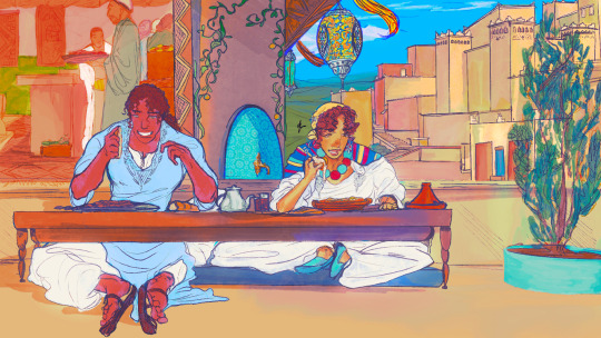
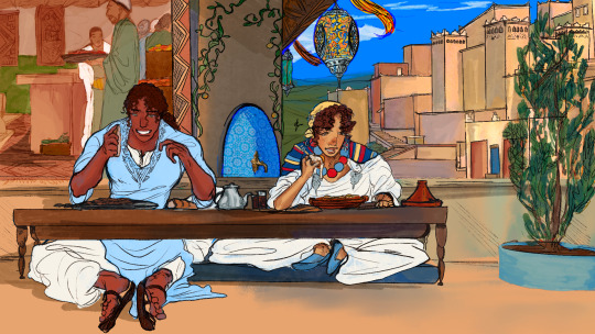
Text


🟡 YELLOW
THE ARTS QUARTER
The 2025 Arts Quarter
LIAM IAN™ / LIAM IAN LLC™ / LIAM IAN-Ai™
www.Liam-Ian.com
202.944.0713
IG: @Liam.Ian.LLC (#LiamIanLLC)
#Art #Design #Photography #More - #Intelligence #Ethnicity #Innovation
© 2025 Liam Ian (LIAM IAN LLC)
#Leonardo #LeonardoAi #Leonardo_Ai #Ai #AiArt #AiArtCommunity #Sexy #SexyAi
#Yellow #TheColorYellow #YellowIsEverything #YellowInEverything #ColorTheory #ColorTheoryOfYellow - #TheArtsQuarter #The2025ArtsQuarter
#black art#black fashion#ai generated#ai#ai art#ai art gallery#ai art generation#ai babe#ai muscle#ai woman#melanin#melanated Ai#Leonardo#Leonardo Ai#Leonardo.Ai#yellow#ColorTheory#🟡#YellowIsEveryThing#TheArtsQuarter#The2025ArtsQuarter#The Arts Quarter#The 2025 Arts Quarter
11 notes
·
View notes
Text

Road trip break 🍃
#art#artwork#drawing#ibispaint#oc#draw#amazigh#anime#originalcharacter#anime character#my characters#design#colortheory#color scheme#colorscheme#colors#desert#maghreb#moroccan#marocaine#north africa#composition
38 notes
·
View notes
Text


Learning about color theory while working on a new project-- I'm amazed by how a blue background brought out the yellow tones in the skin!
Open to feedback and suggestions! (go easy on me tho)
4 notes
·
View notes
Text

Colortheory (apprentice medicine cat) : a white and red male cat with an obsession with positivity. He was named like this because red has mostly positive meanings.
#shoelace draws#tumblrclan#tumblr history#tumblrclan oc#colortheory tumblrclan#colortheory#color theory#childrens hospital
15 notes
·
View notes
Text
Pioneers of Color: From Newton’s Prism to Munsell’s Master Plan
These are the pioneers who didn’t just marvel at rainbows—they dissected them, charted them, and gave us the tools to describe every shade of blush, rust, or regrettable avocado fridge. Let’s raise our color wheels and take a quick, vibrant stroll through the minds who gave color its soul, structure, and swagger.

Isaac Newton: The Prism Pioneer
We know Newton for his run-in with gravity, but the man also gave color theory its first major plot twist. In 1666, he aimed a beam of light through a prism and discovered that white light was actually a sneaky blend of colors. Voilà: the spectrum. He then arranged those hues in a circle, creating the first color wheel. Because nothing says “science” like a good pie chart.
But Newton didn’t stop at optics. He linked each color to a musical note, turning the whole thing into a 17th-century rave. It was pure Enlightenment-era maximalism. And the birth of modern color theory.
Johann Wolfgang von Goethe: The Emotional Alchemist
Fast forward to 1810, when Goethe (yes, the playwright) decided Newton’s light show was a little too... rational. In Theory of Colours, he argued that color wasn’t just physics. It was feeling. Yellow, he said, was the color of joy. Blue evoked melancholy. Red? Let’s just say it depends on your mood and maybe who you're texting.
Goethe’s take was more poetic than precise, but his influence on artists, designers, and even advertisers has never dimmed. He gave us permission to feel our colors. And boy, did we.
Josef Albers: The Perception Trickster
Jump to the mid-20th century, where Bauhaus veteran Josef Albers was blowing minds with nothing more than colored squares. His 1963 book, Interaction of Color, is a classic exercise in visual mischief. Albers showed that color isn’t fixed. It shifts, bends, and changes depending on what’s around it.
He turned perception into a playground and trained generations of artists to see beyond the obvious. If Newton was the scientist and Goethe the poet, Albers was the magician.
Albert H. Munsell: The Scientific Strategist
And then there was Albert Munsell, the guy who finally said: “Enough with the vibes. Let’s measure this thing.” His Atlas of the Munsell Color System (1915) was revolutionary. Where others had feelings or wheels, Munsell had a three-dimensional model: hue (the type of color), value (lightness), and chroma (intensity).
This was no abstract theory. It was practical, portable, and precise—a standardized system that allowed artists, designers, and scientists to describe color with uncanny specificity. Munsell gave us a way to settle arguments about "harvest green" once and for all. (It’s more yellow than you think.)
The atlas itself is a marvel: a tactile grid of painted color chips arranged like a sculptural rainbow. It bridged the gap between beauty and science, and its impact rippled across industries. From agriculture to advertising to interior design.
Today, Munsell’s system is still taught in design schools and quietly underpins everything from Pantone books to Photoshop sliders. Our curated reprints of his original plates honor the man who made color communication as precise as poetry.
Why It Still Matters
Color isn’t just decoration. It’s emotion, identity, instruction. It tells us where to stop, who we root for, and what kind of cereal box screams “buy me.” And none of that would be possible without Newton, Goethe, Albers, and Munsell. The original color commentators.
So the next time you fuss over just the right shade of seafoam, remember: behind that swatch is a 300-year history of obsession, innovation, and beautiful debate. We’re just here to keep the spectrum alive. And maybe sneak a few of Munsell’s classics onto your wall while we’re at it.
Add a splash of history to your space
Our hand-picked prints from the Atlas of the Munsell Color System are now available in the shop. Archival reproductions of a color system that changed the world? Now that’s a conversation starter.
See the Collection →
#ColorTheory#DesignHistory#VintageDesign#Munsell#IsaacNewton#Goethe#JosefAlbers#Bauhaus#Typography#ColorPalette#Prism#ScientificIllustration#ArtHistory#GraphicDesign#PosterArt#MidcenturyDesign#MuseumCore#RainbowCore#ArchiveFever#CarthayStudio
4 notes
·
View notes
Text

Seaming some triangles together with a little help from Nemo
3 notes
·
View notes
Text
Decoding the Emotional Messages of Colors in Art
Colors aren’t just visual; they’re emotional. In art, each shade and tone can evoke feelings, memories, or even inspire action. Have you ever felt calm gazing at a blue sky in a painting or energized by a vibrant red canvas? That’s the magic of color theory at work.
To learn more about how artists craft emotional depth through color, check out this comprehensive guide to unlocking the secrets of color in art. Enhance your art appreciation journey today.

2 notes
·
View notes
Text


Color tests, a Work in progress, some swatches and texture tests for my Beren and Lithuanian piece of the loyal hound Huan and the wolf Carcaroth who went mad having eaten a sillmaril. Mild gore warning for berets severed hand rip.
June 12 2019
#theghostofdash#art#mildgore#hand#sillmarillion#sillmaril#watercolor#gouache#traditionalart#lotr#lordoftherings#berenandluthien#huan#carcharoth#wolf#hound#workinprogess#wip#swatch#watercolorswatches#colortest#texture#texturetest#color#green#colortheory#tw mild gore
2 notes
·
View notes
Text

What do you see in this design? Every detail tells a story. I’d love to hear your thoughts and interpretations!
#LogoDesign#BrandIdentity#GraphicDesign#MinimalistDesign#CreativeProcess#VisualIdentity#DesignInspiration#Innovation#CreativeThinking#Branding#IconDesign#DesignConcepts#ArtisticExpression#ModernDesign#ColorTheory
2 notes
·
View notes
Text


Unlock the secrets of color theory to elevate your poster and video editing skills! In this tutorial, we'll delve into the fundamentals of color theory, covering concepts like the color wheel, complementary colors, and the emotional impact of different hues. Whether you're creating eye-catching posters or captivating video content, understanding how to use color effectively will make your designs stand out. Learn how to create harmony, contrast, and balance with color to convey the right message and mood in your visual projects.
Mastering Color Theory for Stunning Posters and Video Edits
#ColorTheory#GraphicDesign#VideoEditing#PosterDesign#CreativeDesign#ColorPalette#VisualStorytelling#DesignTips#EditingTutorial#DesignInspiration#ColorPsychology#hyderabad#srnagar
3 notes
·
View notes
Text
The Masterfulness in Graphic Designing
In the present outwardly determined world, visual planners are the unrecognized yet truly great individuals behind each enthralling picture, each convincing notice, and each outwardly staggering site. They are the engineers of computerized scenes, winding around together varieties, shapes, and typography to make effective plans that resound with crowds around the world.
At the center of visual depiction lies a mix of inventiveness and specialized ability. It's not just about doing right by things; about making visual encounters convey messages, inspire feelings, and have enduring impressions. A gifted visual originator is much the same as an entertainer, changing thoughts into unmistakable, outwardly striking real factors.
One of the most captivating parts of visual computerization is its always advancing nature. Patterns travel every which way, styles shift, and innovations advance, keeping planners honest and pushing them to investigate new skylines. From moderate plans that say a lot with effortlessness to striking, expressive manifestations that request consideration, the universe of visual communication is a jungle gym of vast conceivable outcomes.
However, it's not about feel. Behind each pixel-wonderful plan is a manner of thinking established in system and reason. Visual architects are narrators, winding around accounts through visuals that resound with interest groups. Whether making a brand personality catches the pith of an organization or planning a UI that upgrades the ease of use of a site, creators assume a critical part in forming how we collaborate with the computerized world.
Also, the effect of visual depiction stretches out a long ways past the computerized domain. It impacts our insights, shapes our choices, and revives thoughts. From the smooth logos of worldwide brands that represent trust and unwavering quality to the lively banners that move social change, visual computerization is a useful asset for correspondence and articulation.
In the high speed computerized age, remaining important as a visual creator implies embracing development and embracing change. From dominating new programming and methods to remaining sensitive to arising patterns, creators should continually advance to remain on top of things. It's an excursion of persistent learning and development, filled by energy and a tenacious quest for greatness.
Thus, the following opportunity you go over a shocking ad, a spellbinding site, or a delightfully planned item, pause for a minute to see the value in the imaginativeness behind it. Behind each extraordinary plan is a gifted visual creator, forming the visual scene and rejuvenating thoughts in manners that charm, motivate, and leave an enduring effect.
#GraphicDesign#DesignInspiration#CreativeDesign#DigitalArt#VisualCommunication#Typography#Illustration#BrandIdentity#UIUXDesign#LogoDesign#ArtisticExpression#DesignTrends#ColorTheory#LayoutDesign#WebDesign#PrintDesign#SocialMediaGraphics#MotionGraphics#GraphicDesignerLife#DesignPortfolio
2 notes
·
View notes
Text

#art#artwork#drawing#ibispaint#oc#draw#amazigh#anime#originalcharacter#izir urinn tt azrim#my character#my characters#characterdesign#design#colortheory#colorscheme
2 notes
·
View notes


Text

work in progress..
I'm going thru something I've decided to name kunstmania. I'm restless and full of creativity with no proper outlet because of my ruthless schedule
#julitocs#colortheory#queer artist#tumblrpost#artists on tumblr#my ocs#oc artwork#oc#wip#work in progress
3 notes
·
View notes
Text


Proper Modeling and Material Setup
The starting point for architectural visualization work is modeling and material setup. Using 3D Max, you need to accurately model the building and its surrounding environment and precisely configure the properties of each surface using V-Ray's material editor. In particular, the materials and lighting settings of the building have a significant impact on the final result.
Lighting and Camera Setup
V-Ray allows you to create lighting effects that resemble the real world. Configure natural light, interior lighting, shadows, and other elements precisely to bring realism to your visualization. Also, adjust camera settings to achieve your desired perspective and angles. Consider the camera's focal length and lens type to enhance the visual effects.
Rendering and Post-Processing
During the rendering phase, use V-Ray to generate high-quality images. Rendering time directly affects the quality, so you need to optimize your computer's performance and rendering settings. In the post-processing stage, use software like Photoshop or other image editing tools to fine-tune the image and add necessary effects.
Continuous Practice and Learning
Finally, architectural visualization work requires ongoing practice and learning. Stay updated on new technologies and tools, analyze the work of other artists, and improve your skills. Developing artistic sensibility is essential, and understanding design principles and color theory can be helpful.
Creating architectural visualizations using 3D Max and V-Ray demands effort and practice, but the results can be astonishingly realistic and beautiful. I encourage you to use these software tools to create your own creative works. Thank you.
#Architecture#3DModeling#Visualization#Design#Rendering#Vray#3DMax#Materials#Lighting#Camera#ArchitecturalRendering#Building#NaturalLight#InteriorDesign#Photoshop#PostProcessing#Creativity#Art#DesignPrinciples#ColorTheory#Realism#VirtualReality#VisualEffects#DigitalArt#FineArt#Architect#VisualDesign#Space#Modernism#ArchitecturalDesign
2 notes
·
View notes
Text
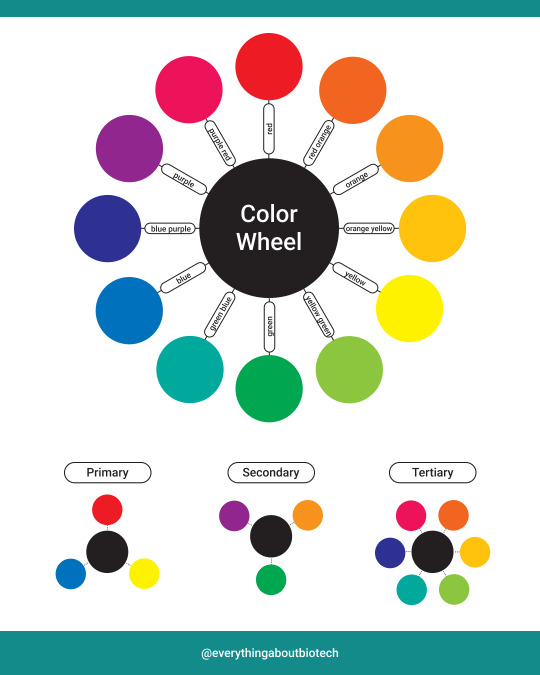
The color wheel is a circular diagram of colors arranged by their chromatic relationship. It is often used to understand color relationships and combinations.
The basic color wheel consists of primary, secondary, and tertiary colors.
Primary Colors:
These are the foundation of every other color.
In traditional color theory, there are three primary colors: red, blue, and yellow.
All other colors are created by mixing these primary colors together.
Secondary Colors:
These colors result from mixing two primary colors.
The three secondary colors are green (blue + yellow), orange (red + yellow), and purple (red + blue).
Tertiary Colors:
These are created by mixing a primary color with a neighboring secondary color.
The six tertiary colors include red-orange, yellow-orange, yellow-green, blue-green, blue-purple, and red-purple.
👉Follow @everythingaboutbiotech for useful posts.
#scicomm#sciencedaily#science#ColorWheel#ColorTheory#PalettePerfection#ArtistsOfInstagram#CreativeColors#ColorHarmony#VibrantPalette#ArtisticExpression#ColorInspiration#HueJunkie
3 notes
·
View notes