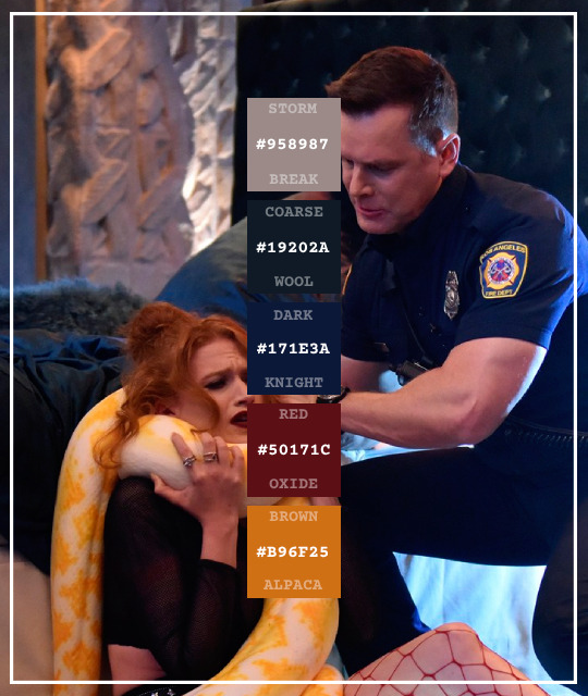
#Hex Codes
Explore tagged Tumblr posts
Visit Tumblr Blog
Explore Tumblr blogs with no restrictions, modern design and the best experience.
Last Seen Tumblr Blogs


Fun Fact
The most popular pages on Tumblr are about Minecraft, GIFs, and David J. Peterson.
Note
how do you get your text that soft pink shade? tutorial?
BABY PINK TEXT TUTORIAL !
hi babe!! here's a short and hopefully easy to understand tutorial for the text i use in my posts ᥫ᭡
also, just a little disclaimer: the images on this post might not be visible because they exceed the limit of 10 images per post on mobile app. should be fine on a laptop or pc though!!

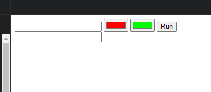
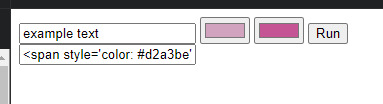
okay firstly, make sure you're using a laptop and open your post in one tab and in a seperate tab open jsfiddle.
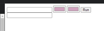
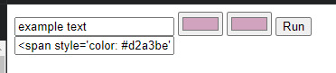
you should be able to see this coding somewhere on your screen:
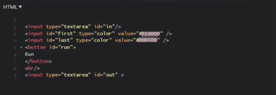
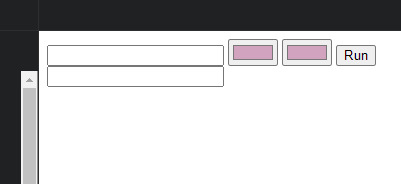
you're gonna replace the two hex-codes (highlighted text) with whichever colours you'd like. to do a gradient, like this, the two codes will be different, but i like to do a solid colour like this so my codes will be the same.
the hex code i use for the baby pink is D2A3BE, or you can use your own. if you don't have a hex code you like yet, you can use the colour picker on this site to find one!
just copy and paste the hex codes into the code so it looks like this:
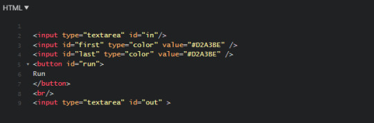
make sure it looks exactly like this. you still need all the spaces, quotations and other code. only change the hex codes.
in the top left of your screen, there should be a "run" button, and when you press it, the colours in the bottom right should change from the default ones to the ones you chose.
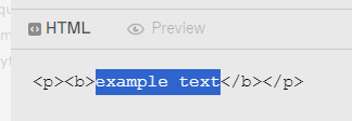
next, you're going to open your tumblr post in your first tab.
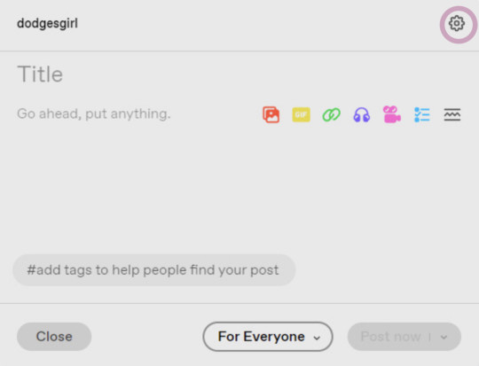
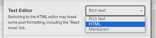
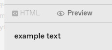
your post will start like this. you'll go to the settings button in the top right (circled) and change the post from rich text to HTML
this will enable coding on the post. you'll still have 'preview' where it will look normal and you can still type and edit the post as you usually would.
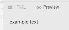
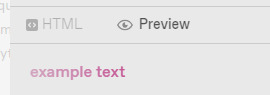
once you've typed something it will show it in the HTML option just in a different way:
you want to go to the preview page and make sure you've got the text looking exactly as you want it (bold, italic, small, etc.). also note that colours look especially good and show up well when the text is bold. i set mine to bold as an example.
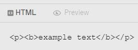
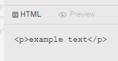
when you switch to HTML it will look something like it does above.
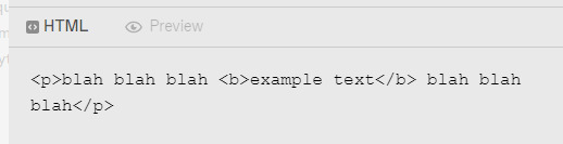
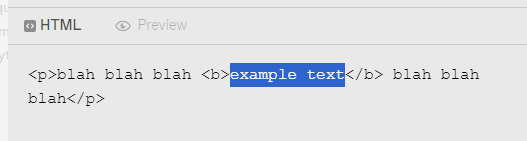
next, you'll copy the text between all the coding prompts (e.g. <p><b> and <b><p>). only copy the text you want to be pink or another colour!! don't highlight any of the coding. then paste it this top box on jsfiddle so it looks like this:
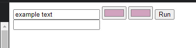
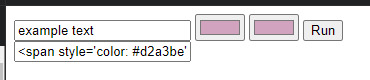
press "run" on the right, and it will spit out a line of code in the second box that will look something like this:
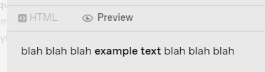
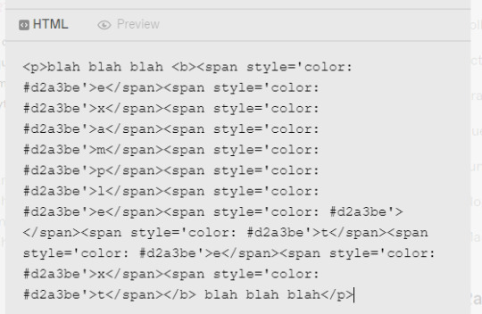
you're gonna copy that line of code and switch over to your tumblr tab. on your HTML version of your post, find the text you're changing and highlight it. then paste the code into that spot. make sure not to highlight any of the surrounding code - only the text you've written and want to change.
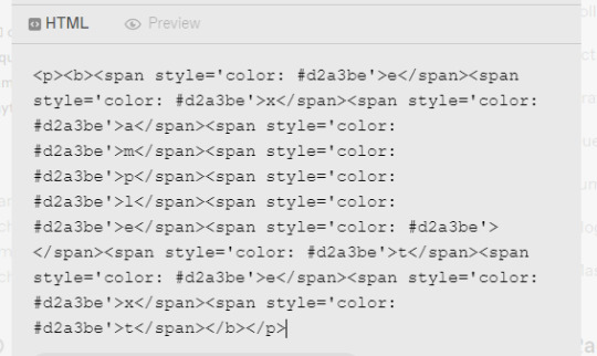
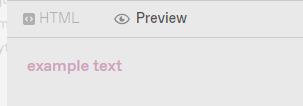
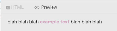
it will look super weird and long because it's colouring each symbol and letter, if you look closely, each letter of "example text" is separated and surrounded by code. when you switch to preview it will look like this:
for gradient, the process is the exact same, but on jsfiddle, when you're replacing the default hex codes with yours, the second hex code you plug in will be different to the one you start with. for example:
this second colour is C45494 btw!!
to do specific text in a paragraph as if bolding it (which i do in a lot of my posts), you just want to find that text in your HTML post, and copy and paste the specific word/s into your top box on jsfiddle, and then proceed as normal. example:
hopefully this helped!! let me know if you have any questions or need me to go over anything ( ˘³˘)
#coloured text tutorial#colored text tutorial#tumblr tutor#text tutorial#text tut#coloured text tut#colored text tut#colored text#coloured text#aesthetic#theme#aesthetic theme#pinterest#pink#hex codes#coding#jsfiddle#dodgesgirl helps#dodgesgirl answers#art donaldson#challengers#mike faist#challengers 2024#challengers movie#mike faist imagines#art donaldson fic#art donaldson smut#challengers smut#mike faist renaissance
237 notes
·
View notes
Text
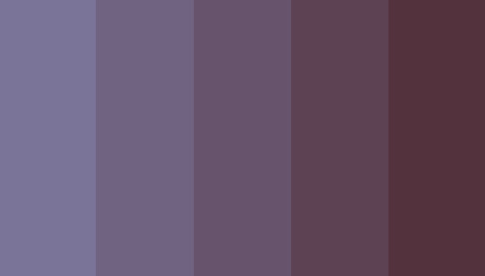
Sparkling Twilight Sand
#7a7499 ✧ #706381 ✧ #67536b ✧ #5d4254 ✧ #54323d
125 notes
·
View notes
Text
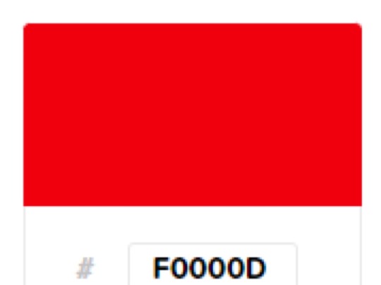
the only color that you can eat: #F0000D
132 notes
·
View notes
Text
My hobby: Interpreting Meaningless Technobabble
in the most ridiculous way possible that still feels like it has enough Connections to make some kind of sense
So in TRON (1982), just before Tron finds Yori, we see her at work on the Solar Sailer dock. The guard supervising her asks, "what's the progress on the simulation?" Yori reports: "30, 56, 99 are correct. Limited 4 and 8 are missing."

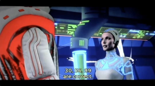

but what do those numbers mean for her simulation?
well.
30, 56, and 99 are very correct...
for making a lovely shade of blue.

As for four and eight?
Well, they are very limited, and somewhat missing... because they represent the amount of red in that color.
---

Source
---
So... if you wanted to read meaning into this entirely arbitrary bit of scripted nonsense?
And if you wanted that meaning to reflect how TRON (1982) adheres to the same "Blue=Good, Red=Evil" theme as Star Wars, Deep Space 9 Season 5, current United States politics, and a variety of other fandoms?
well.
Yori is indicating that Blue is correct, and Blue will win.
because every time Red gets more "limited" and more "missing," Blue takes over just a little bit more.
And maybe, just maybe?
she's using her Simulation Skills to influence the color scheme of her workplace... just a little bit at a time... to reflect the growing power of the Blue resistance.

Yori's a prisoner of the MCP, being forced to do work outside her purpose. And they clearly have a lot of control over her. There's not so much she can do to help, materially.
But at least, she can occasionally... "hex" them.
#tron 1982#tronblr#tron#yori#hex codes#305699#hashtags that are also hexcodes#puns#visual puns#headcanons
18 notes
·
View notes
Text
Matcha inspired Color palette ★

Matcha color palette| a soothing blend of earthy browns and refreshing matcha greens| perfect for calm and cozy vibes for anything you want to use for
A color scheme that enhances your diary, notes themes, art, website, etc
#diaryblr#journalblr#studyblr#hex code#hex color#hex codes#colors#color palette#color scheme#color schemes#color palettes#matcha latte#matcha girl#girl blogger#girlblogging#girlhood#cafe aesthetic#aesthetic#cafe#japanese#artinspiration#digital illustration#illustration#stationery#mini vlog#aesthetic notes#bujoblr#green aesthetic#colored pencil#bakery
11 notes
·
View notes
Text


9-1-1: What's Your Palette? ↳ 1x01~ Pilot
#9-1-1:What's Your Palette?#911#911abc#911edit#911 s1#bobby nash#evan buck buckley#henrietta wilson#chimney han#athena grant#abby clark#colour palette#hex codes#colour names#idk why ive chosen to do this but its fun#probably only for my enjoyment#template: dailyresources
58 notes
·
View notes
Text
ask me about my favorite hex codes,,,or reblog this post and i'll assign you a hex codes,,i like hex codes
7 notes
·
View notes
Text
ACOTAR Hex Codes


#ACOTAR#ACOMAF#ACOWAR#ACOFAS#ACOSF#ACOTAR Series#Hex Codes#Tumblr Themes#Tumblr Color Themes#Color Palettes#Pantones#aesthetics#book cover#book covers#book cover art#design#Sarah J. Maas#Maasverse#SJM#SJMaas#SJMverse#ACOTAR aesthetics#ACOSF covers#A Court of Thorns and Roses#A Court of Mist and Fury#A Court of Wings and Ruin#A Court of Frost and Starlight#A Court of Silver Flames#made by me feel free to use for themes :-)#ACOTAR series Pantones
21 notes
·
View notes
Text
Color Monologue
Because color is one of my obsessions, I figured I’d share this. It’s nice to have names for the colors we don’t often have words to describe.
Below are some charts for examples, followed by a personal monologue.
List of Colors: 550 Color Names and Hex Codes
(If you can distinguish between these shades of black, let me know…. I can’t! Lol)
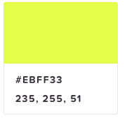
Finding My Favorite Color
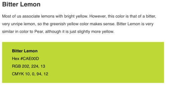
Spoiler alert: It’s #E0EE00
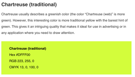
Their “summary” color charts don’t include my favorite color, so I went into their more in-depth lists and found Bitter Lemon, which I think is about right. Actually, this “traditional” Chartreuse is likely closer:
My Favorite Color is an Experience
When people ask me what my favorite color is, I may come off as ridiculous when I respond “the color of new spring leaves when sunlight shines through them,” but it’s really the truth.
I care a lot about that exact sensation. It’s very captivating to me. I don’t even have to get on a plane to witness it. I can just go down the street or to a local park.
The experience of standing under a tree and gazing up through its branches is enchanting, and this array of color tones glows around me and inside of me. The below image kind of communicates this idea.
I particularly like the yellower green, right where the sun hits the leaves. Source
The term “chartreuse” is still inexact because the examples provided are usually not yellow enough.
This next pic is just for fun:
Source
Using a Color Picker to Find My Favorite Color
Here are some more examples of my favorite color.
Color Picker Source I’m aware these are multiple shades, but oh well. I’m searching.
Sometimes I feel like I get to my favorite color fastest if I go to yellow first, then darken it a little.
Funny how this color now looks worse as I place it against the dark background of Tumblr. In fact, it looks like boogers and I don’t like it as much at all.
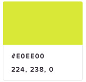
The hex code “E0EE00” is really satisfying. Old Macdonald had a farm, E-0, E-E, 0-0…..
I think I’ll settle there for now.
Clothing With (Almost) My Favorite Color
Source
Source
It’s very, very difficult and rare to find clothing in my favorite color.
Is Chartreuse Green or Yellow?
(and who cares?)
Sometimes I wear a sweater from F21 that is pretty close to my favorite color, and people compliment me on my “yellow sweater,” at which I am always amused. To me, the sweater is green. So I have fun randomly asking people if they think the sweater is yellow or green. I just like to see which one they say. There are no wrong answers. I, too, remain uncertain as to which general category my favorite color inhabits. Relatedly, “Chartreuse” falls under “Green,” while “Chartreuse (traditional)” falls under “Yellow” on the first website I linked, List of Colors: 550 Color Names and Hex Codes. (Their version of “Chartreuse” I do not like at all. It is way too blue-green and not yellow at all.) Well, It’s a good thing that the determination of whether this shade is “yellow” or “green" is not particularly important one way or the other, because if people cared about this, I do think they’d never come to a consensus.
Clothing Website Color Pickers
I do, however, wish clothing websites would recognize “chartreuse” in a keyword search or have a more intelligent color picker when filtering results. It would not be too hard to code a tool that analyzes each clothing image and provides 10-20 color names depending on the hex codes it picks up. One could build in a “margin of error” where hex codes that are within a few degrees of variation are also included under those names. So the user could actually use a color picker (or a longer selection of specific colors, at least) to filter by color, and all matching or near-matching clothes would be included in the results.
Thanks for coming to my color monologue!

Source
#colors#color chart#color names#colorful#art#colorful art#color-meanings.com#color meanings#yellow#red#orange#black#white#blue#green#chartreuse#color monologue#hex codes#hex color codes#hexadecimal codes#hexadecimal#color picker#html color codes#html#hex#clothing#fashion#green clothes#st. patrick’s day#rare colors
9 notes
·
View notes
Text
OhuHueVember Prompt List


Finally, I can share the surprise I’ve been working on! 😆 (Though admittedly later in the day than I really wanted...)
After years of wanting to try out Huevmber, I finally thought of a way to make it work for me, all because I spend far too much time thinking about markers. 🤪 And I did my best to make it easy for others to join in, if you want to!
I tried to get all the essential information on the images themselves but y’all know me by now—If you need more information, I’ve got a MUCH longer write-up hiding behind the "Keep Reading" button + a Spreadsheet, if you need it, too! ✨
⭐️ Like My Art and Want to see more of it? Here's All My Links! ⭐️
----------
Before I get into my usual long-winded description (and trust, it will be long), if you want to actually follow this prompt list—Or the Weekly version—here's what you need to know (some of which is already stated in the image, but I want to keep things as clear and easy to understand as possible!):
Here's the "Official" Spreadsheet that has all of the color codes, Honolulu color names, and some additional information like recommended Light/Dark blend pairings for each color typed out, both in case the image format doesn't work for you and also because some things like the Light/Dark blends just wouldn't all fit in one image. [A sample photo of the Light/Dark blend pairings will also be available soon, and I'll add a link here when they are, but I unfortunately ran out of time to have them ready to post alongside the list
As the upper right corner says: This challenge is not officially affiliated or sponsored by Ohuhu, I just like the markers and have had them on the brain a lot lately!
This is open to all mediums! While this challenge was inspired by working with Ohuhu markers traditionally, as the image says: If you don't have these specific markers or colors, use what you do have! This includes doing the challenge digitally if digital tools are what you have, or whatever other medium you're comfortable with and have access to: Original Art, Coloring Pages, Card Crafting, etc. The point is to play with color and have fun, so as long as you're doing that, pretty much anything goes!
Likewise, as the image says: The idea is to focus on 1 Color ("Hue") Everyday in November, but you can use as many colors as you want each day as long as the "Color of the Day" is the main focus/main visible color.
I've provided a Weekly version of the list in case the full 30 is too much, but you can pick-and-choose words from the full list however you'd like if you're not crazy about the colors I picked for the Weekly version, or if you want to shorten the challenge in a different way. - Do note though that the 5 colors I chose for the Weekly version were selected to specifically work well as a 5-color "mixing" palette to make those 5 colors stretch farther as a limited palette, if you're up for a little extra challenge. Based on this video by Peter Donahue.
Tagging me is appreciated, but not required! However, do note that I will Like & Share posts that I can easily identify as being related to the challenge on platforms where I'm able to do those things. If you want me to see and share what you made, Tagging me makes it easier!
Remember that my views on these Month-Long Daily Challenges is that it's about the challenge of completing a certain amount of creative pieces in the time given...And that's pretty much it, so as long as you're doing that and having fun, I'm really not bothered about how you choose to follow the list! My Inktober motto has always been "work smarter, not harder," and this is no different!
I think that's all the stuff you need to know to participate, but if you're curious in hearing more about my thoughts/process in putting this challenge together, read on!
----------
Would you Sparklers believe that I was so excited about sharing this that I had trouble staying asleep until time to get up this morning? 😆 It's true!
Either way, some of you are probably wondering just as much as I am what exactly has gotten into me lately: First I make my own prompt list for October—something I can't say I ever previously thought I'd do—and now here I am just having finished that list with yet another daily, month-long challenge...And I made this list, too! 😱
Some of you may have noticed that as we went through Obscutober this year, there were various points where I hinted at working on something marker-related and/or something for November. If you haven't figured it out already, this is what that was about! 🤭
And you'd think I would have learned my lesson about taking on one Daily Challenge after another back in 2021...
I'm sorry, Sparklers, I just had the mid-typing realization that the last time I took on a daily challenge in November was also immediately after the last time I did Obscutober instead of Inktober and my brain froze for a second. How did I not notice that before??
What was I saying? Oh.
At that time, I took on @ProjectEducate's 30 Days of Art Challenge, but I also attempted to dial things way back for myself by using it as an excuse to playing more Animal Crossing: New Horizons rather that making full-blown artwork everyday..And while that did help, it still turned out to be my challenging than I expected. 😅
That's one of the primary [ha] reasons I've never participated in the "traditional" Huevember challenge for November, even though I found it very appealing when I discovered it existed. I know myself, and just the same as I typically don't have the stamina to do Inktober in a "normal" way, I know I definitely don't have the stamina to do Huevember in a "normal" way immediately following Inktober (even if I do account for the fact that I do Inktober in weird ways).
Making my own list makes that no different, but then...What are we doing here? 🤔
Well, all of this really stems from the fact that—as I believe I've mentioned somewhere before, maybe multiple places—I've been spending quite a lot of time over on Reddit discussing and answering questions about Ohuhu Markers. As it stands, Ohuhu themselves doesn't provide a ton of resources for the markers, so it largely falls back on the user community to fill in the gaps, and it happens that I know, keep track of, or otherwise have close-at-hand a lot of "gap" information specifically for the purposes of keeping my Ohuhu Swatch Chart up to date.
I also do just really like the markers, so as much of a chore as it can be to keep track of all the information at times, I really don't mind getting the opportunity to just nerd out about them a few times a week.
The thing is, as is not too difficult to notice if you look at my art posting history, I haven't actually had a whole lot of time or allowed myself as much opportunity as I'd like to make actual art with my Ohuhu markers.
So back in September while I was trying to figure out what in the world to do for Inktober this year and one of my friends offhandedly suggested a "Swatch Challenge" for Inktober, in a matter of minutes my brain connected dots from "Swatches" to > "Colors" to > "Huevember" to > "Ohuhu" to > "OhuHUE"!! "Huevember but with Ohuhu markers, specifically!!" 💡
While obviously not really at all helpful for figuring out Inktober, that did sound like a great way to take advantage of how much the markers have been on my mind lately and participate in the Ohuhu community some more beyond being, essentially, a sentient FAQ page. 😆
So, as crazy of a move as it felt—and still does—What time I wasn't planning for and then working on Obscutober during September and October (and wasn't spent either dealing with IRL things or giving myself some much-needed break time in between), I spent trying to pull things together to make this challenge possible.
Those things included (not really in a particular order as a lot of these things I went back-and-forth with at various stages):
Picking the 30 colors that would be featured. The more natural choice probably would have been to "match" Ohuhu colors to the existing Huevember colors, but after thinking it over, I decided it would be better to try and keep things more accessible, if I could. Not everyone will have the big 320 set of Ohuhu Honolulu colors to choose from, but I know a lot of people will probably have at least the "standard" 48 colors that the Honolulu line started with—Either because like me, that's the set they started with, or because those 48 colors are all included in quite a few other "standard" sets.
For what it's worth, I did consider starting with the 24-count Honolulu set colors to try and make the colors even more accessible, but that set has NO orange in it for some reason and I wanted this challenge to be as colorful as possible, so I didn't really want to include black or grey if I could help it.
In the other direction; I very nearly included R13 from the 72 set to try and flesh out the purple sleections more, but I noticed that while I was putting the suggested blends together, the light/dark blends that make the most sense with R13 made the trio-blend look nearly identical to the trio blend for PB2. So in the end, I decided to just shift the Dark blend on PB2 to a slightly more purple-y blue and leave R13 out after all.
In exchange, P3 got added to the list...which made things a little harder in figuring out the trio blends for P4, but my only other option for purple in the 48 set was R11, and in my blend testing it proved even trickier to deal with. 🙃
Picking said Light/Dark blend for each color. This most involved a lot of swatching and test blends, which was easily the longest and most laborious part of the process.
And as stated at the top of the description, I fully intended to have a sample photo to show you those blends in action—I have swatch cards all labelled and everything!—but I simply ran out of time to have that ready to post alongside the list today. 😅
I'm still going to do the samples, it'll just be either later today or tomorrow before they're ready. Either way, I'll post a link here when they are!
I'll spare you the nitty-gritty on the process of picking out said blends, but suffice to say there was a LOT of back-and-forth that took up 5 pieces of cardstock—some of them front and back—because I wanted blends that stayed "true" to the hue of each color, and still actually showed variation in the lightness or darkness of the color, but also were relatively "easy" blends that didn't take too much work to look smooth. At least on the type of paper I like to use (60-80 lb. cardstock or 80-100+ lb. mixed media paper). I did learn from another test that these blends do still mostly work on plain printer paper, for example, but it's not quite the same, so your mileage will vary a little bit on how easy the blends really are. Why did I find this step even necessary to bother with, for as much trouble as it was? Call it a symptom of the wider Ohuhu and alcohol-marker using community. People are always wondering what/how to blend clothes together well, and between that and trying to provide what accessibility to the challenge I can, offering pre-selected blends seemed like a good idea. [And, if I'm being totally honest, I didn't realize exactly how much work figuring the blends out would be and thought getting the chance to just play with color blends sounded fun when I made the decision to do it. 😅]
To that end, I also of course Determined reasonable Hex Code "matches" for each color. Again, this was largely an accessibility thing trying to account for people that either don't have the specific colors/markers listed and want to attempt to match the colors in some way, and to provide an option for any digital artists just in case any see the list and want to give it a try, especially since digital brushes that mimic alcohol marker behavior have become more popular in recent years.
As noted in the Spreadsheet, I both looked at multiple swatches of the actual real marker colors and was using some of those digital "alcohol marker" brushes to text how the selected digital color would behave. I'm quite sure some of my final choices aren't completely perfect picks, especially if you're working in a different program than I was (Procreate), but I at least stand by them as "reasonably close" options.
And just in case anyone passed by this post and is wondering, because I know I've seen people ask for it—I would in fact like to one day provide "reasonably close' Hex code matches for all of the Ohuhu Honolulu markers, but that is definitely a far-off project you should not expect from me any time soon after seeing just how challenging it was to do for these 30 alone. 🫠
Worth an additional here that I actually originally wanted to include hex matches for the Light and Dark blends to make "Light" and "Dark" versions of the prompt list itself for people who do have access to the 320 range and maybe wanted to play with color in different ways than the "base" tones, but again: Figuring out the hex matches for these 30 was trouble enough and I could tell I really, really was not going to have time to do that and the other prep work I still had left to do at that point.
Speaking of, I had to Determine Oahu matches or "close enough" alternatives for each color. Yet again the magic word is accessibility, and I've also noticed that the Oahu (no brush tip) markers just sorted get left out when it comes to Community Ohuhu Resources. Since we now have a Spreadsheet reportedly from Ohuhu themselves listing which Oahu and Honolulu colors match, it was important to me to include them, even if it was a little more work.
For all of the colors that had 1:1 matches, it really wasn't too bad. What through me for a loop was the few colors that didn't have 1:1 matches, so I had to go track down some swatch examples and make an educated guess which other Oahu colors would be closest. So there's your acknowledgement right now, just like the image says, I know at least a few of the Oahu colors aren't exact matches. Both because exact matches don't exist, but also the "closest" matches I did pick may not be fully accurate either since I don't own the Oahus and had to pick based on swatches over the internet. I'm sorry, this is the best I could do!
And of course, what I consider a key component of making Month-Long challenges accessible: I had to Put together a Weekly version!
As noted at the beginning and in the description for the Weekly version: I chose for the Weekly version were selected to specifically work well as a 5-color "mixing" palette to make those 5 colors stretch farther as a limited palette, if you're up for a little extra challenge. Based on this video by Peter Donahue. I had actually previously picked out 5 colors from the 320 Honolulu range after seeing Pete's video purely for fun. Alcohol markers notoriously aren't usually good for "mixing" to get new colors the way you would paints or pencils, but I was intrigued by his limited palette since he was working with oil paints, which kind of notoriously don't mix as vibrantly as other media. For the record, my original 320 set picks for the 5 colors are:
Y080
B070
PB2
RV080
YR3
Two of which were already in my selection of 30 for this challenge, and B070 was naturally super close to PB7. Initially, RP1 was a closer match to RV080, but in testing I found that R10 mixed better for this selection.
So really the only color I had to make a big compromise on was Y080. There's really nothing else quite like in the entire Honolulu range, but in my testing GY6 worked better than I expected as a substitute, considering the limited options I had to choose from here. And then I just lucked out that November technically takes up 5 weeks on the calendar, I just had to figure out the "spacing" so each color would get a reasonable number of days to work with, the same way that I adjusted the days for the Weekly version of Obscutober. [And frankly, that was easier to do here since November has 30 days and 30 divides evenly by 5.]
I did briefly re-visit the idea of sticking just to colors from the 24 Honolulu set so the Weekly version could be as accessible as possible, but long story short the longer I look at the color selections for that set, the weirder the stranger they seem, so I ultimately I couldn't help myself and just went with the colors I thought would be more versatile even if they're not likely to be as accessible.
I mean, after all, I was going to have a disclaimer that you can use whatever you want even if you don't have these specific colors anyway, so hopefully it won't be too big of a deal that I opted for the palette that I personally saw more use in. Oh, and for what it's worth: I did consider making a "Lite"/every-other-day version of this list like I did last month, but after seeing the "Lite" version was not a popular choice last month and acknowledging I already had my work cut out for me, I decided it didn't really seem worth the extra effort when I fully believe everyone is capable of skipping days on their own as they see fit.
And then, of course, another step that ended up being trickier than I expected: I had to figure out how to compile all of this information, or at least most of it, in a single image. (Well, okay, two images including the Weekly version, but you get the idea.)
Again, I'll spare you the nitty-gritty, but I will say that while I did clearly figure something out, I nearly completed another version in a more typical list format before deciding I didn't like how little you could actually see the colors themselves in it. I don't know about you Sparklers, but "Huevember" makes me think colorful, so that's how I wanted the list/post image to be.
In the midst of trying to figure out a better way to do the list for maximum information + maximum color + maximum clarity, I paused to work on the wrap-up template for this year's Obscutober (which yes, is still a thing I'm going to do, probably tomorrow), and it was from doing the calendar format for that from which sprang the idea to try a calendar format for this! 😃
If you look at one of my usual Inktober wrap-ups, you'll notice it's still not 1:1 because I had a lot more text information that needed to be here, but y'know I think it was a pretty great solution, all things considered. 😊
Though, for the record, the Weekly version was originally going to have the bars for each "week" in proper calendar format too—spread over the actual calendar days each one would take up—but that was scrapped because the longer I looked, the more confusing that layout looked for the actual information. So I sacrificed the cheekiness in the name of making it clear and easy to get the information you need from that version.
You might have guesses that even though I was working on this in the background for nearly two months that I still maybe bit off more than I could chew by the fact this is going up both on November 1st instead of a couple of days in advance (like I was very fortunately able to manage with Obscutober) and it's also going up in the very-late "afternoon" instead of more like around lunchtime. 😅
I really, really did my best to have everything ready before now, but the last couple of weeks of October proved much busier than I expected. I probably should've seen that coming because that always seems to happen when I'm working on a time-sensitive project that's big and important to me, but I can't see the future and I can't just never work on another big, important project again because I'm afraid that'll happen, so... 🤷♀️
I just have to accept this is the way things turned out and try not to be too hard on myself about it. It was a lot of work and still deserve credit for that, at least!
Speaking of: Some of you might be wondering about that long-ago mentioned point: "I know myself, and just the same as I typically don't have the stamina to do Inktober in a "normal" way, I know I definitely don't have the stamina to do Huevember in a "normal" way immediately following Inktober..." That is still true, and I do not plan to approach my challenge here in a "normal" way either, for that reason.
But, much like my logic of "well, I made the list, I should use it," for Obscutober, after all the work I put into this, I am still going to use the list/participate, and not just the Weekly version either. [Though I fully admit just doing the Weekly version would probably be the smarter thing to do for me...]
I'll try and keep this brief since the description is certainly enough of a book already and the sooner I can wrap this up and get it posted so other people can actually participate if they want to, the better, but:
I've been wanting to get back into just coloring in Adult Coloring books (or single pages made for that audience) occasionally, as I've unintentionally moved away from that hobby for a few years when I used to do it all the time. When I first started, the hobby was still pretty new and niche, and sharing finished pages felt "wrong" to try and mix in with my regular art posts, but things have noticeably changed since then.
And in particular, using Ohuhu markers in adult coloring books has actually become pretty common.
So that's the first part of what I'm going to do to try and scale this challenge back so I can still particpate be hopefully not overwhelm myself: After some consideration of options, I've printed out some of Johanna Basford's similar illustrations on small, 2.5" x 3.5" cuts of my favorite mixed media paper—Artist Trading Card size!—and those are what I'm going to color for the month.
The second part of how I'm going to scale back is that, while I am going to actually color something every day for the challenge, I'm only going to post my finished results once a week. Because I found/remembered during Obscutober that since I both like to type out these long descriptions (even when it's not really necessary) and cross-post to about a dozen places, the actual posting-everyday-process is what really wears me out and gets me down, often far more than making the art itself typically does. 🫠
I admittedly had much grander plans and was hoping to still post every day in some way when I first set out to make this challenge, but I think if you've read the description this far, you'll understand why I had to change course for my own sake. 😅
Speaking of...Let me think for a moment if this might be it, if I've explained everything I wanted to both about the challenge itself and my approach to it...
I think so, but there was a lot to cover so hopefully if I did leave anything out, it wasn't that important and I can either edit this description or just touch on it at some later point during the month.
Either way, I hope if anyone does want to participate—as I am boldly assuming at least a few people will—I hope you're not too upset and/or can forgive me for not being able to post this sooner so you could get started sooner. As discussed, I did my best and I feel any frustration or disappointment you may have with the posting time of the list, 100%. But I am unfortunately only one human that can only do so much in a day's time that does not have the budget to hire an assistant to help me do stuff like this at this point in my life. 🙃
Oh! For the record, I don't plan to make this a yearly thing, which is why I've not put a year on the image or in the title. Mainly because having to pick all-new colors would really mess with the various points of accessibility I've tried so hard to keep, so if this does turn out to be a thing people want to do again, my plan would honestly be to just use the same list in perpetuity, and maybe just add onto it with some of the things and ideas I didn't have time to flesh out the way I wanted this year. However, that said, I'm not fully opposed to revisiting the idea of wholly new color assortments in the future if this version proves successful enough. What exactly that "enough" is I won't know until I see it, but I did just want to lay all my cards on the table for people who might be curious about long-terms plans here. Now, if you all will excuse me, I best go ahead and get this cross-posted while there is still some sun in the sky and, as mentioned, after that I still have a few other things on my plate that need my attention for the day—including my own participation in the challenge!
So, whether you choose to participate or not: Here's to starting the month off strong and having fun! 🥂 And good luck to us all!
----------
List Design © me, MysticSparklewings
This Challenge is not officially affiliated with or sponsored by Ohuhu
----------
⭐️ Like My Art and Want to see more of it? Here's All My Links! ⭐️
#mysticsparklewings#xxmysticwingsxx#OhuHueVember#ohuhu markers#alcohol markers#copic markers#huevember#art prompts#art challenge#prompt list#limited palette#palette challenge#markers#copic sketch#sketch markers#olo markers#color challenge#november challenge#art inspiration#colors#rainbow#art supplies#use what you got#resources#free resource#art resources#hex codes#ohuhu
13 notes
·
View notes
Note
Hiii this may seem silly to ask but how do you change the colors of your text to the specific colors you use rather the default palette.
Hi there! Not silly at allll.
The text color options can be limiting if you stick to the default palette. Here’s a simple way to use custom HEX codes for your text:
Highlight Your Text Select the text you want to color while editing your post.
Choose a Default Color Click the text color tool (the paint bucket icon) in the text editor and pick a color from the default palette. I recommend using red since it’s easy to spot.
Switch to HTML Mode Click the gear icon in the top-right corner of the post editor and go to the "Text Editor" section and select "HTML" from the dropdown.
Find Your Text and HEX Code Look for the line of code that corresponds to your highlighted text. It will look something like this: "<span style="color: #ff4930">Your Text Here</span>" The '#ff4930' part is the HEX code for red.
Replace the HEX Code Change the default HEX code (#ff4930 in this case) to your custom color. For example, if you want a jade color, you might use #5da271. Your updated code will look like this: "<span style="color: #5da271">Your Text Here</span>"
The website coolors is an excellent resource for color palates & hex codes
Preview and Save Go back to the visual editor to make sure the color looks right, then save or post!
8 notes
·
View notes
Text
OMEN HEADCANONS🙏🏽
Before we begin our civilized and completely normal description of a virtual ghost boy, let me get one thing out the way, yes I do know he does not have a canon body, but that's no fun and I need something to make fics on.
Warnings:N S F W HC, if u don't like the don't read.
HEAD
His head is shrouded in the blackish purple mist we see in game
Has a mouth and capablebkf eating(throat goat)
That's about it, not much happening there😭
CHEST/ABDOMEN
Pretty big, muscular
Has HUGE man tits (muscle)
Nipples glow and are a slight blueish purple (#291c8c)
Is solid/not fog.
Has abs🥰
SLUTTY ASS WAIST 🤤

COCK
TIME FOR THE BEST PARTS🥰
5.6in soft
7.8in hard
1.2 width/girth
VEINEY
Some gains glow
Shaved
Tip #4646cf
Shaft #1c1c63
He has a sensitive spot right below the tip
His balls will pulse when he cums
Has decently big balls


CUM
His baby juice glows light blue (#47a5bf)
It tastes sweet like blue raspberry candy, but just a little bit, salty sweet
Average 20 milliliters per nut, if he hasn't gone in a while or edged before, 90 militers.

POSITIONS
top, only bottoms for cypher when he asks
Sub top, sub bottom
Like anvil and missionary the most because he can see everything that way
Not a fan of handjobs
Love blowjobs
Likes anal
Rarely touches any puss
SEXUALITY/RELATIONSHIP/KINKS
Bi heavily leaning to men
Dated only few people, only 1 being a woman
Stays loyal
Will buy you gifts
Good at comforting
Like overstim
Dominant but has a soft side for parter when they are alone
Protective
Jealous
Uses toys sometimes, prefers rose toys and vibrating d!ldos
Sends to many texts/ spans partners phone
Praise and degradation
DURING SEX
Whimpers and moans alot
Says how good you feel
Praises you
Asks if your okay
Eye contact
Will kiss you while your moaning
Will keep going until you finish
Lasts around 7-9 mins
If he's bottoming he will wrap legs around you
Holds hand while bottoming
Is shy especially when bottoming
Moans and whimpers very loud while bottoming
Likes to get creampied
Loves aftercare
HOLE
Deepness: around 6.4 in
Wet
Grippy
Glows, same color as nips
SKIN/BODY
Has a solid body , is a very dark purple (#120821)
only has smoke around his face
His eye slits change shades depending on emotion

That's all:) I will be making more these in the future and if you guys have any requests I am very happy to fulfill them, cypher coming soon. Bye bye!!!
48 notes
·
View notes
Text

The Wolf Queen's Crypt
#5d455f ✧ #896f8c ✧ #a59cb6 ✧ #c0b5bf ✧ #9faabe ✧ #6d7989
257 notes
·
View notes
Text

29 notes
·
View notes
Note
a thousand million requests coming ur way. assign my special little meow meow Ranpo from BSD hexcodes NEOW !!!!!! /lh

since u dont know the character probably: brown, green, black, or grey/blue hexcodes that spell out words related to candy and mystery type stuff..... pretty please 🙏
here here!! not SUPER familiar with the character but i did my best, i added a few purples there at the end but you can ignore them if you wish!
#633535 (REESES [reeses])
#CA6221 (CARML [caramel])
#506A12 (SUGAR [sugar])
#5DAF12 [SDAFIZ [soda fizz])
#101909 (LOLPOP [lollipop])
#76EA70 (TREAT0 [treat])
#76EA75 (TREATS [treats])
#576B57 (STRBST [starburst])
#0A6E27 (0AGENT [agent])
#5C605E (SCROSE [sucrose])
#50DAA5 [SODAAS [sodas])
#50DAAA [SODAAA [soda])
#229576 (MYSTR [mystery])
#225769 (MSTRY [mystery])
#0CA2D9 (0CANDY [candy])
#0CA5E5 (0CASE5 [cases])
#5EA6C4 (SEARCH [search])
#0CA5EE (0CASEE [case])
#076EA7 (0TREAT [treat])
#1259C7 (INSPCT [inspect])
#0C10E5 (0CLUES [clues])
#060449 (0GUMY [gummy])
#0901CE (0JUICE [juice])
#060229 (0GUMY [gummy])
#120576 (INVSTG [investigate])
#09021E (0PUZLE [puzzle])
#5010ED (SOLVED [solved])
#500EE7 (SWEET [sweet])
#55010E (SSOLVE [solve])
↓ key ↓
0 -> 0 / O / U / V 00 -> W 1 -> I / L 2 -> N / Z 22/44 -> M 3 -> E 4 -> H 5 -> S 6 -> R / G 7 -> T 9 -> Y / P / J 12 -> IN / R
4 notes
·
View notes
Note
Blend the colors #FFFF37 and #FFFFA0
(FNaF game theory fans will know this lol)
#FFFF37 and #FFFFA0 is being blended!!

You cannot save them.

#your fave is being blended#you cannot save them#blend requests#ffff37#ffffa0#hex codes#colors#yellow
50 notes
·
View notes