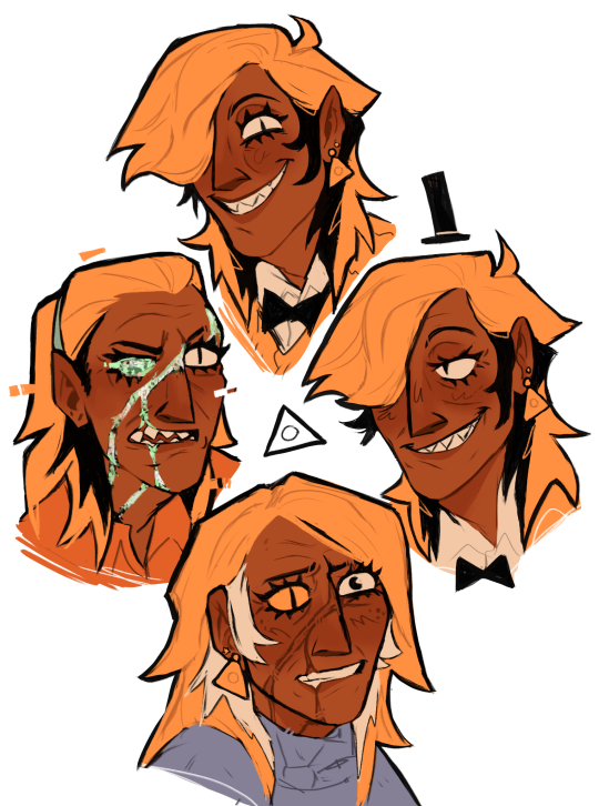
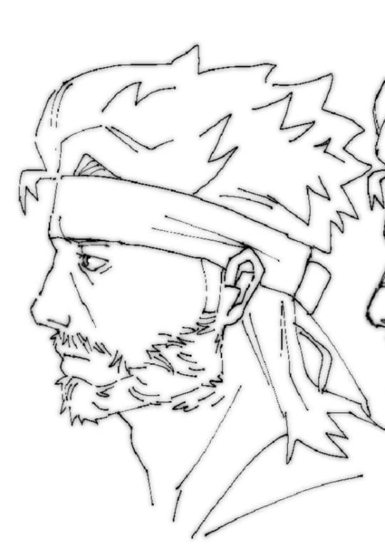
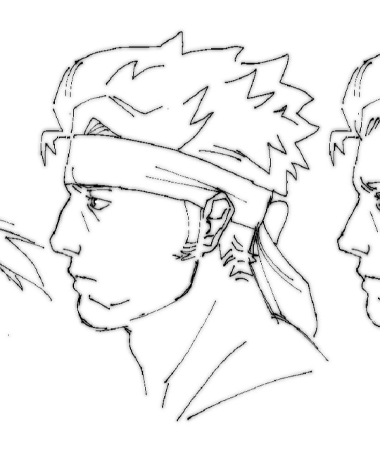
#I changed a bit of a drawing I did and made it my human design of Warren instead of me
Explore tagged Tumblr posts
Visit Tumblr Blog
Explore Tumblr blogs with no restrictions, modern design and the best experience.
Last Seen Tumblr Blogs


Fun Fact
Tumblr was attacked by a cross-site scripting worm deployed by the Internet troll group GNAA on Dec 3, 2012.
Text


You’re never ever ever gettin’ rid of ME!
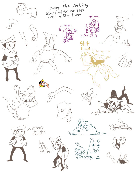
#dhmis#warren dhmis#dhmis warren#warren the eagle#warren the worm#don’t hug me im scared#don’t hug me i’m scared#dont hug me i'm scared#dont hug me i’m scared fanart#dont hug me im scared#🍄🎨🍭🌈#tw eyestrain#I changed a bit of a drawing I did and made it my human design of Warren instead of me#oough how I loves himb..#worm dhmis#dhmis worm
18 notes
·
View notes
Note
hello!!! getting back into gravity falls and billford,,, and i LOVE your designs! do you ever plan on making a reference sheet for your human bill? i love him and i want to draw him accurate to your design. also, very curious to see everything that changed abt him post cannon, especially with your design
Hi!! TYSMM <33 I have made a reference sheet already!! There u go (also put the links for the posts if u want to see my ramblings about the designs) :
Full body:

https://www.tumblr.com/umboloae/760921837359300608/so-i-recently-changed-my-bill-design-and-decided?source=share
Face references (tho I did change his hair a bit after making this):
https://www.tumblr.com/umboloae/760372809144958976/my-new-and-hopefully-final-bill-design-i-made?source=share
1K notes
·
View notes
Text
i shouldnt be trusted with hyperfixations dude this shit started cause of a "hey babe do you wanna play regretevator" and a "yes!" anyway 16 out of the 35 regretevator characters im drawing..i wont be near my drawing tablet for a while so ill do the other 19 once im back :)
i also dont know most of the lore and i tried to do research..my bad im trying
"annon why are they all posed the same" i drew most of these between 11 pm and 6 am i cannot be bothered to pose properly
design explanations under cut
PROGRAM USED:
clip studio paint


LAMPERT:
so he like lives in rokea right..so..ikea colored sweater + a rip off nametag. plus im a believer in wallmark family so uh he gets a tape measure from his peepaw. also gloves cause its lampert height - 6'0 INFECTED/KASPER:
im gonna be so honest i just looked through my boyfriends "i want these clothes" pinterest board and hoped for the best. i am not at all good with scenemo aesthetics :( uhh yeah texture not found glitches just cause and also a lampert colored necklace height - 5'7
PEST:
i had no clue what to do for this guy. it was my first time drawing him and i just tried to keep him as close as the og as normal. i got too scared to expand..and yes i did forget the sweater text. i gave him a lil bag for his stolen stuff, just cause! and that lil dangly bit on his bag is supposed to match with retros necklace..yknow since they were cell mates n stuff height - 6'2
DR RETRO:
dr retro fans im so sorry its been a WHILE since ive drawn a cat.. not too much to say about her! just added big ball necklace and bracelet..wanted to give her the motherly vibe height - 5'6
UNPLEASANT GRADIENT:
hes my favorite character im gonna be so honest guys. i love this greasy fuck nut. i was originally gonna put him in heart boxers but then i thought "hm. jorts." i like to think he steals clothes from kasper - especially belts. that rainbow belt is not his. peep the fortnite and alpha galaxy wolf socks height - 6'1
JEREMY:
shoutout to my punk friend for being punk i wouldnt have known what to put on his patches without you. i pretty much just copy and pasted his outfit onto jeremy and i think it works. his grabby hand has no glove just for funsies. uuh also the pink bracelet if for mozelle theyre bffs trust height - 6'4
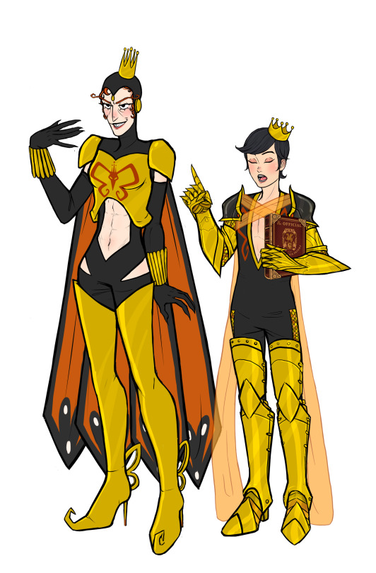
POOB:
i WAS gonna make them decora cause it just FITS but i didnt know what accessories to add :( most likely ill redesign them over n over..sighs..also birthday sash eheheh. note everyone has a friendship bracelet from poob except for pest..pest threw it away. or burned it. both probably. height - 5'6 1/2
NULL:
really nothing to say for him? the main thing i changed was giving him wings. ive seen a handful of people do that and thought "huh thats cool" so i did it too height - 6'0
WALLTER:
"why did you give him hair!!!" please dont attack me i know hes made of concrete but he wasnt ALWAYYSSS like that. i like to think he was more human before the grey stuff incident (tm) so uh hair! i also gave him that like 'english teacher' vibe. hope i did that well. also his scarf was hand crafted by mark i think he would have crocheting as a guilty pleasure sorry height - like 9 1/2
MARK:
yeah i just made him really southern. cowboy boots, jeans, tooth gap, hay in his mouth. i feel like his dream was to live on a ranch with wallter..sighs. also peep the ac/dc shirt cause i think he listens to dad rock. i think he keeps his wedding ring on - hes not over wallter publically and wallter isnt over him privately. ehehaa he has his ring on a necklace under his scarf hehehahaaaaa (im delusional) "annon wheres his stand" prosthetic legs. height - 5'4 lmao
EMERSON:
i KNOW hes not an elevator npc i just have a boyfriend who likes him an di am here to please. i wanted to give emerson the vibes of "jesus fuck i want out of here fuck you all im turning in my two weeks." hes tired :( and no hes not wearing a skirt its an apron height - 5'6
CASHIER:
yes i know hes from get a snack at 4 am i was lectured (/pos) about this by my boyfriend. anyway he has a floor so hes here too. i was originally gonna put him in pj pants then decided thats against company policy height - 5'6
SWIBBLEDIB:
did i give him the wrong eyes? yes. thats my fault. i think he copies sorta what he sees other people doing/wearing. uuh yeah! not too much to say about this guy, i kept him fairly accurate i thinks height - 5'7
MOZELLE:
according to the two google searches i did, mozelle is not a mouse, she is a 'beaked creature'. it was two am so i decided to just make her a lil gal with a masquerade mask. spiked bracelet to match jerey hueuehue and also that lil thing under her mask covering her neck is just a veil..i thought it'd look neat. height - 4'9
BIVE:
also nothing much to say about her! i kept to the canon design..just added a ring for split and a bracelet for poob. shes actually really fun to draw shout out to the sea urchin lookin lady height - 5'6
PILBY:
i havent drawn anything close to a caterpillar since i was into dhmis and scarily obsessed with warren the eagle im so sorry pilby enjoyers. uuhh i put them in a sweater. just felt right. they looked cold. yes they still have the caterpillar tail its just not showing oopsie. uuh also legwarmers!! height - 5'5
#searchin! seek and destroy! ➸ annons art#yellow ➸ regretevator art#digital art#regretevator#regretevator fanart#reference sheet#reference#lampert fanart#infected fanart#lampert regretevator#regretevator infected#regretevator pest#dr retro#dr retro regretevator#regretevator unpleasant#unpleasant gradient#jeremy regretevator#regretevator poob#party noob#regretevator null#regretevator wallter#mark regretevator#mannequin mark#emerson regretevator#cashier gasa4#regretevator swibbledib#regretevator mozelle#mozelle fanart#regretevator bive#bive fanart
121 notes
·
View notes
Text
Heavenbound AU
Masterpost
Charlie Morningstar: Daughter of Lucifer and Lilith

Here's a character sheet for my redesign of Charlie
Notes under the cut to minimize clutter
Family resemblance:


She has a mix of goat and snake traits from Lucifer and Lilith, respectably. I think I gave her a good mix so she looks like both her parents.
Because the biblical devil is associated with a variety of creatures, I wanted to lean into some of them. Snakes because of the whole Garden of Eden debacle, which Lilith was heavily involved with. Because Lilith was created by the angels, her demon form has doll cheeks. (I essentially traded Lucifer's cheeks for Lilith's horns. It just ended up more thematically relevant that way) Goats because Lucifer isn't actually "the Devil" like everyone thinks he is. He gets blamed for everything wrong, and is essentially the scapegoat. "The Devil" as humans know it, doesn't exist. It's a conglomeration of various demonic characters that humans thought was the same one.
Body:
Hair: In canon, she has long hair, long legs, long body, and it was a bit too much 'long'. There's a short, medium, long ratio in character design to help create visual interest. So I shortened her hair and body. And I saw this as an opportunity to give her a hairstyle that resembled a goat tail. So now she has long legs, short body(with the help of the vest), and the hair makes the head a medium ratio. At least, that was the intention.
I had initially thought about giving her a full head of snake hair, like gorgons. But that seemed too complicated, so I limited it to one. (I had the same thought with Lilith, but gave her seven instead, most of which can hide in her hair) His name is Hugh, which is short for Hubris(synonym for pride). And I love him.
Tail: I wanted her tail to be there permanently, instead of just in her full demon form. It just seemed fitting that way. I did the same to Lucifer.
Hooves: Animals that have hooved feet are called ungulates, and typically walk on their toes. The heels on her shoes don't really unbalance her like they do on human-style plantigrade(full foot on ground) feet. For her, running in heels is pretty natural. If anything, the high heels just provide her extra support.
Clothes:
She primarily wears her hotel uniform. Of the hotel staff, only her and Vaggie actually wear the them(Alastor and Husk would never, Niffty simply does not care). Angie already wears pink, but he's not staff. I liked the vest for her, because it felt like a good nod to the buttons on her canon battle outfit. I wanted her to wear something that looked like a uniform, but wasn't just a suit. Too many other characters wear them, and I wanted some variety. I made it pink because it's between red(color of hell) and blue(color of heaven), but also leaning towards hell's colors, since that's where the hotel actually is. And also because I could get it to look good on both Charlie and Vaggie.

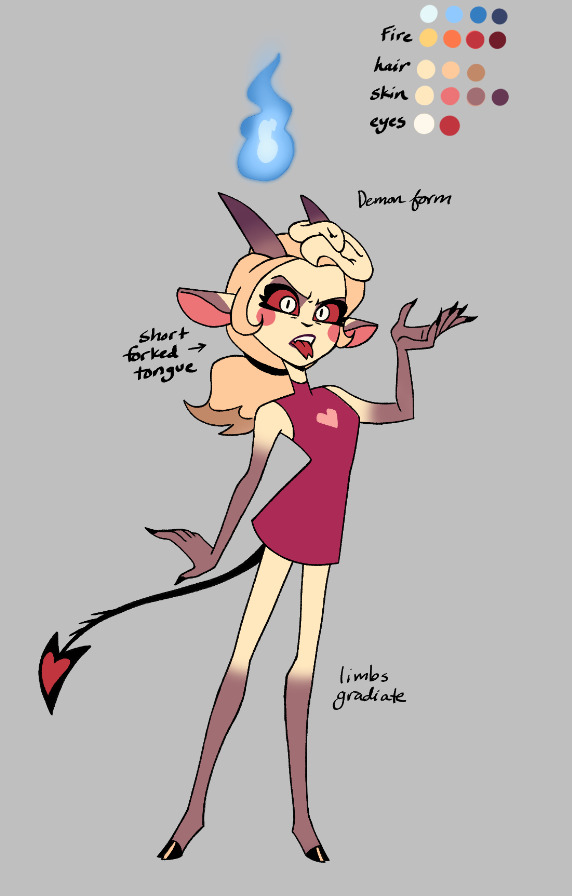
Her battle outfit in the show was cute and all, but I didn't like that she would inevitably flash everyone mid-fight. A dress and thigh-high (boots? socks? tights?) just wasn't practical. So I gave her leggings. I also don't really like the use of crowns, because royalty in hell seems very...pointless, given nobody recognizes them as rulers in any way. I tried to reference her zoophobia design in a way that felt like it suited her current character, but also didn't hugely deviate from the canon battle outfit, and wasn't overly complicated(keeping animation in mind). But all I could really manage was the leggings and boots.
Her "full demon" design doesn't have a specific outfit; I just wanted to show her bare limbs. The forked tongue is true of her normal form as well, I just didn't draw an example of it.

I originally drew her in the dress to show off her hooves and put her in something cute while I was at it.
(Feb 21, 2025- changed flame color from red to blue for lore reasons)
#hazbin hotel#hellaverse#charlie morningstar#lucifer morningstar#lilith morningstar#heavenbound au#a3 art#fanart#digital art#character sheet
276 notes
·
View notes
Text


In the one (1) Block Tales comic i've made so far, I drew the player as this R15 model Noob with modern day Roblox chat. Since blocktales can have four (4) players in a battle, I decided to draw the rest of the sqaud.
OBLIGATORY SEBASTIAN SOLICE

Drew him from memory
READ MORE ABOUT THESE BLOCK TALES CHARACTERS? down below
So you want to know more about these goobers hm?
[Player] (yes that's his name)
- Despite his very cheerful demeanor, he can make grudges extremely easy.
- He's the only one of the squad who talks in modern chat bubbles. Something must've went wrong when he time traveled.
- He still uses R15 because he didn't want to lose his elbows. He needs those to throw balls, Okay?!
- He may, possibly, be abusing the ghost Walker for meaningless- and legally dubious- means. He's not paying for a 777 tix card!
- Was the only who got to experience the later half demo 3. He was quite surprised to be in a hospital after defeating IT. His friends were hovering woriedly over his bed.
- Hatred was particularly strong in this one.
BaconBoy
- Brother of BaconGirl
- Quite a skitish boy, Easily scared. He did not like Telamon's manor ONE BIT!
- the time when his model type was added to Roblox left quite an impact on him. Why were people so mean?
- he forgot to change his scale before time traveling, so now he towers over most people they encounter. Now he's noticed even more and bumps his head on doors... Yay...
- He doesn't know a lot about Roblox before 2016. So the meaning of the swords their collecting is a bit lost on him. He can't help but be a bit fearful of them. The previous holders of the Icedagger and Venomshank seemed to be going insane. And his friends seen awfully attached to the swords they have collected. He hopes everything will end fine.
- FEAR is strong in this one
BaconGirl
- Sister of baconboy
- She can't handle being alone well. Being alone for a short time causes great feeling of solitude. She's always with atleast one of her friends.
- She's in charge of snack duty, she got the biggest bag after all. Someone low on HP? A burger is ready. Low on SP? the Bloxycola is already in your hand. Low on Tix? That's something she can't fix.
- She the only one of the group who realised they should be in the R6 model when they time traveled. She thought the rest also knew this, apparently not.
- The Icedagger is her FAVORITE weapon. Just focus a bit and heal EVERYONE? yes please! ####, She'd let this thing freeze her for less.
- She's a bit cold to the touch
- Solitude is strong in this one
Ann
- short for androgynous default (who is naming these children?)
- Very chaotic person
- They kill every enemy in their wake, be it bird, Mosquito, or zombie. Getting 0 xp does not bring them joy.
- Always has hard mode enable to get more Xp. This has absolutely backfired multiple times.
- They will come up for their friends, every good friend does that! Including when BaconBoy burgers contain pickles.
- Their a fan of the Venomshank. An AOE attack also afflicting poison is. the. best! The pretty flowers coming out of the enemies is a plus too.
- Greed is very strong in this one.
Thanks for reading that btw.
- - - - - - - - - - - - - - - - - - -
New designs:
The drawings were made on my phone.
(trying to post thing broke my Tumblr, lol)
#ibispaint art#ibispaintx#made in ibis paint#my art#oc#roblox#doodle#block tales#roblox block tales#blocktales roblox#block tales roblox#blocktales oc#blocktales player#but like fourth time#infodump#sebastian solace pressure#pressure sebastian solace#pressure sebastian#sebastian pressure#sebastian solace
186 notes
·
View notes
Text


Don't really have much to post again aside from some more sketching that I've done recently, this time of Reimu and Marisa, mainly because I just need a starting point as to how I would go about drawing them in my style (which is why the poses are so boring lol).
Artist's Notes;
So I mentioned in the last post how I've been wanting to experiment with how I wanted to draw Reimu, and I then got an idea for Marisa. So I wanted to try and contrast the two of them with each other via their shape language and body types. For scale I also put some numbers on the side just as a visualizing aid so I can imagine them easier. I wanted to make Reimu very tall and lanky and Marisa to be short and rounder. Also, this provides some interesting contrast in their shape language, and Marisa ends up being more round and Reimu ends up feeling more sharp.
I think what I'm most worried about is mainly that I don't 100% know if these two drawings still...feel like Reimu and Marisa. MMaybe because I made so many changes to both of them, but I feel like it's mostly in their faces. I kept the little personal touches that would add when I would draw them in the past (i.e. Reimu's tiny eyebrows and Marisa's freckles) but I dunno, maybe it's in the eyes? Like, Marisa's bigger eyes and eyebrows are definitley ideas that I want to play with in the future, but Reimu.... I dunno, I like the idea of her face shape in this drawing specifically, and I defnitely feel like I got closer to the monilid eye look I was trying to achieve in my previous attempt at drawing her eyes, but something still feels off with her.
When I drew Marisa, I really wanted to explore some other ideas for her body type, mainly in contrast to Reimu, so I wanted to give her a fuller figure and make her shorter than Reimu. I do feel like her eyes could be a bit sharper as eyes look maybe a little too innocent for Marisa, but I do still want to use these eyes I drew for her as a springboard for later attempts. I made some adjustments to her dress so that they would look good on the body type I gave her. I also need to draw shoes more because those boots....I just, I don't even know, I probably just need to draw that specific body type more wearing those types of boots or find references because I am not happy with how they turned out. Out of the two of them, Marisa was definitely my favourite to draw. I really enjoying drawing different body types when I get the chance to, and I feel like it's important to try your best to expand your variety when it comes to drawing the human body, I'm glad that I'm comfortable with drawing different body types. I do still have a long ways to go with this as I just need to do it more often and still need to do this but with different body shapes and weights and how to combine those two aspects to create unique body types and silhouettes. Also, please feel free to give me any critiques to how these two designs turned out, I remember that I drew Reimu when it was late at night and spent the entire day on Marisa so I defnitely feel like there's some things to critque here.
I'll be honest... I don't really like how Reimu turned out too much. Not to say it's a bad drawing, but I dunno. I think I just need to draw Reimu more, but she's honestly the hardest character to translate into my style. The thing is, I have an idea for her in my head but I just have a hard time putting it to paper. It's not like I've never drawn her before, in fact, aside from the height I really like how she looked in this piece of fanart (why tf did I make her so short in that piece) I did a while back despite the fact that I've imrpoved on my faces a lot since then (again, I do want to try my lineless style again, I just need to find the chance to do so), maybe because that was the drawing that provided me with some of my ideas on how to draw Reimu in my style? I do think I'm definitely in the rut of the "not knowing how to draw a character's face in your style" phase that I'm sure many fan-artists go through, so with enough drawings I'll get through it eventually, just gotta suffer through several more hours of trial and error though so yipeeeeeeee... As for things I do like, Reimu's hair turned out nicely. I did my usual technique for drawing Reimu's hair and then pasted the lineart layer underneath the main lineart layer and changed the colour to give it some extra pizzaz, and I do like how Reimu and Marisa contrast each other a lot. I just need to find a way to make them feel more like themselves while still taking liberties with their designs in my style.
Even if these are just sketches and me laying the groundwork for how I want to draw these two in the future, I still want to improve how I draw them a lot (also I don't like how much these two look like teenagers, I see both of them as being in their late 20s-early 30s and it just doesn't read like that and I definitely need to do more studies in the future to get them right in my style).
255 notes
·
View notes
Text


My second batch of venture bros genderbends are finally done! :D [first set here]
PLEASE LOOK UNDER THE CUT!!! I made all these nice drawings and doodles of them and I want people to see them without this post being super long! :') [My thoughts on the designs and doodles will be under the cut as well]


Okay NOW I'm going talk about my thought process on some of these:
Baby Rusty: I love the baby Rusty, the frilly socks and sleeves were a must. I actually drew her with the original set of genderbends but I turned off her layer and forgot about her 💀
Jonas Jr: not much to say about her, I tried to make her like Rosie the Riveter. Her little bandana has the Venture logo on it :)
Jonas Sr: I wanted her to be a hot bitch, her outfit is maybe a little scandalous for the time era they were in but I think it fits, canon Jonas is a whore. I think everybody would want her and that every celebrity, politician, and anybody with any power would chase after her so badly.
Blue Morpho: I made her so incredibly slay. I fucking love her outfit, I found the inspo for the outfit on Pinterest but I changed it up a bit. Also her gun has the bayonetta butterfly wings on it as a charm because I HAD TO.
Colonel Gentleman: Not a lot to say, I wanted to give her like horse riding esque boots and I gave her a purple flower cause she likes the ladies. I know generally WLW flowers are Violets and Lavender but I wanted to draw a rose so, Purple rose compromise <3
Dr.Boyfriend 2: With my last round Dr.Boyfriend was the only one people had complaints with. I think people wished he was more Masculine and I agree but if I switched up the design too much it wouldn't look like Dr.Girlfriend. I hope giving him armor and making him look like a knight helped him look more masc. I made the sheer wings cross over his chest to make it look like it was holding up the shoulder armor. Also his guild book is insanely high quality because I was procrastinating drawing his armor.
Goofy and Goober (Watch and Ward): I think they ended up really cute, I tried to make their hair colors close to Doc and Jacksons since I heard they are supposed to be like their "main" self inserts. With Ward I had a really specific idea for her hair, I kept thinking about this haircut from my sims and had to do it. It might be hard to see but her ponytail holders have skull charms on them. I also purposely gave them both some sort of ponytail hairstyle so they would match but be slightly different :) (They are absolutely prank calling or trolling their clients on that phone btw)
Shoreleave: OH MY GOD I LOVE SHORELEAVE. I kept turning her folder back on just to keep looking at her when I was drawing the other characters. She is so captivating to me, she looks so soft and human. I want to take a bite out of her thigh. My biggest inspo for her was Cammy from Street Fighter, I felt like her dressing a bit skimpy works for her since canon Shoreleave kinda does. The girls out for the girls.
Alchemist: I love her design so much too. I wanted her to look like some kind of nun or priestess. She looks like if a Zelda fire temple was a person. I kinda gave her like a weird little hime cut under the hood. Also I put the Triad logo on all three of their designs (+ Triana).
Jefferson: Had a lot of fun with her, I didnt change her design much from canon though so there's not much to say. I did give her more flared pants though. Drawing her hair was a really fun change of pace, I very rarely get to draw textured hair.
College Rusty and Monarch Drawing: I love this one, Monarch turned out so hot dude. You can tell what character I like more LMFAO. I made rusty very obnoxious 80s while keeping the colors of the original college rusty outfit. Monarch kind of looks like postal dude but its fine because shes slay.
Hereditary Venture Family Dinner Drawing: This was one of the first drawings I started but the second to last one I finished. I wanted to draw the family doing something together but I think I really truly just wanted to draw Dermott again. 😭 Nobody has said anything if they noticed but I did give hatred the shirt from these edits. (I believe the one on the left is from reddit and the one on the right is by SquashFold on Twitter)

Dermott piercing Dean's ears drawing: Even though its messy its in the top 3 favorites I did, It was also the last one I did. I just love the idea of Dermott giving goth Dean at home ear piercings. At first I didn't know if I wanted to make Dermott giving her piercings at the mall where she works or at home but the mall idea was too much work for a last minute sketch. Dermott is so mean older sister who shoplifts and works at the mall.
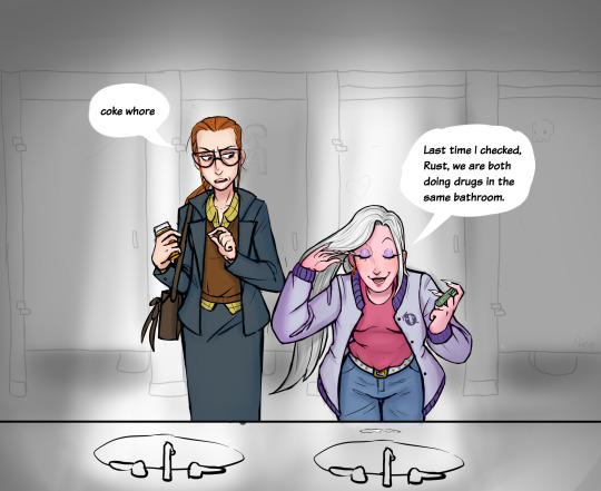
Drug bathroom drawing: Another one of my favorites, its based off a specific deleted scene from Invisible Hand of Fate where Pete and Rusty talk at the bar but Pete comes out of the bathroom sniffling at the start. I love the way I drew Pete pushing the hair out of her face and both of their expressions.
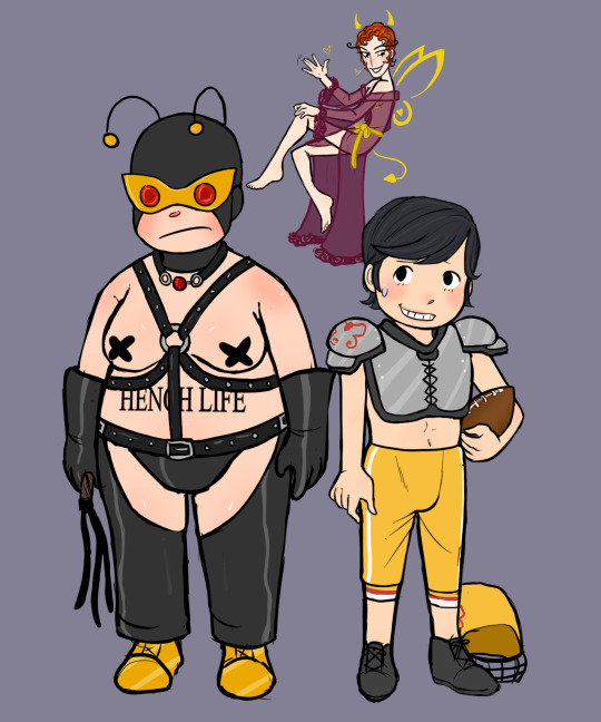
Bdsm 21 drawing: Okay first of all, The little devil Monarch was so cute I was screaming, crying, and throwing up while drawing her. I fucking love her, shes the smallest part of the image but my favorite. I also am quite fond of the bdsm 21.
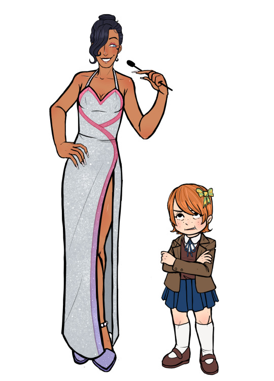
Quizgirls Pete and Billy: I tried looking up Vanna White dresses to base Pete's outfit off of but I couldn't find one that Pete would actually wear so I just had to make shit up. Billy's design is really basic but the bow in her hair is actually from one of my rejected main Billy genderbends.
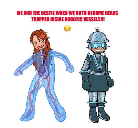
Me and The Bestie: I put a lot of effort into this one for no reason. Literally the moment I saw Jonas in the problem machine I thought he should be made of like blue slime. When I was working on this I kept thinking about Momopatchi's Hatsune Microbe drawing so this Jonas was definitely inspired by that. I gave Jonas makeup because she was having a party movie night on gargantua and I felt like she would still have makeup on thats like completely fucked up and deteriorating on her face after many many years. Vendata's outfit was partially based on Marguerite Chapman's from Flight to Mars, never seen it but I was looking up old sci-fi movie costumes to work with and I thought it would look good :)
#venture bros#the venture bros#my art#rusty venture#jonas venture sr#blue morpho#jefferson twilight#alchemist venture bros#colonel gentleman#shoreleave#jonas venture jr#dr.gf#dr. girlfriend#dr mrs the monarch#watch and ward#watch and ward venture bros#the monarch#henchman 21#gary fischer#pete white venture bros#pete white#billy quizboy#dr girlfriend#vbros#billy whalen#vendata#dermott venture bros#dermott fictel#genderbend#genderswap
540 notes
·
View notes
Text
Kaiju AU Concepts
So while I'm currently slowly working my way through working on my AUs, I had a burst of energy and motivation to draw some Kaiju concepts for characters we've already seen in what I've written--namely Grim and Crowley! (I did have a concept for Crewel's Kaiju form I did last year, but I'm probably going to edit it and just do a before and after comparison or something)
Kaiju AU Grim/Grimfang:

Notes:
This design is based on the updated description in the rewrite of the first chapter I'm almost finished with, keeping enough of his original design while making it fit into the AU.
The crystal on his chest is embedded into the flesh, and yes, it is purple like the crystal on his ribbon in game! It was a spur of the moment thought while sketching, but seemed very fitting and would lend more into the crystals being important to the kaiju themselves and how it helps with regulating magic similar to their in-game counterparts.
In the story, Yuu is supposed to be able to give Grim a proper bath since his fur wasn't as clean as it could have been when they first met. That's how Yuu will discover the crystal.
Keep in mind this is a relatively rough concept sketch to help me with designing the final version. In the meantime, this'll at least help with visualization when reading!
"Average Human" is essentially how tall an average sized human would be compared to kaiju Grim, since not every Yuu is the same height or size!
Kaiju AU Crowley/Nevermore Concept:

Notes:
So...I'll be honest, I've rarely if ever drawn anything relatively bird-like, so Crowley's design in this AU always made me worry he'd be too cartoony or something if I'd attempted before. It is a complete and utter accident that he wound up looking like a griffin without the lion half, but I'm not complaining! 😂
His "face mask" wound up being a last minute pattern I added, which wound up helping flesh him out more and not making him look like any old griffin bird creature. Still a major concept development for his overall design, but I'm feeling more confident on how he looks!
Based on the height differences for each kaiju here, I'd put Crowley at 70 ft tall. Which is pretty crazy in general, but then again, so is Godzilla and the other monsters, so eh. XD Anyway, tiny average human is spooked!
Yes, Crowley has those tiny arms that I mentioned in the rewrite snippet I had posted a bit ago, I just gotta figure out how they're shaped and such. They typically hide under all that chest floof!
That's all I've got for now regarding their designs. I'm still tapping away at the rewrite and working out how each character is designed. I've also got to post the updated species list since I decided to change things around, so keep an eye out for that! 😌
63 notes
·
View notes
Note
As a person who was genuinely made uncomfortable when I discovered Viv does all this crap like 🍇-romantification, I appreciate this blog so far.
For months I've been trying not to interact with hazbin because of viv's actions, which genuinely makes me sad cause I really liked the show (not including episode 4).
I understand darker skin not suiting your style (like mine) or having trouble with different proportions of characters due to where they're from or something (like me) but the fact that she made all the bad guys that way really doesn't scream "I have trouble drawing ____!"
⚠️YOU ARE NOT REQUIRED TO REPLY OR READ FULLY⚠️
Hi! Totally get this all dw, I just got out of the hospital however so if I explain weird please forgive me 😬 also dont take all of this as me giving specifically you a lecture, this is just me letting my thoughts flow out to whoever is reading 🤝
Also theres leaks in this! If you people don’t want leaks be sure to not read past “read more”!!
Its been brought to my attention that the information in the next paragraph is not true and Vivzie did not design or draw these characters! So she apparently just actually can’t draw them at all
Viv has absolutely no problem drawing POC! I mean just look at the human designs for the succubi in Helluva boss
These designs are wonderful and very diverse! But out of these characters, the ones that are important are Verosika and Vortex and even then these characters are side characters. And on top of that, technically they’re only really coded as POC since these aren’t their true bodily forms, but hey thats a topic for another time. Let’s just ignore that for now and say they 100% are POC, they’re still side characters. She can draw POC wonderfully, she just has issues… making them important.
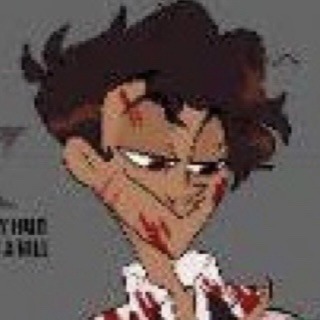
For characters like Alastor (who was only made POC to get away with demonising a closed religion) we don’t see him as his human form. I mean to be fair why would we- but also why did he turn white when he died?? Why did his entire hair texture change. This is a problem for Vivzie where she doesn’t want to commit to representation or feels she doesn’t need to. Vivzie could’ve made Alastor’s design look more like his leaked human design or couldve just altered his colours a bit, but she didn’t do this because she feels so connected to her original high school OC design that she cant bring herself to change him. Like look at this.
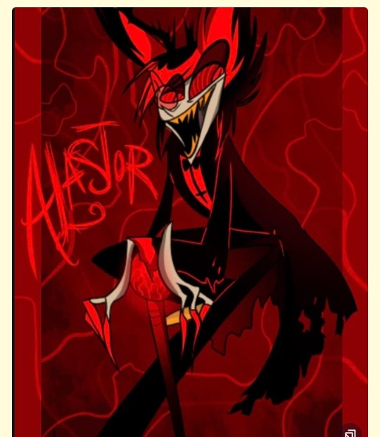

Yeah it’s got a different style, but this is the same guy; he’s just weirdly marketable now. It’s incredibly easy to tell that Vivzie didn’t want to change him if she didn’t 100% have to. Lets take a look at Alastor’s old human design.

This guy definitely looks like he could be Alastor! He’s got the same sort of hair but shorter in the back and a little more combed, but looking at this you can still tell it’s Alastor. However this guy doesn’t exactly seem mixed, right? That’s because he isn’t! Back way way in ye olden days when Alastor went from race ambiguous to white, he just kind of looked like that! And there’s no problem with him being white! Good for him on doing that! I guess!? But when you look his design now, things start to come off as a bit odd.
This is where you non-leakers go read somethin else
This is an entirely different person now. Not just race wise, but personality, the way he presents himself in the arts pose, and just overall the actual look of the character. He looks conniving yes, but he doesn’t look like Alastor. This is not a face matchup.
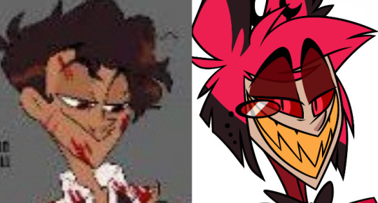
Now, you definitely can have your ugly little red thing design and still use that human one! You just have to not be too chicken to actually change your character so it makes sense. Let me demonstrate.

Shocking how easily this design can fit the human one while still maintaining the original aesthetic of the base design isn’t it! This Alastor looks like the provided new human design. If you don’t want the character to change, don’t change them physically. And if you do, follow through on it and don’t be a wimp. I don’t see whats so hard to grasp about that to this lady. If you want to keep that same ugly fucking bob then just keep him white. She literally only changed his race so she can use it as an excuse to appropriate vodou. Vivzie can draw POC, she just doesn’t want to when it comes to actually having to change a character. Anyway, good day!
#hazbin hotel#hazbin critical#hazbin hotel criticism#hazbin hotel critical#alastor hazbin art#alastor hazbin#alastor the radio demon#human alastor#hazbin alastor#alastor hazbin hotel#hazbin hotel alastor#hazbin hotel spoilers#hazbin hotel leaks#hazbin leaks#hazbin spoilers#my art#anti vivziepop
108 notes
·
View notes
Text
So, I’m making my own pj masks au and I have already like a summary of the au so I decided to make some character design/fan art because I can 🐀✨ (I made drawings in my sketchbook🤓)
This au is basiclly like the original show but if instead of the pj getting their powers since they were little they got them in their teen years, I’m so original I know 😛, (It's sarcasm but just let me be happy 🐒).
I don’t want to explain the au right now because I’m tierd and because it’s still is progress but anyway, here I have the first character design of my au and i decided to start with one of my favorite characters… Octobella 🗣️🗣️🗣️ (Just for u to know, my artstyle is a bit messy 🥹)

So this is like her octopus from or how ever u want to call it. I was going for like something similar to her original design and gave her some more jewelry because queen loves crystals!!! Love my sea witch 🐙✨
Next is her human form??? I’m still figuring things out…

Yes I have her headcanons because it would make my life easier. Well, Her name is Isabella because when I was doing reaserch o found out that “Bella” means “beautiful” or something like that and I found it quite fitting for her. Her last name is Havström because I found out that It’s a swedish surname that means “sea current” (please correct me if I’m wrong because I’m not familiar with it) She is swede because aperantly sea witches are very popular in Norse mythology. In the au, Bella comes frome a large line of powerfull sea witches and they are known for their potions and crystals, she can change her appearance at will between her “human form” and octopus form. In short, she is interested in the pj masks because they get their powers from a crystal and she LOVES crystals.
I made her a short queen in her senior year of high school, (she is older that the pj masks since they are in their junior year). Queen dyies her hair blond 👀.
In my au, Bella is part of a really wealthy family from Sweden but moved to the states arround middle school because her family’s business started growing very well in the states ,(yes, my au is based in the states even though the pj masks is from france but oh well). I imagine that she meet Greg before the other pj masks, they were neighbors in a quite a wealthy neighborhood, Greg went to the same middle school as Amaya and Connor but Bella’s parents and his parents were friends and they saw each other very often. At one point, Bella and Greg where good friends but when Greg started high school, Bella changed schools to go to the same school as Greg and she made his life miserable when she was a sophomore and he was a freshmen, but when she was in her junior year she went to study abroad and greg was in peace (at least until she came back). There is gonna be an episode arround season 2 that shows when Bella comes back from studying abroad (I want to make her apear untill season 2 so this is like spoiler and I’m sorry 😔, and yes, I’m planning the au as if it was a series ☝️🤓).
And to finish this, u might already have noticed that Dylan (Armadylan) is in the corner with Bella, so in a part of the au they are like a couple but like a toxic kind of one because Dylan genuinely likes Bella but she only uses him, I’m planning that she wants to use him to do some kind of spell that would put Dylan in danger but I can’t say much now ,I don’t want to give a lot of detail because this post is already really long and I’m too tired but I promise that in a future post I will explain about it !!!
This post only had like the main idea of what I want to do with Octobella in the au but in future posts I’ll go with much more detail 😨.
Omg, if ur still here, Tysm!! and I hope u liked it !!!
Why did I made it so long 😭😭😭
🐀✨

Here is the full picture if u were wondering. ✨
#pj masks#pj masks au#artwork#artists on tumblr#traditional art#pj masks octobella#octodylan#justice for armadylan#Pj masks teen au
63 notes
·
View notes
Text

a year!!! as of today i have now been drawing these funny little pizza freaks, to the exclusion of almost everything else, for!!! an entire year!!! i wanted to do a nice group shot/lineup of everybody to compare to when i first started trying to draw them because oh boy were they bad. i never even posted most of them anywhere because they were so bad. but im posting them here, now, to see how everything's changed/evolved.
this is probably the hardest time i've ever had trying to figure out how to work with a style, but we got there eventually; i'm pretty happy with the handle i've got on everybody now...dont let ur memes be dreams. lots of unimportant journaling and idle thoughts abt it below.
older pics
the first one is the VERY first time i drew them, before i thought i was going to actually have any interest in drawing them [lmao]; it was just the one isolated image, for my friendserver, to illustrate the funney message, so there was no attempt to make it Good or actually understand anything going on w/ the designs or style.
second is the original run of practices sketches to start trying to figure them out for real; done after i started having ideas for the comics and such and realized oh god maybe i am actually gonna draw fanart for this. [again, lol, and lmao.]
third one is the first pt art thing i posted on here. there were a couple weeks of sprite studies between this one and the previous image. the one on the top right wasn't part of that post i just threw it on as space filler; i'd intended to shift to doing Sprite Redraws But Stylized to explore tings more, but that was the only one i did. ¯\_(ツ)_/¯
individual characters
peppino: by far the hardest dear god. bro what ARE your shapes how DOES your face work. jesus christ. everything i have trouble with this style for, peppino has it in excess. i draw in polygons! i need consistency! and that is the last thing this kind of style is concerned with. they are made of squarshy clay and i do not understand how to mold them. i was really hoping trying to learn this game's style would GIVE me that kind of flexibility for fun exaggerated facial expression but i don't think much came of it in the end 😔. anyway on the bright side all this means once i got peppino figured out a little bit everybody else clicked way easier.
fake peppino: honestly i never did anything with him on purpose except for how his eyes work + the perma-smile thing. i figured ok hes supposed to look weird and off model so whatever happens with him happens. and it did. and it kept happening. it is still, in fact, happening.
noise/ette: somehow, for every bit that peppino was the least natural thing i've ever tried, these two worked pretty much right off the bat. i still don't understand it, seeing as pretty much all the things at play for peppino are also at work for them. i think the new sketches are actually a little worse than older ones but not enough that i care.
gustavo: really funny bc i drew him on model twice and just went 'okay, cool nice, easy, um. he doesn't have any fucking legs?' fortunately he was the only one i had a strong idea for how to stylize him [square] and it worked exactly as i was hoping so wahoo.
brick: is an animal and therefore 5000x easier and more natural for me to draw/stylize than anything else in the cast. that is Just a rat bro. i can draw a rat.
gerome: i think the funniest one here. the most drastic and least necessary change imo. i was gonna have him be really small at first, like smaller than the noises, but then i just... didn't. he's just peppino-sized now. also i gave him like. actual human facial structure, which is funny bc in most cases i'd do anything to avoid, but it works well for his being A Rock to give him some angles and definition like that+ to differentiate his vibe from the rest of the cast who are all very squishy. also since he is essentially Just A Head it's good to emphasize that too ig.
john: i only drew john a couple times but he gets to be here because i like him. and because most of the stuff i applied to gerome was readily applicable to john, though i did try to keep him a little more uncanny because he is a Huge And Lanky Freak. i hate that he is barefoot btw but idk how to make his color balance look right with shoes.
pizzahead: i did not want to put him on here honestly but i Have drawn him a handful of times and more importantly i didn't know what i was gonna do with john's pose if i didn't have him there to be glared at. the only thing that's different with him is giving him wider-bottomed pants, which i got from when i tried to draw these guys in clone high style [i never posted that one either][i will eventually]
snick: he gets to be here because 1. he's like 6 lines 2. i like him and 3. ive scribbled him a few times offhand and it went pretty well
misc
there are some guys missing because those are guys i didn't draw enough [or at all] to have gotten comfortable with them. sorry
i would have Liked to shade these but for the time being i have accepted that my grasp of light/shadow has decayed to the point im not going to be happy with anything i try there, so For Now i am working on my presentation with flats i guess. gerome has a shadow only because he's shaded like that ingame and looks naked without it
anyway if you are still reading [hi?] i get to shamelessly plug now. i'm over the hill of my pizza run now, and while i still have plenty of things i want to make here, most of the bigger more in-depth ones have passed. pizza tower was the first thing in THREE YEARS to get me out of my oc groove to doing fanart, and once i am done with my ideas here i will be going right back to it. if you like my art or how i write characters/interactions you should check out my oc/webcomic blog @jamverse . i can't promise people who like pizza stuff will be terribly into my designs, but i can guarantee i treat my guys with the exact same sort of tone i handle the pt guys with. and hell, i've mentioned it a few times before, but like 70% of my characterization for fake pep is just copied off one of my characters, so if u are going to miss him... he will still be there in spirit >;p
and if you dont care about any of that and are still reading thank you anyway. actually making these comics + seeing how shockingly well-received they've been has done a lot for my confidence, and for seeing that my kind of stuff IS something people enjoy :')
#pizza tower#peppino spaghetti#fake peppino#gustavo and brick#the noise#noisette#pizzahead#arting#pizzaposting
206 notes
·
View notes
Text

I was wondering why I wasn’t getting any notifications for my new art (like I know Tracks isn’t the most well known character, but still), then I remembered that I finished it like 8 minutes before I had to go to work, so that’s why
Well I’m on break now, so might as well write the post
So yeah, I drew Tracks this morning. Saw Auto-Bop, made me realize I think Tracks is pretty neat, and afterwards I proceeded to draw him
It’s mostly based on his g1 design (not that he has many others), though I tweaked the wings a bit to more resemble his Animated self and did my own thing with the helmet. I really wish I was able to do my own thing first try with the rest of the body, but oh well
I also tweaked some colors here and there
He originally had something more similar to a chevron, but I decided to change it and it ended up like this. It’s the wrong angle, but I think it looks good
Also I swear it looks like Knock Out’s helm, but I haven’t looked at his design to check. Tracks also having Breakdown colors and a posh sounding voice really don’t help him beat the KOBD love child allegations, even if he predates both of them (I haven’t even seen the Stunticons yet in g1). I don’t wanna relegate him to that but he does look similar
But yeah for the most part, I’m pretty proud of how he turned out. If only I could give him a proper, more modern redesign. But oh well, not at that level yet
Would be even better if Hasbro just put Tracks into more stuff. He’s a car that can fly, you can use him in stuff. And give him a human bestie like Raoul
#I added the colored background and lighting just because I wanted to embellish a bit#probably because I liked how this turned out#I also did a little embellishing on the name writing but that’s bc my normal handwriting’s too plain#but yes#him#he deserves more spotlight#so many of the g1 Autobot’s do it’s not fair#transformers#transformers g1#tf tracks#my art
70 notes
·
View notes
Text
okay so. i challenged myself to try and draw some snakes and try to capture the features i want to stand out for them. i wanted to see if i could make them all look distinct but where its obvious they look extremely similar.
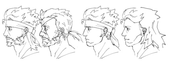
heres the main lineup but i want to get into design elements for them as well as some personal headcanons.
FIRST! bibo.
okay so. i'm going to toot my own horn here. i think his beard looks so fire and i did a good job. i imagine this design is around the portable ops era... not much else to say because most of the interesting stuff (at least to me) comes from the differences the others have from him.
V!!! I LOVE YOU V!!!!!!!!!!
for venom snake, i made him look like big boss but Something's Off. in the game people often (notably huey and the boss' ai) don't recognize him as big boss for a few seconds. an imperfect replica because you cannot get that close with plastic surgery. i made the fat distribution on his neck a bit different from bibo's because i imagine the way that the human body configures itself is hard to change. if you noticed the little snake-tongue-shaped-hair-doohickeys, he is the only one with a slightly different shape. it's a genetic thing, you wouldn't get it. just thought that was silly. his hair texture is different, too. can u tell i like him a lot. also, my favorite detail might be his different nose shape. they never got bibo's nose right i guess. in mgsv, he actually has a bit of a downturned nose, and i honestly don't think i captured that enough.
TIME FOR MY FAVORITE BOY. LOVE OF MY LIFE. HOLDER OF MY GENDER ENVY. solid snake :3
SNAVID! the most obvious difference here is his nose. he broke it as a kid lol. i love headcanons. there's not as much to say about him as with venom, but i can say that he is incredibly handsome and i like him. i think he is cute. was he free yesterday? if so i would like to have dinner yesterday with him yesterday. well... i will say that out of this specific lineup i think he looks the most like good old dad. which is awful and i feel bad for him.
FINALLY: LIQUID!!!!!!!
i gave him his canonical sharp nose and high cheekbones! i based a lot of his features off how he looked as a kid so he really has little shit vibes about him. he also has thinner eyebrows, and i headcanon that he does them himself lol. he has less sideburny sideburns than his brother. his eyelids are also smaller. he also does look kinda like kaz so its plausible that he tricked dave! yippee! i also like drawing his hair. its such a great hairstyle. it reminds me of a lion's mane.
N E WAYS... i hope you enjoyed me rambling about giving these goobers a more realistic design for future reference. i like talking about this kind of stuff. life is so much better without same face syndrome.
211 notes
·
View notes
Text
Hazbin Masterpost
Heavenbound Masterpost
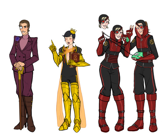
Sir Pentious

So the problems I had with the canon design is that he looked more like a slug than a snake and there were too many eyes. His design just needed to be streamlined. I guess I'm not a fan of the eye motif in general, but that's a personal preference. I altered the colors to add more variety to the hazbin cast, and to reference his early design, which had quite a bit of green.
More notes under the cut, including a human and angel design
I based his design off of the Indian monocled cobra, because the design of its hood was most similar to Pentious', and Hognose snakes. Hognose snakes also have a hood, although not near as impressive as cobras. If that doesn't help to ward off danger, they are will play dead. They are very insistent about playing dead too. It's honestly hilarious. I thought the behavior fit Pentious' overall pathetic demeanor.
Body:
I slimmed his lower body to match his upper body to get rid of the slug look. He also doesn't really have much in terms of shoulders, his suit jacket has padded shoulders to make it look like he has them.
Then I changed the vertical lines to horizontal, which can open to reveal eyes, I guess.
Head:
So a snake hood is literally just their neck. They flatten their neck to make themselves look bigger than they are. I don't have to strictly follow that, since he's a demon and not a real snake, but I felt the need to somewhat allude to the fact. I also liked the animation of his hair/hood as it went up or down and wanted that to stay. So I had the hood part attach to his neck before the collar of his shirt, and the hair is an extra part.
I adjusted the mouth shape to more accurately resemble a snake's, which has a space for the tongue to pass through. The teeth aren't always visible, because snake fangs only show when the mouth is open. I didn't really consider what it would look like for him to unhinge his jaw, but he can totally do that.
Clothes:
I wanted to give him a more clearly Victorian outfit. Specifically late Victorian, because he apparently died in 1888. Fashion was basically transitioning into Edwardian at that point. But the hard part is that men's fashion didn't change as dramatically as women's over time. In a simplified style, I had to make sure it didn't just look like a regular suit. Especially since he doesn't have pants to help complete the look.
I opened his suit jacket to show the waistcoat(vest), and include a chain for a pocket watch. I chose to give him a cravat because it has Victorian vibes, and helped me in my quest to reduce the number of bowties. The tie pin looks like an eye because I didn't see a reason not to.
Top hats were fairly popular in this era. Bowler hats were probably more popular, but the top hat has an older vibe and steampunk aesthetic.
Egg Bois:
I don't actually understand them. He created them, but I don't know how that works. Or why he made them eggs. But they're there. Frank is there. I think one should be named Egbert. Yolkshire(oh, with a Cockney accent too). Um... any other egg pun names?
Mannerisms:
His height is variable, based on his mood and if he's trying to be intimidating.
I didn't consciously decide this, but I kept drawing it and liked it, but he tends to stick his tongue out and hold his hands up. It's pretty autism-coded.

Human: Soooooo. I did see the S2 leaks. I incorporated some things, but changed some as well, so I don't think this will be significant spoilers or anything.
Really long hair was not Victorian style, but there wasn't exactly a strict standard either. So I gave him the longest that I found examples of. Facial hair would have been typical for men to have, but I guess he didn't get the memo. Maybe he was worried about it getting caught in the machinery.
His name is Mr. Pendleton. I don't know a first name, but I sorta like Simon. He was a socially reclusive weapons engineer. To be perfectly honest, I don't have all that much else to say. I'm not sure how deep canon will delve into his human life and I don't want to theorize much at this point. So I'm not sure how he died either. Maybe it was a weapons malfunction.
He might only be in hell because he felt guilty about something that might be spoilers to say. It was honestly a pretty mild sin on his part, and I wonder if he was redeemed because his sacrifice relieved him of that guilt. I'm sure the show will touch on that though.
Redeemed: So the direction I'm going is that angels are more human-like in appearance. Those in hell look different because the place corrupts their appearances. But that mean his redeemed design had to be very different than canon. But it was a chance to give him his iconic hairstyle without worrying about historical accuracy.
(Feb 18, 2025 - added a note to say there are human and angel designs under the cut)
#hazbin hotel#hellaverse#hazbin hotel redesign#sir pentious#hazbin pendleton#human pentious#angel pentious#heavenbound au#a3 art#fanart#digital art#character sheet
93 notes
·
View notes
Text

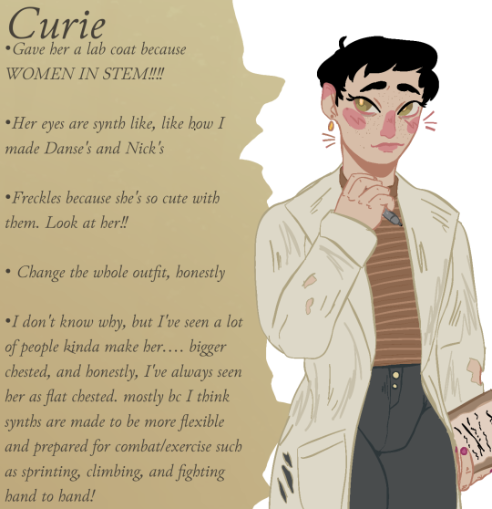
CURIE!!![MORE LIKE CUTIE!!!]
Oh myyy gosh I LOVE CURIE
SOrry ahem.
As you can see first off, I've given her eyes that 'Synth' detail like I did with Nick and Danse
Whole outfit change! Lab coat, cute warm sweater because she's adjusting badly to tempatures, and kinda the same pants bc nothing was wrong with those!!
Honestly I looked at her for a long time and then started plopping down freckles and it made her look so cute
Now I do have a hc about Synth bodies. They can grow obviously like humans, lime they can get fat, or buff or whatever. I believe though, that the default for them, are more agile body types, stuff you'd see in gymnastics! Danse of course, escaped the institute and began buffing up due to outside training and then BoS training. Curie's body however, is NEW! Having escaped the institute only to be put into an accidental coma death where Curie was able to then take over and be well... 'human'! Which is why her body is still that skinnier, agile, and less 'curvy' thing that I have seen from others. This is not hating on other designs however!!! All curies are cuties and everyone is so great at drawing here!!!
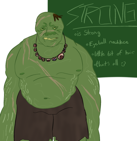
STRONG!!!!!!
Dude I gave him so many scars from fights obvs
Snagle tooth
Little bits of hair!!! I like to think it's too stubborn to leave
I also wanted to add a gorey detail like an eyeball necklace bit I didn't wanna make it like scary so I didn't add too much detail to it. However yes, that's from his victims bc unlike other mutants, he finds eyeballs too gross to eat.
Also, I did attempt stretch marks, but they didn't come out well...
Desdemona!!<3<3
Oh man I love her so much she's so cool!!!
Extremely eye bags because she's constantly working overtime
Got rid of her jacket bc I just wanted to make less jackets lately. However I did substitute it with a yellow hip pouch!
I made her hair more wavy and kinda tangle bc I don't think they get ever good hair care in the railroad....
The reason behind darkening her scarf and stuff was actually not purposefully. I remembered her having a dark scarf for some reason, not a lighter one.... idk why.... SO I JUST KEPT IT DARK!!!
----------
Alrighty... so to explain my time apart. I have been dealing with some personal issues that are now better resolved. I'm back in the game, and I'm ready to draw again!!! Might reopen commissions soon... but for now, I'm just gonna at least finish this art redesign thing!
Thank you all for your patience! ^^'
#fallout 4#fo4#fallout 4 companions#fo4 companions#curie fo4#strong fo4#desdemona#fo4 desdemona#fo4 curie#fallout 4 curie#fo4 strong#can you tell how much i enjoy synths
33 notes
·
View notes
Text
Sylphiel

My first Sylphiel fanart! Really wanted to draw him for a while now, and oh boy did it take me long to finish this. The total time I took drawing this piece was almost 8 hours scattered across several days.
More below the cut!
You might have noticed that Syl looks a lot different from his official design by Jakei, and that’s because I took the liberty to draw my own interpretation of this character (aka headcanons)!
Sylphiel, up to the time that I’m writing this post, has only been drawn in black and white, sketches/doodles and comic pages, with no separate ref sheet or a page dedicated to showing his features (he hasn’t had a single line of dialog yet). So I decided to make his hair a mix of black with white highlights.
For the eyes, black iris with white, cross shaped (or + shaped) pupils, I think this kind of eyes are the prettiest.
Clothing I didn’t change much, extended his hood to cover his shoulders and added a star on the tip of the hood, matching the tail (that I gave him), added more details to his shirt, in which still is sleeveless, pants are pretty much the same. Added a piece of glass to his belt for more diverse detail.
Made the wings more realistic and added a tail with has a star in the tip.
Also since I don’t really like monster designs that resemble humans too much, I also decided to give Syl some spots throughout his body! It’s a pettern that resembles a baby deer coat. Why baby deer especially? No real reason behind it, I just thought it looked cool and cute.
On more thing, I didn’t draw his feet here, but I do imagine him having hoove-like feet, not full blown horse hooves but something similar seen in Imps from Helluva Boss/Hasbin Hotel!
Gonna make some predictions about his personality:
I imagine him to be bold in nature and sassy when the opportunity comes up. But he also can be incredibly gentle when things get serious, teasing but caring. A little bit of a troublemaker and unorganized, but independent on most aspects. He’s also visibly an extrovert and confident but say the right words and he’ll get embarrassed and start stumbling on his words, although he’s quick to make a comeback. When he’s sad or really emotional, he tries to hide or do breathing exercises to try to recompose as quickly as possible, since he doesn’t like crying in front of others he thinks it’s cringe. More specifically, he thinks it’s cringe for him to cry in front of others, it’s fine when other monsters do it.
Sylphiel belongs to @jakei95
———————————————
This drawing was posted way earlier on my Patreon and my Ko-fi. Along with a 20 minute process video, WIPs, a PDF and a Procreate file with all the layers, a unglazed, unwatermarked, full HD version and extra doodles!
Ko-fi is purely SFW while Patreon will contain adult content.
#art#artists on tumblr#artwork#drawing#digital artwork#digital art#design#underverse#xtale#sylphiel xtale#xtale fanart#undertale#underverse fanart#undertale multiverse#undertale alternate universe#UTMV#Sylphiel#undertale alternative multiverse#Cross’ boyfriend#This twink#yakut arts#yakutarts#original art#my art#digital drawing#human artist#furry artist#redesign#character design#xtale Sylphiel
23 notes
·
View notes