#I'll be adding particles and effects
Explore tagged Tumblr posts
Visit Tumblr Blog
Explore Tumblr blogs with no restrictions, modern design and the best experience.
Last Seen Tumblr Blogs


Fun Fact
If you dial 1-866-584-6757, you can leave an audio post for your followers.
Text

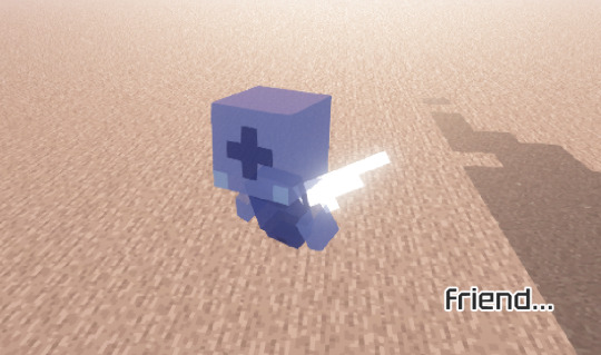
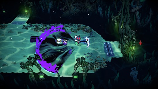
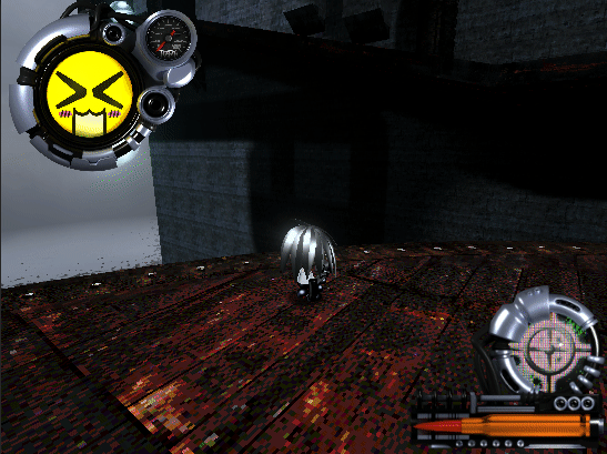
StableBound, my indie horse game! ✨
Here's the start screen so far! :D
More stuff on my website:
#I'll be adding particles and effects#game dev#indie game#stablebound#horse game#digital painting#animation#gif
100 notes
·
View notes
Note
You're more amazing than physical bodies
You're more amazing than bleeding
#finally added a blood particle effect to my game#in other news i got all 12 kinsects in monster hunter world#and spent more time deciding which elements to give each of them than i'll probably spend actually using most of them#very disappointing that there's 6 blast dust kinsects. they're all pretty much the same#and very funny that there's only 2 kinsects with heal as the lowest stat out of the 3 stats#heal is the worst stat so for my first kinsect i looked for the ones with heal as the lowest stat. and there's only 2 of them out of 12#i'm not sure whether it's just a coincidence or if the devs either thought heal was really good or knew it was really bad#WAIT maybe it's because heal determines stamina recovery!#if a player happened to pick a kinsect with low heal then it would often be low on stamina and frequently run out#and that player might just decide to not use the kinsect much and instead just jump and slash. ignoring half the weapon#so they made most of the kinsects have high heal to encourage players to make use of their kinsects#anyway i divided up the elements perfectly; each element has a sever-type a blunt-type and an blast-dust#and for the other dusts i looked at the monsters' elemental and status weaknesses so i could align them!#for example most monsters weak to paralysis are weak to ice or thunder so i made the 2 para-dust kinsects ice and thunder#i also have 3 thunder and 3 dragon kinsects because those are the most common elemental weaknesses#ka asks
0 notes
Text
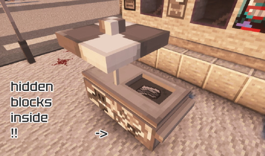
⛏MADNESS COMBAT RESOURCE PACK + DATAPACK IS HERE!

emissive textures support (e.g. continuity mod) and invisible item frames highly recommended
works on 1.21.4/1.21.5
there are two versions of archives, with one of them containing recipe only folders, and the other one making some of the weapon a little fancier as far as my skills go (with sounds, effects and particles being added through custom enchantments). for the resource pack, drop the folder in .minecraft\resourcepacks; to add datapack, drop the folder in .minecraft\saves\WORLD_NAME\datapacks. be careful with the dissonance cannon!
dropbox link
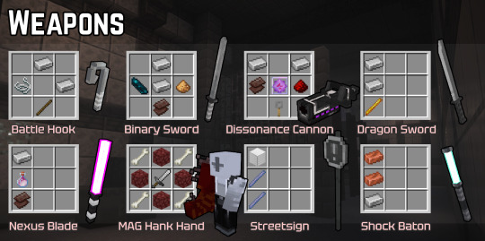
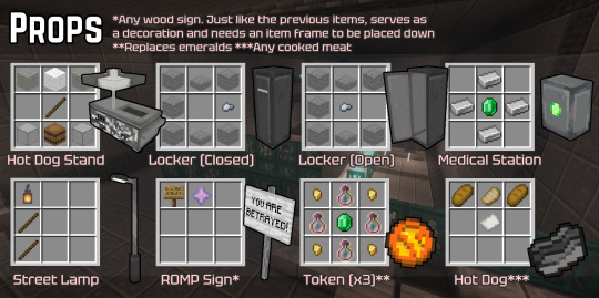
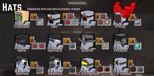

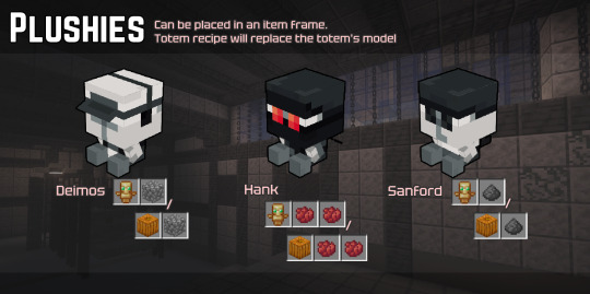
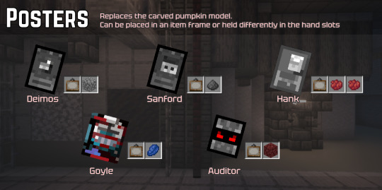
datapack demonstration, additional item frame placements and the arena mode patient’s best friend as a little bonus… i'll try to update and expand the pack over time!

#maybe i'll dedicate the next update to the arena mode characters!#if you have any technical suggestions i'd love to hear them#because i've never made datapacks before especially for later versions#using enchantments instead of advancements seemed more intuitive to me so i used them#madness combat#madness project nexus#madcom#mc deimos#mc sanford#mc hank#minecraft#resource pack
233 notes
·
View notes
Text
What I've learned from making 2 fursuits!
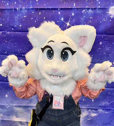
I've learned a TON from the process of both of these suits, making my 2nd suit I improved on a lot of stuff I had learned from the first! Here's stuff I would've liked to know before I started either of these
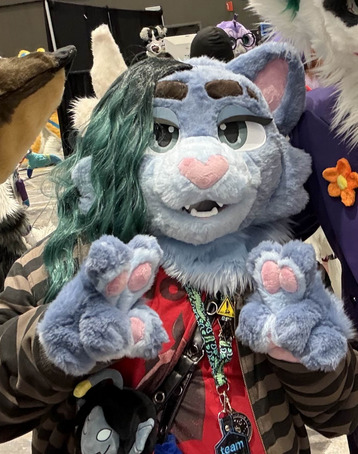
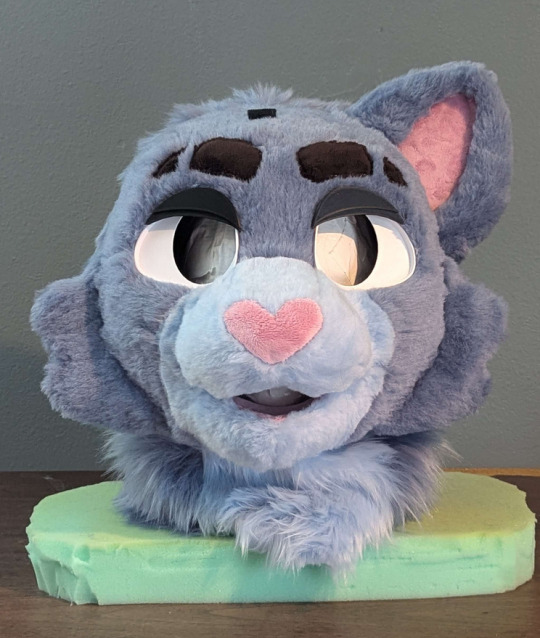
For reference, the white cat suit's name is Sophie and she was made first. The blue one is Raine, and she was made second! I'll be referring to them throughout this.
I've learned nearly everything I know about sewing and these types of craft projects from making these 2 suits, I haven't had any prior experience. This is all very much advice From a beginner TO beginners, experienced makers may say some of this is wrong, this is just my lived experience written down. I figured I'd write all this now while it's fresh in my mind! When you get experienced at doing stuff, you tend to forget what problems you faced as a beginner.
Fur Bulk
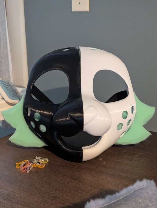
Fur bulk is REAL and a MASSIVE PROBLEM when making your sculpt. Regardless of what method you use to make your base, 3D printed or foam. Depending on how short you can shave your fur, fur bulk will add about 1cm - 0.5cm of thickness to your base
Look how much her mouth closed up from the base sculpt! I ended up still loving the end result, but it was a bit unexpected. (Despite learning about fur bulk from my first suit, and ALSO testing fur bulk in Blender with a fur particle system when I was making the sculpt for this head.)
Raine's ear is an unfortunate victim of fur bulk still, but I didn't have time to remake it how I wanted it. I even tried to make it slimmer on purpose since Sophie's ear ended up so stupidly thick 😭

Seam Allowance & Stitches
(Talking PURELY about hand sewing, I've never used a sewing machine, I cannot give any advice for that)
You should be using a blanket or whip stitch for most of your fursuit, in terms of speed and seams, they are the most effective! Whip stitch for most of your face, it's going to be glued down.. so truly you just need the fabric together and not SECURE since it'll be glued. Use the blanket stitch for things like paws or stuff that's more likely to pop a seam (ears? tails? etc)
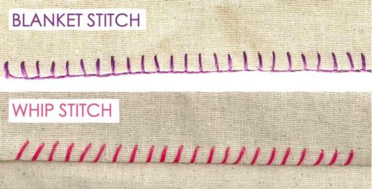
More experienced suit makers might say use blanket for everything, that may be more correct 🤷♀️ Whip/Blanket are nearly the same stitch, blanket is just more secure than a whip stitch, takes a little longer, and uses slightly more thread. I haven't timed other stitches, but the blanket takes me about 5 minutes per inch to do.
On Sophie, I had made up my own bizarre version of a backstitch that was stupidly strong.. but also took a million years to do. It also made my paws near IMPOSSIBLE to turn inside out. Sewing raines face together with a whip stitch was way quicker!
For your face pattern, use next to no seam allowance for the cleanest look. The areas that I added seam allowance on Raine, I really regretted the bulged out look they had. If you aren't confident in your pattern making ability, some seam allowance does give you some wiggle room in terms of how easily your pattern fits onto your base
Designing your suit for airflow
This wasn't actually a problem for me, I did this from the start. But I've worn suits that weren't designed for proper ventilation, and it really just makes suiting a very unpleasant experience. You want to have a mouth hole that is right in front of your own mouth, so you can easily get fresh air in your suit. I'm not saying you HAVE to do this, as not all designs can accommodate this, but it's absolutely something to think about for your comfort!
Another thing I've learned, is the roomier your suit is around the mouth hole, the more overall airflow you get! I tried on my friends head which I sculpted, and they printed in TPU, significantly roomier than Raine, and much more breathable! Raine is still comfortable for me to wear even masked underneath, since I made her ventilation so good!


My future suits I make, I'm going to be looking into TPU due to the sheer weight and breathability difference from my PLA suit!
Non-Fur Supplies
I highly recommend getting hand sewing needles and EVA foam at Daiso if you have one! Daiso has lots of little sewing kits, and I got both of my main needles there. The little circle disks of needles you can find at other stores didn't have needles that were the right size and shape for my hands to comfortably use. Daiso also sells EVA foam in the smaller amounts that you'd need for a suit, unlike hardware stores which usually sell giant square packs of 5
For handsewing, I noticed going for the slightly thicker thread lead to stronger seams overall.
For what you should have in a sewing kit for fursuit, here's what I have (ranked by importance)
Multiple handsewing needles you're comfortable with, just in case you lose one
Pins
Wonder clips (the little plastic rainbow clips) ABSOLUTELY necessary for suit making honestly, they work better than pins in most situations
Seam ripper
Soft measuring tape
Some generic white and/or black thread, as well as your fursuits thread
Safety pins
Overall helpful fursuit supplies
Velcro patches
Masking tape
Duck/Duct Tape
Have garbage shitty scissors, and separate scissors JUST for fabric. Your fabric scissors will remain sharp for much longer if you don't use them on other stuff. (3rd pair of scissors that's not used on tape/sticky stuff, but thread and paper also is helpful. The garbage scissors can get gunky when cutting tape, and your medium scissors remain sharp enough to easily cut other stuff)
Xacto knife + LOTS of new blades. The blades go dull FAST when cutting fur and foam. If you're having to use a lot of pressure to cut through your fur's backing, that means you need a new blade
Box cutter + LOTS of new blades for box cutter. I have a Kobalt box cutter, it's nearly as sharp as my xactos. I use it for cutting out big sections of fur and foam.
I get my eye mesh from Curlworks! I love the visibility on it ^_^
Fur Brands
In terms of my fur company quality rankings, it would be this (I've tried fur from a million different companies on my sample hunt for Raine)
1. Howl Fabrics 2. BigZFabrics 3. MofuMofu.shop
Howl overall is the most dense, relatively soft, and best to shave out of all 3. (Canfur is of very similar quality to Howl, except it has a mild crayon or carpet smell. The smell wears off completely after around 6-7 months, at least on the small sample I got)
BigZ is kind of like a middle ground, but shaves HIGHLY powdery compared to the other 2. As well as shaves a little worse/choppy compared to better quality fur.
MofuMofu is the least dense out of the 3, but I would consider the softest. Best if they have a niche color you need. The fur tends to clump together when it is shaved like sheep wool, and is less powdery than BigZ.
Random furs from etsy are usually LQ/MQ and patchy on their density, not great for shaving super short
Fur Shaving / Length
If you're going for a high quality look on your suit, you want SHORT fur for the face, full-stop. Every suit I've seen that's truly made me go WOW has always had VERY short face fur. Shorter fur shows the look of your sculpt better, instead of hiding it all behind any lumpy fur bulk or unbrushed sections. (Brushing fur doesn't last very long after a suit's been put on haha)
If you can buy your fur in shorter lengths like teddy/beaver, ABSOLUTELY do so. It'll make your shaves much shorter and cleaner. The longer your fur is, is the harder it is to get it to a "HQ" shave length. I personally couldn't get Raine as short as I wanted her to be 😩 But her colors are niche, so I couldn't locate them in shorter fur lengths
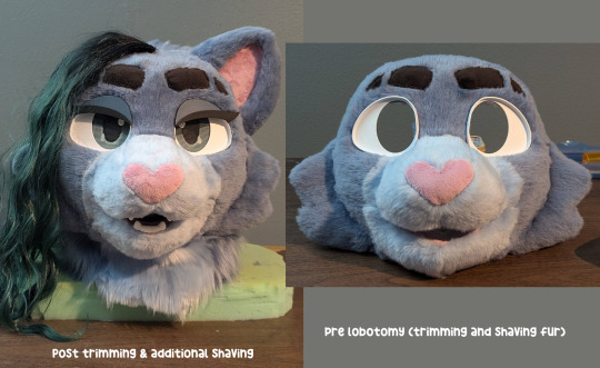
Once your suit is complete, don't be afraid to go in there with scissors and your clippers to clean up the fur+markings as well! Raine's mouth opened up a LOT more when i trimmed it down to shape with my scissors
Pattern Making
Avoid putting any seams down the middle of your face, it is noticeable! This is roughly how my pattern for Raine worked, I think the eyebrows helped disguise that horizontal middle seam really well! (the fur from the "eyebrow" piece covers the seam to the forehead piece as it is brushed over it!) I also made the nose bridge it's own piece, to utilize the visible seam to create a crease for it.

I also recommend avoid making any + shaped intersections on your seams if you can avoid it, it's really hard to sew cleanly😭 Sometimes they're unavoidable, but I try my best to avoid doing them.
Wearability
I'm not sure how much this applies to foam suits, but I really recommend using some elastic, a parachute clip, and some velcro to make an adjustable strap to keep your suit on your head! I tried to use foam on Sophie to get a snug fit, it did not work and made her struggle to stay on. The elastic strap on Raine is way better and more secure.

Misc / Random
When making your ears, you don't necessarily need to sew the minky/inner ear onto the fur parts! You can get a much flatter look on your minky if you just glue it on seperate, and have the fur not connected to it
(Specifically for beginner suit makers making personal projects) Not everything has to be perfect! No one will notice your little imperfections, and you don't have to make a nice product for a client. You can leave some things unsewn, you can have tiny bits of foam show from weird angles. You can hot glue some things instead of sewing them to save time. You can have small accidental bald spots. You can have little unsewn holes in corners if it's too hard to sew around those parts. Take it easy on yourself!
You may spring for fleece to save some money on buying minky, I honestly recommend not doing this. Minky feels significantly nicer, and minky from Howl is really not that much more than some fleece, for small pieces like inner mouths, noses, ears, etc, all you need is a "Fat Quarter" sized piece. It's more than enough! And only $6.50 (if you want fleece specifically, ignore this haha. I just regret going for fleece instead of minky on Sophie!)
Carving a foam base, to me, is the hardest part of suit making. So much so, that I never plan to do it again :P It's some people's thing, definitely not mine. If you've been frustrated with how your foam results turn out, consider 3D printing! Or buying a base from someone.
When looking for fursuit advice and tutorials, beyond the obvious places to look (matrices, youtube, google), I genuinely recommend Tiktok! A lot gets posted there for small niche problems you may have
Use this method for tying a knot on your thread when hand sewing, it's extremely fast https://youtu.be/LWWhRtxl6eE?si=AEt2HDiwp09AigOS
When making a 3D printed base, do not go too thin. I'd do test prints to see what thickness feels right to you, raine was about 0.5-0.7 cm but I wish she was a bit thicker because I worry a lot about her shattering 😨
Removeable eyes are very useful, if i get hair in my face I'm able to pop out Raine's eyes to move it out of my way x)
170 notes
·
View notes
Text
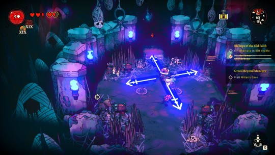
Silk Cradle Secrets
So. Noticed something. A little something. The lighting in Silk Cradle is "wrong", we all know that. It makes Shamura and Helob (purple things) look blue. Red things appear orange, and dark red things appear as a more vibrant red. See: Touch of Turua in Anura for reference.


And there's even complete wild cards. The curse pictured below is Maelstrom pre-cast. These arrows are supposed to be red (orange, since we're in Silk Cradle), but they're appearing as dark blue.
Double and, it's not that the Curse-aimers are just coded to be dark blue in Silk Cradle. Only specific Curses are changed. Flaming Shot is orange, as one would expect. (so is Fervour btw) But Touch of the Revenant is dark blue. As is Curse of the Crown
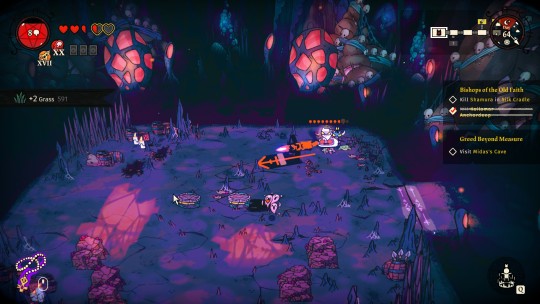

Anchordeep has its own set of unique colors too, but for another time.
Maybe this is something they added with the new updates, I'll never know, but the lighting effect in Silk Cradle changes based on if it's night or day.
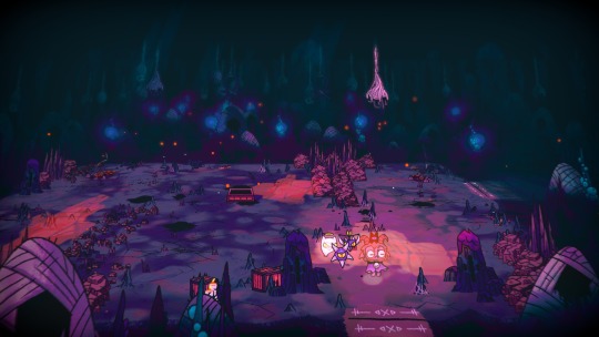


At night, purples stay purple. The blue/white particle effects that are usually floating around turn orange. And the default fleece will turn pink (salmon). You would think the one on the left is daytime because of the light, but according to the in-game clock, it's not. A place that only gets light for 1 quarter of the day instead of 4 quarters...
If we switch over to Purgatory, no matter what "realm" we're in, Death's Attendant appears as pink when charging, and a bright magenta when cast. It changing colors between held and cast states made me do a double take, because it doesn't normally do that. See it cast in Anchordeep for reference.


Now red things selectively change color. Some red things stay red, like the fire, but the Red Crown and Lamb's fleece become pink. Specifically, a shade of salmon. There are purple and dark blue ghosts when using Touch of the Revenant.
And many, many more other examples of this phenomenon.

It's not that the colors during cut scenes (and in Silk Cradle at night) are wrong per say, it's that they're signaling to us that this memory/conversation happened somewhere else. At a different time.
Somewhere liiiiike....


Purgatory?
Which reflects a specific period of time from the land of the living.
During a period of extended darkness.
#cult of the lamb#cotl theory#cotl shamura#cotl#cult of the lamb shamura#cotl goat#long post#cotl lore
23 notes
·
View notes
Note
what’s your painting process?
THIS IS A HARD QUESTION! Because I am a lil chaotic in my personal work. My best personal pieces can vary wildly from me painting randomy shapes in black and white and slowly turning it into something by getting more and more detailed in every pass at it, like I did here:

To an almost completely 3D render with a paint over, like I did here:
Or anything in between those to processes that you can imagine, tbh, I've probably tried that as well. BUT, I'll tell you what I've been doing lately in my professional stuff to keep the quality and style a lil less all over the place.
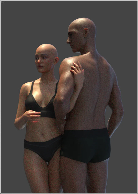
Step 1: Plan a pose and lighting in Daz 3D.
The models I usually use for this are modified Victoria 9 and Michael 9 because those are the most anatomically correct. But you can totally just use the free Genesis 9 or Genesis 8 models that come packaged with the free software and it souldn't really give you any issues.
Step 2: Posterize your refrence until it's 3 Values, then use that a reference to create a 3 value thumbnail, planning the arrangement of element in your painting and the lighting, midtone, and shadow colours.
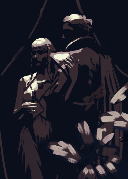
Step 3: Create a duplicate of the thumbnail and apply a black and white filter. Put the original thumbnail in a seperate window or on a reference board or something to look at, so you don't stray too far from the points of contrast and lighting in that. Define your hard and sharp edges in the black and white painting, using your favourite hard edged painting brush and your favourite soft smudging tool. then fil in the values that exist in between your 3 key values. You can usually find these correct in-between values by eye drop selecting from the gradient in your newly softened edges.
Step 4: Detail and paint until your black and white painting looks like it would be a passable greyscale painting by your own standard. This one is hard to give specific instructions on how I detail because I just look at things I dont like and fix them until the things I don’t like are minimal.
Step 4: Add base colours using gradient maps, colour balance, selective colour, or curves. If you don't know which out of these is your favourite method for colouring greyscale, I encourage experimenting. Sometimes I myself use different methods even withing the same painting, because they all have their lil quirks of how they work and the colour results.

Step 5: Render. This one is, again, hard to discribe as it's mostly just looking at things you don't like and fixing them until you're happy.
Step 6: Add lighting effects. Here you can see I added bloom, jittered the hue in the shadow and light affected areas to be warmer or cooler, added glare to the glass, and then, dust particles being hit by the light, a VERY transparent colour dodge layer where the light is coming down from an off screen chandelier, then since all these lighting effects washed the character in the dress out too much, I went in with a softlight layer and a low opacity brush to do colour correction.
Step 7: Post processing. Add a noise layer, smart sharpened the image, added a high pass filter on overlay and set it to 20% yada yada now if one were to print the full res it would look nice.

And that's basically the process right now. But if you ask me again in a month I'm probably going to have changed the way I do things again because I'm always developing the process more and more as I go. I hope this answered some questions for people, was informative, or in any way helped.
#digital art process#digital art#illustation#digital painting#3d art#ask answered#answered#ask#my inbox is always open!
12 notes
·
View notes
Text

500 CALIBER CONTRACTZ Post #15
WISHLIST IT PLZ!
Water Ripplez:
I've been playing DMC3 lately, and I noticed some of the enemies in that game pop out of the ground with this warble effect that makes it look as though the ground beneath them in distorting. I asked some fellow devs about how that might've been done and eventually landed on a specific method.
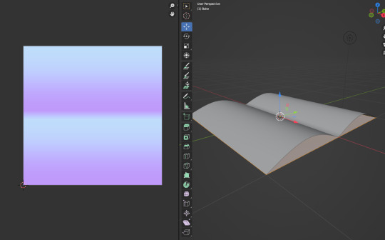
The first step was to go into blender and create this little waves/ripple model and bake it onto a flat plane to get the normal map. If you don't know what a normal map is, it is a 2d texture that tells light what direction it should bounce off it in order to give the illusion of depth. Look them up they are cool.
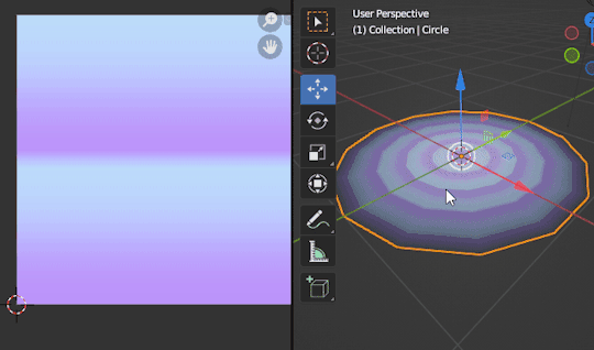
The next thing I did was make a circular model and align the UVs so that scrolling it downwards would make it look as though the waves were traveling outwards from the center.
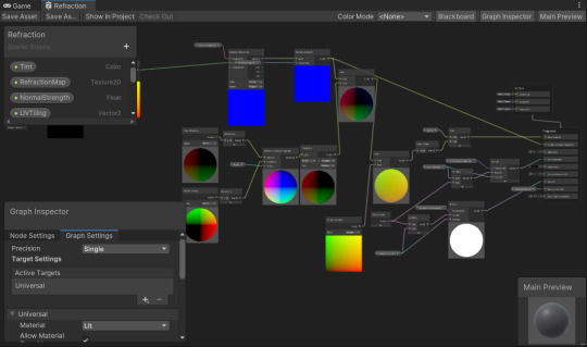
Then I brought that model and the normal map into unity and set up this refraction shader. dw about it.
And finally it all came together to become a little ground distortion. Wow, i'm so proud of it. Not proud as in im proud of making it, but proud of it as if it were my son.
Bubblez:
I decided to add in lil bubbles(z) that you can jump into and they pop which launches you up. They've turned out to be really helpful for bridging gaps in level design, and they were easy af to make. Not much to say about them besides I hope they r fun and I'll be adding cool pop particles to them later.
Doctor Spider:
The first thing I did when getting back on this project after my big October break was finish up Doctor Spider.
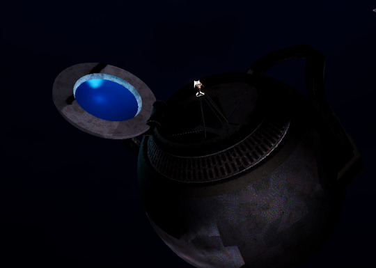
He is the second target in the desert nightclub area, and he lives up this big ass dome. You gotta bring him some blood wine to draw him out and then shoot him with ur gun. He sucks.
Conclusion:
Uhhhh.. idk. Ima be posting more about this again, so look forward to that or don't if u don't wanna. Wishlist the game if u think it looks cool and hope u have good day tyty
#indiegamedev#gamedev#indiegames#indiedev#game development#lowpoly#screenshotsaturday#y2k#y2k aesthetic#indie game#gaming#indie games#indie dev#indie game dev#50 caliber 3d platformer#500 caliber contractz#50 cal#3d platformer#steam games#steam#techart#normal mapz#love u ty
168 notes
·
View notes
Text
Flight Rising added effects, so of course I had to put The Void Stares Back on Zapfino, my Void Gaster dragon. I am not sure how to post the moving image over here, so I'll include a link to his page. This particular effect sort of dims the dragons out a bit and adds a swirling particle effect, which really gives him that not-totally-there vibe. I love it.

17 notes
·
View notes
Text
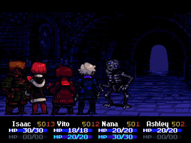
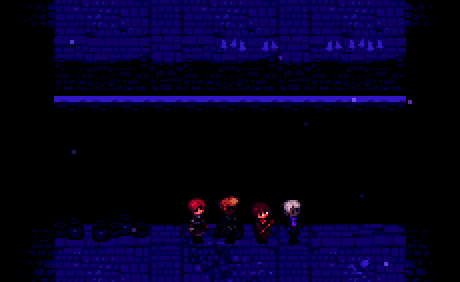
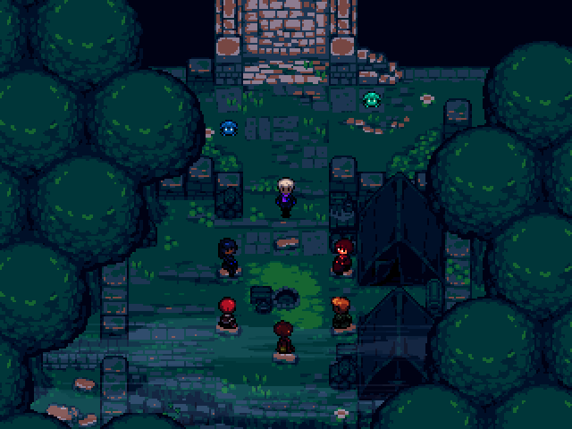
It's been a little while, what have I been working on?
My latest work went into making some pretty significant tweaks to the battle results screen. Really starting to tie things together now, but it's not quite finished yet! That's not all, though.
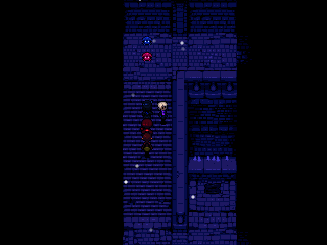
Back in May I was experimenting with RPG Maker's "weather" system. I had implemented a map-specific "overhang" layer that framed the edges of rooms with black space. That prevented weather effects - like snow particles - from displaying beyond the boundaries of the room.
The frogs are just my debug objects for turning the snow on and off.
But it's not like I wanted it to snow indoors - after I had the overhangs figured out, I rewrote the behaviour and graphics code for the "snow" particles to create these dust particles that float around aimlessly.

This ought to make the catacomb interiors feel appropriately dusty - and make the environments feel less still and lifeless in general.
They even display on the battle screen... though sometimes they tend to crowd around the left side of the screen because of the panning and sliding during the battle intro animation. I'll have to fix that at some point.
During May and June, Vito got a complete set of battle sprites and an attack animation.

And so did Yolei. Oh, and the dog enemy is also new.
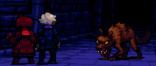
The dog enemy is very evasive, but also cowardly and not very tough.
It is capable of the "flee" action, something that slimes and skeletons will not do.
At the end of June I added a MAJOR quality of life feature. When Ashley is facing something on the map that can be interacted with or talked to with the action button, a quotation bubble with an exclamation mark will pop up above their head. No ambiguity! No more pixel hunting or mashing the action button in front of every random tile!
I didn't save any screenshots in July, it was a busy month I guess. But in August I got back to work.

Remember this old sprite? From February of 2023?
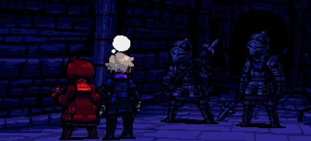
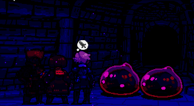
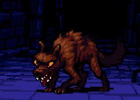
Well, I'm revisiting this enemy type with more practice under my belt. Here are some gifs I recorded as I was figuring them out and implementing their assets and abilities.
As armored enemies, they are very hardy - the weaker party members will have a hard time damaging them with basic attacks.
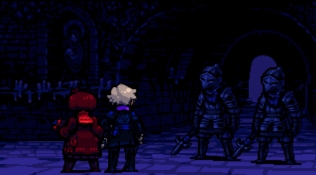
In addition to their basic attacks, all undead enemies can perform a skill that inflicts "fear" status on one party member, which depletes their morale over time...

Here's the same battle running with the mood lighting and dust effects turned on. While I was fiddling with the code, I was also able to configure the target animation to not play if the skill misses. It looked sloppy otherwise.

At some point I put a big, animated door on the front entrance of the debug dungeon. I used this door as a testing model for other interactive doors to use later.
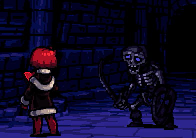
I also spent the last few days of the month filling out Nana's spellbook with some more spell animations. "Dazzle" inflicts dizzy on the entire enemy party. Dizzy enemies have a chance of hitting the wrong target with their basic attacks - including their own allies. Hitting a dizzy target with a basic attack will also knock them down and stun them for one turn.

"Fume" poisons one enemy with a cloud of noxious gas, dealing damage over time.
I should of course note that since skeletons don't breathe, they can't be poisoned in the final game - I was only using this one to demonstrate the animation here.
that's all for now!
47 notes
·
View notes
Note
I’ve noticed for several characters in your weird core au, they have different textured skin, like Kalim’s sandy looking textrue, and Lilia looks like wood or bone! Is there anything to that or just design choice? (I figured Kalim would leave sand everywhere which Jamil has to clean up or something!)
Weirdcore AU Masterlist Here!

Ooh, yeah! I'm probably going to make sure all of the characters have their appearance altered like that (beastmen with fur, Ace with his cards - which he can use to cheat in card games haha, Deuce will probably have something more mechanical like an engine since he likes Blastcycles!)
I feel like it's mostly a design choice - it makes the rest of their bodies feel more cohesive with the design I guess. Plus, it lets me build off of it by being able to worldbuild alongside the design choices (like, I feel like Lilia could have wood-like chitinous plating on his limbs as armour, which helped him in battles in the past!)
Also, the lack of normalcy even in the textures of their skin can lend even more to the Weirdcore effect! Although, I'll probably end up opting to have some characters obscure their appearances (like Rook's face) since I may have trouble figuring out what to do for them haha.
There are some details I feel like I miss out on adding because of the way I do things - it can be limiting if I want to add more inhuman body structures and whatnot - but I can always create new designs and addendums in the future to add onto stuff!

And Kalim is made up of sand-like gold particles! (like, the precious metal) which would likely be worse for Jamil to keep clean, haha! I feel like he'd shed more when he's overexcited or really stressed - essentially when he's feeling strong emotions. His appearance could likely also be quite malleable, but he'd tend to stick to being him! This could also feed into the fact that he's kidnapped a lot, as the precious materials that make up his body may be very rare, and he's a perpetual source of them!

25 notes
·
View notes
Text
Making my character move, using After Effects!
This semester, I'm taking a class called Motion for Illustration, where we're learning how to use Adobe After Effects, as well as how to animate illustrations/prepping illustrations for animation. I've never really done much with animation so this class sounded like a fun challenge and a useful skill to add to my resume. For our first assignment, we had to pitch an idea for an illustration, create it, make it move and then finally render it for the a class screening. I wanted to make this post to show my process and final result!
First, I had to create my pitch, which included a short about me section my inspiration and what I wanted to do for the actual animating part. I'll show the ideation part for my project here:

I had a drawing that was unfinished for a while and thought maybe some motion would make the story more clear! I included some thumbnails (quick doodles that show the concept), as well as a break down on what parts would be moving. This wasn't required, but I also showed some ideas for color palettes, as I hadn't colored the illustration yet :>
After I got approval for my idea, I colored my drawing in Procreate and exported it out to Photoshop. In Photoshop, I did the final rendering and more importantly, separated the parts I wanted to move into individual layers. This was the most time consuming part, as you have to think about what parts that will be exposed while the illustration is moving and specifically what parts needed to be separated so it moves fluidly.
After finishing that up, I saved the file and imported it into After Effects. Since I had already planned out what parts I wanted to move, I used the puppet tool mostly to move the joints back and forth. Besides that, I also added some falling particle effects to add sparkles and moved the hand crank on the music box, making it a 3D object within After Effects and following a tutorial that my professor linked for me to make it move seamlessly. I'll share the link here:
youtube
I also wanted to add music to my animation which turned out to be a lot more complicated than I thought it would be. I found an audio clip that was the right length for my animation, using a website called Freesound.org, linked by my college's website. I imported it into After Effects as an .mp3, as an .mp4 will not give you any sound. Then, as I was rendering it out, each time there would be no sound. I ended up using Premiere Pro to add the music in and it was all good to go!
Here's the final result!
#artwork#illustration#my art#artists on tumblr#digital art#oc#original character#motion graphics#after effects#adobe#adobe after effects#animation#animated#2d animation#SHEMOVES#i love my ocs#video#my video#procreate#photoshop#Youtube
7 notes
·
View notes
Note
can you make a tutorial on how you made your header please (of course you don’t have to if you don’t want to)
hi anon! unfortunately as i was doing so my computer died so i've lost the original one </3 but we'll just make a new one using the same steps hehe! see under the cut.
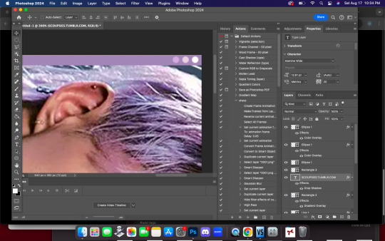
i'm using photoshop 2024. open ps, and create a new canvas that is 640 x 360 px. add the image of your choice. the original picture i used was already rotated, but if you still want that effect and yours isn't, rotate it by 90 degrees. size it to your liking then click the check mark! after that, click your pen tool (or press p). create a rough outline of the areas you want outlined.

after that, click make selection at the top. the settings that pop up are fine. press ok. then, go to your marquee tool and right click on your outline. select stroke. choose the settings and color you want, im using 2px and making it white.

with that done, we can get to work on your text. the original font i used is called payback. here, i am using the font 'grandma house sans'. i am using gradient overlay, stroke and outer glow. after you have your main text, create a rectangle shape underneath. you will use this as the path for your subtext. with the rectangle selected, grab the font tool and place your text within the rectangle. i'm using the font asenine wide. once you have selected your text, look on the right side of your ps at the text properties. scroll down to paragraph and click 'justify all'

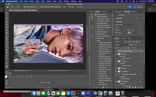
i'm adding a drop shadow and outer glow to the text to accentuate it but that's all i'll do. when that's done, you'll want to use the line tool to draw a line between the first space. duplicate the line and drag it over to the other empty space. i'm using a 1px purple line. i'll also add a drop shadow and outer glow to it bc the colors are light.

now, we are going to go back to our rectangle tool. create a rectangle the same length as the rest of the text. its color is up to you, i'm using a gradient overlay the same colors as the main text so it's cohesive! grab your text tool and again, with the rectangle selected, place your text within it. this text will be your tumblr url (unless you don't want it to be haha). i'm using the same font, asenine wide regular. i've added a drop shadow to the text. this is how it should look.

now, we're going to grab the rectangle tool one more time and place a rectangle at the top that is the same width as the canvas. the height is up to you, mine is 14 px.

now, change your shape to the ellipse and create a circle within the rectangle that's about 8px wide + long. duplicate it twice and place them about 4px from eachother. you can change the colors, i'm going to leave one white and then use two shades of light purple.
now, head on over to the other side of your canvas and use your type tool to add your date (and time if you wish, i didn't). mine is seventeen's debut date :) i used the same font, asenine wide regular. this is what i have so far.
last but not least, we're going to add the particle effect. i screenrecorded effect #5 from this video. to make your life easier and save me from explaining the process, i've uploaded it as a psd here.
before you open the psd, open the timeline on your current canvas. this can be done by going to window -> timeline. mine is already open as you can see, once it is open click create video timeline.

then, you're going to go over to sparkles.psd and copy the 'group one' layer. paste it underneath your text! now, you're going to have the wonky problem of a gif that's significantly shorter than your other layers and cuts off, see here:

so to fix this, use this little thingy and drag it until it no longer goes over the edge of 'group one' in your timeline. it should look like this.

now, why is our overlay still blocking the rest of our image out? this is an easy fix, go over to layers, and with group one still selected, change the blend mode to 'screen'. bam!

finally, to achieve the background effect i have, create a new layer underneath all your other layers, then, go to the layer with your outline on it and use the magic wand tool to select everything outside of the line. go to your image layer with the selection still intact and go to image -> cut to remove the bg. i had to do this in 2 pieces.

then go to that new layer you created and make it whatever color you want. you can use a gradient map, solid color, whatever you want. i'm using a gradient fill similar to background colors, then over it i'm putting a crumpled paper texture (i just googled black paper texture haha) on screen mode. feel free to get creative. this is how it looks!

and that's all, your header is ready to use. go over to file -> export -> save for web (legacy) and save it to your computer. this is our end result! i did add a bit of noise to hoshi bc the image was low quality but otherwise, i did nothing that wasnt't outlined here!

i hope this was semi easy to understand! ♡
#answered#tutorial#tagging some friends for exposure <3#tuserflora#userzaynab#userace#usermery#heymax#cheytermelon#rinblr#long post#image heavy
36 notes
·
View notes
Text
Paper Mario (マリオストーリー): Dialogue Study 5
Hello, time to break down some more Japanese sentences! If you want more, check out the "darcx dialogue study" tag. Last post was introducing Bowser as he confronts Peach after seizing her castle. Now Mario has jumped into frame and Bowser of course has some comments about this.
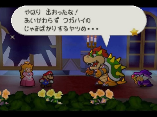
やはり 出おったな!あいかわらず ワガハイの じゃまばかりするヤツめ⋯
For the breakdown, I'll switch to kanji where appropriate, and forgo the spaces.
やはり出おったな!: Sure enough, you have the nerve to show yourself na!
やはり, you may see more often as やっぱり, is a pretty useful adverb/phrases for when you knew something was gonna happen. It can have the same vibe as "I knew it!" or "Just as I thought!" As you can see, there's a lot of creative freedom you have for localization when it comes to words like this.
Next is 出おった. If you've been following along, you've already seen this おる as kind of an old fashioned or high register form of いる. And indeed, when attached to the て form of verbs, it is pretty much that. Here however, it is attached to the 連用形 form, or the "-masu" stem, where it has the same effect as the modern やがる, used to express contempt for the person's actions you're talking to. "Have the nerve to" is often given as a translation, but just like やはり/やっぱり, there's a wealth of options for accurate localization.
The な particle here is acting as a more masculine-coded version of the ね particle.
相変わらずワガハイの邪魔ばかりするヤツめ⋯: You rat, all you do is just get in my way, as always.
A bit awkward to put into English literally... I tried to provide a wording where the meaning is pretty much the same despite being a clunky. 相変わらず and ワガハイの should be pretty clear here.
邪魔する is a verb for being a hindrance/obstacle/etc. Putting ばかり after the noun, 邪魔, gives the sense of "just," "only," "nothing but," etc.
"相変わらずワガハイの邪魔ばかりする" all comes together to modify ヤツめ! This is broken up into ヤツ + め. ヤツ is a word for a person that is very casual. It can be friendly or derogatory depending on the tone an context. め is a suffix you can attach to words that refer to others that further express contempt, kind of a "derogatory suffix," if you will. As usual, there's really no one good way to translate this into English. To me, in this sentence, adding the め to ヤツめ feels like the "scathing 'you'" you use when you're belittling someone, and I chose the word "rat" because it feels appropriate for Bowser's Japanese persona. In reality, a lot of the times you see ヤツ (also written as やつ or 奴) it may be more akin to saying "dude," though.
So a really literal translation might look like: "I knew you'd dare show yourself! Damn guy who, as always, does nothing but get in my way..."
Compare to the official English localization: "[...] I expected you to turn up, right on cue. You're just as annoying as ever."
The やはり出おったな!sentence was mostly translated pretty evenly, but all this talk about Mario being a pest who does nothing but gets in Bowser's way is just reduced to "You're just annoying," lol. It's an understandable decision, trying to encapsulate everything the Japanese line said would be wordy. I said last time that English Bowser's characterization is that of a school bully, and I think this continues to show. Whereas the Japanese Bowser, all-powerful King of Koopas, calls Mario the ever present pest he is!
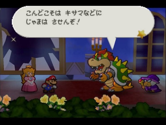
こんどこそは キサマなどに じゃまは させんぞ!
I won't let the likes of pests get in my way this time, that's for sure zo!
今度こそは: 今度 = "this time," while こそは (kosowa) adds a sort of emphasis, in that it draws special attention to the noun it's attached to, to either indicate a sort of limit, or to really mean "for sure." You also see this as just こそ, I'm not really sure if there's a meaningful difference between こそ and こそは, other than you'll likely see just こそ more often.
キサマなど: キサマ is a very insulting word. It's kind of used as a second person pronoun but Japanese "pronouns" aren't that functionally different from nouns, so, you'll see it translated a lot of the times as "bastard" or something. Since concepts of profanity are handled differently between the two languages though, I'm sure you would agree that for a Rated E Mario title, Bowser's not gonna call Mario a bastard, something non-vulgar but still insulting is more appropriate for a more literal translation. など is used to sort of "broaden the scope," let's say, kind of the opposite of こそ(は). Mario is just an example of the kind of chump that's no match for Bowser!
させんぞ: If you expect this to be a verb, at first this looks like a very weird verb and verb conjugation if you're not used to reading Japanese. And it is a verb! Plus the forceful particle ぞ. So what's させん? Well it's actually a shortening of させない! させる is the "causative" of する. Usually translated as "to make" or "to cause to" do, but it can also mean "to allow to" or "to let" do, which, context here makes it obvious Bowser's saying he will not allow someone to hinder him. This verb is why there's a に after キサマなど, when the verb is in the causative form, に marks the thing that is being made/allowed to do something!
Compare the official English localization: "Unfortunately for you, there's nothing you can do this time."
Something to note about this pair of localizations is the attention to symmetry: There is no symmetry in the English version. In Japanese, Bowser's second box here says 邪魔はさせんぞ, which is in direct reference to the previous box where he says 邪魔ばかりする - which was left untranslated in the English localization... So it would make sense to also not translate it in the second box too. This second box is definitely the most different the two versions have been, both do retain the sense of "This time is different!" Japanese Bowser is just a bit more mean spirited about it. Maybe the English developers didn't want to hurt the players' ego too bad?
#darcx dialogue study#japanese sentences#japanese#japanese langblr#langblr#japanese grammar#grammar#paper mario#sentence breakdown#japanese vocabulary
9 notes
·
View notes
Note
Imo, kh1 is the only one that takes longer to use items because you have to select them manually from the menu, whereas in kh2, you can put potions and other healing items onto your shortcuts, which most people use for cure anyways.
Also, you don't have to wait for the particle effects and such to run out before you can move, you have a tiny bit of time before it ends to move. Also the prev anon is right; it takes the same amount of time to cast cure and use a potion, the amount of time it locks you in an animation is damn near identical, unless you're a stickler for like, milliseconds idk.
And then in kh3 they were actually kinder with the mp bar, because they added that whole "you can save 1mp to cast cure if you need to after doing other spells" which i think even includes cure itself? Honestly I'm not as familiar with kh3 since its newer and I've played the other 2 since release. Also they added Kupo Coins... which is just a revival you can buy at the shop. The other games didn't have that, except for the occasional visit from Mickey in kh2 if you died to certain bosses. But getting Mickey isn't guaranteed either, where the Kupo Coin is 100% effective.
Also, just... I know the MP refill seems like it takes forever because yeah, kh2 is pretty fast pace when you're in combat, and you really want that mp bar to fill up again, but it's not 70 seconds wtf??? Its probably like... 20 at most? (Maybe I'll come back after I time this bc I just started a kh2 game and I don't have any mp abilities yet).
But you can change that!!! You get MP Rage (Wisdom lvl4, Hidden Dragon keyblade ((this is literally the first keyblade you can switch to)) ) Theres MP Haste (wisdom lvl 6, Circle of Life keyblade, Full Bloom+ item,), MP Hastera (roxas gets it at 3rd level when playing on Critical) and MP Hastega (Ultima Weapon keyblade). Theres plenty of ways to boost that time. Also carry fucking ethers, or elixirs, or megaelixirs. Don't have them? Buy them!!! At least the ethers!! Every moogle has them!!! Want elixirs? Synthesize them!!! You get both hp and mp back from those, if you're really in a bind! Equip them to your customization menu so you can use them in a shortcut! I do that if I know the fight is gonna be bad! You really only need Cure, Reflect, And one other kind of magic you like on the other 3 slots anyways!!! If its a boss fight, ditch Magnet! Magnet doesn't do anything to bosses!!!
YOU CAN ALSO SUMMON STITCH!!! HE REFILLS YOUR MP EVERY LIKE 3 SECONDS IF YOU'RE USING IT!!!
And if she ever pulled the "well my party members should heal me more" she should GO INTO THE PARTY CUSTOMIZE MENU AND FIX IT!!! YOU CAN CHANGE THE FREQUENCY THAT THEY THROW OUT SUPPORT ITEMS AND ABILITIES!!! IN EVERY GAME!!! I know its a joke to never give Donald and Goofy items but ffs if you know you're gonna have a tough time, GIVE THEM ITEMS!! ESP LATER ON GIVE THEM ITEMS THAT BENEFIT THE WHOLE PARTY!!
Sorry just omg... I have 22 years of playing these games under my belt, okay, I've been playing since I was 3. And kh2 is my favorite and I *know* how to play that game. Well, I'm not a speedrunner or anything, I just know the tips and tricks and things you can do to help yourself out yknow. Like these games give you tools as you level up, its only in early game where using Cure can really screw you.
Like, you get cure in Beasts Castle. You've usually done Land of Dragons by then, so we're not mentioning that, but if you did BC first, LOD will be a breeze anyways. Next world is Olympus Coliseum, and the only time you might have to use it is in Hades Escape (bc Lance Soliders suck), and then maybe in either Cerberus or the Hydra if you struggle on one of them. Then next is Timeless River and your only real struggle there with dying is the fucking Hot Rods in The Scene of The Fire bc they suck too. But once you get to Port Royal, its smooth sailing until, like, Pride Lands fighting Scar (or the Hyenas if you're on Critical bc omg they can one shot you if you're not careful) but by then you should have at least something to help your healing or mp, or have enough stock in items to use those.
....tl;dr, KH gives you tools to deal with the restrictions to healing. Its not a spam like in kh1, but the later (numbered) games give you plently of things to help make healing easier as the game goes on and also being able to put items into your shortcut helps the speed of it too.
((I'm not talking about the non-numbered games bc tbh thats a whole new can of worms. THOSE are the games you have to really plan out healing in bc of the whole card (re:com) or ability slot things that bbs and ddd have that make healing a lot harder.))
Bars
You coulda made up half of that and I wouldn't know i tried to do my own research but this anon showed me that while my perspective was basically right I cannot compete with a true kingdom hearts fan

9 notes
·
View notes
Text
📢 Weekend Update!
Smaller update this week. I've been working on more character sprites and updating some art. Hopefully I'll have Dotties ready by next week.

I've also worked on adding some new layers to my character models so they can do funny things like Defy The Layering Order and Hold Objects...(I admittedly lost a lot of time just admiring Professor Quark holding this box...isn't it just so cute?)
I'm also working on adding footstep sound effects back in and particle effects so hopefully there'll be some audio for next week's update!
13 notes
·
View notes
Text


We're on air.
More precisely, I was on air when I recorded this, but the details are largely irrelevant. Because I don't really feel like covering fuckin' introductory quantum mechanics and telling you exactly how the influence of the Skaian universe, when applied at the quark level and taken alongside the probabilistic effect of quantum behavior, superposes via particle states and results in the formation of what you might refer to as "overlapping timelines". And that's already getting real abecedarian about this shit.
Yeah, sue me. Try boning up on basic physics while you're at it.
So. I'm sure you'd love to hear about how I managed to rig this sick as hell channel-cum-blog up and get it to straddle the space-time continuum like an antediluvian Olympic gymnast doing mad splits over baby's first toy pony, but that ain't the point of this little exercise. Posting what's effectively a vlog is enough of an onanistic venture without adding Skaian Principles For Dummies: Electric Boogaloo to the schedule.
Where was I?
(Rhetorical question. Don't answer, if it needed to be said.)
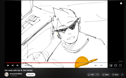
The name's Dirk.
Strider. Yeah, that Strider.
I'd be more worried about internet safety, but seeing as there are only up to two people alive around here no matter how far you pull my timeline back, and I'm one of 'em, it doesn't exactly compute. Face it, brosephine: you aren't getting to year 24xx post-hilarocaust, and you sure aren't getting past that. Wasn't shat out of a lab yet when you were committing identity theft and scamming doddering old ladies out of their sadsack pensions.
(If you manage to get pizza delivered out here, I'll tip extra.)
Besides, you already knew my name, didn't you?
Maybe your next question's going to be:
"Why are you calling this a vlog when it's obviously just a blog?"
Or maybe,
"Why is your URL poorlydrawndirk when it's totally malapropos?"
Buckle in, kids. Strap yourself into that convertible toddler-safe harness and keep your ass glued tight to all the prime polyester-lined foam, because this ride's about to pull into the station and vehicular standards are some passé 21st century horseshit.
The first thing you have to understand is that even peering upon the brink of these echelons of irony is a skill that you'll never grasp in your life. But that's fine. I'm around. And if it puts your mind at ease,
I'll be the one pulling the strings here.
(There's the tired callback. It's not wrong, but it's tired. Worn out enough for it to be begging you to take it out back behind the shed and put it out of its misery.)
(I'll leave it at that for now, because self-referencing is one thing, but if I get any more meta, I'll have to start narrating in twelve-point Times New Roman.)
Anyway, I'll be breaking it down, just this once. Magnanimous as hell, I know. I could wax poetic and in doing so obfuscate the actual meaning once more from obtuse minds, thereby adding another strata to irony so layered that it's settled past sedimentary and is ready to unearth some fossil formations, but let's be real. That shit would fly over your head so far it'd be trying to dial ground control at Houston.
Here we go.
Vlogs aren't cool; making one ironically is.
Putting in this much effort into making a multiversal vlog makes it cooler, ironically.
Putting in this much effort to make a multiversal vlog when the doomed timelines are all inherently fuckin' doomed, as the name implies, and therefore functionally useless to communicate with, makes it more ironic.
I have Heart powers and am able to achieve my ultimate self through my alpha timeline. Therefore, not only is this pimped-out vlog functionally useless, but I actually don't need it at all.
Which means this wasn't too hard to set up to begin with. Ironic, considering the complex presupposed conditions necessary for bridging that 'verse gap.
And despite framing this as a vlog, this is obviously a blog.
Even though it's just a blog, all these drawings I've made had you convinced that I really thought I was posting a vlog.
And in a way, I'm still making one. It ain't the traditional format, but the almost videographic mannerisms I've been laying on you more than compensate for the fact that the video part of "vlog" doesn't exist.
Except it does, for me.
And because it does, none of these pictures are drawn to begin with. They're all film stills. Screenshots, if you prefer.
Which makes the qualifier of "poorly drawn" untrue.
But it's also almost true, because you can call them poorly drawn by virtue of them not even being drawn. Ride that definition of "poorly" down the one-way rail and you're here, selfie central, population two, me and you.
Of course, that means we have to cover the quandary of truth itself. What constitutes the truth? Titillate that thought for a second.
If I consider the attached files to be selfies, but you consider them to be illustrations, which is it actually?
An analysis of the "truth" means that we have to start delineating how much of this is subjective, tying us in bed with the concept of knowledge. The Socratic take calls for dialectical conversation and inquiry via questioning; therefore, if I just bequeath my knowledge to you on a pretty little metaphorical platter, it won't mean fuckall. So we have to keep digging. Get your pickaxe ready, 'cause we ain't hitting any diamonds of wisdom any time soon.
In fact, maybe that ain't the right direction. Flip it turnways. We gotta climb a li'l higher for what we need.
Maybe we gotta head to the roof.

now. brought cal.
where making this HAPEN.

Haha.
Just fuckin' with you.

Welcome to my blog, dude.
Want water? Imagine I got you a nice, chilled glass.
Let's get this parasocial relationship pumping.
Questions? Concerns? Misguided pseudo-parental queries about whether or not it's safe for your pipsqueak to be exposed to a full dose of radically Stridered bullshit?
Cool.
Make it all three and drop it in the asks, yeah?
#Dirk Strider#Homestuck#Homestuck Fanart#Bro Strider#Ask Blog#((#No set timeline! primarily dirk but occasionally other splinters. yeah that includes scratch because why not. it sounds funny.#not a kinnie not a fictive! just a guy with a little bit of time and some bad ideas.#please note that it took dirk approximately five hours in the video to get ready. thank you.#yes the intro is one very lengthy quasi-shitpost. I was going to cover sincerity and the socratic dialogues even more#except it was already really long. lol. anyway I don't have 3 hours to write a more detailed explanation of all the layers of irony but#'trust me bro'#this is a regular askblog despite being named like one of the 'badlydrawn' ones.#im not gonna write long ass monologues at everything i just thought it'd be funny here#i'll spice up the actual blog layout later. for now - hope you enjoyed!#Also - runs not daily prob closer to weekly))
61 notes
·
View notes