#Image Editing( using the effects of photography)
Explore tagged Tumblr posts
Visit Tumblr Blog
Explore Tumblr blogs with no restrictions, modern design and the best experience.
Last Seen Tumblr Blogs


Fun Fact
69% of Tumblr users are millennials.
Text
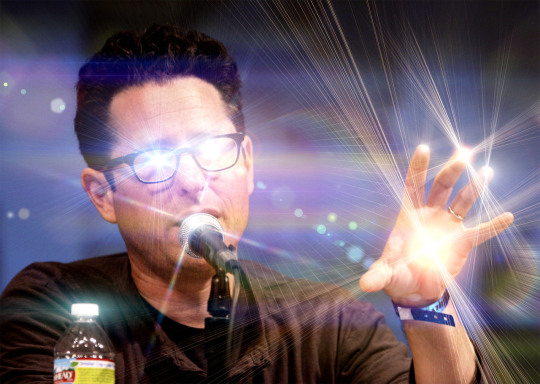
i think image gen can be used like any other artistic tool but I don't really think the big commerical proponents of "ai" are advertising it as a tool, they're adertising it as a solution. I also think it's intellectually dishonest to argue that image generation is exactly like "using photoshop/taking a photograph" because of some generalized "those were also criticized at their conception for being new and scary and disruptive" soundbite. they were not even really criticized for the same reasons. find a better argument.
#it's not serious when someone generates a meme image and ai can be an artistic medium that takes a lot of "effort” (a misaligned word that#i think we need to uncouple from “protestant work ethic” and “human worth” because anything you create#takes effort and that's neutral it has no value it's just unaviodable.#the issue is when we start deciding for ourself how much effort something took for someone else and judge them as less for it]#i also don't think “art” has anything to do with effectivity or the time it took to make. it's just communication man#the openai people don't want you to do something real with their model they want#ikea to use it for generating those paintings they hang in their showrooms.#oh and also. piling on. “the photoshop takes no effort the computer does all the work” was always bunk like anybody who's used any digital#image editing program knows that? because the people saying this literally imagined photoshop working like an image generator lmao.#and that has mostly died down because the accessability of computers that can run photoshop and its ilk has grown to the point#that people realize using photoshop is a pain.#while the photography criticism was strong a 100 years after the invention of photography. on philosophical grounds. brecht hated#photography and he was born 50 years after its conception.#everything that’s criticised isnt like everything else that’s criticised
15 notes
·
View notes
Text
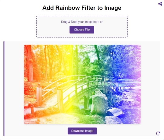
Add Rainbow Filter to Image
#image#photo#picture#free to use#photography#tools#jpg#online#graphic design#photographers#image edit#rainbow#photo effects
0 notes
Text
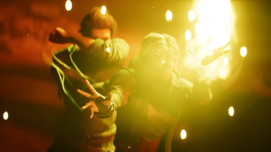
it is difficult to not look around constantly to see if something looks off. there are examples of people's artistic choices or skill levels being mistaken for ai, when sometimes it was just an artist avoiding drawing hands. when ai tools became popular it was fascinating and fun for me to try out and think of how i could integrate them into my cc. while i wasn't planning on using it for all my future cc, i also wasn't aware of how fast ai would become so prominent in all kinds of media. in previous projects i used different techniques to create art for my custom content, like altering copyright free images or photography and i also used my own illustrations, but i never found a workflow that i could stick to or completely satisfied with my results, so i really wanted to give the new image generators a chance. between stylistic choices, different perception or visualization of light, perspective, colour, proportion, as well as the skill level or post editing effects, there are many other factors that can result in interesting art style, that we can appreciate even if an artist isn't as experienced or has the knowledge that computers do. but still, it will rarely be as irritating for the eyes, as what the off-putting ai generated look and feel some of those images have. ironically i still find the weird compositions and funky shapes that often come with ai art actually quite fitting with the maxis art style as well as the simlish language and script, but as genAI art is all around us now and the generated content becomes so overbearing, i don't want to have generated imagery on my custom content anymore. currently, the frame tv is still bugged due to a recent patch which broke the compatibility with custom content tv's and the gaming consoles. unfortunately the batch fix in sims 4 studio only seems to work for regular tv's, but not the wall mounted ones, so i was stuck on trying to fix it manually but that didn't work out for me either. therefor i will have to re-do the whole object anyway which goes hand in hand with the retexturing of the screen. i'll happily take suggestions and requests for this update from you! :)
302 notes
·
View notes
Text
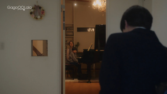
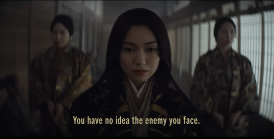
Hishakai Shindo visual analysis (Ep. 1-2): "Depth of field" metaphor
"Because the depth of field is pretty shallow. So this kind of blur actually becomes a unique feature."

I so appreciate how Hishakai Shindo’s cinematography plays with the show’s central metaphor of depth of field. In photography, depth of field refers to the size of the area in an image where objects still appear sharp, and the drama uses it to great effect as a way to visualize Hayakawa's suffocating emptiness and his growing but conflicted attraction to Konno.
Look at the way the show's camera uses shallow depth of field (DOF) to portray Hayakawa's isolation from the world around him:
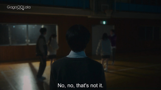
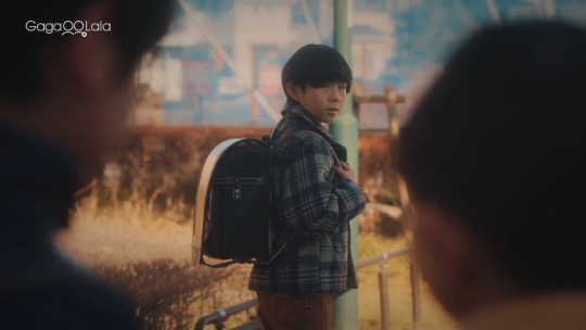
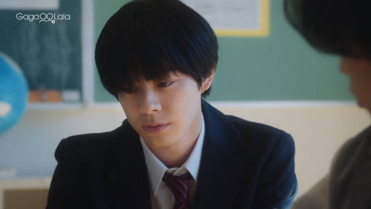
Shallow DOF is where only one plane of an image (either the foreground, midground, or background) appears in focus while the rest doesn't. Within the images of his everyday life, Hayakawa is literally placed on a different plane than the people around him. He either feels ostracized because of his love for music or smothered by the carefree performance he punishes himself with. Either way, there's something very lonely (and even claustrophobic) in the way the camera's subtle blur separates the image of his person from whatever else is in the frame.
Which is why we immediately understand the significance of his rooftop interactions with Konno through the cinematography's change in composition and DOF.

When Hayakawa staggers up the light-drenched stairway and onto the rooftop, he can finally breathe. He's surrounded by water but no longer drowning, which is punctuated by that edit of an air bubble underwater.
The overexposure and vast amount of negative space imbues the scene with an almost divine significance.
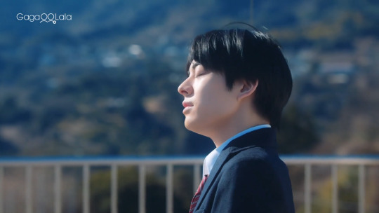

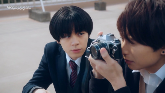
And this moment is of course captured by Konno's camera, stripping Hayakawa bare and human.
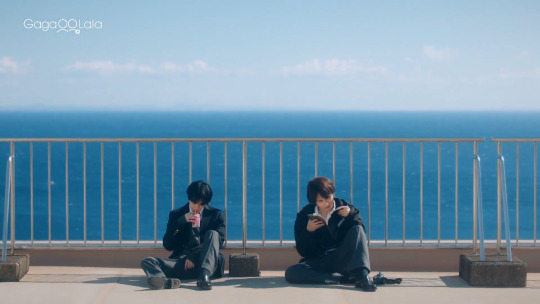
I think it's notable that in their rooftop scenes together, suddenly we see more two shots of Hayakawa sharing the frame and being on the same plane as another character. We also see more shots with deeper DOF. Konno's observant and uninhibited nature prods Hayakawa to be more present and honest.
For the first time, Hayakawa and his inner life are in complete focus to someone else.
95 notes
·
View notes
Note
hii! i absolutely love your work. i've been getting into trying to make borders myself, and i was wondering if you had any tips on where to find good pngs or do you create everything yourself? i feel like my luck so far hasn't been great but maybe i just don't know how to search for it correctly!
Hello, nonnie! I'm so glad you enjoy my work; thank you for your kind words. ( ˶ˆᗜˆ˵ ) And oh my gosh, it's so nice to see a new GFX creator in the making! One of us, one of us, one us. ~ Welcome to the wonderful world of editing, hehe!
I've compiled a list of websites that I use for my graphics, but please do let me know if you need anything else and I'll be happy to assist!
For general assets, as well as inspiration, I generally use these websites: behance (which is pretty much the industry standard when it comes to graphic design in general, they have cool studios or experienced designers that post their works and/or assets), booth (an independent japanese resources hub with many free and paid assets), huanban (an independent chinese resources hub, same proposal as booth), abdz (mostly focused on typography and branding), dribble (more focused on web applications and design) and envato (templates).
Since I'm colourblind, I'm not always confident about how to compose colours together. So whenever I'm in doubt, I use coolors (to get palettes from images and browse through palette ideas) and colorhunt (which gives ideas for palette themes and motifs).
I love typography a whole bunch, but sometimes it's hard to find that one right font for your project. Whenever I need to look for something else, I always run to these websites: google fonts (when I'm on a budget and want to use 100% free fonts, including for commercial use), 1001fonts (to quickly find fonts based on themes, it has a great tag system), dafont (a big classic huge dabatase of custom fonts), befonts (for more industry standard-leaning fonts) and kerismaker (for those magazine looks). When I want to identify a font used on an image and where I can download/purchase it, I use myfonts and font squirrel. They even give you similar options for free, too!
Suppose I'm specifically searching for illustrations/PNGs I can use on my upcoming project. In that case, I'll either go to flat icons (for websites, applications or presentations), vertex (for 3d icons and/or general vectors), graphic burger (for logo making), cleanpng (for I want a tree PNG and do not want to clean it myself, for example), pngtree (same idea as the previous one, you just search for a word and will see all PNGs related to it) and pngall (self explanatory).
Regarding backgrounds, textures, and photography in general, I rely on websites like pixabay, vecteezy, 3d ocean, morguefile, freepik and isorepublic. They have high-quality photos and videos that you can use on your projects. However, if I specifically need mockups or patterns, I turn to unblast, pacage and ava.
Besides those, you can always search for things on Deviantart and Twitter! Though I do not use those much, I think Instagram and Threads also have pages dedicated to sharing resources. Discord can be a nice place to search for graphic design servers, too.
However, if I cannot find specific resources for a commission/project for whatever reason, then I will make them myself. Be it through photography, drawing or anything else I can get my little hands on.
For the more technical/applications side, the programs I use for my graphics and edits are Adobe PhotoShop 2020, Adobe After Effects 2020, Adobe Illustrator 2020, Clip Studio Paint (for when I need to draw or polish something for specific projects/commissions), and HandBrake (for when I need to make screencaps). My drawing tablet is an oldie, Wacom One.
Hopefully, this can be a nice starting point for you! Please feel free to reblog and/or like this post if you'd like to save it for whatever purpose. ~ I hope you enjoy this journey ahead, and if you need anything else, let me know! You got this! ദ്ദി ˉ͈̀꒳ˉ͈́ )✧
#♡: answered! *#graphic resources#gfx resources#roleplay resources#rph#rp resources#editing resources#carrd resources#editing
108 notes
·
View notes
Text
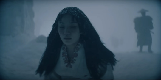
Let's talk about vintage lenses.
Here is your cool samurai show with modern lenses.
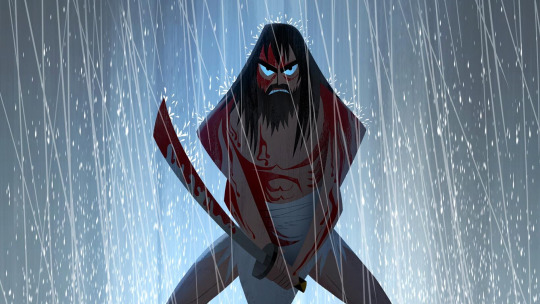
Here is your cool samurai show with vintage lenses.
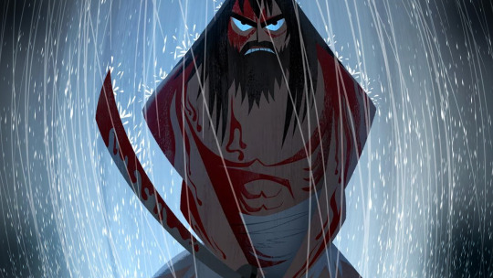
Hollywood is no stranger to fads.
We are currently in the middle of a "make everything too dark" fad. But that fad is starting to overlap with "let's use really old lenses on ridiculously high resolution cameras."
This is Zack Snyder with a Red Monstro 8K camera.
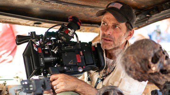
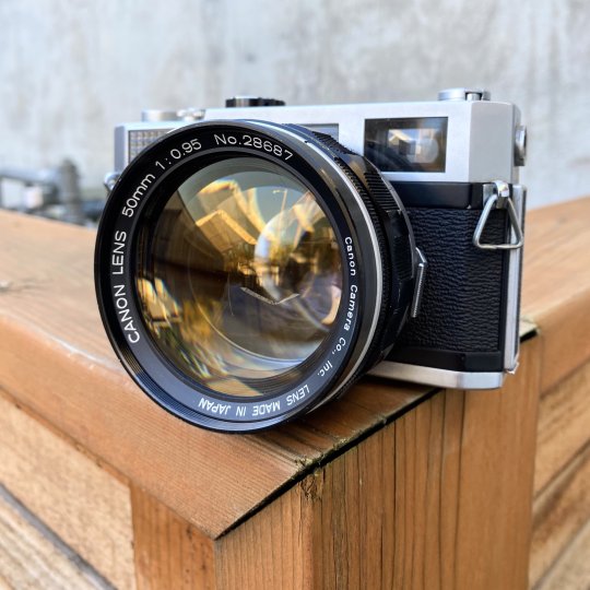
He is using a "rehoused" vintage 50mm f/0.95 Canon "Dream Lens" which was first manufactured in 1961.
This old lens is put inside a fancy new body that can fit onto modern cameras.
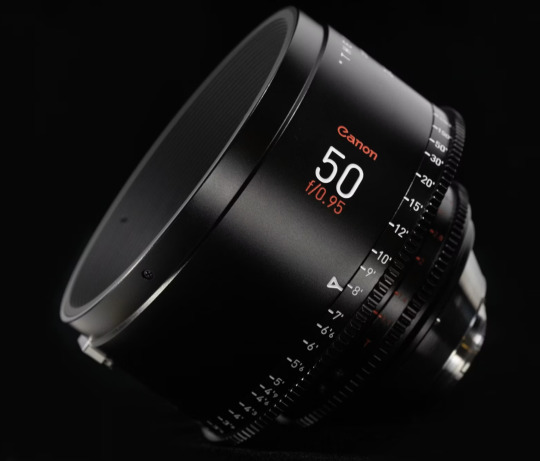
Which means Zack is getting nowhere near 8K worth of detail. These lenses are not even close to being sharp. Which is fine. I think the obsession with detail can get a bit silly and sometimes things can be "too sharp."
But it is a funny juxtaposition.
The dream lens is a cool lens. It has character. It has certain aberrations and defects that can actually be beneficial to making a cool photograph. It's a bit like vinyl records for photography.
[ Peter Thoeny ]
It has vignetting and distortion and a very strange swirly background blur.
[ Gabriel Binder ]
Optical engineers have been spending the last 60 years trying to eliminate these defects. And I sometimes wonder if they are confused by this fad.
"I WORKED 70 HOURS PER WEEK TO GET PERFECT CORNER SHARPNESS!"
And whether you prefer to work with a perfect optic or a vintage one... it is a valid aesthetic decision either way. I think vintage glass can really suit candid natural light photography. You can almost get abstract with these lenses.
[ Peter Theony ]
Personally I like to start with as close to perfect as possible and then add the character in later. That way I can dial in the effect and tweak how much of it I want. But even with modern image editing tools, some of these aberrations are difficult to recreate authentically.
That said, it can be very easy for the "character" of these lenses to become distracting. And just like when someone first finds the lens flares in Photoshop, it can be easy for people to overdo things.
Zack Snyder decided to be his own cameraman and used only vintage glass in his recent movies and it has led to some complaints about the imagery.
I mean, Zack Snyder overdoing something? I can't even imagine it.
Non camera people felt Army of the Dead was blurry and a bit weird but they couldn't quite explain why it felt that way.
The dream lens has a very wide aperture and it lets in a lot of light. But it also has a very very shallow depth of field. Which means it is very difficult to nail focus.
[ Peter Thoeny ]
Her near eye is in focus and her far eye is soft. You literally can't get an entire face in focus.
There is no reason you have to use the dream lens at f/0.95 at all times. But just like those irresistible lens flares, Zack couldn't help himself.
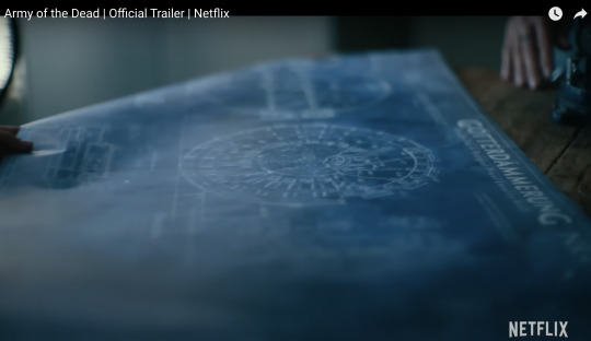
Here is a blueprint that you can't really see.
Extreme close ups of faces without autofocus at f/0.95 is nearly impossible to pull critical focus on.

Looks like Zack nailed the area just above the eyebrow here.
Let's try to find the point of focus in this one.
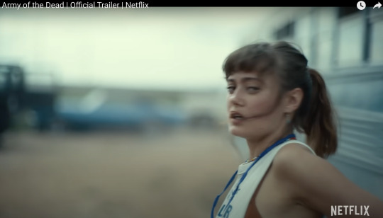
Ummmm... she is just... blurry. Missed focus completely.
But Zack isn't the only one going vintage. I've been seeing this a lot recently.
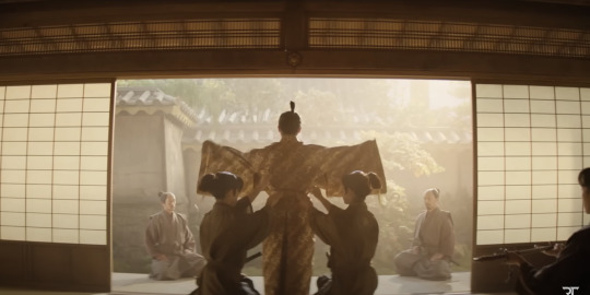
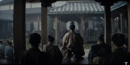
Shogun is a beautiful show. And for the most part, I really enjoyed the cinematography. But they went the vintage lens route and it kept going from gorgeous to "I can't not see it" distracting. And perhaps because I am familiar with these lens defects I am more prone to noticing. But I do think it hurt the imagery in a few spots.
Vingetting is a darkening of the corners of the frame.
Light rays in the corners are much harder to control. A lot of modern lenses still have this problem, but they create software corrections to eliminate the issue. Some cameras do it automatically as you are recording the image.
Vintage lenses were built before lens corrections where a thing—before software was a thing. So you either have to live with them, try to remove them with VFX, or crop into your image and lose some resolution.
It's possible this is the aesthetic they wanted. They felt the vignetting added something to the image. But I just found my eyes darting to the corners and not focusing on the composition.
And then you have distortion.
In this case, barrel distortion.
This is mostly prominent in wide angle lenses. In order to get that wider field of view the lens has to accept light from some very steep angles. And that can be quite difficult to correct. So you kind have to sacrifice any straight lines.
And sometimes this was a positive contribution to the image.
I thought the curved lines matched the way they were sitting here.
But most of the time I just felt like I was looking at feudal Japan through a fish's eye.
It's a bit more tolerable as a still, but when all of these verticals are bowing in motion, I start to feel like I am developing tunnel vision.
I love that this is a tool that is available. Rehousing lenses is a really neat process and I'm glad this old glass is getting new life.
This documentary shows how lens rehousing is done and is quite fascinating if you are in to that sort of thing.
youtube
But I think we are in a "too much of a good thing" phase when it comes to these lenses. I think a balance between old and new can be found.
And I also think maybe Zack should see what f/2.8 looks like. He might like having more than an eyebrow in focus.
446 notes
·
View notes
Note
Hello!! Your 3D renders are SUPER inspirational! If possible, could you tell me how you composited or overall edited your pokemon renders to look the way they do? (i.e the Nosepass in bed). I've been trying to capture a similar effect hehe... Thank you!!
Thanks so much! I usually do a few things in Photoshop after I render. Details below!
This is the Nosepass straight out of Blender - I try to get the colors and effects as close as I can off the bat.

Then, I usually do a color correction pass using the Color Lookup function. (I learned this from the master, Kat Tsai.) Usually, I use a combo of the 3-Strip and the Kodak presets. It's a function that basically maps colors across the spectrum of your original image to a new set of colors - often used in photography and film (which I'm using Blender to emulate!)

I often then draw in 2D details. Finally, to emulate that sort of old-video-game-magazine look, I duplicate the image and use Color Halftone on it. Find a decent blending mode, and voilá!


The post-Blender editing is super fun. I often try weird blending modes and overlay textures at this stage to get the effects I want. Hope this helps! (I also plan on making a beginning-to-end Blender video at some point.)
2K notes
·
View notes
Note
i love your art so much, what does your process look like? how do you edit images to be saturated/glitchy & also cohesive w your art?
awww thanks so much!!
its a lot of playing around with layer settings (shine&shade and burn&dodge are favorites but screen, multiply, overlay, exclude, those are fun too) and turning up saturation & contrast (in whichever program im using at the time). most saturation sliders have an upper limit. you must. go beyond 😈😈
to get a glitchy look i'll either literally look up "free use glitch overlay" on google images (i have all AI sites filtered out on my browser), or a LOT of the time i'll take pictures of trees or clouds around me, and i'll mess with the saturation of those images until its SUPER crunchy and low quality. zooming in on a random part of the image also helps make it crunchier and lower the quality (you'd be surprised how cool and ""glitchy"" a SUUUUPER oversaturated and zoomed in img of a cloud can look. i <3 cumulonimbus and nimbostratus but it doesnt rain much here 🥺)
i'll add a random layer effect, duplicate the layer, add a different effect, overlay a color gradient or random assortment of scribbled colors, etc... just til it looks sufficiently microwaved and cluttered. i also have quite a few glitch brushes on SAI 2 for some additional clutter
then for the main focus of the art i'll usually draw a little critter on MS paint, zoom in so u can see the pixels, copy the image&cut out the whites around it with magic wand, then put it on the image. its fun to do this with a lot of tiny little colorful cats just to add more color to the bg XD
sorry if thats all over the place. i dont have much of a cohesive process since i just goof around until i like how it looks or i recreate whatever my brain wants. sometimes i'll just do everything on a 200x200 canvas and size it up after editing and it looks crunchy on its own (i do this a lot for gifs, like my most recent piece). integrating photography is very fun. mixed media is fun
i might make some speedpaints sometime if i can get over my anxiety of ppl watching me draw XD
but ty again for the very nice msg. sorry if my response is a tad bit incoherent lol
64 notes
·
View notes
Text
So something I realized watching a few videos and reading a few articles is that most of us aren’t angry at the idea of AI in general. Many of us are excited to learn about AI systems that can identify cancer better than doctors, for instance.
What we’re angry about is generative AI being used to destroy the jobs of artists (and I mean all creatives here), who have already been dealing with their work being devalued by modern society.
And I’m not sure how to deal with it. I do remember learning that when photography became a thing, many painters were horrified and terrified of would erase the art of painting. It didn’t obviously, and in fact photography because a whole new art form.
I grew up during the birth of digital art. I distinctly remember the phase digital art went through where many people declared it to not be “real art” and that it was “cheating” etc. I’m sure other millennial artists also remember this transition. But graphic designers pretty quickly adopted digital tools, and websites like DeviantArt popped up, and I don’t think there are too many people nowadays who would say a digital painting isn’t “art”. Still, I do imagine there is a gulf between how some people would view the “artistic merit” of a 3 ft tall oil painting hanging next to a 3 ft tall print of a digital painting, even if the subject and styles were similar. So the worries that digital art would erase physical painting was also proven false. And for the record, I think digital art is 100% art. The merit of digital art is equal to that of physical art.
On the other hand, I can’t say these changes didn’t affect older forms of art. Like, photography did affect the world of painting. I don’t have statistics, but it seems like it probably affected the world of portraiture the most. And I wonder if many of the 20th century art movements were influenced by photography. None of my art history classes touched on that and it’s kinda weird to me. There is definitely something about a Dada or cubism or surrealist painting that transcends beyond what a traditional photo of a landscape or a portrait can do. There is no location in the real world with actual melting clocks or people whose faces show multiple angles at once.
And then there was the digital photograph that changed everything again! Film has become a niche art form.
There were specific kinds of jobs lost due to the digital transition, too. I’m thinking of things like murals being replaced by printed banners, or book covers often being done in photoshop. Oh, and that’s another tool that was faced with fear: Photoshop! There was a fear it would destroy the need for professional photographers because everyone could just fix their own photos. Turns out nope, and in fact people skilled in photography and photo editing are still in demand. And of course there’s the loss of 2D animation in favor of 3D animation, the loss of practical effects for digital, etc.
And you might argue that in some of those cases people can tell corners are being cut and that they won’t stand for it, but Marvel movies still make billions of dollars so…
So I don’t know what’s going to happen with AI art. I am NOT saying “all current artists are stupid and wrong, in the future history students will laugh at how stubborn they were to resist this idea”. AI art is not comparable to photography or digital painting.
With a photograph, you still need to compose the image in the frame, you need to position yourself in the real world, you need to know your equipment, whether you’re using film or digital. You also need to know how to process that photo either in the dark room or in Photoshop. These are skills the average person does not have. You cannot tell an AI “that shot was good but can you increase the contrast?” It’ll just produce a completely new image.
I read an article about an art director who was encountering difficulties as the department tried to incorporate AI. They got back first drafts of art ideas from the people employed to work with the AI, gave critique, and the second round was just completely new images that didn’t include the suggestions… because they couldn’t. AI does not understand color theory. It does not have the ability to take critique. It can’t slightly alter the layout of a design.
And all of that applies to painting too. AI (currently) can’t do what a trained art student can do. It doesn’t know that to create a sense of atmosphere you should make distant objects bluer. It doesn’t know how to use human physiology and psychology to draw a viewer’s eyes across a large painting to reveal a story.
AI also can’t replicate INTENTION - and intentionality is a HUGE part of art. WHY an artist chose those colors, that medium, that composition, those tools, why they chose to display it a certain way, why the composition is like this instead of that - all of that adds meaning to the painting that you can’t get with AI.
(Yes, there is an absolutely valid field of art critique that evaluates a piece of art on its standalone value and the message it conveys without the context of the artist’s intent, but that should be compared to the analysis that DOES include the artist’s intent! That comparison can bring about so much understanding!)
Anyway I’m going to end this post now because it has gotten WAY too long. I focused mostly on painting and photography in this post because those are my particular fields of speciality, but this applies to ALL ART. It applies to music and writing and scripting and acting and composing music and just. Everything. All art.
I don’t think there are any forms of art AI doesn’t threaten. Now granted, AI can’t currently pick up a paint brush. It can’t use a crochet needle. It can’t hold a camera. And maybe there will be some sort of return to physical media in response to AI produced digital art. Or maybe there will be a response in digital art to stylistically distinguish it from AI in a way AI can’t reproduce. I’m not sure what will happen. Maybe some proof the image was digitally painted by a real person, somehow. Or that it’s a real photo, or a real article. I saw someone mention there may end up being labels like “100% human made” like we do for organic food lol. Maybe work in progress videos or photo metadata will become more commonplace as evidence of authenticity.
Anyway, NOW I’m ending this post. Whew.
106 notes
·
View notes
Text

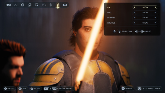
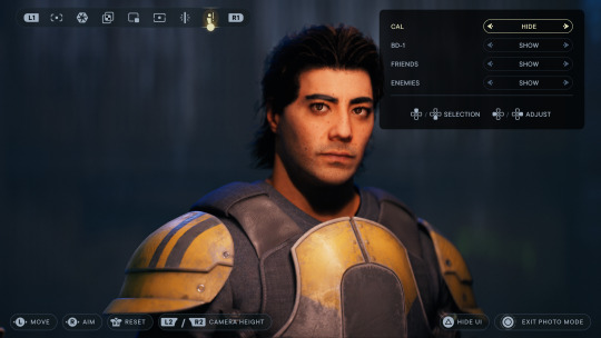
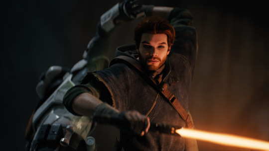
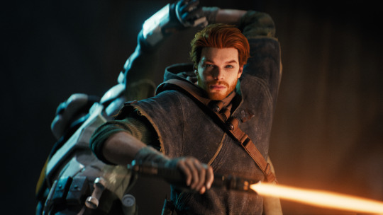
Jedi Survivor Photomode Tips: Portrait Lighting!
There are four lighting features that impact Survivor’s photomode: the environmental light, Cal's lightsaber, the exposure slider, and the three spotlights. Let's use them all 🔆
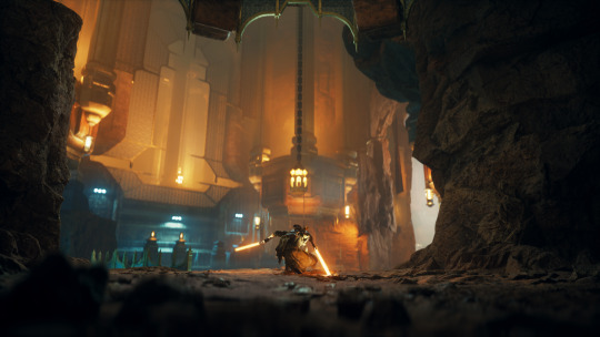
Environment
The environment/lighting teams at Respawn have designed incredible locations across all these different Star Wars planets. Pay attention to how the already-placed lights impact your portrait: I have a running shortlist of favorite locations that I often go back to when creating a specific look.
Environmental lighting also includes effects like fire particles, weapons, Merrin’s magick, etc. If you get your timing right, these can add extra color and visual interest to your photo.
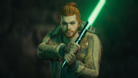
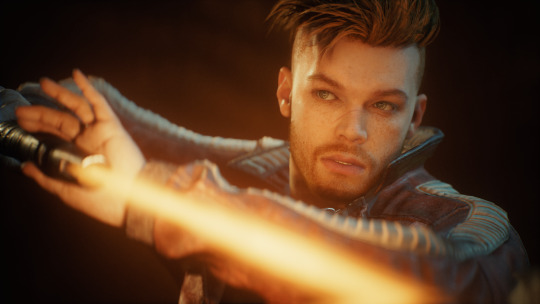
Lightsaber
Cal’s lightsaber! It’s made of light! While everyone has their own color preferences (ginger saber supremacy) keep your color choice in mind when using the saber as a key light.
Bonus tip: Cal’s saber can also be used to help light NPCs 👀 Photomode allows you to toggle Cal’s visibility on and off, but the ambient glow from the saber will remain. It’s pretty easy to tell when I’m using this trick: just look for a bar-shaped catchlight in the character’s eyes.
Speaking of catchlights - they’re a great way to add life to your portrait. If the environmental light doesn’t hit the character’s eyes, I’ll often use the first spotlight as a key (main) light to try and create that reflection.
Spotlights
I’m often using spotlights in two ways, either intensifying the environmental light or pushing the image with stylized lighting. The first creates more interaction between the character and their surroundings, while the second adds drama and visual interest. My favorite portraits are often a mix of both.
Here’s a breakdown from a recent photo: the unlit photo (1), a yellow spotlight as a key (2), a red rim light that connects to the neon sign in the background (3), a green rim light for stylization and repeating color (4), and the final image (5)
Other spotlight tips: play with moving them closer/further away from your subject, along with the intensity of the light itself. Some colors (white, yellow) are more powerful than others (red, blue). If I can’t get the color I want from one light, I’ll place two in the same location and drop the intensity to blend them - blue and green make turquoise!
If you want to be a nerd like me (though I'm in this industry so it's kind of my job) study lighting that’s used in real life portraiture and cinematography. Techniques like short lighting, three point lighting, butterfly lighting, etc.
Exposure Slider
The exposure slider in photomode is a helpful option when the entire scene is darker/brighter than you’d like. It’s also a good way to isolate your subject from the background: drop the exposure down, then use spotlights to add light back to your subject. Note that the spotlight brightness is impacted by the exposure as well, so you’ll need to crank the spotlights up to compensate.
Photo editing
Survivor’s visuals have a beautiful dynamic range and photomode does a great job protecting its highlights and shadows, though that often means less contrast. So if it’s a favorite portrait, I’ll add some contrast back in and often push complementary color into the shadows (yay color theory!)
--
So I've been slowly writing notes for a full-fledged video tutorial and wanted to try a thread-style post in the meantime. Lighting is such an important part of photography, both IRL and virtual, but it's not the easiest tool to use. This is more theory than a practical how-to, but hopefully some of it is helpful?
If you made it all the way down here, you get... a turbo dog or something. Two turbo dogs! 🌭
#star wars jedi survivor#jedi survivor#cal kestis#photomode#virtual photography#star wars#jen makes jedi tutorials
116 notes
·
View notes
Text

blender lighting tutorial + tips.
requested by @thecrimsonsimmer + recommended viewing: youtube video one, two, three, and four. this post will be dealing with newer versions of blender (2.8+) and cycles since that's what i'm more familiar with + commonly used for rendering. this is coming from me as an artist with some dabbling in photography and things i've learned in college!
references and setting the mood
are you basing your render on an existing photo? study the light source and what direction it's coming from: that's what's going to tell you your set up for a similar effect. if you're not basing it on an existing piece, a good start is knowing How you want to set your subject (your sim) up - do you want them to be in the spotlight? are they in a specific environment that has neon lights? are you going for moody or something fresh, bright? definitely look up colors and their meaning (color theory, movie screencaps, etc.) to create a stronger image!
using resources to start the set up
it's always a good thing to mix your tools with different communities, such as the art community! many have lighting tools to figure out how to color their subject, such as this free-to-use head figure that depicts where the lighting source should be placed.

there's also the photography community and teaching people how to set up their lights for certain setups. video three and four linked in the beginning are from photography viewpoints.
spot? area? point? sun?
let's think of the lighting types as objects - a spot is like a plain lightbulb, area is a reflective sheet, spot is a flashlight, and the sun... well is the sun!
a spot is similar to an area light, but triangular/a cone. think of a helicopter search light, it's focused on a small area with the most light concentration. these can be used for lamps with lampshades, car headlights, or a lighthouse.
an area light is great for lighting up technology. a phone screen, tv screen, tablet, anything that's an LED screen emitting from a surface. the light is not as concentrated as a spot and is meant to cover more flatly (hence the rectangular source)
a point is best used for small pops of colors such as candlelight, lamppost, lightning bug tail, etc. a small source that has nothing covering it.
a sun covers the entire area and can be used as the overall mood setter. it can create filter over the entire render by just shifting the color like you would see in a movie. you'll be given a line with a sun light that gives the direction of where the sun is coming from. basically a spot light just on a much larger scale LOL.
power + coloring

this screenshot is mostly what you'll only use to start off with. watts is the unit of measurement and the higher you go, the brighter the light will be. examples with a white colored point light 10W-20W: general portrait lighting 30W-50W: bright source, close flashlight for example 60W+: blinding
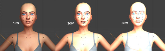
coloring is just like the system for in game lights for ts4. shift it to whatever you want it to be (click the white bar, that's the color preview) and mess around with the vibrancy. the darker, more intense color, the less it's going to appear on the sim.

closeness and intensity
similar to what's shown in the head lighting tool shown earlier, the closer the light is, the more that specific area is lit up. go too close and your sim could be completely washed out. it helps to change the size of the light (change with the radius slider) to better imitate what you're wanting. the larger the radius, the more diffused and softer the light source will be. close + small = very clear of the light source shape, can obviously tell where it is in relation to the subject far away + large = soft lighting, more of a hazy lighting of the color you choose.


to quickly adjust the light, press "G" and hold down your middle mouse button to adjust which axis you'd like to edit along. green is the x-axis, blue is the y-axis, and red is the z-axis. you can also press "G" and type the letter of the axis you want to use. drag the mouse to change the placement on that specific axis to however you want. if you want to freely edit the placement, just press "G" to move it out of the axis bounds.
world lighting
take this step as setting your canvas color before you start painting. in order for the values to look their best, change the world color to the same hue of the color you are mostly using. for example, this is set in a red-toned environment:


this is essentially changing the cast shadow onto the sim. the default is gray and will muddy up your undertones if not changed properly. for this instance, if you were to still use the same red point light in a gray world color it'd look like this:

of course, this will be based on if you have an environment image or not that can affect your lighting overall. this post is based on the fact there is no environment image and what not! if you need a visual demonstration on how to mess with the world lighting, check out this short video.

i hope that helped anyone beginning to render or wanting to light up your own scenes! i'm no rendering expert, but here's some of the helpful tricks i've learned and collected over the years<3 if you have any other questions feel free to send an ask!
#ts4 blender tutorial#sims 4 blender tutorial#ts4 render tutorial#sims 4 render tutorial#lighting tutorial#lyko posts#tutorial#long post
244 notes
·
View notes
Text
Mirror Effect on Image
#image#photo#picture#tools#graphic design#photographers#photography#online#free to use#jpg#image edit#photo effects#mirror
0 notes
Text
Because I had headcanon that Color is Autistic and has developed special interests in things such as photography, travel, maybe even things like social advocacy.
Maybe even philosophy and psychology. For now, in this posts, I’ll focus on the big two: photography and traveling. (I will also touch on how Color’s physical disability, chronic fatigue, his autism, and perhaps his ptsd/ separation anxiety from Killer also effect his ability to engage in his interests in another post.)
I think he’d develop some decent if not above average technical knowledge, such as camera types and functions. Detailed understanding of different types of cameras (DSLR, mirrorless, point-and-shoot, medium format, etc.) and their specific functions.
Knowledge about various lenses (prime, zoom, wide-angle, telephoto, macro) and their applications. Mastery of camera settings like ISO, aperture, shutter speed, and how to manipulate them for different lighting conditions and artistic effects.
In-depth understanding of how aperture, shutter speed, and ISO interact to create a properly exposed photograph. Proficiency in using software like Adobe Lightroom, Photoshop, or other photo editing tools for post-processing and enhancing images.
He’d learn about artistic elements such as composition techniques, lighten and color theory. Develop a familiarity with compositional rules like the rule of thirds, leading lines, framing, symmetry, and how to creatively break these rules.
Knowledge about natural and artificial lighting, how to use light to create mood and depth, and techniques like backlighting, side lighting, and using reflectors. Understanding of how colors interact, complementary colors, and how to use color to convey emotion and direct viewer attention.
Awareness of different photography styles (portrait, landscape, macro, street, documentary, astrophotography, etc.) and genres, and what makes each unique.
Knowledge about influential photographers and their work, such as Ansel Adams, Henri Cartier-Bresson, Annie Leibovitz, and contemporary photographers.
Understanding the evolution of photography, from daguerreotypes to digital photography, and significant milestones in the field. Awareness of current trends in photography, popular styles, and emerging technologies.
And, of course, he’d develop and grow practical experiences and hands on practice. Experience with on-location shoots, managing different weather conditions, and adapting to various shooting environments.
Knowledge about how to properly maintain and clean camera equipment to ensure longevity and optimal performance. Skills in troubleshooting common issues like lens flare, sensor dust, or focus problems.
He’d have a deep enthusiasm for specific techniques or subjects he enjoys photographing, whichever or whatever you all think those could be exactly.
Likely to have personal photography projects, well-organized portfolios, and possibly an online presence showcasing their work. Extensive collection of books, articles, videos, and tutorials related to photography.
A special interest in traveling, in addition to photography, would manifest in the character in several ways, showcasing their passion and extensive knowledge about various aspects of travel. Here are some specific aspects:
For his interest in travel, he’d be very well versed in the planning and research process. Color might create comprehensive travel itineraries, meticulously planning each day's activities, routes, and schedules.
He might gradually develop an extensive knowledge about various travel destinations, including historical sites, natural landmarks, cultural attractions, and lesser-known gems.
He’d display a proficiency in booking flights, accommodations, and transportation, as well as understanding visa requirements, travel insurance, and local regulations.
An expertise in packing efficiently, knowing what to bring for different climates and activities, and how to pack photography gear safely for travel. Color is likely to show a very deep and profound appreciation for different cultures, learning basic phrases or even fluency in multiple languages to better communicate while traveling.
He’d definitely show a deep interest in trying and understanding local cuisines, knowing popular dishes, and even recipes from various regions. He’d have at least some knowledge about local customs, traditions, festivals, and etiquette to respect and immerse themselves in different cultures.
He’d certainly develop some geographical and historical knowledge, with a detailed understanding of world geography, maps, and the ability to navigate using traditional maps as well as digital tools.
Knowledge about the history of the places he visits, including significant events, historical figures, and the cultural evolution of the region.
He might maintain detailed travel logs or journals documenting his experiences, including photos, notes, and personal reflections. He’d definitely collect souvenirs, postcards, or other memorabilia from his travels; often gifting them to beloved friends.
He’d probably engage with travel communities, forums, and social media groups to share experiences and gain insights.
This special interest would possibly lead to him gaining a lot of practical skills, such as in budget management. Expertise in budgeting for travel, finding deals, and managing expenses effectively.
He might display an ability to adapt to different environments, handle unexpected situations, and problem-solve while on the go.
Although it’d probably be harder for him than most, particularly if he has a harder time handling and dealing with change—especially if the change is unexpected and unplanned.
Knowledge about staying healthy while traveling, such as understanding local healthcare options, vaccinations, and travel safety tips.
He’d like combine both interests by using his photography skills to capture stunning images of the places he visits, creating travel blogs or photo albums to document his journeys.
He might create photo essays or visual stories that capture the essence of the cultures and places he explores. Share his travel experiences and recommendations with others, possibly through writing travel guides, blogs, or social media content.
All this is to say that Killer would definitely encourage Color to come with him to explore abandoned places and ghost towns, and Color’s going to be so overjoyed he starts hand flapping. He’s going to take so many pictures, he’s going to remember it forever.
#utmv headcanons#utmv hc#killer sans#utmv#sans au#sans aus#killer!sans#killertale#othertale#othertale sans#other sans#color!sans#colour sans#color spectrum duo#colorkiller#undertale#undertale au#undertale aus#utmv au#autistic headcanon#special interest#undertale something new#undertalesomethingnew#something new#something new sans#something new au#killertale sans#canon disabled character#bad sanses#bad sans gang
36 notes
·
View notes
Text
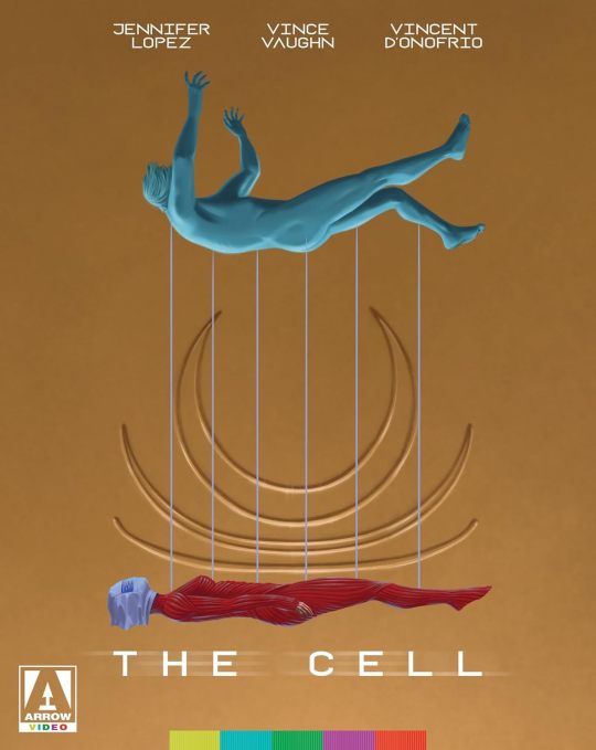
The Cell will be released on 4K Ultra HD and Blu-ray on January 21 via Arrow Video. Peter Savieri designed the new cover art for the 2000 psychological horror film; the original poster is on the reverse side.
Tarsem Singh (Immortals, The Fall) directs from a script by Mark Protosevich (I Am Legend, Thor). Jennifer Lopez, Vince Vaughn, and Vincent D'Onofrio star with Marianne Jean-Baptiste, Jake Weber, and Dylan Baker.
The theatrical and director's cuts have been newly restored in 4K, approved by Singh, with Dolby Vision. An alternate version of the theatrical cut created by director of photography Paul Laufer is also included.
Special features and limited edition contents are listed below, where you can also see more of the packaging.
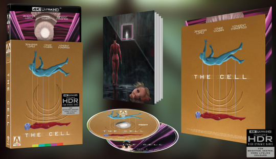
Disc 1 - 4K UHD:
Theatrical cut (107 min)
Director's cut (109 min)
Audio commentary with film scholars Josh Nelson & Alexandra Heller-Nicholas (new)
Audio commentary with screenwriter Mark Protosevich & film critic Kay Lynch (new)
Audio commentary with director Tarsem Singh
Audio commentary with director of photography Paul Laufer, production designer Tom Foden, makeup supervisor Michèle Burke, costume designer April Napier, visual effects supervisor Kevin Tod Haug, and composer Howard Shore
Projection of the Mind’s Eye - Feature-length interview with director Tarsem Singh (new)
Between Two Worlds - Interview with director of photography Paul Laufer (new)
Disc 2 - Blu-ray:
Alternate version of theatrical cut - presented in 1.78:1 aspect ratio with alternate grading from a 2K master created by director of photography Paul Laufer (new)
Interview with director of photography Paul Laufer about the alternate version (new)
Art is Where You Find It - Visual essay by film scholar Alexandra Heller-Nicholas (new)
The Costuming Auteur - Visual essay by film critic Abby Bender (new)
Style as Substance: Reflections on Tarsem
8 deleted/extended scenes with optional commentary by Tarsem Singh
6 multi-angle visual effects vignettes
Theatrical trailers
Image gallery
Also included:
Collector’s book with new writing on the film by critics Heather Drain, Marc Edward Heuck, Josh Hurtado, and Virat Nehru
When serial murderer Carl Stargher (Vincent D’Onofrio) falls into a coma with his latest victim still trapped in an unknown location and waiting to die, the FBI turn to psychologist Catherine Deane (Jennifer Lopez) for help. Using an experimental technology she enters the dark dreamscape of Stargher’s mind, attempting to learn his secrets before it’s too late. But his unconscious is a twisted nightmare, a labyrinth that threatens to trap her inside his terrifying world forever. To save a life, she’ll have to risk her own.
Pre-order The Cell.
#the cell#Jennifer Lopez#Vince Vaughn#Vincent D'Onofrio#marianne jean baptiste#jake weber#dylan baker#arrow video#dvd#gift#Peter Savieri#tarsem singh#horror#00s horror#2000s horror
27 notes
·
View notes
Text
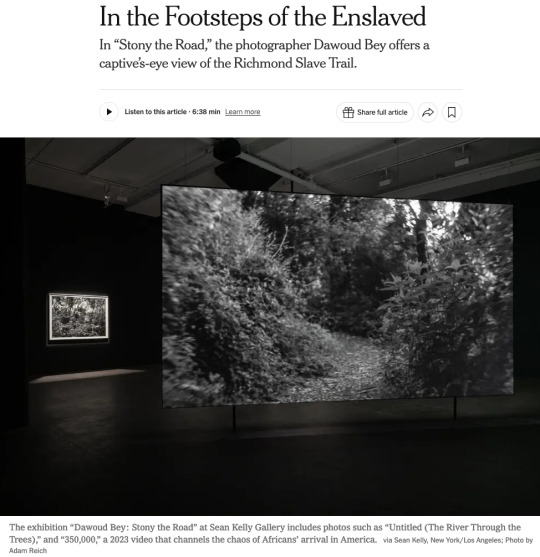
Happy to see my review of Dawoud Bey's great show at Sean Kelly Gallery getting nice play in the New York Times. The full text is below (click on "Keep reading") but one thing I didn't have room to dwell on, as much as I would have liked, is the vitally important tension between Bey's video and his stills. That's a tension (as I see it) between the “gaze” of the enslaved, in the fractured video, and of Europeans, in the elegant, traditionally artistic, even "sublime," prints. It would be so easy for someone to think the prints were just elegant, knock-off commodities meant to fund the more truly important, more challenging video. But I think the reflection back and forth, between the settled elegance and the unsettling challenge, is vital to the entire project.
IN THE FOOTSTEPS OF THE ENSLAVED - THE NEW YORK TIMES
CRITIC’S PICK
By Blake Gopnik
Jan. 30, 2025, 5:00 a.m. ET
The terrifying first capture in Africa.
The deadly crossing of the Middle Passage.
The brutality of slave markets and servitude.
It’s almost impossible to imagine, let alone depict, the full horrors of American slavery, although writers, directors and artists have tried.
But there’s one moment that seems to have caught their attention less often: the first encounter of kidnapped Africans with the strange new land where they were marched into enslavement.
In a remarkable exhibition called “Stony the Road,” at Sean Kelly Gallery in New York, the artist Dawoud Bey takes us on the path that tens of thousands were forced to walk, from the slave ships that landed at the James River’s docks to Richmond’s slave pens and markets.
With 14 still photos and a vast, two-sided video projection, Bey explores the Richmond Slave Trail that extends for several miles in Virginia’s capital. At Sean Kelly, Bey’s stills
are the first art you encounter. Those deluxe black-and-whites, almost a yard across, show various wooded spots along the trail, avoiding any details that speak of our era. (In fact, the trail now crosses many modern settings.) We get a view of trees and ground, of bits of river and patches of distant sky, such as an African might have encountered 250 years ago.
The images were shot on old-fashioned film and printed on traditional photographic paper, so we’re treated to the velvety blacks and sparkling whites of landscapes by Ansel Adams and Edward Weston and other pioneers of American photography. It’s tempting to linger with those tasteful, orderly images — in the gallery, and in this review — but I discovered that they get a whole new meaning after seeing Bey’s video at the gallery’s rear.
That video is titled “350,000,” an estimate of the total number of enslaved people who passed through Richmond’s trading markets. (The piece was originally commissioned for a major Bey show at the Virginia Museum of Fine Arts in Richmond in 2023.) Ten minutes of black-and-white footage appear on a screen that bisects a big space and reaches almost to its high ceiling. It shows the same wooded path as in Bey’s prints, but to utterly different effect.
The piece works hard to put us in the place — physical, but above all psychological — of one of Richmond’s newly disembarked. The images are projected at “life scale,” Bey told me, so that the path’s tree trunks and branches are the same size on the screen as they would be if they were there before us in life. And the trip down the path is captured in a single take, without edits, by a Steadicam held at an adult’s head-height, giving a captive’s-eye view of the passage up the trail.
But the goal isn’t to create a crisp, immersive substitute for a past reality. (Bey insists that his piece isn’t about faking some kind of long-lost documentation.) It’s about using the visible artifice of fine art to encourage a trip into a past we need to confront. In some ways Bey’s video has more in common with a poet’s evocative description than with a Spielbergish attempt at historical re-enactment.
So Bey’s cinematographer, Bron Moyi, shot all the footage with a century-old Petzval lens, once used for dream sequences in silent movies. It blurs all but the middle of the scene it shows, giving an almost drunken effect to Bey’s footage, which is also shown in somewhat slow-motion. Real vision never really works quite like that, but the Petzval provides an excellent metaphor for the kind of disorientation Africans must have felt on first being shoved ashore in Virginia.
They couldn’t have known quite where they were going, or what the endgame might be — most couldn’t understand their tormentors’ language — and “350,000” has a similar lack of plot or endpoint. Its camera’s “eye” rarely looks straight down the path toward some far-off goal. Instead, it veers from earth to treetops; from river, down at right, to undergrowth that hems the path at left.
No one knows if captives would really have looked anywhere but at their own stumbling feet or at the back of the chained figure ahead, but the camera’s wandering eye evokes the fracturing of any normal they might have known. Even the flora in Bey’s video, sure to strike most Americans as an average woodland scene, must have seemed foreign.
Bey makes his disjunctive technique stand for the utter confusion — physical, cognitive, spiritual — that captives must have felt. A soundtrack, commissioned by Bey from the dance scholar E. Gaynell Sherrod, adds to the effect: It’s a mash-up of random footfalls and birdcalls, of heartbeats and hoofbeats, of grunts and sighs and clinking chains. It doesn’t quite reproduce what the enslaved might actually have heard, but it sometimes adds Hollywood melodrama that the visuals smartly avoid. However, Sherrod’s soundtrack, and its lack of obvious sync to Bey’s visuals, maps onto how trauma can fracture our perceptions.
“Bey’s installation doesn’t recreate a single moment in someone’s pain,” our critic writes. “It condenses all the moments that thousands of subjects might have suffered on the Richmond Slave Trail.” via Sean Kelly, New York/Los Angeles; Photo by Adam Reich
In a final touch, Bey gives art viewers a more immediate taste of that same bewilderment: The occasional visitor who peers around to the other side of Bey’s screen will eventually realize that the view there is actually the same path but seen on a different trudge down it. That gives a sense that Bey’s installation doesn't recreate a single moment in someone’s pain; it condenses all the moments that thousands of subjects might have suffered on the Richmond Slave Trail.
And then, leaving the video behind, you encounter Bey’s stills once again, and now they seem to play a different role in his story. After witnessing the splintered sights in his video, his stills now seem to stand for the very firm and settled present that today’s art world lives in, at so many removes from an enslaved person’s view.
They give us something like the stable, settled view favored by Europe’s artistic culture, circa 1800, when wild nature promised escape from the everyday into the sublime. It’s almost as though Bey’s prints offer a bright light at the end of their forest path, so that, as in many an Ansel Adams photo, the white of the immaculate silver print becomes the white of escape and transcendence. The prints have a stable authority, in their confident choice of subject, the snapping of the shutter, their deluxe printing, that isn’t there in the video.
Bey’s show gets its name from a passage in the second stanza of “Lift Every Voice and Sing,” the hymn by James Weldon Johnson that premiered in 1900 and is known as the Black national anthem: “Stony the road we trod/Bitter the chastening rod.”
Here’s how the stanza ends: “Out from the gloomy past/’Til now we stand at last/Where the white gleam of our bright star is cast.”
Now, 125 years later, Bey’s gloom seems to cast new light on art’s gleam.
17 notes
·
View notes
Text
Amazon-Style Product Photography Tips
I got this message from a lovely follower.
Now, a fairly large part of my new steady job is product photography. Not glamour shots, more documentation. The company I work for makes, among other things, licensed drinkware (think water bottles, mugs, tumblers, etc.). Part of my team's duties is to photograph a mockup or finished product both for our records and to submit to the license holder.
The routine typically goes: put item facing forward in lightbox. Click. Rotate to the left. Click, etc. for the back and right. Then a closeup of the copyright info.
Here, finally, is my question: one of the license holders decreed that all of our photographs must be taken at f/8 and shutter time (?) of 1/25s. This strikes me as… not always optimal, considering the range of colors of objects as well as different materials: polypropylene both transparent and opaque, stainless steel, and lacquered cardboard for packaging. I would love to hear your thoughts on how I might better (while being consistent!) adjust camera settings to account for these kinds of factors
As an added bonus, we let the camera decide white balance/color correction. But I don't think I'm knowledgeable enough to try and correct myself, considering none of the monitors/printers I use are color-correct in the first place. I just know there have been many times where I've submitted photos only for the license holders to be like, "Hmmmm, that green doesn't seem like the right kind of green…RESUBMIT!"
First, I'm going to answer this specific question, but at the end I'm going to recommend a full setup for taking these type of rapid fire product shots.
My answer:
f/8 makes sense. Outside of macro photography, this allows a deep depth of field assuring the photo is sharp and in focus for the entire depth of the product. It is usually the sharpest part of the lens and it is not so small of an aperture that you risk diffraction effects softening your image. They probably were told this by a photographer and thought it applied to all of the camera settings.
The shutter speed is problematic. By forcing it to a fixed setting, your camera is going to choose whichever ISO gives a good exposure. And if you don't have enough light, it will choose a high ISO that will possibly add a great deal of noise to your photo. Noise can corrupt the colors of your photo and it just looks bad.
If your camera is on a tripod and they want the sharpness and depth of field f/8 grants you, then I would set your camera to aperture priority mode (usually Av), lock your ISO to it's lowest number (usually 100) and then your camera will choose the best shutter speed on its own.
So… Camera on tripod Av mode f/8 ISO 100 Camera chooses shutter speed
This is all assuming you are using a tripod and continuous lighting. If you are handholding the camera or using flash, I can rewrite the recipe. Otherwise this will get you very sharp photos with minimal noise.
I'd also recommend getting a shutter release cable so you don't shake the camera when taking the picture. Just search your camera brand and “shutter release” and get the cheap wired version unless you really need wireless.
This is the Canon DSLR one, just to give you an idea.
Be warned, if you do not have powerful lighting, you may get some long shutter speeds. That is perfectly okay as long as it is on the tripod and you aren't shaking the camera when taking the picture.
As far as white balance goes, if you really want it to be accurate, you can order a cheap photography “gray white balance card”. They are as cheap as 10 dollars.
This is the one I use.
There are a couple of ways to utilize the gray card.
Option 1:
You put the gray card in the exact lighting as the product or just hold it directly in front of the product.
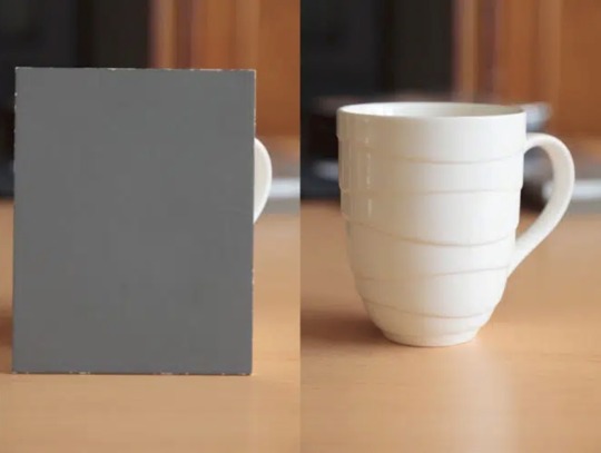
You take all your photos in RAW format (JPEG will not work) and adjust the white balance in Lightroom, Photoshop, or any RAW editing software. Use the white balance picker tool (looks like an eyedropper) and click on the gray card.
This will give you an exact white balance for that lighting environment. You can synchronize those white balance numbers across all of your photos. Lightroom has a copy and paste function or a "sync" button that will change adjustments in all selected photos as you go.
This is the most accurate option because it allows for “tint” adjustments for extra color accuracy.
youtube
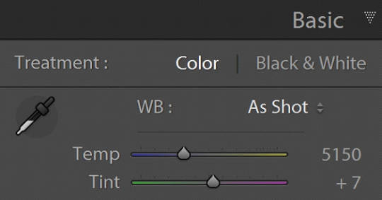
Option 2:
Do the same as above and remember the white balance value. Then set your camera to a custom white balance matching that value. It will probably be around 3200K or 5500K depending on your lights.
Pro tip: If you have any ambient lighting from overhead or other room lights, it could contaminate the photo and skew the white balance into a weird color temperature. Try to make the room as dark as possible aside from your photo lights to avoid this. If you are using flash or have really bright photo lights, this isn't a huge concern.
Option 3:
Use your camera's built in custom white balance tool. It's different for every brand, so you will need to search for a tutorial. But the basic idea is the same. You put the gray card in the lighting of the products, take a picture, the camera analyzes it, and then sets a custom white balance. This can also be done with a white sheet of paper in a pinch.
Here is a video demonstrating the process. Remember every camera brand mau have a slightly different method.
youtube
Good white balance means accurate colors. That is important with product photography and a good value add for your clients. Just be warned, if you change the lighting even a little bit, you have to redo this process. If you bump a light or switch it out for a different one, redo your white balance calibration.
Also, some continuous lights have white balance drift, especially if they allow you to adjust the color temperature manually. Not only will the white balance change depending on the power setting, but it can also change over time. Especially if the lights are used frequently.
Move the lights, redo white balance. Change the power, redo white balance.
And if your lights are stable and on the same power all the time, I’d still redo the white balance every week or so. Personally I would do it before every shoot, but you’ll have to decide if that is worth it depending on how fast you need to turn things around. I usually do it as my first photo in the series so I can set the white balance, select all the photos, and copy the settings to all of them at once.
The nice thing about doing white balance with a gray card is that the results are display agnostic. Even if your monitor is poorly calibrated, you can be assured the white balance is accurate. And if someone says your photos are green, it will be their monitor and not your problem.
You just have to avoid doing any color specific adjustments to the images. Trust the gray card and white balance tool more than your eyeballs and display.
You can boost saturation a tad, but that is all I would mess with unless you know what you are doing. Even if the photos look a little drab or not very colorful, I would leave it alone. It sounds like the importance for this task is accuracy of color rather than making them as pretty as possible.
------------------------------
Okay, that is the question answered. Now I'd like to go through how I would build a setup to do this kind of work.
In the product photography world, this workflow is referred to as "pack shots." The idea is to create a consistent setup so you can just swap out the product one by one and speed through the shoot. It is best to control as many variables as possible so all you need to do is set the product down, take the shot, and repeat.
I'm going to show you my ideal pack shot setup with a light cube. I think it will be similar to what my follower is using. And, if not, it might help him streamline his process a bit.
A light cube is just a box made of diffusion material.

You drape a background with the color of your choice. White is usually preferred for Amazon-style pure white background photos. Though I prefer dark gray for aesthetic reasons. You just want to make sure the backdrop has that natural gravity curve so there isn't a hard line or wrinkles.
For lighting, you should get two *identical* lights. They can be desk lamps as long as they are the same and have the same light bulb inside. Then you just place them on either side of the cube. You want the ball of light on the cube to be in front of your subject.

Remember, your light source isn't your actual lights. It's the ball of light on the sides of the cube.
If you want to make it a little fancier, you can get a black or white acrylic sheet to create a reflective surface. You want it as far forward as possible and a little elevated. Here are some things I did in a simple light cube with the setup above.
Here is what the white acrylic looks like.
I placed a big book under the acrylic sheet like this.
This allowed me to hide the curve of the background and get a nice crisp transition between the acrylic and the background.
And if you do white acrylic, you can get the background to seamlessly blend.

As I said, two desk lamps will work, but if this is for a business and you want something fast, convenient, and reliable, I would suggest something more robust.
I'd probably get two daylight balanced COB (chip-on-board) LED video lights that have a Bowens mount attachment.

This Godox light is very reasonably priced for its features.
Daylight balanced means one consistent color temperature, so less chance of drift. These are very bright so you can use a quick shutter speed and you won't even need a shutter release cable (still a good idea). You also don't *need* a tripod, but you should still use one. The main advantage of bright lights is they can't be overpowered by room lights. You can be assured any overhead lights or window light will not contaminate your photo. A darker room is always preferable, but if you crank these it won't matter.
The Bowens mount allows you to place any modifier you wish on the light from softboxes to reflectors. But the standard reflector should be fine for the light cube. But if you are taking photos of tall cylinders, a couple of strip boxes might help.

Don't worry about putting the grids on. You just line them up towards the front of the light cube so you have even light from the top to the bottom of your cylinder. Again, this is optional.
Since these lights are so versatile, you can do any kind of lighting for any other photographic needs. Slap on a white umbrella and take company portraits if you want. Or you can use them as video lights to film a worker safety video.
So, here is my recommended ingredient list for a pack shot light cube setup.
Light Cube COB video light Black Plexiglass Seamless paper (color of your choice)
Colored poster board also works if you keep it from getting dinged up. And the light cube also comes with some cloth backgrounds, but watch out for wrinkles.
BONUS TIP: If you want that pure white background like in Amazon shots, add a third light from behind with no background paper. Make the light cube material your background and shine a light through it. You have to make sure it is bright enough to give you pure white, but not too bright that the light blasts your subject from the rear.
Otherwise just use a white backdrop and use Photoshop to brighten it to pure white.
Karl Taylor shows a pack shot setup without a cube, but the same principles apply. He shows you how to dial in that white but not too white background. Just imagine instead of shining a light onto a background, you are shining a light through the background (the back of the cube).
youtube
13 notes
·
View notes