#Logo Development
Explore tagged Tumblr posts
Visit Tumblr Blog
Explore Tumblr blogs with no restrictions, modern design and the best experience.
Last Seen Tumblr Blogs


Fun Fact
Tumblr was named as a finalist in Lead411’s New York City Hot 125 in Aug 2010.
Text


#art#design#fashion#fyp#legend#indeedgoodman#high fashion#Aja Wilson#Las Vegas Aces#WBB#lv aces#kate money martin#kate martin#logo#logo design#interface#designer#logo development#logo creation#logo maker#product design
25 notes
·
View notes
Text

"FREE THE SOUL" by DL'S DESIGNS
#artists on tumblr#oil painting#japan#art#small artist#jujutsu kaisen#arcane#sonic the hedgehog#digital art#webcomic#logo#logo design#logo development
5 notes
·
View notes
Text
Just some logo designs for The Filtration District in Calamity


#artist#artists on tumblr#artwork#small artist#digital aritst#digital art#logo#logo design#logo development#worldbuilding project#worldbuilding#worldbuilding ideas#scifiart#scifi#sci fi and fantasy#sci fi#sci fi art
3 notes
·
View notes
Note
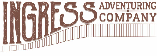
This is a pretty random one, but how did you design the logo for Ingress?
Little did you know, I love to answer questions about ~design~.
The Ingress logo has gone through about 3 different official versions, but at least 50 different conceptual iterations. I'm a graphic designer by trade and profession, so I approached it any other way I would approach making a logo.
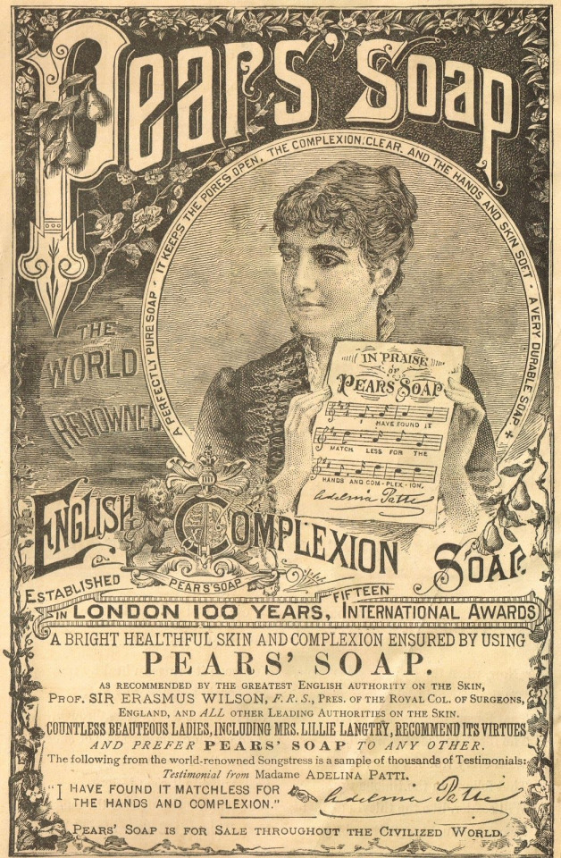
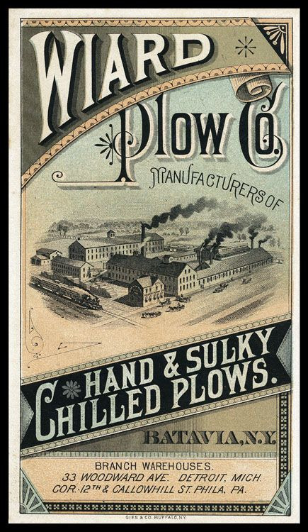
The first iteration of the logo I have less information on the development of, but I was looking at a lot of advertising from the late 1800s to early 1900s. For example, these advertisements have a lot flourishes on the text and warping letters, as was common in that era.
I took that concept and made the first iteration of the ingress logo at the comic's inception in 2017. My graphic design skills weren't as strong then, and I mostly just took a font I thought fit and slapped it around a little bit to try and get the look I wanted.
I wasn't particularly happy with how this one turned out, and it only ended up being used for a few months on the first version of the website and on a single printing of the first chapter of the comic, but I also didn't put a ton of time and energy into making this one. So, I went back to the drawing board soon after I made this first one.
The second iteration of the logo took a lot of inspiration from the same sources, but I first took a lot of time drawing out concepts in my sketchbook to try and get the right visual look for how the logo should be.
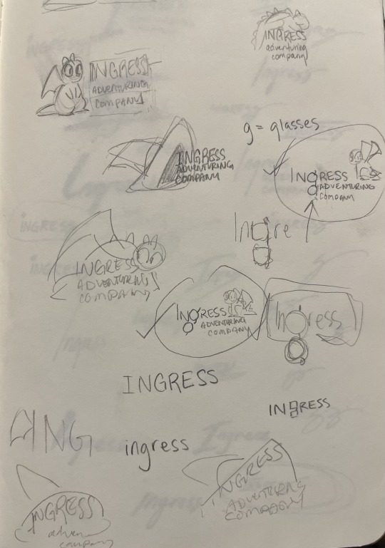
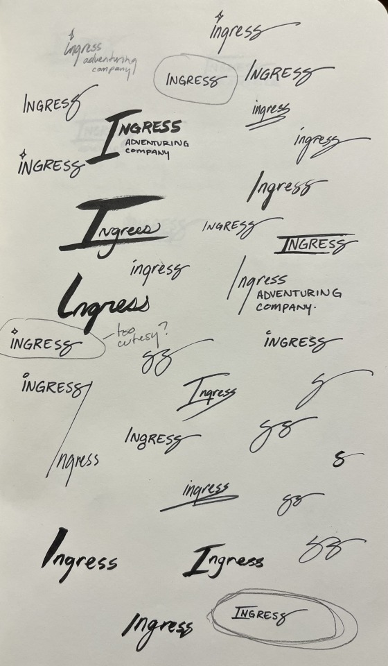
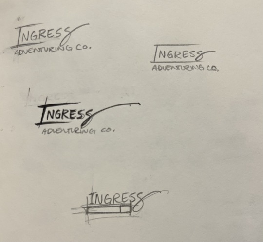
At first I played with the idea of including a little picture along with the logo. I thought maybe Toivo's glasses would be a good thing to try to include in the 'g' in Ingress, or that Rocky or Toivo's hat should appear in the logo. These were all discarded for cluttering up the logo, because the words themselves are all pretty long. Eventually, I started playing with the shape of the word itself, which very quickly lead to the last S becoming the signature swirl.
Next was iterating on this concept with fonts.
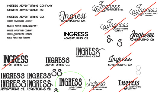
That lead to the second iteration of the logo, and the longest running version of it.
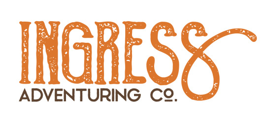
I chose a textured font to give it that "worn" feeling that was so popular in the design world in 2018. There were a ton of brands doing textured stuff to give their brand an edgy feel, but I did it to make it feel old and like it was from the late 1800s.
This would still be the logo today, but I ran into a problem: the font I used, Goldsmith Vintage, had a limitation on how long you could use their font for free and for printing. Fonts aren't particularly expensive, but if you want to use a font for publishing, you need a special license and those fees can rack up in price pretty quickly. It was unlikely that the people who made the font would come after me for using it, but I decided to not take that chance and instead refresh the logo one more time, this time putting more of my own hand in it.
This time, I took a different approach. I liked the old logo, but I was having a hard time finding a font that I really liked and would get the same feeling as the old logo... So instead, I decided to use calligraphy to draw it myself.
I rewrote the word Ingress Over and Over and Over, and specifically I rewrote the S's to try and get the perfect shape of it. Then, I picked out specific letters that I liked.
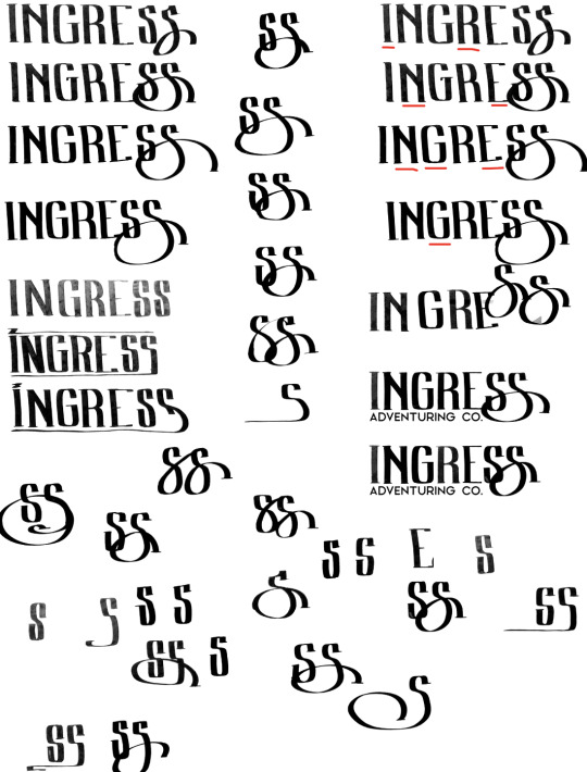
From those letters, I picked the ones I thought looked best, and smashed them together into one rough version of the logo that I liked.
And then from here, I made a digital version of the logo in Adobe Illustrator so I could get a nice crisp vector version. Also, I made rough versions of it, so I could keep doing the same 'old' look.
And... that's about it!
Ultimately, I think the new one is really fun, and I really like the fact that the latest one was made with my hand directly. Those aren't letters you can find in any font, they're my letters.
Maybe you can tell but, I have a lot of opinions on letter shapes.
Anyway, thanks for asking, and I hope this was as entertaining for you to read as it was for me to blather on about.
18 notes
·
View notes
Text


Hydra Elixir Logo
This is my latest project, which is basically a logo for a hair product commissioned by a hair care brand. The client emphasized elegance, luxury, and simplicity, requesting a black and gold overall theme and color. This was an exciting project as I had to get really creative with everything.
The elixir bottle was my initial main element that I was sure I had to incorporate even throughout the drafting process. It was hard to find a shape that would perfectly embody the elegance that the client wanted so I drafted several bottle shapes and finally found one that caught my eyes the most while giving the vibe that we were going for. It is an inverted diamond shape, symbolizing luxury, elegance, and superiority. The crown was a symbolism of the superior quality of the product as well as the edge it holds over other similar products. It is a simple but game-changing addition to the logo.
The hair follicle was the most challenging part that completed the entire look of the logo. I had to incorporate hair in some way, but those logos that used hair with faces are much too overused so I didn't want to use it in that way as well. The bottle had a huge empty space inside, so I thought, why not put an element inside? That's when it all clicked, and the idea of using a single hair follicle instead of a bunch of hair gave me the final touch necessary for this masterpiece!
I had so much fun working with this project. Hoping to do more logo projects in the future!
#adobe photoshop#art#graphic#graphic design#photoshop#portfolio#adobe illustrator#illustrators on tumblr#illustration#custom fonts#font design#fonts#elegance#luxury#luxurious#beauty brand#branding#hair#hair products#creative logo#custom logo design#logo design#logo#logo development#creative#black and gold#hair care#product advertising#advertisement#advertising
3 notes
·
View notes
Text

A handful of fantasy logo designs for shops I’d love to go to ˙𐃷˙
#my art#art#illustration#logo design#logo development#graphic design#digital illustration#fantasy art#fantasy illustration#dnd art#k#typography#lettering#design
19 notes
·
View notes
Text
Have you guys seen the new Detroit sign

Yeah, it kinda sucks ass
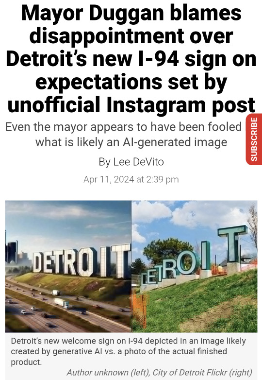
And no I'm not saying this because I saw the obviously AI generated image and my expectations were high, I'm saying this because I'm a graphic design student. Also, the first one still looks like shit and it lacks creativity. It's basically a copy of the Hollywood sign. Have the people who've seen the AI generated image seen what literally anything looks like? Are they stupid? Even the mayor is disappointed. Come the fuck on.
Not to worry, I've come up with a solution. I'm not saying this should be the final solution, but I think it's better than the one where you just use a masking tool to paint parts of the Detroit sports logos over the existing sign letters. I can't find a photo of it.
The solution? Random typography. Not many brands are bold enough to use it. The only one I can think of off the top of my head is the logo for CCS (College for Creative Studies), also in Detroit!
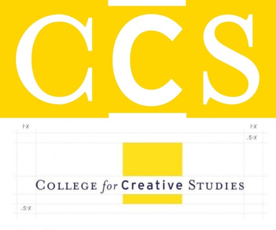
Top image is the acronym, bottom is the full logo. It even shows a grid system!
Maybe if we weren't such cowards, we could incorporate random typography into more brands. I'll be bold enough to take on that task.
You might wonder, how will you choose the typefaces? Using Detroit company logos and taking from those. But I won't do it randomly. In fact, I've done research on Detroit companies and when they were founded. Here are some that I've found.
Comerica: 1849
Carhartt: 1889
Ford: 1903
Faygo: 1907
Little Caesar's: 1959
DTE Energy: 1996
Oh yeah, those letters I filled in? They spell out "etroit." The D will be the Detroit sports logo used for the Lions and the Tigers.

Using some crude editing in Google Slides, I've managed to create this logo.

This uses the following:
The "D" in the Detroit lettermark
The "e" in the Comerica wordmark
A "t" in the Carhartt wordmark
A cursive "r" in the Ford wordmark
The "o" in the Faygo wordmark
The "i" in the Little Caesar's wordmark
The "T" in the DTE wordmark
Crazy? Yes. Maybe this is why most logos stick to just one typeface. But we're building a city sign, dammit! Why shouldn't we break the rules? This is certainly better than the Helvetica ass sign they have out there! There's been diss tracks made, that should be enough to convince the city to change the sign and get some real designers involved!
Also here's a better sign where all the letters are about the same size

I like this one better. There's even a consistent color palette of blue, black and orange, colors associated with the Lions and the Tigers. Where they are, however, is not very consistent. The tones are all different! Do we use all blue at this point? Maybe black? Maybe keep the D blue and also make "et" blue, then "ro" black, then "iT" orange? Or does it look fine like this?
Maybe later I'll find a way to 3D model this
10 notes
·
View notes
Text
Adobe illustrator S logo design
#genshin impact#harry potter#puss in boots#splatfest#the owl house#logo design#logo development#logomaker#logo#adobe#adobe illustrator#adobe photoshop#illustration#illustrator
2 notes
·
View notes
Text
THE IMPORTANCE OF BRANDING IN GRAPHIC DESIGNING – WHERE CREATIVITY MEETS BRAND IDENTITY

In today’s world, branding plays an important role in business. Choosing a correct logo & colour palette is crucial as it represents your brand. The role of Graphic Designing is to create stunning visuals that not only looks great but also represents the Brand. A good Graphic Design acts like a visual language, as it helps Brand to communicate its message. With a lot of businesses out there, we need a strong Branding to stand against competition.
The Importance of Branding in Graphic Designing
Unique Identity: Branding helps businesses to create a unique identity by using visual elements like, logos, colours and fonts that represents Brand. These elements give a consistent look to the business across all platforms. People are more likely to remember a brand by the colours used in logo than the actual design. It enables people to choose the brand in future too, as it sticks in their minds. For example, Amul logo appears visually unique paired with the Amul girl, vibrant colours and a playful tagline. It creates an instant recognition for that brand and makes it standout unique from other Brands.
Trust and Credibility: Consistent branding helps in building trust and credibility. When a Brand uses similar same logo, color scheme and style everywhere like social media, website and products people will trust your brand more. When there is a similar logo, color scheme, and style everywhere-be it a website, social media, or a product there's more trust in the brand. A professional and cohesive look indicates that the brand is serious and trustworthy about its offerings. It requires good graphic design to attain that polished image. For example, Tata is operating in diverse sectors like automobiles, IT sectors, Consumable goods. Still, it maintained the same logo which appears simple and recognizable. This consistency builds Trust and Credibility for TATA and makes it easy to remember.
Brand Values: Every Brand has a story to be told and Graphic Designing can communicate that story effectively. The use of certain colors, fonts and images connects to the audience and reflects Brand Value. Green tones indicate Agriculture, Organic and eco friendly Brands while earthy and black indicates Bold and Luxury Brands. While used correctly, Brands can create a strong connection with audiences. For example, Café Coffee Day (CCD), focuses on youthfulness and relaxing. It’s distinctive and vibrant colors in logo creates an inviting and energetic atmosphere that catches youth attention.
Adapting to Market Trends: Adapting to Market Trends is crucial for Brands to avoid being outdated and connect with their audience. It’s important to maintain consistency while restyling logos. Maintaining fluidity while restyling logos helps your Brand not to lose the integral feel. For example, Swiggy, a food delivering app with its bright orange color, makes changes to its logo during festivals and special events by incorporating festive themes and elements. But, it still maintains the core designs that ensure brand recognition. This helps Swiggy to connect with audiences by following marketing trends.
Branding in Graphic Designing helps foster connection between audience and Brand. It creates a memorable first impression and when used consistently it builds trust and makes people to remember it more often and choose your brand over others. An effective Graphic Designing also communicates your brand values. At Aarka Solutions, our Best Graphic Designers team helps Brands and Businesses to create an identity in this competitive market. With our creative Graphic Designs, we design your Logos, create Social Media Posts, Design Marketing materials like Broachers and business cards. By using a consistent color palette for your Brand, we let your customers recognize you simply by seeing the designs. Visit us at www.aarkasolutions.com / www.aarkasolutions.in.
#aarka solutions#branding#graphic designing in Branding#Graphic Designing Company#Graphic Designers#Graphic Designs#Logo Designing#Logo Development#Logo Design#Logo Colors#Brand Colors#Brand Strategy
3 notes
·
View notes
Text
Logo for my future VN game ~🌠
2 notes
·
View notes
Text
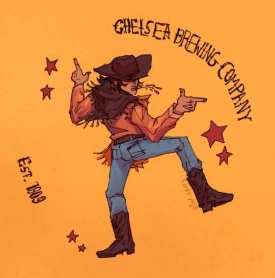
Chelsea brewing company
Concept logo design thing idk i made a while ago
#digital art#digital illustration#digital painting#digital sketch#digital artist#logo design#logo development#concept art#concept sketch#concept design#character concept#logo concept#illustrator#illustrative art#art student#art#drawing#sketch#art inspo#Wild West aesthetic#Wild West art#cowboy aesthetic#cowboy art#western aesthetic#western art
7 notes
·
View notes
Text
Daily Doodle Day 311


<- Day 310 | All Day | Day 312 ->
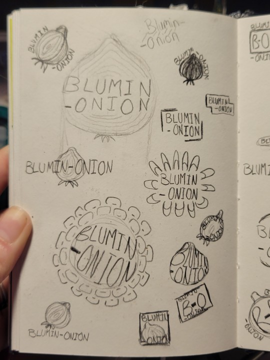
Been noodling on some ideas for a signature/watermark/logo
#daily doodle#daily doodles#traditional art#onionart#doodles#doodle#sketch#sketches#beginner artist#🧅 art#signature#watermark#water mark#logo design#logo development#creative logo#logotype#logo#signatures#watermark design#thumbnail#brain storming#ideas#noodling
6 notes
·
View notes
Text
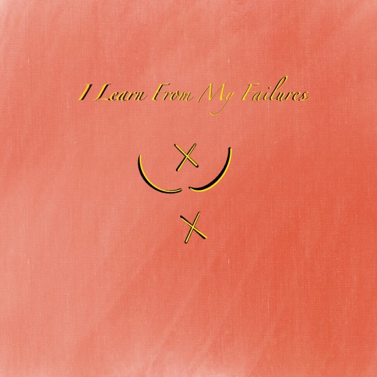
I learn from my failures Sigil! I played with the overlapping colors not just with the lines, but with the text!
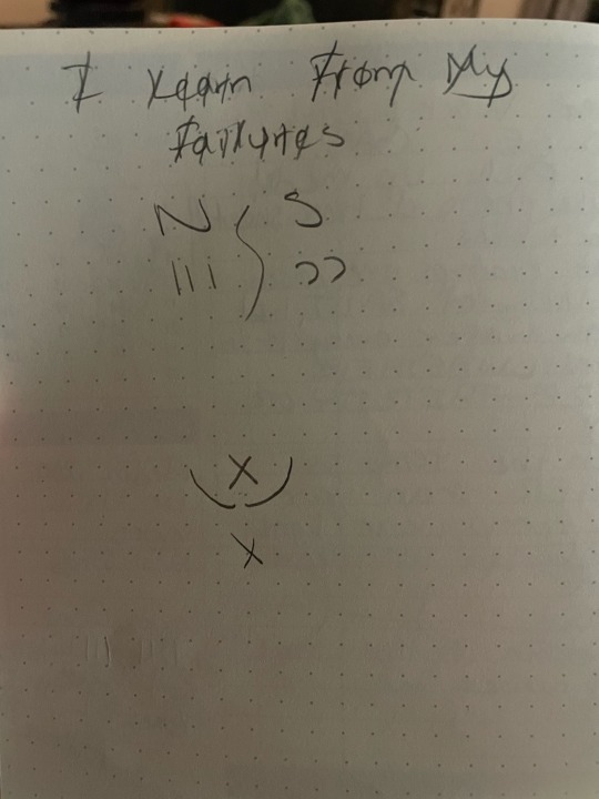
#witchcraft#eclectic witch#magick#witchy#graphic design#logo design#digital art#digital illustration#sigils#graphic art#logo practice#logo development#ceea
2 notes
·
View notes
Text


ROK Army Recon 25 battalion
#roka#design#illustrator#vector#vector art#drawing#art#illustration#illust#patches#military#army#logo#logo design#logo development
2 notes
·
View notes
Text
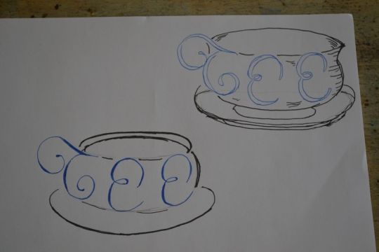
Tee sketching
#design#designer#anti instagram#art#my artwork#my work#my art#original my work#graphic design#art by me#nieuwe secession#gabber artist#sketchbook#sketch#sketching#logo development#logo designer#logo#hand drawing#tee
9 notes
·
View notes
Text

Napping bat artist. 🦇💤🎨
#pop art#logo design#logo development#logos#logo#bat#bats#cute bats#bat appreciation day#flying fox#flying foxes#vampire#vampire bat#bat cave#cute art#paint palette#murcielago#pollinators#nectar#pollen#die fledermaus#artist on tumblr#art commisions#art commissions open#folk art#basquiat#andy warhol#napping#nap time#upside down
4 notes
·
View notes